26 November 2009

[logos] The New AOL Logo Is More Of An Emotion

2266.AOL has come a long long way since 1983, when it was just another online network provider specializing in Commodore 64s (QuantumLink). America On Line rose from a member of that prehistoric scrum to the top of the world for a while – actually becoming a equal, at least in nomenclature, of the venerable Time magazine; the once-geeky haven grew big enough to eat Time Warner to morph into AOL Time Warner, a move seen then as a herald of the New Media, with hands in the old world of print but looking toward the apparently ascendant one of online electronic media and commerce.

Ah, but the best laid plans of mice and men, as they say. As it turned out, just about the time AOL laid out 164 US Megabucks for it, the tech bubble was starting its legendary deflation and the online landscape was beginning its seismic shift away from nation-spanning ISPs and "walled gardens" to the … well, whatever the hell it's supposed to be today. By 2003, the bloom came off the rose, and the AOL came off the Time Warner. By 2005, AOL Wunderkind emeritus Steve Case was not only no longer the excecutive chariman, he was off the board entirely, and now, in 2009, AOL, the ISP That Ate Time Warner, is getting spun off … by Time Warner.

This, of course, means it's time for a re-branding. And that's going to happen as of December 10th.

Throughout its life, the AOL logo has been a rather skillfully-conventional implementation of imbuing a graphic mark with a certain style and letting it stand in for the company. The AOL logos from the late 80s though the 90s and to the doorstep of the 00s were a clever combination of the elements suggesting the A (the big triangle) the O (the upper curve of the swirl suggesting a O) and an L (which is what the lower curve of the swirl suggests). The result is a compact, locked-down logo that contains an energetic heart – kind of the idea of the AOL walled garden, indeed:


As the 80s and 90s ground on and certain fashions fell by the wayside, AOL got rid of the Flashdance inspired typography and simply shifted, as many similarly-named entities seem to over time, to just an initialism:


… a move which was just stylish enough at the time. An interesting point; the letters AOL stopped officially standing for America On Line at this point, and the AOL trigram became a name in and of itself. That hasn't stopped the old-school punters from remembering it as – and still thinking of it as – America On Line (or, as my friends at the time called it, "A**holes On Line").

After the turn of the century and The Biggest Media Merger Evar Until A Bigger One Comes Along, AOL saw the light – realized by a soft light complete with Official Web 2.0 gradients, which actually abstracted the already-abstract AOL logo:


The triangle has become an arrowhead; the AOL logo has become a "play button". Like it or not (and I've seen both opinions – mine is, not bad actually) it's au courant and fairly hip to the trends.

Now, in 2009, the AOL star, rather dimmed, is leaving the Time Warner constellation. The online environment now looks nothing whatsoever like the cosy dialup environment that AOL helped define and poor AOL, even with its hip new Web 2.0 logo, was really feeling out of place.

The first thing one asks onesself after the breakup of a relationship that defines them is usually "who am I? Where am I going now?" And what's AOL's answer going to be, as expressed by it's new logo and identity?


I'm not really sure. You see, all of the above is AOL's new identity – and none of them are. As defined by the company itself:

The new AOL brand identity is a simple, confident logotype, revealed by ever changing images.  It’s one consistent logo with countless ways to reveal.

Just like someone on the rebound – you're everything to everyone. Not even that, really, you're whatever you want me to want you to be, with the true-blue, consistent heart revealed by your ever changing ways. To be exacting, the AOL logo is gone from being AOL to being "Aol." a three letter mixed-case combination which actually pretends to single-glyphdom, with a full-stop bringing the confidence.

Why is it I feel as though I've stepped into a Khalil Gibran poem? The premium seems to be on dynamism. The "Aol." isn't on display, it matches the background and doesn't appear until something steps behind it, it's revealed, as stated, by ever-moving backgrounds, some of them rather pretty in and of themselves, as demoed by the video at this location at the AOL Corporate site. And how pround of this approach is AOL? You can download this video! Here's the link for QuickTime, and here's the link for Flash Video.

I've downloaded it, even though I can't explain why. The whole thing seems New-Coke-y, but AOL … sorry, "Aol.", may be on to something here.

Credit for courage, though, for pushing the evelope as what qualifies as a graphic element to something that's rather like nailing jelly to the wall. Seriously, I'm impressed by the bravado here.

Good luck with that, AOL.

Technorati Tags: , , ,

24 November 2009

[art] Painters Rejoice: Finally A Perfect, Durable Blue – Oregon State Blue

2265.Pigments in paint are made from some amazing things. Tiny beetles, cochineal, give us many reds (as well as the red food coloring that actually goes into food). Ground semi-precious stones (lapis lazuli) give us the blue in Ultramarine.

Biggest problem with painters' pigments is the permanence. Blues and reds are the worst; unless the works are cared for, they fade over time (artists say that they are fugitive). Moreover, some of the chemicals that create these colors are nasty: cadmium, a heavy metal, is used in both reds and blues (that aren't labelled hue; these colors are analogues), Prussian blue can leach cyanide, and cobalt is a carcinogen).

Enter Oregon State University. Creative things come from OSU – did you know that the humble Maraschino cherry originated at OSU Food Science? Well, they've done it again – accidentally:

So it was a pleasant surprise to chemists at Oregon State University when they created a new, durable and brilliantly blue pigment by accident.

The researchers were trying to make compounds with novel electronic properties, mixing manganese oxide, which is black, with other chemicals and heating them to high temperatures.

Then Mas Subramanian, a professor of material sciences, noticed that one of the samples that a graduate student had just taken out of the furnace was blue.

The pigment is a quantum leap but is very expensive to make, based on the materials involved. They say they're looking for less expensive chemicals to use.

Bravo, OSU … from the hallwed academia of Orange comes Oregon State Blue.

Rumors of a truly durable and permanent red are, of course, still crazy talk, along with warp drive.

(via, via and via, and here's the University's announcment)

Technorati Tags: , , ,

[liff] Pareidolia: New Jersey In The Sky

2264.We see what we want to see – or, more appropriately, we recognize what we recognize. And when confronted with a field of random, visual information, we impress meaning upon it, especially if that random information happens to form patterns we are familiar with.

This is what we call pareidolia. It's what we humans seem helpless to resist doing to make sense out of a senseless world. For instance, in this picture (nicked from Strange Maps), the cloud just happens to resemble New Jersey:


Just to see how close, here's an actual map of New Jersey along side:


Uncanny, isn't it? There are some places where the match misses it by a mile, but it's close enough for jazz, as we like to say.

The post at Strange Maps is here, and includes asphalt Maines, many versions of Australia, even a food-based District of Columbia.

Pariedolia is a strange and wild beast. It's why some think there's a human face on Mars; it's why so many see Jesus in peeling paint and the Madonna on a grilled cheese sandwich. We're programmed to recognize things we know, and if things just so happen to fall into a familiar pattern, our recognizer turns on and sees what we recognize.

Sometimes it's a very close resemblance, but sometimes it can be a mile off but still be reminiscent.

The next time you see something that makes you think of something else (Tanzania has always reminded me of Wisconsin, and both make me think of toast. This can lead to an incidence of grilled cheese sandwich), take a moment to let it open some perceptive avenues. Think about how a random assortment of meaningless forces made something that you recognize. Some may see God in the display; some may see the cosmos talking back to them; some may wonder at the amazement that wild impersonal chance can produce.

Thinking about this always makes me go inside and outside at the same time, which, for someone who isn't very religious, is a mind-stretcher, to say the least.

Technorati Tags: , ,

20 November 2009

[liff] Twitter Is Crack Cocaine

2263.Didn't we just know it?

(Warning: Theres a couple of adult words on that. Nothing you've not heard before, but don't go readin' it to the toddlers, K?)

Technorati Tags: , , , ,

[pdx design] Pride Foundations's 25th Anniversary – A Logo Design Contest Worth Entering

2262.As always I'm against "logo design" contests in the broad sense of the word. There are a few out there that deserve one's notice, and I think I've found one.

The Pride Foundation is a NW charity that functions as a philanthropic organization for the LBGT community, (read all about it), and is celebrating its 25th year of service with a 25th Anniversary Logo Design Contest. This differs from the usual logo design cattle call in several significant ways:

  1. The prize is a $250 donation to the non-profit of your choice.
  2. The logo will be used only during the Pride Foundation's 25th Anniversary year.
  3. It's meant to augment the current logo; it's not an attempt to get rebranding on the cheap.
  4. While they promise exposure, they don't promise that this will change your life, though it certainly could.
  5. It's for a charity that serves one of the most vulnerable segments of society right now. Your guardian angel will like it that you do this!
So, here's one logo design contest you can enter that's not evil, in my opinion. I'd at least recommend a serious look. For links to the submission guidelines, rules, and all contact info, check out:

http://www.pridefoundation.org/25th-anniversary-logo-contest/

Good luck.

Technorati Tags: , ,

[IP] U of O Quacks Down On Viral Video – And They're In The Right. Here's Why.

2261.By now, everyone who's curious has seen it or is soon going to because of the buzz … the viral video "I Love My Ducks", by three enterprising UO students … and one registered trademark.

I Smell Roses @ Yahoo! Video

Now, I'll put my cards on the table right here; I'm bored by football – except for college football, and when it comes to that, I bleed Orange. So that's me for you. I think the smell of roses this year is a little stronger in Cow Valley than in Eugene (for more than obvious reasons).

But even though I'm not on "their" side, I'd be the last person in the world to deny their passion for their overrated honorable team. We pick our ponies and we fall in love with them; you roll your dice and take your chances. And sometimes, people who are not lawyers get so in love over their paramour that they forget that things like logos and trademarks and characters like the U of O Fighting Duck – which began life as Disney's Donald Duck – actually belong to someone else, regardless of the emotional investment the fan has.

Or, perhaps, in this case, they just didn't realize this. Or maybe they figured the U would go along once they saw what a good light the mascot was being used in.

The University of Oregon is very very careful about the use of thier marks. Always has been. You might remember in the last political campaign cycle, when Gordon Smith's US Senatorial re-election bid used a font that looked suspicously similar – some thought identical – to the distinctive font found on UO's athletic program, named – appropriately – Belotti Bold:


The probelm with Smith using this font for his campaign is that Belotti Bold is a bespoke font. Just as with so-called "bespoke" fashion, a bespoke font is one developed specifically for a certain customer and not released for sale. The customer – UO, in this case – has the sole right to use and is to whom all permissions must be obtained from.

I can't remember what effect it had on the Smith campaign organisation – I'm sure it embarrassed them just a little – and they removed the very-close-to-Belotti-Bold font from the website.

Actually, while the U of O undoubtedly clearly understands the unspoken message that could be contained within the appearance of the mascot in the video – that the U of O endorses it, at least tacitly – there's more than just that. The U of O Fighting Duck's resemblance to one very well-known Disney character is not just coincidence. As the duck, originally appearing in the 1930s, evolved in artistic depiction over the years, it began to resemble Donald more and more. Walt took note, and the then-athletic director of the U, Leo Harris, who was a friend of Disney, got him to agree on a handshake. Much later, in the 70s, this was formalized as an agreement that essentially licensed the use of the Donald-esque duck to the U of O only, and only by and for Oregon sports.

So, to chase this down to the bitter end, the U of O doesn't actually own the depiction of the duck – Disney does. And Disney allows the U to use it under a set of strict conditions. Conceivably, unless the U takes quick and decisive action, could the Oregon actually lose the right to use it?

The question has been asked and is now on the table. It seems possible. Oregon's marketing dept has actually been stuck in the position of having to be the bad guy.

Moreover, allowing this use would set a precedent. It's funny – when I was a kid, if a parent or someone in authority said "if I let you do it, I'd have to let everyone do it too", I resented that. As an adult I understand that you can't simply pick and choose here. Anyone following Supwitchugirl's effort, if allowed to stand, would be credibly able to point to that video and assert that if they were allowed to do it, so should others. And I'm not a lawyer, but I think they just might have a case there.

So … yeah. It's a painful fact of life, especially for some Duck fans, but the Universitas Oregonensis may seem to be a bit of a bully. But they're on solid ground here and have not only every right to demand the video be taken down but also every right to expect it to happen, the Streisand-effect propagation not withstanding. To protect a most unique relationship giving them the right to use a Disney character for a logo, they would indeed seem obliged to move in a decisive manner.

Some local Duckers are a bit alienated. I can understand why. The U has to be the buzzkill here, and is doing it to a turn. Personally, I don't want to see the Ducks cry over something like this … I'd much rather see them cry the minute the clock ticks off the last second of the Civil War the Beavers win, as they wave bye-bye to their Rose Bowl chance.

Hey, no hatin'. I do bleed Orange though, so there's me for you.

And, as far as I know, Benny Beaver has no cross-ownership issues. So, he has that workin' for him.

Technorati Tags: , , , , ,

15 November 2009

[liff] Ken:By Request Only - Finally Hear What's Behind the Awesomest Album Cover Of All Time!

2260.He's Baaaaaaack …

Ken. By Request Only. The Awesomest Record Album cover of Time, Space, and Dimension. It will never leave the Intartubes:


Have you ever wondered exactly what Ken's song styling sounds like, though? This album is said to have fetched north of $150 when auctioned off at eBay, but what sort of melodic tuneweaving can Ken Snyder do?

Wonder no more.

Click this link to listen to the album on YouTube (or click on the album cover above), where some brave soul has posted the tracks as a playlist.

Not wholly unpleasant, as it turns out. Corny, mawkishly-charming soft songs about sweet things and nice feelings and God and Jesus and stuff. Not Grammy-material, workmanlike but passionate effort, not mad skillz … but not untalented either.

(H/T to Garrido who left this link in the comments to the article at the end of the first link, and found me via some web search apparently. I have no connection or relation to the fellow otherwise)

Technorati Tags: , ,

12 November 2009

[type] Mr Subliminal Tells A Joke In Type

2259.Back in the mid '90s, when Saturday Night Live was still cool and funny [1], repertory cast member Kevin Nealon got a great deal of mileage out a character who was originally named Phil Maloney, an ad exec, but who became known as "Mr. Subliminal". The character delivered a monologue but quickly and sotto voce at critical points inserted clues to how he was really feeling about what it was he was talking about, making it a round commentary on PR in general. As an example (culled from Wikipedia) here's what he had to say about a fellow who inexplicably made world news back in 1994 for being convicted of vandalism in Singapore and was going to be subject to that brutal punishment of which the island city-state is so very famous for:

… the boy admitted to spray painting cars but he's only eighteen and young people often do stupid and impulsive things they later regret Shannen Doherty. I happen to think [pause] that everyone's entitled to one mistake Euro Disney. And I'm not saying there aren't [pause] those who I'd love to see get a good flogging Urkel, it's just that [pause] I'm afraid we've become so insensitive that we've learned to accept the idea of a man's beating in public Pee Wee Herman.

A t-shirt I've seen recently reads "Hi, I'm Hot Sex Mr. Subliminal". You get the idea.

Type gives an excellent route for this. This a sort of "painting with type" that you may hear typographers rhapsodizing about from time to time, and it's quite funny (and since it has to do with web entrepreneurship, ever timely):


as the graphic says, copyright by @Boris,/
http://thenextweb.com.


I can just hear Nealon sotto voceing the white type. And it's all quite funny, with the ring of truth that only a web entrepreneurship professional can bring. And the twist ending is quite good.

And you can all do it with type, and that's what I love about type.

[1] The period that SNL was "cool and funny" seems to be defined for everyone as about 3-5 years in the past, with the standard agreement for everybody being the original Not Ready For Prime Time Players era was pretty much awesome (essentially the first two seasons), though everyone agrees the sixth season was pretty much ass.

Technorati Tags: , , ,

[blog] My Illustrations – A Victim Of My Own Popularity

2258.My hit count (as measured by SiteMeter) per day has been trending upward, which is satisfying to me even if a great deal of them are search hits (though I do get niftyness from Twitter these days). I imagine that it has something to do with the footprint my blog is making – the more I post about the things I care about the more like-mindeds are likely to find me.

Unfortunately, since I'm still poor, I depend on free services to host my images. Photobucket served me very well for a long time but even at my trending-upwards-but-still-modest traffic, I'm now running into a problem I never thought I'd have – in particular here, the 10 MB monthly bandwidth limit Photobucket imposes.

So, as time goes on, I"m shifting my illustration host to Picasa, which makes sense in as much as this blog his hosted by Blogger and the Picasa web interface is cleaner and more intuitive than Photobucket's anyway.

So, if you come here on a search and you get the Photobucket redline graphic, shoot me an email and I'll relocate the graphic. I'm getting to them as I can, assisted by Photobucket's Stats suite.

Technorati Tags: , , ,

07 November 2009

[comic art] The Tintin Sketchbook

2257.There be lots of Tintins here.

And Snowys. And Thom(p)sons. And Haddocks. Even a Thompson Triplet. Sadly, no Bianca Castafiore, Professor Calculus, or even Jollyon Wagg. You can't have it all.

(Update: I have been apprised, by gallery owner Leigh Walton, that there are indeed at least one Castafiore and a couple of Calculuses (?). Next time, I should be more thorough)

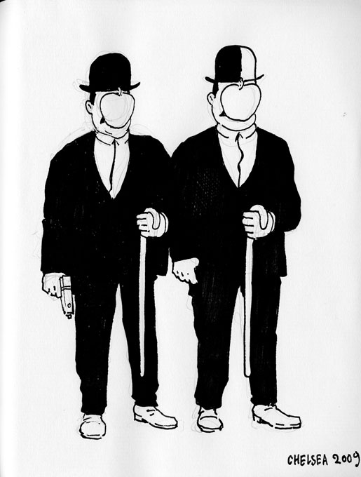
But, there are not only about 100 Tintins/Snowys/Haddocks/Thom(p)sons, there are many interpretations. I particularly enjoy the one I've chosen to illustrate, by artist David Chelsea, since I'm also terribly besotted with Magritte.
From the Flickr description:

Hi, I'm Leigh from Top Shelf. This is a themed sketchbook I started collecting at San Diego Comic-Con 2008. The theme is Herge's Tintin -- any character from the series. So far I've filled up one whole book and moved into a second volume...

100 interesting departures (including a graphic-novel-style realistic Tintin I quite enjoyed can be found here: http://www.flickr.com/photos/phthoggos/sets/72157606566029871/

Go see it.

Technorati Tags: , , ,

06 November 2009

[ad_design] What Might Have Happened If The D&D Club Started Drinking Canadian Club

2256.Last year some ad agency came up with an ad campaign for Canadian Club whisky based on a certain retro perception of The Sixties Dude – a campaign that was a little bit rude, rather un-PC, and played on that proletarian worldliness that could only be bespoke by a tagline such as Your Mom Wasn't Your Dad's First.

Love ya, Mom.

Such ads are ripe for spoofing. And someone did. Beautifully.


Clicky upon the image to embiggen. The copy on the Canadian Club ads reads:

YOUR MOM WASN'T YOUR DAD'S FIRST. He went out. He got two numbers in one night. He drank cocktails. But they were whisky cocktails. Made with Canadian Club®. Served in a rocks glass. They tasted good. They were effortless. DAMN RIGHT YOUR DAD DRANK IT.

Whereas the brilliant copy on this reads:
YOUR DAD WAS A LEVEL 22 NECROMANCER. He didn't bitch about server lag. Your dad put on his ears and his green boots and didn't care who saw. He rolled to feel up his elf girlfriend after kicking Acerrack's ass in the Tomb of Horrors. He set his classmates on edge. He was a nerd before it was cool. And he didn't give two shits about what comic books Megan Fox reads. DAMN RIGHT YOUR DAD PLAYED IT.
Like I said, pitch-perfect. And, I don't know about you all, but you've gotta know that the stereotype of the sexless nerd was just that; as the main character in Revenge of the Nerds sagely noted, "All jocks think about is sports. All nerds think about is sex". True, that. And, I don't know about you all, but those two cuties down in front in the big picture look pretty rowwwr to my inner 17-year-old.

Yep, back then. There were lady gamers. Yes, typically speaking, they were hot. We tried to tell y'all, but you wouldn't listen.

Ah, good times. Good times.

(Thanks to Lyle, who Knew Me Back In The Day™, if you follow)

Technorati Tags: , , , , ,

[maps] Lancashire: 10,000 Holes, And One Invisible Town

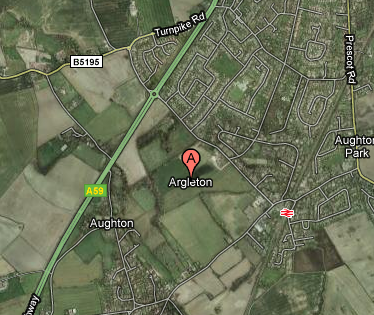
2255.If you haven't heard of Argleton, Lancs, UK, I'm not a bit surprised. It's a bit of a phantom, actually.

If you go to Google Maps, you'll be centered on a spot approximately 10 miles NNE of Liverpool, England, in the Lancashire countryside. Here's a link:


Here's a URL link to the above Google Map
.

Lovely looking place. Quiet green fields; lovely hedgerows; convenient to both the Motorway (that's British for freeway, Clem) A58 and the Aughton Town Green rail station, you won't want for transportation options.

The only thing Argleton doesn't seem to have is … well, you can see above. There seems to be no actual there, there:

The town appears on Google Maps in the middle of fields close to the M58 motorway, just south of Ormskirk.

Its 'presence' means that online businesses that use data from the software have detected it and automatically treated it as a real town in the L39 postcode area.

An internet search for the town now brings up a series of home, job and dating listings for people and places "in Argleton", as well as websites which help people find its nearest chiropractor and even plan jogging or hiking routes through it. The businesses, people and services listed are real, but are actually based elsewhere in the same postcode area.

Neither Google Maps nor the company associated with the provision of the basic data can explain what Argleton's doing there, Brigadoon-like, in a field, just south of Ormskirk.

One wonders how The Beatles would have handled this one, here.

Technorati Tags: , , ,

04 November 2009

[net_liff] Win Fawlty Towers For Following Dave At Twitter

2254.As anyone knows, Dave Knows PDX.

Dave knows PDX is built on an ancient unicorn burial ground, and you can trust Dave, because Dave Knows PDX, as I said.

I know that Dave is on Twitter, and Dave knows he wants more followers, and if you follow Dave, then you DM him on Twitter so that Dave knows you're following him, he will enter your name in a drawing, and once Dave knows he has more than 150 followers, he'll randomly pick a name and you'll know whether or not you'll be the proud owner of a shrink-wrapped set of the complete run of Fawlty Towers, which, as you and Dave and everyone knows, stars the not-yet-late John Cleese.

You know.

So you'll want to follow Dave at http://twitter.com/DaveKnowsPDX. And then let him know that you're following him.

If you know what I mean. You know?

Technorati Tags: , ,

[liff] Unpaid Layout Work is STILL Layout Work …

2253.… ands I lurves me some layout work. And I work best under a deadline. I hate them and I love them. And my hands are very full. Working in InDesign CS3 to lay out the OryCon 31 Programs and the Sierra Club Columbia Groups Columbia Overlook.

In the meantime, let me leave you with this thought to mull over, cribbed from comic Charles Fleischer, but probably somewhat incorrectly (but that's okay):

If Van Johnson had a gym, and Jim Morrison and a van and Don Johnson needed to get there in a hurry, would Van Johnson let Don Johnson use Jim Morrison's van to get to Van Johnson's Gym?

Just askin'.

Technorati Tags: , , , , ,

29 October 2009

[address_nerd] New Seattle Street Blades, And PNW Address Nerds Unite!

2251.Benjamin Lukoff, a Seattleite with whom I'm fortuned to occiasionally communiciate with, has an article up on Crosscut.com about the Seattle street blades which are being gradually rolled out, coincidentally at more-or-less the same time Portland's are undergoing a gradual change.

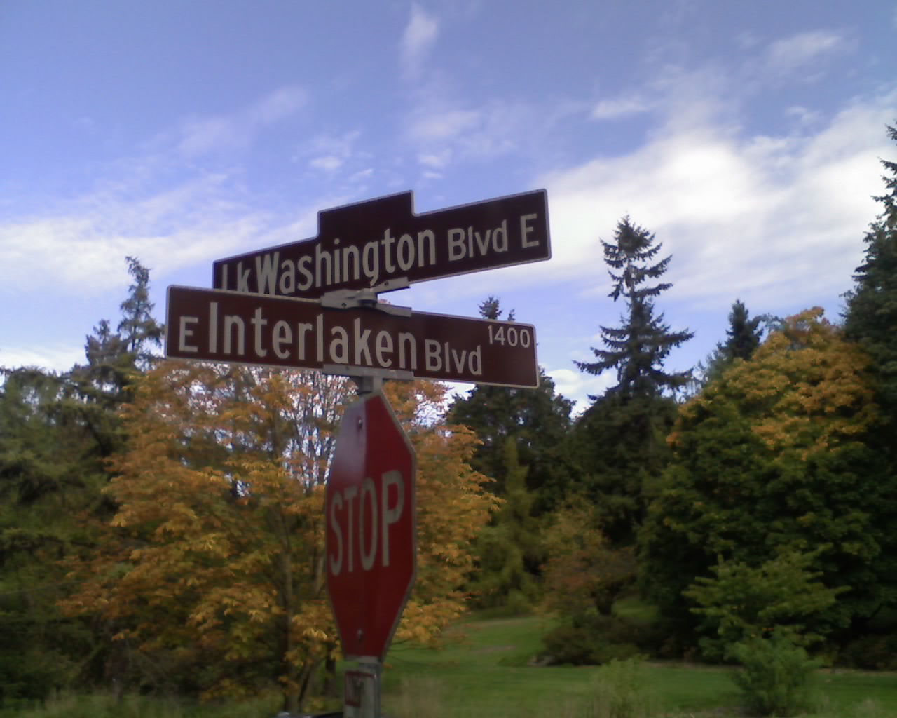
The observation is particularly fun because, just as the leaves are going from green to brown, so are the the Seattle street blades:


Actually, not all of the Seattle blades are brown, just the ones on Seattle's network of Olmstead boulevards, those city-spanning parkway blvds like Ravenna Blvd or (as above) Lake Washington Blvd and Interlaken Blvd that were inspired by the Olmstead Brothers' park plan for Seattle.

Ben points out that this change has been in the works for a while:

Yet it turns out that we approved this project in 2006 as part of the Bridging the Gap levy. Since then we've begun replacing signs at all our nearly 13,000 intersections, as the aluminum ones installed in the 1960s have definitely begun to show their age, and the new fiberglass batch is larger and more reflective. In a sense, we're finally catching up with the rest of the country. Our timing may not have been perfect, but we'd better pray for strong stomachs, because this project is scheduled to go, according to a report in The Seattle Times, until 2016. (On the bright side, that leaves plenty of time for you to pick up your favorite old sign at the city's surplus warehouse.

The material appears to be the same that we here in PDX are seeing going up on our new street blades.

The new Seattle design not only includes a design for streets and roads but also for pedestrian stairways and paths that happen to be in the streets right-of-way and trails (such as the Burke-Gilman Trail), with a walking-man pictogram similar to the ones we see on our walk-signals. Very nifty.

Ben does point out that, as I've seen in Portland, some mistakes are obtaining. No misspellings yet, but directionals are being left off and some signs are a little inscrutable.

It is becoming apparent that Clearview, the font, is catching on all over. Seattle's signs are using it too, and the reputation of mixed-case type is being forewarded thereon.

The real gem is that Ben links two other of us Address Nerd (or sign-obsessives, if you will). The other one is one whom I've enjoyed, Morgan Wick; the other is, of course, my own self. It made my day when I saw he linked me to the work "odd", which made me laugh out loud.

Address nerds go viral? Maybe. And here I thought I was the only one, when I started. Nifty.

Ben's full flickr stream is here. Also very nifty. Don't miss the "Gently Used Kids Sale" while you're at it. That Seattle – so inscrutable.

Technorati Tags: , , , , , , ,

28 October 2009

[art] Drawing Comics With Doug TenNapel

2250.Doug TenNapel gave you Earthworm Jim and GEAR, and now he gives you about ten minutes or so of his time to show you how he does what he does and talk about storytelling:


What is interesting about TenNapel is, with just about everybody (up to and including Scott McCloud and Scott Adams) using graphics tablets to get the job done, TenNapel kicks it old-school – at the drawing board, inking in pencilled panels on Bristol board using Sumi-e ink.

His remarks about using a Cintiq (for which I would kill everyone's grandparents to own) versus drawing to complete a story were insightful and revealing. He draws for the same reason a lot of us draw. Drawing is, amongst other things, sensual as well as sensuous. The adjectives he use approach carnal; the feeling of laying down graphite and ink on paper is indeed seductive. While telling the story is part of what feeds his head, unless he's actually drawing the drawings and filling them in with brush and ink, it's kind of empty. There's a decided lack of kinesthesia there; and while computers can make comic artists mad efficient and productive, there's a decided feeling of separation from one's work.

In the excellent Making Comics, Scott McCloud mentions a moment when he went out, bought a two-dollar (plus tax – the man lives in California, I do believe) roller ball pen, a Pilot Precise (the only pen worth owning) V7 (I prefer V5, but that's just me) and dashes off a sketch with it, making the point that if you really want to draw comics, computers may be the bomb and heaven for you, but you can do it with a scrap of paper and a pen off the shelf.

If you want.

Technorati Tags: , , , ,

27 October 2009

[liff] Neologism Of The Day: Hangoversight

2249.Another new work for y'alls:

hangoversight (n): The factfinding process a drinker puts themselves through analyzing (as best as they can) the things they might have done to prevent the horrible way they feel the morning after the night before. Assaying and measuring the dog that bit you regardless of the hair that it grows.

"Man, Gina really tied one on last night, but after a bit of hangoversight she decided that next time, there will be no mixing that tequila and that rum. Bad mojo on her part!"

Technorati Tags: , ,

26 October 2009

[liff] Neologism Of The Day: Oopsienounce

2248.New word for y'alls, and one what I just camed up with:

Oopsienounce (v.t.): to accidentally let slip that something was going to happen before you meant to announce it, or to admit inadvertantly that you know something that you were trying to keep under wraps. The loose lip sinking the ship. Portmanteau of oopsie and announce. Noun version: oopsienouncement.

Ex. 1: When New York Times publisher Bill Keller spoke on the future of the Times as a visual medium, he oopsienounced that Apple has the debut of a tablet Macintosh impending.

Ex. 2: Kari Chisholm of Blue Oregon noted today that GOP Gubernatorial hopeful has oopsienounced his campaign in advance of its anticipated late-September debut.

You're welcome, Noosphere.

Technorati Tags: , , ,

24 October 2009

[type] letterPLAYGROUND: Type Play For The Peoples

2247.What is letterPLAYGROUND?


It's just what it says it is. No fancy web-based application, just a site where you and I and everyone we know can riff on letterforms, make them art, upload them, share them, and have fun.

It's type, it's art, it's playtime.

You oughta check it out. Any graphic program, any level of artistic skill, any wacky (or restrained) inspiration welcome:


(via the always-excellent Extensis. Featured: "S" by user srgworks; "J" by user jedrek; "K" by user {FBZ})


[art] YouTube Tutorial of the Day: How To Draw The Female Figure

2246.Might be a little NSFW, unless your boss understands that a drawing of a nude female figure is not necessarily pr0n. Teaches you proportions and where the general stuff's suppose to go:


… and here's a quick-sketch, time-lapse of an artist doing a female figure: http://www.youtube.com/watch?v=FMhnb09YjQI. Same edge-of-NSFW warning applies. Tell your boss that artistically-inclined workers make better problem solvers.

Actually, they do.

Technorati Tags: , , ,

[type] Now Mrs. Eaves No Longer Nods Lonely

2245.In 1996, the legendary digital typographer Zuzana Licko created Mrs. Eaves, a font which was an amazing OpenType revival of Baskerville.

Therein lies a tale.

When one looks into the life stories of the great typographers, one finds, as with lives of other artists of remarkable passion, complex personal lives. Eric Gill has proven to be one, and John Baskerville is no exception. From Emigre Magazine, issue 38:
Licko's selection of the name Mrs Eaves reveals an interesting story. Like his types, Baskerville was, himself, a controversial character. He hired Sarah Eaves as his housekeeper. Eventually her husband Richard abandoned her and their five children, and Mrs Eaves became Baskerville's mistress and eventual helpmate with typesetting and printing. On the death of Mrs Eaves estranged husband, she married John Baskerville within the month. Selection of the name Mrs Eaves honors one of the forgotten women in the history of typography.
Behind every great man was a great woman. In Baskerville's case, that was Sarah Eaves.

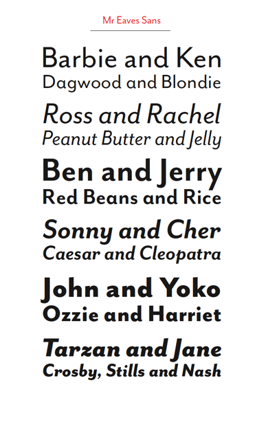
However, one not familiar with the history of Mrs. Eaves might wonder why there couldn't be a Mr. Eaves, to round out the symmetry (indeed, those familiar with the legend might also find it amusing). At the very least one wonders what a "male" version of this distaff font might look like. This monty, Licko released Mr. Eaves, answering the question:


The font Mr Eaves is designed to echo the style of Mrs Eaves but to be more than just a version of the Mrs with the serifs cut off. The ratio of x-height to ascender height gie an impression of classic style, just as with the Mrs, but the clean, modern lines give a current feel, something like a variation of Gill Sans or Myriad. The italic versions, with their obvious but dignified filips, seem to suggest a very refined sort of handwriting. I very much enjoy the curls-up on the bottom of the miniscule l's, and the leg on the majuscule R is something I'm silly in love with. This very much lives at the intersection of modern geometric fonts and humanist, designed fonts – a verson of it, Mr Eaves Modern, comes across as a warm version of Futura.


Graphic copyright Emigre

And now, Mrs Eaves and Mr Eaves live in perfect harmony, which you can avail yourself of at Emigre: http://www.emigre.com/EFfeature.php?di=213.

Technorati Tags: , , , ,

23 October 2009

[type] Laika – A Font That Dynamically Responds To You

2244.I've always felt that type is not as static as people think it is. Even printed, unchanging type has the power to move, influence and change moods (imagine a Last Will and Testament in Times Roman. Now, Imagine the same document in Comic Sans. How would that make you feel?)

In a video that has to be seen to be appreciated, Swiss typographers Nicolas Kunz and Michael Flückinger exhibit Laika, a font that was designed to transition seamlessly between any number of outside stimuli.

Art imitates life, typographically:

LAIKA from Michael Flückiger on Vimeo.

Laika can be further assayed at its website: http://laikafont.ch .

Technorati Tags: , , ,

[blog] My PDX Street Typography Photo Featured At Portland Building Ads And Other Vintage PDX Signs

2243.If you're interested in Portland streetscapes, funky found typography, and Portland visual history as I am, then you already have Portland Building Ads blog (http://pdxbuildingads.blogspot.com) in your blogrollio somewhere.

So, when the proprietor thereon asked me if he couldn't use this picture:


To flesh out a visual history of the corner of SW 17th and West Burnside, I naturally said "hells-to-the-yeah!"

Thanks to Dan for the query. I'm only too happy to assist, because when it comes to Portland visual history, I'm all over that. And flattered too!

If you like vintage type and vintage signs, too, he cited a local blogger who does vintage Portland sign reproductions. His name is Peter Vogel, he blogs at The Nutmegger Workshop: http://www.nutmeggerworkshop.com/, and the works on offer are supremely charming and attractive. So, go, do that thing there!

Technorati Tags: , , , , ,

22 October 2009

[liff] My Comedy Writing Won Me A Prize Today

2242.Well, admittedly, it wasn't a great deal of comedy writing, but famous cartoons have had shorter captions. It just gets down to what works.

All this month, graphic resource house Veer has been holding a series of Twitter contests. They tweet the contest out, and you respond by starting your tweet with "Hey @VeerUpdate" and then including whatever they need and if they select your tweet, during the daily contest you win a 1-month subcription to Veer Marketplace where you can get a scad of great high-quality photostock.

Yesterday's contest was creative contest #32, and the challenge was to caption this photo:


Thumbnail copyright Veer; you can purchase it yourself
by going to http://marketplace.veer.com/images/1589134


My caption:

It was moments like this that Dr. Doctor thanked God
he got a "A" in "Concerned Medical Looks 101" in Pre-Med.

Which won me the subscription (along with a few other lucky and talented souls). So, yay, me! The small triumphs are sometimes quite sweet!

Thanks, Veer!

Technorati Tags: , , , ,

[design] How To Layout A Comic Book Cover

2241.Ever wondered what it takes to create a decent-looking comic book cover?

Well, it takes Adobe InDesign CS3/CS4, Illustrator CS3/CS4, Photoshop CS3/CS4, and this tutorial from the most inspired design blog. It merges photographs and computer graphics to try to make a surrealistic connection between the comic world and the real world.

The result is this:


Why not give it a try?

Technorati Tags: , , , , ,

21 October 2009

[pdx] PDX Street Sign Shop, Ca. 1916

2240.Fellow street sign blogger Eric Fischer, whose San Francisco work I've praised, has done me a definite solid and dropped a very beautiful thing my way.

As I may have alluded to in another post somewhere, Portland's street  blades have looked different. From, I'd estmate, around 1900 through the middle third of the 20th Century, PDX Street blades where these indesctructable iron things, with white and enamel paint, which looked like this:


As you can see, it's very utilitarian. Blocky, almost-military letterforms – not graceful, but very very readable.

In a recent comment to the Cyclotram's P13 Stark Street Milestone, fellow street sign blogger from San Francisco (whose work I enjoy) Eric Fischer pointed me to a most amazing publication, in the public domain and available in its entirety on Google Books. It was in this book, Municpal Engineering Practice, by A. Prescott Folwell and published in 1916 by Wiley and Sons (a book generally about designing and laying out cities), that I found the following view – the inside of Portland's sign shop, ca. 1915 or so:


You have to embiggen this to see it in its full glory, to do this, go to Posterous here and click on the photo (which you can also download) or click on the photo above.

Lined up along the bottom there are signs for E. 70th ST. N (today's NE 70th Avenue), E. 72nd ST. N., 50th AVE. SE (today's SE Raymond Street), and 41st AVE SE (today's SE Gladstone Street). I also see a rather big blade, reading (on two lines) PATTON ROAD/COUNTY ROAD, and there are signs for CRYSTAL SPRINGS BLVD, WISTARIA AVE, and possibly a deprecated style for WASHINGTON ST.

To go over it real quick again, before the Great Renaming of 1933, numbered streets east of the Willamette and north of Burnside not only carried the East prefix because of that but also the North suffix to extend west-side naming practice east in a uniform way; therefore 11th Street east of the Willamette and north of Burnside would be EAST 11TH STREET NORTH. The avenues suffixed SE were in the area south of Powell and east of E. 39th Avenue which, for reasons even not yet clear, had number congruent to today's street blocks going out in both directions, though avenues ran east-west and streets north-south: therefore, 1916's 50th Avenue SE would be today's SE Raymond Street, which is the 5000 block (50th standard street name south of East Burnside) and 41st Avenue SE would be SE Gladstone Street – today's 4100 block (41st standard street name south of East Burnside).

The viewer can no doubt find some things that I've missed, and it's all interesting and good.

Thanks Eric … you definitely da man!

To view the page directly and download your own PDF of this book, surf to the following:

http://books.google.com/books?id=7AJLAAAAMAAJ&dq=%22street%20name%20signs%22&pg=PA295#v=onepage&q=%22street%20name%20signs%22&f=false

Technorati Tags: , , , , , ,

[type] Pen And Ink Journal - A Handwritten Blog!

2239.Naturally, I'm hoping the headline got your attention. But it's not a joke – the blog Pen & Ink Journal, an actual blog at http://www.penandink-journal.com/ is an actual, surfable blog, and the entries are handwritten – in a beautiful, masterly handwritten script:


Naturally, she's not writing directly on the aether, but she's handwriting every entry and uploading them as a JPG graphic. What you see above it just a small sample of her masterful facility with handwriting.

She's a calligrapher named Lisa Ridgely, and you can see she's quite a talent by going to her site, lisaridgely.com, and just opening your eyes, kiddos. Her work is amazing and graceful, italic and swashful (but not too much), each letter and word drawn with an obvious eye for what's exactly right – not too much, not too little.

But at least stop by Pen & Ink Journal, because one thing that artists worry about is, is there a place for the handmade in the computer world, and Lisa proves that, indeed there is …

… with an honest-to-pete, handwritten blog.

Handwriters, rejoice!

Oh, yes, follow her on Twitter at @lisa_ridgely. I am. Via Creative Curio, of course.

Technorati Tags: , , , , ,

[art] The Best Beginner's How-To-Draw Book, Ever, By Bill Martin Jr

2238.This is, prima facie, an article about the best how-to-draw book ever made. There is a bittersweet note to it, though, which see at the end.

The Book: Artist Bill Martin, famous for incredibly detailed landscapes with a touch of whimsy and a touch of surrealism, produced a book first published in 1993, called The Joy Of Drawing. A slender book, it is nonetheless packed with great first steps. Martin's a great artist, and has a skill in communicating that is manifest here; through drawings and amazingly well-chosen words, within the first fifty pages you have a solid idea of how to draw what you see and how to look at what you see, which is skill number one for any artist.

Within those first fifty pages you also learn value, perspective, angles, proportion, how to indicate volume with blends, basic shapes which you can combine to draw basically anything. Bill Martin Jr's succinct writing style and apt illustration style ties it all together in a way that drives the point home more or less instantly. He even, in later sections of the book, show you what to look for in order to draw transparent and liquid-filled glass, two-point perspective, how to show contours using surface textures …

If I had enough money, I'd buy up every copy of this book that I could so I could give it out for free to anyone who wants to draw and doesn't think they can. This can help you out even if you just want to draw for fun, because doodling and scribbling about is fun enough, but making art works is quite liberating.

The Book is that good.

The Artist: Bill Martin, Jr, made a name for himself painting works that had great visual depth and wit, a feeling of realism and a feeling of surrealism – there is an airiness to his works that makes the paintings (many of which were painted on cirular canvases) feel at once like an Earthly landscape and also one might find on a distant planet just discovered by an Earthly explorer light-years from home. The landscapes run from the real to the fantastic. His work was known the world over and seeing what he knew about creating amazing landscapes suggest that he knew even more at understanding the real.

The Bittersweet Part: When I first discovered Bob Ross, the wet-on-wet painter to the masses, I found him ironically interesting like most people do when I started watching him in about 1998 or 1999. Little did I know, as I accidentally found out, that Bob died in 1995 at a very untimely age of lymphoma.

One can imagine how I felt when I heard that Bill Martin, Jr, died back in 2008, in his early sixties, of lymphoma. What a sad loss!

If I ever do hit the big time, you can believe that I will buy up as many copies of The Joy of Drawing as I can and give them free of charge, to anyone who asks. I'd even have another printing done.

The book is that good.

The ISBN is 0-8230-2370-2. It was publshed by Watson-Guptill back in 1993 originally.

If you find a copy, buy it and give it to someone you love who's aching to learn how to draw. You won't regret that.

Technorati Tags: , , ,

19 October 2009

[tech] SCO To Darl McBride: "You're Fired!"

2238.The Linux world has reason to celebrate today. Darl McBride, the master brain cell behind The SCO Group's "Sue 'em Into Oblivion" strategy has been deposed. Ars Technica:

McBride was the architect and public face of SCO's misguided campaign against Linux. He claimed that the open source operating system infringed on SCO's copyright and included a significant quantity of code stolen from UNIX System V. On the basis of this claim, SCO threatened to sue a multitude of corporate Linux users and demanded hefty licensing fees. During the ensuing litigation fiasco, an internal SCO memo was revealed which indicated that SCO's own internal code audits of Linux found no actual evidence of infringement. The courts eventually determined that SCO never even owned the relevant UNIX copyrights in the first place.

Even after SCO's deception was exposed and the company effectively lost its case, Darl McBride continued to insist that the company has evidence of System V code in Linux. No such evidence has been presented and McBride's argument directly contradicts testimony given by other SCO executives. McBride's stubborn detachment from reality has made him a subject of ridicule in the Linux community.

The SCO Group will, oddly, continue prosecuting its lawsuits (one envisions zombie lawyers), but while the mene mene tekel upharsin of the company hasn't yet been written on the wall, buzz I'm reading is that SCO is not long for this world.

This is  a bit off topic for my state-of-the-blog, but I've been following this for a while, and one of our machines has Ubuntu on it, and I like Linux, and I like my friends who run Linux. So, even though SCO hasn't given up on the litigation, this can't be any but good news … if only because teh Darl has gotten a well-deserved comeuppance.

Technorati Tags: , ,

17 October 2009

[pdx] Stark Street Milepost P13 …

2237.… atul666 can haz it, in Gresham:


… it's that little obelisk by the sign post. Probably knocked down by a road crew; lovingly replaced by the Gresham Historical Society.

The picture above is small and hotlinked (with apology to atul) to make you go and read his entry, which is highly skookum.

Cleveland Avenue (historically SE 235th Avenue) and Stark Street.

Check it.

Technorati Tags: , , ,

14 October 2009

[type] Free Typography Rules Poster PDF - With Solid Advice

2236.Since, according the The Book Of Tom Peterson (and Gloria Too!), free is a very good price, here's a nugget I turned up thanks to David Airey at twitter.com/DavidAirey:


The poster, in PDF form at Minneapolis graphic designer Evan Stremke's site (http://www.evanstremke.com/index.php?/design/rules-of-typography/) is classily and elegantly designed and self-proves by using interestingly-laid-out typography to create its own interest. Every one of the rules mentioned is common-sense, and I've passed by them all in my education in typography. Here's a good one:


… and that's the stone truth. For all the insatiable collecting that type-lovers do, it's truly amazing how few type faces one really needs to get the job done. Any sufficiently creative layout artist can combine these and use other design tools and techniques – hierarchy, juxtaposition, what-have-you – to create interest and compelling approaches. As always, context is key: there is a time for Helvetica Neue, there's a time for Myriad Pro, there's a time for Hobo and Cooper Black, even. I suppose there's even a time for ITC Matisse, but I just hope I'm out of town when that time comes. Better still, it should come in Redding.

And to encourage you to download the poster, I'd direct your attention to the very last rule, which is what you need to know once you've learnt all the others. But … soft you now! … download the poster.

The PDF is free, but you have to print your own poster. Oh, well, nothing's perfect, bunkie. It's great design anyway.

Technorati Tags: , , ,

13 October 2009

[liff] TEOTWAWKI Follies: The World Won't End On 12/21/12, Says A Real Mayan

2235.Says an actual Mayan tribal elder:

Definitely not, the Mayan Indian elder insists. "I came back from
England last year and, man, they had me fed up with this stuff.

I know you you feel, fella.

But why believe him when you can believe a non-Mayan who acts like they know it all?

Technorati Tags: , , ,

[pdx] More Proof That PDX Is Unicorn City, USA

2234.Via Twitterer BlazersEdge, we find even more evidence of Portland's privileged position as being built atop an ancient Unicorn burial ground: we attract bball players who are actual Unicorns. Here is a picture of forward Jawan Howard, recouperating from a successful horn removal:

juwan howard underwent successful unicorn horn removal surgery. on Twitpic


Now, as righteous as it is that Portland is on the site of the Unicorn burial ground, it'd be positively awesome to say that you actually were a Unicorn.

But we can see how that'd get in the way on the court. It's best this way.

They grow back, anyway.

At least, I think they do.

That's what I hear.

Good luck on the season, Jawan.

Technorati Tags: , , , , ,

12 October 2009

[type] Kerning … It's Just Rhythm (Without The Blues)

2233.Kerning: the one typographical power word. You can have anything you want going down with your type, but watch that kerning …

Kerning addresses a basic problem with our alphabet: The shapes of certain character pairs create spacing problems, making them appear either more loosely or more tightly spaced than the neighboring characters around them. To create the even and consistent spacing between characters that makes for pleasant reading, you should iron out these spacing anomalies.

Kerning isn't letter-spacing, it's how you do the letter spacing.

The above is from this CreativePro article by James Felici (http://www.creativepro.com/article/one-good-kern-deserves-another) that takes you around the subject of kerning and why you do it; tells you in real simple yet complete terms about kerning pairs.

Kerning is just one of those basic things that you learn when you learn design and it's something you keep an eye for from then on.

Technorati Tags: , , ,

11 October 2009

[art] How To Draw A Good Looking Eye

2232.Here's looking at you, kid.

I find a lot of people who aspire to draw and are disappointed at the result become disappointed because they are not drawing what they see, but what they think they see.

Here's an example. Say you want to draw an eye (go ahead, say it. I'll wait … okay. Back.). You might want to try it now. How did you do it? Did you think of eyes you have seen, remember what  you saw, or did you put down an up-curve, a down-curve, and a couple of circles in the middle?

If you did, you did what I think of as iconic drawing. I have a theory, based on my own experience in drawing, that what we do when we draw things from life like faces and rocks and trees and such is we all have this visual library of icons that we "draw" on when we want to draw something. Before we learn how to see things as an artist does, though, that visual library overrides whatever skill we have, and we either cough up the icon or some odd hybrid of the icon and what we see.

This is not a sin. As a matter of fact, as creatures who have to survive on a visual level, I think it's a pure survival skill. But it's something that will sabotage you as an artist, because if you have to try and try and try to override your visual librarian, you'll get discouraged. That librarian is very good at its job, and it doesn't lay down placidly and take a break. Maybe it heard there's a recession on, who knows.

This is why drawing from life is something everyone who aspires to art should attempt. It's painful at first. I remember the first few times, how it felt to force myself to make the motions (life drawing is a physical thing) and how it felt to disconnect from that visual librarian (in the end it was a necessity; the librarian wasn't writing my grade for the course, the instructor was, so the instructor had veto power). Also, for a lot of people, it's awkward standing in a room of strangers, looking at this nekkid stranger come up and then learning to draw what you see, learning the kinesthetic motions. But then you get in the zone and it's pure, and you realize you're learning the same thing that artists over a thousand years do, and it's liberating.

I told you all that to tell you this: Manga-ka Mark Crilley has a great short video I wanted to share (via here) that combines the two. It stars from observations from life and puts the visual librarian at their service, instead of the other way around, but even though it uses the icon library for bits, the whole thing is based on life drawing observations and experience (as the artist himself makes plain at the front of the thing). If anyone should know about drawing eyes, it's a Manga-ka, but the life drawing referent makes sure it all stays true and realistic:


There you have it. Realism and knowing short-cuts. You probably learned a quick skill or two if you followed him.

Technorati Tags: , , , , ,