
1370. Time to play a little catch-up, good peoples. Here we go.
41:
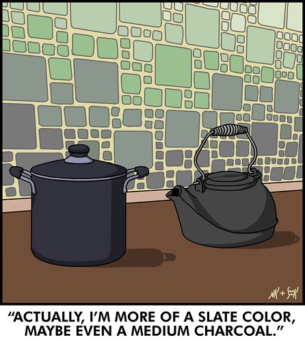
Hey you cookware – you're both equally valid in your own special way? Can't we all just get along?
Stan's treatement of the whole scene here is well done. Moreover the treaement of the colors of the tiles on the walls, which look to be rather a painstaking undertaking, but which he probably has a sekrit to doing quickly.
Also note that Stan gives credit where due: The Lovely Nicole™ essentially wrote the joke.
42:
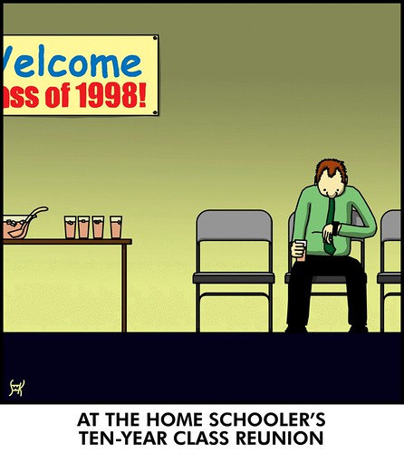
In home schooling, a class of one is the lonliest number. Also, in a homeschool class of one, noone can hear you scream. If you wanted to scream, that is. I'm just sayin'.
Stan's commentary here showed that he was concerned about the use of Comic Sans and Impact, but he reasoned that the two fonts would maybe be a natural choice of the homeschooled. We actually agree with him here, and think it kind of makes the joke.
43:
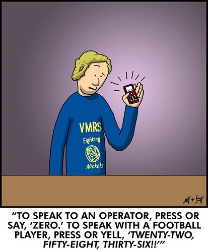
This was probably during the XFL years. Those guys would do anything for viewership.
This comic solidifies what's turned out to be Stan's running gag about VMRS, which I think is funny as heck and makes me think about what a full-page magazine ad for it would look like. I can already hear John Bunnell doing an ad for it just like that one he's doing for ITT Diploma Mill Tech, School of Criminal Justice.
"Vending Machien repair jobs of the future! Require knowledge! And Training! Financial Aid Available For those! Who Qualify!" (there's a bill-changer in Admin lobby; remember, tuition at VMRS is exact-change).
44:

I didn't know they had castaways in the Saint Lawrence River! I mean, you'd think that anyone who had the gumption to raft to 1000 islands might have stumbled on civilization somewhere along the way?
And, lastly, 45:
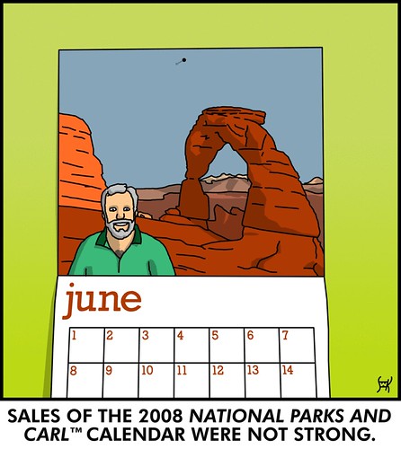
I feel sorry for Carl, because he rocks our world. Just like me – underrated.
We really enjoy Stan's rendition of the arch here. There's precedence in this styile to the Belgian "clear-line" style which gave us such classics as Herge's Tintin. All the lines have equal weight here, and that give the drawing a certain honesty of expression while maintaining a look of utter detail.
Stan's 366 days album can be viewable here. Catch up!
Tags: stan kost, nicole kost, dinglemunch, 366 days of creativity, teh_funnay
Powered by Qumana
2 comments:
These are fabulous!
Thanks, blender! I'm glad you are enjoying the comics.
And Sam, I've acutally tried to use universal line thickness as my personal defining style - I wouldn't go so far to call it a "signature" style (whatever that means), and it's definitely not unique, but I've enjoyed drawing this way because there's a uniform simplicity to it, even when the lines form a lot of extra, often needless detail. When I see the one-width (9-pixel-wide Hard Round brush @ 720 px/in) limitation as a restriction, what it forces me to do is to be more creative to make my ideas work within it. And I have always loved the challenge.
By the way, if you go back and look at the old Joel and Steve strips, you'll notice that I have pretty much employed this style from day one.
Post a Comment