29 April 2010

[art] Some Heraldry I Drew Tonight

2401.
When I can get off my figurative duff and finally draw something, I do heraldic designs on demand for my SCA friends.

I'm trying to draw more. I don't think you can call yourself much of an artist, or even a designer, if you don't draw, and I've always had some facility with a pencil and paper. Latterly, I enjoy a great deal drawing in pen, but I'll always adore the graphite.

About heraldry: maybe it's because I've been in the SCA and near those who play in this singular organization for a long time, but I'm always surprised when I tell someone about it and they haven't heard of it. I tend to think it's as common as the Boy Scouts or the National Guard or summat.

The Society for Creative Anachronism is that group of medieval recreation fanatics who aren't those Ren Faire people you hear about. It sprang from a garden party held in the back yard of the fantasy writer Diana Paxson in about 1962 or so, and it currently has thousands of members across the world (but largely still in North America) and is organized into "Kingdoms". Oregon falls into a Kingdom called An Tir. Since the SCA had its origins in the world of idealized Europe in the Middle Ages, of course, that means coats of arms, and that is what I mean when I say heraldry.

The practice of heraldry is actually a sort of graphic design. A person has a vision of a design and asks an artistically-talented herald (say, myself) to render it. The challenge of designing these "devices" (which is another technical term) comes from the fact that coats-of-arms designs are created according to fairly strict rules and a limited canon of symbols (a large variety, to be sure, but one with limits). What's exhilarating about designing within these limits is wresting not only credible heraldic designs from them but also forging a unique style.

This is possible! I have developed a reputation amongst my heraldic colleagues for having developed a recognizable and visually desirable style while remaining within the heraldic graphic tradition. It's one of my proudest achievements, as well as coming up with credible drawings on very short notice when necessary.

Enough (way too many, actually) words at this point. I did do a couple of drawings tonight and I'm quite happy with them. Here's one:


Many people like acquiring designs that in some way symbolize them and what they do or see themselves as. the above design - a squirrel in "rampant" posture (that's the name for the stylization of the limbs wielding a knife and a spoon as thought they were ninja weapons, with acorns strewn across the background. This was requested by a dear sweet lady, a person who's cooked meals for many many SCAers across this section of An Tir (ask any An Tirian about the legendary "Golde Lemon") and is incredibly hardworking and, well a bit of a nut – but in a good way.

Naturally, squirrels don't actually look like that, of course, but there are giveaways that identify the squirrel – the spoon-shaped ears, the triangular head, fluffy, ticked tail. This is the personal style that at once doesn't violate the heraldic mode and canon but kicks it up to the next level.

Also, it must be said that just because people tend to choose images that express what they seem themselves as, some aspect of their character, there's not – and there never was any – requirement to create a design with any connotations at all! If there's a heraldically-correct combination of colors, shapes and/or symbols that one likes just because they like it, then there's no reason you can't do that. Your coat-of-arms is simply for indentification's sake. The only requirement, beyond it being unique (and there's a book of rules to insure that it is unique) is that it obey several design rules which are drawn from real-world heraldic tradition.

It may seem a bit arrogant to say that what I do here transcends the form a bit, but I have people look me up to do their design just because they've seen me do others. And satisfied customers can't be too far wrong.

The other drawing I did tonight was of a boar's head. This is a common-enough element in coats-of-arms … they can connote roughness, toughness, fierceness, or just someone who likes boar's heads:


I was a little intimidated by the thought of drawing the boar's head until I identified some things from some other pictorial resources that were easy to use as touchpoints – the snout, the tusks, the ears. Of course, it doesn't look very much like an actual boar, and my style is a stylization on top of a stylization, but it does seem rather piggy. And rather fierce as well.

And when I showed them to the people who will be using them there was much admiration.

Next best thing to being paid for this stuff.

Apparently I'm kind of awesome at doing this stuff.

Technorati Tags: , , , , ,

Powered by ScribeFire.

22 April 2010

[pdx] Don't Know Why, There's No Sun Up In The Sky ...

2400.... stormy weather ...


Taking pix in PDX is a good thing to do, even if there's clouds most of the time. This, of course, is my favorite angle on Downtown, taken from the east end of the might, mighty Ross Island Bridge. This is particularly interesting territory because, if you turn your head a little to the right from this vista, you get a look at what I'm thinking is some sort of aggregate plant or summat:


Off on the horizon is the towers of the Lloyd District, and it's sequestered from the nearby industrial neighborhood by the construction on the McLoughlin Blvd Viaduct - which looks to be proceeding quite swimmingly.

Speaking of swimming, here's a pool at the foot of this property that I wouldn't want to jump in:


There's something as strangely pretty about that color as I'm sure it's not-too-healthy for you (not to cast aspersions, I certainly don't know what's there, but I wouldn't want to have to find it in my water glass, let's just say).

If you turn south, you get a glimpse of something that's not just 180 degrees in direction, but attitude:


That's the northwest corner of the Brooklyn nabe, a bit of PDX that goes from the river back to about SE 21st Avenue and Powell Blvd south to SE Holgate Boulevard. Nice little nabe, centrally-located, pretty houses. Lived there once in a four-plex on SE 8th, which was lucky for us because once a clutch gave out on a car we owned as it was cresting the Ross Island Bridge, and The Wife™ was able to coast it most of the way home.

Good times.

Some of those houses on the brow of the knoll there inspire visions of how one would live there if they had one. It would be awesome if someone turned one of those houses into a version of the one the Addams Family lived in.

If me and The Wife™ ever won the lottery – well, watch out Brooklyn. Watch out.

Not too much after that we found ourselves in Hollywood at the Grocery Outlet store. I found the clouds there luminious and photo-worthy, and really needing of no other comment save that Spring in Oregon is grand … unsettled skies, and pretty much no thunder storms. The perfect mix.


Dramatic backlit clouds.


When I was a kid studying weather (but for the vicissitudes of life I'd of been a TV Weatherman) I was told that cumulus clouds were friendly, happy things – but that cloud's clearly got a 'tude on. I bet it's got a switchblade.


Backlit clouds taken through an old, straggly tree that doesn't have its Spring foliage yet create a moody picture that's luminous with a tiny hint of macabre drama, and seems particularly record-album-cover- or book-cover-worthy. I therefore encourage any one laying out an album cover or book jacket to contact me to purchase rightsemphatically if you're a particularly large, wealthy, or popular musical act or publisher. Let's deal.

Technorati Tags: , , , , , ,

Powered by ScribeFire.

21 April 2010

[design] How Is The Author Of XKCD Like John Stump?

2398.Well, there is one way: the Author of XKCD needs no introduction, while you'll probably be scratching your head over the name "John Stump".

And that's not really a commonality, is it? No.

But they do have something important in common – a firm grasp of communicating comedy through a limited canon of symbols.

Today, XKCD posted the funniest electronic schematic I've ever seen. Here it is:


Clicky on the image to go to the entry and see it embiggened. I've had some basic electronics, so this is a howl. A 5-ohm decoy resistor? Sure! A switch marked "Hire Someone To Open And Close Switch Real Fast"? Oh, yeah-job creation! I'm not sure what the bullfighting arena is supposed to do, but I notice there's a "120 Ohm (or to taste)" resistor - as well as a gap labelled "touch tongue here", just daring you. 666 timer chip? Yeah, always suspected computers were the work of the Devil.

John Stump knew, in the same way, how to exploit the conventions of notation to deliver in-jokes. For years, famous around music departments on campuses, was a sheet of music entitled Faerie's Aire and Death Waltz, just waiting for the unsuspecting eye to get drawn in.

The score contains amazing notations, lines arcing to and fro, and bizarre stage and orchestral directions, including Lakers in 6, add bicycle, release the penguins, and ending on the emphatic direction Gradually slide from 12-bar blues to a more Vivaldi-like cadenza. Intonation!


It's a generous piece, allowing some violins to knock off early if the 3rd Clarinet shows up.


The above calls for a light and airy delivery, but this multiple-note collision is so intense that only a little farther along, one must apply ice to the cornet.

Naturally, the piece isn't meant to be played, but just meant to play with the readers mind. But John Stump knew the mode so well, he could make it sing with absolute ridiculousness by working within the canon of musical notation and typesetting styles, and delivered the joke so well that even musical tyros could enjoy it.

What exactly makes it funny is hard to put one's finger on – this was John Stump's unique talent. Faerie's Aire (noted early on that it was "arranged by accident" and was derived from an ancient Cro-magnon skinning chant) and XKCD's circuit digarams are amazing satires crafted by artist who understood exactly what it was they were lampooning – and that what makes them ring so true.

John Stump died in 2006, perhaps not knowing how far the joke had travelled. Very well-done versions of his most famous works – Faerie's Aire, String Quartet No. 556(b) For Strings in A Minor (Motoring Accident) and Love Theme From Prelude and the Last Hope in C and C# Minor (from the opera March De L'oie (March of the Ducks)) are documented and can be seen at the blog Lost in the Cloud and the family still offers high-quality prints of these sheets via the links listed hither:
Technorati Tags: , , , , ,

Powered by ScribeFire.

20 April 2010

[liff] Me and The Tom Peterson Watch

2397.Back in January, when I finally got, through the grace of a good lady in Happy Valley, a Tom Peterson wristwatch, I figured I'd have fun with it, of course, but I figured I'd wear it about 50% of the time, give or take. I have a perfectly good watch that keeps alarms and all that, nice little Timex.

Takes a licking and keeps on ticking, as they say.

It wasn't that I think Tom should stay on the shelf, no, he deserves to be taken out and used. But the more you use a thing, the more the chance is that something will cause damage to it – you know, catch a doorjamb or flying stone or something.

But the truth is, that since I've gotten it, I can't picture going out without it. It is just that cool. So, instead of a kitschy little bit of fun, I've come to depend on it.

So far it's only been a few months with the watch – but I feel undressed if I go out without it.


You rock, Tom.

Technorati Tags: , , ,

Powered by ScribeFire.

17 April 2010

[liff] Roberta Phillip is Out Of The Race

2396.The competition for the Multnomah County District 2 seat is pretty tough; Roberta Phillip, as of yesterday afternoon, has included herself out.

I mention this because I designed part of the look of her campaign – the campaign logo and, at the time of her withdrawal from the race, was entering into a revision cycle (set something on high speed) for her tri-fold campaign brochure.

Looking at the content I must say I think we're missing out. She has a group of firm, good, people-first values and her history suggests she would have done her level best to carry them out into her leadership style. It's to be hoped that she decides, at some later time not too far down the road, to try again.

Thanks to T.A. Barnhart, local liberal lion for giving me the opportunity to design the look of the campaign. I was proud of the logo that I produced, and it looked rather good on the top of her website.


It would have been nifty to see this on a lawn sign, yes? And, I never did get a chance to meet the lady, that would have been cool too.

For what it's worth, I'm available for similar work. I greatly enjoyed this, and would love the chance to do it again for some other political candidate.

The complete tale of the work I did here can be found at my Behance portfolio:
Technorati Tags: , , ,


Powered by ScribeFire.

14 April 2010

[web design] Wear My PDX Skyline As A Firefox Persona

2395.Here's a goodie for Firefox users I couldn't help but share - I've crafted my first Firefox "Persona". Now, you can wrap your browser in one fantastic downtown Portland skyline (clicky to embiggen):


And you can get it here: https://www.getpersonas.com/en-US/persona/183994

Enjoy!

Technorati Tags: , , , , ,

Powered by ScribeFire.

13 April 2010

[design] More Connectivity On My Website

2394.More contact choices for the ZehnKatzen Graphic Arts website:


Now my Twitter and Facebook connections are upfront, and "Contact" has morphed into E-Mail - because "Contact" is kind of vague. Maybe someone's looking for E-Mail.

The implementation, in this Web 2.0 world, is very simple - a high-quality JPG and an image map. That's it. My website expresses an ideal, that it's fine to come up with things that are obviously technically brilliant, but sometimes, Good Enough is just as genius. I like getting a lot of mileage out of technical princples that still are ironclad. JPGs and image maps make for econonmical yet vivid website design.

You can go all-out with Flash design if you want (and so can I), but this is very easy to update, keep current, and maintain. It can go anywhere, even on servers without a lot of space.

Technorati Tags: , ,

Powered by ScribeFire.

[design] A Double Hit Of PMS 4975 Looks Tasty

2393.The excellent things one finds by following printers and designers on twitter – according to Tyler Ashcraft of Bridgetown Printing:
Soft touch aqueous on a rich brown (double hit of PMS 4975) is reminiscent of melted chocolate. Just sayin...
Colors evoke memories, and that's true. Blue, green (like the crops around Salem) and golden brown work very well for me. By a "double hit of PMS 4975", he means you take a spot ink – PMS stands for Pantone Matching System, and specifies an exact colored ink (rather than the approximation you get from four-color process) and overprint it. The "soft touch aqueous" is a coating that creates a shiny translucent surface over that ink. Here's what a double-hit of 4975 looks like in InDesign, with the overprint preview turned on:


Put a sheen on that – yeah, that'd do it.

I love the way printers think. Like water for that chocolate?

Follow Tyler Ashcraft at Twitter by dialing up @TylerInCYMK.

Technorati Tags: , , ,

[blogging] Is Blogger Image Upload working yet? YES!

2392.This star says something simple but happy …


Which is that ScribeFire, thank you Christopher Finke, with version 3.5.2, is working again on the image upload thing there, which makes my entire day already.

Thank you cfinke!

Firefox users – continue to download ScribeFire. You won't be sorry!


Technorati Tags: , ,

[design] The New ZehnKatzen Graphic Arts Website

2392.
One thing that I need to evolve away from is the use of the blog as a sort of website. Not that this is a bad thing, necessarily. It gives a changing look at my attitudes, moods, what's distracting me, what's going here, there and everywhere. But not ideal.

I'm kind of proud to announce a new direction in my online presence. For a very long time now, my usual actual home page, http://www.rdrop.com/users/eagle,  has been, to be kind, moribund. As of today, this has changed:


The site itself is the picture of simplicity and just-enough-design. You go right to what you want to know about me – my blog (if you find me amusing) my portfolio (which is on Behance) and a contact link takes you straight to email with the subject line of Website Contact, so I know where y'all's coming from!

It makes me happy to look at it – I love it when I do something that looks good.

So bookmark me, and stop on by. I'm going to grow that from there, and eventually, get it a better name like, oh, Zehnkatzen.com or something.

Stay tuned.

Technorati Tags: , ,

10 April 2010

[bloggage] Developing A Blog Posting Plan B

2391.

Since I have pretentions to a blog mostly concentrating on the visual world, uploading pictures is close to a deal-breaker. And if I can't find a blog editor that will upload pictures on a dependable basis, I cry inside.

Scribefire has been working for a very long time now. But, over the last two weeks, it has been very confused in the matter of picture uploading. This post is being assembled in the Flock browser's blog post editor, which is nifty in the general and will upload multiple accounts but is undependable in the way that sometimes I will have the function and sometimes I will not and I still don't have too much of a line on how it will behave. Here, for example, is the test pattern – uploaded again, and there are ways to go to the Picasa account to hopefull make it so's I don't have to reupload the picture over and over … but Flock has a lot of different ways to do a lot of different things in the social.


This is that test pattern.

So, I have a plan be until ScribeFire gets its act together. I found (refound actually) two bookmarklets (one for Delicious and the other for generating Technorati tags) and can use them … so until SF is back, I'll use Flock (the interface is kind of nifty) and fight with it occasionally I guess.

Sadly, I'm compelled to blog. I've tried stopping, and I can't. Too bad I'm not famous for doing it but c'est la guerre, mon frere.
 

GAAAAH Update: No, Flock won't work it either. I can't resize an image that it doesn't turn all pixelled. Ptttth!

This is an attempt to see if I can't press Contribute CS3 into service again.

Technorati Tags: , , ,

09 April 2010

[design] New Portfolio Stuff! Websites and Logos and Stickers Oh My!

2390.
Two new notable additions to my online portfolio at Behance – a website and logo design for a worldwide SCA event and a local political campaign:

Number one, at right, is the logo for the Known World Heraldic and Scribal Symposium, a major annual event for the Society for Creative Anachronism. An explanation of  all is at the portfolio website, but briefly what it is is a yearly assembly of SCA members literally worldwide which includes practitioners of the Heraldic arts (Onomastics research and technical design of coats of arms as well as bellowing on the field and in court) and art materials and techniques used to produce scrolls, charters and the like.
The logo for the Roberta Philip for Multnomah County Commissioner website is just on the right here. Thank you very much to T.A. Barnhart for giving me the opportunity to design this. It's a simple design that I think will work well on your average lawn sign, and looks good at the top of a website. It's now on that website and will soon be on a brochure for mailing (which I have roughed in) as well as on a sticker (that T.A. laid out but I polished up just a little bit). T.A. also designed the website.

Of course, my entire online portfolio can be seen here: http://www.behance.net/SamuelJohnKlein/frame/viewall .

[type] Saving Ink When You Print Ad Absurdum

2389.
Ink. Damn, but it's expensive. When you got your inkjet printer you thought Hey, Groovy, they're giving away these printers for a steal these days. And then you saw the inkjet cartridge prices and knew that you were being played.

What to do, what to do? There are a few things actually.

Once you've cut every corner – we have an HP inkjet that takes the 56/57 cartridge pair, which will run you $50 for a replacement – you're forced to turn to the one last thing you can control – the rate of ink usage. Surprisingly, some technical solutions have been implemented.

Ecofont (http://ecofont.com) takes it right out of the middle. That is to say, it reduces ink usage by literally "punching holes" in the letterforms that are big enough to reduce your ink usage by about 15-20% overall but still leave enough of a letterform to be readable. A sample document is available via the Ecofont link above. Here's a closeup of some of it:


The document is still readable though a little light. Ecofont offers one free font download and a handful of other fonts for prices.

The absurd extreme of this, beyond the limits of parsimony, is represented by the AP article published at http://news.yahoo.com/s/ap/20100406/ap_on_hi_te/us_tec_money_saving_fonts, suggests changing the font to one that uses less per glyph and therefore less overall.

This looks good on paper, but seems a little kooky when you consider that the individual user is only saving about $20 on the year and, since (the example given) Century Gothic takes up more space than Arial, you're actually using more paper. So you got six of one, half-dozen of the other – or, more appropriately, a few molecules saved there costing you a few molecules there.

Now, this is not to say that it's not completely without merit. The example given posits an educations instituion that spends over $150,000/year on printer cartridges and toner. So, for a economy of this scale, it might make a few thousands of dollars difference.

But for the individual user? Best practices might more effectively include:
  • Using both sides of paper
  • Test-printing on already-used paper
  • Only printing when absolutely necessary
  • Printing out to a PDF before printing to see how they look in Adobe Reader
One thing that I did agree with was the observation that what they were after was to move the point where you press the print button to a more conservative place.

But if you're the individual user, it might not be so effective to use Century Gothic vs. Arial when compared to using a judicious attitude toward printing in general.

(h/t Twitterer Ugly Mug Advertising for the pointer to the AP article)


Testing Flock Uploading 2

2389.
And another try. These pics are being tried out because ScribeFire is broken and undependable all of a sudden and I needs to post my piccies.

And now … A glider.


No Technorati tags yet.

Testing flock upload picture

2388.
This is a test pattern.


You're making me do this, ScribeFire, by staying broken with the pic uploads and the stuff and the things and the FLAVENS!

08 April 2010

[design] Helveticards - What We Mean When We Say "Swiss Design"

2387.
Occasionally the term Swiss design is bandied about, and people who aren't designers feel a bit of eye-glazing coming on. It's kind of like designer cant. And it is, in as much as cant is a way of economizing language and using one apt term to cover a whole school of thought. But it's hardly occult or incomprehensible.

Swiss design is actually best exemplified by the Helvetica font – just enough art, just enough design, not too much and definitely not too little, but certainly the minimum needed to accomplish the design while still having a cool, subtle sense of style and mode. Swiss design is cool without quite being cold, efficient without being inhuman, minimal, airy, straightforward and refreshing.

If you know what Victorian-era design is, in which there was a tinged attenuation in every color, and every embellishment had its own embellishment, then Swiss design is the anit-Victorian. No better example of the moment demonstrates this than the soon-to-be-released Helveticards, by the Gingko studio. Pictured right, the 5 of clubs is the epitome of Swiss design – simple forms, bare but still somehow enaging. Even the club-symbols have gotten a Swiss-style remodel.

The Helveticard deck is available for pre-order at:
… and it'll cost you $10. For art like this – such a deal!

(via Twitterer Jeff Patterson)

[design] How To Become An Online Designer Plenty Quick

2386.
Pariah Burke, how knows more about establishing an online presence than most people I know have forgotten, breaks it down:

  1. Get a domain name
  2. Install WordPress
  3. Use a nifty, fashionable template

You've probably heard of the free blogging software WordPress. Thanks to the efforts of a massive community of diverse users, WordPress has grown into much more than a platform for blogging. For example, WordPress is an excellent host for easy-to-erect and easier-to-maintain portfolios. Even if you never write a blog post, you can use WordPress to get your portfolio online, in front of prospective clients, and you don't have to learn HTML, CSS, or any other Web design language.

Here's the skinny and the details: http://www.creativepro.com/article/put-your-portfolio-web-without-touching-code

Technorati Tags: , , , ,

[art] How She Became An Illustrator

2385.
Penelope Dullaghan:

First off, I want to start by putting this quote in front of you. Read it twice. Giggle if you want to. An then let it seep in.

Let it comfort you.

“Nobody knows what the hell they are doing. (at least no one I know) You just prepare as best you can and make up the rest as you go."

A very sweet story about how an award-winning illustrator found her way. I found it inspiring. Here:

Technorati Tags: ,

06 April 2010

[Out 122nd Way] Powell Grove Cemetery - In The Curl Of The Off Ramp

2384.
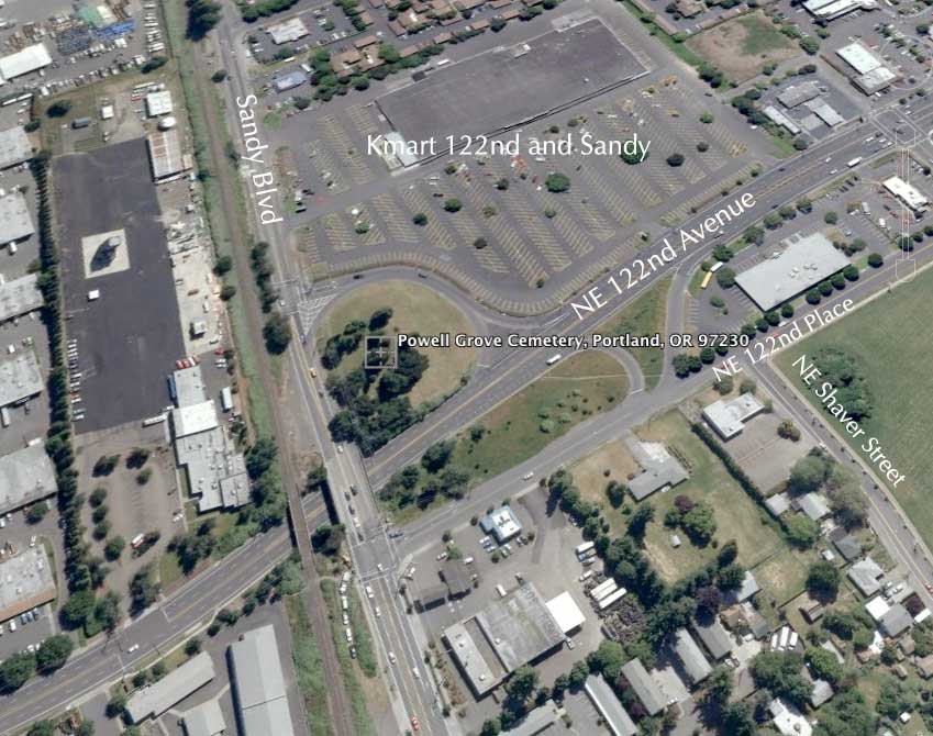
Time for another look Out 122nd Way, my favorite road in the world, this time a little north of Rossi Farm, where NE Sandy Blvd and NE 122nd Avenue cross.

Sandy Blvd and 122nd Avenue do not meet at grade.


The streets flow into each other by on- and off-ramps, southbound is accessed from NE 121st Place (watch for the sign – its easy to miss) and northbound from a curving "on-ramp" that forms a sort of a "jug-handle" on the northwest corner of the 122nd and Sandy Kmart store.


When you see it on a map, it's kind of unbelievable that there would be a cemetery there. But you go there, and there is. In the curl of the  offramp, industry and shopping and apartments and shabby residences as far as the eye can see, but it's there, all right.


There isn't much for parking, to be sure. Wide shoulders on the south side of Sandy provide some pullout; a wide pullout area on the north side is better, but none of that feels particularly safe.


Powell Grove Cemetery has been in operation (not necessarily on this site; reading I've done suggest that it might have been moved at some point) for about 163 years at the time of this writing. That's a significant percentage of the recorded history of the Oregon Country. Wherever it was originally founded, it was miles away from the nearest town, of course though, as things happen, the city came out to meet it.


Still, it's a cemetery in the traditional mode. Old headstones, trees, cenotaphs, family plots, and a sort of sereneness obtains despite it being bounded on all sides by traffic.


Some of the markets are quite old, even for this area. They suggests a fairly grim, if vigorous, story of those who have lived out 122nd Way before we did – or even before it was 122nd. The Reynolds family seems to figure prominently …


There were obelisks and markers and cenotaphs that were each of interest, but by far the Reynolds family marker stands above the rest, if only for that amazing typography:


There's something very "Roaring 20's" in that typography for me. The Reynolds marker designer knew something of design; the common typography ties the entire assembly together:


"Baby" Reynolds didn't even make it to 1881.


Lillian D Reynolds was only with us for 22 years.


John Reynolds made it to age 75. He was born 203 years ago this year, whenever it was he was born. He was undoubtedly the family patriarch.

I have heard, all my life, about how short the average lifespan is for our grandparents and great-grand's generations, and I've looked at the stats just like everyone does, but what really drove it home was the number of childrens' graves I saw there, which were, by my informal survey, a total of "More Than I Expected". They sure seemed easy to find. Eddie Dunbar only was with us for 13 years and 6 months;


His last words were I'm in heaven, now. They just don't do that sort of thing on headstones any more.


His little sister Allie outlasted him by just one single day. Her last words: I love everybody. I love Jesus. I don't have historical research chops, but I wonder if 1882 was a significant year for some sort of epidemic of flu or something in these parts.


"Edward F.", for whom fate held the rather cruel riposte of making his last name illegible via weathering and decay, only made it to age 18, and also died in 1882, though later in the year than the Dunbar children. His marker has a pious poem for an epitaph, but what made it so beautiful to look at for me was the way the type was slanted backwards, a fashion that is never used today, but seemed to be rather popular towards the end of the 19th Century.


The verse reads: Dearest brother, thou has left us/Now, this loss we deeply feel/But 'tis God that hath bereft us/He can all our sorrows heal.

Like I said, they just don't do things like that anymore.

The Bagans are the "youngsters", if one wills, in this group. Heck, one of 'em's still alive!


Eugene Allen Bagan would be in his 70s now.

And, just at the foot of all this, is the jughandle ramp, leading Sandy traffic down to 122nd:


122nd exults in the generic "Boulevard" on some of the signs from Sandy on north. This is not a universal marker, some of them say "Avenue".

That's life and death on NE 122nd Avenue … graveyard on my right, Kmart on my left:


… and traffic all around.

Technorati Tags: , , , , , , ,

04 April 2010

[liff] Deepak Chopra Is Sorry About All That Earthquake

2383.Tweeted Sunday evening, after the big Cali earthquake, Deepak Chopra manned up:

Had a powerful meditation just now - caused an earthquake in Southern California.

Now, that's what I call mojo.

Deepak Chopra has been meditating for many years now. Just how much harm has his meditations caused, we wonder …

If we tapped that man's power for the national defense … we. would. be. un. stoppable.

Technorati Tags: , , ,

[pdx] New Street Blades - SE 122nd and Pardee

2382.
Okay, false alarm there. It looked like Flock would post. Fooled me again.

To show the world I'm not completely hung up here, here's two pictures from a recent photo safari. The new Type 3 blades, at SE 122nd Avenue and Pardee Street – one block south of the light at Holgate.


The 122nd there on this blade looks a little stretched out in the altitudinal direction.


Very readable, very pleasant on the eye. Once again and not for the last time, kudos to the designer of these blades. Very nice looking.

[bloggage] Test posting for pic posting

2381.
Okay, this is a test post with my old copy of the Flock browser to see if it will stand in stead until ScribeFire gets its act together. Have pics! In the meantime, here's a pic of one of the most beautiful women who ever lived, Molly Ivins.

I think it worked …

Tags: , , , ,

03 April 2010

[net liff] The End of the Internet

2380.
This I dug up a few days ago from this spot. Harkens to a time when the intartuuebz was a simpler place:


The farthest east site on the farthest east bit of land in North America used to have just one incoming/outgoing leg.

Good times, people, good times.