06 December 2007

[logo_design] The Turn of Channel 4's

1178. And now, the next chapter in our cavalcade of TV Station Logos, in order; Channel 4.

Another cable channel with some slick artistry about it: the San Diego Channel, 4SD ... Check out the Zardoz-like 4 and the Coca-Colaish stripe:


KPSD KAID 4, Boise, is the flagship station of Idaho's public television fleet:

KARK, Channel 4, Little Rock, with the NBC peacock once again providing coverage you can count on:


KCNC, Channel 4, Denver, eyes you with this CBS mandated logo:


KFOR, Channel 4, Oklahoma City, channeling news with an origami 4:

Judging by some of the news lately, with all this news channeling going on, we wish someone would channel Ed Murrow. Anyhow, moving on...KGBT Channel 4 is taking action for me in Harlingen TX, which is good for me, because I'm not going to be there any time soon, which is bad for them, because they need some design help here:


KITV Channel 4 Honolulu scores points here for making it abstract and interesting without making it unintelligible:


A little design goes a long way.

KMOV TV 4, Saint Louis, shows the influence of the CBS mandate while keeping a classic "4-Square" treatment:


KNBC, NBC's West Coast flagship in glorious Los Angeles, would like to introduce its life partner, the NBC Peacock, here seen departing a limo at the Oscars™ last year:


KOB Channel 4, Albuquerque, keeps the classic "4-Square" simple by letting a negative-space 4 knock out of the purple background:

The bevelled end of the cross-stroke on the four is a deft touch that adds a filip of interest to what would otherwise be a flat, expected shape.

Seattle's KOMO 4, back in the day, had a classic "4-in-Square" but latterly has gone to a more "bannery" presentation which is an evolution from a certain Fisher Broadcasting standard corporate look that held sway over most Fisher stations in the Pacific Northwest (and some still have on thier websites – we've already written extensively about that look here so we won't belabor the point further. The biggest changes are the changing of the call-sign from minuscules to majuscules, and an addition of a red stripe across the bottom there.


KRNV, Channel 4, Reno. The News Comes First here, too:


KRON Channel 4 is the SF area affiliate for the MyNetwork TV Network, but unlike PDX49, it has a full service news bureau, and only brands itself as MyKRON during network transmssions. It's interesting in that the MyNetwork logo gets a significant makeover it the service of KRON. Also notable is the stylization of the 4 and its placement in a circle rather than a square:


KRON's non-My identity is The Bay Area's News Station and is a more traditional view:


Sioux City's KTIV Channel 4 comes up with a logo that would look quite at home at Talladega and, yes, the news is getting channeled here too.


Salt Lake City's KTVX has a 4 with a rather inspired double-beveled cut on the 4's crossbar, all against a rectilinear background that reminds us of a downtown city skyline. The dominance of the ABC logo reminds us, quizzically, of the CBS mandate. But it's not really close to our home. Yours, maybe. If you're, like, in SLC.


KVOA, Channel 4, Tucson, gives the 4 over to a circle and obliques it a little. The diagonal stripe knocked out of the 4 reminds us that a little design creates more than a little interest; it's the kind of detail the back of your mind files and recognizes. And there's the peacock, again with coverage we can count on.


KXLY, ABC Channel 4 Spokane WA, ("kicksley?") gives us the heretofore-unseen "4-in-parallelogram", which succeeds with the plain yet obliqued type and the ABC logo clevely providing a link between the two visual tokens:


WBZ, CBS station in Boston broadcasts on channel 4 – but that part's a SEKRIT!:


The Mandated design for WCCO channel 4, Minneapolis-Saint Paul, is sober, businesslike–and a little sinister with that glossy black and marbled red background "4-In-Square":


Though if your local go-player loses a black stone in the middle of a game, they could get a spare out of the center of that eye.

WCIV channel 4, Charleston SC, gives a classic feel to the circle-4, with the ABC logo about to occultate:


I get the feeling that the 4 has the ABC in its orbit somehow.

It was almost impossible to find the WCMH Columbus OH 4 logo; the branding completely deprecates the station callsign and the website is known as nbc4i.com...


This had to be clipped from a screenshot I got by drilling down. Just visible is the "4-In-Square".

WDIV Detroit lets the shoulder of the 4 touch the edge of the obliqued square, lining up with the negative space to the left, creating a clever connection:


WFOR, Miami, has a hot, "salsa"-ish take on the CBS Mandate:


WHBF, channel 4, Quad Cities Illinion/Iowa, also has it's network logo in orbit about the station logo: the CBS Mandate as interpreted by E.E. "Doc" Smith.


WIVB Channel 4 Buffalo NY's Circle-4 seems a little dated, with the rounded corners seeming kind of 70s-ish, but it's honest and straightforward:


But it really comes alive when the news comes on:


New York–if you can make it there you can make it anywhere. But WNBC 4's logo only has to make it in NY, and shows it:


The obliquing of the HD to meet up with the bevelling of the end of the 4's crossbar is a clever touch, still. And yes, less is more, but I can't help but think something a little more could have happened here.

WOAI Channel 4, San Antonio, understands the value of heave obliquing–this station's on the way to cover the story, and fast. Overall the treatment works. One may think that the straight-up-and-down NBC peacock is a little awkward in a slanted logo, but I've seen people deal with this by obliquing the net logo as well–and that looks even stranger.


WRC, Washington DC, is also branded as NBC 4, and has a straight-up typographic treatment with absolutely no frills at all. Works. Not memorable, but works. The 4 looks similar (and was presumably borrowed) from the WNBC logo (they're probably both NBC O&O's).


WSKY channel 4, Hampton Roads (Norfolk, Newport News, and about) has a 4-in-Square that is a cousing to the KOB edition. With a callsign like WSKY, I'm thinking they could have a whole lot more fun with it.


WSMV, Channel 4, Nashville–Coverage You can Count On, in the logo as well as the tag line. But the stylization of the 4 is kind of cool, and the way the top and the bottom bleed off the blue square is actually a little different. Sometimes it doesn't take too much to be remarkable–just enough of the right detail.


WTAE Channel 4 Pittsbugh seems a spiritual sibling of the KTIV logo, and puts the four against a circle, leaving out part of the stem stroke that results in a distinctive look:


WTMJ is the NBC affiliate in Milwaukee Wisconsin. TMJ stand for The Milwaukee Journal. But when I look at this typographic treament, leaving off the W for brandings' sake, I think TMJ–the syndrome, not any TV station. Still, the typographic solution works–the congruence with painful jaw condition not withstanding.


Indianapolis' Channel 4, WTTV, is a CW station, with its standard, uninspiring treatment:


WTVY, Dothan, AL (serving SE Alabama and the Florida Panhandle, has a burly if sunny 4:


WWL TV 4, New Orleans, understands the value of rhythm and similar shapes. Dig the cool way they overlapped the call letters to create almost a single glyphic shape:


And, finally, WYFF in Greenville SC (famous as the current haunt of a certain currently expat ORBlogger we enjoy reading) displays a Circle-4 that could be cut out of a single sheet of expensive logo-design material:


That's all for nowl, logo lovers-gotta dash...but not before closeing out with a song...


Tags: , ,

[logo_design] KVDO TV-3 Logo, More Finished Version

1177. Another despatch from Electric Logoland. This is a polishing of the KVDO logo we just presented:


We've cleaned up the typography quite a bit here, and extended the type treatment into the station's call-sign. The call-letters align with the letterforms TV, leading the eye across and through. The 3 calls attention to itself through sheer size, leading the eye to the type, where we naturally reset to the left end of that string, reading back rightward to encode the information.

The majuscule T and V letterforms formed the basis for almost all the rest of the type; the D was created from the stem stroke of the T and a clipped O, which was simply composed of two ellipses. The stem was again borrowed as the basis of the K, and the hairline and leg strokes for the K were kept simple so it could all be augured in by sight.

To cap off this trip down Oregon broadcast memory lane, the studio building for KVDO still stands, only, of course, it hasn't been used as a TV studio since the day it was one. The address was–appropriately–3000 Portland Rd NE, in Salem (Google Maps View). It's the rectangular building on the NE corner of Portland Road and Beach Ave NE there.

Sadly, with the exception of whatever mention one can find about the 1976 tower vandalism, about the only thing in Oregon broadcast history is that KVDO existed. There's no record I can find about who any personalities were, what programs they broadcast (other than old movies and syndicated reruns) and precious little print (which is where I got the visual source to produce this). It's a shame. I remember enjoying the fact that Salem had its own full power TV for a while.

I wonder if there's anyone out there who remembers working at/for the old KVDO?

For now, KWVT, Channel 17, keeps the faith for Salem and the surrounding area. It counterprograms Portland by keeping it heavy local, which in these days where everything's desperately trying to look like everything else, is laudatory.

Adobe Illustrator CS3, for what that's worth.

Update: Just found this schedule  from 18 Nov 75, recounted by a poster at this thread in the RadioInsight forums:
  • 5pm Valley View
  • 6:00 News
  • 6:30 Movie: TBA
  • 8:00 700 Club
  • 9:30 Practical Christian Living
  • 10:00 News
  • 10:30 Public Pulse
  • 11:00 sign-off
This was less than a year before KVDO quit being independent, and it shows. Umm, hmmm. Nothing like a two-hour block of syndicated electronic church after a TBA movie to get the folks to tune in, uh huh.

[logo_design] Salem's Own KVDO-TV 3 (1970-1976)

1176. From our headquarters in Electric Logoland, another ZehnKatzen Labs production:


Salem's own Channel 3, KVDO TV. KVDO (the VDO meant video, and some locals called it K-Video for a short while) signed on in February 1970 to big capitial city press. It was an independent station that tried to mount its own news operation, and it was a moderate hit in Salem, but no matter how popular such a station is, it always had to operate in the shadow of the Portland stations–a competition which, by 1976, proved too stiff. Independent Channel 3 signed off an became a star in the OPB constellation.

In 1976, after KVDO was acquired by OPB and began simulcasting PBS programs, Channel 3 went dark from February to September of that year, when an upset local Salem viewer decided to protest the sale to OPB by cutting down the transmission tower. Eventually the station was moved to Bend, which had no OPB coverage, signing on in 1983 as KOAB-TV.

This version of the logo is about 90% faithful to the original. The only record I've been able to find online of KVDO's existence is in the Wikipedia article on Oregon Public Broadcasting, and in this page which is apparently some sort of private individual's record of who had a TV station where and when, and has a very small TV 3 graphic (scroll down to see it) which was apparently clipped at some time from a newspaper or TV Guide ad (there are some other local logos as well, good for the memories). The "TV" letterforms within the frame need tweaking, and the KVDO outside the frame was simply some Times I slapped up there. This too is a work in progress. Adobe Illustrator CS3.

Tags: , , , , ,

05 December 2007

[pdx, humor] Bobby Hacker Is Back. Just Accept It.

1175. Cars III is coming. Seriously. Start building your bomb shelters now.

The below clip is close enough to NSFW that you should just leave off it until you get home, unless you're lucky enough to have one of those bosses that have that sort of sense of humor (the kind that finds you astounded that he/she hasn't been sued yet):


I'm thinking that green-screen "trailer was approved for all audiences" announcement up front was what they in "the biz" call a joke.

Bobby's got a new one on the way–and there's pretty much nothing you can do to stop him. Just deal with it.

Tags: , , ,

[design, art] In Which We Find Ourselves Wishing That We Could Get A Job Designing Album Art

1174. Because coming up with this was liberating:


Also, Snow Patrol is the best band we've heard come along in a hell of a long time.

Fun chutzpah-themed Wikipedia trivia snippet: In the early days, the band used to pretend to be members of the Scottish band Belle & Sebastian in order to gain free entry to the Student Union club at the Glasgow School of Art.

Tags: , , , ,

[pdx, map_design] A Very Spare Map Of Metropolitan Portland

1173. A production of ZehnKatzen Labs:


Not complete–a few roads are left off, but the map is actually not complete. Oh, yes, and no nomenclature at all; impose your own truths, or none, as you see fit (actually, that's kind of scary, isn't it?).

No roads on the Washington side, but nothing personal, Vancouver; VanWA is outside of the bailiwick of the project this map supports. I know you're up there.

Adobe® Illustrator CS3, for those who are wondering.

Oh, yes, this work is governed by the following license:

Creative Commons License


This work is licensed under a
Creative Commons Attribution-Share Alike 3.0 United States License.

If you want to nick it, go ahead, just give me credit for it, neh?

Tags: , , ,

04 December 2007

[sign_design] A Rough Proposal for a Metropolitan Portland Route Sign

1172.


A rather rough rough. The rose represents on behalf of the Rose City, of course, and was clipped from a lower-res photograph I have here strictly for visualization purposes.

The rose graphic might not be completely acceptable for a metropolitan route network–after all, Portland isn't the whole of the Metro area, and other Metro area towns that are not Portland can be somewhat resentful of a Rose-City-centric symbol for a badged route running through thier neighborhoods.

But this gets the general gist of the idea across. The pentagonal shield is, of course, the commonly-used county route cutout, and the idea of personalizing the shield with a commonly-recognizable symbol rather than words (such as METRO ROUTE) was inspired by the way Charlotte NC adorns the Charlotte Route 4 sign with the crown from the city's logo.

Tags: , , , ,

[or_geography, or_roads] State Route 551

1171. One of the few signs or a post-2002 State Route badge–once simply the cutoff route to State Route 99E between Aurora and Hubbard, and Canby via Arndt Rd and Knights Bridge Rd:


Taken on the shoulder of I-5 just before the exit, in less-than-optimum conditions. The "To" banner enables identification of the route but obviates (until the signage is updated at Exit 282A) the need to get a whole new sign up just now.

This was the highest-numbered Route in Oregon before they got shy about a certain "below the Beltline" reference.

Tags: , , , ,

[or_history] Come Hell or High Water: Welcome Back To The 1940's

1169. This weather event seems to be promising to be more significant that the 1996 floods, in terms of all-around damage and overall mayhem and chaos. Withal, we've heard that, amongst other things:
  • Interstate 5 is closed at Chehalis and the main rail line in western Washington is buried in mud at several points, closing access from Portland to Seattle.
  • Every major state route from metropolitan Portland to the Oregon Coast (State Routes 18 and 22 to Lincoln City and Newport, State Route 6 to Tillamook) as well as US 26 to Seaside are closed for at least a few days.
  • US 101 is compromised in at least a few places in the annual "Will the Coast Highway Remain Open During the Storm Season" crapshoot.
  • Tens of thousands of people remain without power or communications on the north and central Oregon Coast (we note that Chinook Winds casino in Lincoln City is open and providing some temporary shelter to locals)
  • Last we heard, Vernonia is utterly cut off–it's a hassle to get out, and darn near impossible to get back in.

Here at Sonnenuhurhaus we, on the other hand, are plagued with a mere roof leak. We shall not bemoan our bad fortune in the light of others.

To the point, though, the news of coastal communities cut off by the vicissitudes of weather make us think more of a time about fifty or sixty years ago. You see, to anyone born later than 1960, facilitous access to any community in Oregon by road is taken as read. Until the 1950s though, this was hardly a given, and even before that, wintertime meant the closing of passes and the general cessation of cross-mountain travel for quite a bit of the popuation.

It wasn't until the 1940s that the Oregon Coast Highway, US 101, then called the Roosevelt Highway, was completed. Before then, family folklore has it (The Wife™'s grandparents lived in Newport during the middle of the 20th C) that it was quite common to use the beach to motor from one town to another where conditions allowed. Before the 1930's, when Conde McCulloch's gracious bridges graced our coastline, ferries plied the coastal bays.

Even as late at 1960, the route to Salem we all take for granted–Interstate 5–was a road interrupted by a ferry crossing at Wilsonville. Now a wide spot on the left bank at the end of Boones Ferry Road, Boone's Ferry (pictured here in 1952 hard at work) connected motorists of the Wilsonville area to northern Marion County's extension of Boones Ferry Road. The completion of what was then called the Baldock Freeway spelled the end of that crossing.

I think what times like this give us (or at least those of us fortunate enough not to have to endure a power outage, a living room full of Johnson Creek water, or a tree through the roof) is the chance to really experience what it was like to not simply be able to assume that there was always a road there. This is what they mean when they said your tax dollars at work when they were building all those roads, and why road taxes are important: they'll make sure you'll have a road waiting to take you where you need to go, whether you need to go or not.

It's kind of a grounding sort of thought, which we'll turn over in our minds while we wait to hear that we can get through to Seattle along Interstate 5 if we so choose–or not, if we don't care to.

(NB: 1952 photo of Boone's Ferry from ODOT History Center page)

Technorati Tags: ,,

03 December 2007

[bloggage] Blogger ist gefloogle

1168. Weirdness at Das Blogger: the wheels have come off of whatever is supporting images. At first in complained that the clicker was suspciously like spam; then it stopped delivering images altogether (unless they're hosted on, say Photobucket or some other provider).

Judging by the uproar in the Blogger Help group, this is happening to a bunch of us folken.

Standing by whilst Google un-gefloogles itself.

02 December 2007

[meme] ZehnKatzen's Weekly Winners #3: Looking East at Sundown

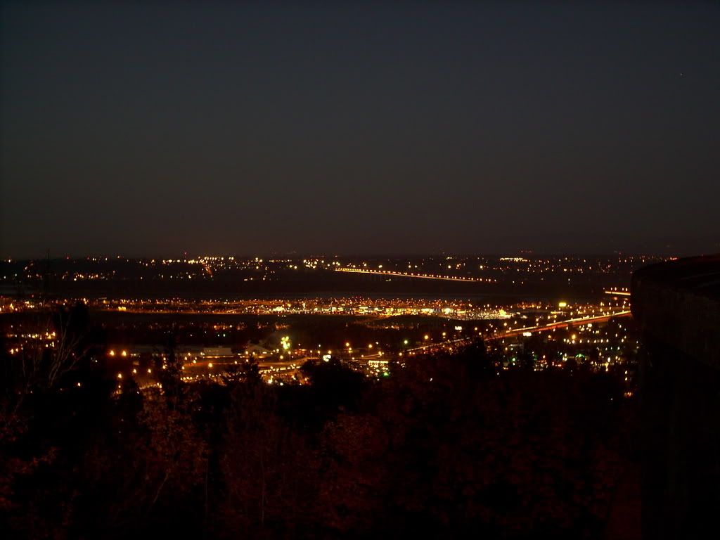
1167. For this weeks, edition, more night landscapes. We love the city lights–that's one of the reasons we live in the ... well, city:


This is taken from the top of Portland's Rocky Butte. I love digital cameras–couldn't take this sort of picture with the old Instamatics or (yikes!) Disc cameras. that long sloped line of lights in the distance is the Glenn Jackson (Interstate 205) Bridge going into Vancouver, WA. The dark swatch going across the middle of the photo to meet it is the Columbia River. The actual PDX facility is off to the right of the frame: what's going across the middle there is actually NE Airport Way running up to the 'port.

Now, we take a more due-easterly view:


We look east toward Troutdale, Wood Village, Fairview, and the northern extent of Gresham. That beautiful light streak is Interstate 84, the Columbia River Highway.

What I love doing is getting lost in the individual street lights. The subjective impression they give of just the area around them that they illuminate is poetic. And light streaks are always cool.


Tags: , , , ,

01 December 2007

[bloggage] NaBloPoMo: Job Done!

1166. I, along with a lot of other people, have completed that inspired silliness, NaBloPoMo. I enjoyed it. It never really became a treadmill for me; as a matter of fact, I found even more interesting things to explore and to write about.

And if maybe my visitor volume didn't come up to where I'd hoped it would and maybe American didn't fall in love with me like I'd hoped it would, I did fall even more in love with writing and creating.

I'm not designing for pay yet, but yesterday night I entered an idea in a contest (a lark, for non-design prizes, yo, still flyin' the NO!SPEC banner y'all) and since I'd left it off for the last minute I got it done quickly. The design had been gestating in my mind for a couple of weeks (sometimes, you just can't thumbnail except in the gestalt).

I've upped my Photoshop game–I don't think I could have done those old Salem sign mockups a couple of missives back before. Now my skill set's bigger.

I may still not be one of the more popular PDX bloggers, but I remembered that I'm doing it for fun, and for the creative outlet that it offers pretty much whenever I want it.

NaBloPoMo badge courtesy this blithe spirit.

Tags: ,