
This was phased out sometime in the '80's, when a more utilitaran and typographic approach was decided on. all Helevetica and American Typewriter.
This year, though, QwestDex returns local color...or maybe local duotone...to directory covers with this gem:
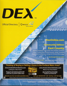
Clicky upon it to see it bigger. BTW, it's copyrighted by whoever the 7734 owns it, I get no money for displaying it. Never mind that now.
The photo, which is actually quite cleverly integrated with the QuestDex cover design style, is of the Gresham Central MAX Station. It's a nice touch, I think, and an example of what happens when design can be used to impart a local flavor and style to things. It's tied to our surroundings, and no matter what you think of Gresham, you have an emotional connection to the object, a sort of hometown feeling that's really missing from daily life these latter years.
And, for now, that's the design view from Baja Gresham.
No comments:
Post a Comment