
 Surf this link for the previous step in the process.
Now that I have route number symbols, I find I like the look of the map better than before. I'm feeling now would be the right time to take the first step in connecting the route network to its envrionment; adding a symbol for the Willamette River.
It goes without saying that one important thing that almost every major Oregon city shares is the Willamette (minus obvious examples like Medford, Pendleton, K-Falls, Bend...). Including the River not only helps define the local geography in terms of the map but also helps the user subconcously place the location in terms of what they most likely know of the region. It forms an important basic connection to reality.
The Willamette follows an interesting path through Salem as well. Within the Urban Growth Boundary are two tracts of bottom land that were historically islands but aren't any more due to changes over time (Minto Island and Brown Island), and just outside it an island whose name is the same as an island in the Columbia off the North Portland Shore (Hayden Island). There's also a small island (McNeil Island) actually in the river along the North Salem stretch of the Willamette (I've not included it here for the moment).
It was fairly easy to trace (from an old Salem city council ward map I happen to have, that I scanned in and put on a template layer) an outline of the river and the small sloughs that connect to it. I gave it an appropriate blue color that I like, and I've always found a hard line graphically attractive, so I darkened that and applied it as a stroke to the traced shape.
Here, in toto, is the result:
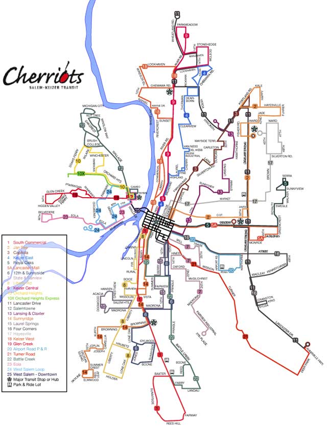 The route list has also been backed up with a white box with a black stroke. I'll not be leaving it this way; it's not really readable in its original format, but I'm starting to experiment with it too. Leaving the river visible but ghosted appeals to me, as an artistic point.
The presence of the river instantly brings additional logic to the design. It's clear where West Salem is, it's obvious where downtown is, and it's apparent without having to read down into the design how the city aligns itself to the river. Also, since the towns along the Willamette typically have thier city centers along the river, the map becomes a pathfinding tool with more utility than merely illustrating the routes; anyone with an elementary knowledge of Salem can figure out how to go downtown or get uptown with knowing and logic.
Next we'll be putting in even more supporting detail; adding major streets. This is definitely becoming a labor of love.
2 comments:
When this is all done, I think I will be seriously tempted to head down to the trasit center and add a stack of your maps to the pile of official ones.
Your kind words are much encouragement. Thank you!
I'll admit, I did entertain a fantasy of Salem-Keizer Transit contacting me for the upkeep of thier printed matter. It's kind a dream job.
But I love maps, and I love design. Transit maps have always fascinated me in particular. So I'm having fun with this personal creative thing and documenting its progress.
Post a Comment