 One of the things I do to keep up with type trends is subscribe to the FontShop monthly e-newsletter. This month's can be seen by surfing here; it's a free subscription to anybody who likes type.
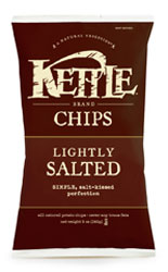
One example used is the packaging of Kettle Chips. They've gotten big; they're no longer the charmingly-small company started by Cameron Healy (then N.S. Khalsa) in the early '80s. They are, however, still based in Salem, which I think is cool.
However, the company, even though it's bigger now, still seems to keep to the same core ideas of healthful snacks and foods, well-made, and being a good citizen (they apparently run thier vehicles on biodiesel derived from used cooking oil–that they supply), to which I personally say "well-done".
A company's personality is seen in the designs it uses to brand itself, theme its products and publications, and brand its products. The values that Kettle forwards with its design should be clear: thoughtful hand-crafting, 'natural' products created for people who love chips and snacks but don't want to settle for the usual mass-produced mess–people who care about what they consume, and what it does to them and to the world around them.
Kettle's designs–with the friendly, rough and ready, distressed type and the simple designs and colors meant to harmonize with the contents as well as generate appetite appeal–serve thier purpose very well indeed. Personally, when I look at a bag of Kettle...heck, I want one.
What better endorsement can you have than that?
Technorati Tags: type design, typography, kettle foods, kettle chips

1 comment:
Mercy sakes! No, I had not seen this.
After reading your bit on the subject, I must say, I see your points.
All my life, anything that becomes big in Oregon can't wait to move on...either that, or it gets bought out and gets deOregonized.
For the moment it does appear, based on what you've said, that Kettle's deOregonization isn't imminent. But 5 years on, who can say?
Thanks for commenting, by the way.
Post a Comment