All Quarksters know...or ought to know...that, like knowing palettes in InDesign, the true secret to amping up your productivity in QuarkXPress is knowing where the keyboard shortcuts are. Even with more functions going to palettes in the upcoming version 7, knowledge of keyboard shortcuts are in XPress are your Swiss Army Knife, enableing you to MacGyver your way through your layout.
When I was trained in XPress, the first quarter of the course was spent madly memorizing them. They pay off every time I use it.
This article I stumbled on in Digit Magazine (an excerpt from the book QuarkXPress 6 Killer Tips)is a must-look if you're a regular Quarkster. All sorts of extra tips and secrets you may have heard of at one time or another, like selecting a tool with the Option key to keep it active.
But go look! It's a good one.

By Samuel John Klein of Portland, Oregon - Graphic Designer without Portfolio, aspiring artist who dawdled too long.
29 April 2006
[net_life] How Come...
...An email showed up at my Yahoo email inbox from a fellow with all sorts of news briefs about Masons?
Texas Masons?
No, not the ones who actually do masonry...those ones with the ceremonies and all that stuff.
Bizzare.
Texas Masons?
No, not the ones who actually do masonry...those ones with the ceremonies and all that stuff.
Bizzare.
28 April 2006
[or_politics] Obscene Campaign Mail
Yet another astroturf-y organization promses to tell the the truth about a ScArY Democratic state representative. Chee, thanks.
Over the next few weeks, some proud organziation calledin itself "Taxpayers Association of Oregon PAC" will be polluting my snailmail box with negative campaign ads about Rep. Jeff Merkley, who's my state rep, and a pretty good fellow actually.
It's irritating. I mean, this is a reason I don't watch TV anymore. Well, there's Cheaters, but at least they're honest about what they tell stories about. They show me the tapes and I decide.
This week's tissue is all about how Jeff was all for new taxes (cue Theremin). This is the same idiot BS I've been made to listen to since the 1980's. Rating Jeff against a bunch of issues in which he was for new taxes, he's compared to this person called Voters, who was against them each and every time (big surprise there). Apparently they'll think I'll jump away from them without looking into the issues.
Well, actually, here's a surprise: I'm not going to be looking into these issues. I'm not going to be paying attention the the claims of "Taxpayer Association of Oregon" (if I'm an Oregon taxpayer, why haven't they asked me to join?). The only reason this organization is interested in mailing me this tripe is to, if not outright lie about Jeff, to distort his record just enough to make him look bad.
They also have a website called "OregonWatchdog.org", which sounds like it's on your side but really isn't. The website should rightly be called "ReadyToJumpOnAnOregonDemocratWeDon'tLike.org". I'm betting they're more likely to give any given Republican a pass while calling for the drawing and quartering of any Democrat who breathes out when they think they should be breathing in.
Or the outright stoning of any Democrat. Period.
You think I should be fair? You think I should give the claims a chance by looking into them? Why? Why should I give thugs and people who lie equal time?
I'm an Oregon Voter, the actual real thing, who has been paying attention to politics for longer than I ought to. There's no such thing in this state, or anywhere, as a conservative actually trying for an honest debate with a liberal. What does happen is that the liberal tries to take care of business and the conservative tries to destroy them in place.
Like the President said: "Fool me...can't get fooled again".
I see you guys coming a mile down the road.
27 April 2006
[design] Redesigning Cherriots: Part 3, All Roads Lead to Salem
Surf this for Part 2. There's a connection in Part 2 for Part 1.
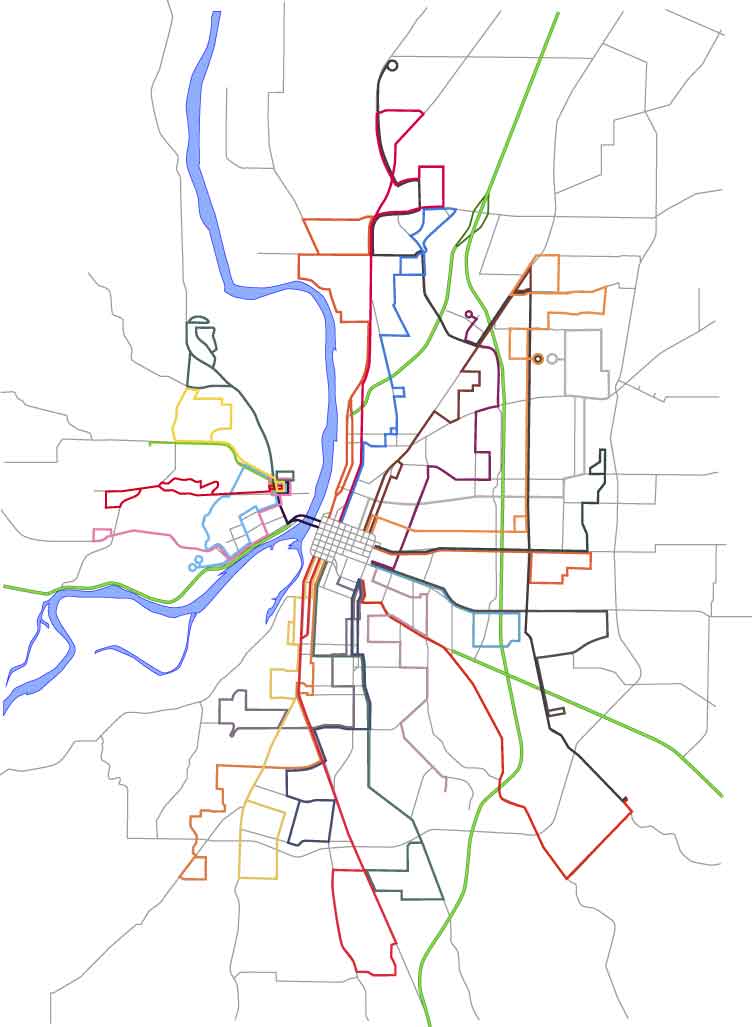
When I last left the Cherriots System Map, I'd dressed it up a little with the Willamette River and a re-think to the way we put numbers on the route lines themselves. I think I've pushed it about as far as I can without adding things to it. Wholly appropriate to the last observation is remembering one of my primary logics in redesigning the map; to increase its utility to the user by tying it into its surroundings, incidentally increasing its utility to more than just transit map users.
So, creating a new layer in Illustrator, turning off all the other work I've done so far (it's invisible but it's not gone–layers are without a doubt one of the greatest paradigms implemented in digital art applications), I turn on the scanned Salem ward map I'm using as a template and begin to draw lines where the pricipal streets are. The detail of the diagram and my knowledge of Salem are of great help here.
After a bit of work, then, viola! (click it to see it bigly):

I've also always found the street layout around Salem very interesting. A standout is the way streets converge into Salem. Portland is a big grid that grew out to the east (think about it: the first north-south avenue that cuts all the way across town without having to jog over on a cross-street as you go east of MLK/McLoughlin is NE/SE 82nd Avenue, but I digress), but Salem grew up in the middle of a big spread of agricultural prairie, and the streets that converge remind one of an asterisk. Another notable feature is the Kuebler Blvd/Cordon Rd/Hazel Green Rd-Chemawa Rd-Lockhaven Dr beltline–which is a close approximation to the urban area's edge, which also closely corresponds to the limits of the Salem-Keizer Transit District's service area. The wishbone formed by Liberty Road and Commercial Street south of Vista Avenue is also just plain interesting.
With the Salem ward map and the main streets laid in then, it's time to get to one of the important tasks; aligning the route network to more closely actually follow the streets. The original map, if it will be recalled, took minor liberties; the Commercial/Liberty couplet along the 18-Keizer West line north of the city center does a gentle curve that doesn't reflect reality at all; the bend along all the routes north of city center doesn't happen in the same place; the loop at the east end of the 20-Airport P&R route is not only geographically incorrect as to its shape, it's way too large. Depending on that representation, you'll think you're going east of I-5 when in fact the line stays completely west of the freeway. Those are just a few examples.
I make a copy of the layer that contained all the old routes. This I do so that if, unlikely as that is, I mess up the copies that I'm working on (Illustrator makes it as tough as possible to screw things up, and Version Cue saves earlier versions so I can go back at any point, but it can happen) I can grab a new copy of the original and start working on it. Also, it means I'm working on paths that are just the same size and position (more or less) as the original, so I can see the difference I've made.
So, I get out the direct-select tool (the white arrow) and move points so the corners and turns go where they ought to. I also add and subtract points (those tools are under the pen tool–eventually I tear off the pen tool palette for more efficient access) as necessary.
Most of the way through, here's what I have now:

At this point I'm taking pauses to step back and enjoy what I'm seeing. I do like doing this sort of thing, and one of the romances of the transit map for me is there is a certain indescribable pleasure I get in seeing a city rendered in such an abstract yet realistic style. This is the sort of abstraction that maps do. You can't plot everything; a truly accurate map is a physical impossiblilty, that's what GPSs are for, and not even they get absolutely everything.
You'll notice the street network has been screened back–instead of strong black lines, it is now a network of gray lines. This is important because they need to be there to support the route information and must be visible but must not compete with it for your attention. You must be informed by it, but not distracted.
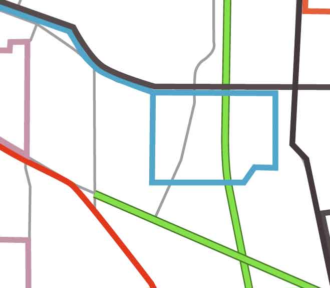
The difference between what is and what ought to be can be demonstrated by the closeup clipping that should appear just to the right of these words. The line 20 symbol is the blue green path that forms a square in the center-right of the illustration. Note that it overlaps the I-5 Freeway (the light-green with dark-green bordered line running vertically through the image). Remember that I plotted everything on the same scale, so if I took the original route lines and matched them to a correct base map appropriately scaled, it would be off just like this.
The actual route of the blue-green line should be down the gray line in the middle that curves down and to the left (that's Hawthorne Ave, SE) leftward just above the diagonal green line (that's Highway 22) on Ryan Dr, whichs is not on the map but whose location can be estimaed, and back up and rejoning the outgoing line on the next vertical gray line over (which represents Airport Rd, SE).
The appeal to a connection to reality may seem persnickety and pedantic, but remember, I'm out to connect this symbol to reality as much as possible. I believe it informs on the subconcious level–we recognize it even if we don't know it–and the end product will be much more useful.
One more thing I want to do a minor brag about: the green symbols marking expressways (such as Salem Parkway and Salem-Dallas Highway) and full-fledged freeways (I-5 and Highway 22 going east). These were made on a separate layer which was then locked (I didn't want to mess them up once I finally placed them). The lines themselves were made with a stacked path; The dark green path was given a 3-point stroke, copied over on top of itself, then then top line was lightened and given a 2-point stroke. This gives the appearance of a hard-edged wide line.
When I last left the Cherriots System Map, I'd dressed it up a little with the Willamette River and a re-think to the way we put numbers on the route lines themselves. I think I've pushed it about as far as I can without adding things to it. Wholly appropriate to the last observation is remembering one of my primary logics in redesigning the map; to increase its utility to the user by tying it into its surroundings, incidentally increasing its utility to more than just transit map users.
So, creating a new layer in Illustrator, turning off all the other work I've done so far (it's invisible but it's not gone–layers are without a doubt one of the greatest paradigms implemented in digital art applications), I turn on the scanned Salem ward map I'm using as a template and begin to draw lines where the pricipal streets are. The detail of the diagram and my knowledge of Salem are of great help here.
After a bit of work, then, viola! (click it to see it bigly):
I've also always found the street layout around Salem very interesting. A standout is the way streets converge into Salem. Portland is a big grid that grew out to the east (think about it: the first north-south avenue that cuts all the way across town without having to jog over on a cross-street as you go east of MLK/McLoughlin is NE/SE 82nd Avenue, but I digress), but Salem grew up in the middle of a big spread of agricultural prairie, and the streets that converge remind one of an asterisk. Another notable feature is the Kuebler Blvd/Cordon Rd/Hazel Green Rd-Chemawa Rd-Lockhaven Dr beltline–which is a close approximation to the urban area's edge, which also closely corresponds to the limits of the Salem-Keizer Transit District's service area. The wishbone formed by Liberty Road and Commercial Street south of Vista Avenue is also just plain interesting.
With the Salem ward map and the main streets laid in then, it's time to get to one of the important tasks; aligning the route network to more closely actually follow the streets. The original map, if it will be recalled, took minor liberties; the Commercial/Liberty couplet along the 18-Keizer West line north of the city center does a gentle curve that doesn't reflect reality at all; the bend along all the routes north of city center doesn't happen in the same place; the loop at the east end of the 20-Airport P&R route is not only geographically incorrect as to its shape, it's way too large. Depending on that representation, you'll think you're going east of I-5 when in fact the line stays completely west of the freeway. Those are just a few examples.
I make a copy of the layer that contained all the old routes. This I do so that if, unlikely as that is, I mess up the copies that I'm working on (Illustrator makes it as tough as possible to screw things up, and Version Cue saves earlier versions so I can go back at any point, but it can happen) I can grab a new copy of the original and start working on it. Also, it means I'm working on paths that are just the same size and position (more or less) as the original, so I can see the difference I've made.
So, I get out the direct-select tool (the white arrow) and move points so the corners and turns go where they ought to. I also add and subtract points (those tools are under the pen tool–eventually I tear off the pen tool palette for more efficient access) as necessary.
Most of the way through, here's what I have now:
At this point I'm taking pauses to step back and enjoy what I'm seeing. I do like doing this sort of thing, and one of the romances of the transit map for me is there is a certain indescribable pleasure I get in seeing a city rendered in such an abstract yet realistic style. This is the sort of abstraction that maps do. You can't plot everything; a truly accurate map is a physical impossiblilty, that's what GPSs are for, and not even they get absolutely everything.
You'll notice the street network has been screened back–instead of strong black lines, it is now a network of gray lines. This is important because they need to be there to support the route information and must be visible but must not compete with it for your attention. You must be informed by it, but not distracted.
The difference between what is and what ought to be can be demonstrated by the closeup
 clipping that should appear just to the right of these words. The line 20 symbol is the blue green path that forms a square in the center-right of the illustration. Note that it overlaps the I-5 Freeway (the light-green with dark-green bordered line running vertically through the image). Remember that I plotted everything on the same scale, so if I took the original route lines and matched them to a correct base map appropriately scaled, it would be off just like this.
The actual route of the blue-green line should be down the gray line in the middle that curves down and to the left (that's Hawthorne Ave, SE) leftward just above the diagonal green line (that's Highway 22) on Ryan Dr, whichs is not on the map but whose location can be estimaed, and back up and rejoning the outgoing line on the next vertical gray line over (which represents Airport Rd, SE).
The appeal to a connection to reality may seem persnickety and pedantic, but remember, I'm out to connect this symbol to reality as much as possible. I believe it informs on the subconcious level–we recognize it even if we don't know it–and the end product will be much more useful.
One more thing I want to do a minor brag about: the green symbols marking expressways (such as Salem Parkway and Salem-Dallas Highway) and full-fledged freeways (I-5 and Highway 22 going east). These were made on a separate layer which was then locked (I didn't want to mess them up once I finally placed them). The lines themselves were made with a stacked path; The dark green path was given a 3-point stroke, copied over on top of itself, then then top line was lightened and given a 2-point stroke. This gives the appearance of a hard-edged wide line.
[net_life] Save The Internet, Update
Today a house committee voted on something called the "Markey Amendment", that is supposed to guarantee the net neutrality that preserves the net-as-we-know it...you know, the one where you can go anywhere without being diverted from or blocked away from sites and blogs that people who can spend enough don't want you to see.
The amendment was defeated, but not by the wide margin expected. This actually bodes well; once again people power closes the gap in a very measly span of time versus the long time and money you don't have that telcos have spent softening up the Congress. Save-The-Internet explains here. The battle is lost, but the war remains to be won.
Meanwhile, myDD takes an angry look at five DINOs whose loyalty to big checks from industry trumps thier stewardship of the public good and their notional commitment to thier consituents.
I've always felt that, given the reach and effect they can have on national public policy, everyone in America is a Congressmember's indirect constituent.
24 April 2006
[net_life] They Want Our Net
As b!x said, "Once upon a time, this was sort of a joke phrase". That was, of course, before corproations got thier hands all up in our business.
The Internet, this great network of networks, despite the flaws and and spam, still works pretty much the way it used to. Anyone can put just about anything up on the net that they want to, and anyone can come and see it, without someone getting in the way.
Well, they're busy trying to mess this up too. To big business in America, the world is just full of things they can't control yet or make money off of. And now they want to control what you see and make you pay extra to get what you really want.
In other words, if you like what isn't necessarily approved of by the big telcos or if what you like can't afford to pay extra then you get to see the world like I do...as though you were on dialup.
Grok the term network neutrality, move in with it, live with it, understand why it's important that it remain. And if you think it's just so much 'power to the people' lefty raving, let rest upon your brain the delicate fact that both Instapundit and MoveOn are in this one on the same side.
Then click the button below:

Or go to http://www.savetheinternet.com and read up.
We're for real here, people. If you don't get active on anything else, get active on this.
The Internet, this great network of networks, despite the flaws and and spam, still works pretty much the way it used to. Anyone can put just about anything up on the net that they want to, and anyone can come and see it, without someone getting in the way.
Well, they're busy trying to mess this up too. To big business in America, the world is just full of things they can't control yet or make money off of. And now they want to control what you see and make you pay extra to get what you really want.
In other words, if you like what isn't necessarily approved of by the big telcos or if what you like can't afford to pay extra then you get to see the world like I do...as though you were on dialup.
Grok the term network neutrality, move in with it, live with it, understand why it's important that it remain. And if you think it's just so much 'power to the people' lefty raving, let rest upon your brain the delicate fact that both Instapundit and MoveOn are in this one on the same side.
Then click the button below:
Or go to http://www.savetheinternet.com and read up.
We're for real here, people. If you don't get active on anything else, get active on this.
[design] Tutorial: The Whole Is Greater Than The Sum Of The Parts
 Update 00:31 25-Apr-06: Designorati seems to be back up now.
Important Notice–Designorati off line: as of this time (this update written 22:00 24-Apr-06) the server supporting Designorati has fallen off the face of the earth. These tutes really are there, so try again later, because they ARE worth your time.
Dig, if you will, the illustration. I'll wait.
Done? Good. I borrowed it from a post Jeremy Schultz, a graphic designer from West Des Moines, IA, and my colleague at Designorati, wrote. He's m4d wizardly in Photoshop, and this is proof.
This is actually the tale of two incredibly worthwhile tutorials he did. One shows how to use Photoshop's shrinking-violet sister, ImageReady, to do a powerhouse conditional action and saving it as a droplet. Droplets are cool 'applets' generated from PS and IR actions that live on your desktop, or wherever; just drag your files to them, drop, and they process. They're little robots.
Jeremy's tute about ImageReady conditional droplets is here. Go read it. It's good.
Now, as ki113r as that was, the image really made an impression with all of us at Team D:. It's the heart of graphic design, really; solving the problem of communicating, and oh, so deftly. We all asked Jeremy how he did it, and he decided it would make a jim-dandy tute on its own.
And it does. Go read it!
It reminds of the importants of fundamentals, that true wizardry happens best when you use the basics to generate impact. Layers, Magic Wand, Spherize filter, brush palette. Not much more.
23 April 2006
[design, cartography] My Skepticism Is Noted In Indonesia
While hardly the most popular or oft-read blogger in these parts, never mind the world, I wonder how many of you can say that your words were assayed in Indonesia?
I'm serious about this. Please follow:
A few weeks back, following the ruckus generated when a Chinese attorney claimed to have found a map purporting to be drawn from information said to prove the chinese mariner Zheng He visited America and circumnavigted the globe about 70 years before Columbus first visited what we now call the West Indies, I wrote a short article.
After subequent testing of the paper, which is claimed to have verified the claimed provenance of the map (which I call the "Mo Yi Tong" map, after its purported drafter), the attorney held an invitation-only event where the findings were released. Predictably, the owner claimed that the scientific test, combined with various naked-eye examinations by experts, prove that the map was done at about the time that was claimed (1798 AD). This is felt, by the advocates, to lend weight to the claim that the map itself was drawn from a lost source that records the Chinese admiral's western hemisphere visits in approximately the year 1418 AD, on the Western calendar.
I wrote about that on Designorati:Cartography here.
The map itself suffers from a variety of stylistic problems which more learned experts than myself can articulately explain; the most glaring even to this layman's eyes are the representation of California as an island (which was actually widely regarded as incorrect when it was popular and is, on this map, nearly identical to its depiction on French maps of the day) and the peculiar two-lobed hemispherical display, which is apparently very much unlike the style that Mo Yi Tong would have been prone to acutally use (if we believe that Mo Yi Tong existed).
Most importantly, I feel that finding that the map may have been authentic, if we take this as true for the sake of the argument, proves little else than this map may well be authentic. The crucial link, that the map itself was based on authentic and true records of a voyage that have since gone lost, is neither proved nor disproved by Mo Yi Tong's authenticity. It's still a matter of faith, and is therefore a very weak link indeed.
The proving or disproving of that link is of, per se, crucial importance, since it is the rock upon which credence of the claim (which I call the Menzies conjecture, after the British author who made it popular with his book 1421: The Year the Chinese Discovered the World (the claim that the map was drawn from records dated 1418 also generate problems with this conjecture)) is based.
Anyway, I was Googling my own name and I found this link:
http://www.geografiana.com/dunia/budaya/peta_china_1418_otentik_1
which leads to an article on the Indoesian site Geografiana which makes reference to the article I wrote on Designorati analyzing the news of the authenticity announcment. I don't know any Indonesian (which I understand is a standardized version of Malay) but I believe that my conclusions are not exactly viewed with favor. The currency of the Menzies conjecture seems widely-approved of in eastern Asia, at least for the purpose of world-historical bragging rights, and in China, naturally, Zheng He is a national hero–all the more now since his name has been in the news of late.
The grown-ups remain unconvinced that Zheng visited the Western Hemisphere, and the weakness of the Mo Yi Tong map-based claim has not dissuaged the Menzies partisans from their position. From my layman's perspective, I find the Menzies conjecture interesting, but as a skeptic, I believe that such astounding claims require similarly strong proof–and it just hasn't yet been provided.
22 April 2006
[design] Redesigning Cherriots: Part 2, Old Man River
 Surf this link for the previous step in the process.
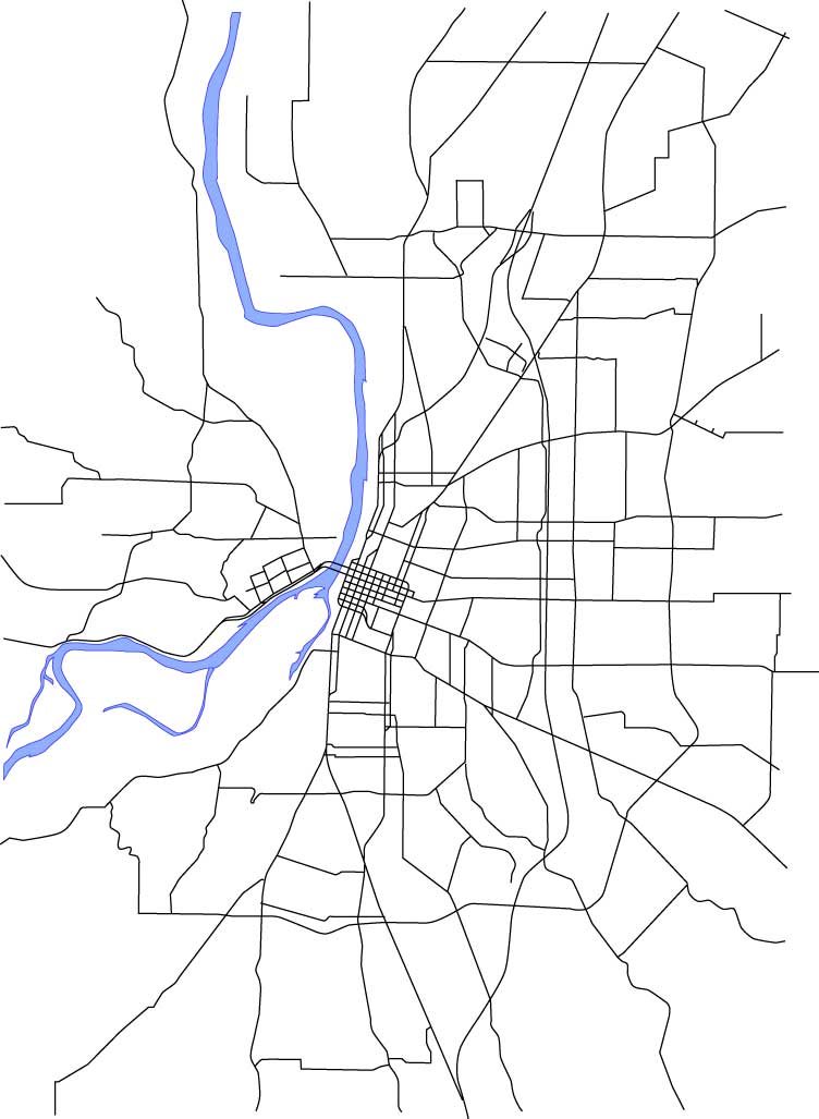
Now that I have route number symbols, I find I like the look of the map better than before. I'm feeling now would be the right time to take the first step in connecting the route network to its envrionment; adding a symbol for the Willamette River.
It goes without saying that one important thing that almost every major Oregon city shares is the Willamette (minus obvious examples like Medford, Pendleton, K-Falls, Bend...). Including the River not only helps define the local geography in terms of the map but also helps the user subconcously place the location in terms of what they most likely know of the region. It forms an important basic connection to reality.
The Willamette follows an interesting path through Salem as well. Within the Urban Growth Boundary are two tracts of bottom land that were historically islands but aren't any more due to changes over time (Minto Island and Brown Island), and just outside it an island whose name is the same as an island in the Columbia off the North Portland Shore (Hayden Island). There's also a small island (McNeil Island) actually in the river along the North Salem stretch of the Willamette (I've not included it here for the moment).
It was fairly easy to trace (from an old Salem city council ward map I happen to have, that I scanned in and put on a template layer) an outline of the river and the small sloughs that connect to it. I gave it an appropriate blue color that I like, and I've always found a hard line graphically attractive, so I darkened that and applied it as a stroke to the traced shape.
Here, in toto, is the result:
 The route list has also been backed up with a white box with a black stroke. I'll not be leaving it this way; it's not really readable in its original format, but I'm starting to experiment with it too. Leaving the river visible but ghosted appeals to me, as an artistic point.
The presence of the river instantly brings additional logic to the design. It's clear where West Salem is, it's obvious where downtown is, and it's apparent without having to read down into the design how the city aligns itself to the river. Also, since the towns along the Willamette typically have thier city centers along the river, the map becomes a pathfinding tool with more utility than merely illustrating the routes; anyone with an elementary knowledge of Salem can figure out how to go downtown or get uptown with knowing and logic.
Next we'll be putting in even more supporting detail; adding major streets. This is definitely becoming a labor of love.
21 April 2006
[pdx_geography] A Visit To The Willamette Stone
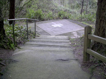
 The picture you see on the right at the top here sits at the entry to one of the smallest and the most singular State Park in all of Oregon or Washington: Willamette Stone State Park.
For those who missed my pontificating on just what the Willamette Stone is, here's a quick recap: All real estate surveying in both Oregon and Washington references a single initial point of what is called the Public Lands Survey System. This initial point (and there are many of them for various regions of the US, this one governs Oregon and Washington only) marks the intersection of a base line (running E-W) and a meridian (running N-S) from which 6-mile-square townships are measured, tierned in townships north and south and ranges east and west (this system is sometimes called township-and-range). These townships are further broken down into 1-mile-square sections. This system, used throughout the west from its various bases, allowed the government to determine who owned what, where. All surveyed real estate, from Boundary Point in Washington to the driest, emptiest corner of Malheur County, relates to this point.
It's in Portland's West Hills, in approximately the 200 Block of NW Skyline Blvd, and it can easily be visited. The wayside is a wide area on the left as you go outward from the city center and is easily missed (it's right across from a house addressed 220 NW Skyline Blvd (I only provide this for reference, don't bother the nice people there, okay?)). From the roadside an asphalt trail leads down what becomes a bit of a steep slope. Stop at the entry and look on the right for a sign that explains all about the Stone and why it is where it is.
 Turns out it started as a wood stake. Who knew?
The walk down the hill is nice but does get steep. If you're easily winded, take it slow and easy, and you'll get there...it's not quite two city blocks. What is magnificent about the park is that even though it is quite small, maybe 200 feet wide at its widest point near the entry at Skyline Blvd, there's been enough trees left that one can imagine what it must have been like when the first surveyors went up there to drive that stake. But why there?
I cut down the graphic for the sign pretty small and it probably can't be read, so here it is: the initial point was put there so that the Willamette Base Line should remain south of the Columbia River (closest it gets is out at Corbett, where it's scarcely a mile south of the river) and the Willamette Meridian should stay west of Vancouver Lake (which it does...just).
I guess they figured they'd have enough trouble surveying across the Columbia River and
 thorough the hills that they didn't need to do it across water.
As one traverses the trail downwards, it's very nice and natural, but big old satellite dishes can be seen easily through the trees to the right, and as one gets close to the Stone itself, the new houses of yet another West Hills subdivision can be seen in the near distance. We've come so far. About halfway down the slope, in the interests of safety perhaps, the State have thoughtfully provided the split-wood rails you see in the third figure.
But what does the end look like? Well, if you come upon the following scene:
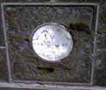
 You're almost there. Ahead is a concrete platform, about ten feet on a side, a concrete (if you will) demonstration of what the Stone anchors and represents. In weathered brass are four large squares, and at the center of the interescting lines is a square containing a rough-hewn rock (which I think of at the Willamette Stone itself) and a bright steel disk with information engraved on. This is the Stone, the center of it all–or at least, the survey of an area the size of the whole of the nation of Germany.
Close up, the Willamette Stone (and the monument) look like this:
It is a little hard to see, so here's a diagram:
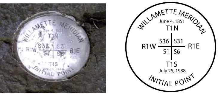 The information on the disk tells the tale of what the point means. The top date (June 4, 1851) was the date of the first survey. The plaque due south of the monument tells the tale of the monument and how it was defaced by vandals and replaced and dedicated by Vic Atiyeh (July 25, 1988).
Here's a better view of the setting:
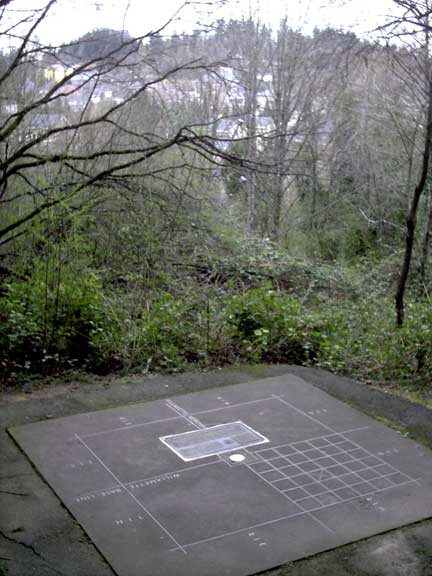
This detail allows me to point out some salient features:
- The Willamette Meridian is delineated by the centerline running from the lower right to the upper left of the picture, through the big inlaid brass plaque. This is true north-south. It is denoted with the brass inlay WILLAMETTE MERIDIAN.
- The Willamette Base Line is delineated by the centerline running athwart that; that is, almost right to left. It is denoted with the brass inlay WILLAMETTE BASE LINE.
- On the outside of the square, just visible in the resolution of the photo, are four inlaid notations: T1N (Township 1 North) and T1S (Townshop 1 South) closest to us and on the left; closest to us are R1E (Range 1 East) on the left of the centerline and R1W (Range 1 West) on the right.
- From what we know we can be certain we are looking approximately south-southwest.
- Knowing what we know about where the Multnomah-Washington county line lies, we know that the quarter of the square farthest from us (upper right in our view) is in Washington County, and we are standing in Multnomah County. The county line goes away south along the Meridian and west (to the right) alone the Base Line. Further, those houses in the distance are in Washington County.
- The grid pattern we can see is a graphical representation of the pattern of 36 standard one-mile sections each township is ideally divided into.
There are few places more remarkable and reachable in Portland.
You are here.
19 April 2006
[art and artists] Slight Stumbles on the Way to Artistic Genius
A couple of faux pas:
- While the book Drawing on the Right Side of the Brain was quite educational, it was ultimately a failure for me; I could never get past the surgery part.
- Painting With Children was a similar travail; thier heads are too big, and they squirm. Also, the parents object.
18 April 2006
[design] Pushing the Envelope in Adobe Illustrator and Photoshop

The picture featured here is astounding. Gorgeous 3-D cutaway art, masterfully rendered in a style reminiscient of the best of its type. Give it a click and look at it close.
Would you believe this gobstopping bit of art was done in Adobe Illustrator, and colored in Adobe Photoshop? Neither did I, but it was, and it was God of Technical Illustration Kevin Hulsey who did it. The job itself was quite intense, but he came up with a tutorial that will scale down to the most modest of such jobs by concentrating on the concepts of the process. It's astoundingly simple for the results it garners.
In the case of this particular work, though, the particulars of the job were indeed titanic and I imagine are intimidating to even the everyday Illy user (I quail when I review them). The line art was produced in Illy and exported as a grayscale to PS where it was colored.
The Princess Cruise Lines' Empress of the Seas, then, by the numbers:
- Final File Layers: 35
- Final File Size: 1.3 GB
- Time in Production: 920 hours
- Export of the Illustrator grayscale file: 9 hours on a PowerMac G4 (clock speed not known)
It has high-resolution closeups of the image. You can almost imagine dancing on the dance floors, you can almost feel the pile of the carpets and the grain on the wood rails and floors, you can actually see full place-settings in the dining areas. With respect to the Empress, Hulsey faced certain challenges:
This project presented many unique challenges. The actual ship was still in Germany being completed when I started the project. There was no photography or CAD reference to work from, only the paper blueprint you see below. In order to have the brochures completed by the time the ship went into service, the final illustration had to be finished in under two months.
Yet another person I want to grow up to be. It's an advanced subject; if you aren't to this level yet, its something to shoot for.
Simply. Amazing.
(Credit where due: Veerle reported on it first, and I just stumbled on it when Googling for interesting Illustrator stuff)
13 April 2006
[design] Redesigning Cherriots: Part 1, Route Numbers
The first thing I wanted to 'play' with was the route numbers. In the previous chapter of this chronicle, I detailed the weaknesses with the presentation, and made particular mention of the route numbers, large size-numbers placed next to the lines themselves where space allowed, remarking that they looked like they were hunting down the street names.
Being so large they tend to take attention away from the routes and street names themselves; we say they compete with the other information on the graphic. In this case, they win, principally by intimidation.
The question becomes, then, how would I include the route numbers so they identify but don't sit on the map so uncomfortably. Fortunately, this is not a hard question to answer; years of development by other transit companies, in thier own informational graphics, show us the way. The system map at C-Tran is a good example; I rather enjoyed the way TriMet did it before thier redesign.
What I'm going to do is create what I call route-number icons. These will be small, reproudcible symbols that sit directly on the line itself. Done at the right size they can identify and draw the eye to the annotated subject but not crowd other information off. Also, this will encourage the eye to follow the line directly rather than having to glance off the line to make sure you're following the real one (that's accomplished by color at this point, but at some future point the designers may find it advantageous not to use color, so this option is now open for further developing the item).
After a little bit of experimentation, I came upon a graphic that pleased me and I felt communicated well. Check the following illustraton for a close-up view of the route-number icons in action:

The impression I get is one of distinct visual relief from the previous version. The informational usefulness of the work has increased a little. Attaching the route numbers directly to the graphical representation of the line itself brings your awareness right down to the line iteself and the street it travels on, which is one of the things that these maps are all about.
Another thing to point out here is one of the magnficent features of Adobe Illustrator CS2 (and previous versions, actually, but if you aren't running CS2, you're missing out), and that is symbols. Now, Illustrator is a vector drawing program, which means that each line is a mathematical expression that is stored as an object which contains all sorts of information about where the points lay and how the line between them is drawn/printed/displayed. One simple icon is no great problem, but when you multiply it over and over, drawings can get huge, and can cause problems even on the faster systems.
Symbols get around this problem by allowing you to store the object just once, but using that stored object to create as many instances as you need. It's like an ink stamp; the image is on the press but it creates copies on the page (of course, the metaphor here breaks down pretty quickly, in as much there's no link back to the stamp to break, but for basic practical purposes, it works alright).
I created the icon for each line by making a small rounded corner rectangle, filling it with the approprate color, setting the type for the number inside, grouping the two together, and dragging it to Illustrator's symbol palette. Whilst drawing, I held down the Shift key; this changed the original grouped object to a symbol instance automatically, thus saving a step. It was then a simple matter to drag as many symbols off the symbol palette as I needed (or copying the ones I had about) and drag them into position. Additionally I grouped the icons on thier own layer so I could play with them without messing up my earlier work, and also to move them out of the way to make visual comparisons.
Creating symbols out of these objects also allows me to export them and import them as a library, simplifying inclusion in other drawings. I'm also planning a couple of inset diagrams which I'm going to develop off of the main drawing then include, so this will be of use.
Here is the full map, with my improved route number icons:

12 April 2006
[Address_Nerd] West Stark Street At Miller Road
 On the right, NW Miller Road, looking south at the West Stark sign; on the left, SW Miller Road, looking north at the same sign.
Continuing the grand tour of the westside's secret division from this post, so, dig, if you will, the above diptich.
This is another piece of West Stark Street, off Miller Road just north of the light at it's southern terminus at SW Barnes Road. This is the segment of West Stark that's farthest east of all; less about 2/3rds of a mile east of here, there's the Willamette Stone; just a thousand or so feet east of the light down at the bitter end of Miller, the SW Barnes Road Changes to West Burnside Road. You are on the edge of Multnomah County in more ways than one here.
The signage, apparently neglected by either adjoining jurisdiction, is handmade, presumably by a local, and affixed to the county line signs. The green color closely matches the blade colors almost universally used by either jurisidition, but the lettering is applied in a mildly amusing yellow (Go Ducks!, maybe?).
A notable fact is that this bit of West Stark is, indeed, on the Multnomah-Washington County line, dispite one laying, generally speaking, east of the other. Typically, motorists and travelers experience the county line as a north-south line, crossed going either east or west. South of the surveyed line of the Willamette Base Line (which Stark Street, both east side and west side, happen to lie on), this is a north-south line, running alone SW 65th Avenue (this is why the area around SW Borland and 65th, in Tualatin, has come to be known as "Meridian Park"; indeed, SW 65th in the Tualatin area was once known as Meridian Road).
Once the line encounters the Stone, though, it turns west, laying along the Baseline, for exactly one mile (one Range west), then one mile north (one Township), following the township and range lines for west nine miles and north nine miles. That's 18 zigzags, and gives the Multnomah/Washington county line it's unique 'look', as well as keeping Washington County on the east side of the Tualatin Mountains and the Willamette River well within Multnomah. And it's why after going a fraction of a mile west from Multnomah into Washington County one only has to turn north a fraction of a mile to get back into Multnomah again.
Now, take a look down West Stark:
 West Stark Street at approximately the 7900 block, a few steps off the intersection with Miller Road
This is a view westward down West Stark, about 50 or 60 feet off Miller Road (just out of shot on the right of the picture is a pricey Suburban McHouse). Note how off in the distance, just as the road gets to the trees, the paving gives up. Tempting to follow, but not 50 feet up that track is the undoubted End Of The Road; an old sign tells the interloper in no uncertain terms that this is a PRIVATE driveway and should you even think about using this to turn round, well, lets just not go there, and another driveway which forks off to the right and down which exults via a sign proclaiming "100 NW Tuality Way".
By my reckoning, just beyond the crest of that hill in the woods is the beginning of the part of West Stark that crosses Leahy Road/90th Avenue, just east of St. Vinnie's. The first time we visitied this section of street, what looked very much like city-street-standard streetlamps could be seen dissappearing into the grove on a straight line; "How neat", though I, myself; an uninmproved road with streetlamps. Sadly, no.
One more remarkable factor can be seen by closely examining the nature of the pavement. Noted that the right side of the street (the one in Multnomah County) has been finished with a nice curb. The left, however, in Washington County, has no such amenity. My conjecture is that the county line runs along that left pavement margin; it aligns with the location of the sign in the first picture, which one can presume was placed dead on the surveyed county line.
This is a thing that tends to happen on jurisdictional boundaries (SW Ankeny Street was planned right on the boundary of a donation land claim, and only one side lived up to thier side of the bargain of developing it, so it turned out dinky, but that's another story); it could be a jurisdictional quarrel or just differing timetables, but the other side of a line like that is off-limits. Multnomah is only tasked with improving and maintaining one side of the road; Washington the other.
Next time I post about this unique street, I'll be commenting on the part that intersects Leahy Road/90th Avenue. Stay tuned.
11 April 2006
[design] Redesigning Cherriots: Prologue
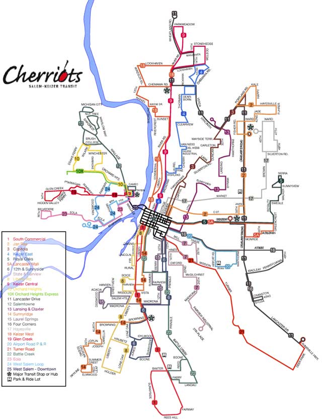
Not too very long ago, one Stumptown-based British expat photo-blogger, name of Major Clanger, was insipred by the anagramming transit maps craze on Boing-Boing. He did a fantastic and absurdly funny mash-up of his own featuring MAX. Some of the station and area names are not just absurd but weirdly appropriate; "City Center" became "Nice Try, Etc." and Hillsboro became "Sob Hill, OR". Go here to view it.
I became insipred to do the same with a couple of more modest arrangements: Salem's Cherriots and Greater Eugene's LTD. In the middle of crafting (in Adobe Illustrator CS2) a duplicate of the extant Cherriots System Map online version, I got a bit sidetracked, however. I may, at a time in the near future, anagram a Cherriots map, but I hit upon something much more fun and mind expanding, at least to me.
Before going on, I'd like to show my work product (at that time) off. I'm rather proud of it. Click at it to look at it bigly;
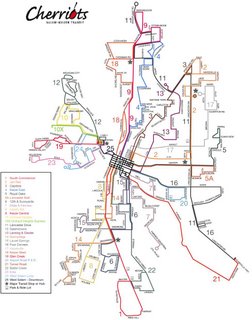 It's a 93K low-quality JPEG that is 975px x 1240px. It should blow up to about an A4 sheet in size.
The aim, in my opinion, of a transit map, is quick communication. It ought to tell you, hopefully at a glance, how you need to use the system to get from where you are to where you want to be. This, IMHO, is its highest function.
What follows is a bit of critique. If the original designer is reading these words then please don't take any negative-seeming words personally; I'm designing to what I think a transit map should do and to my own tastes, governed by my lifelong love of the printed map (and a not-insubstational transit map collection from cities nationwide). The following observations are mine, and mine alone.
The Cherriots system map as extant does its basic job adequately, but I find it personally a bit unstatisfying to look at. The route network hangs in limbo connected to nothing and not at all connecting the viewer to the reality of the area it serves. It includes an absolute minimum of information; the only extra information are a star-in-a-circle (for "Major Transit Stop of Hub"), and a small bus-front view graphic identifying Park & Ride lots (none of which feature any information about the Park & Ride lot)
It seems very much probably the the type in the map is Helvetica Neue. Now, everyone's heard of Helvetica, but I'll bet nobody can point out an example. There's a reason for this: back when it was first released into the wild, in the 60's, it was an exemplar of that design outlook called the "Swiss School". Swiss design of the day seemed to focus on the functional, with an emphasis on clean, no-nonsense form. The face Helvetica appeared and took the world by storm; at the time it was a revolution in type design.
It became so popular, however, that it became ubiquitous, and then overexposed (just like Paris Hilton and Lindsay Lohan). Type carries mood and atmosphere, but when it's all over the place it becomes banal and unremarkable, and the coventional wisdom amongst typographers is that that is just where Helvetica is right now. Subesquently a font called Helvetica Neue was designed which has a little more warmth to it, but the ordinariness of Helvetica still speaks out loud and clear. Check the following illustration:
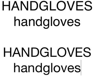 (Top, Helvetica regular; bottom, Helvetica Neue regular, as snapshotted from Apple's Text Edit. The fonts used are the ones I had available on my system at this time)
Close–nearly indistinguishably so. Anyway, and to bring my font-prattling to an end, the point isn't that Helvetica is eeeville, not necessarily anyway. There are fonts that just blare out loudly "I used the defaults on this and dove on in", and thanks to Helvetica's overexposure, despite the continued exisence of the need of such fonts, designers tend to shun it. I have no actual dislike of it, but even I sometimes call it Velveetica Overexposed.
Other typographical sins include a sort of disordered feel to the type, as though it's all jostling with the lines for position. The big, horsey route numbers look like they're out to hunt down the street names. Some street names sit awkwardly alongside the lines they identify, as do the line numbers aforementioned.
Now, some may debate me on this point, and I'll respect that, but it just seems a not-altogther fitting calling card for the transit system of Oregon's second-largest city. The more I looked at it the more the maps for Portland and Eugene's systems came up: polished (though I'm still not entirely thrilled at the new TriMet look it is consistent and carried off professionally). I particularly enjoy LTD's elegant map; they get a lot done with only one color.
It was about this time that I fantasized about how I would redesign the Cherriots system map if I were given the job. I started identifying things I would do differently and decided I ought, in this case, walk my talk. I have a version in work right now in Adobe Illustrator CS2, and over the next few weeks or so, I'll post versions of my work to put the process on display.
Design is a process, which in this case somthing line a "Choose your own adventure" book. I love the process, and I love sharing the process.
06 April 2006
[design_career] Toot! Toot!*: My How-To On QuarkXPress is on CreativePro.com
PreScript: I borrowed Jeff Fisher's horn for this. See bottom of post.
This is a big deal for me:
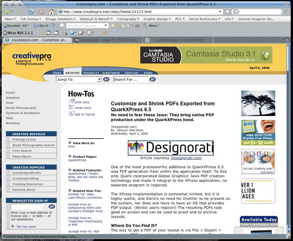
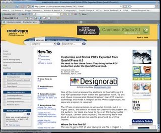 A screenshot of CreativePro.com's featuring of my QuarkXPress 6.5 how-to article on creating PDFs from XPress 6.5. Clickit to see it bigly; go here to read it.
The above graphic is a screenshot of CreativePro.com's homepage, the current featured how-to article. It's mine! The subject is how to go about creating PDFs from QuarkXPress 6.5.
This is a worthy topic. Before XPress 6.x, Quarksters had to either use Adobe Distiller or export the layout as a PostScript file and then feed that to Distiller. If you were using XPress 4.x (which, reputedly, most of the installed base still is) then you were running under Mac OS 9.2 mostly and things worked fairly smoothly (operative word here is fairly). If you were running XPress 4.x or 5.x then you were running in the Mac Classic Enviro and unless you also had a Carbonized version of Acrobat Distiller.
When faced with this challenge, I found the solution for getting a PDF from a QuarkXPress 5.01 layout was to export the layout as an EPS then feed that to Distiller. The resulting PDF was readable. Exhibited wierd behavior, but readable.
The biggest complaint people have about XPress 6.5 PDF exporting is that the Jaws PDF rendering engine (Quark offers you an Adobe-free route to PDFs, BTW) creates bloated PDFs. It does, if you accept the defaults. If you used the "Job Options" tab of the Export Options dialog, however, you can specify image compression options that reduce the size of your PDF drastically.
Drawbacks: QuarkXPress 6.5 can only output PDF version 1.4. It's good for many proof uses and might also be adequate for press, but you don't get the fancy-schmancy PDF/X standards that are becoming fashionable. This looks to be cured by XPress 7, which does support them, but 7 isn't out quite yet. Almost, but not quite yet.
Anyway! Creativepro.com is regularly read by designers nation- (if not world-) wide. It was flattering to have Creativepro ask to publish it, and I'm incredibly pumped to see it up there.
Postscript: as Fisher's Axiom of Self Promotion has it, if I don't toot my own horn, nobody else will.
This is a big deal for me:
 A screenshot of CreativePro.com's featuring of my QuarkXPress 6.5 how-to article on creating PDFs from XPress 6.5. Clickit to see it bigly; go here to read it.
The above graphic is a screenshot of CreativePro.com's homepage, the current featured how-to article. It's mine! The subject is how to go about creating PDFs from QuarkXPress 6.5.
This is a worthy topic. Before XPress 6.x, Quarksters had to either use Adobe Distiller or export the layout as a PostScript file and then feed that to Distiller. If you were using XPress 4.x (which, reputedly, most of the installed base still is) then you were running under Mac OS 9.2 mostly and things worked fairly smoothly (operative word here is fairly). If you were running XPress 4.x or 5.x then you were running in the Mac Classic Enviro and unless you also had a Carbonized version of Acrobat Distiller.
When faced with this challenge, I found the solution for getting a PDF from a QuarkXPress 5.01 layout was to export the layout as an EPS then feed that to Distiller. The resulting PDF was readable. Exhibited wierd behavior, but readable.
The biggest complaint people have about XPress 6.5 PDF exporting is that the Jaws PDF rendering engine (Quark offers you an Adobe-free route to PDFs, BTW) creates bloated PDFs. It does, if you accept the defaults. If you used the "Job Options" tab of the Export Options dialog, however, you can specify image compression options that reduce the size of your PDF drastically.
Drawbacks: QuarkXPress 6.5 can only output PDF version 1.4. It's good for many proof uses and might also be adequate for press, but you don't get the fancy-schmancy PDF/X standards that are becoming fashionable. This looks to be cured by XPress 7, which does support them, but 7 isn't out quite yet. Almost, but not quite yet.
Anyway! Creativepro.com is regularly read by designers nation- (if not world-) wide. It was flattering to have Creativepro ask to publish it, and I'm incredibly pumped to see it up there.
Postscript: as Fisher's Axiom of Self Promotion has it, if I don't toot my own horn, nobody else will.
[net_life] The BlogPatrol Report
Just a few funny search terms taken completely out of context. Remember these are simply search strings, lifted without respect to the author's intentions (as though we could find that out anyway...).
Quark Express Public Beta Password
yanni beating
Quark Express Public Beta Password
You're joking, right? You get it by signing up. It's free! And the Public Beta will go dead on you on 3 May anyway. Jeebus but I swear, if you're Googling for passwords for a free time-limited application you really are scraping the bottom of the barrel. I mean what's next–looking for a h4X0rific way of getting into your own Yahoo! email? Hey, while you're at it, I've heard of this 1337-o-licious place called Myspace.com. Invitation only, but we'll see what we can do for you, you scamp.Hillsboro's population in 80's
Big hair and Duran Duran LP's, just like everywhere else, I mean, GOSH!idaho falls bel air subdivision
...and if you thought that was fabulous, just wait 'till you see what Idaho does to Beverly. Hills, that is; swimmin' pools. Movie stars.
yanni beating
Some would say that's a good start. Actually it's part of a new show on FOX, tentatively titled When Audiences Attack. What happened to John Tesh wasn't pretty. Remember, loves, it's all fun and games until someone gets hurt; after that, it's just fun.no meaning text FPO
Yes meaning text FPO, it be meaning "for position only". Good grief but I hate having to get out the big crayon..."Tom Peterson's" and Portland
...go together like pie and coffee. You want that haircut? You can't handle that haircut!QuarkXPress 7 public beta 2 DOWNLOAD
Well, maybe it would if you wouldn't yell at it. And use a computer. And regardless of what you saw Scotty do in Star Trek:Save the Whales, that isn't a microphone, it's a mouse.
05 April 2006
[design] Quark: At Least We're All On The Same Page Now
This morning I recieved in my e-mail a notification from Quark, Inc. to announce that the Public Beta 2 of QuarkXPress 7 was available for download.
This, of course, was after I had actually downloaded the 116MB file.
On dialup.
56K dialup.
It took three days.
(On and off, of course)
And a couple of days after I wrote something up here about it.
Thanks, fellas.
FWIW, the Public Beta is set to time-bomb on 2 May 2006. This was one day after I had heard earlier. And, the buzz is that QXP7 will at long last be released sometime during late May, but I'm holding officially publishing something on that on either Designorati. com or QuarkVsInDesign.com until either a)Pariah finds out solid info about it first or b)I can get some sort of confirmation on it myself.
My money's on Pariah, of course.
[Address_Nerd] The Outer Limits of SE Francis Street
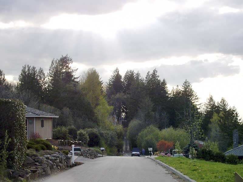
 Dig, if you will, this picture. Also, if y'all'd be so kind, please get out the Guide of Thomas, and open it to page 630, and turn your attention to grid E3.
You there? Good.
One of the interesting things of streets in Greater Portland is that you'll find extensions of streets that emanate from the main part of Portland, whose structure sets the address and street pattern for the greater part of the three counties of Multnomah, Washington, and Clackamas. This picture depicts what I think is the farthest reach of any street from its base: SE Francis Street at about the 34600 block. You get there by going out to Oxbow Park; follow the signs all the way out past Gresham on SE (then NW, then NE, then SE again but it's a "Drive" after that) Division Street.
It's a beautiful wooded area, going down into a dale, and it feels like its about a million miles away from anywhere else (just like the prices on the sumptuous houses in the area...but I digress). It may indeed be possible that the street should just so happen to have that name, but a rather detailed examination of the maps in my collection shows that this bit of road very nearly lines up with the parts within the Portland corprorate demesne, or near enough that any other alignment would result in a similar name. Also the addresses of what few houses were in that area on Oxbow Parkway (a n-s street) were in the 3800-3900 range, which corresponds to where Francis crosses inside the city.
As far as I can see, this is the one street name which extends farthest out from the Portland base than any other (nearest other I can find is SW Vermont Street west of SW 209th Avenue in Washington County–check it out–this lines up even better than this does).
And what kind of landscape does one find out there? Tranquil. Almost fit for a Bob Ross painting:
 SE Francis Street looking west from SE Oxbow Parkway. The speed is rated 25 MPH, but I dare anyone without an ORV to try even that fast.
04 April 2006
[design] Setting up QuarkXPress 7 Public Beta 2
 Well, I did finally get QuarkXPress 7 public beta 2 downloaded and installed. It's looking slicker than beta 1 (check the Mac OS X doc icon and the file icon illustrated).
There's one thing you must be aware of. Your copy of the public beta will likely crash when launched. If this happens, try two things:
- The old standby: trash preferences.
- If 7 won't run after this, this is because XPress needs a "Preferences" folder to exist inside the application's home folder and the installer, for some reason, does not create it. Create a folder called "Preferences" in the QuarkXPress 7.0 application folder, and it should start up just fine.
 Just one other remark for now: I just lurve that new file icon (.QXP). I'm getting a strong resonance with the old Mac OS 9 .QXP file icon here. I don't know how 7 will fly once it takes off, but someone over at Quark is finally paying attention to the style.
01 April 2006
[design] Quark: Of Logos and XPress 7 public betas
 Fault Quark, Inc. for many things, but dont fault them for not getting busy when they absolutely have to.
The Winter of the Logo's Discontent
Some months ago, it happened, Quark finally brought to the public a redesign that was long in coming. Discarding the old familiar water lily in favor of a dressed down and modernistic majuscule Q, in Pantone 386 (renamed by Pantone "Quark Green"). It looked like a good move.
In nearly no time at all, though, the digital design community took it apart. Evenutally, rather far from appearing the canny move it was intended to be, it began to look like the biggest self-inflicted PR bruise Quark delivered itself since the Hardworking Clown/Valor Cross Media affair of October 2004.
Like or hate Quark, like or hate XPress, I don't see how any thinking person could have drawn the conclusion that the Quark PR machine was The Gang Who Couldn't Shoot Straight. I'm still scratching my head of the Hardworking Clown.
But Quark, no stranger to rising from the ashes, has come back with a new new logo. Welcome to the New Quark V2.0. Instead of an abstract shape (which some tend to confuse with a lowercase "a") we have a new badge which, in its full aspect (shown here) would look just as in place on the bonnet of a luxury car as it would on a software package.
 Personally, I'm a fan of this go. The flat version (just the Pantone 386, no bevelling or lens flare) stands very well on its own and is an apt substitute with what they had before.
Just as with the Novermber 2005 logo, though, Quark has no shortage of ready critcism, but on style points this time. Commentary I've seen on the design cites the use of bevelling as being "amateurish" and the tiny lens flares looking like dropped pixels.
These of course are valid calls; they are indeed weaknesses that I wonder would have gotten past my community college instructors. The redesign is, I think, sound however (maybe they should have just come out with the flat version). It has a lot more going for it than against it, but living as it does in the wake of the rather embarrassing November 2006 identity rollout, it has to live that down just as QuarkXPress 7 has to live down the reputation of a company that claims it's found customer service religion.
You, Too, Can Get A Look at the Future of Quark
Another notable development in the Quarkiverse is the release of QuarkXPress 7 Public Beta 2.
At about the end of February, Quark announced somehing that the digital design community ha been waiting for, it seemed, almost since the beginning of time; the first betas of XPress 7 was not only released, but it was released to the general public. I've played with it and noted my reactions not only here but also on Designorati.
Long story short: I'm pleased with it, but it won't be the InDesign beater than some may hope for. But it will keep XPress in the game; for those who like this sort of thing, it should be just the sort of thing they like.
The first Public Beta was time-bombed; if you still have it on your system, it won't work now. Quark has, however posted the Public Beta 2, and it's a free download, but time-bombed to expire on 1 May. Still, it's a good idea to get your beak into this one if you're and InDesignista and wonder what you'll be missing, A Quarkster wondering if it'll be worth getting excited about, or just someone who wonders what the hell all this electronic layout brouhaha is all about anyway. Anyone with an interest can download the 116MB beta.
You can read about the program and sign up to play at Quark's site here.
Subscribe to:
Posts (Atom)