30 January 2010

[pdx] Presenting The César E Chávez Blvd Blades (with Bonus Beech Street)

2312.As I mentioned yesterday, I was going to have César E Chávez Blvd blades for posting today. And I do try to live up to my promises. Here we go.

The unveiling and a ceremony happened in front of the Central Christian Church, 1844 SE César E Chávez Blvd, at the cross street of SE Stephens Street. Across the street is another church, the Temple of Praise, and nothing against the Central Christian Church, but it made a much more attractive backdrop (and it was easier to lens the pics from the former's parking lot, actually …)


The new Blades are the recently-evolved Type 3's, and the same sensitivity to leading, kerning, and tracking are evident. That's still a good looking Clearview sign, dang it!


The type is the right size, easy to read, aware of its baselines, and the generic and the block index align very nicely. This is a tightly-designed piece.


The signs will co-exist on SE 39th Avenue for the next five years, as per standard PDX practice. The buzz I heard (I thought it was via Mayor Sam's twitter stream, but I'm wrong, it seems) is that they'll come down and be sold or auctioned off for charity's sake. I'll look for confirmation of that.

Despite the ballyhoo of the signs being installed "from Hollywood to Hawthorne", they were only installed at one place each in Hollywood and Hawthorne. The above is Hawthorne's intstallation. The following two are from the so-far sole Hollywood installation, the overheads at the Broadway/Sandy/39th plenum, just north of the Banfield Freeway:


This is the overhead looking west on NE Broadway from CEC. Yet another evolution for Portland street blades: The overhead blade looks like the car-level blade – note the formatting of the generic and the block index, and the directional:


A very high-information sign, indeed. If you go south on NE 37th Avenue, just a couple blocks west, and approach the traffic distrbutor that encourages you to choose either Halsey Street eastbound or CEC soutbound, you'll now notice the directional sign points to César E Chávez Blvd South, and they're all in Clearview now.

Yes, I luves Clearview. Sosumi. I'm a type obsessive as well as a street blade obsessive.

Moreover, the inclusion of the accute accents impart a definited sense of sophistication. One of the things I regret about English is no diacritics, no umlauts, no accents. Well, just write about CEC Blvd, and you have them (Fellow sign obsessive Ben Lukoff also reacted positively, and he, too, has a good eye).

Oh, yes, the bonus: the Type 3s are up at the corner of NE 57th Ave and Beech Street, too:


Actually, this is along the side of 57th along the cemetery fence, but you can't miss it. An embarrassment of riches today, for sure – history no matter which way you look at it, and attractive, grown-up-city street blades slowly but surely populating the best city in the world … my home, Portland, in the state of my birth, Oregon.

O yea.

Technorati Tags: , , , , , , , , , ,

29 January 2010

[liff] Gang Aft Agley - César E. Chávez Blvd Pix To Come Tomorrow

2311.As I tweeted and announced on @SJPKDX and facebook.com/samueljohnklein earlier today:

They're hanging the first Cesar E. Chavez Blvd sign today, at the corner of CEC/39th and SE Stephens Street in Portland. I'm planning on being there with a camera to get the first pictures on line - if possible.

As it turned out, not possible. Such is the gentle tyranny of having a third-shift job in 10-hour shifts. I did get straight home, straight to bed, and didn't wake up until after 1 pm. Sic transit gloria.

But I did get a report from KGW-TV to share with y'alls. Here it is:


It gives you a good idea of what the overhead signs look like, and they most likely look a great deal like the street-level blades.

Of particular and delightful interest is the accent marks over the vowels e in César and a in Chávez. In Spanish, these indicate which syllable is to be stressed and, I understand, only occurs over the vowel. Presumably, this is why we pronounce the name SAY-sar SHA-vez instead of say-SAR cha-VEZ. What's delightful about it is that, as Ben from Seattle tweeted at me, they don't have those on Seattle's street blades – and I've always felt Seattle's were a bit more sophisticated than Portland's.

Well, that's the genius of Clearview. FHWA sign fonts apparently don't have this standard.

I better stop writing or I'll have nothing to accompany the pix with. Tomorrow morning, when I'm on my way home from that third-shift job, I'll trip on down to 39th/CEC Blvd and get some pics for the files which I will perforce share here, and the taking of which will be unencumbered by having to rush through Friday traffic and not getting enough shut-eye.

Technorati Tags: , , , ,

28 January 2010

[design] Redwood City CA: Funny, Slightly Sarcastic Speed Limit Signs

2310.Redwood City, California, understands one thing about delivering a message: if you do it with humor, people will more likely remember the message. On the streets of Redwood City, then, observe that this municipality likes to remind you that there are such things as speed limits with a message delivered on wry:


Yeah. C'mon, big boy, it'll still be there when you get there. Get on your big-boy pants and obey the rules.

And if you still want to speed, remember, you'll just get scheduled for traffic school on a weekend day you'd rather be somewhere else:


Are we getting through to you yet?

Thanks for the smiles and the photos to my SF Bay Area Semiotics Bureau Chief, Sharon K.

Technorati Tags: , , ,

27 January 2010

[type] Free Font – An Homage To M.C.Escher

2309.
One of the people who use the free web font maker Fontstruct have come up with a nifty thing, a font which is an homage to M.C. Escher and the Penrose Triangle:


Pretty cool, I think.

FontStruct is a free web-based app which allows you to use a tile-based interface to make your very own fonts, which can be downloaded as TrueType and shared for free. I've used it and it's fun; I heartily recommend it to all you budding Gutenbergs and Alduses out there.

Bookmark http://www.fontstruct.com, will you?

Technorati Tags: , , ,

26 January 2010

[logo] An Update To The Channel Surfing Series-WPHT Channel 8

2309.I'm pretty happy to announce a donation to the gallery I did sometime back called "Channel Surfing", where I gathered a great number of TV station logos (which I adore) and commented on them.

This is an addition to the Eights, and comes to me from Matt Locker, via email. He described it thus:

I saw your collection of "Channel 8's" - here's another.  WPHT was a cable-only on campus commercial station on the Campus of William paterson College.
 
PHT stood for Pioneer, Heritage, Towers ...the names of the dorms...

Since WPHT wasn't a broadcast channel, I'm intrigued that they took an approach like this, but in the library there are quite a few cable channels that adopt the broadcast logo look, so it's hardly unprecedented. Here's what Channel 8-WPHT's logo, based at William Paterson College (now William Paterson University) in Wayne NJ, looked like:


Nice looking logo! Tightly-designed, all parts of the logo - the letter forms and the digit - look good together and harmonize. Gets, as I like to say, the job done. What I especially enjoy is that the letterforms look as thout they were designed to to the digit. Overall, the whole thing looks as though it were from the school of visual thought that gave birth to the KGW logo from about 1976-1978 or so.

Thanks, Matt! And, hey, I guess I accept submissions to the gallery, so if anyone has anything interesting they'd like to share, heck ... send it along! Clicking "Blog Contact" in the header image will do it for you.

Technorati Tags: , , ,

[liff] You See, This Is Why We Can't Have Nice Things

2308.Some people take Monday to unnecessary extremes:
On Friday afternoon a woman taking an adult education class at the Metropolitan Museum of Art accidentally lost her balance and fell into “The Actor,” right, a rare Rose Period Picasso, tearing the canvas about six inches along its lower right-hand corner.
Good news – the damage is repairable. It's not like she stumbled through the middle of the painting. Bad news – she still goes down in history as That Woman Who Tripped And Holed A Picasso™.

At least I get through my Mondays without damaging world treasures. Countin' my blessin's.

(via Just Out blog)

Technorati Tags: , , ,

24 January 2010

[Address_Nerd] Seeking Cesar E Chavez Blvd

2307.I've been keeping a keen eye out for the blades going up to begin the evolution over on 39th Avenue to remake it over to SE/NE Cesar E Chavez Blvd.

Whether you like it or now, it's going to be part of city history now. The warp and the woof.

You know what would be keener than the eye I'm keeping out for them? If I could somehow be the first Portlander to get a picture of the first new CECB blade going up. I heard there was one over by SE 39th and Belmont or Taylor or somesuch, but no joy there.

Anybody know?

Anybody heard anything?

Just saying.

Just -ah- throwin' that one out there.

Technorati Tags: , , , ,

[Address_Nerd] New Portland Street Blades Evolve, and More Clearview Type

2306.We haven't had the chance to go on sign safari for a long time, the only explanation being It's Complicated. But we finally have bagged some big game, and I'm actually delighted to say that the design of the next generation of Portland street blades is evolving in attractive and designerly ways that can only imbue the heart of an Address Nerd with glee.

I first saw this example of design at the corner of E Burnside and SE 103rd Avenue, in the Russellville area of outer eastside Portland. But I'm getting ahead of myself. The first chance I got to actually snap a picture is here, and E Burnside and NE 68th Avenue, which is just down from the brow of the hill where you shunt off Burnside via SE Gilham Avenue to get to Thorburn Street and downtown Montavilla:


This blade is on the south side of E Burnside; the blade reads NE 68th Av because the street only extends north of Burnside at that point. A close look at both blades reveals a designerly concept known as hierarchy at work:


Note the directional and the generic are the same size and weight. The specific ("Burnside") stands out; if you're glancing at any speed, you'll take in that you're on Burnside in a flash.


Same as the named-blade, the numbered blade shows the same sense of hierarchy. Note also that on both blades the baseline is shared between the big letterforms and the small letterforms – and the ordinal, the "th" on 68th, now is rid of the awkward capital letter we saw on the sign at SE 47th and Hawthorne Blvd. Compare:


Also, the letterspacing overall is exactly what it should be – everything lives comfortably on the blade, nothing's crowding yet everything has room to breath. Likey? You bet! Notice also the lack of a white margin all around. I liked the white margin at first, but the lack of same is actually an improvement.

I'm really starting to hope the blades are evolving in that direction.

Also sighted: This set at NE 42nd and Halsey, directly across from the TriMet Hollywood Transit Center/MAX station, and on the same block as the Hollywood Trader Joe's Market:


We now have a very clear idea of how the blade sets will look when mounted as a corner assembly. Particularly attractive is the way the block face number now lives comfortably in the area above the street generic abbreviation – on the previous blade versions the block number sat in the upper left corner, awkwardly and a bit uncomfortably – as above, the letterspacing and leading is immaculate and exactly appropriate.

It's not just the street blades that are getting the Clearview treatment. Directional signs that have sprung up around the Hollywood business district also use it. Here's one directly adjacent to the above blades:


That's Clearview there, spelling out the name Tillamook St. The harm to letterspacing for letterforms this big is pair-to-pair kerning, and I can find little fault with the job done here. Someone's really paying strict attention, and bravo!

Another thing you'll find in the Hollywood district is new signs directing you to the Banfield Freeway from the north side. These too are in Clearview, but the font is all caps (words like EAST, WEST, above the I-84 shield on the overhead signs coming down from Sandy Blvd) so it might not be immediately evident, but the trained eye will see. I was unable to get a snap this time around, but we'll return there maybe soon.

Finally to cap all this off, is the place I first saw the new evolution. SE 103rd Avenue and East Burnside anchor a new development which is part of the old Russellville nabe. You have to be going eastbound on Burnside to see this. as east of East 99th Avenue, you have the MAX making this old road a necessarily divided highway, but as can probably be seen from the eastbound E 102nd Avenue MAX platform, is this:


Naturally, that caught my attention immeds, for being both the same and different from the street blades we've been assaying for the past half year (or longer?). Here's the one for 103rd Avenue:


And here's the one for E. Burnside Street. Nota Bene the block face in the upper right corner here: it's the numeral 1.


Burnside Street, as nobody needs be told, is the address baseline; going east and west from the Willamette River's origin, the lowest possible addresses on crossing avenues will be found here, and the block index is the lowest address possible on the block you're leaving (or entering, depending on the direction of travel). We note that the blade for Burnside at NE 68th Ave actually has no block index, and my guess is that since it's on the south side of the street and 68th does not have a block at that point, you wont be leaving or entering any block at that point (at least without major damage to your car, major dismay on the part of a property owner, and a significant divot in the side of Mount Tabor). By this logic, I'd expect the blade on the north side of NE 68th and E Burnside to have a "1" on the corner of the Burnside blade – when it does finally go up, of course.

A particularly good day to be an Address Nerd, as well as a typographer. We feel fulfilled.

Technorati Tags: , , , , , , , ,

[ad design] YaVaughnie Williams and Charles Phillips: Inappropriate Subject, Appropriate Design

2305.High-flying people have high-flying appetites, as they say. When Oracle co-supremo Charles Phillips flew, he flew high, and he had a girl on the side, as they also say. Taking revenge, for some people, is an act of art as well as design.

The art part, the part that will be remembered, emerged when the melodically-named YaVaughnie Williams decided to take revenge on her ex-beau (with whom she waged an 8.5-year-long extramarital affair, as reported by the New York Daily News) by paying for three-storey-high billboards in New York's Times Square, Atlanta, and San Francisco with a very compelling romantic message (Image right screenclipped from the Daily News article).

The point I'm driving at is, in the midst of all this sordidness, the design of the ad is actually quite solid. The flowing script type is romantic in its own way, and when coupled (sorry) with the image of a happy pair embracing, the descender on the g dipping below and behind the line of the lady's head and linking them inextricably, the message of carefree, passionate romance is powerfully sent. The tagline You Are My Soulmate Forever - cep is just so much icing on the cake.

Charles and YaVaughnie's relationship may be in shambles, but that designer deserves to be art-directing somewhere.

Why YaVaughnie felt compelled to throw down big coin to humiliate her ex so remains unclear at press time.

Technorati Tags: , , , ,

21 January 2010

[type] There Seems To Be No Such Thing As A Beautiful Shorthand

2305.I have certain requirements for my handwriting, no matter what mode it is; alphabetic, syllabaric, whatever. I also have a penchant for diary writing - actual diary writing, not public blogging (though I love this too, obviously).

Diarising fiend that I am, I find that, maybe I get lazy or something, but the chance write, put pen to paper, doesn't present itself as much as I'd like. Or maybe I'm too picky about my surroundings, or maybe I just approach it the wrong way sometimes.

Occasionally it occurs to me that I'd get more down and have more fun using a shorthand. Many of the great figures in literature, I find, used shorthand (George Bernard Shaw used Pitman). So, I think, now and again, the acquisition of a shorthand skill would be good. Problem: All the shorthand systems in the world I find ugly.

Here, sourced from Wikipedia, is The Lord's Prayer, written in the Pitman shorthand system:


Now, understand clearly that the following is meant as no reflection on the proclivities, preferences, or talents of the scribe who produced the above, but; ugh. Not beautiful. Not even pretty.

But what about the other major popular system, Gregg shorthand? Well, here's The Lord's Prayer in Gregg:


Better, but not by much. I find the presence of harmonious curves and a certain slant rather appealing, but not enough to commend.

Another thing that should be clearly understood is that I'm not judging each system on technical worth or efficiency; if you want to dash down a thought in a split-second, shorthand – developed for a time when court reporters had to do everything by hand – is just the thing. They accomplish thier goal by using coded strokes to map to sounds rather than letters to form phonetic bits. Aesthetically, though, these both leave colder than cold. And, moreover, say I do learn one of these systems, but fall away from using them. Decades later, am I going to have to carry about a key to remind myself what it was I wrote?

Some have devised their own shorthand, and I may or may not be that bright, but what good is a shorthand that will lock its secrets away with the absence of the owner?

A shorthand system may be something I'd use … but as for now, the search for such a thing continues. As for now, the plain old Latin alphabet will have to suffice.

Technorati Tags: , , , , ,

20 January 2010

[logo] LOGO DESIGN EPIC FAIL: Anti-Piracy Agency Uses Pirated Font In Logo

2304.In Britain you have the Digital Economy Act, in America, the  Millennium Copyright Act, and, in France, the High Authority Promoting the Distribution and Protection of Creative Works on the Internet, or, as the Frenchies say, the Haute Autorité pour la Diffusion des Œuvres et la Protection des Droits sur Internet.

Of course, a mouthful like that deserves an initialism, and this one's is Hadopi, as is the name of the agency charged with the administration of same. Here, via The Font Feed, is Hadopi's logo:


Now, in my opinion, that's pretty well-done. the idea of rights-protection is driven home with the d and the p embracing and protecting the o (which, it will be recalled, stands for the French word for "works", which we 'Merikins somewhat incorrectly spell oeuvre.

Now, if you were wanting to come up with an ironic twist on this, how would you work that into the plot?

I bet you're ahead of me on this one (especially provided you read the title of this). As it turned out, the designer charged with creating a logo for the French agency charged with imposing fines for people ripping off works from creators … ripped off the font. Specifically, the font used, Bienvenue, is the exclusive bespoke font – for France Télécom.

"Bespoke" as in "exclusively reserved for France Télécom's use, and only their use, and not to be released to the general public or, in fact, anybody".

Awkward. Not full of win.

The Font Feed has all the content you'd want on this one at http://fontfeed.com/archives/french-anti-piracy-organisation-uses-pirated-font-in-ownlogo/.

Hate it when that happens. Just goes to show how hard due diligence is sometimes (giving the benefit of the doubt there).

 Technorati Tags: , , , ,

[pdx] I Now Have A Tom Peterson Watch. It Is Overflowing With Win.

2303.I have, over the course of this chronicle, demonstrated at  a perennial affection for things Tom Peterson.

I really can't explain it. Maybe I just regret missing out. Despite living in Portland for a very long time now and being an Oregon native I never managed to make it over there, and Tom sure did define late-night kitschy advertising for Channel 12 (KPTV).

I've longed for examples of TP giveaway kitsch that I could call my very own. The big, smiling face of Tom is, as I've pointed out; iconic – it graced walls in PDX for many a year as a guerrilla stencil, and even made it into a comic book. But the real thing about having a bit of TP is the giveaways – the alarm clock, the coffee mug, the wristwatch.

Well, it's my thrilled whilst humble opportunity to announce to the world that, when it comes to a Tom Peterson watch – I haz it:


The Tom Peterson Watch. It tells you the time. It doesn't tell you the date; it doesn't have to. It won't chime on the hour – it doesn't need to show off.

What about alarms?

Where we're going … we don't need alarms.

It tells you what time it is, bucko. If you can't handle the rest, then, sorry, you just aren't good enough for the Tom Peterson watch. It has so much win, the Yes watch (which I still lust for) bows down with respect – and not just a little awe.

Because no matter what watch you have and what it does or doesn't do, it sure-as-shootin' don't do it with the incomparable style that the Tom Peterson visage rather naturally imbues to the process.

Now in all seriousness, the above may sound off with a studied irony but I really am thrilled and happy to have this watch. I actually do have a deep affection for Petersoniana, it's entirely sincere, and one of my dreams has been to own this watch (or at least a Tom'n'Gloria version), and I have one now, for real and for sure and I'm going to have some fun with it.

The story behind getting it is a rather touching one, actually, and I'll try to tell it respectfully. Very recently, a very sweet woman out in Clackamas lost her loved one. And that fellow owned this watch. Working out what to do with it, she Googled about the watch and found my blog postings about it, and finding that I was the sort of person who would value it for the awesomeness it contained, asked if I would wish to have it, and naturally I said that I would.

So, this started out as Charlie's watch. When Lorraine met me and The Wife™, she opined that I looked like the kind of person who would want to wear such a watch, which, for me, stands as a very high compliment.

It comes with something of an obligation. I'd like to take this watch on an adventure, but I don't quite know what sort of adventure to go on; with meagre means, our adventures don't range too far. But I'll figure out something, because I owe a debt of gratitude, if nothing else, for Lorraine's being so excellent. But there is one thing that me and Charlie had in common, sorta-kinda … he was a musician, and I aspire to be one, even if occasionally and with the bass guitar. So, maybe that's a point of departure there.

I'll keep everyone posted, of course. And, Lorraine, if you Google or drop by here … the watch works like a charm. It's one sweet timepiece, I'll tell you that sincerely.

Technorati Tags: , , , , ,

18 January 2010

[liff] My Musical Goal This Year: 5 Memorized Bass Lines

2301.One goal I have this year is to learn how to play my bass guitar and commit to memory five bass lines. It's not a maximum, and it's not necessarily a minimum, but it's a target. Here are the five, not necessarily in order, but in countdown format.

<Kasey Casem Voice>

At number five on the countdown, this Scottish troubadour formerly of the band "Stealer's Wheel" scored an iconic hit with "Baker Street" from the same album. Here, at number five, is Gerry Rafferty with an underappreciated gem from the amazing 1978 album City To City, and "Home And Dry".


Now, clocking in at number four, this California-based singer/songwriter would go on to movie soundtrack megastardom, but at the time, he was still coming up from his long and famous association with fellow folk-rock artist Jim Messina. That's right, it's Kenny Loggins with his 1979 charter from the similarly-titled album, "Keep the Fire".


At number three, with two left on the way to number one, is a song made famous by a America's first fictional family of song between the years 1970-1974. It's The Partridge Family, with "I Think I Love You":


Now we're at Number Two, and we go modern for this song. He started out as in a punk band as a drummer, became a comic, and now dominates the late-night talk show stage. It's Craig Ferguson with "The Late Late Show Theme".


And at last we come to Number one. This band hailed from Sidney, Australia, and even though they hit it big with one song and might seem a one-hit wonder to us jaded Americans, they were hugely popular in their native Great Southern Land, releasing a string of popular albums. But, to break into the American market, they enlisted the help of John Oates (of Hall and Oates) and crashed the charts – Here, at number one, is Icehouse, from the album Man of Colours, with "Electric Blue".


And that's the countdown. I'll be trying to memorize the bass lines of each of the above songs, which in a way are the soundtrack of a life.

So, keep your feet on the ground … and keep reaching for the stars.
</Kasey Casem Voice>

Technorati Tags: , ,

[web design] This Trend Must Still Die Screaming – Banner Ads With Odd Photos

2300.The dumb banner-ads from LowerMyBills.com have always irritated. They take us for reacting-engines with all the restraint of Pavlov's dogs. And I've got to say here that, despite the worn-til-shiny witticism that "there is no such thing as bad publicity", sometimes, bad publicity is still bad. So in this case, talking about them is not the same as giving them air (at least, not with this blog's readership).

Here's the latest travesty. I ignored it for as long as I could but I can't ignore it no more:


Here's the photo:


Whiskey Tango Froxtot, dudes? I mean, you've tortured me with pictures of very handsome African-Americans and the caption "Obama wants Moms to Go Back To School", but I … I just don't get this. Who is that? Patty Hearst during her Tania/SLA days with facial hair? Your CEO after a bender? Joaquin Phoenix after a bender? What?

The thing about clever ads is that the clever wears off after a while. The banner ads with odd animated pictures, dancing silhouettes, and tattoos were entertaining for a while, but this horse has pretty much been ridden to death.

Clever ads are nice, but nothing but a diet of them is like a steady diet of Key lime pie … heaven for a while, but before long, if you don't get hold of a saltine cracker, you're going to puke. Past that point, advertisers are just yanking you. And not in the good way.

I'm feeling like a "yankee" right about now.

Technorati Tags: , , ,

14 January 2010

[liff] For Sale On Los Angeles Craigslist: One Talk Show. Slightly Used. Room For A Futon. Make Offer!

2299.(via Fatboy Roberts on Twitter) You just never know what'll pop up on Craigslist these days.

This slightly-used late night talk show boasts a band that can be sold seperately – but you'll have to honor the Barry Manilow booking next week:


This is a chance of a lifetime to own your very own late night talk show--guaranteed to last for up to seven months!! Really must see to appreciate.

Information for potential buyers:

- Measures 100’ x 100’ x 32’ – plenty of room for a futon!

- Designed for 11:35 but can be easily moved

- Band can be sold separately

- Buyer must honor Barry Manilow booking next Thursday

MAKE ME YOUR BEST OFFER!!!!! (Also willing to trade for Coldplay tickets.)

    * Location: Universal Studios
    * it's NOT ok to contact this poster with services or other commercial interests
View it at http://losangeles.craigslist.org/sfv/clt/1551463643.html while the viewings good.


[type] A Free Font For Today: Nevis

2299.Nevis is a free font by Bournemouth, England web designer Ed Merritt that seems to recall famously British typefaces like the famous Johnston (the London Underground font). It's a good, strong, modern sans-serif that is good for clean, structured layouts where readability is important, that also projects a kind of dressed-down modernity.

Although I bet if you grunged-it-up for adventure's sake, it'd look pretty good too.


Specimen diagram copyright Ed Merritt

Judging by the illustration, I'm imagining it was named for Ben Nevis – a Scottish mountain which is the highest point in the British Isles.

Oh, yeah, you'd wat to download it. Here you go: http://www.tenbytwenty.com/products/typefaces/nevis.

Technorati Tags: , , ,

[photoshop] Into The Blending Modes With Gun And Camera, Part 2: The Contrast Modes

2298.In the last missive in this series, we reviewed the top three groups on Photoshop's layer blending modes list: Normal (Normal and Dissolve), Darken (Darken, Multiply, Color Burn, and Linear Burn), and Lighten (Lighten, Screen, Color Dodge, and Linear Dodge).

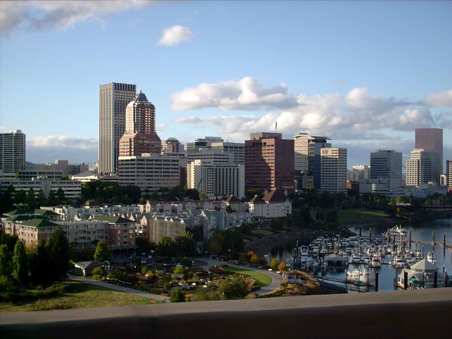
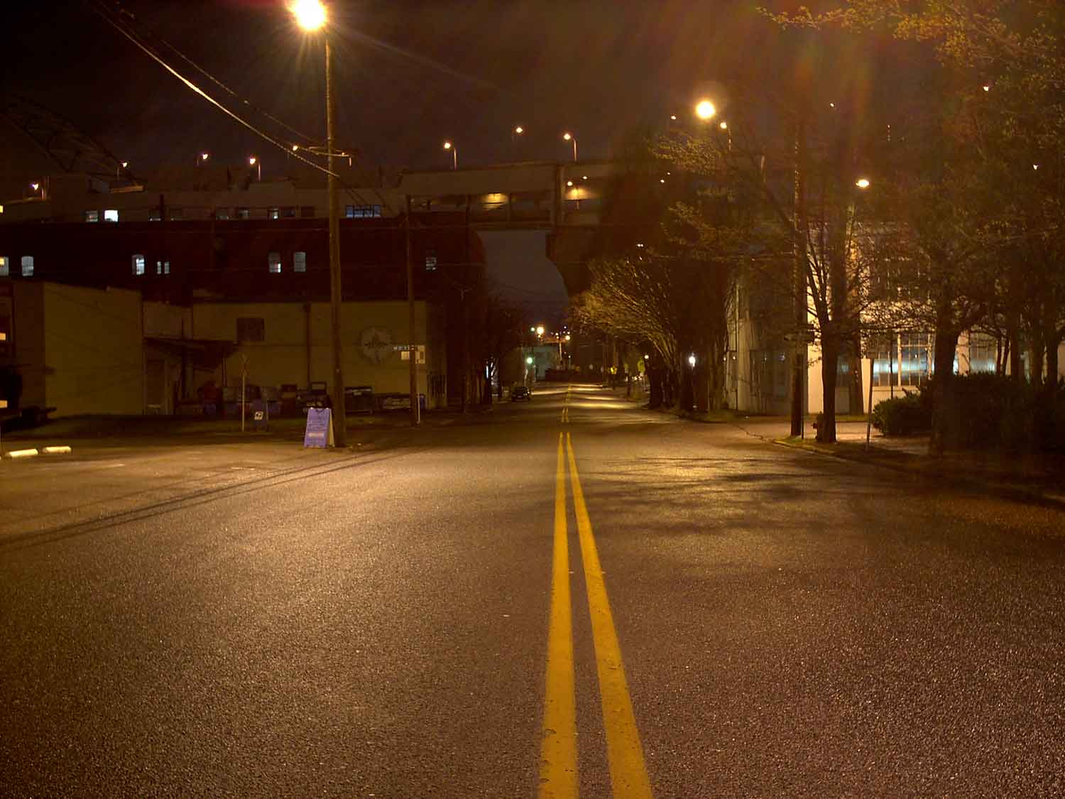
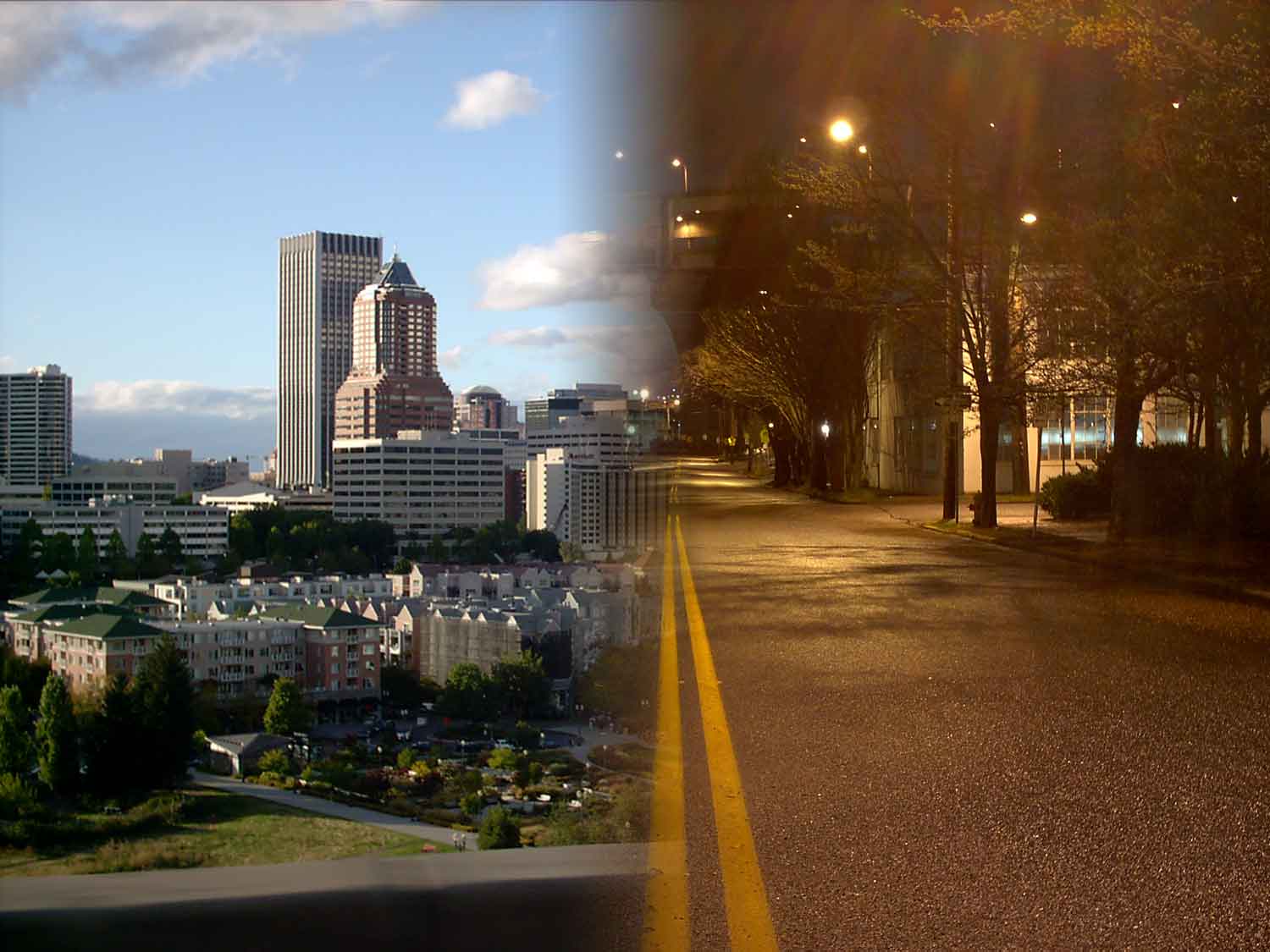
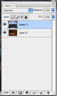
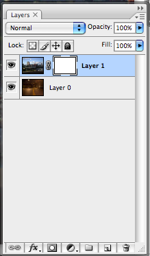
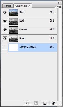
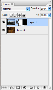
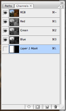
The section after this, comprising seven modes starting with Overlay and ending in Hard Mix, are known as the Contrast modes, because the modes cause colors in the base and/or blend layer to darken or lighten, thus increasing the contrast. The measuring point is the value of the blend layer or color; usually here, lightening happens in some way if the blend is brighter than 50% gray, and darkening happens if they blend is darker than 50% gray. The principal difference between the modes seems to be how each accomplishes that.
  • The first mode, Overlay, allows the upper layer (blend layer) to overlay the lower layer (base layer), multiplying or screening the color depending on the base layer. This has the effect of maintaining the highlights and shadows of the base layer. According to Photoshop Help, the base color is not replaced but mixed with the base color to reflect the lightness or darkness of the base color.
  • Soft Light makes the blend layer kind of behave as a light source. The color is lightened or darkened depending on the blend layer. As a result, the image looks as though you're shining a soft spotlight on it. From Photoshop Help: If the blend color (light source) is lighter than 50% gray, the image is lightened as if it were dodged. If the blend color is darker than 50% gray, the image is darkened as if it were burned in. Painting with pure black or white produces a distinctly darker or lighter area, but does not result in pure black or white.
  • Hard Light works differently, of course; whereas the Soft Light blend lightens or darkens, Hard light multiplies or screens the color, depending on the blend layer. The effect is as though you're shining a harsh spotlight on the image. If the blend is lighter than 50% gray, it's lightened as though screened; if the blend is darker, it's darkened as though multiplied. This is useful for adding shadows to an image. Painting with black or white results in pure black or white.
  • Vivid Light burns or dodges the images by increasing or decreasing the brightness, depending on the blend layer. Blends (the light source) brighter than 50% gray result in a lightening of the image by decreasing the contrast, and darker than 50% gray are darkened by increasing the contrast.
  • Linear Light works as Linear Light does, but where Vivid darkens or lightens the image by changing the contrast depending on the blend, Linear Light darkens or lightens image by changing the brightness depending on the blend. Again, the cutoff is at 50% gray.
  • Pin Light actually replaces the colors, depending on the blend color. If the blend layer is lighter than 50% gray, pixels that are darker than the blend are replace where those lighter are left alone. If the blend is darker than 50%, the lighter pixels are the ones that are replaced.
  • Hard Mix is the most radical of this group. Remember that the RGB digital values can range from 0 to 255. Hard Mix adds the RGB channel values of the blend layer to the base layer; if the channel result is greater than 255, then that channel is set to 255; if it's less, the channel is set to 0. As a result, all pixels are changed to primary colors: red, green blue, cyan, yellow, magenta, white, or black.
These blending modes are a little hard to explain; I depended on Photoshop Help and tried to rephrase them a little better, with alternative success. Now, one can begin to see why a lot of Photoshoppers it's a process of trial and error.

In the next chapter of this exploration, I'll try and increase my own understanding of this by actually blending layers and examinging the results; along the way, we'll get to the next group, the Comparison modes, comprising Difference and Exclusion, and try to make some sense out of those.

Technorati Tags: , , ,

13 January 2010

[liff] Craig Ferguson's Late Late Show Theme – The Extended Version

2297.Today In Pop Culture: If anything about the current late night American major network TV imbroglio has done around here is actually make us watch TV late-night again.

We've always been partial to Craig Ferguson. In the 5 or so years since he's assumed the desk at CBS's The Late Late Show, he's both redefined it and kept it familiar. He's brought a simply brilliant level of comedy loaded with self-deprecation, wry wit, impersonations so odd they're funny, and an intimate interview style that lets the viewer in on the joke.

His monologues alone are worth tuning in for.

His current open and show theme, though, are extremely catchy. Beautiful photography (the opening with the aerial angle of downtown LA from a POV over the Griffith Observatory is simple brilliance), catchy pace, and great, hook-laden music. Ferguson started as a musician, and it shows; the talent is there to be seen.

But what I happily found very recently is that the song you hear on the open is a reduced version. There's a full version, about three minutes long, which you can peep on YouTube:


Or surf to this link
if you can't get the whole interface in that above (hey, YouTube, how about an embed of 400px wide, yes?)

What's really fun about this song is that it stands alone as a song in its own right; if it wasn't connected to a show it wouldn't harm it at all; it's a fun, hooky, beat-driven bit of antic rock and roll, they lyrics a paean to the late night club-goer, TV-watcher, 3rd-shift denizen, night-owl, or general purpose insomniac.

I transcribed the lyrics, and they're copyright the peoples who did'em, please don't sue me CBS et. al, I just want to help spread the Ferguson magic, because people who don't like Craig Ferguson … well, they suck.

I don't mean to be unkind, I just repeat the truth. And now, you can sing along with the video above. And, yes, the song was in fact written by Craig.

It's hard to stay up
It's been a long long day
And you've got the Sandman at your door
But hang on
Leave the TV on
And let's do it anyway

CHORUS:
It's okay

You can always sleep through work tomorrow
Okay, Hey hey
Tomorrow's just your future yesterday

Tell the clock on the wall
Forget the wake-up call
'Cos the night's not nearly through
Wipe the sleep from your eyes
Give yourself a surprise
Let your worries wait another day

And if you stay too late in the bar
At least you made it out this far
So make up your mind and say
Let's do it anyway

CHORUS: Repeat

Life's too short to worry about
The things that you can live without
And I regret to say
The morning light is hours away
The world can be such a fright
But it belongs to us tonight
What's the point of going to bed?
You look so lovely when your eyes are red …

(instrumental bridge)

Tomorrow's just your future yesterday

The world can be such a fright
But it belongs to us tonight
What's the point of going to bed?
You look so lovely when your eyes are red

It's hard to stay up
It's been a long long day
And you've got the Sandman at your door
But hang on
Leave the TV on
And let's do it anyway

CHORUS: Repeat

Tomorrow's just your future …
Yesterday
We wish Conan the best; Craig's been making cutting, funny-as-hell commentary on the NBC's strangling-to-death of The Tonight Show (has anyone checked Johnny's grave for signs of him spinning yet?), but we love Craig. We aren't 'fans' of much; celebrities in the main irritate us, but as much as we can be fans of anyone, we are of Craig Ferguson.

Whoever decided to cast him as the host of The Late Late Show deserves the Nobel Prize for Television Programming, if there was such a thing.

Technorati Tags: , , ,

[design] Adobe To Remove Application Deactivation Cap

2296.Here's what looks like some big news for those of you who find yourselves having to move your Adobe design tools from one system to another: according to Eric Wilde at this Adobe blog posting, the deactivation cap of 20 goes is going to go away …
Currently, activating Adobe software has a limit on the number of deactivations that can occur. For all Adobe activating software (including Acrobat-based products), that deactivation limit is 20. Starting January 15th, the deactivation limit will no longer be enforced.

Deactivations are useful when installing the software on a new system. Adobe's license agreements stipulate that the software can be installed on two different systems at any one time. Activation is intended to enforce this license agreement. When installing on a new system it is often necessary to remove the software from older systems. That removal is tracked by deactivating the software on the old system prior to removing it.
Sounds like a sensible, customer-centered sort of thing to do. Thumbs-up from this longtime Adobe user.

Technorati Tags: , , ,

12 January 2010

[type] New Punctuation, The Sarcasm Mark. Ironically, There Already Was One.

2295.Via Gawker, we find that an entrepreneur feels that our stock of punctuation isn't rich enough; they feel that we need a mark specifically created to mark a sentence as sarcastic; the SarcMark®:


And, for $1.99, they'll sell you a bit of code designed to make it easy to insert one.

Ironically, many typographers are pointing out, we've already been there and done that:


We await the reactions from the punters.

Technorati Tags: , , , ,

10 January 2010

[art] Art – Neandertals Did It, Too

2294.Ever since 16,000-year-old cave paintings were found at Lascaux, people have argued about who did art first, where, when, and how, and even why.

As reported by io9.com at http://io9.com/5444560/new-evidence-that-neandertals-wore-shell-jewelry-and-painted, it turns out that the Neandertals (who coexisted with early Homo sapiens in Europe) were quite the crafty sorts themselves, with artifacts lending credence to the idea that H. neandertalensis was creating ornamental jewelry, using sparkly makeup, and painting with pigments at the same time that our ancestors were, and that they came upon it by themselves, 50,000 years ago:

The researchers found brightly-colored shell ornaments and the remains of several colorful pigments in a cave that would have been a few kilometers from the Mediterranean Sea 50 thousand years ago and is now in southern Spain). At another site nearby, they found more shell ornaments and pigments. What's remarkable is that many of these objects predate the era when Neandertals and early homo sapiens lived together in Europe. That means the Neandertals independently hit upon the idea to create shell jewelry and pigments. Previously, it's been difficult to determine whether Neandertal ornaments were the result of cross-pollination between the immigrant human population and the native Neandertals.

This offers further undermining of the conventional wisdom that Neandertal man was a less bright cousin of H. sapiens, but not just that, it shows that art has been part of the Human make up for longer than everyone thought. Can anyone doubt that there can be no Humanity without Art?

Maybe that's why this news makes me feel kind of antic inside.

Technorati Tags: , , , ,

09 January 2010

[logo] A Metric Buttload of Logo Tutorials and Inspriation

2293.Stumbled on earlier today, via The Web Blend, here's a collection of more than 90 resources, all omnibussed together, about logos: How to use Illustrator and/or Photoshop to create them, articles on famous logos, designers (including our own local legend, The Vonster) talking about how they create them, a whole bunch of stuff that should at least inspire you.

I've reviewed a great many of them and it looks incredibly bookmarkable.

Go to the article at Tripwire Magazine: http://www.tripwiremagazine.com/2009/08/90-exceptionally-useful-logo-tutorials.html

Technorati Tags: , , ,

[liff] Teh Google, Now Cleaning Up Your Backside

2292.Just when you thought that Google couldn't show up in any more places, comes, (via Weird Asia News), Google … Toilet Paper.


Photo copyright Weird Asia News. My Photoshop skillz aren't nearly that good.

Yep, seriously. Google Toilet Paper. 100% virgin pulp, because nobody likes pulp with a loose reputation. Available in a Vietnam near you.

Nothing else to say about this. What other witticism could possibly compare?

(hat/tip)

Technorati Tags: , , , , ,

[photoshop] Into The Blending Modes With Gun and Camera, Part 1: Normal, Darken, and Lighten Groups

2291.Originally, this was Missive 1816, done on the 18th of October 2006. I figured that since layer blending modes was one of the thumping hearts of how to use Photoshop, it would be good to reasearch and make notes on just what each blending mod did and make my findings public here.

Photoshop blending modes allow you to, of course, take two layers and make one influence the other in some way. Knowing how they work makes using them a thing of knowledge rather than of chance. The problem with blending modes is there's so darned many of them!, and some of the names are far from suggestive about what they do. You have all these great tools, but more than you can use, and you're not certain that the one you use will be the one you need.

That's not to say trial'n'error is inferior, but there's a time when you have the time to muck around, and there's a time when you don't (say it with me: dead-line. Very good.). Therefore, this exploration.

At the time, I planned on going through each group, then after I did this first group, I got distracted by … well, who knows? But I'm funking around with the Shop again, which means that it may be timely to go back into the blending modes again, with gun and camera.

That said, on with the show …

Working the last few tutorials has again reminded me how useful Photoshop's blending modes are. However, when I was trained in PS, I wasn't given a very deep understanding of them. The modes were used in a trial-and-error fashion, which, for a beginner, was kind of a relief ... the list can be eye-glazing to the tyro.

However, for long-term artistic development, one really wants to have a somewhat deeper understanding of what blending modes (with their odd names) mean. Along the way, and from various sources, I've made my own list. It's a work in progress, but it helps me a bit.

Knowing which tool to use improves your workflow; you save yourself the trial-and-error step and go straight to tweaking the mode.

The blending modes in PS are divided into a handful of groups, which are related by the general effect they have on the pixels they govern. In the following, I use three terms: base color is the original color in the image, blend color is the color that's being applied with the editing tool, and result color is the color that, of course, results.

 Herewith the list, divided by groups:

The Normal Group: causes no fundamental change to the pixel's color values
  • Normal Normal blending is just what it says; the normal mode of operation. To be specific, any painted pixel on a layer above simply covers up any pixel below it. This is the default.
  • Dissolve This one I don't use much. On a layer with a faded edge, Dissolve randomly replaces the pixel color with the blend color, depending on the opacity of the location. On something with a soft, blurry fade, Dissolving with another layer will turn it into a choppy, noise-y sort of thing. If you drop layer opacity below 100%, Dissolve will dither all pixels.
The Darken Group: Blends the pixels on the active layer to a darker color depending on the setting.
  • Darken The result of this is the blend color or the base color, whichever is the darker one. If the pixel is lighter than the blend color it's replaced; if not, no change.
  • Multiply Mathematically multiplies the two colors together; the result is the new blend. Multiplying any color by black will give you black; multiplication with white produces no change. Paint with this mode active and get darker and darker colors with each successive stroke.
  • Color Burn darkens the base color to reflect the blend color by increasing the contrast. I'm not too clear on what that verbiage means, but the result is what one site calls "crisp, toasty" colors. They look rich, warm, and overexposed.
  • Linear Burn darkens the base color to reflecting the blend color by increasing the brightness. The result is less lurid and smoother than Color Burn.
The term "Burn" comes to us from the photographer's darkroom, where an area of a negative was overexposed by by screening out the light all around. The Photoshop Burn tool icon itself reflects this heritage: the hand forming an aperture just so was a common way photographers isolated a burn.

The Lighten Group: Blends the pixels on the active layer to a lighter color depending on the setting.
  • Lighten replaces the base color with either the base color or the blend color depending; pixels darker than the blend color are replaced, and pixels lighter are not.
  • Screen mathematically inverts the colors, multiplies them, then inverts them again. The result is usually a lighter image. The name is wholly non-intuitive.
  • Color Dodge with the dodge modes we once again return to the darkroom. Dodging an image was the opposite of burning an image; instead of isolating an image for more light, the photographer used a paddle-shaped tool with a wire handle to block out the light, resulting in a lighter area. Similar to Color Burn, Color Dodge lightens the base to reflect the blend by decreasing the contrast. Each color becomes a value-brightness multiplier; black drops out entirely.
  • Linear Dodge Lightens the base color to reflect the blend by decreasing the brightness. Gives a smoother effect than Color Dodging.
We'll treat the next groups, Light, Invert, and Color blending modes, in a near-future missive.

Technorati Tags: ,

08 January 2010

[pdx design] FOODday Loves Them Some Lelo In Nopo's Designed Can Labels

2290.I both admire her and envy her because she comes up with a ton of great ideas daily and makes it all look so freaking good and easy. 

I was thrilled to see that the superbly designed jar labels sold by Lelo made it into The Oregonian's FOODday's "100 Things We Absolutely Love" list. These pastel-colored lids with a charming pattern on marry typography and sweet and simple design into something that really pops – and is a whole lot more classy and easy to deal with than Sharpie markers and masking tape.

Her etsy shop is at the end of the link: http://www.etsy.com/shop/Lelo. You can see what I mean.

Give her a little info, and for $6, you'll get a PDF you can riffle off as often as you want to make as many jartop labels as you need. And it's such a brilliant and simple idea too – it's pretty inspiring.

Like I said, I admire her and envy her – because she does this genius and just makes it look so damned easy!

Congratulations, Lelo!

Technorati Tags: , , , ,

07 January 2010

[comics] Why Joe Sacco Prefers PDX

2289.Joe Sacco, awesome globetrotting comic artist that he is, keeps coming back to quiet, nothing-ever-happens-here PDX.

I've always wondered why myself, and with all this foofaraw about the so-called creative class, it's a good question, I think. So, why does someone who could pretty much carve his niche anywhere he wants continually return to this our cozy little town? PMerc tells you:

But I came back about six years ago or maybe seven years ago to finish this book. Because I was living in Europe at the time and I was thinking, "What's the next city I want to live in?" I just needed to be in a place where I know I can work and I will have as many distractions as I want, not too few necessarily—it's not like New York where you're just distracted endlessly. Portland's a place where you can hear yourself think.

So he comes back to Portland because this is little old, quite, nothing-ever-happens-here PDX.

Technorati Tags: , , ,

[logo design] Logos Of Dreamland #1: Simon & Simon Confidential Investigations

2288.This is the first in what I'm intending to make into a series of posts regarding logo design for companies that don't really exist.

In TV and movies, we come upon fictional businesses. These business form part of the platform for the plot of the story, and are very necessary in many cases: they reflect the personalities of some of the characters involved, almost becoming a silent character in their own rights.

Simon & Simon was one of the more popular and long-lived examples of that perennial American TV favorite, the private detective story. Simon & Simon's particular driver was the opposites of the two Simon brohers – Rick (Gerald McRaney), the free-spirit, rough-and-ready, charmingly womanizing Vietnam Marine vet who acts on his gut and A.J. – the boyishly-handsome, smooth, stylish, business-oriented and smart sort who uses his mind as much as he uses his gut (Jameson Parker). The chemistry between them were of loyal brothers who were also best friends (as the first season's theme song will tell you) and both who have a passion for being PIs.

It made sense that the logo for the agency, Simon & Simon Confidental Investigations (motto: Courteous Service, Resonable Rates) should unite the two names. The symmetry is kind of irresistable. How to combine it in a way to illustrate the mission in a TV-memorable way?

Combine it with that old detective standby, the magnifying glass, arrange it just so. The series' debut episode, "Details at Eleven" (notable for Peter Graves as the villain) also debuted the Simon & Simon logo which, for the first two seasons, were on an awning over the entry to the office:


The logo unifies the two names by highlighting the initial S's. To play up the detecting property of the magnifying glass, note that the I's in Simon are slightly enlarged in the lens of the glass.

This, however, wasn't the final version of the logo. Pilots being what they are, some things change between the first and second episodes. And thus it was with the logo; the glass was reversed, and the logo was actually improved on:


Reversing the magnifying glass and making it focus on the ampersand really strengthens this logo. The emphasis on connection between the brothers carries many positive connotations that helpmarket the brand. It also reminds one of the thing that a skilled investigator does – making connections and looking closely and carefully. The ampersand is a memorable glyph that centers well. The visual play on the magnifying glass's lens is also preserved. The retro touch on the handle of the glass is also a very nice touch – PIs have a long history in western culture, and the design appeals to mystery lovers and tradition lovers alike. It also nests well between the names (when the name is in small caps away from the initials), tying the whole thing together, just like The Dude's rug.

It works well at small sizes too, as this yellow pages ad from a first-season episode demonstrates:


Also notice two things for trivia buffs: Simon & Simon were based in San Diego, and A.J. Simon's full name was Andrew Jackson Simon.

The Verdict: The logo for Simon & Simon Confidential Investigations succeeds at its job. Depending on the magnifying glass, a detective cliche, is a smart move here because of the way it's used to unify and impart a charming meaning to the whole thing – even the graphic trick of enlarging what's seen through the glass makes sense here. Would it win a design award? I don't know. Does it work very well? Yes it does, it does indeed.

Simon & Simon's logo is apt design and is one I kind of wish I'd have come up with.

(NB: the above shots were screenshots and also at least one of them was screenclipped from http://www.simon-and-simon.info/, which is a wonderful site with a bunch of cool rememberances and screencaps from a true fan. You can't go wrong with this show, truly).

Technorati Tags: , ,

02 January 2010

[photoshop] Layer Masks, or More About The Alpha Channel

2287.A commenter in the missive, a few back, about creating the big-dot halftone
, further expanded on the notion of what an alpha channel is, and provides insight on how to better understand and use Photoshop masking technniques.

An alpha channel, as this artist understands it, is a separate informational channel, a companion to (If it's an RGB channel) the Red, Green, and Blue channels. It is not viewable – it is, however, used to store transparency information for the other channels.

"Storing selections" is one way of thinking of it. But, perhaps, a more catholic way of thinking about it is to think of alpha channels as masks. They are 8-bit channels, meaning each pixel can store one of 256 levels of gray, and can be worked on just like any other image. But the real power in the channel comes not so much from what you do to it, but what you do with it. Photoshop

If a Photoshop artist doesn't work with alpha channels much or is only now getting acquainted with them, the quickest way to get an introduction is to create Layer Masks with PS.

You probably know "layer masks" as those easy ways of combining two photos into one with an artistic transition, say a gradient or a whatever brush-or-eraser work you want to do, or custom brushes, or whatever. In my example here, I combine this image:


and this image:


To create, say, this:


It's very quick for the Photoshop user, and it's implemented via alpha channels and the information they contain (the amount of gray determines how much of the image below shows up – you're not really destroying the image, but I get ahead of myself).

Layer Masks are enabled via the menu bar pulldowns Layers > Layer Mask > Reveal All/Hide All/Reveal Selection/Hide Selection. The differences between reveal and hide might be kind of obvious, but to define, if you have two images, one on each layer, the Reveal option will have the effect of letting you paint or change the top image to reveal the image below; the Hide option hides the top image and working the image you see causes the top image to show through. It all has to do how Photoshop interprets the alpha channel – which becomes the layer mask.

In the above two images, the city skyline sits on Layer 1 and the night scene sits on Layer 0:


With Layer 1 selected, I go Layers > Layer Mask > Reveal All, and this is what I get:


Note how a white rectangle, highlighted with corners and linked, has showed up in the Layers palette. This is your layer mask, and editing that layer mask will cause the image on Layer 0 to show through.

The white color is significant. If we look at the Channels palette, based on what we've found out about alpha channels, we begin to get an idea of why:


The layer mask is actually an alpha channel. It's solid whiteness tells Photoshop that the opacity of this mask is at a maximum, and if applied to a layer as a mask, it'll cause that layer to give maximum opacity. You'll see nothing through it – as long as you leave it alone.

If I go back to the layers palette, leave the layer mask highlighted, and do a foreground-to-background, linear gradient, this is what I get:


See how the layer mask icon on Layer 1 has changed? By making a gradient, I've changed the alpha channel info:


… which tells Photoshop how to interpret it as the mask which governs the opacity, giving me the half-reveal and the fuzzy transition in the middle which partially-obscures and partially-hides the lower layer – because that part was neither white (hide all) or black (reveall all) but gray (hide the lower layer to the degree that the mask is gray).


And that's not all. If you're sufficiently clever or if you want to operate directly on the mask, you can simply go to the channels panel and operate directly on the Layer 1 Mask channel.

Technorati Tags: , , ,

[design] Clients From Hell

2286.(via @iamkhyyam on Twitter) Everyone's got 'em. The designer version will make your head swim:

"An insurance salesman I was working with called me, livid about a 10-second music pad I had created for him. It featured some pop drums and an upbeat a cappella melody. In an outrage, he told me that his clients weren’t black, didn’t live in Harlem, and didn’t want to hear hip hop."

And:

"We have figured out why only a few shop visitors buy: they have to agree to the terms and conditions during checkout. Please remove that."

And how about this?:

Client: You know about final cut pro right?

Me: Yes.

Client: I hear there is a button that makes the video go into focus.

Me: What do you mean into focus?

Client: Well I shot video but it’s all out of focus and I hear there is a button in final cut pro that will fix this for me.

Me: I don’t think that’s possible.

Client: I thought you said you knew final cut pro.


For more, surf to Clients From Hell (http://clientsfromhell.tumblr.com/).

Got a story? Submit it anonymously and blow off some steam.

Technorati Tags: , , ,

[art] Wordnik: A Lexicon For The Impatient

2285Wordnik.com is a place, as commenter pril notes, for the psycho word wierdo in us. And truer words ne'er be spoke.
It's the online dictionary for the impatient. From the "What is Wordnik" section of the About:

Wordnik wants to be a place for all the words, and everything known about them.

Our goal is to show you as much information as possible, as fast as we can find it, for every word in English, and to give you a place where you can make your own opinions about words known.

Traditional dictionaries make you wait until they've found what they consider to be "enough" information about a word before they will show it to you. Wordnik knows you don't want to wait—if you're interested in a word, we're interested too!

Once there, you're invited, via a very spare yet beautiful interface, to input a word. That's all you have to do. It'll come up with everything they can find, right now, including example sentences, the meaning, links to other usages on the web, special featured-lists of words that they are like. They seem to browse news, media, blogs, a whole lot of stuff.

There's also synonyms, antonyms, links to flickr streams containing appropriate pictures (probably looking for tags), comments – this is an edited site, you're not allowed to edit, this isn't a wiki, but participation is encouraged. You can submit words, rate words, even tell them to take this word and shove it if you want.

Not sure where to start? Just go to the front page and clicky on one of the words on the lower part of the screen. You'll catch on soon enough. And sign up it you want to participate (it's free).


That's http://www.wordnik.com, you wordwankers.

Technorati Tags: , ,