29 May 2011

[design] QuarkXpress's Days of Future Past

2632.Punditry is full of its own pitfalls. It tends to create them for you.

It must be said, it really can't be helped. Even the most clear-eyed, prudent, and sober prognostication still amounts to throwing the dice. And when trends seem to be strong, they can't be denied in the moment.

One of my favorite articles ever written is one done by Scott Kelby, in 2003 for (then) Mac Design Magazine, which was succeeded by Layers magazine. Kelby is of course justly famous as one of the premier Adobe Photoshop doyens, with a fairly sparking wit besides. His writings, salted and peppered with his inimitable humor, are always a pleasure to read.

Back in 2005, I got permission to post to this blog this aforementioned column, titled "Big Trouble in Page Layout Land". It was a witty survey of the scene in 2004, when I first started learning page layout, at what seemed to be the trajectory of QuarkXPress … and it wasn't looking promising.

Quark, Inc had rightfully displaced PageMaker as The Layout App To Have If You Were Only Having one. XTensions technology was innovative, XPress had a way to do everything you could do in print at the time. But, in 2002-2003, QuarkXPress 4 still ruled the roost. QuarkXPress 5 was rolling out, but wasn't bowling the DTP world over - it had tables, which was nifty, but wasn't enough to cause the installed base to storm on over the Quark for an upgrade.

Things were looking pretty grim for Quark. Because not only was Adobe bringing its "A"-game on InDesign, as well as evolving it into an integrated Creative Suite - eventually bringing drag-and-drop simplicity between InDy, AI, and PS, and a slick look and feel, but Quark didn't make XPress OSX-native until XPress 6, which debuted more than 2 years after InDesign 2 which was, while not quite the Quark-killer everyone had hoped for, winning fans for being OSX-native. InDesign 3 was the equal of Quark 6, passed it when reinvented as the Creative Suite, and hasn't, in my opinion, looked back. It zoomed out ahead, taking a good deal of Quark's market share along with it.

Reliable market-share figures are hard to come by, but the rumor and buzz I hear are remarkably consistent … upwards of 50-60 percent of the electronic layout market has moved over to Adobe InDesign. Locally, I've applied for my share of design jobs, and the refrain I hear over and over and over in skills-desired-lists is InDesign, and very little Quark.

In 2003, Scott predicted that QuarkXPress would be, in my words, to InDesign what Microsoft Publisher was then to Quark - an entry-level layout package for the small-office and non-professional design market, complete with templates for newsletters, business cards and such … the sort of person who would use Publisher then, someone who needs to get out publications but not necessarily design them.

The dice have come up a little differently though. Quark, in 2003-2004, seemed to be slow to start and slow to catch up. Scott's prediction seemed not an unreasonable one. Well, mabe Quark is now the scrappy underdog that can, because in the meantime, while XPress has lost a great deal of market share, it's hanging on the minority position it enjoys, and a strong one - 30-40 per cent, if the buzz I'm hearing is correct. Quark is applying itself to the digital trend aptly (rather than clumsily as in the old dark days there), with Quark Design Studio locked and loaded for the iPad. 

So while it would seem that QuarkXPress's days as the dominant platform are over, predictions of its demise (by more than one of us) were rather overstated.

That's not the fault of any of the punditry. It sure looked like that's the way it was going.

And, for what it's worth, I'd still trust Scott Kelby on the trends in the industry. 

But even the best shot misses one or two occasionally.

 
Technorati Tags: , ,

26 May 2011

[ad_design] What's Up Your Butt?, Or The Power Of A Negative Message

2631.As reported by KGW and other media outlets, a … well, there's no other way to say this … blunt message about colorectal health was nixed Washington-state dry-siders - specifically, those dry-siders around the Tri-Cities. But I can't help but thinking that maybe it hit the mark (again, 'scuse) anyway.

The billboards depict a bespectacled, rather average-looking woman with a mildly unpleasant look on her face, her mouth screwed up, lips pressed together, perhaps contemplating something awkward, maybe even nasty, but necessary. The message: What's Up Your Butt? Get tested for colon cancer starting at age 50 takes up most of the rest of the board (check the link above to see it).

As odd as it might seem, it's an "up-front" and irreverent way to get people thinking about a major risk factor as they move into the second half of life - something that will sneak up on you from, well … behind. Colorectal cancer is something that is, at best, awkward to talk about but it can get the most beautiful of us … Farrah Fawcett was killed by a form of this disease.

To say that this campaign didn't play in Pasco suggests that it did elsewhere; just up I-82, in Yakima, the article suggests, it's been running for a bit. 

Even though it's a simple design, it works, and it doesn't have to stay up to do so. Everyone in the Tri-cities, or at least a whole lot of people in the target audience, while presumably appalled at the lack of taste, is talking about it now. 

Sometimes, you don't have to design a design for the ages. Sometimes, you just have to design for right now.

Mission accomplished.

Now, I'm going to go off an giggle a lot. My inner four-year-old is loving this thing.

 
Technorati Tags: , ,

25 May 2011

[pdx] The First National/First Interstate/Wells Fargo Tower

2630.A post to Facebook by Dave Strom made me think on my favorite, and one of the most beautiful buildings anywhere in my opinion … well, they call it the Wells Fargo Center today, but when it was built back in 1972, it housed and was known for its primary tenant: the First National Bank of Oregon. 

Good times.

Even though Big Pink has a couple more floors, the First is still first in altitude - by about 10 or so feet (546 feet to 536), making it the tallest building in Oregon.

And it has a grand, sleek design I just love:

First One

There's something very "2001-ish" about it.

First Two

I've got to get more pictures, is one thing.

[pdx] Portland: On The Edge Of Something Or Other

2629.(via OLive)The National Lists of Things Administration, outsourced at this juncture to the makers of Edge Shaving Gel, have deemed Portland as one of 10 cities on the "Edge of Greatness".

Having been born in Oregon and grown up in the Willamette Valley, I'd say what we're actually on is the Edge of Wetness, but that's my sarcastic side speaking out, and I've promised to discipline him this year. No dinner for you tonight, young man, and we're not reading you any more Camus for your bedtime story!

What pushes a city up to the Edge? Well, in our case, Indie arts (hallo, Indiewood!), indie music, a whole bunch of LEED-y buildings and soccer.

On the list, we are not quite as Edgy as Denver, but Edgier than Austin, Seattle, and even Los Angeles? Wha? We're edgier than Elay? Dude!

Here's the List. We await yet the next list of something or other that Portland will no doubt appear on.

If there's a list of cities that are apt to appear on lists, Portland would no doubt be right up at the top of it.

 
Technorati Tags: , ,


20 May 2011

[art] RIP Jeffrey Catherine Jones, Renowned Fantasy Artist

2628.As it often occurrs, you only recognize some shaping influences after they've passed you by. It's the way of life, it seems

This last week, the renowned fantasy artist Jeffrey Catherine Jones passed away, and since the topic trended so strongly, I checked out the artist's oeurve, and I saw there a series of images that explained to me why I thought of fantasy artwork in publications like Heavy Metal and the expressive artworks from things like the covers of the Burroughs novels I used to read. The sensibility also informed the artwork on some of the saucier fantasy novels I've seen.

Jones was, by all accounts, a complex and fascinating individual. Transgendered, transitioned MTF in 1999. Member in a small alliance called The Studio back in the 1970s that set the tone for a lot of fantasy art of the day. Celebrated by no less than Frazetta as the "greatest living American painter".

If you can't live forever, it's good to at least leave behind a body of glowing admiration.

In reviewing the work on the artists website, I noted that I'd seen it all before, that style – but in the good way. Jones' work must have been one of those wellsprings of inspiration that a lot of aspiring artists strove to copy as they forged their own styles. You sense the solidity of one of those "shoulders of giants" that others stand on to evolve and forward a craft or school of thought.

Even I, as unfamiliar as I was with the name, find a compellling sense of power in the impressionistic, unfocussed quality. The website (should you enter) has a great number of galleries of drawings and paintings that will give the viewer a fine sense of how important this artist was.

There's something to profit from viewing that site.

 Technorati Tags: , ,

[pdx] What Now? Quebec Imperialism in Oregon?

2627.As Isaac Laquedem has found, Google Maps has deeded I-84 in NE Portland to French North America: it would seem to be also Quebec Route 366.

Just so the Quebecois PM knows, I draw the line at escargot. That stuff's nasty.

Technorati Tags: ,

19 May 2011

[pdx] Urban Archaeology at the Burlingame Fred Meyer (updated x 2)

2626.(Update, 23 May 11 1957) Just came down from the high induced by watching this posting being mentioned on local TV. KGW's "Live @ 7" program, broadcast weekdays from 7-7:30 PM, mentioned it as a part of the "Web Links" section, selected by producer Aaron Weiss and reported on by Steph Stricklen. Not only was Steph's reporting on the bit articulate and nifty, but she said my last name correctly! Seriously, you'd be surprised how many people have trouble with the name Klein.

Not only does this solidify my Live @ 7 fandom, it bears witness to the fact that, while all the Portland TV stations are fairly nifty, KGW's crew - and especially the Live @ 7 staff - are the most adept at connecting with viewers and fans on the Intartubez and the twitter-device. For your handy reference, the twitter-point for Steph Stricklen is @StephStricklen and for producer Aaron and the Live @ 7 production juggernaut is @TheSquare. This post is also linked from the Monday Links section at http://www.kgw.com/thesquare/inside/Mondays-links-122477424.html. And thank you, guys!

(Update, 20 May 11 0915) A friendly indvidual, fellow-traveller 'sputnik housewares' from the comments, pointed me at a nifty vintage picture of the FM Burlingame sign going in. Please see the bottom of this postng for the goods.

The Burlingame Fred Meyer store, located near where Terwilliger Blvd and Barbur Blvd meet I-5 in southwest Portland, is one of the oldest stores but has survived over the years where stores like the old Hollywood store (NE Sandy and 41st) and the Rose City (NE 72nd, where Sandy and Fremont cross) haven't perhaps because there aren't any other good Fred Meyers in convenient distance. Thanks to its small size, it's been presented as a "Fred Meyer Marketplace" (a term, I understand, for smaller Freddy's such as this one and the Stadium store), and boasts about the last vintage Fred Meyer sign that I can find.

During this season, Fred Meyer closed the store to put it through a balls-to-the-wall remodel. Everything was cleaned out, out to the walls of the old building. The Chase bank brand moved a couple hundred yards east, to the old Hollywood Video store on the west side of SW Barbur between Bertha Blvd and Terwilliger, but the rest won't be back until this Fall, according to the banners around the site. At this point, the building is extremely cleaned out:

Burlingame Fred Meyer 1

Naturally, having the outside off the way it is, the building has had its skin removed; we're looking at the bones. It's more interesting than I thought it would be. For instance, in the above photo, notice the slanting-out faces of the vertical supports. They have details on, some grooves in the masonry that add visual interest, and there are mansard-style caps on each of them.

The vintage sign bears mention at this point. I'll refer back to it presently:

vintage Fred Meyer sign

My understanding is that the style of sign used to be Fred Meyer empire style; I don't know how many old Freddy's it graced, but I do remember the old one, exactly similar in style, that used to perch over the corner of 39th (now César E Chávez) and SE Hawthorne Blvd at the Hawthorne store. It was smaller. After the Hawthorne store got LEEDed to the gills, a new sign - an inferior version, IMHO - was placed at the corner of SE CEC and Main. Here, you be the judge:

FMH sign

Meh, amirite (thanks, Google Street View, BTW).

Pulling this digression train back on the tracks, there were two most visually appealing palimpsets that I wanted to point out. At the eastern end of the building (Barbur is a N-S street but this is on an almost east-west kink in the road due to the low-spot in the hills that also hosts the famous Terwilliger Curves) is this:

Burlingame Fred Meyer 2

Fred Meyer stores have long had a tradition of having additional retail spaces for things like salons and cleaners and the like. This is particularly intriguing because of the obvious human touch; the HAIR FASHIONS manifestly created by sight and hand as the uneven kerning and awkwardly sized S attest.

Just on the left of this art is a light blue angle, before the outer skin of the building ends. I wonder what that must have led into. I hope someone else captured it.

The big prize was on the east end of the building, nearest to Bertha Blvd:

Burlingame Fred Meyer 3

In the state the building is in, this is as good as it got, but it's nice, no? Referring back to the vintage sign above, notice that the script style is all but identical (the descender on the g and the low-hanging bottom of the e being the giveaways) with the script on the sign styled to fit in with the backslanted sign edge. It's a small point to note, I suppose, like the Dude's rug, this ties the sign and the building together irrevocably.

As with the other bit of wall art above, I don't know if there was more to reveal. The building has got to be, oh, I don't know, at least 60 years old. I only got this; if there was more, I hope someone else noted it.

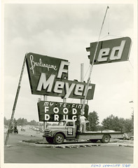
If you jumped down here because of the note at the head of this post: in the comments of the post, a commenter by the name of sputnik housewares posted a link to the following picture on Flickr, of the above sign going in at the first:

 Fred Meyer

You'll note the sign at the bottom …My-Te-Fine Foods Drugs. As any dyed-in-the-Doug-Fir Oregonian knows, My-Te-Fine was the FM house brand, before the chain went through a series of sales which eventually made it a subsidiary of Kroger (which is why you can find Big K, the Kroger house brand, in Fred Meyer stores latterly.

Thanks, sput! Nifty!

 
Technorati Tags: , , , ,

[pdx] Hawthornehenge

2625.In my neighborhood there's a little section of SE Hawthorne Blvd that runs from SE 114th Avenue to SE 117th Avenue. And, very close to my house, the last block of that bit of Hawthorne turns west-northwest - a bit of a diagonal.

Every year, in the middle of May, when you stand in the middle of the street, for one perfect moment, you get the sun setting over the middle of the street like this:

Hawthornehenge

Most of the rest of the year, it's just a outer SE side street.

For one moment on one day, it's HawthorneHenge.

 
Technorati Tags: , ,

[pdx] A Clearer View From Council Crest

2624.Not too long ago I put up some pictures from Rocky Butte. Yesterday I wangled our way over to the other beauty viewpoint in town, which as any Portlander ought to know is Council Crest.

Council Crest has had a variety of roles since Europeans came to this area. As related in a very clever way at the summit viewpoint, the knoll itself was named by a group of church leaders who, for some strange reason, decided that it would be just the grandest place to hold a gathering and decided that, since it was so majestic, that the Native tribes who preceded them simply must have done the same thing.

Never mind that it took them two hours in horse-drawn carriages to get up there.

In the past it's also been an amusement park (imagine riding the roller coaster on that one … they have something like that in Vegas now, though they had to build a tower to get it) and a terminus to one of the iconic old Portland streetcar runs (the CC car). Now, of course, it's one of our most popular city parks and has, at 1,070, the best view of any park in town.

Until recently, though, the signature views were actually getting obscured by tree and brush growth. This put more than one Oregonian in a peculiar place: unironically advocating for the removal of a bunch of trees. But it's in the service of a good cause, and there's still plenty of green.

The clearing has reopened views that had gone away so gradually I didn't know they were gone. The Fremont Bridge is one again clearly visible with Mount Saint Helens in the distance:

Loowit and Fremont Bridge

And, signature and picture-postcard views of downtown and NE Portland are back in style:

PDX From Council Crest

The niftiest thing to me is the view of Sandy Boulevard that this viewpoint gives:

Sandy Boulevard from Council Crest

And if you can zoom in … welcome to Hollywood, baby!

Hollywood Close-up

And that's Council Crest, today.

 
Technorati Tags: , , ,

[ad_design] Sarcasm Day: Snark About Coors Billboards

2623.I'm declaring this a Sarcasm Day, mostly because these ads:

Coors billboards 1

… have really gotten on my nerves.

Gosh almighty, we can't send a man to the Moon anymore, but we'll always know when a Coors Light is at the perfect serving temperature. Remember those days when you just, well, I don't know … picked up a bottle to see if it was cold or not? Yeah, those were hard times. We had to write down phone numbers to remember them an' all. The horror.


Technorati Tags: , , ,

[liff] Three Girls, One Teapot

2622.Them Aussie women are a different kind of crayzee.

I mean, if they aren't planking, they're teapotting.

Some women are doing with sheep, for cryin' out loud!

I know! Sheep … in Australia?

Don't think this sort of public behavior is dangerous? It's getting people fired at Woolworths.

Kids these days. Next thing you know, it'll be jazz halls and dancing.

Technorati Tags: , , ,

13 May 2011

[type] Handschrift: A Different Sort of Sign Language

2621.What do you need to create a type font?

José Ernesto Rodriguez needed a photocopier and his own two hands:

Handscrift Sample

"Handscrift" is a complete 26-glyph, majuscule and minuscule, punctuation and special symbols, font produced by Rodriguez using just those two things. It's really cool stuff, and his project at Behance (http://www.behance.net/gallery/Handschrift/1271211) shows a complete display of the type, how he did it, and pages out a sketchbook, which is always my favorite thing.


11 May 2011

[logo] First Ahhnold and Maria Separate, Now This, or, Paging Sarah Connor

2621.So, just after we hear that Mr and Mrs Schwarzenegger separate, we hear that MSFT has bought Skype.

Hmm…

SkyNet

Coincidence?

I sure hope so.

Will Sarah Connor come to the white courtesy phone?

Via Jeff Patterson.

09 May 2011

[web_design] Did The Lakers Get Swept? Simple Website - Effective CSS Lesson

2620.I don't know if Brad Benites was out to teach web design, but he did.

Brad Benites is a resident of Arizona who's also a DMavs fan. In other words, he's also thrilled that the Mavericks ate the Lakers lunch, but whereas my joy is based on schadenfreude and despair, his is based on his team actually winning the series, an alternative I hope the Blazers explore in future seasons.

Proving it's impossible to predict what will go viral (believe me, I wish I knew that magic bullet (Magic and Bullet being two other NBA squads entirely)) He asked the question "Did the Mavericks Sweep The Lakers" with the website http://didthelakersgetswept.com/.

Go ahead and click the link. Even dialup users can do this one.

Are you back? Good. Since web design intrigues, I ordered up a source view, and wasn't surprised to find out that it included very little: What you see is what you got, except for the visitor tracking javascript. However … the simplicity of the design provided a straight-ahead look at some thoroughly modern web design. Here's what it was:

Of course, first, there was some header information. It's what you might expect. Then, came this bit of text:

<style type="text/css">

.yes {
    font-family:Arial, sans-serif;
    color:black;
    font-size:7.0em;
    text-align:center;
    padding-top:200px;
}

This is just basic CSS. Since it's in the file itself, it's inline CSS. Specifies font family, color, font size in ems, aligns in the center, and gives 200 pixels top and bottom padding. Good old box-model CSS.

The body (skipping the javascript) looks like this:

</head>
<body>
<div class="yes">Yes.</div>
</body>
</html>

The logic used makes it obvious to even the beginner here.

The first block, which defines the display of the characters, is a class selector. What identifies that, of course, is the period in front of the work "yes". Class selectors, of course, can be used wherever, on single things, large groups of things. The other thing is the ID selector, which is used to style only one element at a time. Each has their strengths. And this could have been styled with either an ID or a class selector, but class seems to be the right way to go here; the most simple approach, as demonstrated by the fact that all you have to do is insert the attribute in the div tag, and the job is done.

This is why CSS is so powerful. All you have to do is change one attribute in the selector definition, and the body text changes automatically. The box model makes positioning the text oh, so very easy - and so browser agnostic, you don't need to care (at least with this application) whether you're going to use Firefox, Opera, Safari, or Chrome to view it.

Moreover, a small task like this is ideal for inline CSS, which is typically eschewed in favor of external CSS. That's not to say that external CSS couldn't be used here: that selector could go into a file of its own, say yes.css,  and be attached to the file with the tag

<link rel="stylesheet" type="text/css" href="yes.css" />

It would be rather too much design for this little gem, but it would be utterly valid.

In the meantime … the Lakers are out! Swept by the Mavs! Go Mavs!

[liff] Condolences to Commission Randy Leonard

2619.I'm not a huge fan of Randy Leonard as a Portland City Councilor, but as a human being, and someone who has lost a younger brother to the vicissitudes of life and fate, I can certainly sense the pain in losing a child.

Doubtless he should agree with my mother who has opined that a parent should never outlive their child.

And in that spirit, heartfelt condolences.

[art] A Fantasy Diary Girl

2619.Well, not really some fantasy-dream-girl, but a girl's face and head drawn from a how-to book, Christopher Hart's Figure It Out!:

Hart Girl

The book, Figure It Out!, is, as said, one in the nigh-indefatigable Hart's line of how to draw and cartoon books. I swear, half the art-how-to bookage in the world has to have been produced by Mr. Hart … prolific seems such a quaint word when it comes to his output.

Most of it doesn't work too well for me … there's something formulaic, urelenting about them. But if you must buy a Hart book, this is one this is the one. Goes over figure drawing in a friendly, followable way. Which is worth its weight in gold.

And I'll be going over some of the exercises in the book and copying out drawings, to keep my newly-rediscovered chops developing.

07 May 2011

[media] The Whole Animal Kingdom, Or Just That Horse There?

2618.I wish headline-writing was its own career. I would so go for that.

Why? Because every once in a while, I can come up with this (via KGW-TV):

Animal Kingdom Wins!

Those throngs in the stands are the horse's support staff, I guess.

Sometimes the sweetest victories are those that are shared precariously. This is the day of history: not only did this horse win the Derby, not only did humanity win, by extension, but the entire animal kingdom.

I guess we never have to run that race again.

In other headlines that caught my eye, KPTV-TV has a very clever titler working today:

TTTT

… I love that. Also, in other alliterative news: Purloiners Pick at Pontiacs in Pendleton, Absconders Attack Acuras in Albany, Saboteurs Sully Saturns in Salem, and Villians Victimize VWs in Vernonia.

Oh, won't someone think of the children?

05 May 2011

[pdx] Beauiful Day; My Favorite Mountain

2617.Mount Hood is, forgive me for stating perhaps the over-obvious, iconic for very good reasons, three of which are location, location, and location.

Mount Hood tight shot

On Wednesday, that beautiful day, me and mine were at the top of Rocky Butte, in that lovely little Joseph Wood Hill park, and I was getting pictures of my favorite mountain.

Mt Hood Piccy Postcard

Some good enough for postcards.

I've grown up with Mount Hood visible out my window most of my life. I strongly identify with the Cascade volcanoes, and when I showed people pictures of my hometown, what bits of the world I have seen, they were absolutely enchanted by the big city with the graceful mountain in the background.

Mt Hood Portrait

Observing the mountain over my hometown, my east side, concentrates the sense of time and space and leave me feeling … something, somehow. Aw, heck, I guess some things defy words for a very good reason.

But those peaks on the horizon? That's part of me too.

04 May 2011

[art] Crappy Late Night Photoshop Presents a Star Wars Character Lucas Decided Not To Use

2616.I give you:

Django Fett

… Django Fett.

[art] Diary Drawing: Sayuri from Pastel Manga

2616.At the library today I went looking for manga with visual style that appealed, and hit upon Pastel, which is some sort of romantic-comedy-shonen joint. I'm not too concerned with subject matter right now; more visual style, for styles my eye enjoys that I would like to emulate for practice. And Pastel hit the spot exactly and satisfyingly. One of the characters is named Sayuri, and this is her:

Sayuri Number 1

She had just snuck up on one of the main characters and played a prank on her by pretending to be a violently-inclined mugger, but revealing the game with a squirt of the gun and a knowing wink. That weapon she's holding is indeed a squirt gun.

I instantly saw how I could render that, and here's my go:

Sayuri Pastel Number 2

I took out the squirty-mark to make it a general girl-with-gun pic. Because we all know that chicks with guns go over big. Here's a close look.

Sayuri Pastel Number 3

Stiff fun-loving and playful, but a little dangerous maybe.

And I call this one a success.

28 April 2011

[tech] They Actually Are Still Making Typewriters, Somewhere

2615.It would seem that, as a wise American once expounded, reports of the death of the typewriter have been greatly exaggerated. This from Gawker, via The Great Penguini:

In the retelling, however, this somehow came to mean that Godrej & Boyce was the last existing typewriter manufacturer in the world, and that this therefore marked the final, wheezing gasps for the antiquated word-processing machines. From the fake typewriter ashes, a million nostalgic personal essays bloomed.

There are at least a few firms left that are creating new typewriters, including a firm referenced in the article that apparently creates "see-through" typewriters for use by prisoners.

Referenced was this search on Staples website which turns up several models. I would point out that these are strictly electronic typewriters, which, to me, is an important distinction … perhaps not to others, but certainly to me. I think the mechanical typewriter has a niche, infinitesimal though it may be.

But breathe easy, fellow lovers of the rustic art of creating type with actual mechanical effort … our day is not completely over. Not yet, anyway.

And while we're there, mea culpa for spreading a bit of un-information there. But it was with a good heart.

[Address_Nerd] You're So Vain, I Bet You Think This Address Is About You

2614.Thanks to fellow League of Extraordinary Address Nerds member Ben Lukoff for this little gem.

To a person like me, the New York City address pattern in extremely interesting. Twenty house numbers to the block on the avenues (and not every avenue beginning on the baseline of 5th Avenue) make for a very interesting address location experience: a tradition in phonebooks and travel guides is to include a amusingly abstruse algorithm to determine what cross-street your address may (or may not) be near.

Latterly the wonders of the intartubez have brought web-based pages and apps for download that make it very easy for those who are NYC tyros to find what they need. But, as in life, everything is as it is, but not as it ought to be: there is cachet and status to addresses, and as it turns out, if you are sufficiently close to Fifth Avenue, that Avenue of distinction, you can petition the City of New York for a vanity address:

Borelli is a somewhat reluctant steward of the vanity-address program, which dates back several decades and can be blamed for, among other things, the proliferation of the word “plaza” and the disproportionate number of businesses and homeowners with Park Avenue and Fifth Avenue letterheads. (“Pulling an avenue address over” is the topographical parlance for denying that your building’s real entrance is on, say, East Seventy-sixth Street.) “I usually try to talk them out of it,” Borelli said, referring to vainglorious building owners. “If you’re having a heart attack and you’ve got a vanity address, it could take a few crucial moments for the E.M.T. driver to figure it out. And you could be dead by the time help arrives.” The residents of 44 West Sixty-second Street once sued the owners of 62 West Sixty-second Street, whose nifty mnemonic address comes at the expense of directional logic: it is east, not west, of No. 44. The plaintiffs were upset about missing out on pizza deliveries and Town Car pickups amid the confusion. (They lost.)

I like to think, anyway, that such a thing is very unlikely to have happen here in PDX, with our excuciatingly-logical street rationale; while we will be goofy about naming our streets sometimes (it must be said, I've warmed to the idea of SE César E Chávez Blvd instead of Thirty-Ninth Avenue, as flawed as the process of getting there was … heck, it looks great on a street blade), you aren't going to get an address on SW Broadway, say, if you are two doors around the corner on Taylor Street.

[logo_design] Google Chrome Logo … With A Bit Less Chrome

2613.I just now noticed this … I should keep up on Google Chrome browser news, especially since I love the logo quite a bit. Clever little thing.

When I started up Chrome today, just to go get a look at somthing in it, I noticed it had become, well, flat …

New Google Chrome Logo

… and I knew it used to look a bit more pictorial:

Old Google chrome logo


Or as Steve Rura, designer, explains it:

Since Chrome is all about making your web experience as easy and clutter-free as possible, we refreshed the Chrome icon to better represent these sentiments. A simpler icon embodies the Chrome spirit — to make the web quicker, lighter, and easier for all.

Which, if you're going to evolve a logo design, is a good way to move - in concert with the animating idea, or at least as close as you can execute it. After being a bit surprised by the evolution, I found myself warming to it right away. So, for me, it's a good move.

Read all about it and look at some of the user explorations that inspired the move here: http://chrome.blogspot.com/2011/03/fresh-take-on-icon.html

26 April 2011

[logo_design] That Peculiar Lightness of Logos for 2011

2612.So saith GD USA's Logolounge: the fashion trend for logos seems to be light, airy, and transcendant:

For the 2011 report, our ninth, color is still prevalent, but tinted down. Where black has been used as the strong neutral, now brown or gray is in place. Blues and greens are softer, and pinks are starting to appear.

Other degrees of lightness: Shapes are airier, lifting off the page. Designs are rising out of their 2D resting places and suggesting that they would really like to go places. In some logos, line weights are slimmer. There’s plenty of transparency, too, as if light is now able to flow right through.

The transcendancey comes from what's turning out to be a logo's new remit: it did what it does before, but now it does it in places that Paul Rand never would have guessed. You'll find a logo as a favicon, animated, in print and in electronic form … but not just one form, many of them – animated, backgrounded, what have you. As digital design tools evolve, more effects and functions, once the domain of fairly abstruse professionals, now come to the fingertips of your friendly neighborhood desktop designer.

They can be used for evil, yes, we understand that. With great power comes great responsibility. Also, large power bills.

Read the Logolounge's report here … http://www.gdusa.com/issue_2011/april/logolounge.php … and go right to the graphic that illustrates what they see as the 2011 trends here … http://www.gdusa.com/issue_2011/april/logolounge/index.php … each image has a link to a definition and examples.

H/T to Jeff Fisher.

[tech] The Typewriter Era Is Over … Period

2611.Typewriters have, of course, been on the way out for a long time. Here in America they've all but become ghosts, and those of us who have actual typewriters and use them (me, for one) have to know where to get typewriter ribbons (not an easy thing, but I at least have Bill Morrison's at 122nd and SE Stark St, which is within walking distance).

I was aware that they were less popular for a long time, you know when I knew that the typewriter's days were numbered? When you couldn't find them at the Goodwill store anymore. They used to have shelves and shelves of broken old machines. Then, one year … and not all that long ago … the old typewriters just kind of disappeared.

Those of us who like type and typing … and for me there's always a sort of joy to it, a healing feeling … cherish our machines. The author Harlan Ellison has several in storage, because nothing lasts forever and, I imagine, soon enough, there won't be any way to even get them fixed any more. Keeps spare typewriter ribbons in the freezer, I understand.

With the announcement of the last known typewriter manufacturer in the world ceasing operations, I fear that day is here:

With only about 200 machines left -- and most of those in Arabic languages -- Godrej and Boyce shut down its plant in Mumbai, India, today. "Although typewriters became obsolete years ago in the west, they were still common in India -- until recently," according to the Daily Mail, which ran a special story this morning about the typewriters demise. "Demand for the machines has sunk in the last ten years as consumers switch to computers." Secretaries, rejoice.

"We are not getting many orders now," Milind Dukle, Godrej and Boyce's general manager, told the paper. "From the early 2000s onwards, computers started dominating. All the manufacturers of office typewriters stopped production, except us. 'Till 2009, we used to produce 10,000 to 12,000 machines a year. But this might be the last chance for typewriter lovers. Now, our primary market is among the defence agencies, courts and government offices."

Well, my Royal Futura isn't on the verge of breaking down, and I can still get ribbons for it. But she's amongst the last of a now-extinct species.

24 April 2011

[icons] "Get A Mac": Art Imitates Life Imitates Art Imitating Life

2610.They've become iconic: John Hodgman as the PC and Justin Long as the Mac. Over many years and between 60 and 70 seperate commercials, the buttoned-down, business-suited, bland Hodgman became a sort of PC-tan against Long's Mac-tan in the ultimate collision of American advertising and moe anthropomorphism.

Turns out that the incarnations are actually quite close to the stereotype.

An article on PC World reports than an unscientific survey run by a site called Hunch suggests that the stereotypes have basis in reality:

An unscientific survey by Hunch, a website that makes custom predictions based on your interests, shows that PC users tend to prefer fitting in with others, are less tech savvy, and prefer Hollywood films over indie films. The same survey suggests Mac users tend to throw more parties, are modern art enthusiasts, and would rather drive a Vespa than a Harley.

The real cosmic joke, in my opine, is that John Hodgman is actually a hardcore Mac user:

Here is the joke that is absolutely apt, though I once promised I would never make it: "I play one on TV, but I am not a PC." It is true. I am first of all: not a computer, but a human being; and second of all: a Mac user, almost exclusively, since 1984. There was a brief period in the wilderness between 1997 and 2003. Let us not speak of it.

Justin Long is an Actor whom, I presume, doesn't trouble too much about computers.

And so it goes.

[logo_design] Descendants of Original NY Yankees Logo Desiger Suing For Rights

2609.This story may or may not demonstrate the wisdom of getting it in writing, depending on how the court case works out.

The New York Yankees "Top Hat" logo is, if not among the most famous logos, certainly one of the most recognizable, and carries a lot of history and fame. The logo was reputed to have been created by Kenneth Timur in 1936 who, according to the article at CNN, apparently depended on the good will of the Yankees organization to be properly recompensed:

Buday explains that her uncle was not aware that the Yankees adopted the logo until he immigrated to America in 1947 and was asked to revise the logo for their 1952 celebration of 50 years based in New York City.

She claims Timur was hopeful that this time the sports franchise would offer him some kind of recognition, but took the opportunity to "sign" his work with a "P." Instead of 1903 to 1952, the logo appears as "1P03-1952" on the patches of the uniform.

A spokesperson for the organization quipped in response This is a wonderful country where anybody can sue for anything, even when the allegations are over 70 years old. And there, though I'm not a lawyer, would appear to be at least one place where there may be a crux of the matter. There may indeed be a credit due, but a delay of 70 years would seem, to this layman, to be a big obstacle to the claims of the descendants.

Good luck to the litigants, and we'll keep our eye on this one.

[liff] The Death Of Print, Part 9,207: The Onion Fools The NYT

2608.This probably explains everything somehow: In a recent retrospective on the evergreen, unchanging teen rag Tiger Beat (yes! it still exists!), the nation's paper of record, The New York Times, thought a parody cover of TB, featuring President Obama, was a real Tiger Beat cover.

Fooling the Chinese media that the Congress is going to leave DC unless they get a new Capitol is one thing.

This makes ya want to cry and die inside.


23 April 2011

[art] Diary Girl: You Can Be My Mangaface

2607.Taking my inspiration today a relatively simple girl's face from a copy of Shonen Jump I have hanging about to draw from if I have no other inspiration that day:

Mangaface 1

The model is up there at the top of the picture. Here she is up close:

Mangaface 2

Me very pleased!

I'm not constructing head shapes and filling them in; I'm drawing-what-I-see here, starting with reproducible shapes and curves from inside the drawing and 'growing' the rest of it from that. So, oddly, this is more like life-drawing than cartooning.

18 April 2011

[art] A New Diary Girl: Ashley Judd

2606.Latesley, I gots to draw. And here's another "Diary Girl":

Ashley Judd 1

I have a lot of lady co-workers, and a lot of mags like People, Us Weekly, and stuffs like that find their way to work. And they do have good poses and models - being glamourous women, they invite looking especially for art's sake.

I get good breaks on my job but they're shortish - enough to keep ones sanity, not enough to play, say, Risk. And I took a copy of one of the latest People, with a story about Ashley Judd and good photos. I'm not that big a fan of Ashley - not that she's bad or anything, just never acted in anything that lit my candle - but she is a fairly pulchritudinous celebrity, I think it must be admitted. And somthing inside of me seems to say that I might grow as an artist if I draw what's at hand - you can't always pick and choose your subject. The shortness of the work break mean you have to make your moves count. I wanted to see if I could complete anything quickly. Turned out, I could.


… and it almost looks like her, too.

Drawing what you see is hard in the details, like the eyes. But I'm getting there.

17 April 2011

[pdx_design] Morel Ink - New Name, Old Stalwart

2605.A favorite PDX resource, Witham and Dickey, has changed thier branding and name. Before (which wasn't too shabby):

Witham and dickey

… and after. Now it's "Morel Ink".

Morel Ink

Nifty logo (notice the way the blue color from the old logo is incorporated? Legacy on a subtle level) and clever name. We likey. The name is also shared by certain mushrooms that Cascadians tend to enjoy. Also, if you respace the letters, MOREL INK becomes MORE LINK, which is a laudable thing to want in this world which can get sometimes a bit too impersonal.

I've always wondered about applying to them …

16 April 2011

[tech] The Return of the Commodore 64 - And More?

2604.Everything old really is new, again.

Meet the Commodore 64 again, for the first time:

Commo 64

With a new Intel Atom D525 processor and the ability to read DVDs and various smart cards/SD cards/Memory sticks built in, PC compatibility and modern graphics, this is not the C=64 you programmed on back when all your friends had Apple ][s.

It can support up to 4GB of memory. C=64 is a brand, after all. Good luck shoving that Photoshop into 64 KB …

While the case looks largely the same there's supposed to be improved key action, and the F keys on the right there have media control functions (FF, REW, PLAY, PAUSE, Volume up and down, et. al.) and a key I'd never thought I'd see on a C=64: Internet.

This isn't your old Commie. This isn't even your dad's.

A group has licensed the old Commodore name and seems to be quite serious about reviving the brand, and that includes the Amiga, as well as a line of VIC models that have about as much to do with the old VIC20 as a jackhammer has to do with a can opener. The site, http://commodoreusa.net, is a pretty place to look. They have amazing current ambitions and very lofty near-term goals. Not only will the new C=64 be "PC Compatible" (and that term is beginning to look dated but just works so wonderfully well here) but will also apparently have a legacy C=64 compatibility mode and they're going to be coming out with a "Commodore OS" which is Linux based (and there's nothing not to like about that).

But the problem in concepting the new C=64 wasn't so much finding components that would fit inside the classic form factor. No, indeed. The problem really was in coming up with the classic case color … seems Pantone doesn't have a "Commodore gray".

I don't know how much of a niche is available for the new Commodore USA - marketing tastes are famously fickle. This may fizzle - or it may take the country by storm. There is a significant market for retro hardware, or at least that's my impression. But that this company cares as much about exterior design as interior design (and went to the expense and bother) is a very Apple-esque attitude, and it bodes well. It may not dominate the industry but if they price it right, they'll sell enough to be a solid, sustainable, minor player, and I don't think that's bad at all.

Now if y'alls 'll excuse me, I got to jet: there's an Everything But the Girl concert down at the Paramount and if I don't leave know I'll miss the opening act …

14 April 2011

[art] Another Diary Portrait: PDX Mayor Sam Adams

2603.Yesterday at the Belmont Branch Library I did another drawing, this one based on another photograph. This time, it's a well known photograph of a well-known personage in this town: Mayor Sam Adams.

Sam Adams 1

Some liberties were taken around the background, but I think I came pretty close here.

And closer:

Sam Adams 2

I know it's not perfect either (the line of the mouth and the shading were a bit tough to hit), but I like the way I was able to pull this one off. I'll call this one a success.

[liff] Advice From the Gosselins? Even at Dollar Tree, That's Overpriced.

2603.The Dollar Tree is a great place to pick up cheap craft supplies. The Wife™ subjects me to visits weekly. The Dollar Tree, however, is not a good place to expand your library unless you want to stock the bathroom or do it ironically. Recently saw this glossy little number, and wondered if this signified some sort of cryptic disdain for the customer base:

Jon and Kate Give Advice

The book. Multiple Bles8ings: Surviving and Thriving with Twins and Sextuplets, was on sale at the Foster Rd. Dollar Tree on a table of books they have out there - kind of like they do at Costco, except the books were clearly not exactly huge sellers the public. Jon and Kate, of course, having apparently felt the succeeded long enough at survining and thriving with twins and sextuplets, decided to plant C4 under thier marriage. Last seen, Kate is doing whatever she can to land on the cover of People next week, and Jon … actually, who gives a crap?

They said it was dollar for that. I told them they'd have to pay more than a buck for me to take it off their hands.

There is finally a retail space that is below the remainder bin.

I've tried coming up with another one-liner for this, but find that my mind is beggared for any ideas. But I will say this: though I am solidly against burning books, there are some which argue that maybe trees shouldn't have died to produce them.

[comics] Dutch Bros. Freedom Fighters - The Review

2602.Beginnings are such delicate times, to paraphrase a phrase that should identify me as the subculture geek I am. It is with this pithy sentiment, then, that we turn to consider the newest local band-of-compadres in comics, the Dutch Bros. Freedom Fighters.

Yes, our favorite Oregonized coffee experience has decided to go into the print realm, with a punchy little publication aiming to be filled with the same Dutchy goodness that fills every Annihilator, breve, and ER-911 that come from the ol' Blue-and-White. DBFFAvailable for the asking at your local Broze kiosk - wherever you may find them, and they're a-springin' up all over, much to the delight of those of us who've been put under that particular spell - it looks to be the first issue of an adventure series driven by the love of comics, the love of coffee, and the desire to celebrate both.

The story thus far: One fine day in Dutch-land, as a square-jawed, mulleted, cheefrul barista serves a be-fro'd customer beverages prepared by the razor-sharp and dapper Pez (who bears a no-doubt-intentional resemblance to the Dutch Bros Mafiosi from the ubiquitous sticker) an angry Holstein secret-agent driving a DMC-12 and with an enormous cow-chip on her shoulder and the desire to undermine the good feelings that is Dutch Bros Back-To-The-Futures our three fellows into a cave with a  just-awakened - and cranky - dragon, who clearly has not had his caffiene yet.

Riding to the rescue is the decidedly babe-a-licious Princes Penny who gives our fellows the knowledge they need to tame (for now, anyway) the ferocious beast - turned out he just needed his morning coffee. Who knew?

The Holstein, Mad Cow (Agent 0015) retreats with her martial-art-infused frog sidekick to plan another revenge. And the boys have to figure out a way home.

These three fellows along with Princess Penny complete the quartet known as the Dutch Bros. Freedom Fighters, with adventure sure to ensue.

The comic was drawn by Grants Pass comic artist (and Iguana Comics owner) Jeff Egli, with scripting by Jason Hetzer and editorial direction by a Bros scion, Brant Boersma. There's an interesting bit of shared history here, according to this interview on the blog Wut Eye Read, Brant was one of the first box subscribers during Iguana's first incarnation - and when they opened it up again, Brant came in and wondered if his old box was available. Things evidently snowballed from there.

So, I'll admit to a pro-Broze bias. I enjoy pretty much everything about Dutch Bros from the attitude of the employees to the Annihlator (which they will add maple syrup to for me … mmmmhm, maple). With this in mind, what can we say about the Fighters' first outing?

It was good, but, character-wise, kind of weak. Origin stories are always a bit tricky to pull off, and the story makes sense, but I felt as though I had to keep going back to see if there was something I missed. I'm still not terribly clear on the names of all the characters - I think the one with the 'fro is simply called Fro, and I never did see the mulleted-one referred to by name. Princess Penny makes for a very strong character but the fellas are going to have to come to the fore or she'll pretty much steal the show from them.

That put out there, the artist and writer did give themselves a heck of a job to do, and that is establishing real characters based on a certain Dutch Bros je ne sais quoi in the space of just a handful of pages. Clearly they are up to the task, but it's going to take another issue perhaps to do it.

Despite this, the comic is a fun romp. No complaints about the artistic style, I thought that was well pulled-off, and the idea of a dragon that only needs to be served a steaming cuppa every day by a lovely young lady to be calmed - well, a lot of people I know wouldn't mind being that dragon.

I plan on keeping an eye out for Issue 2. Issue 1 is still available at your local Broze. Rumor is that they aren't going to be printing any more, so you may have a collectors item on your hands if you can score one. A must for anyone who's a member of the Dutch fan club.

Overall Grade: B-