
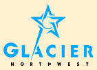
 First, for a casual comment: I completely dig the Glacier Northwest logo.
Second, while you read the following comment, think on the logo itself. If you've never heard of Glacier Northwest, what industry do you think it's in? What product or products do you suppose it produces?
Now, the commentary.
The Glacier Northwest logo is a clever interplay of abstract form, letterform, and shape play. The star is an obvious motif here (not to mention something with a strong human resonance), but, if I can don my Captain Obvious cloak here, it goes so much farther.
The breaking up into individual shapes allows a great deal of play. The ends of the angles are drawn into the center, forming the distinct impression of a majuscule G (thus, of course, the initial of the company's name) in clever ways without actually forming the letterform itself. The opposite ends of the angles overlap the next angle, expanding (again, without actually constructing) the letterform's presence within the design and melding the two aspects (the star and the G) into one very remarkably good looking graphic concept. The extensions to the angles also give a dynamic tension in the design that suggests, to me, clockwise rotation or perhaps a spiral, which is amongst the most attention-arresting graphic symbols I know.
The name of the company is drawn into the logo by deconstructing the lower left hand starbuck (that's what the point on a star is, in case you didn't know) and extending it to become a stem stroke in the A in the word "GLACIER". The word itself is a simple, utilitarian, modern sans-serif, direct in communication, resistant to dating. The blue-green color evokes the color of glacial ice.
This is a captivating logo.
Okay, now I promised early on to tell you, if you didn't know what industry this company was in, to say so, but only after the logo was considered.
Would you be surprised if you were told that Glacier Northwest is amongst the largest, if not the largest, aggregate, cement, and allied building material concern in the northwestern United States and western Canada? Based in Seattle and with facilities across four US states and two Canadian provinces, it sells cement, concrete, and aggregate materials and building systems. There are a handful of Glacier Northwest sites in the Portland area as well as a major cement plant on the Willamette in Portland near Swan Island, easily identifiable by the dome-shaped building with the G-Star logo on all sides.
What's most notable in this light about Glacier Northwest is that its logo exhibits no obvious connection to cement, concret, or building materials whatsoever, and this is also a concept of logo design. Logos can make some direct or obvious connection to the industry or business the logoed company engages in, but there's no law that says they have to. It is an appropriate avenue, but not the only one.
What companies what Glacier Northwest seem to strive to do is to highlight, oftimes indirectly, some quality or impression they want to express about the company – some character attribute that is a decided positive. The star logo may be expressive of the self-view of a company that dominates in its industry: an industry leader, well-acknowledged in quality and market coverage. A star indicates primacy on a map; the five-pointed star, in particular, is the traditional denoter of a capital city.
On the other hand, someone in the company might have thought that having a star-shaped logo is just a darned good idea. Which, in my opinion, in this case, it is.
No comments:
Post a Comment