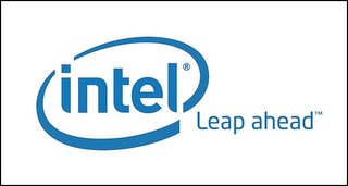
 So, it's the ashcan of history for the familiar old "dropped-e" Intel logo and the tagline "Intel inside". Now it's a new minuscule look with a jaunty oval swipe and the tagline "Leap Ahead".
You all are going to have to update your Intel-based jokes.
The new logo does preserve a link to the past with the traditional Intel blue, and the minuscules hark back to the old logo as well. The oval swash alighns with the baseline of the word "intel", completing the curve made at the lower left hand corner of the "l", and sweeps around back of the logo then comes back up front to connect with the new tag line.
While reviews of the new logo design have yet to trickle in, I had an interesting reaction to it; I was originally unconvinced that Intel needed a logo-level revision program, but now that I've seen the new logo, the old familiar workhorse seems dated. Perhaps it was high time for Intel to freshen up its look.
It's all part of a new branding overhaul that will eventually see the Pentium's retirement in favor of Intel's newer designs. I'm not that much of a tech watcher, so I'll link to a much better coverage of the shift by The Washington Post here.

No comments:
Post a Comment