Showing posts with label artists. Show all posts

28 April 2024

Margaret Plumb Paints the Wolf Building En Plein Air

4130

Sherman, set the Wayback Machine for that warm fall afternoon last year, when we larked to Silverton and stumbled into the Sidewak Shindig. We met Gary Quay there, and that was excellent in and of itself, but I did find this example if en plein air art in action and the memory still warms the heart.

It should be developing now that the Wolf Building in downtown Silverton is unique and beloved. It makes a fine subject for photography, and that I've proven. But plein air acrylic painting? Well, there could, I suppose, be a question, but really, if one has any common sense, that question should pretty much answer itself.

And if it doesn't, consider this:


The artist is a woman from the Eugene area named Margaret Plumb and what has become a fond memory is her allowing me, a still-aspiring artist, to look over her shoulder while she created this work. 

She's an impressionist, working in saturated colors which warm the eye and the heart (her Facebook page is here, her page at Lunaria Gallery, where she was standing in front of, is here). Most admirable technique and an accomplished talent. 

This one she was painting that day in front of Lunaria was sold, in short order, to a buyer in Virginia; testimony to that and the finished panting can be seen at this Facebook post. I had a great experience watching an artist create lovely art in real-time, and I'll ever be grateful to Margaret for allowing the house of Klein to invade her personal space, answer little questions about her process, and tolerate inane observations about what she did.

It can be problematic to get an artist to allow you to watch them create as they do it, so if you ever get the chance, savor this. Nothing quite like it, I can guarantee you. 

21 January 2024

Hiroko Cannon

4101

Spotted on an Oregon Art Beat viewed a week or so ago, the artist Hiroko Cannon, a resident of Pendleton, who does watercolor works of wildlife that put Audubon to shame, if for no other reason that all this amazing artist needs to do is watch the animals. This apparently comes from a memory enabled by a contemplative state of mind. 

She does this from memory. 

That and a Winsor & Newton pocket box and water control that the rest of us can only dream about.

19 June 2018

Considering Bridgman's Complete Guide To Drawing From Life

3541A.
I, very recently, under the aegis of Powell's, acquired Bridgman's Complete Guide to Drawing From Life to bolster an already-groaning shelf loaded with books on drawing practice and technique.

As an older work, it attracts. George Bridgman was an artist and illustrator who lived from 1865-1943. He was trained at the Ecole des Beaux Arts and made the practical part of his fame teaching anatomy at the legendary Art Students' League of New York; he's said to have taught thousands of art students the subject, and amongst his more famous students were Will Eisner and Norman Rockwell.

He taught a method of anatomy that involved grouping the large masses into blocks and connecting them with gestural curves and 'wedges' to simplify drawing the human form.

The book itself has remained popular over the years, remaining in print in many editions. It's a meaty book, weighing in at 300 pages and generously laid-out with a legion of simple yet communicative drawings and patiently-worded text.

I've not been all the way through this yet, but it appears to be a worthy reference book for any artist's shelf.

18 November 2017

OryCon 39: The Souvenir Program Cover

3524.
And, here's one look at my real contribution to the OryCon 39 effort: the cover of the Souvenir Program. Design by myself, artwork by the Artist GoH, the delightful Sarah Clemens:

 
We saw Timothy Zahn. Affable fellow.

The site of the illustrator, Sarah Clemens, is http://www.clemensart.com/.

06 October 2016

[cartoonist] New Artist!: Jupiter Dragon And Her Blog

3390.
Recent readers will remember that I've been a fan of J.R.R.R. (Jim) Hardison's writing for a while (Buy Fish Wielder on Amazon, yo) but what we've been aware of on Facebook is that his daughter is a budding artist which undoubted skill.

Human Lady Rainicorn (c) 2016, Jupiter Dragon
He's been sharing her art online. The illustration is just a clip out of one of her works in which she depicts the character Lady Rainicorn from Adventure Time as a young, hip, stylish human lady.

There's more now, she's just starting out but she's got work that a strong manga influence but also hints at a firm grasp of drawing natural forms, inking, and a great familiarity with craft that a lot of us aspiring artists reach for.

The strength of the talent behind the "First Post", a stunning realistic picture of a rearing horse's head, must be acknowledged.

She is launching an art blog under her art nom de guerre: Jupiter Dragon, and ignition has happened at http://jupiterdragon.blogspot.com/. Impressive!


09 September 2016

[art] Fun With A Pencil: Andrew Loomis' Foundational Drawing Text

3358.
Though I prefix-tagged the title with the word art, a modest handful of tags would have done as well: cartooning, art, artist, comic art … Andrew Loomis' book for beginners at both artists both casual and aspiring to serious craft has a great, great deal to offer.

As mentioned in the previous article, up until recently, Andrew Loomis' works were much beloved and, since they had been out of print for a very long time, highly sought after. A quick online search reveals that used vintage copies of his classic works from reliable sellers ask $60-$80 a copy. But it doesn't take much looking thorough Fun With A Pencil, that beginner's book, to convince one that this is something that in a fairer world would be of much benefit if it were more widely available.

Well, my friends, your Loomis famine is pretty much over. Starting in 2013, Titan Books has re-released these classic books for a more accessible price, unleashing them upon the world to inspire the next generation of motivated illustrators. The quarto-sized hardcovers are just as one might have bought them in the 1930s-1950s … not one illustration missing or out of place, in the volumes I've seen, each of a quality befitting the publisher and the legacy of the author. They'd look stunning on any shelf, not only for fans of drawing and learning to draw but anyone who adores and remembers the graphic style of books published during those days.

Titan may have been out to publicize the work of a foundational American illustrator, but they worked it out on one level by just making them lovely productions of book design on its own terms. The design look is very much that of of the 2nd quarter of the 20th Century in American graphic design.

Professor Blook, our
author's alter-ego, is
our companion along
the educational journey
But, of course, it's not just the book and its cover that are so pleasing. The inside is a pure revelation, as Loomis, one of the most popular and in-demand commercial artists of his day, takes the auto-didact though his poetically powerful and accessible drawing technique. The accent is on warmth, friendliness and lightheartedness as he enouragingly beckons the reader forward to learn to create art on what eventually becomes the burgeoning artist's own terms. Taking a the simple idea of a circle we move in one deft idea to the ball and how to take this easy-to-draw (even if your circle is a wobbly oval, he swiftly shows us that that's no problem either) figure to create the heads of cartoon figures. After several pages of practice suggestions, all clearly laid out, we get some technical tips and then its on into bodies. From bodies we move into clothing them, and from there we are encouraged to construct a world for them.

The result after all this is a beginning artist with enough skill to either please themselves and friends by drawing for the sheer pleasure or, if they want, take it farther. The book originally came out in 1939, and Loomis and his contemporaries could scarcely have seen the rise of computers and digital art, but as a foundation, the ideas and techniques presented in this book are timeless and are as fresh and necessary today as they were nearly 80 years ago, when the book was introduced. The illustrator of 2016 might have the most amazing electronic tools to use, but without the building blocks of drawing technique, it's all just a powerful scratch pad.

This is the sort of book were you take your time, have fun with it, and make it yours. Like John Hendrix, Andrew Loomis must have been the kind of teacher who wanted everyone to at least try, and noticed that a lot of people wanted to. That encouragement animates the entire text and causes you to understand, in a gut-level way, why drawing, even casual, can be a lifesaver.

In the next article, I'll take a more critical look at the Loomis method. You'll be pleasantly surprised at how essentially easy and potentially powerful it is.

Publisher: Titan Books, http://www.titanbooks.com
ISBN: 9780857687609
Retail: $39.95/$46.00 CDN/GBP 29.99

08 September 2016

[cartoonists] A Couple of Andrew Loomis Links For Your Delectation

3356.
Forgot a couple of sites that I should link you to in the last article, so here's a nifty little list:


  1. JVJ Publishing's one-page bio on Loomis. Rich in good illustrations: http://www.bpib.com/illustrat/loomis.htm
  2. A single page with several Loomis illos can be found at http://www.oklahoma.net/~silvrdal/loomis2.html
  3. Art blogger Armand Cabrera has a short article at his Art and Influence blog here at http://www.artandinfluence.com/2010/08/william-andrew-loomis.html
  4. The page Save The Books has links to help you acquire Loomis works: http://www.saveloomis.org/
  5. Here's an Ebay page selling Andrew Loomis: http://www.ebay.com/bhp/andrew-loomis
  6. And, of course, Titan Books' page where you can get them new and direct: http://titanbooks.com/creators/andrew-loomis/
  7. Lastly, a preloaded Google Image search so you can go right to the experiential goods, because I am the nice one. 

30 May 2015

[art] One Thing Bwana Spoons Did At Muse Art and Design

3185.
On Wednesday we were privileged to attend another one of +Muse Art and Design 's increasingly powerful demo-seminars. We went to one in February that I'm still unpacking, not because it's complex, but because I'm a mess. But I'll get to that one in due course. This dude abides.

Last Wednesday's event was about demoing the Acryla line of acrylic gouaches. They're good ones, and more on that to come. The featured artist was none other than Bwana Spoons, a man whose name is fun to say and is worth coming just to see him work. And he demoed the gouaches by doing so. A more complete write up is to come, but, for now, let me give you a taste of what he did do.


The man dances with chaos. But, like I said, more on that anon. Stay tuned.

25 August 2014

[pdx_legends] Working Kirk Reeves - Portland's Patron Saint, Now In Mural Form

3133.
He's part of Portland's landscape now … on a permanent, full-time basis.

When Kirk Reeves passed from us, since two years ago as of November, more than one intersecting PDX artistic community gasped in shock, dismay and despair. I'm sure there are those around us trying to still come to terms with it. I, for one, can't hit the west end of the Hawthorne Bridge going east, either straight on from SW Madison Street or coming up the ramp from northbound Naito Parkway, without looking at that little pavement peninsula he sat on with his horn and his paraphernalia, busking in those absurd-but-oh-so-right white tails, sequined waistcoat, and Mickey Mouse ears, wishing that he could somehow come back and do an encore for a while.

Well, Kirk is back … in a way.

Of course, those of us who knew and loved having Kirk around were hoping for a tribute of some sort. You don't lose that sort of happiness without feeling generally betrayed by the world in general, but having a homage to someone who kept others' spirits so high helps us do what healing we have to do to move on.

We loved Kirk enough that we lobbied to have the Tilikum Crossing named for him; the learned heads on the commission decided on another name despite Working Kirk being the popular choice, because learned heads reasons.

But someone did finally come up with something, and it's smashing, and I fancy that Kirk might have approved. At 430 NE Lloyd Blvd – the corner of Lloyd and NE Grand Avenue … there is a small, plain building that was, for years, home to a business called Rich's Delicatessen. Like almost everything that thrived in the 80s, it's gone now, and the building has been remodeled and refreshed, at least on the outside (the inside remains unfinished, a large expanse of gravel taking up most of the middle of the floor. Oddest thing …).

Thanks to the preternaturally sensitive artist, Gwenn Seemel, there is now a firey-passionate mural on that wall …


The style of the painting, seeming to layer small abstract shapes over colors and making up forms from these shapes, conveys a lot of emotion. It depicts, as closely as possible, the quiet riot that was the passion of Kirk.


The permanent beatific smile, the immense personal warmth one felt when talking with the man … it's all there. The message is there too, and rendered in playful, hand-created type.


It's a thing of despair to see that Kirk now kind of iconically stands out in the city he spent his artistic passion in, but it's a hopeful thing too … the combination of the style, the likeliness gazing warmly out at everyone who may pass that way and the message above, kind of makes me think he's really gazing out there. Makes me think I can go by and say 'hi' and he will, somehow, hear me and listen and somehow respond.

He's a part of the fabric of the city now, a patron saint of all of us aspiring artists who are striving to overcome our own obstacles, made real by an artist with a very deft touch.


… watching over a city where food carts roam the streets between gigs …


… and where streetcar tracks bask in the warmth of a somewhat-too-warm late August Portland gloaming.


Being part of the Orycon family, I'd call him a friend; he had closer friends than I did. But I feel privileged that I knew him at all.

He was one of those people who are like that. The world was simply better that he was around at all; it's a bit lacklustre becase he's not here now, but you know you were lucky just to share the same planet with him, if only for a little while. 

18 June 2014

[#art] All Over Coffee with Paul Madonna

3115.
Add this man to the list of artists without which I cannot do.

Paul Madonna is a SF-based artist who does one of the most singular comics out there. All Over Coffee is a impressionistic masterpiece, with moody, visually-delicious drawings of San Francisco street scenes with bits of text strewn within. The text itself is, at best, tangentially referential to the picture; the text seems to provide a sound track to what is happening within the picture, kinda. 


It's very subjective. You can imagine the text as someone thinking to themselves about something that something in the picture referenced; a snatch of a distant conversation heard by the person at the POV; or just text living in the picture.

It's the perfect blend of word and picture, forming a poetry and music of its own. Sometimes the words live within the picture, forming a grim, yet funny existential punchline.

Ultimately what a person sees within an All Over Coffee strip is what they find there; you will probably see what you bring to the experience. And, to be sure, the idea of putting only-vaguely-sequitur words with images is hardly something new or unusual. The way Madonna does it, though, is unique … though it defies embodiment in something as surly as mere words, it certainly is there. There's something approaching vulnerability there, the artist's vulnerability, his love of his hometown, and the pure liberating passion of drawing that make the series absolutely beguiling, and once seen, never to be forgotten.

I've lusted for Madonna's  first eponymously-named collection for quite some time, drawn in by the beguilement that cannot be quite expressed in print. Some weeks ago, I found a copy at Powell's, only to be disappointed that someone had razored-out a single page. Bad human! but at our last visit, last Sunday evening, there was a copy, at a price.

All Over Coffee is now mine to leaf through whenever I want. They have a copy at +Multnomah County Library, and I encourage any of you all to check it out when you can. There's a second volume of AOC collected, Everything Is Its Own Reward, which I shall lust over perforce.


28 May 2014

[artists] Donna Barr's Radio Blitzkrieg

3100.
Ever wonder what Donna Barr's (The Desert Peach, Stinz) like in person? Well, a show I'd not heard of before, Karl Show! (starring Jason), took on Donna Barr. That probably left a mark.

But in a good way.

Listen, dammit! : http://www.karlshowstarringjason.com/2014/05/artist-donna-barr/. Just do it. Don't argue with me.

21 May 2014

[art] The Artist's Guide, By Jackie Battenfield

3091.
The Artist's Guide is a book by Jackie Battenfield that I've just acquired. It's a book subtitled How to make a living doing what you love, and is one of the many that you can find that claim to be able to show you a path from being a tyro artist to one that lives on what one makes.

This seems to be fine art. I'm looking to become an illustrator of some sort.

If anyone has read of this book or has used it and got any sort of result, I'd like to hear what you have to say. Leave a thumbnail review in the comments and later, when I'm done, I'll post again with my own thoughts.

19 May 2014

[art] Meredith Dittmar At Muse: Creative Process From The Inside Out

3088.
On Saturday, 17 May 2014, as the May offering in Muse Art and Design's Artist-to-Artist talks, Peter and the crew hosted an artist I'd not heard of before: Meredith Dittmar. This is Meredith:

Meredith Dittmar at Muse Art and Design.

She works in polymer clay: Fimo, if I remember correctly. She takes it and assembles it into the most enigmatic ways and shapes; view her website, the picaresquely-named CorporatePig.com. The splash page will give you a big ol' taste; click through to her homepage and thither to the portfolio. Cute characters cavort amidst abstract confections that are possessed of the hint of a mathematical reverence and resonance that is hard to put a finger on but tickles the imagination.

There's a reason for that. During her talk, she mentioned that her father was an engineer and her grandfather was a NASA rocket scientist. She didn't elaborate, but it's not hard to presume that she fairly swum in scientific verities as a youngster. Another anecdote seemed to suggest that she also has something of a suspicion of authorities; when learning vowels in school she was schooled up on the traditional five plus the sometimes-sixth, her father corrected this by saying that the sometimes-sixth was a full-fledged vowel, no sometimes about it, and furthermore there was a seventh*.

When relating this at school, this lowered the proverbial boom, and her father stuck up for her. I'm not sure of the eventual resolution, but bless that man, right?

Meredith struck me as a brilliant human who appreciated knowledge while at the same time rejecting the 'it has to be' structure that knowledge is sometimes unjustly straitjacketed into, at least by way of authority. She worked, by a sort of gestalt way, to cause me to come to the conclusion that while there is a great deal that is knowable, capital-E-Everything is unknowable, or at least not-quite-completely-knowable, which appealed to me on a Tao level. And my impression was that this was a tremendous informative data line on her own work.

She shared with us a lot of images of idea boards that she kept. Patterns, clippings, fractal patters, mathematical formulae scampered about on them in happy semi-anarchy. The genius expressed … the jelly somehow nailed to the wall and not nailed to the wall, all simultaneously, which is a heady experience for any armchair philosopher and aspiring artist trying to find direction.

In retrospect this formed a sort of base stratum for what was happening concurrently. Everytime I think of it, I get a little more impressed and in awe. See, she never showed off much of her work, but she showed off a great deal of her working, or at least her possibility. At the beginning  of the hour-long talk, she distributed small cut pieces of Fimo and invited us to play with them at will, but without taking our attention from her. She did her talk about her life and influences and work, and I kneaded my bit of Fimo about without taking it too seriously.

My bad there. A word on that presently.

At the end of the discussion about her and her work, she asked us to take part in two 'experiments'. They both involved yet another lump of Fimo, but we were to listen to two recordings of physicists discussing quite abstruse concepts: the first, from its discussion of spin and color was no doubt relating to quarks, and the second was completely beyond me, but I did recognize the word eigenvector, though about the only thing I currently know about that is how to spell it. The important part about working was to simply observe your hands working the clay into whatever shapes the environment moved you to create, to get into that zone, and if we slipped out and got too self-aware, to pause a moment and refocus on the process of molding.

This is the stuff she plays in the background when she creates and the idea, as it seemed, was to see what sorts of things her audience would create. Whether she was compiling any sort of result or even per se looking for one we weren't clear on, and I suspect that wasn't the point anyway. All we walked away from the experience with was the experience, left to do its subliminal work on us; photos of past exploits showed spirals, geometric patterns, interesting prettiness.

Just before she left I got the chance to chat for a few minutes and found her intellect quickly drew me into a sort of orbit in which I started actively applying the experience to where I hope my own artistic growth takes me. I know this sounds kind of crazy, but she would say something and it would start this whole intellectual cascade, or at least that's what it seemed from my point of view. At this point, it's hard to put it into any specific words (never mind how prolix I've gotten here) what effects this is having upon me. Every time I look over the experience, it opens up again like another level of a Matrioshka doll.

She did talk for a moment about fractals, come to think.

Crazy.

The experimental process that she took us through, though, suddenly gelled for what I think it was, and what it will forever mean to me: the most effective look at the fabled creative process that I've ever had and probably ever will. She, as nearly as possible, without excess motion, deconstructed her own creative process for us, let us in, then reconstructed it about us so that we were suddenly on the inside looking out. I can draw parallels between the way I create when I'm in the zone and what she does, and see where it's different, and I can't put any of that into any less than the most clumsy of ramblings, but it's there for me. Elegantly and economically, and it continues to have impact after the fact because it worked on so many levels that one can only see when in the rear-view.

She taught me something without actively teaching a thing. How rare is that?

Oh, and the 'bad' I was talking of? I realized, on review, that giving us the clay at the beginning was also an experiment, but with different terms. There's that Matrioshka doll opening, again. And every time I think I've come to a conclusion on a thought generated by this, no fewer than two paths shoot out.

Clay isn't my medium, but she just might be amongst the most important artists I'll ever sit in on.

And you'll please forgive the rambling; each time I go over the experience I am once again beMused. It's hard not to be distracted.

*The classic 5 vowels are, of course, A, E, I, O, and U. The sometimes-sixth would by Y, naturally. The unknown seventh was cited as W. It makes logical sense, when you think of the sound the Y makes, which is fluid like a vowel, not staccato like a consonant, and any Welshman or woman can tell you quite naturally that W is a vowel (consider that the Welsh spelling of the English house name Tudor is Twdwr). 

14 January 2014

[art] Guest Post: The Comic Creative, With Christina Cabral

3007.
And now, after a long,long time my little blog tries to grow up … with a guest post! I am in a sort of a mixture of renaissance/reconfiguration and I'm aiming to push this into more of a resource. This means more than just sharing my art-healing but also trying to bring more than just my fun personality every entry.

This is the first guest post of my blog and, since I've been exploring creativity I thought I'd ask one of my more inspiring Facebook acquaintances for some insight. I adore work-in-progress and the creative process … I've always imagined it was like being able to watch a nuclear reaction in real-time on the atomic level … watching small things coming together to become something more than the sum of its
Copyright Christina Cabral. More awesome
at her website.
original parts.

L.A artist Christina Cabral's work crackles with inventiveness, flair, fearlessness and take-on-the-world attitude. Since she's allowed me the privilege of a front-row seat to her creativity, I've watched her go from merely great to excellent, zooming in a superlative direction. I find her art challenging, delightful, daring and antic. It brims with a sort of confidence that's hard to contain. She's going to be something big sometime soon.

So, naturally, I wondered about how she met her creative challenge. She graciously agreed to speak a few words about it, and I'm grateful for the privilege of sharing. So, the following words, which may be read … and read through to the bottom for links that will take you into this artist's world.

And now, Christina …


Because I went to school for animation I tend to start a comic like I would a short; I make a list of things that need to get done. This is just how I get to work,I’m just a crazy list maker.

  •  Idea
  •  Story
  •  Characters
  •  Supporting characters
  •  Concepts for world and character building
  •  Storyboard full story arch/or short story
  •  Block out pages
  •  Edit
  •  Finalize pencils on pages
  •  Ink Pages
  •  Edit 
  •  Tone and/or Color pages
  •  Edit
  •  Dialog and FX
  •  Edit
Clearly editing is pretty important to the process. Ideally sticking to the list is best but it doesn’t always happen. In the end as long as the final result is the comic you want to see then you did it,you made a thing! 

Story and Characters

It’s cool to have elaborate backgrounds for every character you have but it’s not as great to make that the first 5 chapters of your comic. For Gardenia* I just made quick 3 pose turnarounds for each character and wrote some simple stats on the side of them like; name, height, age. Since it was in black and white I didn’t color them. If it was in color I’d have worked that out in concept doodles and made a small square color key on the side of the turnarounds for future pages. 

When it comes to story I’ve learned from struggling on my first comic that scripts are important. Outline first then script will make storyboarding the pages much easier. Storyboarding/thumbnailing is also super useful because you can figure out the blocking right away. If you can coloring the thumbnails that helps too. The more prep you do the less time editing you need. 

Inking and Coloring

For Gardenia* I inked it by hand and added the tone with photoshop. Whatever you work in fastest is going to be the best bet. For me inking by hand is much faster because I feel the Wacom pen lags for the way I like my lineart. As for the coloring I like to use photoshop because it’s faster to block color out and still be able to change it on a dime.

Dialog and FX

Decorative fonts are neat but think about how you read a comic. If the text is too fancy it’s hard to read and takes longer to get the story across. It’s ok to have it on background items or characters clothes but not so much fun to read as dialog. I like to use Helvetica but any sans-serif works brilliantly. FX are just as tricky especially if the font is not contrast enough on what the FX are against. Quick fix for that is to add a stroke to the font in white or black (or contrasting color) so it will read but not distract too much. 

Layout and Printing

Layout can be done easily enough using InDesign. If you don’t know how to use it there are tutorials online that I used as well. Make a booklet tutorial (http://youtu.be/GY16m7QcFj4) Ah printing … the final frontier of your finished comic. You can use your local printer if you have connections,use a service like KaBlam (http://ka-blam.com/printing/front/) or Createspace or do like my friend and I did; print it at home/Staples using a long arm stapler to connect it. I don’t suggest the latter unless you have lots of patients and less than 10 pieces of paper for your book. The industrial cutters at Kinkos/Staples/printing places can only cut through so many pieces of paper. In the long run doing it at a printer or using a service is going to be way more cost effective because of test prints. Like always the first pancake is always ugly,no matter what. 


I hope these tips helped anyone starting to make comics. Work smarter, not harder. 

… Thanks, Christina!

A notabene… The comic Gardenia mentioned above is from her zine Kitten Squad: Resurrection, a romantic and spooky tale which I've been privileged to see. The zine is on my desk and ready for a review, and that's coming soon. Really moving stuff.

To get on board the Kittie express, you can follow her at Facebook; her Kittie Cakes Designs page there is https://www.facebook.com/kittiecakes. If you want a look at some more of her art and design, Kittie Cakes Design's home on the web is http://www.kittiecakes.net/, where you can see her other art, bloggy stuff, all sorts of goodness.


09 January 2014

[liff] Odds and Sods #1, 2014-Week 1

3001.
Just to keep things fresh, here's some stuff I found tooling about the intartubez this week. I'll try to make this a regular Thursday morning thing.

In this article at Portland Architecture we find that the idea of demolishing the Portland Building has been broached. I'm hate this idea. I fail to understand the hatred this building generates. I think postmodernism is a silly term, because it's full of silly, but it takes a certain sort of courage to design and build an edifice like this. If they're thinking of demolishing it because 95 megabucks of renovation, that's one thing, but if they're thinking of demolishing it because WE HATES HOWZ IT LOOKZ, well, geez, grow up people. I've seen a hell of a lot worse than the Portland Building in even my modest travels. It's quite pretty, I like it, and that settles that.

Idibon wonders, in this post, about streets with strangely-coined names, a subject I'm planning to explore down the road a bit; that there are fewer First Streets than Second Streets, the reality of a 4400th Street, and Evil Avenue. These streets all exist, and I've found them on Google Maps. Read the article, then go on your own adventure.

The strange world of Lisa Frank is fading faster than the fugitive colors in her psychedelic tweenie's school supplies. The center of the candy-cane unicorn's world is a pale and lonely shadow of its former self (and, yes, there really is a Lisa Frank).

SARK, the artist (not the MCP lieutenant … this SARK is much nicer and won't make you fight on the Game Grid) has a way to get you out of your doldrums that looks workable. Micromovements*. It's sold as a way for busy people to Get Things Done, but looks like it can possibly overcome a certain inertia. Might be good for people mired in certain feelings.

While you're at it, just visit SARK's website. It's good feelin's.

And, ever wonder how our favorite art supply stores can be so awesome, compete, and not compete each other to death? Well, they compete … and they cooperate. They support each other as we support them. The pie is big enough for everyone to have a slice and still keep great art local. And this article offers you a look.

Laterz!

24 October 2012

[art] Color From Out Of Oregon: How Gamblin Sees It

2874.Here's a nifty little video with the man himself, Robert Gamblin, talking about what he does and why he does it, with behind-the-scenes scenes.


Approach to Colormaking from Gamblin Artists Colors on Vimeo.

Gamblin's website is http://www.gamblincolors.com/;  You can get the at I've Been Framed, Muse, and Utrecht, and even Blick (if you must).

[art] Sensazioni!: Photorealistic Pencil Portraiture by Diego Fazio

2873.(h/t Cort Webber at this Facebook post) I dare anyone to not believe this photo:


… is anything other than a photo. Looks pretty realistic. And here, I'm giving it a way a bit; this portrait, called Sensaztioni, by Italian artist Diego Fazio.

It takes some close looking. But you can get a better view if you follow this link, and views in progress here and here and here, too. Being a huge fan of the pencil to begin with this was greatly inspiring, but I did draw something myself last night at Denny's … but it was a crabby sketch of the USS Enterprise. 

Well, one thing I have discovered is that I've let my drawing muscles lay fallow for far, far too long. Also I was tired then. And vexed generally; my entire life right now is kind of at sixes and sevens. But this is quite a light.

While there's no video of the work-in-progress, here's about 20 seconds (far too little!) of the drawing with the light playing about it. As the POV moves right, you can see the light reflecting on the layered graphite, a telltale visual signature that can't be mistaken.


Splendid, absolutely splendid.

29 May 2012

[art] Leo Dillon Is No Longer With Us

2833.If you had to name, as a member of the reading hoi polloi, you (nothing personal), who had a great influence on the way SF and speculative fiction was looked at through the 60s and 70s, in terms of the gestalt … not only what was written on the page but also what contributed to the general perception, stance, expectation, the indefinable aura about the literature that not only informed the reader opening the usually-thoughtfully, sometimes-phantasmagorically decorated covers off the day but also opened the reader up to the changed environment of the story within. … I don't know who's name you, dear reader would come up with. But I wonder if you'd come up with The Dillons?

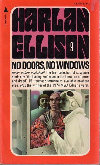
The Dillons - Leo and Diane - became one of the most famous illustrative artists of the speculative fiction field, beloved of by more than one author. I met their work through the books of my favorite author, Harlan Ellison; the cover of a copy of Approaching Oblivion, a collection I got through one of those 'get-10-books-for-a-penny' book clubs, was done by then.

If you read paperback SF through the 70s and you got an Ellison book you probably was introduced to The Dillons through the Pyramid Harlan Ellison Uniform series, a line with identically-designed covers different only by the color scheme and the cover art. The books are easy to identify: the name HARLAN ELLISON fills the upper third, designed in a typeface that seems of-the-times, with the counter in the O replaced by the number-in-series of the book itself. After the boldfaced book title and a short tagline takes up the remainder of that upper half, the lower half is reserved for the cover art.

When I'd heard that Leo Dillon had passed away, it gave me cause to think about the effect great cover art has on the reader. A book without cover art or design is fine enough - you're going in for the meat anyway, and some books comport themselves by reputation alone. A book with bad or mismatched cover art is irritating; you feel like you're told a lie just to get you to open a book. But cover art that speaks intimately to the subject matter inside - or at least respect it - makes you ready for the material within. It softens you up in the good way. If you opened Ellison's No Doors, No Windows with any other sort of cover art, I don't know if you'd be as receptive to the contents within. And each one had an easter-egg; somewhere in the cover art was a depiction of Harlan. Some were easier to find (see right) than others. I own six of them: No Doors, No Windows; Gentleman Junkie; Partners in Wonder; Spider Kiss; The Other Glass Teat; Memos From Purgatory.

Leo and Diane Dillon had a real understanding of where Harlan was trying to get to with his strange and wonderful stories. They must have. How else would they come up with cover art that so intimately suits the material? And how else would they get the intense and sincere favor of Ellison, if he didn't think they picked up what he furiously put down?

The Dillons illustrated a lot of speculative fiction works over the years, and their work has won plaudits: at least one Hugo, two Caldecotts, Society of Illustrators Hall of Fame; the list goes on (and is provided by some Wikipedian for your convenience). I feel lessened that such a man is gone.

I've never met them, but I feel for Diane, in as much as I have a lifelong romance with a spouse, as well, and I can't even begin to imagine what life would be like without her.

Leo Dillon, 1933-2012.

26 May 2012

[art] Is Your Signature Style Killing Your Art?

2830.Being an aspiring artist, I read ere and oft about the importance of finding your individual "voice", mostly expressed as distilling a signature style that can make your work recognizable and then developing that personal métier. This is marketed as a laudable goal on the way to becoming an accomplished artist and, to the beginner and the aspirant, makes some sense.


Eugenia Loli, however, prefers not to:
In my opinion, “finding your personal style” is ARTISTIC DEATH. It doesn’t show maturation, it shows old age. The artist, unable to think differently anymore. The artist, stuck in seeing the world in one way. The artist, doing art for art’s sake without further exploration. The artist, becomes single-dimensional, no matter how complex his artwork is.
She makes a good case in very few words. At least it deserves some consideration, I think: the idea of doing one thing in a certain way for so long that it becomes second nature seems to imply a lack of further development so prima-facie obvious that it requires no proving.

However, I think there is some advantage to having a signature style to go-to, where you can let your inspiration just flow onto the page without thinking about some new way of doing something. Eugenia makes a good point, complete with chewy food for thought, but I think I'll probably stand somewhere between the extremes. I don't think any tool is worth ignoring or disregarding, and I regard a signature style as a tool in the tool box.

Perhaps a third way to think of this is to be ready to lay down your 'personal' style, to keep a watchful eye on what one does as an artist, and if the idea of sameness creeps in to your work, and it becomes more of a chore than a joy, then it's time to do something different for a while. Put away your signature style for a while and come back to it when you're refreshed. What you've found out in the meantime will feed back into that style, and make it more fleshed out, more deep and interesting.


17 May 2012

[art_liff] Shaun Tan Makes An Excellent Gift Idea

2821.The real dear gift was from The Wife™ who knows my number, too.

I am a huge fan of Shaun Tan. I am a late arrival to that party, sadly, because his books generally get marketed to children, but he's a fantasist on the level of, say, a Harlan Ellison, but one who wields a pencil with the same gusto and sense of surreality that he does with his words.

Many of you already know of his wondrous book The Arrival, and if you don't you should. It's not just an immigrant's experience, it's the immigrant experience, portrayed in a world that is fantastical and phantasmagorical in its way, wondrous and cool, with vistas open to great colossi and geometric cities that can't exist but do in this world. It tells its story without words, but tells it clearly enough.

Surf this link to see pictures from the book: http://www.shauntan.net/books/the-arrival.html. Tell me this man isn't God's gift to the pencil. The incredible imagination and deep humanity blazes fort from every page.

Shaun Tan has forgotten more than all my other favorite artists have known about illustration.