Showing posts with label identity and branding. Show all posts

10 December 2017

SDCC: All Your Comic Con™ Are Belong To Us

3534/A.
A tale from the branding and trademark war: Forbes magazine is reporting that, in a rights battle between the organizers of what was up until now called the Salt Lake City Comic Con and the juggernaut-of-them-all, San Diego Comic Con International, the side that cast themselves as the David in the all-too-inevitable David v. Goliath interpretation, the SLC group, lost in its contention that the term comic con was one that was a generic description of a convention-style (at least as this legal layman understands it) event celebrating comics (and in the SDCC case, just about every corner of pop culture).

A fairly close reading of the article suggests that however one might feel about the battle, the SLC organizers show signs of being the wrong partisans. For example, the article cites a finding in which two of the organizers voted themselves a six-figure bonus even as they were crowdfunding their legal defense; if someone was going to release a zig for great justice, this may not have been the ideal one, even with a barnstorming prosecution via the court of public opinion. Meanwhile, SDCC seemed to have a solid case on their side and proved infringement in court.

As a result, many fan events calling themselves 'comic cons' may find themselves having to negotiate agreements with SDCC International just to use the term, this case having established a precedent. Since IANAL, I imagine there's a lot of context that may come to bear, but the article also mentions a few top-echelon Comic Cons that have worked out licensing agreements with SDCC, Emerald City ComicCon and our own local Rose City Comic Con. There are also many ways to title an event: the current-on-hiatus indie fest Linework NW and a few small micro-cons offer examples of this and how it can avoid what is now a court-adjudicated trademark issue.

It's kind of like the dark side of the idea of trademarks and service marks, and I can't help it: proving one has the rights to a generic-sounding trademark like "Comic Con" feels a little like trademarking the phrase "I Love You" (which I remember happening during my lifetime), or "air" as "something to breathe." In the context of first-magnitude events, it attains a certain level of reasonableness, somehow, however.

This definitely puts a new wrinkle into the idea of crafting an identity and personality for media-centered fan events going forward. The ripples from this one will probably be spreading out for a while.


21 October 2016

[logo] The New MetLife Logo: What They Ditched Snoopy For

3411.
Despite the wide-spread social consternation over the forced retirement of Peanuts' Snoopy from the logo of the insurance firm MetLife, I was a little bemused to find very little … nothing really at the time … about the new look of MetLife other than logo talk about colors and type font changes and business friendly this-or-that.

I did finally turn up what the new logo and word mark is, and here you go:


In logo-ese, the blue references the company's historic logo and brings that presence forward, and the green represents energy and life. The profile of the logo glyph is that of an M, and if you need to be told what that stands for I don't want to know you any more, and the two colors combine to form a dark bluish not-really-a-color which probably signifies something somehow. You decide.

I do enjoy the new type, which is a solid improvement over the old one which now looks dated next to it. That was a good choice.

Also, business-friendly black.

A link to the page that contains all this info (and a link to a PDF press release too)? Here you go, pilgrim: https://www.metlife.com/about-us/brand/

[logo] Why MetLife Would Kick Snoopy To The Curb

3409.
Much consternation in the public as the nationally-recognized insurance icon, MetLife, is doing away with a multi-decade branding institution by ending its identification with Snoopy and the Peanuts characters, themselves American icons. But why?

It seems a sad thing to do, but when it comes to branding, meaning is everything. Up until now MetLife has been big in consumer life insurance, currently the largest life insurer in the United States. In 1975 it licensed the characters because, in the words of Esther Lee, MetLife chief marketing officer, they wanted "to make our company more friendly and approachable during a time when insurance companies were seen as cold and distant."

MetLife will be exiting from the personal insurance market by this time in 2017 for a more B2B approach: selling directly to corporations that provide insurance to employees. Being solely in the corporate market, being seen as cold and distant, a drawback anywhere else, becomes a positive boon. The new logo set, which we've not yet seen, has been described as being in a different typeface, with a change to a more "business friendly" black color.

About as cuddly as a leather briefcase, but it works for them, and, just as importantly, it'll save them around fifteen megabucks a year in licensing fees, because there'll be no cartoon characters to buy the rights to. One wonders if they got the 'coffee's for closers' speech before being shown the door. Whatever.

The Inquistr has the best article I've seen about it so far, with several aghast tweets

30 August 2015

[branding] When Dead Celebrities Endorse

3224.
If they had only checked out the time they brought Orville Redenbacher from the dead. If only.

In May, 2015, KFC, as everyone by now knows, reincarnated (reintarnated, one could say) the legendary founder characater, Colonel Harland Sanders, in a series of slightly twisted commercials which simultaneously touched on KFC's heritage as well as dark places in our collective id that shouldn't have been touched; my recollection of the most-used adjective to descirbe SNL-alum Darrel Hammond's cackling Colonel is 'creepy'.

So, in July, KFC changed Colonels, literally. Now, filling the white suit is also-SNL-alum Norm Macdonald, a curious choice to portray the man if ever there was one. This USA Today article details some of the dissonances by some of the people who knew him. The narrative seems to be him, the real, sincere Colonel, coming back into play because some celebrity impersonator tried to take that identity. He's here to get it back, and to assert that you just can't throw a white suit on some super-funny Hollywood actor and have yourself a real Colonel, amusingly and metareferentially doing it while putting on a clip-on ribbon bowtie and, through quick-cuts, throwing a white suit on what appears to be a super-funny Hollywood actor.

I can't shake the idea that KFC has some sort of surreal long-game here. The self-referentially sarcastic frame is too plain for me to ignore. The USA Today article suggests that KFC's trimming everything in weird to refresh the brand, and maybe that's so.

But I still think everyone in branding who's trying to revive an old founder as a brand icon should see this 2007 ad for Orville Redenbacher. He was born in Indiana and died in California in 1995. There was, therefore, no live Orville to do a commercial with, and they wanted to touch on the country's history of using him in those aw-shucks commercials that he used to do so well.

So, what did they use to bring him back? CGI. The result is the scenic overlook to the Uncanny Valley:


I can't watch that without wondering what Outer Limits episode it was supposed to go in on. Response was in accordance; the brand's attempt to re-animate Orville pretty much stopped there.

Still, I can't help but giggle at the KFC Commercials … the oddball approach seems to be working, at least that way. And Macdonald is actually a slightly funnier Colonel than Hammond was, because Macdonald plays it so dry and straight ahead.

The bigger question I have? Why is it that suddenly American comedy is powered by SNL graduates. They seem to be taking over.

Now, there's a conspiracy story that needs to be told. 

25 March 2015

[branding] On My First Pair of "Doc" Martens

3166.
It has come to pass, at this stage of the game, that I've been introduced to my first pair of Dr. Martens shoes. And since I started breaking them in, a surprisingly gentle process, I've been struck suddenly with a great many resonances with what I've learnt over time about style, reputation, and that god of our modern times, branding. 

The Shoes In Question. Dr Martens Icon 7B10 SSF.
Branding is all, it must be writ somewhere largely, more than likely in some latter-day design text. And, to a degree, it makes sense. More than ever, marketing doesn't just seem to mean getting things sold, it means survival. And Docs have survived, that's for certain - 50 years and more now.

What the brand signature of Docs contain, then, carries a lot of baggage. They've been everywhere … from the forefront of 60s British rock and roll (Pete Townshend made them famous and Tommy put them on the map, according to the legend) to the urban discontent of 70s and 80s era punks and skinheads – a signature of violence. Since then, they've ascended to the rarefied air of timeless fashion, it would seem. And now, non-ironically, characters from Adventure Time are rocking them.

Dr. Martens are as likely to be worn latterly as for reasons of style as well as for reasons of function. In several cities in America and around the world, Dr. Martins have boutique-style storefronts; Portland is one of them, with a store at the corner of NW 10th Ave. and W. Burnside Street, across the street from Powell's Books.

There's history there … you can shop in a space that once held the broadcast booth where the legendary KISN Good Guys held court, visibly from the street. A lot of commerce has gone that way.

For someone like me, the primary consideration in investing in a pair of Docs is quality and endurance. I prefer the workboot style – properly kept, in a sharp style and profile, goes with just about anything, and will take you everywhere. The well-done workboot, with its treaded, skid-resistant sole, should offer traction that will make the urban walker feel confident on and off the street. It's a real all-purpose style for someone who doesn't want to be bothered too much about it.

The Dr. Martens Icon 7B10 SSF gives me all that, and more there's the obvious appeal to quality. The manufacturer makes a pride of showing off the quality steps involved, and, if you come from a background of buying a pair of Payless Shoe Source shoes every couple of years, after thrashing the current pair, the high quality of the components are obvious after even the most causal perusal. Next to the famous air-cushioned soles of the Docs, the soles of the Payless shoes seem cheap plastic; the leather of the uppers is supple and feels good to the touch, as opposed to the cheaper, thinner leather of the others; the pull-strap on the back of the shoe seems designed with easy donning in mind, rather than simply put there for looks. Dr. Martens has learned lessons in fit, design and construction from the decades of serving workers of many lands (before it made its debut on the stage, Docs were favored by workers in heavy trades such as construction and postal work).

So, by now, Dr. Martens is all those things and more, an example of basic style that adapts to the whims of fashion and though it went on outings with thugs in its youth, it's grown up and gotten down to work, and if the message is sometimes a little mixed (we fancy our Docs were Made in England, as in the web site's screenshot - though mine were made in China, and Made In England applies to a subset of their styles) the accent on solid quality for the value (you'll be paying a lot for a good pair of Docs, but you'll presumably get at least as much back in function and use) keeps it a vital product, and all of that positive attribution makes it into the brand, and keeps it valuable.

If it keeps me out of the shoe store every two years, stays easy-to-wear, and stays looking good, then that'll aquit them with me. 

17 June 2014

[#logo] The Vincent Price Legacy Logo - Best Thing I've Seen Today

3114.
Or maybe I'm in a macabre mood, maybe that's it.

To anyone with a horror-movie bent (or maybe hunch-back, if you prefer), Vincent Price is an icon amongst icons. I remember growing up during the latter half of his career, just after he'd made is greats and was doing more television work than film. Funny thing about Vincent, though … he could star in the most throwaway piece of TV tripe but just having him there made the whole thing watchable. He was rocking the idea of being an past-one's-peak actor long before William Shatner even started to make it fashionable.

He did it by being a compleat personality. There was Vincent the aesthete, Vincent the intellectual, Vincent the style maven, and - most notably - Victor the gourmet cook and author, doing his small and stylish part to make the world safe for the modern foodie.

It's a bit unfair, though not inappropriate, to think of him as merely a horror film icon.

Toward the latter period of his life, he lent his considerable mind toward art. There is a museum of art and his legacy that exist in his name. The Vincent Price Legacy, http://vincentprice.com, is where you connect to all that awesomeness. But what's got me enthused today is that I stumbled on this pitch-perfect logo, which encapsulates all the sophistication, charm, wit, and style of the great man:


This is the first  time I've seen it and it is sooooo perfect.  Understated and urbane …

What I usually say?

Wish I'd of thought of it.

20 May 2014

[branding] While You Eat McDonald's, Its New Mascot Will Consume Your Soul

3090.
McDonalds, that symbol of the modern age, has a new mascot intended to encourage kids to eat healthier versions of its Happy Meals™. I'm sure it will encourage them to eat something, but it will either be Burger King, or their own hopes and dreams in some sort of existential terror.

They call it "Happy". And what it's happy from, exactly, I don't want to know.

Where to begin? Those eyes, those dead, dead eyes, devoid of emotion? The arms, like animated strands of pasta horror, waiting to grasp you? Or that mouth, that entry to the utter void of ravenous nothingness, seemingly torn from the living, with a darkness within that seems to be struggling to come out, like some poisonous misama driven to smother the living?

Gaze upon the horror, if you can:


Say hello to their little friend. They say it's popular in Europe.

There are a lot of things that are popular in Europe that don't have legs here.

Not even legs like those.

I'm not sure which horseman of the Apocalypse this is supposed to be, but it is one.  I know it!

02 May 2014

[branding] John Oliver Shoots Messenger, Runs Them Over, Looks Behind Car, And Backs Over Them, Just To Make Sure They're Down

3077.
Thus spake ZehnKatzen: this is what comes of being the face of an initiative and, naturally, leading with your chin.

It's writ large in more than one place: success has a million parents; failure, an orphan. And, when something huge pancakes like Cover Oregon did, a failure that's going to be talked about for years after the last lawsuit is settled, it sits at ground zero of a field where every nuclear-tipped satire missile has its gimlet-eyed guidance trained on. So, perhaps it's something we should have expected when the ads for Cover Oregon … which just begged to be called totes adorbs … became, essentially, the face of failure for those looking for the cutting gag.

The ads, which featured a sort of living diorama of Oregoniana and were peopled by members of the Portland Cello Project and folk singer Laura Gibson, were kick-ass and I enjoyed them. Easy and delightful on the eye as well as the ear, and as Oregon as f##k, had Cover Oregon been the success it ought to have been, would have been fondly seen as the face of a great, good thing.

But Cover Oregon … well, what didn't go wrong? The State of Oregon will have to assemble several new agencies to invent things to mess up just to even out the shambolic mess. Of all the state Obamacare exchanges, only Oregon's never worked. Never signed up a single person. Of course, the alternative, the paper application route, did the yeoman's job … and had the CO site worked, they would have been more than half-way to their enrollment goals within the first week. The problem with, and the reason the media let us way down about all the state Obamacare exchanges, is because the narrative was kept stupidly simple: it was all about the website. Websites, websites, websites. Obamacare is a failure because website website website.

This should not be seen as a high point in American journalism. The reportage from just about every outlet was shallower than a children's wading pool, insight-free, and only grudgingly seemed to accept that anyone was getting access to health care at all. But for every minute of reporting that progress was getting made, we seemed to get a half hour of how the IT sucked. And since Cover Oregon never worked, well, we got poster kid right here in River City. Governor K and Oracle are pointing so many fingers they have to rent extra hands just to get the job done.

Recently, it is writ, John Oliver, who made his satirical bones as Jon Stewart's relief on The Daily Show, got enough notice that he was given his own satirical news show on another network. And, judging by his performance, Cover Oregon was low-hanging fruit that was just too good to ignore. His show produced a spoof commercial that  … well, to call it acidic would be gilding the lily.

I'll be honest, at first, I giggled a bit. Some of the humor is dead-on. We do get a bit too twee for our own good out here; if the Olympics are ever held in Oregon, count on Oregonians taking silver, gold, and bronze in smug patting-ourselves-on-the back.

I thought that dude carrying the spinning beach-ball cursor across the set was genius.

But if we Oregonians are a bit too smug about our adorableness, I've got to point out that Oliver's commentary got a bit too smug about pointing out how smug we all are.

Welcome to honorary Oregonianship, Mr. Oliver.

Doubling down on the perception-as-reality tip, it really went to town on mixing up the idea that the commercials promoted Cover Oregon with the idea that the commercials were Cover Oregon before going in for the delicious, gory, satirical kill. In the end, it was clear that he was enjoying calling the entire state of Oregon idiots maybe just a little too much. 

Here's the sort of news that gets lost when the satire is as shallow as the reporting (emphasis mine):
You may think it’s especially unjust because our work helped delivered the numbers: awareness of Cover Oregon through advertising increased nearly 70% in only four months prior to the first enrollment window in 2013. And on that first day of enrollment, a third of a million people came to the website to sign up. Had it been working, it’s a safe estimate we would have been more than half-way to enrollment goals within the first week. Relative to the marketing budget, along with the many efforts of the Cover Oregon marketing team, we created real return on taxpayer money.It’s also never mentioned that as portal delays and bad press persisted, we hunkered down, responded with ads that were transparent, honest and informative. We worked especially hard with the Cover Oregon team to move people toward paper applications through agents and sign-up fairs.Most importantly they fail to mention that, despite the broken portal, more than 250,000 Oregonians who previously had no access to health insurance were still able to shop for, apply for, and obtain coverage. Even with no online portal, Oregon is in the middle ranking for state enrollments. Remarkable, given the circumstances, and also a tribute to the tireless efforts of Cover Oregon’s communications and marketing staff.
The agency that produced the ads is North, an agency that did a very effective job with your tax money, Oregonians. You should be proud; they took it seriously, did a sincere job, and got the word out effectively.

But failure is an orphan, and North gets the blame for being the bad parent, even though it ain't so.

But if you insist on sticking them with the blame, then nobody gets to complain when they own the good parts, too … people are right to be upset that CO was such a disaster, and now North has to live with the fact that their honest, passionate deft work is going to be permanently associated with a broke website, but that's life.

North is proud to be stupid f##king idiots, given the world today.

More power to 'em, I say.

26 April 2014

[pdx] Juanita vs. Josefina: A New Chip Tries To Block Off The Old Chip

3071.
Josefina is out to get Juanita.

This could get ugly … but we hope not.

In this corner, Juanita's yummy-a$$ tortilla chips … an Oregon original, made in Oregon, by Oregonians of Latino descent. Hood River produces more than apples, beer, spirits, windsurfers, and charming train rides.

In this corner, the challenger … Cocina de Josefina, produced by a plant off Fruit Valley Road in Vancouver. Local? Kinda …  as Willamette Week has revealed …
But while the chips are indeed made in the Northwest, they're manufactured at the Vancouver Frito-Lay plant at 4808 NW Fruit Valley Rd., the Columbian first reported, and Frito-Lay is listed nowhere on the packaging because, in the words of a spokesperson, "this is a specialty brand in the Northwest. We wanted it to have that local feel." Some stores display the chips with "Made in Vancouver" signs.

Remember these commercials?


Now, it's true that Cocina de Josefina brand is made in Vancouver, but since the initiative doesn't seem to come straight outta Vancouver, it makes us think of a trend in marketing that makes us pretty sad, and that's this compulsion the big players seem to have to horn in on every single market they can make an excuse to compete in. Life is homogeneous as it is, and Frito-Lay is hardly hurting for customers. Cocina de Josefina … whose bags, while not identical to Juanita's, has a design resonance which seems more than coincidental … is apparently going up against Juanita's, and, well, those are some great chips. You can't really improve on what's already good and satisfying.

The best you can do is reinvent the wheel. An the wheel's rolling pretty good as it is.

Well, they're going to do what they're going to do, regardless of what lil'ol' me says. So, for me and my house, we'll stick with Juanita's.

When you have a choice between the fake-local and local, I recommend going with the local every time. 

05 April 2014

[brand] Spearmint Rhino Is a "Gentlemens Club". No, I Wouldn't Have Guessed Either.

3044.
Living in Portland, one develops a certain blasé mien toward strip clubs. Not that they are necessarily something that one welcomes to a neighborhood, really. More a recognition, much as the seashore recognizes the tide is coming in whether it likes it or not, that it's coming … like it or not.

Personally, I don't have a problem with strip clubs as such; I don't patronize them, I don't like a lot about them, but people are going to want them and others are going to set them up for those people. Sex sells, and almost everyone's buying. 'Specially here in PDX, where the reputation for such establishments is nothing short of legendary.

We can, each one of us, I suppose, differ on whether or not there are are too many of them. I don't think Portland needs any more, really, and I have proof that they're getting a little too common (if that be possible; they've long since run out of names for them that are impossible not to mock.

I figured we were in a dark place when a local Division Street dive bar of long standing, the Peanut Farm, at 12646 SE Division Street, became yet another strip club … but called itself the Pitiful Princess. That's the most depressing name I can think of for a strip club. Pitiful Princess. It's like naming a strip club Daddy Issues. 

Well, the sun rises and sets, the tide goes in and out, and, like the ticking of some sleazy clock, another strip club has opened in Stumptown, and it's called …

Spearmint Rhino. 

Wait … what?

Yeah. Spearmint Rhino. It doesn't seem to be code for anything, it isn't some bizarre and obscure name for a hitherto little-known bit of male or female intimate anatomy. Spearmint Rhino. A name designed to leave you scratching your head. The logo (right) isn't particularly brilliant or inspired, but at least it looks like someone spent some time on designing it. If you really want to say something for it … hey, nice font, I guess.

Give it that.

So, Spearmint Rhino, a name that will come to signify something in the annals of something somehow, has opened its doors in PDX. Yayz. And you know what else? Hey, it's an international chain! Yayz again! According to Wikipedia, the club opened in 1989 as a supplement to the existing Peppermint Elephant Restaurant. So, there's that.

So, we missed out on the Peppermint Elephant, but we do know that it took supplements.

Stay tuned for what are sure to be newer additions to the panoply of being able to see naked women in Portland:

  • Vanilla Zebra
  • Raspberry Giraffe
  • Licorice Bison
  • Habañero Hippo
  • Butterscotch Buffalo
Oh, we could go on.  But we won't.

No, I ain't giving you directions. You got Google. Find in yourowndangself.

04 April 2014

[design] Q: What Do A Major Liberal Poliblog Site And A Famous Conservative Tycoon Have In Common?

3042.
A: The same illustration. And it's crazy.

By now, the Daily Kos should need no introduction to anyone liberal (or anyone who finds us suspicious). One of the kings-of-the-liberal-blogosphere, it's been going strong since the early days of W, when a vet named Markos Moulitsas Zúniga created a liberal blog of his own. It grew and grew and grew, and now innumerable users post thousands of posts in discussions daily. It's a community in the sense of the thing; not only are there message boards, but each user can maintain an on-site blog, a diary. It's become fairly sprawling.

And, to anyone who reads the political news with any depth, the name Charles Koch has resonance as well. He is part of a family that's so wealthy they could probably buy and sell the Waltons a handful of times over, and whose company, Koch Industries, owns enough industrial power than it's downright tough to avoid all the products that they produce. Notably for this narrative, they donate and support conservative causes enthusiastically.

I don't think it's unreasonable to say that a Koch is pretty much nearly the opposite of a Kossack.

So, when the WSJ decided to publish an op-ed by Charles Koch, what with patriotic feelings appertaining and all , it was felt reasonable to come up with an illustration … well, like this:


Some of you who visit DKos on a regular bases (amusingly, I'm not amongst that – no hating, I'm just more a Democratic Underground sorta guy, kind of like Yale vs. Harvard) will recognize that image, because, for a very long time, here was DKos's virtual logo:


It's not kinda the same thing. It's exactly the same thing.

Now, I've got to hasten to point out that this is clearly not a case of copyright infringement; as the notation at the WSJ notes, the image was licensed from Getty Images, which is undoubtedly where DKos got it as well. Anyone can pay for a license, and with Getty Images making a great deal of its library free for use, we can probably expect to see a lot more of this. Also, DKos has refined the idea; it's not exactly the same thing any more:


… but still it's something that makes you go hmmmm … was it sort of a jibe? Was the person who chose the illustration 'taking the piss', as the Brits say, out of the idealized typical Kossack? Did they think they were 'reclaiming' an image for one side or another in a great Manichean struggle?

Or was it just a coincidence?

Either way, it's a thing that makes you go hmmm …

27 March 2013

[brand] Branded With a Life Sentence

2905.Being a national brand's spokes-face carries dangers of its own.

One can read any number of tales of an actors' stereotyping due to a strong character identification … Adam West and Batman come to mind. But what of those who become so strongly identified with a brand name consumer product?

Like Enzyte's "Smilin' Bob" … Joe Isuzu … The Dell Dude?

They've handled the fame and stereotyping in different ways. Joe Isuzu (David Leasure) kept trying until he got a sitcom role. Andrew Olcott (Smilin' Bob) went into production. Ben Curtis (The Dell Dude) is trying to be a filmmaker and trying to get roles as an actor … and, in the most folorn way, hoping that the Dell dude can make a comeback somehow.

Businessweek Insider has the most interesting story here. Call it a most unexpected dark side of the branding equation.

I'm betting Stephanie Courtney can probably find life after Flo the Progressive Girl, whenever that happens … but it'll probably touch and go, for a while.

23 June 2012

[logo] The Biggest Bimbo You've Never Heard Of

2846.One of the niftiest and funnest things in language as well as design is when a foreign firm or company translates itself into American English terms without changing the name that made them famous, even if that name picks up baggage in the translation.

For example.

If I asked you, without Googling, now, what the largest bakery in America would be, what would you say?

Hostess?

Guess again … Bimbo.


Portland newsie Kristi Turnquist peeped this on the back of a delivery truck, and it struck her as funny, presumably because the word bimbo has a historic association with women of a certain perceived character.

The real funny thing about it, though, is that the word Bimbo … pronounced in its native Spanish, "BEEM-bo" rather than the American English "BIM-bo", means nothing in that native tongue. Research indicates its a made-up word. In Latin America, however, it's a market titan, and in some countries, it's pretty much a synonym for bread itself.

Like many companies these days, it's a multinational; it has a huge subsidiary in the USA called Bimbo Bakeries USA which, during the last decade, has merged its way into becoming the single largest baked goods producer in the nation.

Had a Boboli pizza crust? Oroweat bread? Thomas' English Muffin? You're having a Bimbo for lunch, bucko.

Now, that's one big Bimbo. 

20 April 2012

[branding] Whither And/Or Whence Oak Grove, Oregon?

2799Seen in The Oregonian today:

The sign just appeared. If anyone knows where it came from, they haven't come forward. But there it was -- the white and green "Welcome to Oak Grove" sign nailed below the green state signs on southbound McLoughlin Boulevard alerting drivers to the next towns coming up.  
That was April 4. Two days later, Milwaukie crews took the sign down because it wasn't actually in the unincorporated Oak Grove area, but one-third of a mile north, inside Milwaukie's city limits. Instead of trashing it, Milwaukie staff turned it over to Oak Grove resident Fred Nelligan. 
As it would happen, Oak Grove is a community laying roughly in the northern part of the unincorporated area of Clackamas County between Milwaukie and Gladstone. It doesn't include the whole of that area, of course; if you go to the corner of SE McLoughlin Blvd and SE Oak Grove Blvd, right by the Oak Grove Fred Meyer store, and draw a circle about 1.5 miles in radius about that point that'll pretty much take in most of the community. While some definitions have it between the Willamette River and Oatfield Road, others are a little more generous going east. And I'll be frank; I don't know what the neighborhood association's definition is.

But it's a pleasant enough place. I know several people there and they're very happy with the area; there's always been a banked fire of pride about being from Oak Grove. But never a strong sense of that thing we can't do without any more, 'brand identity'.

What is Oak Grove? Well, it's a bit of land in Clackamas County with a community that has a shared identity. It's got all sorts of incomes and lifestyles, from high to low; its axis is one of Oregon's oldest highways, State Hwy 99E, also known as McLoughlin Blvd, named for Oregon's most notable European pioneer. Follow that road south just a couple more miles and you land in Oregon City, where Oregon (and most of the organized American West) began. There are prosperous middle-class residents off either side of McLoughlin, even if some of the properties along that old road seem rather distressed. And there's a panoply of opportunities to spend your money on the main drag; chances are, if you can't find it along McLoughlin, you can get by without it for a little while. There is some local history, if one considers the famous "Bomber", which has a quirky history of its very own.

What Oak Grove is really doing right now is growing an identity. Up until now, that identity was pretty much a place you passed through either just after leaving or just before you get to Milwaukie. There's bound to be some basic human "you had to be there" silliness, like an unknown signster putting up a "Welcome To Oak Grove" sign up on a state milepost sign that's actually 1/2 mile inside the Milwaukie city limits.

But Oak Grove is a nice place with a whole lot of nice people, and community is a good thing, and they have a right to be proud as they build that community.

More power to them.

Just put the right sign in the right place, next time. Remember, it's easier to ask forgiveness than to ask permission, as someone once said.

You should probably try getting permission next time though.

08 March 2012

[branding] Dollar Shave Club Proves Cheeky Humor Still Sells

2791… well, at least it still sells if you pitch it just so.

In a conversation last night, I overheard someone talking about Dollar Shave Club, that it was apparently a dotcom that sent you just your basic, two-bladed razor for a dollar a month. Skeptical? You bet. But I've seen sillier things sold seriously (Artisanal Pencil Sharpening, anyone?) and anyone who's been on the intertubez for any length of time knows that it really does allow you to fuse things that weren't really 'fusable' before into something that works.

According to this article at Huffington Post*, the entrepreneur behind it, Michael Dubin, was able to mash up direct importing form China and Korea** with the savings that strictly-internet commerce can provide to deliver a free handle, five blades/month of a basic two-bladed men's razor for $1/unit, or $3/month.

What really gets this over-the-hump, however, is the cheeky, dry humor that seems to borrow as much from the sensibility of The Daily Show as it does Saturday Night Live with a dash of National Lampoon. The video, of course, has gone viral. Touching on such things as the quality-price-value proposition, men's grooming over the 20th Century (you're handsome Grandpa just used one blade, and he had polio) lampooning of some trite ad-speak, and even works in how he's improving the economy. Just watch.


The three models offered show a similar wry humor. The DSC's basic model, 'The Humble Twin' boasts that it 'does not front'; the middle-range model, 'The 4X', is good enough for you and your girlfriend; the Cadillac of the line, 'The Executive', 'comes from the future and lives in Outer Space'.

But this startup does exist and will send you blades at prices that make buying your shave at the variety, grocery, and drug store look kind of look a little extravagant. And I enjoy the humor.

Even though I wear a beard. Makes me wish I preferred being clean-shaven.

*I refuse to call it HuffPo. I cry and die inside whenever anyone I know does.
** I, too am a bit conflicted about importing from China and Korea but, on the upside, Alejandra wasn't working last month, and this month, she is. So that's something right there. 

20 February 2012

[logo] Four Blue Screens: The Windows 8 Logo

2782Software brand identities, they be funny things, yarr.

Software enthusiasts tend to fly these things like flags and they begin to feel as though, merely by looking at a symbol and identifying it it becomes, in a certain real way, theirs. I remember the minor uproar when the icon for the Mac Finder got changed just a little; the big collective point-and-laugh when Quark debuted a logo that was all but exactly identical to that of the Scottish Arts Council; and the wistful sigh of regret when Apple shifted from a rainbow to a cold, glossy sheen.

Didn't know so many people felt that way about Alar. So 1980s.

Anywhoozle, it struck me as odd that Microsoft should even want to update the Windows logo. I thought it rather keen. The original logo, back along about Windows 1, was very straightforward and functional. Showed what it did. Didn't mess around.


Yup. Pretty nifty. But it went from that, evolving, to this:


The accent for me isn't so much on the type (though I enjoy it muchly) but the evolution of the graphical representation of the idea of windows. It was obvious up top, and here in the middle it has the flag-like wave the world has come to know and love in the design. 

There is a thing in design called dynamic tension. Anything squared off and balanced or aligned or symmetrical expresses a sort of 'locked down' feeling … all energy balanced, all bases covered. Giving something a slant visually suggests unbalance, and we all understand potential energy on a primordial level, so we imbue the unbalanced logo with a sort of energy. Dynamism. Tension. Dynamic tension. And despite it sounding like a damnation, in Logoville, dynamic tension, artfully managed, can visually energize a logo.

But MSFT has a habit of not leaving well enough alone. And thus, and so, and here, courtesy of the design giant Pentagram is the new look of Windows 8:


The four blue screens. 

I don't place a whole lot of emotional value into the Windows logo, actually; there are other logos I care much more about. But I thought, in its 7 incarnation, with the warm color and the reduction of the wavy-flag look, it had arrived at a certain good place. And then MSFT took it elsewhere.

I don't think it's a failure, per se; Windows 8 is going to live and die on whether or not it's a great OS. I can't believe that MSFT doesn't have a few more tricks up its sleeve; with the formerly-beleaguered Apple now well resurgent and on its way to the top of the IT heap, MSFT isn't the computer-gawd it once was, but is still a Titan, with human experience worth, as the MCP might have said, worth 'millions of man-years'. The personal computer of today isn't the same as the personal computer of 2003 (or even 1993) and that's where the battle is to be waged.

But in the side-skirmish that is graphic design, the Windows 8 logo is kind of blah. Nothing to get too excited about. Flat. A bit uninteresting. But it does synch-up nicely with MSFT's Swiss-influenced "Metro" design language, emphasizing simple, clean typography, simple shapes for thumbnails and straightforward design. 

In that way, it is a success.

But the logo? I think they should have left well-enough alone. The flag? It was kinda cool.

09 September 2011

[branding] When You "Make Your Brand Work" For A Bigger Brand, Does That Make You Seem Phony?

2692.This may sound odd coming from me, since I don't really even care for Project Runway, but I happen to think that Tim Gunn is one of the most fun TV personalities out there right now.

The whole elegant, confident "Make It Work" thing. He's turned his personality into a pretty powerful brand and it's really taken him off and taken him places. As a matter of fact, he's recognizable and big enough now that he can hire his brand out to promote other brands, as this recently-released commercial where Expedia gets the Project Runway treatment …


I'm hardly a brand guru (yet), but I get a certain feeling when I see things like this.

Now, I've got to say, the commercial is very slick, and nails the PR vibe with preciseness. And it's not unentertaining. Expedia got their money's worth, and more. Tim Gunn's smoothness and personality lend a certain style to Expedia's brand that's hip and unique.

But here's where I think this might be going a bit far. I'll try not to ramble, because I'm going way subjective here … but then, that's what branding is all about.

Tim Gunn's signature phrases … Make it work, Major WOW factor … were uniquely him. They expressed his personality in ways nothing else quite could and that nobody else could ever own. He is suave and smooth in a way that's obviously sincere and authentic. I get the impression that, when we see Tim doing his Timness, we aren't seeing an act. He's not a put-on.

However, when he does it in the service of another brand, that removes a the honestness about it. More's the pity, it seems insincere now. I'm left with the impression that Expedia has enhanced his brand … but Tim's unenhanced his, and now, it's not as fun as it used to be.

Now, I'm not exactly saying that it's a bad thing to hire your brand out. Branding is a tool. It's a powerful tool with more edges than a Gillette disposable razor (see what I did there?). It can be used for evil, good, or awesome. But I do wonder if it's always a good thing to hire out your brand to support someone else's for advertising in this way. And branding, when it's used in this way, to me, sucks a bit of the sincerity out of human emotion.

Or … am I just being too sensitive here? Obviously this use of Tim Gunn's identity to promote Expedia obviously moved me in a way.

I'd be interested to know what people think. Comment, please.

19 May 2009

Can You Find The Eleven In The Big Ten?

2062.There's a artistic trick called trompe l'oeil (close-enough English pronounciation "trump loy", literally "trick of the eye"), which is an artist's way of using implied perspective to make a flat thing look three-dimensional; the painting actually seems to offer a window into another world, to tell a deeper story, to mean more than it seems to mean.

Logo designers go for this. It's not necessarily a triumph of design to have a logo tell a story, but it is wicked clever to have them do it subtly. The inimitable Larry Fire of The Fire Wire pointed me to an article at the Graphic Design Forum that illustrates logo design trompe l'oeil-age.

For instance, consider the design of the Big Ten Conference's logo, pictured right. The oldest Division I collegiate athletic association in America, it has a brand-recognition second to absolutely nobody (except maybe the Ivy League). But in 1990, Penn State joined the constellation, making the membership not ten schools, but eleven.

Big Eleven conference?

Well, no. Just like 20th Century Fox didn't change its name in the year 2001 (and the 20th Century Lanes here in SE Portland off SE 92nd Avenue and Powell Blvd retains it suddenly-rustic name) you don't mess with success. You design it into the logo. By now you should see the number 11 in the BIG TEN, but if you don't, look at the negative space on either side of T.

There you go. Logo trompe l'oeil. It tells a bigger story and makes the logo appropriate even if the name is no longer.

Via Larry Fire, then, here's a bunch of similar logos. It's pretty cool tour, and not all of them are of Randian brilliance, but many come close, and have the same deft subtletly that allows the logo to tell the story without a lot of fuss, bother, or mess (including the Toblerone bear, which I documented as well).

Technorati Tags: ,

McCall's Restaurant is Getting The Rose On

2061.As reported in The Big O today, Randy's Rose is going up on the old McCall's Restaurant (once the Vistor's Center) Building:
Last month the City Council waived the sign code to allow the large red neon rose that will twinkle during the festival. That waiver meant a lively discussion and a lone "no" vote from Commissioner Amanda Fritz, who said she was "beyond troubled" that the sign proposal didn't go before the city's Historic Landmarks Commission.

We're troubled, too, Amanda, but I've noticed that's the way things roll around here. Maybe I'm tired of all the sign and landmark controversy around here, but I kind of like it. It's not as bad as some things that they could be putting up there.

Sadly, no unicorns. A man can dream, though.

(photo screenclipped from The Big O's online version. Photo credit:Thomas Boyd)

Technorati Tags: , , , ,

12 May 2009

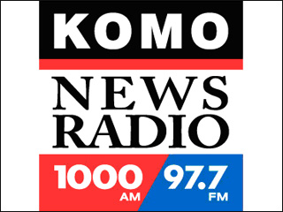
KOMO Adds FM Side, Numbers To Logo

2055.The Seattle radio station constellation has shifted just a little bit once again.

Tip o'the cap to Gentleman Ben in Seattle who keeps an eye out for these things for me, for which I am grateful. He catches such interesting things!

KOMO 1000 AM radio, a big talker in the Space Noodleplex, has signed an agreement to simulcast over 97.7 FM, KFMY, licensed to Oakville WA, currently broadcasting a Classic Hits format and serving the south Puget Sound area. It's branding is The Eagle 97.7 FM, which is kind of a confusing fit until you see all the motorcycles, pick-um-up-trucks and bikini babes on the site.


But it's going on May 15th, so get your looks while you can, you chauvinists. Anyway. An Agreement between The Flag and South Sound Broadcasting will get KOMO 1000 AM signal on both KFMY and KOMO, and KFMY will be rebranded KOMO News Radio 97.7 FM.

The KOMO AM logo looked like this:


Very straightforward, static and dependable, with a red slash under the word 'radio' for dynamic interest.  The spare typographic treatment brings to mind The Flag's former empire style, and synchs up well with the style used by all the KOMO broadcasting outlets, both radio and TV.

Adding a frequency calls for a change to the logo in KOMOland, and here's what they did:


This has works and not-works to speak for it. Overall it's an improvment, but I'm not sure I'd execute it quite that way.

Here's the works about it:
  • The overall balanced aspect of the logo – the square, stable shape – has been retained. The call-sign and frequencies have remained in a very modern, machine-like font, which resonates with the old look, thereby maintaining the identification on a visual level.
  • The same blue, black, and red colors are used. Consistent use of color continues to stableize the brand identification.
  • The serifed, humanist type in the middle would be an off note, but it's bookended top and bottom by the stable rectangular shapes that define the limits of the design. It's not unlike a book and its pages that way; you have thick covers and thin, flexible pages, but it's a single unit. The choice of a serifed font is a dignified touch that gives an impression of seriousness and tradition.
Now, what doesn't work:
  • My essential crotchet about this design comes from the division of the bottom stripe into red and blue parts with a slanted line. In and of itself, this isn't such a bad thing; it reminds one of a slash one might write when making a note about the two frequencies (1000AM/97.7FM), and also is engineered to be parallel to the slated strokes in the 7's. The sour note that rings comes from the inclusion of a slanting element where it seems actually rather awkward. The entire logo bases itself on a stable, locked-down look, which is appropriate for a broadcast outlet that specializes in news – a commodity that you want people to trust when it's your product. The slanted division introduces tension in a logo where tension isn't necessarily a good thing.
It's been opined to me that it's a little boring, and I'm not going to contradict that. Boring is kind of in the eye of the beholder. Solid and ordered can be a plus if you're looking to generate an attitude of trust and respect.

And a slant as part of the logo design of a news station can work: just check the slant in the KIRO AM logo, which I analyzed to death pretty much, here.

Thanks again, Ben. You have an esteemable eye!

Technorati Tags: , , , , , ,