Showing posts with label The Daily Paint By Number. Show all posts

05 September 2022

Some Flowers from a PBN

4052

A flower break, as we take an existential breath from what we've just been through and in anticipation of what may or may not come.


27 December 2021

The Progress on Summertime Farm

4047

The current PBN project, Summertime Farm, heads toward completion. I am, evidently, going to fill in the barn last of all.


The barn is full of detailed little spaces that will require much attention, and the weathered American flag design on it so so detailed in and of itself that it requires a separate callout on the instructional diagram. 

Should be satisfying. 

24 November 2021

The Current Painting: PaintWorks 73-91733, "Summer Farm", Plate 3

4040

The progress has placed, now, a charming and nifty rock wall in the forefront of the painting. This took more than an evening because, first, there are so many little tiny regions to cover, miss, remix paint and return to, and second, I embrace this because it is very much a healing meditation.


It is, as all PaintWorks projects do, shaping up nicely, no?

Also want to mention that Princeton Art & Brush's "Snap!" value-priced line of brushes is the aspiring-artist-on-a-budget's best friend. Oh, I've said that before?

Well, it still holds true.

I finally got me a van Gogh pocket watercolor box and an water-brush pen for doing watercolors. It's a bit late, though, so I'm going to hold off on that until tomorrow. 

21 November 2021

The Current Painting: PaintWorks 73-91733, "Summer Farm", Plates 1 and 2

4039

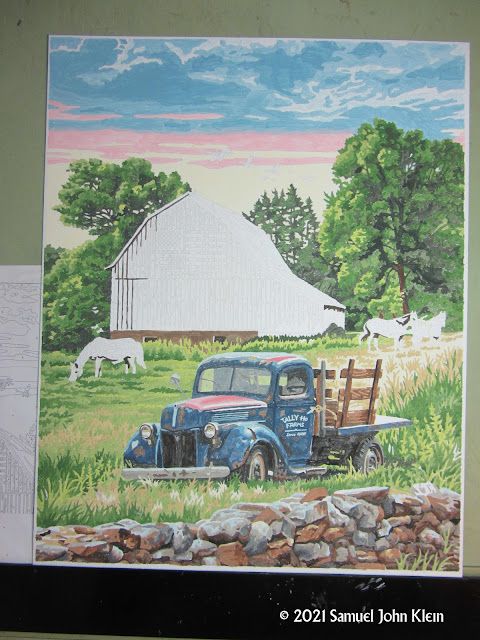
We have been getting back into painting, and PaintWorks' PBNs are always, always ready to go and great fun and much detail.

I've started one titled "Summer Farm", number 73-91733. 

This is plates 1 and 2 of progress on the bucolic scene.


The old truck emerges from the horse pasture it's abandoned in and doing all that foliage painting is great fun, very therapeutic. We need much therapy around here in the art way.

24 April 2021

Painting a Busy Thing

3829

Painting is a thing that's happening here, as I prepare to dive back into freeform painting and paint an elephant (all in due time, Grasshopper) and I'm doing another PaintWorks work called By The Harbor. in the foreground, an overstuffed antique store on a pier, its charming contents spilling out; beyond, the aforementioned harbor, a schooner moving along through

There is a riot of flowers hanting over the scene. They are a busy, busy thing to paint.


In one of those touches so charmingly PaintWorks, the instructions invite you to personalize the picture if you so feel moved to do so by painting over the outlined words on the panel and painting your own words on the sign.

It still seems liberating the way a programmed activity, paint by numbers, is very subtly subverted by this manufacturer. You can go with the lines and disregard the little techniques and it's still pretty neat when it's done, or you can dance with the techniques and go outside the envelope a little and it's a creative artistic adventure. 

That's why I love this brand so much. You can have your paint-by-number your way, if you want.

10 March 2021

Veranda PBN Progress, Plate 1

3791

The first step, as I've said before, in completing a PaintWorks project, is to cover the black area and then the gray area.

I don't know if that's best practices or not, but they are the most optically-attractive part of the design, and compel me to go there first. Tonight, I covered the black areas (leaning over to check if I've closed the black paint pot, yes, yes, I did).


And thinking of the parenthetical in the statement above makes me want to point out one of the ways in which PaintWorks quality really shines out. These are acrylic paints, as are the vast majority of PBN kits you'll find today (when I was a kid they were as likely as not oil paints, as some of my stained shirts of the time would attest). Acrylics are versatile, mix handily, give themselves to a bunch of effects that look like watercolor or oil, but they dry quick, yo, and once they do, they're literally a sort of plastic. You can't thin them down or reuse them like watercolors.

I've lost at least one PBN paint pot this way. Forgetting to cap your paint at the end of a sesh might just cost you that pot. In the pot, though, PW paints dry slow enough that if you leave it uncapped overnight, you won't necessarily lose that color. You do have to put some water in there, thin it out, and make sure you cap it; dry acrylic paint is dry acrylic paint. But, you leave this open overnight, you don't necessarily lose it.

Don't take that for granted though. Like I just day, dry acrylic paint is dry acrylic paint. I have a paint morguefile, but not everyone does. Be careful about this. 

The New PBN: PaintWorks 79-91437, Veranda, Dempsey Essick

3789

We parked on the downhill when completing Cat Signs, so we shall proceed with velocity into the next project. 

Allow me to introduce you to PaintWorks #97-91437, Veranda, design credited to on Dempsey Essick. The box perforce:


The scene suggests something of the atmosphere of Dixie, a hint of genteel living with the horse and buggy in the distance in the trees on the right.

There's something to that Southern note. The artist, Dempsey Essick, is based in Lexington, North Carolina. The artist's (who retired in 2015) work sounds a long, warm note featuring hummingbirds and other flying critters, serene rural scenes and pastoral Southern buildings lushly attended by the foliage one expects to find near them. 

Here, now, on my much-beloved palette, the 18 colors that come with the set, in the wonderfully-designed PaintWorks pots. I love this design; easy to find colors, easy to keep organized. Also the brush which, while of a higher quality than most PBN kits you'll find, still doesn't quite satisfy; I use my own, usually a #2 round for acrylics and watercolors. I've found the most satisfaction with the "Gray Matter" brand, for what that's worth.


And last, but not least, the piece itself, the panel ready to accept the paint. 20-by-14, standard for PaintWorks' larger pieces; as usual, what stands out are the areas where black is supposed to go, and the gray areas where the secondary color note will be placed.


The deck area of the veranda I'm anticipating with both excitement and trepidation. There the borders between the colors is dotted, calling for drybrushing for creating soft blends between the colors, and this really creates the effect of a shiny, painted deck. I have so far struggled with drybrushing so I'm looking forward to confronting this and making a real effort to master the technique here.

Also note the wide-open unnumbered area on that deck. Unnumbered areas usually mean you're going to paint them white (sometimes what's unnumbered on the panel is numbered on the diagram due to space and clarity issues, so confirming on the diagram is always essential) and that's just what's going to happen here. I will, however, not be applying the white; as I learned long ago, when you're painting in acrylic or watercolor, the white of the paper or panel is almost always sufficient. It simplifies things, and also demands a certain amount of caution; the fix for accidentally painting the area may mean you have to paint that area white anyway to make it look totally right. 

The color approach and theme of the piece is something outside of what I usually like to go for, so this is a little outside my comfort zone, but it's exciting and as a completed piece, should like quite lovely.

So, on we go. 

09 March 2021

Cat Signs PBN Progress, Plate 6 and Final

3788

This is it, the end product of the PaintWorks kit 73-91655, Cat Signs:


You want to pet the cat, don't you? Of course you do.

Now, on to the next person, place, or thing. 

08 March 2021

Cat Signs PBN Progress, Plate 5

3787

This is Cat Signs at the closing bell this morning. 


It's all starting to feel quite cosy (I'm choosing the British spelling for reasons) isn't it? The Craven "A" sign and the wood of the wall in back generate quite a bit of warmth.

Just the quilt in the SE corner and the outside-the-window in the NW to go. That NW corner I'm going to take a bit of care with, as there is, yes, yet again, my old nemesis, dry-brushing to be done there. But I approach the challenge with joy and a sense of adventure. 

Cat Signs PBN Progress, Plates 3 and 4

3785

This last weekend was a busy one, in the way that a work colleague who's healing up from a serious injury had to call out twice and I wound up working one 11-hour day and one 10-hour day on very short notice and I didn't even feel like doing much reading or writing so I got up to the PBN easel and filled in some more color ...

... and it felt good. 

These are the last two checkpoints on Cat Signs, and the whole thing is coming together with a shout, I must say.

In the first one, plate 3, I begin filling in the labels on the old boxes that support the box the fuzzbutt is smugly reclining in. 


I can also tell now that this is a very British shorthair. How? Google makes it easy. Googling Craven "A" Cigarettes and Pelaw tell me that both brands are British with a long history of popularity. The tobacco brand, Wikipedia tells me, was manufactured in Britain by a subsidiary of British American Tobacco, and, Wikipedia also tells me, the founder of Pakistan smoked 50 per day even when ill with tuberculosis, and Charles deGaulle rather fancied them after being deprived of his usual brand during exile in World-War-Deuce. 

It also tells me it was named after the third Earl of Craven, though not why. 

I also gather that Pelaw is a brand of polishes that have been around for a very very long time. I've found references to metal polish and shoe polish and it was apparently quite beloved for a very long time.

I know not what the Lyons' refers to.


After detailing the labels under the moggy we turn the corner and begin filling in the quilt int he corner and the tools and tool-shed impedimenta in the northeast corner of the panel. It's at that point the work really starts to pop for me and take on that impression of space and volume, that magic moment in doing these that I love so much. 

Gonna enter the home stretch very soon now. 

04 March 2021

Cat Signs PBN Progress, Plate 2

3784

It was my goal to fill in the kitty cat in the picture. 

Mission: accomplished. 

Beatific smile, scritchable fur, ears that beg for fondling, boopable nose; it's all there. The colors are very well designed here; the lighter colors aren't too far apart from each other but have enough contrast to produce that beloved tabby pattern. The darkest color, a very very shaded brown, gives the perfect counterpoint to the light cream and buff colors. It's a pleasure, this cat.

Where they fits, they sits; if you don't have scritches or treats, it's OK, make an appointment for later and they will pencil you in if you promise to have the proper accessories at that time.

Cat Signs PBN Progress, Plate 1

3783

This is the first stage of Cat Signs: 


The PaintWorks paintings, as usual, start with the black areas colored black (and those are psychologically attractive so I did that first) then the next dominant color, in gray. That, this time, was a mustard-golden-yellow, and we could predict, if we hadn't first looked at the picture on the box, that this was going to predominate in warm, happy tones. 

The lovely vintage typography, labelling,and signage is already evident. 

28 February 2021

Cat Signs, The Next PBN

3782

This is the next PBN work I'll be doing:


Dimensions PaintWorks' 73-91655, Cat Signs, by Geoffrey Tristram. 

Fluffbutts? Yes. Vintage label design? Yes yes. Both? Yes, please. 

The Bob Ross Paint-by-Number Triptych

3780

So, here's the final result of doing the three tiny numberless paint-by-number works in the Bob Ross By The Numbers kit.


... a mountain scene, Bob's iconic portrait, and a covered bridge. Just like Bob's paintings, the style lends itself to freedom if you just go with it. 

Each one of the pictures has an instructional diagram. The colors to be used are keyed to numbers in the diagram and you are given the seven colors to mix as you will. As noted before, the numbers on the diagram were actually left off the panels, and you could write the numbers on, say, with pencil, if you wanted, but the pictures are not all that complex and, with just a couple of oopsies, I was able to refer to the diagrams to put the colors in the right places.

Also, recall that, despite depicting above the colors and brush included with the kit, I did not use them. Anyone who wants to get this kit, I recommend using closely corresponding colors from elsewhere, even if they're cheapo acrylic pots from the craft store or craft acrylic. Get the colors as close as you can then mix. The colors in the kit are kind of a mockery of Bob's work; poor quality materials make the work hard due to the frustration and energy expended in working round the issues those poor quality materials cause. There's no joy in painting with these lousy-quality acrylics in hard-to-open and close, tiny pots. 

The brush is cute though.

21 February 2021

What A Difference A Paint Makes (Painting A Very Small Bob Ross, By The Numbers, Round 2)

3778

In the immediately-previous missive, I tried painting the PBN style tiny Bob Ross portrait from the set Bob Ross By The Numbers, and documented the results which, while fun, were pretty sad.

Despite using my own brushes (the only things PBN brushes are good for are spreading masking fluid then discarding) the effort was doomed by the low-low-low quality paints included in the kit. Packaged in small, hard-to-open plastic pots, it mixed poorly and flowed even worse. You may follow this link to the previous entry if you're too pandemic-tired to scroll down, if you must. I was okay to settle for the result as I wasn't trying to reproduce La Giaconda after all, just have a bit of fun. But! The Brown Eyed Girl informed me, post-painting, that she wanted to scan this so she could color it in on the computer in Photoshop. 

No longer possible! Oh, well ... we just got us another from I've Been Framed (they're cheap, as they say, at twice the price ... about $10 at IBF, probably even less when you buy on-line). And she scanned them and has them as a digital file and colored on in the 'shop and it does look quite nice. Also, I was able to try something I wanted to try.

It's said, by more than one authority, that, when given the chance, one should spend as much as able when buying art supplies such as paint and brushes. The savings in aggravation and having to cope with (and replace) bad-quality materials alone is supposedly worth it. And there are quality differences between student quality and serious hobbyist quality and professional quality. The aspiring artist frequently does not have the experience on embarking to really make a confident choice and lowballs it, only to spend a little more next time. 

I'm being a bit melodramatic; you're not buying a car here, after all. But it means something because the less aggravation over your materials the more likely an art habit won't be dropped early. What of the quality question, though? Does it make that much of a difference? This experiment shows that it does, and I'll prove it, starting here.

Now, PBN acrylics aren't renowned for their high quality no matter who you buy it from. Some are better than others; Royal & Langnickel are just acceptable and Paint Works are pretty fair, for PBN, but none of them are ever going to be confused with Grumbacher or Liqutex Basic. The quality of the acrylics in the Bob Ross By The Numbers set, though, is bad enough on their own; the producer of the set should publicly apologize to the Bob Ross estate for putting the Ross name on a box containing them. 

What if I found comparable Paint Works PBN colors and tried them? I've had good experience with them, they mix and flow well. To the morgue! The thing about PBNs is you'll frequently have leftover paint, and I keep them, morgue-file style, in a box. The Bob Ross kit came with seven colors: a blue, a red, a green, a yellow, a brown, white and black. Could I find approximate replacements in the paint morgue?


... yes, as it turned out, I could. The tall pots in the back row are from old Paint Works kits; the small ones in the foreground were the ones from the Bob Ross kit. 

That front row may now exeunt; they shall not be heard from again.

I proceed as before. For Bob's face, hair, skin, and parts of the brush as directed, I used brown; highlight tone was a tinted brown, pure brown for the middle tone, and shaded brown for the dark tones. 


Then I proceeded to the blues. there was a light blue, a dark blue, and a blue-gray. As with the brown I mixed white and black to get the tint and the shade, and let the pure blue dominate the sky. Perhaps I should have tinted the dark blue a bit to lighten that sky up, but I'm looking at the finished product and I'm still okay with it. 


There were two greens; the pure green for the light green areas and a shaded green for the dark green areas. Filling those in, the painting is complete.


The result looks pretty good, given the limits of the materials and the context of the form. But where the real point of the whole pursuit becomes plain when the two paintings are compared side-by-side, as does the relative quality of the paint:


What sort of difference even a minimal increase in quality make? All the difference in the world, really. Mixing, flow, coverage ... it's blindingly obvious. 

06 February 2021

Painting A Very Small Bob Ross, By The Numbers

3777

So, I took out one of those teeny-tiny Bob Ross PBNs and I did it. And I couldn't resist, I wanted to save the Bob portrait until last, but my compulsion just wasn't having that.

The skin and hair tones were noted as 1, 2, 3, in order from light to dark. One of the seven colors is a brown color; for the lighter ones, I tinted the brown, for the darker, I shaded.


Then came the blue of the sides of the mountains toward the light and the bluish white of Bob's shirt. I took the blue that came with the kit and tinted again.


The parts of the mountains in shadow as well as the highlights of Bob's shirt were created of a gray with just enough blue to make it bias the blue's direction. 

Unlike most PBNs, abutting regions were colored with the same color. That was a bit of a distraction, but not near as much as the suckyness of the paint, which refused to flow evenly. That's a bit of a thing that you run into with PBNs, but this really pushed it.


Finishing off with a pure blue for the sky and other appropriate areas, and a pure green and a shaded green for the tow different intensities of green the diagram called for.


I was the most unhappy with Bob's hair. the unevenness of flow really did a bad job there, so I made another shade fo brown and overlayed the paint already there. By improving the contrast between the hair and the background, it actually improved this a bit.

It ain't pretty, but it can live up by by Funko POP! Bob Ross. They'll make famous friends. 

04 February 2021

I Found A Bob Ross Paint-By-Number Set. It Is Very Small.

3776

It would stand to reason that my affection for PBN and my ongoing fondness for Bob Ross would eventually cross paths. Actually, as big as Bob has gotten, more than 25 years after his death (he died in 1995 and the last The Joy of Painting episode aired the day after my birthday in 1994 ... I myself only discovered Bob after he'd passed on) and as adept as BRI has been at marketing his memory (some say he's bigger than Andy Warhol now) I'm rather abashed to discover that The 'Fro of Art is nowhere to be found on real adult PBN kits.

There is a Bob Ross PBN kit now, though. Titled Bob Ross By The Numbers, it's copyrighted in 2018 by Running Press, and it's a rather remarkable, somewhat gently iconoclastic work, not unlike Bob himself. Here is the box, on my desk, with a number of desk-top sized objects in shot to give you an idea:


The box could maybe hold a number of playing cards. And you know, going in, that you're going to have a kind of a Bob Ross experience. 

What comes out when you open this little box? Glad you asked! Here's what comes out:


  1. Three small PBN panels, each about the size of a Post-it Note.
  2. Seven small pots of acrylic paint
  3. A totes adorbs easel for display of finished work (just one though)
  4. A very tiny book about Bob Ross describing each one of the works and the thumbnailiest of histories of wet-in-wet painting and Bob's professional trajectory, which includes tips on how to mix the colors provided.
  5. A very small, about 4-inch long, brush
  6. A graphic instructional sheet detailing how to paint the panels
The instructional guide (shown below) tells you one thing about this kit that provides the most Rossian part of th experience: You'll be using whatever skills you have in paint mixing to create the proper colors to apply to each panel. This is all about process!


There are three panels: The one I've pictured, with the iconic picture of Bob and his 2 inch brush; a Scenic Landscape, and a Covered Bridge, each one drawn from Bob's colossal oeurve, with a picture of the original painting as reference. 

The small book accompanying the set has a bit of commentary on each piece and tries to borrow Bob's easygoing style to describe and inspire. One omission, and a rather curious one at that, is that the text says that the 'canvases' (their word) has numbered sections, but as you can see in the photo next:


There are no numbers on the panel. Fortunately the instructional guide is clearly marked, and if I wanted to, I'd take, maybe, a pencil and mark down the numbers before starting. They aren't that complex, so I don't know if I'll take the time to do that. 

It's an audacious little design though, this is a thing that can fit in the pocket (well, of a pair of cargo pants, but still) and it looks like it'll be a bit of fun if I don't take it too seriously. This is Bob Ross for fun, not necessarily for artistic accomplishment, though PBN can get you going in directions, as I myself have found. 

And for all this, it doesn't seem to promise more than it'll deliver. Bob has taught us to take things as we find, them, really, 

14 June 2020

Unboxing Paris Flower Shop, Dimensions PaintWorks #73-91651


3694Done with the last work, on to the next one.

We have before us today the Dimensions PaintWorks Kit #73-91651, Paris Flower Shop, design credit to The MacNeil Studio which represents artist Robert McNeil (who has a Facebook page here and the I found the original at artlicensing.com here).

Parenthetically, I must add that looking up these artists is giving me a great visual lesson in artistic voice. And here is another way that PaintWorks kits are more than just an idle PBN habit. They're always teaching you something you don't know.

Anyhow, this morning I opened the box, which looks like this:


... and removed the contents, which look like this:


The standard stuff, really. Hey, it's PBN: you couldn't expect more than this: The media itself, thick card, 20 inches by 14 inches, the mixing chart and painting diagram, 18 acyrlic colors in PaintWorks' splendid paint pots, and a round, #2-ish brush.

A couple of technical points of interest: the brush matches the quality bar of the other components of the PaintWorks line that I've come to enjoy. It is a cheap brush, but it's a well-made cheap brush, good-quality gold fiber bristles (no doubt synthetic), fit and finish of the ferrule is good. Though I usually use one of my serious brushes for this, I'd use the provided brush. And usually the provided brush in a PBN is more than a hindrance than a help and it typically really only good for throwaway things like spreading masking fluid, but these are just a bit better than that. Also, the painting and mixing chart which, up until now, has been both sides of one sheet, is half-on-one-sheet-half-on-another. PaintWorks usually provides two, one being the painting chart and the other being a sheet of instructions and tips in English, French, German, and Spanish, but they split the duties this time.

The finished scene is certainly romantic and intriguing with all the different things in it to paint, and I think this is going to be another good one. I'll be documenting my progress by the day as I go, posting them all here.

13 June 2020

Drybrushing The Moon

3693 Now, as I said before, Lighthouse In Moonlight is essentially finished, but for a few areas of drybrushing. And, in the past, being the impatient artist that I am, I basically blew it off most of the time. This time, with such wide areas of drybrushing to do and the potential to improve the painting, I decided to really apply myself and try.

Hence the two graphics.

The first is the painting before, the second, after. And there is something to be seen and learnt here.

Before Drybrushing


After Drybrushing

Doing PBNs you learn to process the posterized look of them, it's just part of the visual language of the thing, so you learn, in your mind, to interpret. PaintWorks kits give you the opportunity to kick it up to the next level by encouraging these little painterly techniques. Its directions for drybrushing are: load the brush with the lighter color, use a paper towel to wipe off the most of it then, with a realtively dry brush with enough color to leave on the painting, dab into the darker color. The resulting thin, translucent layer of paint seems to blend in from the lighter color to the darker color, disappearing into the darker and setting up the visual blending. My original attempts were unsatisfactory.

Then, The Brown Eyed Girl, who had drybrushed with aplomb in painting her RPG miniatures, suggested I pinched the belly of the bristles rather than wipe. And I tried this. It helped a great deal, if only to give me the courage to go in again and be ready to make a mistake or two. In places I laid it down a little too thickly and was able to blend it out before it dried too hard.

The results are fairly satisfying if not wholly accomplished. I don't doubt I have a ways to go, but practice will bend toward perfection, if not ever actually getting there; the hard, posterized color edges around the Moon and on the lighthouse tower have been softened and the soft layer of light color visually influences the darker color in a kind of atmospheric way. The first image is before I tried; the second, after I decided I was through.

I'm pronouncing this effort a qualified success, and am much more likely not to blow this step off in future works.

10 June 2020

PBN Today: The Process of Lighthouse In Moonlight

3692Of the PBN boon provided me by my Brown Eyed Girl on my birthday, I've breached the first and have largely conquered it. And here's the general arc of the diver.

The PBN in question was PaintWorks by Dimensions' #73-91424, Lighthouse in Moonlight, based on a painting by artist Al Hogue. This work is very much his artist's voice, if you see the other works on his site: soft-focus stylized landscapes drenched in moonlight made of magical realism. All very dreamscape-like.


In the past my overall strategic approach to one of these paintings was to find a color and hit it wherever I found it, trying to get as many of, say, color 4 (or any given mixture) in one pass. This has been efficient but ultimately unsatisfying. The layout of the painting seemed to speak to me to try a different approach: doing one region at a time even if it meant I'd be remixing and reopening pots later on. It made it a very rewarding experience.

I started with the sky because enclosing the Moon appealed to me in a gut way.


The clouds and moon precipitated out of the sky like those old Polaroid instant photos developed. It was fun to watch it happen.

Once the sky was sufficiently filled in, I moved on to the promontory.


This is a painting with a great many small fussy areas to fill in. It's not uncommon for me to regard these as small countries, with areas you get familiar with and then move on once you've done your time there. Specifically satisfying was to watch the colorful foliage display blossom under the brush. Al Hogue knows from palette; the colors, warm and cool, coming out with a lush, rich sense of calm and comfort.

I then worked up the tower of the lighthouse, ending at the rather detailed filling in of the light and structures around it itself. If I get nothing else from PBNing, the dexterity workout is worth it alone.


Last but certainly not least I entered upon the sea and the waves. I'm always charmed by the way the interplay of color, thoughtfully selected, makes for the illusion of a phosphorescent, translucent, yet solid wave of water. This painting had that and more. At this point, I hit that moment of epiphany, got that feeling of frisson when the painting became more than just a pattern of lines I was filling in with color but a thing I was creating, that had volume and space and depth, that I was a participant in. I'm convinced that this is part of the magic of art making, whether you're creating original work or rotely following directions. You get into it and it gets into you.

This makes completing a mere PBN more than just following directions. PBNs are an easy way for the non-pro to get a taste of what the pro feels when they're in the zone, and it's a great feeling to have, that moment of realization. I recommend it to literally everyone.

In the more practical wise, it was satisfying to watch the waves emerge from the ground the way they did, and it was also easy to recognize that it was the interplay of light and dark colors, perspective generated of contrast, that made it all so.

Next, and cruising into the homestretch now, we get the colors that define the foreground and cause the small wave in front to emerge from the pattern just like the bigger wave in back did. Warm colors reflecting the lighthouse and reddened moonglow and darker greens giving dimension to the water's surface tie the whole thing into a coherent whole.


All but completed. All the colors are filled in but I'm going to confront a thing now. The extra added feature of PaintWorks kits, as I've said before, is that it gives you more than just a pattern to follow, it encourages you to take it a little farther. There are blends that would make this painting even more of a visual treat, blending the borders between the gradient bands circling the Moon and the shadows on the lighthouse tower and these call for drybrushing, which the kit, as all PaintWorks kits do, give you instructions for.

PaintWorks' system gives you actual instruction in some basic painterly things. Drybrushing is the most common. However, not only am I an impatient artist, I also am having a bit of trouble grasping drybrushing. I've tried in on a few of them and have been dissatisfied with the results. However, the Brown Eyed Girl, whose skill with painting RPG miniatures I've sncerely not matched elsewhere, gave me some protips on drybrushing and I learned something there, and I'm going to try them here. I'll work around the Moon first, then try them on the tower if it works.

So, stay tuned for that.