Showing posts with label art tools. Show all posts

25 May 2014

[art] The Legend Of The Blackwing 602

3094.
Now, I'll start this out by saying that my jones for art supplies exists on a level second to nobody's. If I actually created as much art as I know I can with the supplies I have stocked up, I could fuel several musea for rather a few years. And I like what I like, like many aspiring self-made creators; it's hard to explain, but some things just work where other things … well, not so work. There are some tools and materials that, when I see them, my mind's all DADDY LIKE!!! and I have to use them somehow.

For writing I've always preferred pen (up until now the Pilot Precise V5 but I'm going in on my Cross Classic Century ballpoint in ways that bemuse me) because I like the tightness of the line and I love ink. The last time I used pencil for any extensive writing was during high school. And my compulsive diary-writing knows nothing but ink's unique benediction.

Still, even someone as preference-oriented as I continues to scratch my head at the religious intensity a certain pencil has inspired amongst literary, musical, and screenwriting titans. That talisman has a name: Blackwing 602.

The shape is the thing that originally gets your attention. The ferrule uniting the eraser with the wood case is unlike anything you've ever seen before. This is no Ticonderoga, you know this going in.

Above: The Palomino Blackwing.
Below: The Palomino Blackwing 602, a horse of a different color.

The ferrule flares and turns into something of a rectangle to support a uniquely-shaped (for the end of a pencil, anyway) eraser. 

About two weeks ago now, when we stopped by Muse to watch Meredith Dittmar work her mojo, I noticed a new display stocked with small, elastic-band notebooks and these interesting pencils. The ad copy on the side boasted devotion from unnamed screenwriters and Pulitzer winners, opting for the appeal to unknown authority and a flavor not unlike the campaign that got the Moleskine into the mass-market consciousness about a decade or so ago. 

Claiming credentials like those certainly piqued my interest. One shouldn't throw such support around in vain, so I looked into them, and the names of the people who would use them was simply stunning and as iconic as promised; Stephen Sondheim, Quincy Jones, and Vladimir Nabokov would apparently use nothing else, and John Steinbeck was quoted as exulting I have found a new kind of pencil -- the best I have ever had! upon discovering it. 

The general trajectory of its history has it born in the 1930s, produced by Eberhard Faber and then by its successor Faber-Castell until 1998. In 1994, the custom machine that created the unique ferrule was discovered to be broken, and in the merciless bottom-line accounting of the time it was presumably deemed that there was no percentage in repairing it. The backstock of necessary parts lasted another four years until the pencil was discontinued entirely; despite appeals from the creative elite which doted on it, proving that prestige doesn't always win the day.

Bona-fides established, I was intrigued enough to purchase two of them … the original Palomino Blackwing redux, and the Palomino Blackwing 602. They are available by the each not only at Muse but also at I've Been Framed in not only the original and 602 versions but a third version called Blackwing Pearl.

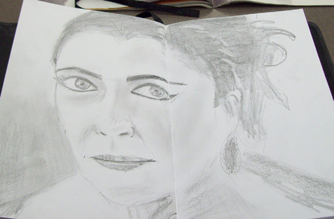
There's an interesting sensation in picking up a wood-cased pencil after years of using anything but. I felt as back in grade school … I never knew what the year would bring but there's something about about-to-be-used school supplies that suggests possibility. Smell, sensation, feel (and taste, if you're so inclined) … there's a gestalt going on there that's powerful good.

But I was going for the practical, not the poetic. I sharpened the two pencils and got down to my favorite thing to do in the library; writing in my diary. Here's the results:

Page one.

Page 2
That was quite an experience, actually. I prefer mechanical pencils, markers, and pens precisely because you don't have to spend time sharpening them. I like the tightness of line that never lets up. So writing with a pencil you have to sharpen induces a different set of perceptions: awareness of the dulling of the tip, awareness of having to sharpen, the tactile sensation of the graphite transferring to the paper, the visual sensations of the not-always-crisp line.

As far as the quality of the graphite, they are of a decent quality; I found the writing to be smooth and really quite silk. In particular, the redux Blackwing has a very soft lead; it doesn't stand up for long under pressure, at least my pressure, and I switched over to the 602 much sooner than I anticipated. The 602, on the other hand, was a much better writer than the basic Blackwing, with a firmer lead that still marked nice and darkly. It also required a finesse I didn't use much. The iconic tagline Half The Pressure, Twice The Speed, sounds a nonsensical as it scans memorably, but once I got on the pencil's wavelength, I found a bit of truth in that; it did require less pressure to make a satisfying mark, and I was able to write a bit quicker.

The detachable, replacable
erasable.
The eraser, I found, is replaceable. Funny, no? The eraser itself, a rectangular object reminiscent of a bit of Chiclet gum, is held by a small metal clip which one inserts into that unusual ferrule. They sell extra replacement erasers; the reason I find it funny, I suppose, is because you're going to be using up that pencil. But then maybe the creators who are fans tend to use erasers faster than they use the pencil up. Seeing as one of the famous Blackwing fans was animator Chuck Jones, there's a case for that.

The Blackwing 602 was a more exultant writing experience than I thought it would be. It hasn't dissuaded me completely from my habituation to pen and ink, but it's a pencil I'd keep around for note-taking and art. The quality is high, and it's manifest. And, as a funky bit of 20th Century creative America it's, at the least, most delightful.

For further delectation, here's an article from The Hollywood Reporter that delves deeper into the legend: http://www.hollywoodreporter.com/news/blackwing-602-why-is-hollywood-600265, and there's a whole website devoted to the pencil … The Blackwing Pages … here: http://blackwingpages.com/

If you can't get to Muse or IBF to buy some (what a shame that would be) you can, as just about everything short of the human soul these days, buy them online. $20 the box.

18 May 2014

[writing] I Have A New Cross Pen. Bring On Your Sword.

3084.
Okay, so the title's a little grandiloquent. Or, hell, a lot. There was an alternative title to this posting, riffing on something Pete Seeger had written on a banjo as sort of an answer to what Woody Guthrie's guitar famously said: This machine surrounds facists and makes them surrender. 

But so what? It's my blog. You want me to be a shrinking violet about my bad self, you go write your own blog about me.

Anyway.


Licensed to carry in all 50 states and the District of Columbia.
It's a First Amendment thing, yo.
It has latterly been my birthday, and I had recently lost my old trusty Cross Classic Century sliver chrome ballpoint. It's been a strange journey. I loathe ballpoint pens, generally speaking.  My personal favorite, aside from this unlikely hero, is the Pilot Precise V5. I like a fine line, not too fine, and the liquid ink from the Pilot is always perfect, has never let me down.

Sustaining a writing habit with the Pilot can be kind of pricey, though, and a little unsustainable to the personal economy, incomes being what they are these days. While I was in handwriting bliss with the Pilot Precise, in my daily work I actually consume pens. I leave them dry. I find excuses and reasons to write. When I was a kid I could scarcely be bothered; I thought pens lasted forever, or as near as practically so. As an adult, I exhaust them.

Ballpoints are also eminently practical, a truth so obvious as to be axiomatic. They travel. They rarely, if ever, leak. With a minimum effort of care, a ballpoint will keep going and going until the ink runs out. So a side quest was to find the perfect dependable ballpoint pen. Since I keep my personal standards in this area so high, it's been a long search.

Sometime in the last few years, I know not how, I battered Cross Century (judging by the style of the lettering, it was made before they started calling it Classic) fell into my hands. I was still obsessing on finding a dependable, affordable fountain pen (that was as I was getting acquainted with the Preppy) so it sat on the shelf for a while longer. Then, balancing the old Century in my hand one day I imagined that it was kind of a cross of two things; the desire to have a dependable modern writing tool and a well-designed object for daily use. 

And, heck, the thing just felt good. So I went to find refills, imagining it would be difficult. It was, a little, but I narrowed down Staples as the best source; not only do they have Cross-brand refills, and a more bargain-priced refill by Penatia that works acceptably.

There was a bit of a breaking-in period. The Century form factor was like a high-performance car: responsive, tight, giving if you got on its wavelength but unforgiving if you didn't (I tend to a vise-grip on my pen as I use it continually). So it's taught me a lot about writing with the pen rather than just dispassionately using it. You have to form a relationship with it, but once you do, it tends to reward you rather well.

Suddenly, it was gone. I have one suspicion as to where it might be, and that will have to wait until Monday to be followed-up. But I missed that pen a hell of a lot more than I thought I would, was obsessing on the fact that it no longer was available to me to use. So … what a perfect birthday gift! And so plans were made.

The purchasing experience was a bit more frought than I counted on. The display at Staples promises that you will get something from the stock room, all you have to do is bring a card from the little stack inside the little hole next to the display model and they'll run back and get one. I had, originally, the basic model, described as a Cross Classic Century Lustrous Chrome. Simple, austere yet elegant. it's the one with the black plastic tip on the clip end. But despite the inventory showing three there was not one. And yeah, we could get it shipped, but wanting it today made for an awkward moment.

How is it I was so obsessed over this silly ballpoint pen? I'm still more than a little amazed at myself. Well, if illiteracy is no virtue, then extremism in the acquisition of one's favorite writing utensil is no vice. That's what I always say (backdated).

The manager of the Staples was most kind and generous this day. After phoning Jantzen Beach and finding none in stock not there neither, and sensing, perceptively, that making me wait any further for this is punishment cruel and unusual, he found the next more expensive model and let me have it for the price we actually had already paid (payment processed before the inventory discrepancy had made itself known) for the cheaper model. And so I now have it.

The new pen is a Classic Century, but it's the Medalist. The biggest difference is the addition of 23-carat gold plate on the clip, the cowling near the business end and the end cap which was plastic on the Lustrous Chrome edition. It feels even better than the old one and it's a little more luxe without being blowout-ostentatious, so it's been easy to get to know and to use.

… even though, it must be said, it comes with a medium point rather than a fine point. It's acceptable for now; I'll not waste it. Writing is a sacrament and ink the consecrated wine. But what is it about pen companies that they think, unless you're looking for some fancy roller ball or gel-ink pen, all you want is medium? Irritating, is is.

But me and my new fascism-surrounding weapon will get along just fine I think.

This all may seem a little intense, but if being obsessive about my pen is wrong, then I don't want to be write.

Er, right.

30 March 2014

[art] Pens, For the Record

3037.
For writing at work: old, battered Cross Classic Century, probably from before the time they started using the word "Classic" up from to market it. Penatia makes refills for these at about $5 the two at Staples. Only ballpoint pen I can stand using.

For diary writing: One of either:

  • Preppy Platinum Fountain Pen. Well-used by now, economical, will go the distance. 
  • The above mentioned Cross Classic Century.
  • Pilot Precise V5 Roller-ball. Liquid ink. The best roller ball pen on the market, by far. No competition.
For Drawing: for inking in,  COPIC Muliliner SP, 0.1, 0.35, 0.7 widths.

Pencils employed are usually mechanical, and I rely on the .5. Have 2 really nifty Staedtler 925s for this.


08 December 2013

[art] If You Don't Want To Use Adobe Illustrator CC …

2975.There are many reasons why a digital artist would not want to (or can't) use Adobe Illustrator. Cost and the hazards of the cloud are two reasons I've heard; there are those I've spoken with who still can't wrap their brains around the idea of a application you have to subscribe to to have continue to work (and I'll admit, I'm one of them). The idea of your personal information getting compromised (as has recently happened to Adobe) does not argue, at least not to me, in favor of the idea of the cloud.

I'm a bit old fashioned, so go ahead, point and laugh, and let's get past this together.

If Adobe Illustrator seems no longer a viable idea, or if your budget puts it out of the question,  this article at Spoon Graphics gives you ways to go. Vector drawing is a thing, and other applications are more routes to that thing. I've tried Inkscape before, and I like it; I'm installing it on my iMac right now to get a better taste.

The link is: http://blog.spoongraphics.co.uk/articles/7-adobe-illustrator-alternatives-for-the-casual-designer

12 June 2013

[art] Gakyō Rōjin Manji Microsoft Excel

2943.… or, The Old Man Mad About Art with Microsoft Excel.

Seriously? He did this:


With MS Excel?

Yep. As quoted, the 73-year old artist, Tatsuo Horiuchi, remarked "Graphics software is expensive but Excel comes pre-installed in most computers. And it has more functions and is easier to use than [Microsoft] Paint."

I didn't even know Excel had drawing tools!

A more complete gallery is viewable at Spoon & Tamago: http://www.spoon-tamago.com/2013/05/28/tatsuo-horiuchi-excel-spreadsheet-artist/

Hat tip to Carla Axtman at the Book of Face.

27 October 2012

[diary] Two Sites All About Diary Essentials

2879.Those essentials being, of course, pens and notebooks, two things which I absolutely adore.

Two sites I'm abashed to say that I've only now stumbled on:
  1. Pen Addict: http://www.penaddict.com This is a very spare, cleanly designed site, very few photos, but links, links, and more links. Follow any one for interesting things about pens, pens, pens … so … many … pens. I've only begun to explore.
  2. Notebook Stories: http://www.notebookstories.com/. "In search of the perfect page" is its tagline, and there are profiles of notebook addicts, some personal stories … again, I've only started exploring, but it looks promising.
The design of Pen Addict showed me something I might have forgotten myself; a good, efficient design, with just what is needed, no more, no less, can get across as much as a cute little blog festooned with baubles.

Food for thought, there.

24 October 2012

[art] Color From Out Of Oregon: How Gamblin Sees It

2874.Here's a nifty little video with the man himself, Robert Gamblin, talking about what he does and why he does it, with behind-the-scenes scenes.


Approach to Colormaking from Gamblin Artists Colors on Vimeo.

Gamblin's website is http://www.gamblincolors.com/;  You can get the at I've Been Framed, Muse, and Utrecht, and even Blick (if you must).

[art] Sensazioni!: Photorealistic Pencil Portraiture by Diego Fazio

2873.(h/t Cort Webber at this Facebook post) I dare anyone to not believe this photo:


… is anything other than a photo. Looks pretty realistic. And here, I'm giving it a way a bit; this portrait, called Sensaztioni, by Italian artist Diego Fazio.

It takes some close looking. But you can get a better view if you follow this link, and views in progress here and here and here, too. Being a huge fan of the pencil to begin with this was greatly inspiring, but I did draw something myself last night at Denny's … but it was a crabby sketch of the USS Enterprise. 

Well, one thing I have discovered is that I've let my drawing muscles lay fallow for far, far too long. Also I was tired then. And vexed generally; my entire life right now is kind of at sixes and sevens. But this is quite a light.

While there's no video of the work-in-progress, here's about 20 seconds (far too little!) of the drawing with the light playing about it. As the POV moves right, you can see the light reflecting on the layered graphite, a telltale visual signature that can't be mistaken.


Splendid, absolutely splendid.

08 March 2012

[art] Muse Art and Design-Earth Safe Finishes Demo at Milepost 5

2792So, yesterday night, The Wife™ and I took part in a demo/workshop put on by Muse Art and Design at the Milepost 5 complex. The subject of interest is a line of art supplies by Earth Safe Finishes (http://earthsafefinishes.com), and we found the whole thing nifty as a rule.

Earth Safe Finishes is a company working in the field of 'green'; the line is different, they say, for two main reasons. First, they're made in the USA, which is always a plus these days, and second (and maybe more important to an individual artist) they boast that they're free of VOC's, or volatile organic compounds. These are the chemicals that allow the paints, mediums, etc to dry quickly by outgassing. For those who are chemical-sensitive they are an active concern.

If they are a concern for any individual, then Earth Safe Finishes products do indeed provide an alternative. They are all non-toxic. They include mediums (including a titan called Fabric Magic, which can do just about anything, it seems) and a line of paints (called colorants but now called pigments) that are very very concentrated. A few drops do go a loooong way.

I used very small amounts of Phthalo Blue, Red, Yellow, and Lampblack to produce this Mona-Lisa-esque work over the two-hour workshop:


The colors are very rich and vibrant and enjoyably workable. The right side of the picture was me playing around with colors and a medium. 

A good time was had by all, and the Musers Marcus, Peter and David were there, and did their own works; I found all three to be skillful artists … albeit with visions running toward the comically disturbing. Good thing I don't have clown issues … and let's leave it there. Susan, led the demo had a sure and informative hand over the proceedings, and the people who showed up were all very affable and friendly.

In short, fun.

10 June 2011

[liff] Finally, A Holiday Me (and every Graphic Designer) Can Get Behind!

2637.Who knew … June 10th is none other than National Ball Point Pen Day

Of course, you could celebrate with a Bic Stic or one of those blue clicky-pens, but for me, there's only one true love …

Pilot Precise V5. Black ink, baby. Because, as some sage once concepted my direction, one should only write in pencil when sick in bed or on a train.

I can't explain that, either, but it makes sense on the ineffable level, where things are basically not effed, or something.


13 May 2011

[type] Handschrift: A Different Sort of Sign Language

2621.What do you need to create a type font?

José Ernesto Rodriguez needed a photocopier and his own two hands:

Handscrift Sample

"Handscrift" is a complete 26-glyph, majuscule and minuscule, punctuation and special symbols, font produced by Rodriguez using just those two things. It's really cool stuff, and his project at Behance (http://www.behance.net/gallery/Handschrift/1271211) shows a complete display of the type, how he did it, and pages out a sketchbook, which is always my favorite thing.


26 April 2011

[tech] The Typewriter Era Is Over … Period

2611.Typewriters have, of course, been on the way out for a long time. Here in America they've all but become ghosts, and those of us who have actual typewriters and use them (me, for one) have to know where to get typewriter ribbons (not an easy thing, but I at least have Bill Morrison's at 122nd and SE Stark St, which is within walking distance).

I was aware that they were less popular for a long time, you know when I knew that the typewriter's days were numbered? When you couldn't find them at the Goodwill store anymore. They used to have shelves and shelves of broken old machines. Then, one year … and not all that long ago … the old typewriters just kind of disappeared.

Those of us who like type and typing … and for me there's always a sort of joy to it, a healing feeling … cherish our machines. The author Harlan Ellison has several in storage, because nothing lasts forever and, I imagine, soon enough, there won't be any way to even get them fixed any more. Keeps spare typewriter ribbons in the freezer, I understand.

With the announcement of the last known typewriter manufacturer in the world ceasing operations, I fear that day is here:

With only about 200 machines left -- and most of those in Arabic languages -- Godrej and Boyce shut down its plant in Mumbai, India, today. "Although typewriters became obsolete years ago in the west, they were still common in India -- until recently," according to the Daily Mail, which ran a special story this morning about the typewriters demise. "Demand for the machines has sunk in the last ten years as consumers switch to computers." Secretaries, rejoice.

"We are not getting many orders now," Milind Dukle, Godrej and Boyce's general manager, told the paper. "From the early 2000s onwards, computers started dominating. All the manufacturers of office typewriters stopped production, except us. 'Till 2009, we used to produce 10,000 to 12,000 machines a year. But this might be the last chance for typewriter lovers. Now, our primary market is among the defence agencies, courts and government offices."

Well, my Royal Futura isn't on the verge of breaking down, and I can still get ribbons for it. But she's amongst the last of a now-extinct species.

18 April 2011

[art] A New Diary Girl: Ashley Judd

2606.Latesley, I gots to draw. And here's another "Diary Girl":

Ashley Judd 1

I have a lot of lady co-workers, and a lot of mags like People, Us Weekly, and stuffs like that find their way to work. And they do have good poses and models - being glamourous women, they invite looking especially for art's sake.

I get good breaks on my job but they're shortish - enough to keep ones sanity, not enough to play, say, Risk. And I took a copy of one of the latest People, with a story about Ashley Judd and good photos. I'm not that big a fan of Ashley - not that she's bad or anything, just never acted in anything that lit my candle - but she is a fairly pulchritudinous celebrity, I think it must be admitted. And somthing inside of me seems to say that I might grow as an artist if I draw what's at hand - you can't always pick and choose your subject. The shortness of the work break mean you have to make your moves count. I wanted to see if I could complete anything quickly. Turned out, I could.


… and it almost looks like her, too.

Drawing what you see is hard in the details, like the eyes. But I'm getting there.

06 April 2011

[art] Another Diary Girl: Elizabeth Taylor

2595.My last diary girl came out pretty well. I wanted to push my envelope a little, and found a picture that really spoke to me.

In a Time magazine article from a couple weeks back about the passing of Elizabeth Taylor, there was this big beautiful face-shot that, despite being in black and white, captured her facial beauty very well I thought. The famous eyes, darkly outlined, kind of looked right into you. Also, the overall theme was rather simple and involved a monochrome palette, perfect for graphite, which, due to its eternal friendliness, has always been a co-favorite with pen and ink.

So, out came the diary, and this is the result:

Liz Taylor in a Diary

Here's a closeup of the drawing itself:

Liz Taylor in a Diary Closeup

So, I'll be honest about this one … I'm not 100% pleased with it. I didn't get the physical appearance as close as I'd hoped, and for some reason, at this resolution, it's plain to see why. The eyes are too big. The mouth is too narrow. The vertical proportions are off. I tried for Liz Taylor, but what I got more resembles a blend of Audrey Hepburn and Carrie Fisher … which are/were not unbeautious actresses, but when you're trying for Liz, a bit wide of the mark.

However! It would be a mistake to assume that because I didn't get exactly the result I wanted that I consider this a failure. I'm unstiffening my visual and drawing muscles after a too-long hiatus; I would have been overjoyed to hit the mark but that's not really a practical thing to want. Things rarely go that well when one is tentative. But I did use shading to indicate volumes; I did use tone, rather than line, to define objects, which is what happens in real life; I did, at least, get the damned woodless graphite sticks … the second greatest art supply after pen'n'ink … out and used them. And when you've been creatively disabled, as I have for a while, just the feel of these things getting used is redemption.

I have the basic muscles. They're still there! The thing is, to flex them. I'm going to try to draw a bunch of lovely women, and then after that whatever strikes my fancy, or maybe during, and keep putting them in my diary and putting it up here for all the world to see.

This is hard work. Creating art always is. But there's good hard work, and it doesn't scare me much anymore.

31 March 2011

[art] I Sometimes Do Drawrings. Do You Want To See, You Cheeky Monkeys?

2592.I'm sorry to say, I lied a little in the last posting. I said I can't share anything in my diary with you (specifically, my writing) but I can share one thing with you. I did a drawring:

Diary Drawing at Powells

It's okay. You can look! I've put no sensitive information there. As a matter of fact, I'm rather insufferably proud of my handwriting, so please look!

Here's a tighter angle on the girl:

Diary Girl

As happy as I am with the way this turned out (so far - it needs inking), I must say that it is not an original. It's a copy of an illustration done by Hanie Mohd, http://onion-sama.livejournal.com, http://oniyon.deviantart.com, which appeared on the cover of the crafting zone CROQ, Issue 4, Spring 2006 (I see a lot of CROQ now that The Wife™ has taken up crafting). Here's a screenclip of a graphic I found that has that illo:

CROQ Goth Chick

I think I came creditably close. I'm not quite finished, and may or may not ink - there's writing on the other side of the page and I don't want bleed-through to send what I've written there into oblivion.

Hanie's high-contrast style captured me as did her drawing style as pertains to pretty women (which has given me pause to realize just how much art in this world is inspired by pretty women. Also, pretty women are fun to draw, as Terry Moore (Strangers In Paradise) has pointed out … and when it comes to "pretty", let's just say that pretty is decidedly in the eye of the beholder). One of the exercises I'm putting myself through to recover my creative self is to draw illustrations I find that I enjoy looking at, and I did enjoy looking at this one. So much detail and richness out of a high-contrast image!

There are other very attractive and engaging images in this issue of the zine that I'm going to copy into my diary before I give it back to the library. Copying the illustrations of others removes a block I've had lately - coming up with things to draw. Naturally, these are not drawn to sell or even to publish for money, but simply for practice.

I thereby thank Hanie Mohd for merely existing. The lady (who I likely will never meet) has enriched my life.

And the style is just wonderful. Can't get past that.

08 March 2011

[art] What Color Is Your Color? Color Names and PIgment Codes Explained

2574.It shouldn't surprise anyone from student level on up that not every red is identical, for example: this cadmium yellow will look a little different and mix a little different than this other one.

As Muse Art and Design has posted here (http://museartanddesign.com/2011/03/paints-pigment-codes/), there's more to the color in your tube of paint than just the artistly name on the front. For instance, I have in my hand a tube of Winsor & Newton Galeria Cad Yellow Medium. If you look on the back of the tube, underneath the color name is the line  

Pigment: Cadmium Zinc Sulphide (PY35)

All pigments are made of metals and/or various chemicals. Words like cadmium zinc sulphide, however, may seem too abstruse. But never fear - the code at the end, the PY35, is part of a standard coding system amongst producers of artistic paints.

It's rather simple to learn and not to difficult to understand. The letter P signifies "pigment", naturally, with the next letter signifying the class (R=red, O=Orange, Y=Yellow, G=Green, Br=Brown, Bk=Black, W=White, and M=Metal) of color. The number uniquely identifies the chemical combination that produces the pigment. To get really abstruse about it, the color PY1, or Pigment Yellow 1, can be marketed as Cadmium Yellow Hue, Hansa Yellow G, or Permanent Yellow Deep as well as Permanent Yellow Medium. But it's all PY1, a Monoazo, arylamide, with a CAS registry number of 2512-29-0. On the other hand, PY3 is also a Hansa Yellow, has been marketed as Arylamide Yellow, Bright Yellow Lake, Cadmium Lemon Hue as well as Cadmium Yellow Lemon Hue, but it's all PY3, an Organic, Monoazo, Arylamide, CAS registry number 6846-26-6.

That's quite a prodigious flood of info, I know, but the point is, look on your paint tube and find that pigment code number. For instance, the Cad Yel Med from Winsor & Newton, in both the student and professional ranges, come in PY35. Another manufacturer, Liquitex, has a color in its Basics value-student range called Cadmium Yellow Medium Hue, which is made of PY74 (Arylide Yellow 5Gx) and PY83 (Diarylide Yellow).

Once again, a lot of abstruse info. The point I'm making right now is not that you have to know what a Diarylide anything is, unless you're that interested in chemistry, but each and every pigment mixes a bit differently and behaves a bit differently. If you came to the end of your tube of W&N Galeria Cad Yellow Med and all you have around is a tube of Liquitex BASICS Cad Yellow Med Hue, you'll probably want to do a little mixing off-palette to see how it'll react.

This is also useful info in the way Muse's article expresses, that knowing how pigments mix to create the packaged colors you buy could enable you to create your own mixes in a pinch from what you already have on hand. And knowing how to read pigment codes goes a long way toward enabling you to make consistent paint buying decisions despite the sometimes confusing welter of names colors can go by.

Muse's blog article is here, again http://museartanddesign.com/2011/03/paints-pigment-codes/; and if you want to go really deep into what all these different pigments are, the Color Of Art Pigment Database can be had via http://www.artiscreation.com/Color_index_names.html


15 November 2010

[art] Mandala Monks In The Library, Part II

2540.
We took some time out from OryCon 32 on Friday afternoon to peep the mandala I mentioned in the previous-minus-one missive. It had come quite a way, well towards being finished.

I, sadly, forgot the camera and do not have pictures. A completed version of one can be found at this page, click on the image just to the left of the text and it will expand for you; also some pictures of a similar one under construction can be seen here. A picture of a similar mandala, produced for the Dalai Lama's visit to the British House of Commons in 2008, (which suggests some style variation is allowed) can be seen right; it's sourced from Wikipedia here.

I can say that the impression upon approaching the mandala is that it's remarkable just how much surface relief it has. The nearest visual analogue I can cite is the way that the tops of decorated sheet cakes you get from the Safeway look. There is a granular visual texture to everything, and the fact that they are creating small ridges, mounds, and piles of colored sand are obviously explicitly taken advantage of the the monk constructors to cause some design elements to lead the eye about and stand out somewhat as focal points.

As I mentioned above, it looks like some variation in execution is permitted. Left, find a photo clip of the interior; an eight-petaled design. Notice how the gradations in color from the center to the outside of the petals at NW,SW,NE, and SE are discrete bands of color. In our library's version, the monks have achieved a gradation worthy of Adobe Photoshop or Illustrator. It's truly impressive to see, and I'd love to know how it was done. Sadly, in as much as I'm not Buddhist nor a monk nor looking to be one, I should probably never find out. But it is suggestive of one of my favorite ideas, which is freedom within bounds and limits, of creativity amazingly unleashed which you are made to work within a canon of expression, which is utterly counter-intuitive but seems to be the way life works.

I've experienced it. But it defies easy explanation. And I digress.

When we got there, it was just before quitting time for the day, which was 5:30 PM. Four days into a five-day construction program, the mandala was largely complete, with just the outermost ring to be filled in. The circle of petal-like shapes just inside that were about 99 per cent completed.

The construction of the mandala depends of steady and exacting precision application of those colored powders by each of the monks. The tool for this is called a chakpur, which pictures I took can be seen in the entry two-back, and they're simply long metal funnels with a sawtoothed area on one side. The monk scoops up some colored sand from one of the bowls, strokes the chakpur with a metal stylus to make sure that sand has packed up against the applicator end, then lays the funnel against his forearm and goes to work. By lightly rapping the serrated surface back and forth, an almost waterlike stream of sand is deposited. The rest, I'm guessing, is practice and skill.

Once again, the mandala will remain for public viewing (the mere act of viewing seems to be held to impart a blessing to the viewer) until the 29th at noon, at which time the mandala will be ritualistically dismantled and the sands will be deposited in the Willamette (no worries, people, it's non-toxic. You think Buddhists would want to harm a fishy?) in order to release the compassion blessing to the world.

A good idea of what physical effort goes into creating a sand mandala can be seen at the Liveleak video here: http://www.liveleak.com/view?i=b42_1275511628. Six days condensed into about two minutes. Very enlightening, let's say.

Complete info, again, is here: http://www.multcolib.org/events/collins/mandala.html

Technorati Tags: , ,

Powered by ScribeFire.

10 November 2010

[art] There's Tibetan Monks In The Library, Making A Mandala

2538.
I have had a passing interest in temporary art, sand paintings and the like, so when The Wife™ scryed that Tibetan monks were going to be creating a sand mandala on the 3rd Floor lobby of the Multnomah County Library's Central Branch, in downtown Portland, we just had to go see this.

Construction of the art began somwhere around 5 or 6:30 PM, and we ran a little behind. Whatever benediction was performed was over before we got there, but we didn't miss too awful much.

As things wore on, I realized that I was watching something I enjoy watching ... artists at work. Oddly, I didn't realize that before. Strange for me.


The opening moves for the mandala is to construct the layout skeleton on which the design will be "hung", and the first thing to do here is to make the construction lines. This is accomplished - on a square table - by something so mundane as snapping chalk lines. A great many of them, as it turned out. By the time they were moving on to laying in the design itself, the table was an absolute hash of fine chalk lines creating a most astoundingly-detailed grid.

On a table to one side sat the colors and their application tools:


... patiently awaiting their employ. The colored sands, we found, were pigmented with opaque watercolors, presumably non-toxic.

The layout tools, some of which lay next to the sand funnels:


... consisted of tools hardly any more complicated than what the average elementary schooler would use in geometry class. Rulers. Compasses. And that's about it. The white pencils will be used to lay in the actual design's lines; they look, for all the world, to be nothing more than white china markers.

A great number of patrons milled about the work at first. A photograph of the Dalai Lama occupied what looked to be an altar used for the opening blessing, in front of which were lined brass bowls filled with rice, incense sticks, and water with saffron strands in. Off in a corner, as with every travelling act, a table for vending merch.

But the center was occupied by the table upon which the design was being constructed, complete with four Buddhist monks, garbed in red robes with blue piping along the arm-holes. They allowed us to get unexpectedly close. Though they seemed to be aware of us, our presences - and our wordless insistances to get close enough to get good flash photography, from which nobody discouraged any of us - deterred them not at all.

This I understand. When I drew all the time, much more than now (and as much as I ought to be doing) I occasionally drew in public for people who were watching, and once in the zone, I didn't care who was watching. Me, the pencil, and that paper were the only things that mattered in the universe.

Drawing has always been a kind of meditative activity. And why not?

As the construction lines became numerous enough, the china pencils, rulers, and smaller compasses were pressed into service.


At the time I was curious as to how the design was going to be completed if they rubbed the chalk markings away; at the time, I didn't realize that the chalk marks were meant to support the white wax markings. The table did seem to hang on to the chalk though, and the lady who was the monk's "tour manager" (this being a fundraiser for their monastery, which is located in southern India) told us that the table's surface, essentially, had the "tooth" required, just like with paper, to hold the marks for as long as needed.

The table was square, but there was nothing ritualistic about its dimensions. Regular squares and circles make practical sense, and while the design can scale up and down a little, the size is just right to do the work.


It was at this point that I really began to understand what was going on with the chalk and pencil markings. The intricate construction grid is staring to be brushed away, but if one can look close enough in the web-resolution picture above, the details of the final design are beginning to emerge as curves are now laid in.


A bit of a better angle with still more curves laid in. The familiar mandala design is beginning to emerge. One more thing before we all had to leave the library, and that was the snapping of more chalk lines, and the laying out of big circles that will enclose the interior design.


With this, the mandala's design is starting to really come out from the chalk lines.

Four Tibetan monks, one to a quarter, working in concert, talking little, but in tune with each other, taking cues from one another, laying the foundation for an artwork that is the definition of ephemeral.

They'll be working on it for a few more days, however.

We will be trying to get by there by Thursday to see the progress. Stay tuned.

MultCoLib info, including the sponsoring organizations links, can be had here: http://www.multcolib.org/events/collins/mandala.html

Technorati Tags: , , , ,

Powered by ScribeFire.

02 December 2009

[art] A Master's Tools, Mystical Powers Imbued?

2268.While I was reading the New York Times article that inspired (and was linked to) by the last post, I remembered a bit I read in another book, and the similarities in the human attitudes in the two related bits struck me with maybe a not-too-odd congruence, given that Human peoples love to relate to the cosmos on a spiritual level as they do (I say with a mixture of odd delight and weariness).

In it, the rare-book dealer describes the emotion that came over him when seeing the humble Olivetti Lettra 32:

Glenn Horowitz, a rare-book dealer who is handling the auction for Mr. McCarthy, said: “When I grasped that some of the most complex, almost otherworldly fiction of the postwar era was composed on such a simple, functional, frail-looking machine, it conferred a sort of talismanic quality to Cormac’s typewriter. It’s as if Mount Rushmore was carved with a Swiss Army knife.”

While the metaphoric image of the Four Presidence carved by MacGyver will now forever stick, the real point is the mere knowledge that a master's tools had some sort of creative essence transferred into it seems to be something many, both aspiring artists and those who never aspire to any art, seem to share. In his excellent how-to-draw book, Drawing From Within, former MAD Magazine editor Nick Meglin relates the following:

…When my instructions in class were still met with moans and groans, I would introduce the work of Frank Frazetta, a popular artist and close friend. Frank, Angelo Torres and I were part of a small group of young men who played ball and hung around together in Brooklyn. We shared drawing interests and occasionally attended life drawing sketch classes at the Brooklyn Museum and the Art Students League.

Frazetta had little formal art education, but he was a "natural" from the very start. Invariably, someone in our classroom would approach Frank during the break, and ask about his drawing materials. Some of them actually attempted to buy his "miraculous media" with which he had captured the living form so beautifully and effortlessly. Frazetta never understood why anyone would want to buy his chewed-up pencil stubs!

"They don't even have erasers!" he said incredulously.

How absurd it was to think that it was the drawing instrument and not the artist's hand behind it that was responsible for his remarkable drawings.
It may or may not be stronger within the actual community of artists, such as they are, than the general public at large. As the rare-book dealer found an almost-supernatual respect for Cormac McCarthy's typewriter, the stories about this tendency that really seem to stick with me are when an artist – say, a printmaker or engraver – get to work with authentic tools that a well-known master. They treat them with a reverence and respect usually I see in situations like that of a Catholic Mass, when the pastor is handling the regalia. Utmost humility.

Art comes from the heart, the mind, and whatever you consider a soul; if you believe in a Creator, you are creating kind of in his/her/its image; maybe its naturally human to invoke a sort of animism in the tools the artist uses.

I've heard we humans are "wired" that way.

We humans is funny peoples.

Technorati Tags: , , , ,