
1965.Clear your mind of as many preconceptions about color vs perception as you can, and look at this map for a few minutes (which I sourced from here)
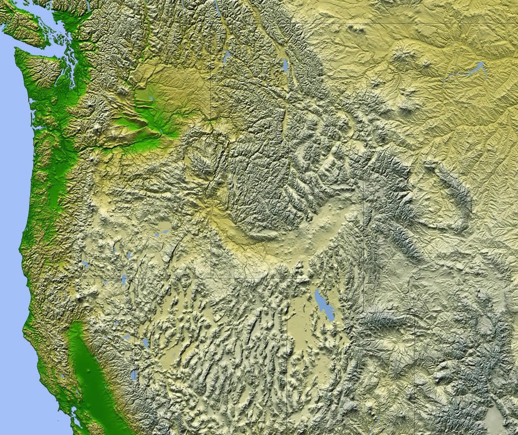
Now that you've had a chance to look at it, What's the overwhelming sense that you get? If you sense colors as dquivalent ot temperatures, as I do, you feel attracted to the green areas because they speak of coolness, especially when contrasted against the buff and textured areas.
You'd be partially correct ... but not wholly so. Naturally, the areas nearer the water that are green tend to be the most temperate, but the area in the lower-left–California's Sacramento River Valley–can get scorching hot in the summer. And, while the area around the Columbia River curling east and north into the Washington interior is green, anyone who lives in the agricultural areas of northeastern Oregon and southeastern Washington will tell you that cool lushness is anything but the order of the day during much of the year. The choice of color does communicate a sense of sparseness in the hieights though, however, in the Snake River Basin, which is a buff-yellow near the river itself, the grasslands frequently go to green where there is much irrigation.
But such is the drawback of using color to indicate altitude. Note, this is not a criticism, just an observation. For as many trained in art know, colors have a subjective "warmness" and "coolness"; a red-violet is warm, a blue-green is cool.
This is actually quite an apt color scheme. I recall US maps from grade school, and if you went to school in the good ol' U.S. of A., you know what I mean; lowlands were colored green and gradated to a rather aggressive red the higher up you went. The highlands seemed veritable infernos!
The colors tell a story about the highlands that may be consistent but may not be true. Again, this is not the fault of the cartographer, and nobody's fault really–it's just the way we're all wired.
Since color suggests so very much subjectively, we need to use it with consideration and care in our logo, print, and web design.
Technorati Tags: graphic design, color design, color, designing with color
2 comments:
I grew up in Mississippi where the area maps were entirely green. Mississippi is hot and humid, so I interpreted green as hot and humid. The browns that I saw on Western maps, I interpreted as dry and maybe cool. I also saw them as a lot more interesting because they represented places that I saw on cowboy shows and movies but had never visited.
Yea, that' s the thing, isn't it? Since I grew up here in the PNW ... specifically, a child of the Willamette Valley ... I identified green (the small smear of which I lived in–most of the West Coast north of the Great Valley is highlands, it's easy to forget) with cool, lush, and evergreens.
It's all so very relative. The highlands, with their browns and buffs, always came off as hot, airless, and dry.
Then I spent 6 months in Idaho Falls one year. They have a saying there: if you don't think Hell freezes over, then you've not been in I.F. in the winter.
Post a Comment