
When I last left the Cherriots System Map, I'd dressed it up a little with the Willamette River and a re-think to the way we put numbers on the route lines themselves. I think I've pushed it about as far as I can without adding things to it. Wholly appropriate to the last observation is remembering one of my primary logics in redesigning the map; to increase its utility to the user by tying it into its surroundings, incidentally increasing its utility to more than just transit map users.
So, creating a new layer in Illustrator, turning off all the other work I've done so far (it's invisible but it's not gone–layers are without a doubt one of the greatest paradigms implemented in digital art applications), I turn on the scanned Salem ward map I'm using as a template and begin to draw lines where the pricipal streets are. The detail of the diagram and my knowledge of Salem are of great help here.
After a bit of work, then, viola! (click it to see it bigly):
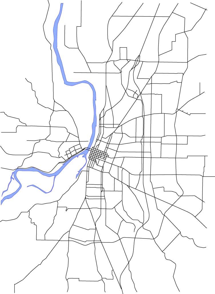
I've also always found the street layout around Salem very interesting. A standout is the way streets converge into Salem. Portland is a big grid that grew out to the east (think about it: the first north-south avenue that cuts all the way across town without having to jog over on a cross-street as you go east of MLK/McLoughlin is NE/SE 82nd Avenue, but I digress), but Salem grew up in the middle of a big spread of agricultural prairie, and the streets that converge remind one of an asterisk. Another notable feature is the Kuebler Blvd/Cordon Rd/Hazel Green Rd-Chemawa Rd-Lockhaven Dr beltline–which is a close approximation to the urban area's edge, which also closely corresponds to the limits of the Salem-Keizer Transit District's service area. The wishbone formed by Liberty Road and Commercial Street south of Vista Avenue is also just plain interesting.
With the Salem ward map and the main streets laid in then, it's time to get to one of the important tasks; aligning the route network to more closely actually follow the streets. The original map, if it will be recalled, took minor liberties; the Commercial/Liberty couplet along the 18-Keizer West line north of the city center does a gentle curve that doesn't reflect reality at all; the bend along all the routes north of city center doesn't happen in the same place; the loop at the east end of the 20-Airport P&R route is not only geographically incorrect as to its shape, it's way too large. Depending on that representation, you'll think you're going east of I-5 when in fact the line stays completely west of the freeway. Those are just a few examples.
I make a copy of the layer that contained all the old routes. This I do so that if, unlikely as that is, I mess up the copies that I'm working on (Illustrator makes it as tough as possible to screw things up, and Version Cue saves earlier versions so I can go back at any point, but it can happen) I can grab a new copy of the original and start working on it. Also, it means I'm working on paths that are just the same size and position (more or less) as the original, so I can see the difference I've made.
So, I get out the direct-select tool (the white arrow) and move points so the corners and turns go where they ought to. I also add and subtract points (those tools are under the pen tool–eventually I tear off the pen tool palette for more efficient access) as necessary.
Most of the way through, here's what I have now:
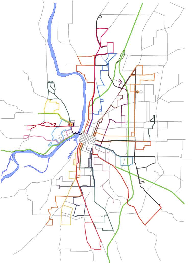
At this point I'm taking pauses to step back and enjoy what I'm seeing. I do like doing this sort of thing, and one of the romances of the transit map for me is there is a certain indescribable pleasure I get in seeing a city rendered in such an abstract yet realistic style. This is the sort of abstraction that maps do. You can't plot everything; a truly accurate map is a physical impossiblilty, that's what GPSs are for, and not even they get absolutely everything.
You'll notice the street network has been screened back–instead of strong black lines, it is now a network of gray lines. This is important because they need to be there to support the route information and must be visible but must not compete with it for your attention. You must be informed by it, but not distracted.
The difference between what is and what ought to be can be demonstrated by the closeup
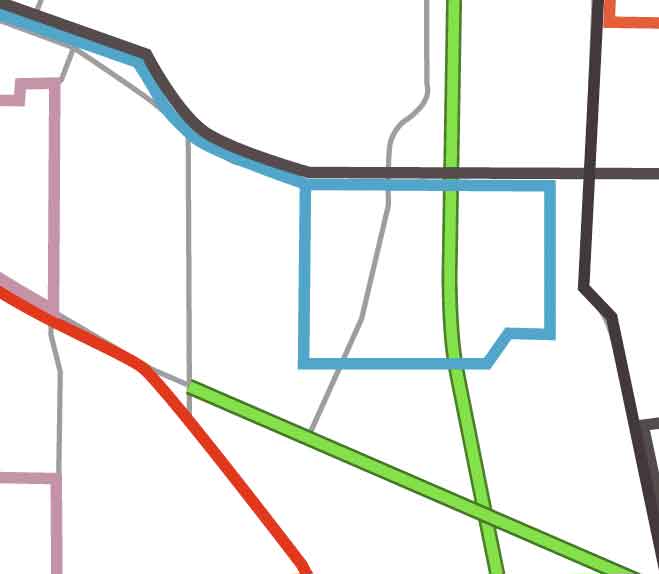 clipping that should appear just to the right of these words. The line 20 symbol is the blue green path that forms a square in the center-right of the illustration. Note that it overlaps the I-5 Freeway (the light-green with dark-green bordered line running vertically through the image). Remember that I plotted everything on the same scale, so if I took the original route lines and matched them to a correct base map appropriately scaled, it would be off just like this.
The actual route of the blue-green line should be down the gray line in the middle that curves down and to the left (that's Hawthorne Ave, SE) leftward just above the diagonal green line (that's Highway 22) on Ryan Dr, whichs is not on the map but whose location can be estimaed, and back up and rejoning the outgoing line on the next vertical gray line over (which represents Airport Rd, SE).
The appeal to a connection to reality may seem persnickety and pedantic, but remember, I'm out to connect this symbol to reality as much as possible. I believe it informs on the subconcious level–we recognize it even if we don't know it–and the end product will be much more useful.
One more thing I want to do a minor brag about: the green symbols marking expressways (such as Salem Parkway and Salem-Dallas Highway) and full-fledged freeways (I-5 and Highway 22 going east). These were made on a separate layer which was then locked (I didn't want to mess them up once I finally placed them). The lines themselves were made with a stacked path; The dark green path was given a 3-point stroke, copied over on top of itself, then then top line was lightened and given a 2-point stroke. This gives the appearance of a hard-edged wide line.
2 comments:
salem has never looked better
-carywd
Thanks. My plan is to make Salem look a whole lot better before I'm done with this.
Post a Comment