Showing posts with label broadcast graphic design. Show all posts

21 February 2017

[logo] Seattle's Public Radio KUOW Re-logos

3452.
KUOW, one of the Puget Sound area's two NPR affiliates and, by reputation at least, one of the most listened-to NPR stations in the nation, has been on the air since 1952.

It's a historic blowtorch on the FM dial. Up until now the logo look has been like this:


It's also more recently used this look, which eschews the Futura for a bit of timeless class:


KUOW has changed its look again, going for something that's a little futuristic, a little hip, and a little retro:

 
I see all three, here. The abstraction of the letters into 3-d space gives me a retro-future feeling. The red lines giving volume to the letters while only serving as a transparent skeleton speak to me somehow of the past. The starring role of the call-sign continues a trend I've noticed of broadcast stations taking the focus off the frequency and bringing the call-sign front-and-center, to become more of a brand: here in Portland we have KBOO, which everyone knows by name even if you can't call the frequency to mind immedately. The type shows features of the hip, mechanically-drawn lines I've seen quite a bit of lately, that seem to have visual resonance even with an old-fashioned type lover like myself.

Not everyone I know is enamored of it, finding it busy, or with too much visually going on. I think I can see that. I'd be interested to know what other people think.


08 September 2014

[logo] Goodby KGW NewsChannel 8, Hello, KGW8

3137.
A few weeks into the new graphics change over at 15th and SW Jefferson, and here are a couple of thoughts about that.

Portland's KGW-TV is one of the senior members of the broadcasting world; that it should get by on only three letters in its call-sign should tell you that – the system was rationalized a bit sometime during the 1930s/40s to only allow four-letter callsigns, and the three-letter ones were grandfathered in. KGW, to be specific, has broadcasted in one form or another since 1922.

During the 70s, 80s, and 90s, KGW seemed to change looks more often than any other station locally, at least as far as I can remember. In 1995, however, it went to the coinage Northwest NewsChannel 8, and then in 1996 firmed up the look: A wide one, with the word Northwest reversed out of a red stripe, NewsChannel in condensed bold italicized, and a comparatively-dainty 8 in a blue box of its own.

Myself, I found the coinage rather awkward to say, and a bit confusing actually; to me, a News Channel is one that has news on all the time, or most of the time, kind of like CNN was before you couldn't watch it without pulling a face while you raced to change the channel to something that wouldn't melt your head. It also subsumed the individual station identity, which I felt should always include the call-sign. But it worked for KGW, and it (or some version - in 2008, a version of the NewsChannel 8 logo mostly based on the FF DIN font once again highlighting the call-sign debuted, of which I approved) served stalwart duty as KGW's identity for nearly 20 years.

Reently, Belo, the company which owned KGW (and its Seattle sisters, KING and KIRO) underwent a major rearrangement, dividing its print media from its broadcast media into two separate companies. Subsequently, the broadcast media side was purchased by Gannett (the same company that publishes both USA Today and, locally, the Statesman-Journal down Salem way). And the changes rang.

This is was KGW's NewsChannel 8's logo:


… and this is KGW 8's logo now:


KGW's new logo look approaches design by pretty much eschewing design. It's a simple, stark thing now, the only thing brought forward being the the unique detail of the bevelled end of the G's cross-bar, which I've tried to use to identify the font this was constructed out of with, so far, no success (the closest WhatTheFont seems to come to is the 205 foundry's Maax Bold) (Update here: It's my understanding now that the font used here is Gotham, and KGW's graphic design king Jeff Patterson did that tweaking). It wins on the uncomplicated level, proving that sometimes next-to-no design is actually pretty successful design.

Another thing that this design does do fairly well is mesh with the station's new graphics. Gannett's USA Today original design brought us sections with color-coding, and KGW's new on-air graphic approach follows this logic too. Reading what I could get and following what I could on-line reveals that Gannett has a sort of empire style and all the broadcast properties carry this forward, including KGW's new website design, which is clear, clean, fairly tight, and works a great deal like USA Today's website does. The fonts on the website, according to the WhatFont bookmarklet I have installed in my Opera browser, indicate 2 fonts used overall: A version of Futura developed especially for USA Today's use called Futura Today, used for the menu headers across the top of the page, and Arial, which seems to be used for pretty much everything else.

And it all clicks pretty well together, proving that if you use it just right, Arial can be an asset rather than looking like the font you used because you didn't feel like going with anything other than the default.

The lower-thirds of the KGW news on-air presentation have been thoroughly revamped. They're harder-working now: the story being reported on occupies the large upper portion of the strip, with a colored line along the top indicating the 'department' the story falls into. Along the skinnier portion of the new chyron, the next three stories coming up are announced, with a similar colored bar immediately to each story's left noting their department:


The color along the top of SUPERHEROES SURPRISE BURN VICTIM here is purple, denoting a Feature story; the three upcoming stories have blue bars, denoting Local stories. They have a congruence with the USA Today scheme (they use the same colors for Weather and for Money, for example). While each report is running, if location or person ID information becomes necessary to display, the large title moves down and the necessary information appears in a smaller point-size in gray superior to the large title.

That's not all, of course. As these YouTube clips will show, the same approach is now being used by KGW's sisters. KING-5 in Seattle's looks like this (and gives a snappy example of how the new chyron works):


… and this is what NWCN's (Northwest Cable News) opening looks like now …


I've watched the KGW deploying of same, and I actually like it a great deal. Teasing stories is a tactic the programs use to keep you tuned in, and I understand this, but there's teasing and there's aggravating. Seeing exactly what they have coming up is a Good Thing™ and I very much approve.

Even though KGW is essentially using Gannett empire style, which is a sort of thing I usually dread, I find myself having to admit that, if it's a uniform thing, at least it does its job well. It's hard to be concise and informative, and on that level, at least, it's a success. 

21 April 2014

[design] Breaking News: The New Look of KOIN Channel 6

3064.
The KOIN Local 6 identity for The House That Mike Donahue Helped Build is no more. Welcome to the new KOIN 6:


Pretty spiff and shiny, no?

I'm glad they were finally able to pull it all together and give it a nice rollout. That said, I'm going to mourn the passing of the KOIN Local 6 approach. It was an admirable attempt and ought to be lauded. Boasting about being local, in a media environment that seems, in markets like Portland, driven from somewhere else, is a good thing and can work if brought off right. The obstacle there, of course, is figuring out how to sell it, which is a simple thing … well, not much more difficult than trying to solve Rubik's Cube with gloves on and a blindfold, I suppose.

In Portland, Local sells. Oddly, nobody was buying. No, I can't figure it out either.

The new logo is a modern treatment on what is actually an old approach … the classic callsign-channel number presentation. It recalls the classic look of the 6 … usually designed into a containing frame, for 6 this was a circle, until the Local 6 branding happened. The modern fashion is the quadrilateral, with the clipped corner an interesting filip. The other big substantive change is the introduction of a new tagling, Watching Out For You, which reflects the kind of advocacy investigative journalism that KOIN has latterly been working very hard to own locally.

Over the past few weeks, KOIN 6's morning report, which was called Right Now, was delivered by Chad Carter and Elishah Oesch in front of a rather cozy-looking brick backdrop while the old set was being remodeled. Today was the big reveal. KOIN has a video that gives some behind-the-scenes time-lapses which is most fun to watch, and you should go there to do this thing because the embed code just won't work here.

However, a video hosted at YouTube gives a clear idea of the new approach of the new look:


The opening (which is not yet available, so you'll have to tune in to see it) features an aerial view of the KOIN Tower, which is perfect. When your headquarters is housed in one of the most recognizable buildings (that just so happens to be named for you) in a widely-admired major American city, you're a stone fool if you don't hype that.

So, welcome KOIN 6. You're looking mighty fine. 

08 June 2009

Oregon Media Forum: A Logo With Wit

2068.The recently-opened Oregon Media Forum, in its current form a message forum devoted to those of us who really are having a hard time living without the abruptly-retired and rather-beloved Oregon Media Insiders, has it going on in the logo department.

LynnS's logo for that monumental work was nice, playful, and I enjoyed it much:


Radio, TV, Print. Great retro images (though in my opinion, the pencil is a timeless thing – I love drawing in pencil. Infinitely forgiving).

The pseudonymous founder of the Oregon Media Forum, "oregonmedia", brought the cleverness with a similarly-collage-like logo which takes the idea to the level of straight-faced satire:


The newspaper logo (s)he's riffing on is obvious, the two TV station logos, maybe not so much (though I parsed it straight away).

The phrase "straight-faced satire" might come off a bit awkward but it's actually meant as a compliment. An independent message board that welcomes anonymous comments branding itself using the visual grammar of prominent members of the community it critiques is actually quite visually fun if it comes off well, as it has here. And now that I'm taking a good deep look at it I like the subtle supporting touches: the gradients, the drop shadows, are all done just right. The beveling on the top of the F is a little stroke (so to speak) of genius, seriously.

If I was the type who had enough pull to give out Portland Logo of the Year awards, this would be up on that list. It's nifty!

Technorati Tags: , , , , , ,

12 May 2009

KOMO Adds FM Side, Numbers To Logo

2055.The Seattle radio station constellation has shifted just a little bit once again.

Tip o'the cap to Gentleman Ben in Seattle who keeps an eye out for these things for me, for which I am grateful. He catches such interesting things!

KOMO 1000 AM radio, a big talker in the Space Noodleplex, has signed an agreement to simulcast over 97.7 FM, KFMY, licensed to Oakville WA, currently broadcasting a Classic Hits format and serving the south Puget Sound area. It's branding is The Eagle 97.7 FM, which is kind of a confusing fit until you see all the motorcycles, pick-um-up-trucks and bikini babes on the site.


But it's going on May 15th, so get your looks while you can, you chauvinists. Anyway. An Agreement between The Flag and South Sound Broadcasting will get KOMO 1000 AM signal on both KFMY and KOMO, and KFMY will be rebranded KOMO News Radio 97.7 FM.

The KOMO AM logo looked like this:


Very straightforward, static and dependable, with a red slash under the word 'radio' for dynamic interest.  The spare typographic treatment brings to mind The Flag's former empire style, and synchs up well with the style used by all the KOMO broadcasting outlets, both radio and TV.

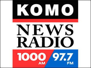
Adding a frequency calls for a change to the logo in KOMOland, and here's what they did:


This has works and not-works to speak for it. Overall it's an improvment, but I'm not sure I'd execute it quite that way.

Here's the works about it:
  • The overall balanced aspect of the logo – the square, stable shape – has been retained. The call-sign and frequencies have remained in a very modern, machine-like font, which resonates with the old look, thereby maintaining the identification on a visual level.
  • The same blue, black, and red colors are used. Consistent use of color continues to stableize the brand identification.
  • The serifed, humanist type in the middle would be an off note, but it's bookended top and bottom by the stable rectangular shapes that define the limits of the design. It's not unlike a book and its pages that way; you have thick covers and thin, flexible pages, but it's a single unit. The choice of a serifed font is a dignified touch that gives an impression of seriousness and tradition.
Now, what doesn't work:
  • My essential crotchet about this design comes from the division of the bottom stripe into red and blue parts with a slanted line. In and of itself, this isn't such a bad thing; it reminds one of a slash one might write when making a note about the two frequencies (1000AM/97.7FM), and also is engineered to be parallel to the slated strokes in the 7's. The sour note that rings comes from the inclusion of a slanting element where it seems actually rather awkward. The entire logo bases itself on a stable, locked-down look, which is appropriate for a broadcast outlet that specializes in news – a commodity that you want people to trust when it's your product. The slanted division introduces tension in a logo where tension isn't necessarily a good thing.
It's been opined to me that it's a little boring, and I'm not going to contradict that. Boring is kind of in the eye of the beholder. Solid and ordered can be a plus if you're looking to generate an attitude of trust and respect.

And a slant as part of the logo design of a news station can work: just check the slant in the KIRO AM logo, which I analyzed to death pretty much, here.

Thanks again, Ben. You have an esteemable eye!

Technorati Tags: , , , , , ,