29 January 2006

[42] Those Were All Personal Days

While this humble chronicle isn't even near the most read blog locally, there are a few stalwarts who check this place on a regular basis. You will have noticed that my participation and presence have dropped rather remarkably.

I may not be the most popular kid on the block (and certainly not amongst the cool) but I have valued my consistency.

The unexpected hiatus began with my catching What Was Going Around™ back during January, Week 2. This developed into a cough that was pretty much a twenty four seven thing, with concomitant effects to my sleep. Things just kinda went downhill from there as my health, then my sanity hit something of a rough patch.

Midway through that illness, a hoped-for opportunity not only didn't pan out, but didn't pan out in the most despicable way. I'll not write on that just this moment; it is a sort of post that every aspiring designer passes, though, and as such is germane to the writing that I do do, so I'm developing something out of it.

Life, lemons, lemonade, that sort of thing.

I have suffered the disappointment of still not being paid to design more than six months since leaving school with a diploma. That certainly contributed to it.

But, mind, I'm not going for sympathy. Perhaps I'm just thinking this one out loud. If, in life, one must taste failure so as not to take victory for granted, that must go double or more for design, where the right combination of happenings can combine, so far as I've seen, to one very sweet success indeed.

Sure, I love design. That's a given. I also am uppity enough to think that I deserve to make a living at it.

So, I'm getting back to arranging a few things I'm working on as continuing projects:
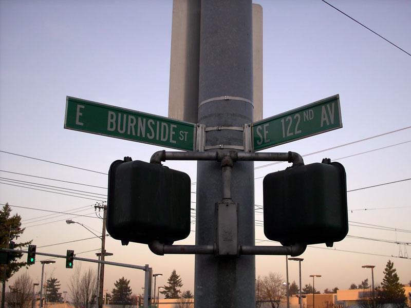
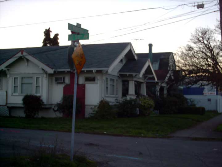
  • First, I so very much enjoyed that bit on Burnside Street I did a few entries back, I'm very much leaning toward making a series out of it. It's hard right now, for me, a night worker in a season with short days, to get the pictures I want of the street signs. So that one will start out slowly.
  • Second, I'm going to continue finding local logos I like and pontificating. A love of logos is one reason I decided to become a designer to begin with (amongst other factors).
  • Third, I have a goal of landing a regular design paycheck by the end of 2006. This has exactly one moving part right now: 1. Get a design job. It's a little weak, but I've learnt the value of starting small. I'll work it out.
  • Fourth, me. That should go without saying.
Okay, enough self-obsession. The next entry down here will not be for a few days; I have a few article deadlines to meet, and I am way behind in planning.

Tomorrow is a work day. Writing, writing, writing. Tuesday we visit The Squirt™, who stays with The Mom™ and The Dad™ down in my old home country, about an hour away.

24 January 2006

[sundial_life] Synchronicity

Like many, I saw the news about a fire in a south Salem duplex that tragically claimed the lives of two very sweet children.

Understand that I wish to make no light of this situation, but I was bugged by how familiar that duplex looked. After dialing up the Statesman Journal's coverage of it, my suspicion was confirmed; I lived in that very complex when I was in high school.

If my suppositions about which individual unit is correct, I likely lived in the other side of the very duplex which burnt.

Update, 24 Jan 06 at 0713: I have just heard on the radio that the cousin of the two victims, who was at Doernbecher being treated, has passed. Truly one of the most tragic of tragedies is the loss of a child. Think of the Arendt family in whatever prayers as you may.

19 January 2006

[design] Hangin' With QuarkXPress 7

Thanks to the indispensable Pariah S. Burke, I have the QuarkXPress 7 public beta.

It's bigger than 100MB, and here am I still on dialup; if I were left to my own devices I'd be downloading it for the next two weeks. Once again, I owe him one.

Experiences so far are positive; I won't go into too much detail because I need something to write about for either QuarkVsInDesign.com or Designorati.com (or maybe both). But I will offer a few quick takes on what I've seen so far:
  • The program runs pretty smoothly. I, however, am not the most demanding QuarkXPress user. Short shameful confession; I have actually never used QXP in a professional mien. The only layout app I've used in a professional role is Adobe InDesign; 2.0, CS, CS2. If anyone has a freelance opportunity that requires QXP, feel free to contact me. I'd like to use it as such.
  • The program version (as illustrated) is QXP Passport. Passport is the version of QXP enabled for international publishing, meaning it includes multi-language dictionaries, hyphenation rules, et cetera. If you use one of your own old *.qxd files to test drive it, you will probably want to Save As a QXP7 version; if you save this file back out, you might not be able to open it again if your regular version of XPress isn't Passport. Another question asked by Quarksters and InDesignistas alike is if XPress now groks OpenType and Unicode, why does Quark have a Passport version (usually much more expensive) at all, when Adobe InDesign has always offered alternative language support for no extra price? That would appear to be a question for the ages. Nobody knows or understands, and Quark certainly isn't sayin'.
  • New program icon (see illo). It's pretty cool. I'll miss the water lily, however...I thought it had style. Am I the only one who thinks that that thing filling the counter of the shiny, chrome Q is a yellow traffic light? Yellow traffic signals mean caution, donnay?
  • Program interface – big thing for me, for reasons I won't go into here – has been polished up a bit. But it still looks like XPress 4. But they are needed improvments. Big improvements to the floating palettes; they can be grouped and palette arrangements can be saved. Palette menus that remind one of Adobe's 'flyout menus'.
  • Big question: QuarkXPress 7 better than InDesign CS2? Gut reaction right now: no. Weak showing when Quark needs to come on with a bang. Feature parity? Maybe. Won't get ex-Quarkers back from the clutches of Adobe, may or may not prevent Quark from losing more customers who are on the bubble. But for those who like this sort of thing, this should be just the sort of thing they'd like.

13 January 2006

[42+1] Klein Bottle – No Relation

How would you like to have your very own 3D immersion of a 2D non-orientable manifold that can only truly be represented in 4 Dimensions?

What I speak of, of course, is the Klein Bottle. I have an affinity for all things Klein, and the Klein Bottle is amongst the coolest things I've found.

Now, all that high-talk in the first paragraph was just a way of saying a bottle with one side (take a good look at the accompanying picture, and let your eye travel about on it). In the same way that a Möbius strip is is a one-sided surface, a Klein bottle is a one-sided volume. It has only one side; or, looked at another way, its outside contains its inside. This, by the way, is what they mean by "non-orientable", which is another way of saying you can't say whether you're inside it or outside it.

The difference between 3D and 4D space is, of course, that in 3D space there is a hole in the side where the spot can come through and then be mated to the base. In 4D space the bottle's side is pierced by the spout but is still intact.

It's topology, so that's about the limit of my understanding too.

But the reason I told you all that is to tell you this: there's actually a company, Acme Klein Bottles, that makes and sells them. You can find 'em all there; classic Kleins, Erlenmeyer Kleins, even Klein Steins (which you may or may not be able to drink from). Prices range from $30 (for the small classics) to $12,000 (for huge Kleins for people with much more money than sanity.

Visit them...you must! It's a hoot!

(Illustration is copyright Acme Klein Bottles)

11 January 2006

[design] Direct Link To QuarkXPress 7 Public Beta Program

In case you can't get through to Designorati.com to get to Quark.com to sign up for the free Public Beta download program, here's a link directly to Quark's Quark 7 page:

http://www.quark.com/products/xpress/seven/

Originally it was so overwhelmed by requests that it was returning confusing error-on-load message. That situation should have cleared up by now.

Here's the drill:
  • Go to the QuarkXPress 7 page. Click on the Public Beta link.
  • Submit the information.
  • Quark fires you back an email with directions for downloading and a password.
  • Follow the instructions in the email.
  • The Wintel version is 111MB, the Mac version 147MB.
  • Run it, play with it, but remember – it's beta. And it expires on 30 March 2006. That means some features won't work, the program may or may not crash, and there is no tech support available – but there is a forum available for discussion.
The buzz I've been hearing lately has been somwhere between positive and pleased.

[design, tech] Designorati, MWSF 06, and Quark 7

Well, I pick a hell of a time to take a couple of sick days, don't I?

This means that I wasn't able to take part in covering the breaking news with the rest of Team:Designorati, but no matter. They've done a hell of a job, which you should read.

In particular:


And as someone who enjoys layout design just about more than anything else, it's notable indeed that the public is getting its first look at QuarkXPress 7.0. After the release date set at the tantalizing "Real Soon Now" for as long as anyone cares to remember, Quark Inc. has finally put up a public beta available for download (it's about 147MB, so you dialup customers, either find a broadband spout or prepare for a wait).

Pariah Burke mentions it here, at QuarkVSInDesign.com, including a link to Quark's Public Beta registration site. The Public Beta is automatically set to expire after 31 March 2006, so you still have to pay for an upgrade, but at least you'll get to see, at long last, what QuarkXPress 7 is supposed to look like, and after all this waiting, that's something to say.

05 January 2006

[sundial_life] Little Triumphs

While the dream of networking The Wife™'s Win98 machine to my PowerMac G4 remains elusive, some improvments can be made.

Now, at least, the Olde Beeste has appropriate drivers, so we can hot-swap the Memorex 1GB Travel Drive or the Zip250 if we so choose. SneakerNet it is, then, and better than the typical Wintel 1.44 MB floppy, and less wasteful than endlessly burning CD-Rs.

The sound of a Zip250 spinning up whilst attached to a 1997-9 vintage Dell is something odd, let me tell you.

02 January 2006

[pdx_life] Zim's Ball: Gone But Not Forgotten

From The Oregonian we find some good-ish news.

Over the last year The O has been running an ongoing series (in the East Metro pullout) about Gresham's first 100 years (it's Gresham's official centennial year). Now, I rib Gresham a lot but the series has been very interesting with many good pictures and stories. This last week was no exception.

The last page of it was a collection of quotes taken over the year. One was a loving rememberance of Zim's Shopping Center (223rd and SE Stark) by Jan Weston of Weston Pontiac, the firm that acquired the land and subsequently cleared off the old Zim's building, including the landmark ball-shaped sign (which I eulogized earlier).

The O quoted Jan as saying that the ball been carted away to storage. It didn't say what they planned on doing with it, but I certainly hope we can see it put up again some day.

Good on you, Weston-the building was dilapidated, but the sign was unique. I'm hoping you honor it's uniqueness.

01 January 2006

[design] Designer World Domination Continues

A comment in this post on this chronicle by Cat Morley (thanks, and I'm honored!) of Designers Who Blog alerted me to another kudo: the site IF (http://if.psfk.com) has featured not only DWB but Chris Gee's excellent site The Prepared Mind it it's list of Top Ten Design Websites of 2005.

My goal is to get up there for 2006. Gotta get started...

In the meantime, congratulations to online designers who show the way and, seriously, inspire me daily.

30 December 2005

[42] Thanksgiving in December

Most people think thanks 'round the end of November, but for me it's the New Years that causes me to put on my Janus face.

In the work I've got to do to keep us in house and The Wife™ supplied with diabetes meds, I tend to work holidays. Holidays, as I like to say, are for other people; when most of you who deign read my small ramblings are looking forward to a party of time off, I have get read to go off to do the drudge.

In a way, this is liberating. We celebrate our holidays our way. We had our home Christmas two days after most of the rest of you, and I use New Years not to make resolutions but to look back on the year before and think thanks and kindness about those who've helped smooth my way and those who have done what they could to remove obstacles thoughtlessly thrown in my way by others.

Thanks, then, to the following:

Pariah S. Burke. I've written about him before. He has the site I Am Pariah, where you can see his work; he's had nearly 20 years experience as a creative and has done many of the things I wish I could do. He has been my accidental mentor, and I am in his debt to be able to say that. He's given me the chance to write professionally through QuarkVsInDesign and Designorati. Indeed, if it weren't for him, there would be no such sites and at this point, it's enough to say that I've helped. Thanks to Pariah, I've done actual editing work on an actual book, and my name's in the credits. That alone is more than I've ever done before and it was a hell of a lot of fun.

We are now building Designorati (and I'm thankful for the Team there; you all know who you are) and are steadily gaining altitude. I got in on the beginning and am using it to push my own envelope.

I am doing about as well as I can as a designer without actually having a steady design job (got some irons in the fire though) and that keeps my hopes up and keeps me honing my own craft. And Pariah isn't the only one who's helped, but if it weren't for him, I would be a lot more desparate and discouraged. As it is, I stay hungry. And it's thanks to this unique individual. Thanks, Pariah.

The Wife™ We have about the number of bickerings you'd expect out of marrieds but we get along famously and no matter how we feel about each other we can't imagine life without the other. You can't have the good without the bad, but when you have the bad you always remember that after working through the bad the good's coming.

She's looking for work so I can spend more time looking for design employ. Send her good wishes, will you?

My other friends There are a few friends, especially from my SCA days, that I don't mention enough. Latterly there are two, Leslie and Friday, who have shot me emails and I have yet to answer them (If you're reading this, guys, I know I owe you email replies). Particulary Friday, who I appreciate not nearly enough, keeps an eye out for job openings (thanks for the ref to Columbia Sportwear, Friday!).

Team:Designorati Go to this link, will you, and look at who I get to hobnob with. This is why I'm luckier than most of you.

People who have linked to me Is it a popularity test? Maybe. If so, I'm not playing it well, but I have some pretty special people linking to me, including a couple of heroes. Stan springs to mind because he always is very nice to me and sometimes includes me in some neat things, like Zrharc!. Jeff Fisher is also another person I'd like to grow up to be. He was one of my inspirations to go into design and now that I'm here, he linked to me (defn:nifty). Homopoliticogeek was the first person to link to me, and he comes and goes, but I'll always be grateful for that link because he just did it, didn't tell me or beg for reciprocation, and that's flattering. Stumptown Confidential, pril, Mover Mike have always been extraspecialnice to me and I appreciate that. It makes me feel like I'm liked around here.

There are many others who've pulled for me in their own special ways. If I forget to mention you, it's 'cos it's late in my day, and I'm a bit cotton-brained.

Gerry Rafferty, in the dedication to his landmark album City to City (you know, it's the one with "Baker Street" on it), remarked thanks to all those who helped, and curses to those who hindered.

I'd like to echo that. I'll try to remember everyone I can, as I make my way forward.

29 December 2005

[logo_design] Intel, Leaping Ahead

So, it's the ashcan of history for the familiar old "dropped-e" Intel logo and the tagline "Intel inside". Now it's a new minuscule look with a jaunty oval swipe and the tagline "Leap Ahead".

You all are going to have to update your Intel-based jokes.

The new logo does preserve a link to the past with the traditional Intel blue, and the minuscules hark back to the old logo as well. The oval swash alighns with the baseline of the word "intel", completing the curve made at the lower left hand corner of the "l", and sweeps around back of the logo then comes back up front to connect with the new tag line.

While reviews of the new logo design have yet to trickle in, I had an interesting reaction to it; I was originally unconvinced that Intel needed a logo-level revision program, but now that I've seen the new logo, the old familiar workhorse seems dated. Perhaps it was high time for Intel to freshen up its look.

It's all part of a new branding overhaul that will eventually see the Pentium's retirement in favor of Intel's newer designs. I'm not that much of a tech watcher, so I'll link to a much better coverage of the shift by The Washington Post here.

26 December 2005

[design] Win A Copy Of Illustrator CS2 @ Work

Pariah S. Burke's, Illustrator CS2 @ Work is a brilliant bit of how-to, and I'm not saying this just because I tech-edited the book. Which I did.

Pariah is a local designer who needs no help from me, of course, but since I did tech-edit the book I got to road test the projects. They taught me some new things that I use when I use Adobe Illustrator today.

Well, if anyone's interested, CreativePro.com's weekly giveaway this week is a signed copy of Illustrator CS2 @ Work. Go here to enter to win one of five copies they're giving out (you have to register on CreativePro.com to enter, but that's free, and CP is a very useful site to know).

And, while you're at it, visit Designorati.com and see what we all have been up to. We do and do and do for you people, you know.

25 December 2005

[logo_design] Glacier Northwest

First, for a casual comment: I completely dig the Glacier Northwest logo.

Second, while you read the following comment, think on the logo itself. If you've never heard of Glacier Northwest, what industry do you think it's in? What product or products do you suppose it produces?

Now, the commentary.

The Glacier Northwest logo is a clever interplay of abstract form, letterform, and shape play. The star is an obvious motif here (not to mention something with a strong human resonance), but, if I can don my Captain Obvious cloak here, it goes so much farther.

The breaking up into individual shapes allows a great deal of play. The ends of the angles are drawn into the center, forming the distinct impression of a majuscule G (thus, of course, the initial of the company's name) in clever ways without actually forming the letterform itself. The opposite ends of the angles overlap the next angle, expanding (again, without actually constructing) the letterform's presence within the design and melding the two aspects (the star and the G) into one very remarkably good looking graphic concept. The extensions to the angles also give a dynamic tension in the design that suggests, to me, clockwise rotation or perhaps a spiral, which is amongst the most attention-arresting graphic symbols I know.

The name of the company is drawn into the logo by deconstructing the lower left hand starbuck (that's what the point on a star is, in case you didn't know) and extending it to become a stem stroke in the A in the word "GLACIER". The word itself is a simple, utilitarian, modern sans-serif, direct in communication, resistant to dating. The blue-green color evokes the color of glacial ice.

This is a captivating logo.

Okay, now I promised early on to tell you, if you didn't know what industry this company was in, to say so, but only after the logo was considered.

Would you be surprised if you were told that Glacier Northwest is amongst the largest, if not the largest, aggregate, cement, and allied building material concern in the northwestern United States and western Canada? Based in Seattle and with facilities across four US states and two Canadian provinces, it sells cement, concrete, and aggregate materials and building systems. There are a handful of Glacier Northwest sites in the Portland area as well as a major cement plant on the Willamette in Portland near Swan Island, easily identifiable by the dome-shaped building with the G-Star logo on all sides.

What's most notable in this light about Glacier Northwest is that its logo exhibits no obvious connection to cement, concret, or building materials whatsoever, and this is also a concept of logo design. Logos can make some direct or obvious connection to the industry or business the logoed company engages in, but there's no law that says they have to. It is an appropriate avenue, but not the only one.

What companies what Glacier Northwest seem to strive to do is to highlight, oftimes indirectly, some quality or impression they want to express about the company – some character attribute that is a decided positive. The star logo may be expressive of the self-view of a company that dominates in its industry: an industry leader, well-acknowledged in quality and market coverage. A star indicates primacy on a map; the five-pointed star, in particular, is the traditional denoter of a capital city.

On the other hand, someone in the company might have thought that having a star-shaped logo is just a darned good idea. Which, in my opinion, in this case, it is.

24 December 2005

[42] Many Happy Returns of the Season

There's too much arguing lately over how everyone's going to tolerate how other people refer to and respect this holiday season.

As a matter of fact, there's every reason to remember that not only did the Christians decide to celebrate the birth of Jesus during the modern month of December, but also many cultures and creeds in many countries the world over have, through history, jubilantly raised a candle to the dark in the depths of the short days and cold nights of wintertime.

So, even though I identify myself as a Christian (to be exact, a "lapsed" adherent to a creed who has a very scary looking man resembling Kris Palpatine as a temporal leader), I have no problem with the word "Holidays" (which evolved from the word "holy days" – will you people please crack a book?), Christmas, Kwaznaa, or whatever you want to do. Nobody's storming my house to tear down my Christmas tree and, if I so chose, I could go to any Christian church in America to worship if I wanted and I don't have to worry about someone persecuting me for it.

Trust me, Christians in America don't know from persectution. but I'm starting to digress.

So, everyone, in your own personal way, raise a candle to the darkness, live in the moment in your own way, and look forward for the spring, for that is what humans on this planet have always done.

Build community. Respect your neighbor.

And remember, an approximate axial tilt of 23.5 degrees is the reason for the season.

Have a happy 2006.

19 December 2005

[net_life, xmas] Alek Komarnitsky Does It Again, This Time for Charity

Updated 2005-12-19 21:37 PST

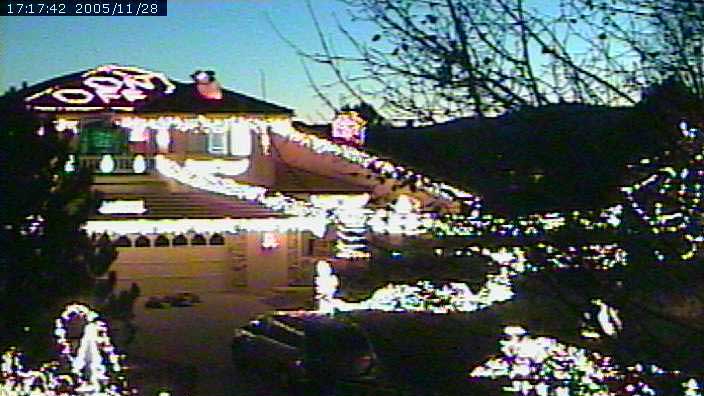
Last year, Coloradan Alek Komarnitsky posted a link to a page that allowed people from all over the world to come and play with his Christmas light set. Page controls allowed people (or so it was claimed) to switch on and off different zones of his display and play with the yard decorations.

It turned out to be a hoax, with a lot of press getting inexplicably mad at him. It seemed to go over well with the general public, though, who thought it was a good and funny 'gotcha'. I thought it was quite the splendid goof.

This year the King of Lights let me know he's back with a display that he says is quite real, no hoax, and you can play with it too. Four zones of lights and inflatable yard decos of Frosty the Snowman, Santa Claus, and The Incredible Hulk (don't make him mad!) that you can play with and frolic at your leisure (though I must echo his request to please don't make the neighbors mad).

An additional bonus this year is that Alek is using his display as a gateway to give people a chance to do a good deed. Celiac disease – gluten intolerance – has recently made the news. Far from being a 'rare' or 'formerly just European' (as I read somewhere) disease, it is only now coming to prominence. It is an autoimmune disorder with currently no cure. Alek's FAQ on the disease provides food for thought.

Go here to see Alek's current display and have much fun with his power bill (until 22:00 MST (GMT -7), anyway) And then, if you're so inclined, click on the green donate button to help Alek raise money for Celiac research, which is, as of this writing, up to $3,160.

Light on, Alek.

Update: After telling Alek about my posting, he emailed me back. The link to the hoax reaction has been redirected to his defnintive page about the hoax phenom, and I've replaced the earlier pic with a new one from his archive, which has an "on/off" switch on the roof, which I think is a hoot.

His neighbors are actually quite supportive of his antics. As he said to me in email:
My neighbors are actually very supportive and have been great.
I would not be able to let the lights actually blink (in real life)
if this was not the case.
What a cool group of neighbors, neh?

More "power" to you, sir.

18 December 2005

[pdx_life] How I Hate It When They're Right

It's said that weather here in South Cascadia is, despite all the modern prognostication tools that exist, notoriously unpredictable.

I don't know if that's just reputation, subjective truth, or actual truth. I do know, as a native-born Oregonian, that once you think you know what's coming down the pike, there is a large chance that you are going to be hoisted up on one very large pétard.

The wind, we find, has introduced us to the wonderful world of minor home repairs – the wind took the metal cap off the chiminey. Now, we have to go up on the roof and look into things. Also, the commute into work tonight is going to be a stone cold pain in the exhaust.

Work itself is going to be an exquisite agony. I wish I could go on about it, but at this time, I have a strict embargo on news from the barely-bill-payer. Have notice that opining about that on the 'blogside gets you into trouble these days.

At least I have the next three days off.

17 December 2005

[Address_Nerd] Portland Signs: Burnside Street

From the so-far notional Field Guide to Portland Streets, I give you one of the essential structures in Portland's street Geography.

Burnside Street is, in its way, a street that runs through every Portlander, if only to give us our sens of place in the city – I daily run into no shortage of people who, when asked about where they live in town, without drawing a second breath, cite thier compass quadrant (NE, SE, SW, NW, N) before they say anything else – even those of us who call Baja Gresham home. In a strange way, it matters. Subjectively speaking, NE carries the upper-middle class connotation, SE is blue-collar working-class, NW is trendy apartment dwellers, SW is relative sumptuous hillside dwellers and uptown sorts, and N seems to be everyones poor relation. Your mileage will essentially very on this; the preceding are stereotypes necessarily, for reasons right and wrong. But it's all based on this street.

The reason for that is that Burnside Street, is one of the two essential spines (the other being the Willamette River) from which the address system of the vast majority of the three-counties of the Oregon side of the Portland SMSA depend. We humans order our world based on major points. This is one of them.

The namesake of Burnside Street was a early Portlander named David W. Burnside (d. 1887), a rather successful pioneer businessman and merchant. According to Snyder, He was a Vermont import, arriving in Portland in about 1852, and was the husband of one Jane Davis (daugher of the man Davis Street was named for). Amongst his other notable achievments is serving on the Portland City Council and serving as a volunteer fireman. He worked with Savier & Co, flour merchants, eventually partnering with Thomas Savier and eventually starting his own concern, Imperial Flouring Mills.

The precursor to Burnside Street was "B" Street in the original west side street plan, in what we call today the NW "Alphabet District", and was named for Burnside in the Great Renaming of 1891. Historically, today's downtown West Burnside was the rough end of town, known as Portland's "Bowery" when this was a much smaller town; as history came forward the areas of Burnside in the city's core became a place where homeless and jobless men and women "on the skids" lived, leading to a further uncomplimentary name: "Skid Row".

But Burnside, in its over 10 miles of length within Portland, wears many faces. The farthest west end – known also as West Burnside Road – travels up the gullies and across the top of the Tualatin Mountains, Portland's West Hills, near some of the most notable city addresses, not the least the great Pittock Mansion. East of the city core Burnside travels through a small commercial strip before disappearing into the undulating patter of Laurelhurst by the time one reaches E 39th Avenue, the upper middle class districts of the east 50s, 60s, and 70s, ascending one shoulder of Mount Tabor before reaching 82nd Avenue, then crossing I-205 into the modest homes, apartments and incomes of Baja Gresham, where it becomes the location of the Red Line (the oldest branch of the MAX system) until 197th at a place called by the Oregon Electric RR Ruby Junction.

East of 181st Burnside bends south, becoming successively SE Burnside Rd, and NW, NE, and SE Burnside Rd in the Gresham address system before ending at the Highway 26 junction on Gresham's east side. The address base carries on as a notional line straight eastward from there.

14 December 2005

[logo_design, pdx_history] Now, That's Tom Peterson's!

Does the word "Xonix" mean anything to you? Does the thought of a cheeful fellow with a laser-precise crewcut knocking on the inside of your TV screen exhorting you to "Wake up! Wake up" at oh-dark-thirty on KPTV tug at the heart strings of nostalgia for you? Ever get a free crewcut at 82nd and SE Foster on a Saturday?

Then you know of the Portland legend that is Tom Peterson. Yes, yes, I know it's "and Gloria's too!". That is true now. But that's getting ahead of ourselves. First, the logo talk.

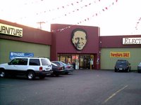
The Tom Peterson's logo is singularly distinct and recognizable (see illustrative photo above right, click on it to enlarge). It's Tom. Smiling at you with his signature smile, the happy-to-see-you look that was his trademark, his face had become so familiar to Portland area daytime and late-late-show (and, yes, Portland Wrestling) viewers that he was the company. You didn't go to Tom Peterson's store . . . you went to Tom Peterson's. He could often be found there, especially during his weekend sales that turned the corner of SE 82nd and Foster Road into a happy circus of furniture, applicance, and Xonix television sales.

The treatment is what is called high contrast. Take any photo and winnow it down to the lightest light highlights and darkest dark shadows, discarding all other shades of gray. Tom's face rendering for his company's identity is a good enough example of high-contrast that it could serve in a textbook. The benefit of high-contrast treatment is that it enables the logo designer to render a very complicated symbol or design, such a human face, into a simple yet recognizable format that expands to Biblical proportions (again, see illo above) and can yet be reduced down to below postage-stamp dimensions (your business card, for example) and retain its recognizable features. It travels well (even to graffiti stencils and the pages of the comic Boris the Bear) and becomes an icon.

The distinctive type treatment, featured on the building and in ads, is also a graphic mainstay of the company's image, just as instantly recognizable as Tom's face.

Just like the fellow whom it depicts, the Tom Peterson logo is a winner.

For the Love of Tom and Gloria

And now, a bit of history.

Every major market in the country has their local advert heroes/cult figures. I recall there was this chubby guy in SoCal who sold cars, would breathlessly rush through his adverts, ending with "Se habla Español!" and "Bye Kids!", and there was Crazy Eddie on the east coast.

Tom Peterson was ours. From the mid-Willamette Valley northward, there wasn't anybody who didn't own a TV who didn't know his name, he was that ubiquitious. And, over the years, by doing what he loved – selling TVs, appliances, and home furnishings – with his trademark look, enthusiasm, and passion, he became a Portland mainstay.
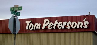
By the time the early 1990's rolled around, he was king of SE 82nd and Foster, with the store on the corner (the current building), the big store on the north side of SE Insley St just east of 82nd (it's an Oriental market now) and a store about a block and a half west of 82nd on the south side of Foster (it was a United Furniture Warehouse until that chain folded, and now stands empty). For his weekend events he gave out free chips, hot dogs and sodas, free crewcuts, and had a trolley bus running between the three buildings so you didn't have to cross the busy intersections (that much hasn't changed).

Just as famous as his wares were the souvenirs. For a long time you could get a wristwatch with Tom's face on it and an alarm clock, shaped like a little TV set, with Tom's logo on the face. There are probably people still around Portland who have Tom's voice in the AM exhorting them to "Wake up! Wake up and have a happy day!" Yes, they really did have Tom's voice saying that.

Logo designers, take further note: you never know where your design may end up. Design accordingly. Anyway.

Coming into the 199o's, Tom was going well, with $30 million in yearly sales. If you date back to that time you may also recall another name "Stereo Super Stores". It was another local retailer, a chain of stores which competed with Tom in the TV and electronics biz. It wasn't doing so well, and the owners wanted to sell. Tom was doing well – why not sell to Tom? Tom wanted to expand, and the SSS owners wanted out of the business. Win-win-win.

Only, Gloria, Tom's wife, who had done the books for Tom for a very long time, had a bad feeling about it. Everything looked good, but something was amiss. She couldn't put her finger on it. She thought taking over the SSS was a bad idea. Tom, confident that this would be a good deal, went ahead and took the plunge.

The company pretty much went down with him. Within 18 months after buying Stereo Super Stores, Tom Peterson's was on the ropes, declaring bankruptcy. And, for a while, the only appliance store owner who'd ever been in a Gus Van Sant film sank from the Portland commercial landscape.

They say, in an old saw, you can't keep a good man down. And Tom is a good man. Tom regrouped. Family saw him through, and he set up once again, under the name Tom Peterson's and Gloria's Too!, giving due to the woman he ought to have listened to all along (though her face doesn't grace the building, nor her name, her visage has joined Tom's in the company logo and she appears in the store's commercials). The company is now organized under his daughter and son-in-law, but Tom, now in his 70s, still runs the show.

The store is kind of a shadow of its former self, but if you stand outside you can kind of hear echoes of the way it used to be. And, for the time being, the King of 82nd and Foster still holds court there. No 24-hour "Wake Up!" sales anymore, but the smiling visage of Tom Peterson still gazes benevolently over one of the busiest interesections in Portland, Oregon.

[metro_transit] TriMet Goes Biodiesel – But Just A Little

TriMet is going with the biodiesel. There was much rejoicing.

Well, I was thrilled. When I got into the guts of the press release, though, the achievement didn't seem so major.

Starting this month, TriMet is going to start using a biodiesel fuel called "B5". B5 has come down in price so that it's now economical to use. They're piloting it in 75 buses before using it in the whole fleet – of LIFT buses.

TriMet LIFT is the paratransit program, of course. If it works out in the 75 buses then they'll expand B5 use to the entire fleet – of LIFT buses. There are 210 of those. The press release makes no mention of when (or even if) B5 is to be used in the entire fleet, which would seem to me to make more of a difference.

B5 is rendered from used commercial cooking oils, and is a mixture of petroleum fuel and biodiesel fuel. 95% petroleum to . . . 5% bio.

So, TriMet is using biodiesel . . . plus! The biodiesel is being rendered from local producers (such as Kettle Foods) . . . plus! In a minority fraction of the fleet . . . minus. And only 5% of the fuel is actually biodiesel . . . minus. The release goes on to say that if the biodiesel LIFT bus test is successful they'd evaluate using it in the 611-unit main fleet.

I'd like to see them using more biodiesel and ramping it up a little bit faster. One of our economical problems is dependence on foreign petroleum, and this all seems a bit . . . casual. Maybe I just don't get it. I want to be impressed by this but somehow I just don't feel all that impressed by it.

09 December 2005

[42+1] Robert Sheckley, 1928-2005

It has been reported that Robert Sheckley, acknowledged master of and one of the deep thinkers of science fiction, has passed away at a hospital in Poughkeepsie, NY, at the age of 77.

A longtime resident of Portland, many know of him through the 1992 movie Freejack, which was a loose adaptation of perhaps his most famous novel, Immortality, Inc (1959). Though it was given a hard time by the critics it was a fun movie, viewable and re-viewable. Long admired by fans, he was also highly regarded by his peers; Brian W. Aldiss said of his writing that , at his best, Sheckley was "Voltaire-and-Soda", and Harlan Ellison opined that "If the Marx Brothers had been literary reather than thespian fantasists, they would have been Robert Sheckley."

In Science Fiction, Sheckley's name was great, and he was a gem stashed away here in Portland.

Find out more about the life and works of Robert Sheckley here (his official site).

[net_life, pdx_geography] Google Hearts TriMet

There's this thing that's all the rage lately, with all the net-based map services opening their APIs to the public, and that's called the "mashup": take their API, your needs and data, and mash 'em all up together.

TriMet's getting in on the act.

Google Maps (if buzz is any indication, by far the most popular API so far) has inagurated a new wing of the Great Google House 'o' Maps, Google Transit (http://www.google.com/transit). It is a beta test version, but the system that Google Transit is beta testing out, is our very own TriMet.

This is a TriMet PR coup and they know it; the requisite press releases have been sprayed hither and yon (I got one – anybody can, just go to the TriMet website and subscribe). Since it's beta test, TriMet asks that for serious transit planning to please keep using the o-fish-o TriMet Transit Planner for now.

It's worth a look though.

05 December 2005

[pdx_design] Portland Designers r0x0r!

Jeff Fisher, man in motion at bLog-oMotives, has publicized a worthy fact: The ominbus Designers Who Blog, maintained by Cat Morely of katz-i design, (who is, as is other designers such as Jeff and Pariah, much mo'smarter people than I) has been rated one of the top ten websites fo the month by HOW Magazine, an important design journal.

Why this is important for the local designosphere is that several of us local Portland-area designers are linked to from that 'blog. Amongst them, Jeff, Pariah, and Your Humble Servant.

There are others of note that you should also note. Read Jeff's post to find out which.

[logo_design, pdx_history] Well, We Won't Have Thomason To Kick Around Anymore

Gaze lovingly upon the logo, Portlanders. If what the Oregonian says is correct, we may be seeing the last of a long standing Portland commercial name: Thomason Autogroup.

Thomason has a storied history. Everyone who's watched a television in the Portland market in the last 10 years has seen one of the goofy ads (usually starring Scott Thomason himself), and the former logo, Thomason-head (cousin to Tom Peterson's head) that was ubiquitous anywhere within 20 miles of a Thomason dealership. The run of ads reached its zenith in the year-long "Greatest Car Commercial In The World" campaign, featuring Scott as the longsuffering dealer and Kid-in-the-Hall Kevin McDonald as a remarkably flamboyant video producer hired to helm the project.

Perhaps wanting to climb out of the pool on a (relatively) high note, he sold his stake to New York's Asbury Automotive Group in 1998. Scott's head left the logo as well. The replacement, while not having the obvious character of Scott's head, was effective in its way. Contained within the still-fashionable oval (which seemed to take the auto-logo world by storm when Inifinti debuted and still seems to rule) is, what appears to be, a road intersection at a hilltop. The green seems to then suggest countryside, the yellow, city. The intersection is, of course, a "T" intersection. The Thomason name is emphasized in the type with a mixed-case approach providing subtle artistry.

Though it lacked personality (as did the entire Thomason public face did after the Asbury aquisition) the logo itself is quite effective and I rate it as rather well-done. It's just – well, how can you ever follow Scott's act?

Since Asbury's entry, Thomason's stores have been – well, not so good. As this story (which you'll have to pay to read after fourteen days hence) from the Sunday Oregonian holds, Asbury has been quietly selling off the Thomason dealerships and should have them all unloaded by the end of the month. None have changed public names yet, though business names have been changing.

It is entirely possible, if not probable, that by the time 2006 is but a few months old there will be no more Thomason anywhere. The empire started by Scott when he acquired his dad Dee's dealership (Dee Thomason Ford, I think it was) will have ceased to be, gone not with a bang, but a decided whimper.

Goodbye, Scott. We scarcely knew ye – wait, I tell a lie; maybe we knew you too well.

(NB: anyone loading the autogroup's home page Thomason.com will note a nod to Dad in the page title: Deefault Thomason Autogroup Portland. I approve of the inside joke)

04 December 2005

[blog_life] The BlogPatrol Report

In which I highlight BP search terms that just make ya go...hmm.

Well, that's what we're assuming:
"wayne faligowski, born"
My suggestion: purchase QuarkXPress:
"how to bypass adobe CS2 serial number"
Uh, what was the question?
"does an increase in unemployment cause you to go inside the PCC curve"
Inasmuch as he's still unemployed, I'm thinking "no":
"victor boc flow of money is it any good"
Well, when I menched it, I meant "mentioned":
"what does menched mean?"
Where you are when you're not at the end of the world, but you can see it from there:
"Idaho Falls"
Slim pickin's this time around, I'm afraid.

03 December 2005

[logo_design] Unitus, Uniting Us

In 1937, the Oregon Telephone Employees Credit Union was chartered. With a name like that, it shouldn't be hard to guess who they considered thier core constituency.

That was 70 years ago. Tempus, as they say, fugit. Throughout the 1990's, the credit union sector grew mightily. Formerly industry-centric credit unions gradually grew thier membership until the names of many of them weren't quite such a close fit anymore. As it was known by the turn of the 21st Century, "Oregon Telco Community Credit Union" certainly was one of them. From a relatively select audience the non-profit had grown to serve many thousands of people in northwestern Oregon.

Clearly a change was in order. Also, the old logo (illustration, top), though well-done, seemed somewhat dated (my opinion).

Therefore it's apparent the company felt a complete identity makeover was the order of the day. The solution (illustration, bottom) is a study in clever and effective design with many strengths and few weaknesses.

First, the name: Unitus (pronounced unite us) is an obvious solution that I'll bet, by now, other people are wishing they'd thought of, but is as clever as it is obvious. Not only does it evoke one huge positive aspect of the credit union concept (bringing people together – credit union depositors are also member-owners) the word itself refers the word "union". The overall effect is one of community, of people helping people.

Second, and most important to me, the logotype design. This works on a great many levels. The letterforms are sans-serif, with a clean, modern sensitivity. The design makes brilliant use of pronouciation symbols (a/k/a diacritics) in the horizonal bar over the "U", indicating the "long" vowel voice (this symbol is called a macron, as I will refer to it ever more, so take notes).

Moreover, the macron extends by association into the yellow box around the initial letterform, which not only lives inside the logotype but allows the initial letter to be broken out of the logotype to form a logo all on its own. The boxing of the U also evokes unity, but since the macron and the rest of the box have necessary gaps, the U doesn't feel totally trapped.

The designer also tipped thier hat toward legacy in including a yellow color that is very similar to the yellow color of the spiral swooshes in the old logo, bringing a kernel of the past into a very dynamic present.

There are, as I mentioned, a couple of weaknesses. The box up front, while extremely insipired, promotes a crowded feel since there is room to breathe around all the other letterforms. The choice of a sunny yellow is also a potential stumbling block, but only because one then has to be quite careful about the backgrounds on which the mark gets exhibited. One application, the building sign, has the type in black with the yellow in the background and the macron and box reversed out in white, which works well.

These weakenesses, however, are easily worked around (as noted above) and do little if anything to harm the communicative power of a very well-done logo. Unitus is modern, friendly, and dynamic – and all you have to do to become a member now is to open an account.

Unitus' website is at the end of this link.

02 December 2005

[logo_design] Pajamas Media, Episode III; A New Robe

In the continuing search for identity that is the story of OSM/Pajamas Media, the new logo has debuted. It's been in the wild for over a week now, and reaction has been somewhat darkly humorous.

Logo design is a struggle to implant a message about one's strengths in the minds of those who view it, with an aim toward creating a memorable, catchy image – but catchy in the right way. It's quite possible to be catchy in the wrong way. Does PJM come off on that route? The individual verdict is in the eye of the beholder; the verdict of the public court seems to be coming in, and it's aim being political, the critical return tends to be opinionated.

But I digress. To its strengths: It is simple and memorable. The use of color in the graphic design and the type provide a strong unity. The image – a bathrobe – is an obvious reference to the fast-becoming-trite joke that bloggers do it in thier peejays. The diminishing curves to left and to right reinforce the center and seem to suggest technology in action the way the curved lines coming off the typical speaker icon suggest that bit of technology in action.

But it has remarkable weaknesses, and some of these make reference to the "10 attaboy" rule (it takes 10 "attaboys" to overcome 1 "aw-hell"). The graphic representation is obvious and rather cleverly done – but exactly what it isn't is a set of peejays. The radiating and diminishing curved lines have been noted by at least one blogger I've read to more suggest vibration (put in your own ribald comments) than anything else.

The 10-attaboys rule come up when one studies the rest of the site, particularly two points. Firstly, while the old circular brush stroke is banished from the logo it is not gone from the website. Dig, if you will, the following picture:


Note the ghost of the old logo behind the headlines list. This can still be viewed at the website, 'below the fold', as it were. Scroll down, you'll see it immedately to the right of the featured blog. This simply shouldn't be there, if this is a true rebranding; it doesn't relate to the new brand or logo, and anyone coming on the site would wonder what, exactly it is – and possibly conclude that it's an abstract pretty, meant to fill or activate the space.

The other major problem is the domain name. It's still www.osm.org. I tried punching in various versions of 'pajamasmedia' and 'pjm' into my browser's address bar and found that certain other commercial organizations already had them, so obvious lateral moves aren't that available, but something should be getting done to make the URL match the site's title. They have a scad of venture capital; maybe they should start negotiations with someone (NB: at least one of the variations of URLs containing pajamasmedia is not for kiddies or the easily offended – it's quite adult. Run your own tests at your own risk).

The damage is this: for a site that seems to position itself as a serious 'blog omnibus portal its branding and apparent PR strategy make it all look very amateur, as though they are flailing about looking for a way out of a silly mess that they really shouldn't have found themselves in to begin with. The site links to several 'blogs of anywhere from amateur to professional interest, but the site is driven by professional communicators, people who should know better. It's tough to take such a site seriously when they can't get their branding and logoing together.

01 December 2005

[pdx_life, blogs] A b!X From The (Recent) Past

b!X has mounted the compleat Portland Communique, restyled in a funky, deco-ish (and quite pleasing) way, at his old address of http://communique.portland.or.us.

(Via FURIOUS Nads, of course)

[design, tech] Two Big Announcments

Type designers and web designers alike have things to think about now, as two big names bring themselves up to new current versions.

Fontlab, Ltd licensed the code for Macromedia's Fontographer some months back. Fontographer, one of the big guns in the desktop font design world, went into extended hibernation with respect to the Macintosh some eight or ten years ago, but despite only being runnable under OS 9 was still quite popular.

Fontographer for Mac OS X has finally arrived (link to my announcement on Designorati) And, to further fuel Mac OS X smugness, is at version 4.7 for Mac users only . . . Wintellers only get a version 4.1.5. You can check 'em out here.

Naturally, the real big news of the day (in some people's opinions, anyway) is the release of Firefox 1.5. (Firefox 1.5, Madge? Yes, you're posting in it!) There are improvments such as drag and drop tab shuffling, redesigned preferences, auto updating, new options to clear personal data, more standards-compliant stuff. After falling in love with Safari when I finally got a Mac I got Firefox and it's gotten good enough that it's now my default browser. I still wish they'd beef up RSS handling; "Live Bookmarks" are a poor substitute (I have Opera for reading my feeds).
You can download it from Mozilla.com here.

28 November 2005

[zeitgeist] It's Just Another Color-Themed Day

Unlike (apparently) a lot of people, I was a little taken aback to find that the day after Thanksgiving, up until this year called "The-day-after-Thanksgiving", of "The-busiest-shopping-day-of-the-year", has been given the moniker "Black Friday".

Say wha'?

See what happens when I take my eye off the ball for a few days? Sheesh. I miss the old news cycle that closed down at night, but anyway.

For a day that held so much hope for retailers and the economy, "Black Friday" seems a pretty darned sombre name. Not that I could think up a better one; I thought "The-day-after-Thanksgiving" worked pretty well, and you don't mess with success in my world.

Then I saw the Wal-Marts. You know, the ones where people are lining up before dawn in thirty-degree weather to get in? And the appalling behavior in Orlando that hit the national news.

No, when people are lining up in front of Godforsaken Wal-Marts to buy stuff, then, I guess "Black Friday" applies just fine.

Oh, and if anyone's paying attention, please understand the following: There is nothing in a Wal-Mart worth lining up for before it opens. There never has been. THERE NEVER WILL BE!!!

In other words, if you're waiting outside a Wal-Mart before it opens to buy something, brothers and sisters, it's time you looked deep inside yourselves and asked yourself if you really need it all that much.

23 November 2005

[Address_Nerd] History in the Curbstones, Part II

Dig, if you will, this picture:

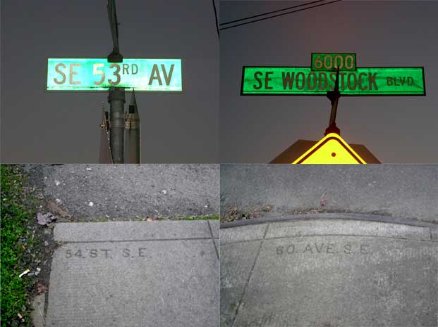
This is the corner of SE Woodstock Blvd and SE 53rd Avenue, facing WSW, taken late on a recent late Fall afternoon (which, of course, is not all that late, but for the early sunset, which is why the light is so low). SE 53rd Avenue is the small unpaved street in the foreground, and it ends in a dead end about 100 feet or so off to the left. On the right hand, and just out of shot, is Woodstock Blvd, the Our Lady of Sorrows Catholic Church across the street, and immediately left and out of shot is a small drive-up espresso stand. Less than a block east on the same side of the street is a Plaid Pantry store; the bluish building in the background of the shot is the Mike's Auto Parts store at 52nd and Woodstock.

Recall, a few weeks back, I noted that before the street name rationalization in ca. 1930, the area sout of division and east of 39th out to the city's edge had a different pattern than the rest of the city; numbered avenues ran east-west crossing numbered streets, all suffixed SE and based on our modern baselines of Burnside and the river. In this area, many streetcorner markings in the pavement date from that time, so, if you come to a corner and look down, you can actually see what the streets used to be called.

Woodstock is the 6000 block south of Burnside, so in the old system it would be 60th Avenue, SE; what we today call SE 53rd Avenue would be 53rd Street SE. Let's go to the evidence:

The curbstone picture beneath the sign is the marking you see on the street the sign belongs to. So we see that, as predicted, the curb (on the right) under the SE Woodstock Blvd sign says 60(th) AVE S.E., but the curb on the SE 53rd Avenue side reads, not 53, but 54 ST S.E..

A look at a map suggests that someone, at some time, needed to make a judgement call. Between SE 52nd and SE 57th Avenues on the south side of Woodstock Blvd there are three dead-end stubs. Today they are 53rd, 55th, and 56th. At the time they were made it must have seemed more appropriate to number it 54th; very close by, entering Woodstock from the north, is another part of SE 54th Avenue.

These pavement markings still exist in a great many places in S.E., and though we can't expect them to stay indefinitely, the city doesn't seem to be in a hurry to remove them, so there's still time to find 'em.

[logo_design] The Adventures of Pajamas Media, we mean Open Source Media, no, we mean Pajamas Media after all

This week, a blog network/portal site debuted with the name of Open Source Media. The site, an alliance of blogs and personalities self-described as conservative, chose a fairly slick looking logo: a dark cyan spiral paint stripe emanating from the majuscule O in the OSM, with the rest of the acronym punching through the spiral, the S seeming to be centered on it. The expansion of the acronym, "Open Source Media", lay below the M and aligning with its left stem stroke, was a dialed-back gray so as to inform the viewer of what OSM was supposed to stand for but not to distract from the trigram; it seemed apparent that from this display (as well as the website address – www.osm.org) that the OSM mark was to be the core identity.

It looked pretty slick, and in my opinion it's not a bad logo at all. It's got good eyeflow, divides and encloses the space interestingly, and delivers information.

And it immediately showed the symptoms of a raging case of Quark disease.

DTP maker Quark, if you'll recall, recently freshened up its image. Problem: it's redesign looked a heck of a lot like a number of already-existing identities (for back story see Gene Gable's commentary on CreativePro.com here, Pariah S. Burke's on QuarkVsInDesign.com here, Jeff Fisher's Logo Notions commentary at Creative Latitude here, or my own comments on Designorati.com, if you're a glutton for punishment (I also have one on somewhere here on the Times, but I think that'll be enough linkage for one article).

Anyway, it wasn't long before Quarkitis hit. Blogger Jonathan Miller, at this post on his political commentary site Blogoland, wittily and snarkily noted two similar logos – philly.com and Lucent Technologies. Are they similar enough to be plagiarized? Likely not. Are the similar enough to make OSM look unoriginal? Could be. That's kind of in the eye of the beholder – follow the links and judge for yourself.

The biggest conflict isn't the logo, though, it's the name. Open Source Media already seems to be in use: an independent journo who promotes a podcast through his URI http://www.radioopensource.com uses just that name for his site.

A combination of pressures – liability to the already extant Radio Open Source and general humiliation amongst them – have contributed to the site going back to its working title, Pajamas Media, a reference to the oft-forwarded remark that bloggers post news to the world whilst sitting in front of thier computers in thier pj's (the URI, http://www.osm.org, remains unchanged). The illustration at the head of the article is a screenshot of the logo as currently represented on the site's masthead, and is a clever and somewhat self-deprecating way of shifting identity. The new identity is typographical rather than graphic but preserves the colors of the original logo – the dark grey of the letterforms and the dark cyan go to the dots over the minuscule i's.

It's true you just can't check enough, and thorough research is a necessary thing, but one wonders exactly how much happened when a simple Google search could have turned up conflicts.

21 November 2005

20 November 2005

[beaver_nation] There's Always Next Year

I give you the 2005 OSU-UO Civil War: living proof that OSU's season, as I thought, ended four games ago.

OSU Football is the only football I listen to on broadcast. This time, got up late, tuned in with three-something minutes left to go, heard the score and about two minutes worth of commentary, and turned that radio right back off, friends.

'Cos that, my babies, is what they call...

(Image borrowed from a site I found Google searching, copyright everyone, Star Trek belongs to Paramount, copyright this that and the other thing, copyright Paramount, please don't sue me Paramount it's only a joke. And tell Spock to stop mind melding with Coach Riley for chrissakes!)

18 November 2005

[pdx_geography] Exits on the Banfield Freeway

An interesting thing I found whilst going about lately satiating my craving for information on the Mount Hood Freeway was a bit about the exits on the Banfield Freeway (I-84) that I'd never noticed before.

Exit numbers, as many are aware, in Oregon are keyed to the freeway mile. The exit from I-5 to Keizer is in freeway mile 260, so the Keizer exit is Exit 260.

On the Banfield eastbound, in the stretch that rounds Rocky Butte to the east, the 82nd Avenue exit is Exit 5; it's in freeway mile 5. The I-205 southbound/Salem exit is Exit 6, the Gateway exit is Exit 7, the I-205 northbound/Airport exit is Exit 8, and the 102nd Avenue offramp is Exit 9.

But the distance between exits 5 and 9 isn't between three and four miles...it's only about 1.2 miles. Strange, but explainable.

It developed that the stretch of Mount Hood freeway from I-5 to I-205 was to be added to the Interstate system as I-80N (or I-84 as we have today), and the stretch of Banfield between city center and I-205 was to be dropped from the Interstate system, simply signed as US 30. The shift of the route, with I-84 and 205 "duplexed" from what is now I-205 and Powell Blvd to the Gateway area, would account for the "lost" mileage. The mileage on I-84 east of I-205 is reckoned as though the Mount Hood freeway was actually built.

This, friends, is serendipity in action.

16 November 2005

[design] Would You Believe...A Sudoku Generator for Adobe InDesign?

Over on Designorati, the inimitable Elisabetta Bruno, DTP doyenne extraordinaire, let us all know about a couple of free plugins from Rorohiko.com.

One is a nifty-sounding thing called "Place-auto-synchronize", which makes live subscription to placed files possible. That's cool enough. But would you believe they make a free plug-in that generates Sudoku puzzles for your layouts?

'Strewth! Go here to see it.

Meanwhile, over on Designorati:Photoshop, PShop expert Jeremy Schutz is producing a series of nifty little how-tos – bite-sized tutorials on little useful things, like how to get that pet-eye reflection out of your photos (a technique that was, per se, developed by one of my other Designorati colleagues, Sara Froehlich).

It's useful stuff, you people! Other people would make you pay for it, but we give it away–how cool is that?