28 April 2011

[tech] They Actually Are Still Making Typewriters, Somewhere

2615.It would seem that, as a wise American once expounded, reports of the death of the typewriter have been greatly exaggerated. This from Gawker, via The Great Penguini:

In the retelling, however, this somehow came to mean that Godrej & Boyce was the last existing typewriter manufacturer in the world, and that this therefore marked the final, wheezing gasps for the antiquated word-processing machines. From the fake typewriter ashes, a million nostalgic personal essays bloomed.

There are at least a few firms left that are creating new typewriters, including a firm referenced in the article that apparently creates "see-through" typewriters for use by prisoners.

Referenced was this search on Staples website which turns up several models. I would point out that these are strictly electronic typewriters, which, to me, is an important distinction … perhaps not to others, but certainly to me. I think the mechanical typewriter has a niche, infinitesimal though it may be.

But breathe easy, fellow lovers of the rustic art of creating type with actual mechanical effort … our day is not completely over. Not yet, anyway.

And while we're there, mea culpa for spreading a bit of un-information there. But it was with a good heart.

[Address_Nerd] You're So Vain, I Bet You Think This Address Is About You

2614.Thanks to fellow League of Extraordinary Address Nerds member Ben Lukoff for this little gem.

To a person like me, the New York City address pattern in extremely interesting. Twenty house numbers to the block on the avenues (and not every avenue beginning on the baseline of 5th Avenue) make for a very interesting address location experience: a tradition in phonebooks and travel guides is to include a amusingly abstruse algorithm to determine what cross-street your address may (or may not) be near.

Latterly the wonders of the intartubez have brought web-based pages and apps for download that make it very easy for those who are NYC tyros to find what they need. But, as in life, everything is as it is, but not as it ought to be: there is cachet and status to addresses, and as it turns out, if you are sufficiently close to Fifth Avenue, that Avenue of distinction, you can petition the City of New York for a vanity address:

Borelli is a somewhat reluctant steward of the vanity-address program, which dates back several decades and can be blamed for, among other things, the proliferation of the word “plaza” and the disproportionate number of businesses and homeowners with Park Avenue and Fifth Avenue letterheads. (“Pulling an avenue address over” is the topographical parlance for denying that your building’s real entrance is on, say, East Seventy-sixth Street.) “I usually try to talk them out of it,” Borelli said, referring to vainglorious building owners. “If you’re having a heart attack and you’ve got a vanity address, it could take a few crucial moments for the E.M.T. driver to figure it out. And you could be dead by the time help arrives.” The residents of 44 West Sixty-second Street once sued the owners of 62 West Sixty-second Street, whose nifty mnemonic address comes at the expense of directional logic: it is east, not west, of No. 44. The plaintiffs were upset about missing out on pizza deliveries and Town Car pickups amid the confusion. (They lost.)

I like to think, anyway, that such a thing is very unlikely to have happen here in PDX, with our excuciatingly-logical street rationale; while we will be goofy about naming our streets sometimes (it must be said, I've warmed to the idea of SE César E Chávez Blvd instead of Thirty-Ninth Avenue, as flawed as the process of getting there was … heck, it looks great on a street blade), you aren't going to get an address on SW Broadway, say, if you are two doors around the corner on Taylor Street.

[logo_design] Google Chrome Logo … With A Bit Less Chrome

2613.I just now noticed this … I should keep up on Google Chrome browser news, especially since I love the logo quite a bit. Clever little thing.

When I started up Chrome today, just to go get a look at somthing in it, I noticed it had become, well, flat

New Google Chrome Logo

… and I knew it used to look a bit more pictorial:

Old Google chrome logo


Or as Steve Rura, designer, explains it:

Since Chrome is all about making your web experience as easy and clutter-free as possible, we refreshed the Chrome icon to better represent these sentiments. A simpler icon embodies the Chrome spirit — to make the web quicker, lighter, and easier for all.

Which, if you're going to evolve a logo design, is a good way to move - in concert with the animating idea, or at least as close as you can execute it. After being a bit surprised by the evolution, I found myself warming to it right away. So, for me, it's a good move.

Read all about it and look at some of the user explorations that inspired the move here: http://chrome.blogspot.com/2011/03/fresh-take-on-icon.html

26 April 2011

[logo_design] That Peculiar Lightness of Logos for 2011

2612.So saith GD USA's Logolounge: the fashion trend for logos seems to be light, airy, and transcendant:

For the 2011 report, our ninth, color is still prevalent, but tinted down. Where black has been used as the strong neutral, now brown or gray is in place. Blues and greens are softer, and pinks are starting to appear.

Other degrees of lightness: Shapes are airier, lifting off the page. Designs are rising out of their 2D resting places and suggesting that they would really like to go places. In some logos, line weights are slimmer. There’s plenty of transparency, too, as if light is now able to flow right through.

The transcendancey comes from what's turning out to be a logo's new remit: it did what it does before, but now it does it in places that Paul Rand never would have guessed. You'll find a logo as a favicon, animated, in print and in electronic form … but not just one form, many of them – animated, backgrounded, what have you. As digital design tools evolve, more effects and functions, once the domain of fairly abstruse professionals, now come to the fingertips of your friendly neighborhood desktop designer.

They can be used for evil, yes, we understand that. With great power comes great responsibility. Also, large power bills.

Read the Logolounge's report here … http://www.gdusa.com/issue_2011/april/logolounge.php … and go right to the graphic that illustrates what they see as the 2011 trends here … http://www.gdusa.com/issue_2011/april/logolounge/index.php … each image has a link to a definition and examples.

H/T to Jeff Fisher.

[tech] The Typewriter Era Is Over … Period

2611.Typewriters have, of course, been on the way out for a long time. Here in America they've all but become ghosts, and those of us who have actual typewriters and use them (me, for one) have to know where to get typewriter ribbons (not an easy thing, but I at least have Bill Morrison's at 122nd and SE Stark St, which is within walking distance).

I was aware that they were less popular for a long time, you know when I knew that the typewriter's days were numbered? When you couldn't find them at the Goodwill store anymore. They used to have shelves and shelves of broken old machines. Then, one year … and not all that long ago … the old typewriters just kind of disappeared.

Those of us who like type and typing … and for me there's always a sort of joy to it, a healing feeling … cherish our machines. The author Harlan Ellison has several in storage, because nothing lasts forever and, I imagine, soon enough, there won't be any way to even get them fixed any more. Keeps spare typewriter ribbons in the freezer, I understand.

With the announcement of the last known typewriter manufacturer in the world ceasing operations, I fear that day is here:

With only about 200 machines left -- and most of those in Arabic languages -- Godrej and Boyce shut down its plant in Mumbai, India, today. "Although typewriters became obsolete years ago in the west, they were still common in India -- until recently," according to the Daily Mail, which ran a special story this morning about the typewriters demise. "Demand for the machines has sunk in the last ten years as consumers switch to computers." Secretaries, rejoice.

"We are not getting many orders now," Milind Dukle, Godrej and Boyce's general manager, told the paper. "From the early 2000s onwards, computers started dominating. All the manufacturers of office typewriters stopped production, except us. 'Till 2009, we used to produce 10,000 to 12,000 machines a year. But this might be the last chance for typewriter lovers. Now, our primary market is among the defence agencies, courts and government offices."

Well, my Royal Futura isn't on the verge of breaking down, and I can still get ribbons for it. But she's amongst the last of a now-extinct species.

24 April 2011

[icons] "Get A Mac": Art Imitates Life Imitates Art Imitating Life

2610.They've become iconic: John Hodgman as the PC and Justin Long as the Mac. Over many years and between 60 and 70 seperate commercials, the buttoned-down, business-suited, bland Hodgman became a sort of PC-tan against Long's Mac-tan in the ultimate collision of American advertising and moe anthropomorphism.

Turns out that the incarnations are actually quite close to the stereotype.

An article on PC World reports than an unscientific survey run by a site called Hunch suggests that the stereotypes have basis in reality:

An unscientific survey by Hunch, a website that makes custom predictions based on your interests, shows that PC users tend to prefer fitting in with others, are less tech savvy, and prefer Hollywood films over indie films. The same survey suggests Mac users tend to throw more parties, are modern art enthusiasts, and would rather drive a Vespa than a Harley.

The real cosmic joke, in my opine, is that John Hodgman is actually a hardcore Mac user:

Here is the joke that is absolutely apt, though I once promised I would never make it: "I play one on TV, but I am not a PC." It is true. I am first of all: not a computer, but a human being; and second of all: a Mac user, almost exclusively, since 1984. There was a brief period in the wilderness between 1997 and 2003. Let us not speak of it.

Justin Long is an Actor whom, I presume, doesn't trouble too much about computers.

And so it goes.

[logo_design] Descendants of Original NY Yankees Logo Desiger Suing For Rights

2609.This story may or may not demonstrate the wisdom of getting it in writing, depending on how the court case works out.

The New York Yankees "Top Hat" logo is, if not among the most famous logos, certainly one of the most recognizable, and carries a lot of history and fame. The logo was reputed to have been created by Kenneth Timur in 1936 who, according to the article at CNN, apparently depended on the good will of the Yankees organization to be properly recompensed:

Buday explains that her uncle was not aware that the Yankees adopted the logo until he immigrated to America in 1947 and was asked to revise the logo for their 1952 celebration of 50 years based in New York City.

She claims Timur was hopeful that this time the sports franchise would offer him some kind of recognition, but took the opportunity to "sign" his work with a "P." Instead of 1903 to 1952, the logo appears as "1P03-1952" on the patches of the uniform.

A spokesperson for the organization quipped in response This is a wonderful country where anybody can sue for anything, even when the allegations are over 70 years old. And there, though I'm not a lawyer, would appear to be at least one place where there may be a crux of the matter. There may indeed be a credit due, but a delay of 70 years would seem, to this layman, to be a big obstacle to the claims of the descendants.

Good luck to the litigants, and we'll keep our eye on this one.

[liff] The Death Of Print, Part 9,207: The Onion Fools The NYT

2608.This probably explains everything somehow: In a recent retrospective on the evergreen, unchanging teen rag Tiger Beat (yes! it still exists!), the nation's paper of record, The New York Times, thought a parody cover of TB, featuring President Obama, was a real Tiger Beat cover.

Fooling the Chinese media that the Congress is going to leave DC unless they get a new Capitol is one thing.

This makes ya want to cry and die inside.


23 April 2011

[art] Diary Girl: You Can Be My Mangaface

2607.Taking my inspiration today a relatively simple girl's face from a copy of Shonen Jump I have hanging about to draw from if I have no other inspiration that day:

Mangaface 1

The model is up there at the top of the picture. Here she is up close:

Mangaface 2

Me very pleased!

I'm not constructing head shapes and filling them in; I'm drawing-what-I-see here, starting with reproducible shapes and curves from inside the drawing and 'growing' the rest of it from that. So, oddly, this is more like life-drawing than cartooning.

18 April 2011

[art] A New Diary Girl: Ashley Judd

2606.Latesley, I gots to draw. And here's another "Diary Girl":

Ashley Judd 1

I have a lot of lady co-workers, and a lot of mags like People, Us Weekly, and stuffs like that find their way to work. And they do have good poses and models - being glamourous women, they invite looking especially for art's sake.

I get good breaks on my job but they're shortish - enough to keep ones sanity, not enough to play, say, Risk. And I took a copy of one of the latest People, with a story about Ashley Judd and good photos. I'm not that big a fan of Ashley - not that she's bad or anything, just never acted in anything that lit my candle - but she is a fairly pulchritudinous celebrity, I think it must be admitted. And somthing inside of me seems to say that I might grow as an artist if I draw what's at hand - you can't always pick and choose your subject. The shortness of the work break mean you have to make your moves count. I wanted to see if I could complete anything quickly. Turned out, I could.


… and it almost looks like her, too.

Drawing what you see is hard in the details, like the eyes. But I'm getting there.

17 April 2011

[pdx_design] Morel Ink - New Name, Old Stalwart

2605.A favorite PDX resource, Witham and Dickey, has changed thier branding and name. Before (which wasn't too shabby):

Witham and dickey

… and after. Now it's "Morel Ink".

Morel Ink

Nifty logo (notice the way the blue color from the old logo is incorporated? Legacy on a subtle level) and clever name. We likey. The name is also shared by certain mushrooms that Cascadians tend to enjoy. Also, if you respace the letters, MOREL INK becomes MORE LINK, which is a laudable thing to want in this world which can get sometimes a bit too impersonal.

I've always wondered about applying to them …

16 April 2011

[tech] The Return of the Commodore 64 - And More?

2604.Everything old really is new, again.

Meet the Commodore 64 again, for the first time:

Commo 64

With a new Intel Atom D525 processor and the ability to read DVDs and various smart cards/SD cards/Memory sticks built in, PC compatibility and modern graphics, this is not the C=64 you programmed on back when all your friends had Apple ][s.

It can support up to 4GB of memory. C=64 is a brand, after all. Good luck shoving that Photoshop into 64 KB …

While the case looks largely the same there's supposed to be improved key action, and the F keys on the right there have media control functions (FF, REW, PLAY, PAUSE, Volume up and down, et. al.) and a key I'd never thought I'd see on a C=64: Internet.

This isn't your old Commie. This isn't even your dad's.

A group has licensed the old Commodore name and seems to be quite serious about reviving the brand, and that includes the Amiga, as well as a line of VIC models that have about as much to do with the old VIC20 as a jackhammer has to do with a can opener. The site, http://commodoreusa.net, is a pretty place to look. They have amazing current ambitions and very lofty near-term goals. Not only will the new C=64 be "PC Compatible" (and that term is beginning to look dated but just works so wonderfully well here) but will also apparently have a legacy C=64 compatibility mode and they're going to be coming out with a "Commodore OS" which is Linux based (and there's nothing not to like about that).

But the problem in concepting the new C=64 wasn't so much finding components that would fit inside the classic form factor. No, indeed. The problem really was in coming up with the classic case color … seems Pantone doesn't have a "Commodore gray".

I don't know how much of a niche is available for the new Commodore USA - marketing tastes are famously fickle. This may fizzle - or it may take the country by storm. There is a significant market for retro hardware, or at least that's my impression. But that this company cares as much about exterior design as interior design (and went to the expense and bother) is a very Apple-esque attitude, and it bodes well. It may not dominate the industry but if they price it right, they'll sell enough to be a solid, sustainable, minor player, and I don't think that's bad at all.

Now if y'alls 'll excuse me, I got to jet: there's an Everything But the Girl concert down at the Paramount and if I don't leave know I'll miss the opening act …

14 April 2011

[art] Another Diary Portrait: PDX Mayor Sam Adams

2603.Yesterday at the Belmont Branch Library I did another drawing, this one based on another photograph. This time, it's a well known photograph of a well-known personage in this town: Mayor Sam Adams.

Sam Adams 1

Some liberties were taken around the background, but I think I came pretty close here.

And closer:

Sam Adams 2

I know it's not perfect either (the line of the mouth and the shading were a bit tough to hit), but I like the way I was able to pull this one off. I'll call this one a success.

[liff] Advice From the Gosselins? Even at Dollar Tree, That's Overpriced.

2603.The Dollar Tree is a great place to pick up cheap craft supplies. The Wife™ subjects me to visits weekly. The Dollar Tree, however, is not a good place to expand your library unless you want to stock the bathroom or do it ironically. Recently saw this glossy little number, and wondered if this signified some sort of cryptic disdain for the customer base:

Jon and Kate Give Advice

The book. Multiple Bles8ings: Surviving and Thriving with Twins and Sextuplets, was on sale at the Foster Rd. Dollar Tree on a table of books they have out there - kind of like they do at Costco, except the books were clearly not exactly huge sellers the public. Jon and Kate, of course, having apparently felt the succeeded long enough at survining and thriving with twins and sextuplets, decided to plant C4 under thier marriage. Last seen, Kate is doing whatever she can to land on the cover of People next week, and Jon … actually, who gives a crap?

They said it was dollar for that. I told them they'd have to pay more than a buck for me to take it off their hands.

There is finally a retail space that is below the remainder bin.

I've tried coming up with another one-liner for this, but find that my mind is beggared for any ideas. But I will say this: though I am solidly against burning books, there are some which argue that maybe trees shouldn't have died to produce them.

[comics] Dutch Bros. Freedom Fighters - The Review

2602.Beginnings are such delicate times, to paraphrase a phrase that should identify me as the subculture geek I am. It is with this pithy sentiment, then, that we turn to consider the newest local band-of-compadres in comics, the Dutch Bros. Freedom Fighters.

Yes, our favorite Oregonized coffee experience has decided to go into the print realm, with a punchy little publication aiming to be filled with the same Dutchy goodness that fills every Annihilator, breve, and ER-911 that come from the ol' Blue-and-White. DBFFAvailable for the asking at your local Broze kiosk - wherever you may find them, and they're a-springin' up all over, much to the delight of those of us who've been put under that particular spell - it looks to be the first issue of an adventure series driven by the love of comics, the love of coffee, and the desire to celebrate both.

The story thus far: One fine day in Dutch-land, as a square-jawed, mulleted, cheefrul barista serves a be-fro'd customer beverages prepared by the razor-sharp and dapper Pez (who bears a no-doubt-intentional resemblance to the Dutch Bros Mafiosi from the ubiquitous sticker) an angry Holstein secret-agent driving a DMC-12 and with an enormous cow-chip on her shoulder and the desire to undermine the good feelings that is Dutch Bros Back-To-The-Futures our three fellows into a cave with a  just-awakened - and cranky - dragon, who clearly has not had his caffiene yet.

Riding to the rescue is the decidedly babe-a-licious Princes Penny who gives our fellows the knowledge they need to tame (for now, anyway) the ferocious beast - turned out he just needed his morning coffee. Who knew?

The Holstein, Mad Cow (Agent 0015) retreats with her martial-art-infused frog sidekick to plan another revenge. And the boys have to figure out a way home.

These three fellows along with Princess Penny complete the quartet known as the Dutch Bros. Freedom Fighters, with adventure sure to ensue.

The comic was drawn by Grants Pass comic artist (and Iguana Comics owner) Jeff Egli, with scripting by Jason Hetzer and editorial direction by a Bros scion, Brant Boersma. There's an interesting bit of shared history here, according to this interview on the blog Wut Eye Read, Brant was one of the first box subscribers during Iguana's first incarnation - and when they opened it up again, Brant came in and wondered if his old box was available. Things evidently snowballed from there.

So, I'll admit to a pro-Broze bias. I enjoy pretty much everything about Dutch Bros from the attitude of the employees to the Annihlator (which they will add maple syrup to for me … mmmmhm, maple). With this in mind, what can we say about the Fighters' first outing?

It was good, but, character-wise, kind of weak. Origin stories are always a bit tricky to pull off, and the story makes sense, but I felt as though I had to keep going back to see if there was something I missed. I'm still not terribly clear on the names of all the characters - I think the one with the 'fro is simply called Fro, and I never did see the mulleted-one referred to by name. Princess Penny makes for a very strong character but the fellas are going to have to come to the fore or she'll pretty much steal the show from them.

That put out there, the artist and writer did give themselves a heck of a job to do, and that is establishing real characters based on a certain Dutch Bros je ne sais quoi in the space of just a handful of pages. Clearly they are up to the task, but it's going to take another issue perhaps to do it.

Despite this, the comic is a fun romp. No complaints about the artistic style, I thought that was well pulled-off, and the idea of a dragon that only needs to be served a steaming cuppa every day by a lovely young lady to be calmed - well, a lot of people I know wouldn't mind being that dragon.

I plan on keeping an eye out for Issue 2. Issue 1 is still available at your local Broze. Rumor is that they aren't going to be printing any more, so you may have a collectors item on your hands if you can score one. A must for anyone who's a member of the Dutch fan club.

Overall Grade: B-

[ad design] Charlie Sheen: Poster Child for … Well, Something.

2601.Facebook ads are proving to be the same rich orchard for ironic humor as any other in these modern times.

Because who's the modern poster child for quitting?

Charlie Sheen FB Ad

Of course, what some people call quitting, others call "Winning".

Depending on who you talk to, of course.


12 April 2011

[unicorns] PDX Unicorn Mounted Patrol - Magically Delicious

2600.A very very thrilled tip-o-the-unicorn-horn today to Farmer McGlitter, who's featuring a photo and a link to this blog entry in his blog Unicornomics today:

Unicorn Patrol

Word is getting out that Portland was built on a unicorn burial ground, and that makes us even more magical!

Farmer McG's post, including five things that make having a mounted unicorn patrol awesome, can be found here:

http://unicornomics.com/unicorn-mounted-police

Clean. Green. Sustainable. Magical. Unicorns!


[logo design] Mitt Romney: Believe In A Minty-Fresh and Sparkling America

2599.Whoever coined the phrase "there is nothing new under the sun" obviously designed a logo. And the farther we go into the 21st century, the more it seems that influences are harder and harder to get away from.

Mitt Romney, you see, has a Presidential Exploratory Committee out. And, while we wait to see if they find one, they did have time to roll out … what else … a logo. Here it is.

Mitt's Logo

There isn't anything wrong per se with it. It's a solid design - no Saul Bass or Paul Rand calibre, to be sure, but it'll get the job done. The classic type, the ligature between the E and the Y suggesting someone remembered to turn on contextual alternates; the vaguely inspiring tag line that anyone can read anything into. The graphical treatment of the R, the more I look at it, looks like three people standing shoulder to shoulder, facing the future and America's challenges – the three peoples that made America great: the red people, the white people, and the Na'vi.

But since, to a certain degree, everything borrows - eventually - from everything else. And it wasn't too long before the wags figured out that Mitt's logo has a certain minty-fresh feelng also featured by, well … this product:

AuqaFresh Logo

This, it should be noted, is not the first time a professed Mormon and dental care have been thrown together in the same boat; 20th Century American History recalls the cultural hegemony of soft, family-friendly entertainment and sparkling teeth promoted by the Osmond family during the 1970s and 80s (and the welter of tasteless jokes about how wealthy the Osmond's phalanx of dentists must have been). But more than any percieved eminience grise of the LDS-orthodontia-industrial complex is the idea that these days, it's getting harder and harder to be interesting.

Romney's logo isn't bad, but it isn't memorable. The true triumph of working within a limited canon such as the political logo is to take every restriction and by exploiting them, create something truly interesting. And Romney's logo isn't bad … but it's not interesting. It's like they aimed for the sort of iconic impact of Obama's "O" without perhaps completely understanding what they were aiming for.

07 April 2011

[liff] Live Feed from NHK about the 7.4 Aftershock NE Honshu Miyagi Prefecture

2598.If you click through to http://www3.nhk.or.jp/daily/english/ you can get a live English feed of NHK's coverage of the new earthquake news.

[liff] THIS JUST IN: 7.4 Mag Quake Hits Northeastern Honshu

2597.As though Japan (and the rest of us) don't have enough to worry about, and as though Japan hasn't already seen enough weal over this, news has just broke that a magnitude 7.4 earthquake has occurred off the already-ravaged coast of Miyagi prefecture.

A tsunami warning of a wave up to a meter (a little more than three feet) in height has also been issued.

Pray to whatever gods there be, if you'd all be so kind.

[web_design] Quickly ID Web Page Fonts with WhatFont Bookmarklet

2596.There are quite a few ways of figuring out what font a web page is doing but Chengyin Liu may have just come up with the quickest, most intuitive.

Utilities like Firebug are nifty but they assault you with information … way too much unless you're a real web-design pro. Or maybe you are but you want a real quick read. Here's how you go about it.

1. Navigate to this page: http://chengyinliu.com/whatfont.html

2. Mouseover the gray button that reads WhatFont, click and drag to your bookmarks bar, and drop it. It will lodge there under with the label "WhatFont".

Dragging WhatFont

Additionally, you can click on the button to try it out without installing it.

3. To use the bookmarklet, click on it and mouse over the text. You'll see something just like this:

WhatFont In Action

The font (as defined in the page's font specification) appears in a gray box just like above.

4. To turn it off, click on the "Exit WhatFont" block that has appeared in the upper-right-hand corner of the browser window:

Exit WhatFont

… and it will go away.

It's just a clever, quick, and simple way to do it.


06 April 2011

[art] Another Diary Girl: Elizabeth Taylor

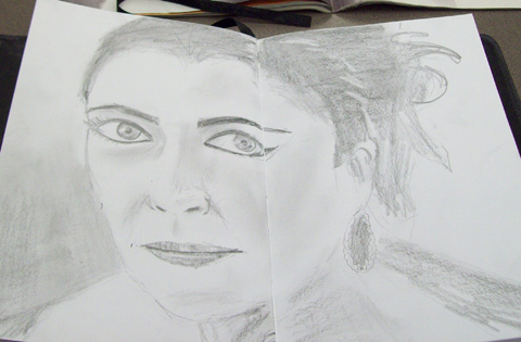
2595.My last diary girl came out pretty well. I wanted to push my envelope a little, and found a picture that really spoke to me.

In a Time magazine article from a couple weeks back about the passing of Elizabeth Taylor, there was this big beautiful face-shot that, despite being in black and white, captured her facial beauty very well I thought. The famous eyes, darkly outlined, kind of looked right into you. Also, the overall theme was rather simple and involved a monochrome palette, perfect for graphite, which, due to its eternal friendliness, has always been a co-favorite with pen and ink.

So, out came the diary, and this is the result:

Liz Taylor in a Diary

Here's a closeup of the drawing itself:

Liz Taylor in a Diary Closeup

So, I'll be honest about this one … I'm not 100% pleased with it. I didn't get the physical appearance as close as I'd hoped, and for some reason, at this resolution, it's plain to see why. The eyes are too big. The mouth is too narrow. The vertical proportions are off. I tried for Liz Taylor, but what I got more resembles a blend of Audrey Hepburn and Carrie Fisher … which are/were not unbeautious actresses, but when you're trying for Liz, a bit wide of the mark.

However! It would be a mistake to assume that because I didn't get exactly the result I wanted that I consider this a failure. I'm unstiffening my visual and drawing muscles after a too-long hiatus; I would have been overjoyed to hit the mark but that's not really a practical thing to want. Things rarely go that well when one is tentative. But I did use shading to indicate volumes; I did use tone, rather than line, to define objects, which is what happens in real life; I did, at least, get the damned woodless graphite sticks … the second greatest art supply after pen'n'ink … out and used them. And when you've been creatively disabled, as I have for a while, just the feel of these things getting used is redemption.

I have the basic muscles. They're still there! The thing is, to flex them. I'm going to try to draw a bunch of lovely women, and then after that whatever strikes my fancy, or maybe during, and keep putting them in my diary and putting it up here for all the world to see.

This is hard work. Creating art always is. But there's good hard work, and it doesn't scare me much anymore.