15 March 2009

How Do You Get A Rewrite For Street Blades?

1978.On a street-blade safari today, and I got some good ones, but none as interesting as the ones at NE 148th and SE Stark and SE 148th and NE Glisan.

Didn't I get that wrong just there? Yep. So did whoever put up the street blades.

Also, I've been remiss. In my excitement over the apparently-revised look of the standard Portland street blade, I've left out mentioning there's apparently an entire new look for the major intersections, as well. Let's look:


The difference is of a class. Instead of having one type size handle the directional and the specific and smaller one for the generic on the Street blade and one type size for all type on the Avenue blade, we have one size for the directional and generic and a larger one for the specific on all blades.

This has the distinctive characteristic, via the design concept of hierarchy, to make the specifics (the street/avenue names themselves) come up front and center. While the supporting information is now smaller, it's uniformly so, but not so very small; moreover, these signs are about 20 per cent larger than the old design, so everything is large.

Also, due to what has to be some error (or perhaps a rift in the fabric of space that happened that I missed), Northeast Glisan Street at the corner of Glendoveer Golf Course is crossed, improbably, by Southeast 148th Avenue.

Going down to 148th and Stark, in the shadow of the 7-Eleven store, we have the same anomaly:


Also:


Isn't that second one kind of artistic, what with the lining-up with the overhead wires 'n' stuff. And can you believe that iStockphoto turned me the hell down!?!?! Yes, seriously! It's unjust.

The mistake at the southwest corner of 148th and Stark was repeated over on the southeast corner as well. Just looking at the signs is kind of mind-bending.

Can the city sign shop get rewrite on this? Or, put another way ... can we fix this in "post"?

Technorati Tags: , , , ,

13 March 2009

Color In The News: Gamblin's Unique Torrit Gray

1978.When going over what I could find out about color today, I was pleasantly surprised that not only was color in the news, but that it was a well-regarded Oregon maker of world-famous oil paints that was making the news.

Gamblin Artists Colors, I've the impression, is a company in the tradition of the colormen of the 16th and 17th centuries–utterly committed to providing artists with the best-concoted oil paints. Oil paints in and of themselves are a fascinating medium, whether or not it's your medium of choice (what painting I do I do in watercolor), and are, as far as I am aware, a very simple thing; you mix powdered pigments (some of them quite nasty and made from heavy-metals) and linseed oil.

Gamblin brings their "A" game by committing utterly to not only quality but also by a committment to being kind to the environment–very wise considering the qualities of some of the pigments, and very appropriate, being an Oregon company. In their studio, an efficient filtration system removes any particulate matter using products from a company called Donaldson Torit. Throughout the manufacturing and sample process, doubtlessly samples and bits of paint are discarded. Add all this waste together, colorwise, and what do you get?

Gray. In the ideal paint world, when you mix a great many colors together, the colors do not necessarily sum up to black; what they do is neutralize each other (an ideal red mixed with an ideal violet, for instance, being complementary (note they are 180 degress away from each other on the color wheel) cancel each other out to the degree they are ideal, resulting in, not black but gray).


If you mix together all the paint-leavings from around the studio and the particulate strained out of the air in the Torit filters, the result is, apparently, a luminous, somewhat pearly gray, with a green note. John Foyston of The Big O tells the story:

Each February, cardboard drums of pigment powder trapped by the factory's Donaldson Torit air filter are added to an oil base and buckets of waste paint, then run through the roller mill that gives Gamblin paints their trademark silky texture. Torrit Grey (with an extra "r" to avoid any trademark infringement) is the result, and it's packed into date-coded 37-milliliter tubes marked "always complimentary, not for sale" and then given away -- 11,000 of them last year -- to artists, students and teachers starting every Earth Day.

Torrit Grey is always free and it's always gray, because that's what happens when you mix together pigments from the dozens of different paints that Gamblin makes and sells to artists around the world. But don't think that gray is a synonym for boring: Any artist worth her palette knife knows that gray is a many-splendored thing. Far from being simply black and white, gray has a range of hues and shades -- they are the mid-tones that make up much of our visual world.

So it should be available in your local gentlemany art supply emporium pretty soon now. Locally I trust Art Media and Utrecht for new art supplies. You will, likely, not find this at your local Michael's, but I might be wrong about that.

Something else that occurred to me was that the Gamblin company (and, by extension, Mr Gamblin himself) are very canny marketers. Each Torrit Gray tube is as individual as what sold that year, and each are valuable in and of itself as subtly distinctive and individual.

It's a quirkiness that lends itself to amazing self-expression. The Gamblin concern even runs a contest each year for the most creative work produced by an artist using Gamblin Torrit Gray, White, and Black oils. Using these three colors is a bit of a challenge, because instead of using color, which, even when inexpertly-mixed, can tell a very subjective story with relative ease, using just black, white, and gray means you work only with value–the relative whiteness or blackness of a thing. As it happens (and this I've found true when you reduce your canon or your working tools to minimum) limiting your range to simply values seems to infuse even more creativity, resulting in works that are even more moving and compelling than you'd think. Gamblin's current gallery of Torrit Gray competition works can be found here; if they change it, just go to the Gamblin page and look up Torrit Gray.

Gamblin has a reputation of care and committment I find admirable. Torrit Gray is a brilliant stroke of genius. If Robert Gamblin only did what he did for oil paints to watercolors, I just shudder to think what would result.

Visit the Gamblin company here.

View the Oregonian article here, complete with a nifty video about how they do it.

(illustrations were taken from the Gamblin site for purposes of illustration only. All copyrights and rights obtain to them)

Technorati Tags: , , , ,

A Sort Of Inscrutable Color/Mood Graph

1976.As part of my researches into the intersection of color and mood, I stumbled on this chart. Follow the below link to view it.

Color Mood Chart

It's a little inscrutable. It's not clear how one might use or or how the list below maps to the diagram up top, but it does suggest connections.

Moreover, I'm finding charts that seem to be in agreement. It's hard to say if it's a group-think thing, or perceptions reinforcing preconcieved notions. The trouble with such suggestve things is that we cross-associate a great deal of things in our heads, and no two people, no matter how similar in overall outlook they may be, are really wired exactly the same. The color blue may suggest the same overall thing to the notional you versus me, but it does not mean that while the notional you might find blue with experiential biases toward happy things, I might find it biased toward sad or indifferent or not as happy as you.

What verbiage! I just barely avoided not wading through it.

In this list, for example:

Blue represents peace, tranquility, calm, stability, harmony, unity, trust, truth, confidence, conservatism, security, cleanliness, order, loyalty, sky, water, cold, technology, and depression

From the color mood chart linked above, we have Blue meaning:
  • RELAXED
  • AT EASE
  • CALM
  • LOVABLE
There is some congruence.

I'm still trying to find any scientific color study (you know, like that one in The Andromeda Strain (the better one made in the 70s, not that recent abomination) that told the engineers what colors to paint the walls on the underground WildFire lab) and will report back soon on this. I'm sure it's just around the corner.

Technorati Tags: , , , ,

Color Wheels Through History

1977.Something I didn't know until recently was that the concept of the Color Wheel itself–the flash of genius that caused someone to realize that you could arrange the producible colors in a logical wheel that not only displayed the natural progression but also turned the idea of color combining into an accessable thinking thing–blazed in the mind of none other than Sir Isaac Newton.


Not to belabor the point overmuch, but this is your general basic additive RYB color wheel. It's more than a logical progression for colors but a guide on how to produce more. To cover the obvious just for the sake of completeness, you start with your primaries–Red, Yellow, and Blue. These are the primaries, the colors from which all others flow and which cannot be further reduced. Exactly halfway between these colors are Green (Yellow+Blue), Orange (Yellow+Red) and Violet (Red+Blue), made with ideal equal proportions of the ideal primaries. Rounding out (if you'll excuse) the primaries and the adjacent secondaries produce the tertiaries.

In practice, of course, there's no such thing as an ideal, perfect primary. every color you get from a tube, crayon, or pencil has a very subtle bias, which is an idea I've lived with for a while and will write on very shortly.

The reason I wrote all the obviousness above is because the idea of the color wheel is a natural poetry that appeals. It's such a simple thing and works so very brilliantly, it's the most simple and effective guide to how to get what you want out of what you got ... it's born in logic and then transcends logic.

And I can't believe how highfalutin' I've gotten all of a sudden over the simple color wheel but I do whenever I realize what a quantum leap it was. I'd like to have been in the lab when Newton hit upon this. Well, that and when he figured out how to make them cookies (mmm, Fig Newtons(™ probabaly))!).

The reason I visited the color wheel is that I wanted to look through history. Wikipedia, while not 100% trustworthy, seems to have good examples.

This, for one, is Newtons original color wheel, diagrammed, correlated with musical notes and astrological symbols for planets (see, I said it was all kind of subjective):


Note, interstingly, that Newton came up with only seven colors. The color wheel's evolved since it was devised. As a matter of fact, let me direct your attention to Boutet's wheels, which came in seven and twelve color flavors:


Ahh, cherubs and unnecessary illustration. This dates from the 18th C, 1708 to be exact, so this was probably sehr teuer, if you catch my German drift. Not too many could have afforded the book that contained it.

Speaking of the German, even the great Goethe got into the act:


This from his 1810 work, Theory of Colours.

This color circle, from a 1904 book, wouldn't look to out-of-place in an art manual in modern times:


It also ID's the colors by initialisms around the rim. Very useful.

Actuallly preparing a color wheel should be something I will do very soon now, since it's simply fun playing with paint, and something I will post here as soon as I can get it up.

There are a couple of other nifty wheel designs to be seen at the Wikipedia entry here.

Technorati Tags: , , , ,

12 March 2009

The Periodic Table Of Oregon, Version Beta 2

1975.Did a little clean up and correction. Added column titles because this is more strongly reminiscent of the column headings you'll find on real Periodic tables, and explains the column themes if they aren't so clear.


Enjoy, and view it bigly here.

Technorati Tags: , , ,

11 March 2009

The Periodic Table Of Oregon

1974.The previous periodic table inspired me to create one of my own.


Clicky here to embiggen. It's not finished – I want to create some column headings and add a bit more decoration, but there's the meat of it right there.

It's a big NW-Oregon centric, but that's where I roll. The Periodic Table is a handy framework, though, so I don't see why there can't be a Periodic Table of Eastern Oregon, etc ...

In the main part, the columns are themes which should be pretty obvious. The "Rare Earths" part, the separated part off below, I reserved for real Oregon characters from the good (Tom McCall) to the bad (Bhagwan Sri Rajeneesh) to the Ugly (Ma Anand Sheela), and creative types (authors and musicians, for example) The last four in the bottom row are just there because they needed to be, and there's no room for them anywhere else.

Technorati Tags: , , ,

The Periodic Table of Typography

1973.The Periodic Table of the Elements has always been a nifty framework to show off witty and wry humor and to combine any sort of element for illuminating display.

Here's type arranged by famililies and classes. It really is amazing how the format lent itself to this.


The number in in the upper corner is the ranking of the font based on a number of metrics. To read about that, go here (Awesomness courtesy of Behance). A link to an embiggened image can either be found at that posting or if you just want to cut to the chase, clicky here then.

(Combined h/t to Larry Fire and Alan Cordle, who both emailed me at about the same time here. A design consipracy! Nifty!)

Technorati Tags: , , ,

10 March 2009

Art Research: Redefining Our Past, One Formerly-Dorky Looking Person At A Time

1972.First, we find out that Martha "Mrs. Father Of Our Country" Washington was quite the rrowr-licious hottie:


Now, we find out that, due to a recently-discovered painting, Bill Shakespeare may well have looked a lot less dorky than we thought:


Kinda got some young Nic Cage working there, I'd say. What a pompadour, yes? Apparently our vision of Tha Bardd was based on an engraving that was based on a sketch, possibly of an Elizabethan bar napkin ... or something like that.

Time magazine has the whole bit.

Yeah, we kind of like art history.

Technorati Tags: , ,

09 March 2009

The New Portland Street Blades, Now at SE 101st And Division

1971.I have no rules of thumb as to city sign rollouts, but it seems to me that the first time is a test run, the second time would be a pilot project, but the third time would be a trend.

One this snowy(!!!) March Oregon morning, we go to SE 101st Avenue and Division Street, just down the street from the big "I" at Division and I-205:


This is in front of a Miller Paint store, of course. The store with the gray face was, up until recently, a Radio Shack. It's now Wall Street Pizza Co (they have some tasty pizza there too).

The numbered avenue:


And the named street (SE Division is, remember, the 25th street south of Burnside, therefore is the 2500 block of crossing streets):


One thing I find curious is that all three occurrences of the new blade design has been along SE Division Street. I've had my eyes peeled for more, but just those three, and just Division so far. The blades they replaced didn't seem overly worn – I can think of others that need it more, but that's me for you.

More as I find 'em.

Technorati Tags: , , , ,

08 March 2009

The Portland Police Mounted Unicorn Patrol, Then and Now

1970.Unicorns have been with us longer and in more remarkable ways that you might know. Our researches have uncovered this previously unreleased photo of one of the first Portland Police Bureau Mounted Unicorn Patrols ... ca, 1891:


And in modern times (ca. "now"):


Stranger and stranger, inDEED! Our guess is that the more world-weary unicorns (the ones that don't need to be tamed by a virgin) try out for the mounted patrol.

It's entirely possible that the old legends about the unicorn is a bit wrong, of course. You know, everyone has a PR flack these days ...

Technorati Tags: , , , , ,

Which Websites/Blogs Do I Hate The Most?

1969.The ones that have a music track ... that plays on loading, whether you're in the mood or not.

DSL is easier to get than ever, but music still consumes enough bandwidth that you're slowing the load, and on older computers, you'll notice.

Moreover, I know what I like to listen to when I'm websurfing ... I'm already listening to it (right now, I'm listening to Deutsche Welle via iTunes as part of my person German immersion program. It's amazing how much I understand ... but it call goes so fast). So, when I'm working on something and your horrid jangly geetar rawk crashes through it, it pisses me off.

Proud of your music? Great! We should all have something we should be passionate on. DONT PLAY IT AUTOMATICALLY ON LOADING OR I WILL HATE YOU. Give me a link if you want me to sample it, but don't get all hurt if I don't listen. I like what I like. It's not personal.

But if you load up and fling your music at me when I load your site and make me look all over the place for the mute button, I'll think twice about coming back to see you again.

Wow me with design. Don't puncture my eardrums with your music.

K, Thx.

Technorati Tags: , , ,

07 March 2009

Blippity-Fling-Flang Is The New Lorem Ipsum?

1968.Blippity-Fling-Flang is a webby-bloggy thing that takes any website and turns it in to funny gibberish. This text is taken from a local blog, and Flangitized:
Tonglewooble, Blong 7, 2009: I zowee boo binggobble

Dubbaizzle blo funk oodle bla duh boo wacko "zangity"
jangle nip boo Zingle Hizzle. Yada floo duh izzle boo nizzleding.
Dubbaizzle bla zang boo zong zip bam funk flop fling


So, what are you waiting for? Get Flangitizing!

Technorati Tags: , , ,

Visit Number 80,000

1967.This happened on the 6th, at 4:07pm:


Someone in Greater Montreal checking out a comment on some surveillance society art. Pretty nifty.

I keep telling you people, if I was famous there would be so many prizes given out. Now it's less than 20,000 until the big 100K, so there's still time.

Technorati Tags: , ,

Opening The Science Fiction Museum's Blog

1966.There can be a cool, world-class Science Fiction museum in Oregon.

Oregon has contributed towering talents to the genre: Ursula K. LeGuin, Robert Sheckley, Kate Wilhelm, Damon Knight ...

For a very long time now, a very good friend of mine named Ed who lives down in Salem has nurtured a dream. He has the most amazing collection of Science Fiction memorabilia you've ever seen. Collected over a lifetime of being an enthusiastic fan, he's assembled a collection that truly celebrates the future as seen through the past, or as we like to say, preserving yesterday's tomorrow.

Where I come in is I'm designing (or rethinking) the website. I'm starting out basic and bestowing a clean, organized appearance to it. From there, we want to take it up and out.

The website, http://www.sciencefictionmuseum.org, is in the process of being reborn. Not the entire website is redesigned ... yet, but I'm doing it on a page-by-page basis.

Don't let the newness of the site and the counts fool you. SFM has been developing for more than 10 years now. I may or may not amount to much, but I'm giving it the best push I can.

There is another site I'm shepherding, and its the blog I've opened for posting breaking information to the SFM website. It's http://thesciencefictionmuseum.blogspot.com, and an RSS feed from that is embedded in the SFM website, so we have an effective newswire going.

I really want to help Ed realize his dream. I'm giving what I can (yes, another pro bono job). But if you saw what I've seen, you'll realize it needs to be seen. If any reader of this here blog cares to visit, that'd be nifty. If you care to donate, because this is something really worth bringing to fruition, there's a donation link on the home page (which contains contact information for Ed if you'd like to send encouragement).

At the very least, if you think kindly of me, Ed, and this dream, at least help spread the word.

Ad astra per ardua, my peoples!

Technorati Tags: ,

06 March 2009

Color and Mood, Part 2: What Does Green Suggest On A Map?

1965.Clear your mind of as many preconceptions about color vs perception as you can, and look at this map for a few minutes (which I sourced from here)


Now that you've had a chance to look at it, What's the overwhelming sense that you get? If you sense colors as dquivalent ot temperatures, as I do, you feel attracted to the green areas because they speak of coolness, especially when contrasted against the buff and textured areas.

You'd be partially correct ... but not wholly so. Naturally, the areas nearer the water that are green tend to be the most temperate, but the area in the lower-left–California's Sacramento River Valley–can get scorching hot in the summer. And, while the area around the Columbia River curling east and north into the Washington interior is green, anyone who lives in the agricultural areas of northeastern Oregon and southeastern Washington will tell you that cool lushness is anything but the order of the day during much of the year. The choice of color does communicate a sense of sparseness in the hieights though, however, in the Snake River Basin, which is a buff-yellow near the river itself, the grasslands frequently go to green where there is much irrigation.

But such is the drawback of using color to indicate altitude. Note, this is not a criticism, just an observation. For as many trained in art know, colors have a subjective "warmness" and "coolness"; a red-violet is warm, a blue-green is cool.

This is actually quite an apt color scheme. I recall US maps from grade school, and if you went to school in the good ol' U.S. of A., you know what I mean; lowlands were colored green and gradated to a rather aggressive red the higher up you went. The highlands seemed veritable infernos!

The colors tell a story about the highlands that may be consistent but may not be true. Again, this is not the fault of the cartographer, and nobody's fault really–it's just the way we're all wired.

Since color suggests so very much subjectively, we need to use it with consideration and care in our logo, print, and web design.

Technorati Tags: , , ,

04 March 2009

A Closer Look At The Cupertino Street Blades

1964.We revisit the look of the street blades they grow in Cupertino, California, thanks to my Cupertino Bureau Chief Sharon, who sent a bigger picture (with my profious thanks):


We can see the font a bit better now. It looks very much like they're using the Souvenir font here, or something like it.

That's an important point. Type carries baggage with labels like "meaning", "mood", and "import". The usual faces we find on street blades, namely simple, clean sans-serifs, very business-like, devoid of sentimentality or cosyiness.

That's not a criticism, by the way, but a simple statement. There are situations where certain approaches are appropriate. Street blades with simple, clean, businesslike type are eminently appropriate design usages.

The type of the Cupertino signs, however, puts you in a different frame of mind. The type is serfed, artistic, soft. Just by mere comparison to the faces you usually find on a street blade, they evoke a sort of "country-club" feeling; sophisticated, quaint, poised, refined. They encourage the eye to linger a few moments longer. The type in and of itself is more interesting.

One can argue that a softer-type approach to labelling streets is called-for or not, but what can't be argued with is that looking at these street-blades, you feel as though you've driven into a more exclusive neighborhood, and as far as that goes, if that was the aim of the jurisdiction, it works and works very well.

There are absolute design concerns, certainly, and there are relative ones as well. The intersection of those two streets is where you'll find the most workable application for the context.

Technorati Tags: , , , , , ,

Color and Mood, Part 1: What Color Goes With What Mood?

1962.Color, to express an obvious point, is a subjective thing.

Our responses to color are conditioned by context, present mood, expectiations, and culture. What color connotes in one culture is different than what another says about it. For instance, in Western Culture, the color white can be thought to connote purity and "good" and might therefore induce a cheerful, sympathetic response in the viewer.

On the other hand, in Chinese culture, white is the color of death and funerals, and use of white as a design element will probably send the wrong message.

By way of anecdote, colors such as red and orange seem to sharpen the appetite. You find them used widely in steakhouses and Italian restaurants–it's not by accident, perhaps that the stereotypical checked tablecloth in Italian restaurants have a great deal of red on them.

A personal story might also illustrate. I adore pork chops, and some time ago, my wife cooked a singularly spectacular meal centered on chops. She loves to experiment, so she used some fruit juice to cook the chops in. The resulting color–a deep, rich, reddish-brown that diffused upward through the meat–rang so many appetite bells that I still remember the sensousness of eating this perfectly-otherwise-ordinary pork chop even today.

Color has power, and our reactions can be–well, colored–by the hues we use.

What colors are best for what uses? People like the good folk at Pantone have been researching this for years and can give you answers. With this post, I'm embarking on a personal research program in pursuit of updating a logo for a client (whose responsible in a large way for getting me back on my computing legs).

I don't know if that's what he meant to do, but it's a scary thing and an exciting thing. Color is ephemeral and subjective, and seems notoriously difficult to quantify. In the process, I'll be rooting out and finding every study I can. At the end, I don't think I'll have a definitive statement on color, but I expect I will have had a very wide adventure.

I'd like to call it a series of white papers, but that seems unfair somehow.

Technorati Tags: , ,

02 March 2009

Randy Leonard and The Black Unicorn

1961.Back in the early days of the Attorney General campaign, Randy Leonard introduced John Kroger to the peoples at a photo-op in downtown Portland (the following photo from here):


It was the beginning of a successful campaign to put the most dynamic AG we've seen for a great long time in office.

But did they know they had a visitor? After analyzing the photo, we found out:


Yes. It's the Black Unicorn.

Did his presence bless the campaign? Was the Black Unicorn simply looking on (as unicorns are wont to do, keeping their own counsel, as they do)? We find something oddly compelling about Randy, maybe he does, too.

One thing's for certain; we've been analyzing photos from the Macpherson campaign for a while now. Not one unicorn ever went anywhere near him.

And so that one goes.

Technorati Tags: , , , , , ,

The Perlis Of News Map Design: Double-Check That Graphic Scale

1960.Map design, of course, is one of the monkeys on my back, and my interest in urban growth caused me to stumble on a little gem.

Spokane, Washington, is on the verge of an historic annexation. Between it and a little suburban community about three or four miles west of the city limits–a place called Airway Heights–is an area called the West Plains. It's been served by Spokane city services for a while and encompasses Spokane International Airport; a small area on the east side of Airway Heights is attractive to that town because, due to urban growth, it represents an opportunity for an increase in the municipal tax base.

When I first heard about the possibility of annexation (strangely enough, on KPOJ) well, you know me, the first thing I tried to do was find a map of the area concerned. I'm incredibly addicted to seeing the footprint of a city's incorporated area.

None was forthcoming. Until I checked now: this map now adorns the article in the Spokesman-Review:


That does seem historically large, especially compared to the graphic scale on the right side of the map there.

But, hang on a moment ... that scale says 5 miles. The news story says that Airway Heights wanted to annex about 1/2 square mile of land, but on the graphic scale, that segment of Airway Heights measures more like 8 or 9 square miles. Moreover, the long runway at Spokane International is about 15 to 20 miles long. You could land the entire Shuttle fleet there and not have a collision!

Unless that little graphical scale should have said "1" where the "5" was. That's probably it ...

Actually, that's the only flaw this great little map has, which makes it so much more unfortunate that it's there. But you know how it is that, sometimes, you can be looking at everything and it all looks so right that you look right past the glaring error? I'm betting that's what happened here.

You can never have too many eyes looking at a thing, but stuff will happen.

Technorati Tags: , , , ,

27 February 2009

These Things Tend To Work Out, With The Right Spirit

1959.Just recieved a note from the Hall Of Records folks, and it was so excellent that I can't help but share it:
We're so sorry about the photo. Obviously our graphic designer didn't do due diligence on the image used. Lesson learned for next time. But thank you for being so cool about it.  You're right, we are small fish just starting out. In the essence of turning every negative into a positive, we'd love to buy you a beer and maybe even use you to do some graphic design for us some day.
I've always thought that where we can we must be excellent to each other.

May fortune smile on thier enterprise, and good instant karma all around. It sounds pretty cool.

And if you can, go to their party and have a beer and a slice for me, will you? I'll be drudging away somewhere dreary, but I'll feel a little better about things if you do this for me.

Technorati Tags: , , , , ,

26 February 2009

Hey! How'd My Photo Get On That Cool Poster!

1958.Check out this poster I found via Dave:


Now, look at the piccy I took back in March of '05:


I'm flattered, to say the least. I adore that type. The funky vibe is represented. I fully approve of the poster and my photo's use in it.

Just one thing, though. I check my sitemeter logs regularly; this must be one of the most hit parts of the blog, this picture. It's probably been round the world once or twice. One of the risks you take with putting your creative work on the web is that people tend to help themselves to it.

And I understand that. Hell, a couple of posties ago, I ripped off a photo from the PMerc. But it was satire, and they were credited.

But this photo is particularly dear to me. It was taken by me, foolishly, with my camera in one hand and the steering wheel of my '72 VW in the other, at speed, hurtling over the Marquam Bridge on cold spring morning after one of my evenings at work. I'm in love with my cityscape, and I'm in love with tthis photo of it.

So, if you want to use it, that's cool. But don't assume that I have put it in the public domain; I have not. Write me and ask. You might be surprised. I could very well just say yes, and if you're a little fish just starting out like the Hall Of Records is, the only price I might ask is that you credit me for it.

Thanks. And hey, since I'm too poor to go and work nights and weekends anyway, go on over to the Hall Of Records party for me. Have a brew and a slice in my name. I'll catch the spirit.

(Update: Checked the metadata for the photo. I actually took it in 2004 on Sept 16th, at about 11 AM.)

Technorati Tags: , , , , ,

Street Blade Gallery, Mardi Gras NOLA Streetlife Edition

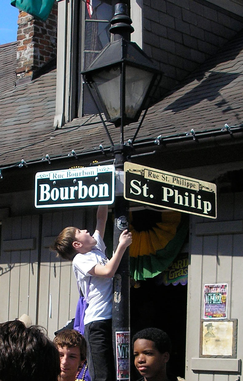
1957.For the newest addition to the Gallery, let's go down to the streets of the Vieux Carré, from which Portland's (and this blogger's) favorite formerly-of-NOLA-but-now-back-in-NOLA mystery writer, Kevin Allman, checks in with this lovely shot:


You really can't include a picture of a bona fide French Quarter street blade without including some of the street life around it. New Orleans has that charming reputation for a reason, yo.

Kevin tells me there are many variations of street blades in NOLA, an I'm presuming it's because the city has a singularly-colorful history. The one you're most likely and remember as tourist and as illustration are the blades in the French Quarter, I'd wager.

And, as information design, they aren't ideal-ideal. They don't have a directional; they don't say whether the way is a Street or an Avenue; they don't use FHWA-approved typeface one. But they work nonetheless and they please me mightily, visually. Why, for a person who's obsessed about a street blade that will help you navigate am I so down with this design?

It's an extension of the art and effective atmosphere and attitude that draw so many there for the annual celebration and contribute in a note-perfect way to the attitude of the area. The most charming part of the sign is the box in the upper center that contains the historic name of the street expressed in French.

A technical point worth noting is the bracketing used to mount the signs. Three rivets through attach the sign to  right-angled support which has an angle at the corner which is, itself attached to the post; this puts the blade up front-and-center as the star of the show (which is actually a very designerly thing to do) while leaving the blade unencumbered by hardware which requires gripping one side or the other of the sign itself. The design can come right up to the edge of the blade.

The whole street-scene picture provided me by Kevin is too cool not to share in toto, so get a good look at this:


You can't have a picture of New Orleans without some of its people really. Kevin really has an eye for the moment, does he not? The fellow in the hoodie up from, distracted by something; the punky girl with the pink wig, hot miniskirt and legs, and amazing boots on the left; the two youths just hangin' under the post, and the kid climbing up it for who-knows-what.

It's a warm photo. Invites you in.

Technorati Tags: , , , , , ,

25 February 2009

Unicorns In The City Council Chamber

1956.Portland being built over an ancient unicorn burial ground explains so very much, if you let silly things like logic go by the board.

For instance, over at PMerc, there's a photo of Councilor Fritz and Mayor Sam at the hearing for the increasingly-brobdingangian Columbia River Crossing thingy. View the article and the image here.


I found myself, though, in a Kolchak: The Night Stalker*/X-Files/Fringe** sort of way, wondering if there was a deeper story to the unsanity that has been Portland City Council of late. So, I nicked the photo from Blogtown and put it into Photoshop, applying the Unicorn Filter (of which I own the only one), found that there was indeed, something deeper to say about it:


What is the unicorn doing? Whispering some sage policy advice in Sam's ear? Protecting Amanda from a psychic barrage leading to cynicsm? Simply observing? We know not, and will never know, for unicorns keep their own council.

We could find a gentle virgin to tame the unicorn and perhaps find out, but, hey ... this is Portland, yes?

A note on the Photoshop Unicorn Filter: I've been allowed its use only if I keep the developers an absolute secret. I have further been told to say that if I tell you all who did it, the developers would kill themselves, which I 'splained to them was kind of backwards, but they said that's what they meant, and boarded the TriMet 33 so they could get out to Jim & Patty's coffee before it closed.

You don't argue with geniuses. You all know what I mean.

* The Darren McGavin version, not that lame-o Stuart Copeland version that deservedly died, screaming.
** Not the X-Files, no matter what anyone says.

Technorati Tags: , , , ,

The Street Blades They Grow In Cupertino

1955.Cupertino is a California city that needs little introduction to some who might be inclined to read a blog; it's part of the legendary technological heartland known "Silicon Valley"; it's a city of about 50,000 that covers about 10 square miles; and, according to my valued friend Sharon, who sent along the pics you're about to see, it is one of California's most expensive cities.

It also has given its name to the so-called "Cupertino effect", which is the vernacular name for what happens when a spellchecker suggests unappropriate subistituions for misspelt words or words you haven't put in its dictionary. I am indebted, for example, to people like Sharon for giving me her complete Cupertino in helping my build my Street Blade Gallery.

Anyway, here's the pic (by way of explanation, somewhat low-res):


The things I find interesting here is the obviously-non-FWHA font which, at low-res, it's hard to say exactly what it is, though something like Souvenir is hardly out of th question here. The sheer height of the placement is interesting: that would seem particularly driver-unfriendly. The staggering-apart of the street blades themselves is also interesting–of the photos I've so far seen, I'd not seen them spaced that far apart. The blue color is striking but a little dark for me somehow. I don't find that blue makes a very good background color, but that is certainly my opinion.

Thanks very much, Sharon, for sharing your photos with me and my street-blade-obsessed readers.

24 February 2009

Quick–Which One Of These Is An Actual Product?

1954.Go ahead ... tell me which one is the actual product you'll find in the freezer case:


Time's up!

Well, to be honest, it's probably not all that hard. The one on the left, of course, is the one I did.

It was a student project, done while still at PCC. I was always satisfied with it, and I always thought it shoulde that I had a decided handle on things like layout, hierarchy, type, and such. I think it hangs together rather magnificently.

The one on the right we consumed the contents out of very recently (we better have had, anyway, yes?). The designs, in my humble opinion, share very common elements–the way the type hierarchy encourages eyeflow towards the product, the way the product anchors the whole design at the bottom, the way both designs depend on blue and white to get the job done. and while my design doesn't include a shell full of cocktail sauce (which I'd of thought of something like that) the reddish-brown tone of the table surface does kind of the same job–completing the span of dark reddish color.

The point I'm making here isn't whether my design is better or worse, but I think it could creditably hold its own in the freezer case next to any other frozen product. It certainly looks like it belongs. and it must be pointed out, the thing where line becomes a wave and is followed across the product name ... I obviously came up with that one first!

Technorati Tags: , , , ,

Towards A More Postcard-Friendly Unicorn

1953.It has been pointed out to me that "UNICORNS BITCHEZ!!!111!!!" might not play so well amongst the more sophisticated amongst us (which I thought I wuz, but see how I am). So I've changed the type. Now available here for the asking, a more modest unicorn graphic with more warm and welcoming message:


Magical, yes?

I expect this to be up in the NYT within the week. It was meant to be.

Expect it in bus shelters soons after. If Travel Portland wants to use it, thaz' cool, just credit me.

NB: The Portland Photo is CC-SA-BY-2.5 licensed by Eric Baetscher. I got it from here. The unicorn graphic I scraped off my hard drive somewhere; if you recognize it, just shout out, and I'll credit.

Technorati Tags: , , , , ,

23 February 2009

Zines I've Seen

1952.Herewith, a few delights I've found along the way. Moar as I find 'em.

The Multomah County Library is an unexpected place to find zines, but find them you will. Check-outable too. They say that it's a very personal medium, and zines have been around long enough that the observation is a bit trite, but it's the truth. This first one is particularly personal, and one of the first I looked at since I decided to stop fearing the zine.

Some|body, by Amaris Summer Hayden, is as personal and witty as it is poignant. So far as I've been able to find, two issues have been published; Chapter 1, in July 2006, and Chapter 2, in May 2008. The covers, made to resemble medical file folders (right down to the colored first-three-letters-of-the-last-name labels on the tabs) are created from actual trimmed-down Pendaflex Esselte™ brand folders. The detailing on the cover, consisting of the clip-strip on the top and the big ol' paper clip on the side, were hand-done. A "Patient Information Sheet" is attached to the inside of each's cover It makes one pause after reading the story within, thinking that the person to whom all these events happened and, we estimate, are continuing to unfold.


Idiopathic Pulmonary Hypertension is a particularly dreadful disease. You may have heard of it when the "fen-phen" diet medicine controvery broke some years back, when it was called Primary Pulmonary Hypertension. In IPH, constriction of pulmonary arteries (typically with no known cause) cause oxygen-deficient blood to return to the heart from the lungs. This causes the heart to pump harder to compensate, causing enlargement of the right ventricle, overstressing and wearing out the heart at an astounding rate; average survival after diagnosis, via right heart failure, is a mere 2.8-10 years.

Add into this the fact that the author was a mere 27 when diagnosed, and had a 6 year old son when diagnosed, causes the reader to ask themselves questions which were theretofore somewhat corny, such as "what would I do if today were my last day?".


Hayden will live to see her son's 17th birthday, unless the dice roll against her before then, and the odds are not in her favor.

The author uses all variety of cut and paste, drawing styles contrasting detailed realism and childlike on the same page, in a very unafraid style. I suppose anything I say up past this point would be a bit maudlin and lachrymose, so I'd just suggest that anyone who wonders about life, mortality, and how short life can be (and how much observation you can pack into an abbreviated lifespan).

Her last contact address is Mszine@gmail.com.

The Superman Stories, by Mark Russel, is wry and deadpan. In the mode of ironically reinterpreting past icons in a modern light, he recreates Superman as a superhero who doesn't have an alter ego (who really believed that just a pair of glasses and a suit made Kal-El look like a normal newspaper reporter? And I suppose you were totally fooled by Sandra Bullock's 'regular' garb in Armed and Fablulous?) and is kind of a self-centered, tempremental, misogynist fellow–a real jerk at times.

Through a series of vignettes–fifteen "episodes" and a series of intersitials called "The Lois Lane Dialogues" which make you wonder why she puts up with the jerk–we learn much: why Lex Luthor hates him (turns out Superman's the reason he's bald); What Superman's "Indian" name is; that Superman is constanly pestered by leopards; what interruped Superman when he tried to bowl; why Superdog was a menace to the city's butcher shops (and how Superman dealt with it) and more. There's even a "Superman Warnings List" on the back, with such forearmings as:
  • 3: Superman does not eat food that has been prepared in a microwave oven. Hot-pockets, pizza rolls and Jolly time popcorn are all unknown to him.
  • 7: Superman's two favorite smells in the world are Bark-o-mulch and taco meat. Number three is Lois' hair.
  • 9: Superman doesn't enjoy shopping, except for grocery shopping. But he doesn't like to stick his hand too deeply into the fruit displays, for fear of being bitten by tarantulas. Whenever he mentiones this to Lois, she secretly laughs to herself.
The spare, icon-line graphic treatment of the cover is what drew me to it (especially the 1-2-3 illustrated sequence of Supe taking off which has nothing obvious to do with the text beside it). The dry humor kept me reading it.

Mark Russell is also known as a Portland-based writer and cartoonist who self-published The Penny Dreadful. He also has been published in McSweeney's, which means we admire and hate him, because we sent them a list once and it was rejected. It was brilliant.

Technorati Tags: , , , , , ,

20 February 2009

This Handy Chart Should Explain Everything:

1951.It's all so very clear to me now.


Clicky here to embiggen.

Technorati Tags: , , , , , ,

Kelly Groucutt, Electric Light Orchestra Bassist, Dies at 63

1950.Michael William Groucutt, known professionally as Kelly Groucutt, a member of the Electric Light Orchestra during their signature years, died of a heart attack yesterday in the UK. He was 63 years old.

Kelly joined the lineup, replacing original bassist Mike De Albuquerque, with the Face The Music album (1974) the album which gave us the early ELO hits "Evil Woman" and "Strange Magic". He remained, with his high-pitched backing vocals and intricate bass work helping to craft the classic ELO sound through 1983's Secret Message, though more than one source makes plain that he at most only performed four songs on it.

In 1983, Kelly split somewhat bitterly from the group, unhappy with royalty payments, a move which culminated in lawsuits against band managment and group leader, Jeff Lynne.

Post-ELO, he remained active in music, recording at least two solo albums and collecting a small core of devoted fans. In 1989, he joined former ELO bandmates Bev Bevan and Mik Kaminski with a few other players to form the ELO-revival group Electric Light Orchestra Part II. In 2000, ELO Part II became The OrKestra. He also had a small session band which did live gigs around the area he lived.

Kelly was my first favorite bassist, and he's one of the reasons I remain in love with the bass and consider it integral to any real rock band.

As old as some rock dinosaurs get these days, 63 years seems an extremely untimely death.

He will be missed by many.

Technorati Tags: , , , , , ,

18 February 2009

In Memory Of The Unicorns

1949.NB, 3-Mar,2009: A hearty "heigh-ho" to all of you who surfed on over from Blue Oregon. Nifty!

After the revelation today that Portland was built over the site of an ancient Unicorn burial ground, I couldn't let the magic of the day go by without honoring their gentle spirits.

If only they could be with us now.


Please excuse the crap*ss Photoshoppery, but I was so seized by the emotion of the moment, I had a hard time getting a grip.

I think that's about right, for the sentiment.

In addition, I propose a moment of silence, tomorrow, and 11:11 am.

No freaking reason, I just want everyone to pipe down then.


Technorati Tags: , , ,

Factish :Portland Is Built On An Ancient Unicorn Burial Ground

Can A Name Change Erase A Troubled History: The Question of "Xe"

1947.Blackwater USA.

Likely as not, you took one look at that pair of words and had an instant reaction.

And, no matter where you stand on the idea of the world's most famous private security firm, a truth is that coporations go through brand refreshes for a very specific reason; whatever the previous identity said about the company, the fit has become awkward or completely wrong.

Blackwater, of course, has gone through two such evolutions; from the orignial form "Blackwater USA" to the latter-day form "Blackwater Worldwide" and now, the new, tabula rasa-esque, very nearly devoid of any apparent meaning, short, sweet, and easy-to spell "Xe".

In updating the identity to Xe, the company has explained as its reason:

On February 13, 2009 the company announced that it will now operate under the name 'Xe' (pronounced 'zee'). In a memo sent to employees, President Gary Jackson wrote that the new name "reflects the change in company focus away from the business of providing private security." A spokesman for the company stated that it feels the Blackwater name is too closely associated with the company's work in Iraq. Spokeswoman Anne Tyrrell said there was no meaning in the new name, which the company spent over a year to arrive at in an internal search.

Shades of the word "Exxon" there.

At this time it might be a little instructive to go through the evolution of the Blackwater logo. The first and most famous version is this:


Blackwater (now Xe) is based in eastern North Carolina ... Dixie, the American South. Knowing this, several visual tropes leap immediately to mind. The name Blackwater itself ties it in geographically; the so-called "black water" rivers (slow-moving rivers whose waters are inky due to an abundance of tannin from decaying vegetation that is not quickly moved away) are very common in the US's rural south, as are black bears, which very well may have provided the inspiration for the spookily-unnaturally-symmetrical paw print. The oval-and-ticks arrangement communicate nothing so obviously as a guns's target reticle.

The over-arching type reminds this commenter strongly of the type design typically found on logos you'll see on NASCAR autos (we once watched every auto race we could find). Indeed, the logo itself would seem quite at home on a stock car.

It's a very locally-tuned design. But between there and the desination of Xe, Blackwater must have realized that thier design was a little too "good 'ol Southern boys". It needed to be more grown-up, more corporate. A remodel was ordered up, and this was the result:


And it it somethign of an improvement. Gone is the heavy overarching type which looks more like it belonged on a satin jacket than a corporate letterhead. The reticle is stil a reticle, but is a little more abstract. And the bear paw now looks like a real bear paw.

The graphic design has become more ecumenical, while obviously referring its roots.

The type design became much more corporate: obliqued and off to the side, with Blackwater in large type with the word Worldwide reduced and tucked below. It was also broken away from the logo, which frequently appeared without the type at all (as above).

With the advent of Xe, we notice some that the corporate identity, however it's been re-engineered, is still being held very close to the vest. Despite exhaustive searches via teh Google we've been unable to find out what the new graphic design is, or even if Xe has deigned to develop a new logo at all.

Meanwhile, the company's training facilities have taken on the much more generic name of U.S. Training Centers, retaining use of the updated Blackwater Worldwide logo.

Can a name erase a troubled history? After thinking a great deal about it, we really still don't know. It would be naïve indeed to say that Blackwater/Xe doesn't have simple hurdles to overcome to rehabilitate its pulblic image. Where you stand on this issue depends on where you sit.

But just like every organization that has a past it wants to separate itself from, Xe understands that they have to make a clean, effective break with it if they are to recast themselves in the image they now see themselves in. And that, in and of itself, is a canny branding move.

Technorati Tags: , , , , ,

13 February 2009

This Comment Made My Day, As It Should Have

1946.My Address Nerdery has garnered some really cool responses. Here's the latest and the neatest.

Referring to my definitive post on the 1928 address layout of Portland (and the Hibernia Map), today, I recieved the following comment, which was too good not to share. Credit one Valerie Jasperson for the following:
Well, not sure where any of us came from, actually, but I got to your wonderful mapnerd blog after a long search for early Portland addresses. I just finished reading "On the Trail of the Lonesome Pine", and my 101 year old book has a name written in the front with the address "684 E. 11 North, Tr 0090 Portland, Oregon." Your site did it for me! Not only am I gratified to understand the address, your blog is a great read. Rarely do I get to see the word "embiggened" in print. Love it. Also love maps. My Dad was a surveyor and later draughtsman for PGE in the 50's, and he used to bring home waste blueprints and I'd color in the lots and make mazes of them. I hated the way the paper made your hands feel dry and the ink smelled so sharp and dull at the same time, but I was captivated by the map bug, just the same. Thank you for the great old PDX info,SJK. May you always fold it right on the first try!
Publicly, you're welcome, Valerie. As I said in the response to this, one of the most thrilling things is when my obsession answers a question that someone else didn't even know they had until they found me.

The only part that mystifies me is the "Tr 0090" part. Looks like a postal code somehow, Hey! Another investigation!

Anyway, is this not cool? I can attest to the smell and feel of those prints–I have some experience making diazo prints, and actually grew to like the ammonia smell that you got assaulted with when making one, but they are hard on the fingers.

Also, On The Trail of The Lonesome Pine is a book so old not even Amazon knows about it. Must be some book!

One of the best things in a life where you are but really a cypher moving amongst a throng of cyphers is when someone else reaches out and says "thanks" for something like this. So I may be making a party out of a comment ...

... but why not?

Thanks again, Valerie.

Technorati Tags: , , ,

Cleaning Out A Corner: Before and After

1945.Before ... Something had to go. This corkboard is kind of representative of the doldrums I've been in lately and am still struggling to emerge from:


A lot of that stuff was fun ... the big cow from Aquent, who for some reason thinks I'm an employer looking for staff (rather than the other way round) was a favorite at one time. But sometimes, everything (or almost everything) must go.

After.


That actually makes me feel better. The things I'm keeping up are (upper left) the sticker I got from Weiden and Kennedy after not making the cut in the "Seeking" campaign (I had such high hopes and really tried to pull that one out, but thought that the haiku was a little mocking. I don't think so much now), which remains as a spur; the lower right, a favorite image, the promo image from that amazingly singular movie The Quiet Earth; lower left, a packet of 8 "So Big" Crayola crayons (because, in this world, sometimes you just have to get out what I like to call the big crayon for people).

In the center is a note card designed to be sent, with a single phrase on it. It's inspiration. It contains a quote from the great George Sand, and it goes like this:

It is never too late to be what you might have been

Can't give up, no.

Public PS to Kris @ Rorohiko: I am still working on your project. It is pressing my boundaries more than expected yes. Thank you for believing in me.

Technorati Tags:

12 February 2009

Pepsi: The Powell Street Station Domination

1944.The lampoon by Lawrence Yang referring to the Pepsi posters in BART's Powell Street Station set me to looking for images of the posters. Since it had designers and digerati talking about it there ought to be some documentation, Right.

Right. Here it is, courtesty of Nancy Friedman's Fritinancy. My favorite (nicked impolitely from her blog–but she took the piccy, not me!) is this one:


Yup. Sody Pop.

Such is the aim of this campaign that they apparently actually call it station domination. Be afraid, I say, be very afraid.

Such is also the sway that the mere image and thought of Pepsi has over people that the properly executed sways hearts and minds in ... unpredictable ways.

A FreeRepublic message thread I accidentally (trust me ... the existence of FreeRepublic strongly suggests that hell is full and the dead walk the earth) hit on my travels to find the above was apparently written by someone who didn't get the memo that the development of the new-look Pepsi logo had nothing to do with the devlopment of the Obama logo.

I mean, they're both in circles, right? What are the odds?

If you want to peer into the abyss, go here. You have been warned.

Technorati Tags: , , ,