Showing posts with label Portland Geography. Show all posts

08 February 2018

Harvey Milk Comes To Portland

3520A.
This rather snuck up on me and took me by surprise, I'm abashed to say, but a rather historically-named street in downtown Portland is about to change its colors, rainbow-ward.

As reported by KPTV and other news outlets, on Wednesday, the Portland City Council voted unanimously to support the renaming of the 13 blocks of SW Stark Street, from Naito Parkway to where it merges into West Burnside at SW 13th Avenue, to "SW Harvey Milk St".

It's a change that's appropriately placed. For a very long time, the three-sided area bounded by SW 11th, SW Stark, and West Burnside was the hub of Portland's gay culture with popular nightspots like the Fish Grotto, the Red Cap Garage, Boxxes, and the Club Portland. Back in the day, some of those I knew called it the Pink Triangle, and it was gritty old-Portland. Today, it's the West End, the Fish Grotto's gone, the Club Portland has been McMenamized, and the old Ben Stark hotel is the modern-friendly boutique Ace Hotel. But the one axis all these had in common was SW Stark Street.

The change isn't yet quite in the bag, but it's very likely to happen. It has the support of the full City Council, as well as endorsement by more than 75 per cent of the businesses along the street. The rest, apparently, is all process.

My feelings are mixed about this, of course. The words I heard used on the radio and in the news defined Portland for me long before I lived here; geographically, the phrase "Southwest Stark Street" has a resonance that means purest Portland to me. But I'm not afraid of the name change, and expect to welcome it; and, as I said before, there's no place in Portland more apt for such a memorial.

Best of all, for those who would that a pillar of early Portland not be forgotten, this change applies only to Southwest Stark Street. There will still be more than fifteen miles of Southeast Stark Street, and the bits of West Stark that extend out into Washington County.

The Harvey Milk Street Project has a web page here (https://harveymilkpdx.org/), which may be read.


15 December 2017

Men At Work: Portland Edition

3542.
Yesterday morning I went down to the OSU Food Innovation Center to do a taste test. It was burger patties. Rated two samples, each about a quarter of a small patty, and since my taste buds had been sharpened by coming directly off work and not having anything since The Wife™'s lovingly-calibrated snack she sent me off to work with, it was like this tiny feast.

They were both superb. One a little more superb than the other, but it's hard to put me off when it comes to hamburgers.

The OSU FIC is on NW Naito Parkway (or "Front Avenue", if you have the memory) just north of the Broadway Bridge, just south of the NW 9th Avenue signal, wedged between the street and the rail tracks going northward out of town toward Seattle. Immediately across the tracks from us, there's yet another building of some sort going up (don't ask me, I can't keep up anymore), and there were workers on it, and beyond that, a 15-story condo silo called The Pinnacle (presumably to differentiate it from other pinnacles in the area, and my, haven't a lot of them sprung up in that area in the last decade?). And, after I got my bits'o'burger and collected my $30, I went out to the lobby and my love was chatting with another woman who was there, and then she pointed out the window and had me look at the men at work there.

I pointed and shot. Cameras are like the best thing ever any more. At least we have that workin' for us. Which is nice.


The building in the foreground (don't ask me, I only live here) has four men on those pillars: the two on the left have orange shirts, the two on the right, yellow shirts.

The building beyond, The Pinnacle, has four guys cleaning the windows (truth be told, one or more may be women. I had no chance to go up and ask). One of the window washers is on the balcony between the two glass faces. Here's a closer look at them:


What I wasn't able to capture at the moment was the farthestmost-right one, he was having himself (or herself) an enjoyable time swinging back and forth.

Well, that's just the sort of thing someone enjoying that sort of thing would enjoy, I guess. They go up there so you don't have to.

21 July 2009

[pdx] Views Of The West End

2161.SW 13th Avenue, Stark Street, and West Burnside come together at this big plenum which used to anchor the west end of the gay club district. With PDXEagle up on N Lombard now, Club Portland gone, and the Pink Triangle becoming more metrosexual by the day, it's comforting to know that, for now anyway, the district still looks like a slice of old downtown Portland, the downtown Portland that I fell in sloppy love with when I first visited as a teenager out of Salem:


View it embiggened at Posterous here.

Another view I particularly enjoy is looking down West Burnside. Now, my camera does a pretty fine job, my Plastic Fantastic, the ViviCam 3705, but it's views like this that make me wish I could afford a nifty camera with telephoto, because street views like this are so much fun to play with:


View this one embiggened at Posterous.

It's just quintessentially downtown Portland. And I've always loved downtown Portland.

Technorati Tags: , , , , , ,

15 July 2009

The Horizon and The City: "Bluffing" Portland

2152.Another thing we did on a day simply pointing the car in whatever direction and taking whatever picture we felt was there are, as everyone knows, great places to get long-view skyline photos of Portland.

Visual Portland is a treat. If you could eat the view, it would taste like your favorite food and would never get you fat and never give you heart disease. And we have great viewpoints that we can take our leisure at. Here's a few we found, and if you want to view them embiggened, then click on the words "Posterous Link" that should appear beneath each photo. If you want to see my whole Posterous stream, it's at http://zehnkatzen.posterous.com.

One great place is the University of Portland. The very cheerful campus, located in north Portland, is located at the lip of a cliff called Waud's Bluff. It affords a commanding view of the working harbor of Portland, Swan Island, and the Swan Island lagoon:


If you move just a schoshe to the west, you have a handy-dandy, neato-mosquito ready-made visual frame made out of foliage:


In the first, you get a great view of the harbor and Swan Island. In the second, you get a layered effect; nature, Island, and bustling city in the distance.

I've got to say also at this point that the UP is a very welcoming host. Me and The Wife™ wandered onto campus with a camera and just started pointing and shooting, and as soon as Campus Security realized we were just takin' landscape snaps, they let us be. Thank you, UP security. You rock.

At the other end of town there's a bluff which I don't know the name of, which overlooks two very special Portland places. One is the wetland known as Oaks Bottom, which is an urban wildlife paradise, and the other is the Oaks Amusement Park, one of the last of that old-fashioned breed, 104 years old and just as popular as ever, with a legendary roller rink.

At the lip of the bluff overlooking the bottom, there's a shortish street called SE Sellwood Blvd. Narrow, pleasant, and lined with homes that are so very modest and charming you just know they cost more than $500,000 each, even in this economy.

Well, you do get quite a view for your coin, especially at sunset:


If you let the land dominate, rather than the sky, you get this view:


These two shots demonstrate a certain thing that I always had a feel about but didn't really realize solidly until I saw it. It's true in the University of Portland shots but it really jumps out to you in the Oak Bottom pair. The upper shot, containing just the sky and the skyline, is very warm, very dreamy – almost ephemeral. The new buildings in the Portland skyline almost make it a truly-futuristic thing. But when I let the land dominate, it changed the color balance entirely, making it very cool and less Brigadoon like.

On the UP photos, including the nature in the foreground softened up and gave the view a boundary. But with the Sellwood/Oaks Bottom photos, it goes between dream and reality.

Such is the magic of composition. No matter what camera you got, you can choose for effect.

And Portland makes a very cool model. I frigg'n love my hometown.

Technorati Tags: , , , ,

Another New Street Blade – On E Burnside

2148.One of the street blades we were out to get yesterday I missed putting in the big post a couple back, but there's also a new one on E Burnside.


This is East Burnside Street in the 9100 block, looking east. The car in the distance is just crossing the I-205 overpass.

Standing on the north side of the street at this point you are at the physical corner of East Burnside and NE 91st Place. Looking across the street, you can see this:


Atop that post, just visible in the foliage, is the street blade, mounted so as to identify the cross street to someone leaving NE 91st Place … though with all that foliate, we aren't quite saying "mission accomplished" here. However, it makes a first-class background for a close up picture:


The new sign, like the others we've been increasingly finding, is in the Clearview font.

The block index ought to be zero, and should read "00" in the upper right hand corner (which you'd read "zero-hundred" maybe). Although it is possible that it was deemed unnecessary to include a block number because it is the baseline and this is a well-known thing. Still, as a format-completist, I'd like to see the double-aught there.


Sign Safari: New Blades on outer Tibbetts and Taggart, And A Couple of Oddities

2145.We went on sign safari again today, and came up with some goodies, from one end of the east side to the other. New Street blades, with the new Clearview font, show how the new Portland street blade look is shaping up. We have a couple of oddities as well, one which proves an assumption we made earlier.

Not long ago, I don't remember why, I had an occasion to be along SE 162nd between Division and Powell, and caught a glimpse of the new blades in passing. Went back today, and here's what we got:


Zooming in for a nice, close look, we find that while the numbered avenue still seems to use the old-style glyphs:


… the named blade uses the new Clearview type (this is also kind of evident in the photo above):


The tracking amongst all the letters is rather appropriate, and nothing in the positioning of the glyps looks forced or awkward at all.

The ironic thing about this was, I had forgotten the name of the street, confusing it with another T-named street nearby – Tibbetts. I told The Wife™ we were going out to 162nd and Tibbetts to see the new blades. She wanted to do a little neighborhood cruising and we found our way to Tibbetts. What should we find at SE 167th Avenue and Tibbetts Street, of all things, but this:


Another catch! In constrast to the last blade set, whereas the blade for SE Tibbetts Street is in Clearview:


So, also is the numbered avenue blade:


The downstroke to the 7 is the dead giveaway where, but the subtle curves and tapers on all the glyphs should be obvious to students of the form.

This is additionally notable because it's the first one which is solidly away from any main thoroughfare. SE 167th and Tibbetts is in a sleepy corner of a remote SE neighborhood, which is still very charming, with mid 20th Century ranch-style houses and gently curving streets. Very pleasant area overall.

In the area, we also found an oddity. Street blades have been appearing on very narrow streets serving infill housing on greatly subdivided lots; these seem to typically be green glyphs on a white background, opposite the Portland standard. Given the look of the property this following street stub serves, we're pretty sure that these signs denote privately-maintained streets whose developers arranged to be integrated into the address grid for purposes of ease of location. This sign was seen along SE 162nd Avenue, between (as you might expect) Division and Stark Streets:


At least two notable differences are immediately apparent here. First of all, unlike any other sign of this type, the specific (HAWTHORNE) is larger than both the directional (SE) as well as the generic (CT). Situate as it is, we can safely assume that it was named as an extension to SE Hawthorne Blvd (it's the county standard to do things this way). Secondly, the post on which the single blade is mounted is not the round metal pipe, but rather more of a fence-post which is square in cross-section. Also, as you can tell by this photo:


It's built rather lowe to the ground. The city doesn't seem to mount blades this low without some sort of reason, which is usually apparent from the surroundings. There's no real reason to put the sign down this low – as a matter of fact, a taller pole would actually make it more visible. Also, something about the location of that sign within a private front-yard fence line strongly suggests that this is a private installation.

To close out this safari, how about something you may not have known: you're aware that any numbered street (except in Linnton) is an Avenue. How about one that's a Boulevard? For a while now, the section of NE 122nd Avenue north of Sandy, through Airport Way to Marine Drive, has been designated as such:


This blade is at the corner of NE 122nd and Marine Drive, but has been marked "NE 122nd Blvd". No apparent reason for this except, we guess, that 122nd north of Sandy very wide, high-capacity road serving the industrial flatland. However, though the signs along most of this stretch have it as Blvd, new signs going in at 122nd and Airport Way now denote 122nd Avenue, so maybe that designation is reverting.

Technorati Tags: , , , , , ,

10 July 2009

Portland Street Mnemonics Make The New York Times

2140.Okay, well, the comments of a regular feature anyway.

One of the residents of the sidebar is a couple of Portland street name mnemonics. It'd be fantastic if I could take the credit for them, but while I, amazingly enough, inspired them, they aren't my composition. But they are nifty. Today, via the miracle of Google alerts, I saw that this humble place of woolgathering was namechecked by a commenter to the "Schott's Vocab" column, identifying himself as one Matthew G. Miller:

And Samuel John Klein has posted three more–covering more streets and helping us remember the order of which M and which C streets come first–on his blog The ZehnKatzen Times in a posting January 14, 2009:

The colon there at the end was as in the original; presumably the commenter ran out of room. The 14 Jan 09 post which mentions this is at the end of this rabbit hole, but if you don't feel like clicking yet another link that has a target="_blank" attribute, I'll save you a step.

The streets, in order from north to south starting from SW Ankeny Street (1 short block south of West Burnside, which should need no introduction) and continuing through the PSU district, run as follows:

Ankeny, Ash, Pine, Oak, Stark, Washington, Alder, Morrison, Yamhill, Taylor, Salmon, Main, Madison, Jefferson, Columbia, Clay, Market, Mill, Montgomery, Harrison, Hall, College, Jackson.

The first submitted one, from a commenter identifying himself as JD, went as such:
All Across Portland Our Streets Wind Around Mossy Yards. Traffic Snarls May Mean Jammed Cars, Cranky Motorists Making Minimal Headway. Harried Commuters Just Love Going Slow.
Nice, simple, sweet, poetic, and topical. Mnemonic WIN. But another commenter, Dave DiNucci, pointed out that since some initials duplicate (Main-Madison, Market-Mill-Montgomery, Harrison-Hall), and gave us two alternatives that included more letters. The first one plays off the tendency of names in the Alphabet District to be named for historic Portland figures and alludes to the curious geography of the south end of the grid, where all lines pivot, and offers a sort of gently gibing editorial commentary of the fairly fashion-oriented names of the streets:

ANcestors ASsociated Portland Oregon STreets With ALphabetic MORtals, Yet Toward SAlem, MAInly MADe JEjune, COLUmnar, CLiche MARked MIxtures. MONotones HARmonize HALfway, COLLiding JAuntily.  Lines Gently SHim.

Another mnemonic WIN. But Dave wasn't finished. Knowing that Portland has its share of left-brain/right-brain thinkers, he offered another, more lyrical version which goes so far as including the whole of the name Columbia:
AN AScending Path Of STone
Wends ALong MORning Yellow Trilliums.
SAnity MAIntenance.
MADe JEalous,
COLUmbia CLeaves MARvelous MIsty MONuments,
HARsh HALcyon COLLages.
JAcob's Ladders Gorge-ously SHine.
Note also that Dave's mnemonics include streets athward the I-405/South Portland interface, which is even more nifty.

From the comment at the NYT's column comes the phrase that started it all with me. The original questor of a memorable PDX downtown mnemonic was none other than The Oregonian's quondam quotidian quipster, Jonathan Nicholas (who was in his time sort of PDX's version of Herb Caen) who, after an appeal in his column sometime back in the 80s, eventually produced a little gem of his own:

Any Portland, Oregon Sunny Weather Always Makes You Think Some More Magic Just Came Calling.

Which at least gets you through to Columbia and Clay.

We have an embarrassment of riches, each suited to a particular way of thinking, each equally memorable, so that you may never be lost amongst Portland's downtown street again. I wish I could have said that I came up with them, but I am honored to have been thought highly enough by some that they'd share them with you all here.

And thanks to Matthew G. Miller who though enough of my blog to have made a mention of it in the New York Times.

Technorati Tags: , , , ,

01 May 2009

The Evolution Of The TriMet MAX Map 4: Say Hi To Yellow

2050.Now we move up to 2004 in our series about the MAX Map, because between 2000 and 2004 several changes obtained, culminating in the quantum leap of the debut of a new branch to the network – The MAX Yellow line, for the Interstate Avenue corridor, nicknamed "IMAX" by some wags during construction.

The MAX System now has two dendritic branches rather than just one, and the design could have kept the old theme, but my guess is someone along the line found it too sprawling and probably was a stone pain to do layout around. So, treating the original Blue line as the system backbone (as indeed it seems) and the newer lines as subordinate branches:


You can clicky the map above to embiggen, or go here (while TriMet still supports it) to see the map even better and get a PDF copy.

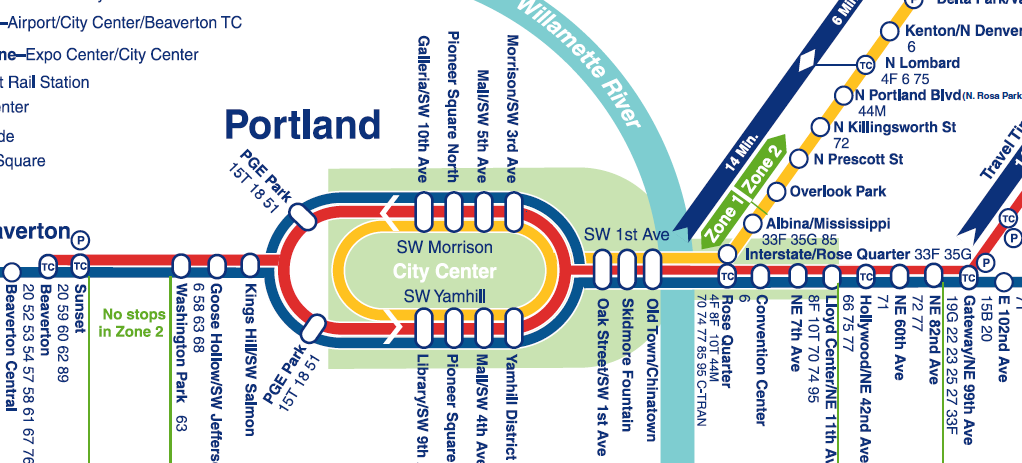
This is the acme, so far, of geographical simplification and abstraction. The Yamhill-Morrison downtown axis has become the center of the system, remarkably so, and the system has been laid out along a single backbone line, even to the extent of mapping the SW 1st Avenue and Steel Bridge sections completely out-of-line with reality.

But the genius of this style of mapping is that it works, and works well. Think again about the London Underground map and consider. If you get on the MAX, according to the diagram, at Yamhill District, and go three stops, you're at the Rose Quarter TC. It matters not at all that after the Yamhill District station the system hangs a ninety-degree left onto SW 1st or that it makes a somehwat-complicated dogleg over the Steel Bridge and into the Rose Quarter. The map and diagram works and delivers you exactly where you think you should go.

The time stripes along the line give you good information as to how long you expect to be on the train. And your eyes will provide you with the rest of the information (I've lived in Portland for most of my life but I can't stop looking at my town. If the mere sight of Portland doesn't nourish you I say its time for your to find another town, to be blunt).

The following image zooms in to the vital enter, and shows the maturing of several cosmopolitan design elements:


Clicky on the image above to embiggen. The big point, and my hobbyhorse thus far, is the use of the cartouche-like ovals for stations that serve more than one line. If you look at the Rose Quarter stop, you can see why this works. The Yellow Line stop is a circle which is physically adjacent to the Red and Blue Line oval. This indicates while they are physically close, you have to be at one or the other to get a certain line. That's a big story told very effectively by only two well-chosen and placed symbols.

Amongst the other changes reflected in the map is the extension of the Fareless Square area by a "panhandle" encompassing the Lloyd district (hard to see in this map because the Red/Blue/Yellow lines in that area are so typographically busy, but I don't see how the designer had any choice there really – sometimes the best graphic solution isn't exactly ideal) and the extension of the Red Line, for Airport service, to the Beaverton Transit Center.

One other interesting point is the PGE Park station. In this (and the map before), the station serving "The Piggy" has been diagrammed as two stations. And, while the station itself can be thought of as a single system access point, in reality, the eastbound and westbound boarding platforms are separated by about half a block, making them physically separate, and though they are very close physically, they couldn't be more separated by intent, so the wide separation of east and west bound PGE stations are quite appropriate.

The next evolutions, by the present day (2009) saw the addition of not one but two lines: The Green Line (serving a new route up and down The Portland Mall, Gateway, and the I-205 corridor to Clackamas) and WES-which turns TriMet's rail approach into multi-modal thing, and creates a truly exciting approach (well, I sure as hell like it!).

About more which presently.

Technorati Tags: , , , , , ,

TriMet Map Cover Designs: 1997, 1998, 1999

2049.Picking up a series I've dropped for a few entries, here's the continuation of the TriMet covers series. This time, we look at 1997, 1998, and 1999.


The design sense is starting to be very dialled back now. The 1997 cover seems inspired by the 1996 cover, it uses the same type and has the same color-block-and-dotted-line theme. The photo of MAX at the Civic Stadium (I don't think it was "The Piggy" quite yet) is similarly monchromatic and screened back just a little.

The 1997 Book, which I don't have to hand right now, was a different animal altogether. The format of the TriMet Schedule books have tended to resemble a paperback novel, about the same size, with newsprint pages and a cardstock cover. For this year, it was a newsprint pamphlet, about the size of a small magazine.

Being entirely newsprint and larger, it was simpler to get more than one schedule grid on a page, meaning instead of Weekday/Saturday/Sun-Holiday sections, each route had all three schedules (as appropriate) grouped under route number.

It sounds as though it was a great idea, and on paper it looks good, but in practice is was not a success. The biggest problem was durability. If you bought a Transportation Guide and Map it was something that was liable to go many places (if you were a heavy transit user) and could be stuffed in a backpack, and back pocket, a purse, or what-have-you. The smaller format also held up very well under the uses it would have gotten (I knew someone who drilled a hole through one corner and hung it up by a string by the phone, like a small-town phone book). A Guide that was wholly newsprint just didn't stand up, and the larger format was awkward, to say the least.

The preceding was my assumption, but I must be getting some of it right ... the old Guide format returned the very next year, 1998.

As far as 1998 and 1999, the design ideas, which went from restrained to raucous, went straight to restraint and stayed there. "Slice-of-transit-life" photos, friendly and quaint, formed the centerpiece of the design, and minimal type and graphic adventurism. The trend toward a new typeface is also confirmed, as the same type had graced the design since approximately 1996.

Technorati Tags: , , , , ,

22 April 2009

TriMet Map Cover Designs: 1995, 1996

2041.Now we move up to the years '95 and '96. Here they are:


The designs from these years are very different in style and mood.

The 1995 map is very businesslike and celebrates the most charming feature of the TriMet graphic oeurve from prior to 2001; the TriMet Sector Symbols. I'm saving the meat of that idea for another article, but the idea is that, like a pie, the landscape was divided into seven radial segments, all pointing toward The Portland Mall, going, from the north clockwise: Purple Raindrops, Blue Snowflake, Brown Beaver, Green Leaf, Yellow Rose, Orange Deer, Red Fish. The sector lines were grouped into their respective shelters along Fifth And Sixth Avenues on the transit mall, and the lines serving each shelter along with the sector symbol could be clearly seen on illuminated signage that was visible from at least a half block away.

The genius of this system can hardly be overstated. If you're unfamiliar with the system, all you need remember is the color and symbol of the route that brought you in, look for the sign, and you're halfway there. If you do know the system and you just want to be "in the moment", just look for the sign. The simple shapes were charming and the colors were interesting.

The 1996 design doesn't invite too much commentary, and that's a statement on the strength and appropriateness of its look. There is no overestimating what appropriately-chosen type, a screened-back monochrome approach, and simple graphic elements can do. This design is niether too much nor too little, but it's just right.

Technorati Tags: , , , ,

SE 82nd And Washington, Tuesday, 8 PM

2040.The sign of the Chinese Village restaurant, SE 82nd and Washington, doesn't get any respect in any classic neon inventories of the Portland area. But that doesn't mean it's just as charming:


If you'll remember the timeless quality of that sunset on Tuesday evening, I'm sure you'lll agree. It seemed to go on forever. If you don't agree with me ... well, why you got to be so mean?

The sign top along 82nd by many of the signs reads 82nd Avenue of Roses:


It's a bid to raise the profile of 82nd Avenue which, by many accounts, might pass as distressed. It doesn't bother me much. You see a different level of life on 82nd Avenue and it looks a little threadbare in places, but, judging by the ruin latterly practiced in Portland under the rubric of "urban renewal", maybe it's better off the way it is.

There are lovely places alone 82nd; there are shabby places along 82nd. Sure it would be nice ever everything were lovely and dear and pleasing, but life isn't that way: there are sweet spots and ugly spots. Why are we afraid that the world around us reflect the life that we live?

Sure there are things about 82nd Avenue that need attention; the prostitution traffic along that arterial comes to mind. But for every shabby car lot there's a rehabilitated restaurant; for every tired-looking Safeway store there's a pleasant view of Mount Tabor.

But then, I've always looked up at life from lower levels. Maybe that's why it does't faze me too much.

Technorati Tags: , , , , , ,

Mount Hood: Monday Night, Tuesday Afternoon

2039.Two Views.

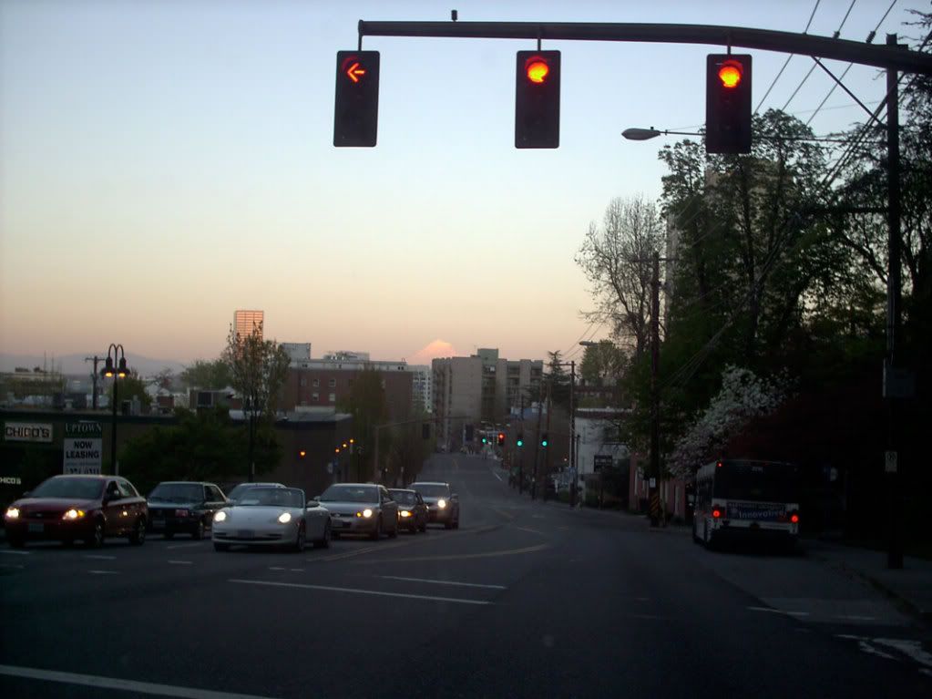
1. Monday evening about 7:30 PM, looking east at the sunset from the light at West Burnside and Northwest 24th Place:


Click image to view bigly. The white pointy cloud over the buildings in the distance is the mountain, of course. A better view was to be had about 1/2 block up the hill, but we were due somewhere, and couldn't backtrack. Some other time, it is to be hoped.

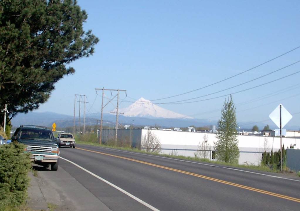
2. Tuesday afternoon, 4:30 PM approximately, from the 13800 block of NE Marine Drive:


Again click image to view bigly. Some of the best sightlines are available along Marine Drive along the mighty Columbia. Sadly, the view is befouled by industrial development. Or, if you prefer, happily, there is industrial development, contrasting the patient force of nature with the insistent one of man's development.

Choose as you'd like.

Technorati Tags: , , , ,

21 April 2009

Blade Rewrite Achieved: SE 148th and Stark

2038.It may be remembered that, back here a bit, I scouted a rogue NE avenue blade that had somehow wandered into the SE:


While we were on blade patrol today we went by that corner and found out that the rewrite that we had called for had occurred. The blade now reads SE 148th Av. Despite its closeness we were unable to go by NE 148th and Glisan to see if that had been fixed but we presume it had.

We don't know if writing about this blogwise caused the rewrite or some sharp eye in the neighbohood. Either way, good work City of Portland, and we thank you for taking the trouble to correct! Much obliged!

Technorati Tags: , , , , , ,

SW 57th and Barnes Rd: New Blades In The Woods

2037.Out on new street-blade patrol today, inspired by a tip from Isaac Laquedem who mentioned there's a new blade set at SW Barnes Rd and 57th Avenue (thanks, Isaac!)

This area, in the section of the city we call Sylvan, is a curious one in geographic terms. Portland grew to the east, mostly, and the flatter part, the part it's easier to draw straight streets over, is there, and you'll find vastly more continued streets. But there are extended streets in the West Hills, you just have to go looking for them. I'd wanted to do that for some time.

To get to SW Barnes and 57th, just find your best route to SW Skyline Blvd and go west on Barnes, which is the first cross street south of West Burnside Road. The KOIN transmitters are up there too, since Sylvan Hill is a traditional area for placing of radio and TV transmission towers, so if you follow the big masts, you'll get there too. A very short jaunt west on Barnes from Skyline will bring you to SW 57th Avenue.

The sign is there to the right. Below you'll find a few tighter shots.

This is the Avenue blade:


And here's the Street (Barnes Road) blade:


What's that now? There's no block index here. I wonder why? I have a feeling they're still trying to get the bugs out, or they just want to see these blades up; they seem to be going up rather more quickly than I'd of assumed they'd be; but there it is.

For what it's worth, if the sign did have a block index, it would be 800 at this point; SW Barnes Rd cuts SW 57th Avenue at the 800s. There's a single house between there and the next street south with a three-digit address beginning with 8, and the next block down is SW Taylor Street, which is the 900 block west of the river.

And that's why I mentioned streets being extended westward. It's an interesting thing to my Address Nerd ears to hear "Southwest 57th and Taylor", since streets are so sparse in that area. But when The Great Renaming happened, one of the tenets was a street name should be extended across the city wherever logical, and, presumably, if Taylor had been built up unbroken from downtown over the hills, it would cut through here (or near enough as makes little difference).

Speaking of new blades, the SW 57th Avenue sign at Taylor Street sign would need rather a bit of help, I think:


The setting of SW 57th Avenue going south from Taylor and Barnes is quite a pleasant place, actually:


If I wasn't already familiar with the diversity of Portland's geography, I wouldn't believe this were within city limits.

Technorati Tags: , , , , ,

17 April 2009

The Evolution Of The TriMet MAX Map 2: MAE West

2034.Through the middle of the 1990s planning and construction activity actively worked to extend MAX west from its origin to serve Washington County.

Noting that, properly, the initialism was MAE, rather than MAX, a certain wag during the time (it was in Jonathan Nicholas' Oregonian column, if I recall correctly) opined that it should be called MAE West.

Ahh, lost opportunity.

Anyway, after a couple of years work by Bore-Regard and furious track laying to downtown Hillsboro, what we called at the time Westside MAX opened in 1997-1998. Mapping such an extended line to fit within the confines of the typically small paper publications TriMet produced for customer edification required a different approach. A map at the proper proportion, given the meanderings and the spacings between stations, would be difficult if not impossible to straitjacket to within the confines of a pocket schedule. Abstraction was called for ... and what abstraction (clicky to embiggen, or better, go to the Picasa Web album page for this one and use the zoom tool to get a real good look):


The simplification took no prisoners. The meandering route has been straightened, all stations sit in nice intervals, all spaced out evenly, happily. The only concession to scale is in the interval between the Washington Park station and the Goose Hollow/SW Jefferson station.

This is reducing something to its schematic parts and making it work. For instance, as is well known, the distance between the Washington Park station and the Sunset TC station is no short walk. However, on this line, it's enough to show that one follows the other directly to see that it works and works well for the application.

The only concessions to geographic awareness is the North arrow and the position of the Willamette River, and the quadrilateral in the middle which approximates Fareless Square. The line parallels the river before turning sharply to cross it, which, in this simplified way, is as it should be.

Since there was still, effectively, only one line, there were no colored stripes. That was to come later, with the debut of Airport MAX ... to be known as the Red Line.

But I get ahead of myself. Next time.

Technorati Tags: , , , , ,

16 April 2009

TriMet Map Cover Designs: 1984, 1985

2030.TriMet is known for having a neato-mosquito way of having any schedule you'll need to use as well as complete transit information in a democratic, dead-tree form that I've found pleasing over the years.

The Tri-Met Map and Guide has been published annually for over 25 years now (I'm guessing – I really don't know when it was first done) and is still being published, even in this age of PDAs and iPhones and wireless devices with tiny screens.

This is a good thing. Wireless devices are nifty and no mistake, but not everyone has such a device or needs one, really.

Here begins a tour of my collection of map cover designs. The book and map have had a new design every year for most of the last twenty-odd years I've used the system, and for many of those years (with some gaps) I've gotten myself every one. This time, we look at 1985 and 1986. You ought to be able to clicky to embiggen the following graphic.


In 1984, Tri-Met (remember in those days there was a hyphen in the name) had just debuted two new things: A new color scheme and design (reflected in the "sunset" stripes you see on the 1984 cover) replacing the silver-and-orange of up until then (the current design that TriMet's updating from? This is when it started) and a new technology that was hoped to move Tri-Met to being a cashless fare system.

"America's Fastest Buses" referred to the time you were going to save from pawing about for change for the bus because what Tri-Met wanted you to do was purchase a ticket before the ride. You can do that now, of course, but the idea here was that each and every bus had a ticket validator on, which meant if you had a single ticket or a 10-ride ticket (which was this long bit of cardstock with notches which the validator clipped off whilst printing the time of boarding on) you just stick it in the validator, punch it, and go. Upside: no irritating transfer waste to clutter up your purse or backpack. Downside: no convenient transfer to repurpose later as a bookmark.

I tried the validator and ticket system and found it nifty. Sadly, the public rejected it in droves.

In 1985, Tri-Met was just about to undertake actual construction of MAX – which didn't even have that name yet, we all just called it "Tri-Met Light Rail". Excitement was building then for it, and everyone was eager to see it start.

In downtown, Southwest Morrison and Yamhill Streets were used as the princpal cross-Mall access for lines that went straight east or west out of downtown – lines like the 15-Belmont, which was known then as the 15–Mt. Tabor – either way, they all went up Belmont to Mount Tabor, so six of one, you know.

Tri-Met used a zone-system for determining fares in those days, as today, though there were more zones-five instead of three. Zones 1, 2, and 3 were as they are now; Zone 4 took in areas such as East County (the area between I-205 and Gresham), Oak Grove-Jennings Lodge, and Aloha, and Zone 5 ecompassed places such as Hillsboro proper, Oregon City/West Linn/Gladstone, Gresham, and points beyond.

Technorati Tags: , , , , , ,

05 April 2009

New Street Sign Moves NW Marshall St Two Blocks North – Get Us Rewrite #2!

2013.Fresh from the blog Sellwood Street, I see proprietor John D has also been on the new-blade lookout. He's found us a gem:


Photo copyright John D of the blog Sellwood Street
(sellwoodstreet.blogspot.com), used for illustration
purposes only. Creator retains all rights.

That looks pretty good! The new form is still consistently followed. That's not all; this is the first instance of the new blades I can recall being on a non-arterial (you can argue that nearly every street in NW Portland is a main street, but it's not one of the through routes I'd recommend to get through the area). All other examples found so far are either on arterials (such as SE Division Street) or main routes through neigborhoods (SE 92nd Avenue).

But, just as our blade at SE 75th and Division has, there's a small problem with that one too. Coincidentally, it's the same one: The block index is wrong. John D nails it as to why, but succinctly, while M (this is PDX's own Alphabet City, remember) is the 13th letter of the alphabet, Marshall Street is not 13 blocks north of Burnside, it's 11. Since the first block (Burnside to Couch) is for addresses between 1 and 99, that makes Couch 100, and counting north, NW Marshall Street is the 1100 block, not the 1300 block.

John asks:

You makin' a list ZehnKatzen?

Maybe I should. Someone ought to!

(mad props to John D and Sellwood Street)

Technorati Tags: , , , , , , , ,

25 March 2009

New-PDX-StreetBladePalooza and More Curbstone History In Sellwood

1995.Today I found not one but two new-look PDX street blades. We go into Sellwood with gun and camera ... minus the gun.

This is a view down SE Tacoma Street looking toward the 13th Avenue light. That spire on the right is a Columbia Sportswear store that at one time, not too long ago, was the Sellwood Theater movie house:


A thing to see in the area is the sign to the Methodist Church, there on the left, which typically has Korean (well, at least it looks Hangul) on the readerboard. Very interesting to view.

And, askew on the SE corner of SE 13th Avenue and Tacoma Street, The Wife™'s sharp eye picked out this:


Tacoma Street is the 81st full block south of Burnside, so Tacoma equals the 8100 block.

The signs are looking better and better. The block index, which seemed to crowd the name at first, now seems more natural that way. Here's a closer look:


And the Avenue blade:


The kerning on this sign is very well done. There's a companion for it, over on the NW corner of the intersection, adjacent to the dental clinic (which, I note, is accepting new customers).

Some time ago I had a "day job" down in little ol' Sellwood, and decided to leave the area on a circuitous route, doubling back on SE 17th Avenue to go either north out that street or east out SE Tacoma. Little did I know that Sherrett Street had a surprise for me. Here you go:


It's a longer name, there's a longer blade, and the block index number is a little condensed (the numbers themselves seem a little bit squeezed skinny). Note also here it's a mixed set; like the 92nd and Ellis assembly I showed off a little while back, the SE 17th Avenue blade is the old-look, extruded style. The new Sherrett Street blade is only on the NE corner of the intersection; it's companion, on the SW corner, is the traditional old-style (complete with bolted-on block index tab on the Sherrett blade), is pretty weathered and could use replacing itself.


I remember when I worked in this area, about two-three blocks south of here. If I didn't know it before, I'd not recognize it now; something is always being built or remodeled around there these days:


That convenience store there on the right, Foster's Market and Deli, has been there an awful long time, and if it's still owned by the Fosters, under the same ownership.

Nice, dark photos, yes? When you've lived in a place all your life, you tend to take the environment for granted, including the seemingly-everpresent Oregon overcast. It's not till you get the photo home that you realize how dark it was out there. You'd think I was shooting day-for-night here.

One other remarkable thing. My obsession with the Portland address grid should by now be a matter of wide public record. I've also documented that frequently the archaic street name was preserved in the curbstone of the corner; I don't know exactly why they decided to do that, though I've always thought that it was for the benefit of pedestrians (of which there were undoubtedly more of back before 1930). But the point I'm driving at is that when the city street grid was rationalized in The Great Renaming of 1933, some numbered avenues actually changed thier names too. In a posting made on 23 Nov 2005, I published some pictures and findings detailing the changes that occurred over time at the corner of SE 53rd Avenue and Woodstock Blvd (which were once known as, respectively, 54th Street SE and 60th Avenue SE).

The corner of SE 17th Avenue and Sherrett Street has a similar treat in store. The corner holds the name of the contractor who poured the cement and dates it to 1910, twenty years after the merger of Portland, East Portland and Albina into the kernel of the modern-day City of Portland and twenty-three years before The Great Renaming. Looking down at the corner side facing onto SE 17th Avenue, one finds the following:


It may be a little hard to read at that resolution, but it says:

E. 19 ST. S

In 1910, what we call SE 17th Avenue was known to the people who lived in Sellwood rather as East 19th Street South. The suffixing of South is unexepected, as the general Portland street naming scheme of the day suggests it would have merely been East 19th Street only. Perhaps the suffixing of South was reserved for streets in the city's outer areas, as Sellwood is today, and with the slower travelling modes of the dawn of the 20th Century, would have seemed like the boonies.

But how did 19th Street move down two places to become 17th Avenue? We can only guess that they started counting from a slightly different place, or decided to call 15th 17th for some reason. But some number changing went along with the name changing.

Technorati Tags: , , , , , , , ,

15 March 2009

SE 145th & Division: The New PDX Street Blade Look on Old Blades

1979.Our other catch today on the Street Blade Safari (in the rain and the cold, but I'm Oregonian, and that's how I roll) is a distinctly unexpected surprise – the apparently-new street blade design, but not as I expected it:


SE 145th and Division is immediately northwest of the Division Street Fred Meyer. On the northeast corner there's a KFC; on the southwest, a gas station. The parts of SE 145th Avenue north of and south of Division do not meet square, they 'jog'; it's a signalled intersection, presumably because getting into that area of neighborhood both north and south of Division over on 148th is a bit impractical maybe.

And it's where the new Portland blade design – which, on Division at SE 117th, SE 101st, and SE 57th Avenues are on big, white-bordered sheet – are here applied to the traditional, extruded metal blade which are the standard for Portland blades

The fit of the letterforms on the blade is a feels a little force and awkward, but it works fine really. Particularly good is the way the layout artist aligned the block index (2500) and the generic (ST) along margin on the left ends of the respective text blocks.

I have wondered if there was going to be some way to deal with the fact that the new big-blades, which appear to be sheet, might need the strutctural-stiffness the ribbed extruded shape provides for support of Portland's numerous neighborhood sign-toppers. One reason this redesign pleases me so much is because many of those sign-toppers result in the loss of the block-index tab, which can be a great help to visitors in finding thier way around and for delivery drivers and others who might take the time to memorize the blocks but probably find just having to find a sign to get them saving a huge step.

These new blades grace the northeast and southwest corners of SE 145th and Division. I have the ones here on the northeast corner, by the KFC; it was just too rainy and cold to stay out and take many more pics (I'm Oregonian, and that's the way I roll, but I'm just insane about street blades, and not about standing out in the cold and wet).

Here's a couple more pixs. First, a view from the north of the SE Division blade:


And now, the full monty. Maybe it's just that it's a newer blade, but there's something crisper and better-proportioned about the letterforms on the new blade (when I first saw them from the side, I thought they were using Helvetica for a split second):


And the documentation continues.

Say ... has anyone seen these blades in thier 'hoods? One curiosity is that these are only appearing (so far as I know) along SE Division Street. Why nowhere else? I see about my share of corners in the city, but no other examples of this yet.

Anyone else see these around town?

Technorati Tags: , , , , ,

26 February 2009

Hey! How'd My Photo Get On That Cool Poster!

1958.Check out this poster I found via Dave:


Now, look at the piccy I took back in March of '05:


I'm flattered, to say the least. I adore that type. The funky vibe is represented. I fully approve of the poster and my photo's use in it.

Just one thing, though. I check my sitemeter logs regularly; this must be one of the most hit parts of the blog, this picture. It's probably been round the world once or twice. One of the risks you take with putting your creative work on the web is that people tend to help themselves to it.

And I understand that. Hell, a couple of posties ago, I ripped off a photo from the PMerc. But it was satire, and they were credited.

But this photo is particularly dear to me. It was taken by me, foolishly, with my camera in one hand and the steering wheel of my '72 VW in the other, at speed, hurtling over the Marquam Bridge on cold spring morning after one of my evenings at work. I'm in love with my cityscape, and I'm in love with tthis photo of it.

So, if you want to use it, that's cool. But don't assume that I have put it in the public domain; I have not. Write me and ask. You might be surprised. I could very well just say yes, and if you're a little fish just starting out like the Hall Of Records is, the only price I might ask is that you credit me for it.

Thanks. And hey, since I'm too poor to go and work nights and weekends anyway, go on over to the Hall Of Records party for me. Have a brew and a slice in my name. I'll catch the spirit.

(Update: Checked the metadata for the photo. I actually took it in 2004 on Sept 16th, at about 11 AM.)

Technorati Tags: , , , , ,