Going down!
Technorati Tags: Seattle, Alaskan Way Viaduct, Urban Growth
Powered by ScribeFire.


Powered by ScribeFire.
KVDO channel 3 was the first TV station licensed to Salem and was well known in thearea. One of KVDO was the lack of available programming. This was in the days prior to Sat's and small format tape. Master control consisted of three quad 2" machines and a film chain of 3 16mm and one dual 35mm slide drum. This was also Salem’s only news cast until KECH 22 for a short time ran news. News was a three man cast, two talent and a MCR operator. The "talent" did double duty in that when not on the air they were the camera operators so when one was on air the other ran camera.
One must remember in those days news was all on film and in B&W. I have been told but other in the know KVDO demise happened in a major part with something good for them bad got a Portland station. When a tower was cut in Portland KVDO became a network during the repair. The network rating went way up because KVDO not only covered Portland but the Eugene (at the time there was only 2 networks in Eugene). This got the attention of some people and they did everything they could do remove this potential problem. About 1 to 2 years later KVDO was sold to KEZI Eugene and then to OEPBS (now OPB). OEPBS ran channel 3 for a couple of years and then had the channel moved to Bend Oregon in exchange moving channel 32 allocation to Salem (now KRCW).
Even today with the right aged crowd if you say KVDO a vast majority say “oh I remember it” main in that this was a “SALEM station” vs. a “Portland” station. Programming was not the best but in the late 60’s and 70’s it was something to watch/ whether it was TV shows, news Salem “live” wrestling, roller derby or movies it was one of only 4 stations to watch.
Powered by ScribeFire.
It is the next step in the branding of the presidency -- a development that is not unique to Obama but one that he has used better than any other politician in recent memory.
Fairey's initial design -- a guerrilla style, dark-colored portrait of the then-candidate -- proved to be a political and cultural phenomenon during the campaign. The current edition plays heavily off those themes and it seems likely to be a major symbol during the inauguration festivities. The image will be available on buttons, lapel pins, stickers and t-shirts.
As a designer, I'd say that "guerilla style" is pretty much in the eye of the beholder. But that's as may be. I do agree on the branding viewpoint; if there were a Nobel Prize in Marketing, whoever's driving Obama's branding deserves it, hands down.
Regardless of what you think of him, it's hard to deny that, in the context of the buttoned-down world of USA politics, it's like a firework exploding. It's exciting and very new. I enjoy this style; it takes the average world of political visual design and splashes a big dash of hot sauce on it.
Powered by ScribeFire.
The choice of Mr. Chávez – a U.S. native who became the nation's leading advocate for farmworkers – has generated strong feelings around Dallas about the region's ongoing demographic shift, illegal immigration and the legacy of Mr. Chávez himself.
And this morning, as the council's Trinity River Project Committee gets set to vote on the new name, many of those issues could sit through the meeting like elephants in the room.
"Industrial Boulevard" is an apt name for the gritty strip of warehouses, bail-bond offices and liquor stores that runs parallel to the Trinity River on the western edge of this Texas city's urban core.
I love it that they called it an 'uh-oh' moment.The name game did succeed in garnering local interest -- just not in the way officials had hoped. Instead, it sparked a rancorous power struggle between the city's growing Hispanic population and its entrenched Anglo and black leadership.
Dallas officials' 'uh-oh' moment came when they received the results of their summer survey. Having favored scenic-sounding names such as Riverfront and Trinityview for the waterside development, officials were stunned by the top choice: "Cesar Chavez Boulevard."
Last month, the 15-member Dallas City Council put an end to at least part of the debate by voting to rename Industrial Boulevard "Riverfront Boulevard," with only the three Hispanic members opposing.
The council also voted to allow Ross Avenue to keep its name. The city now hopes to assuage Hispanics by finding another suitable street or landmark to bear the Chavez name, though Hispanics leaders say they will sign off only on a suitably prominent thoroughfare.
You think we have enough trouble getting things done with a five member city commission? Imagine if we had 15 members ...
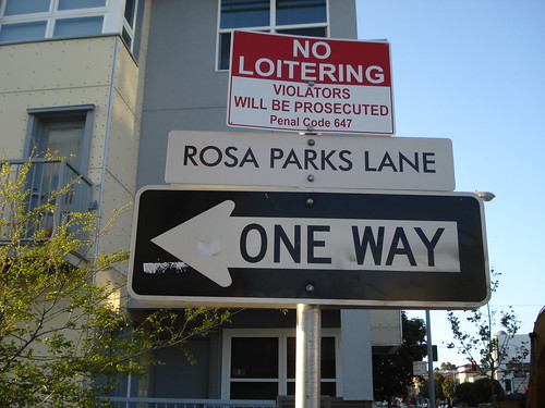
At least, here in PDX, we're all bickering about the process. I don't think anyone would have a problem with a Cesar Chavez Blvd somewhere in Portland if people would just follow the rules (that, in the advocates' defense, have been routinely broken from Naito up through Rosa Parks). If a city where more people than probably live in Portland voted in favor of Sr. Chavez can't even name a street after him, in a city whose land used to be in Mexico, what about that?
Food for thought. Irony of ironies.
Oh, here's the WSJ article I was referring to. Compelling reading.
Powered by ScribeFire.

Powered by ScribeFire.
In the past I've given Jeff Fisher much credit for inspiring me to go for a career as a designer, which is true, but few people have just one inspiration. Brian was one. You see, before I had pretentions to be a graphic designer, I just loved drawing. Brian saw this, and in his persona as an SCA monk-on-the-run (long story) and my natural affinity for other heralds, he knew just the thing I needed to do: draw coats-of-arms.Vert a cross-crosslet Argent square-pierced Gules on a chief engrailed Argent three hunting horns Vert stringed and viroled Gules
You can see why heraldry needs a specialized language. For the complete glory of the arms, including a description of the stuff on top (the crest), go here. If you're a Herald and you don't go "that there's some good stuff, boy", then there's something wrong with you.Powered by ScribeFire.
Powered by ScribeFire.

Powered by ScribeFire.

Powered by ScribeFire.
NB: There is a public update, 1438 18 Dec. Please seen end of the post
1884.
The bestest thing about the intermet is that it allows me to be an open admirer of something and sometimes the creator notices my hat tip and returns it.
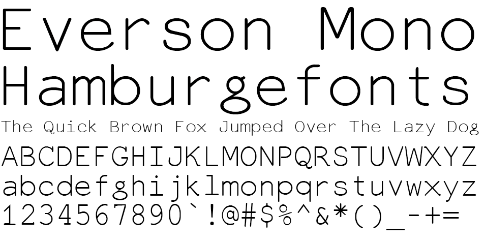
This time, it's Michael Everson. He developed this font, which I fell silly in love with, called Everson Mono:

The thing about Everson Mono is that it's monospaced (as the name would suggest). A monospaced font is one in which every glyph, regardless of shape, occupies one unmutable space, and all the spaces are equal. If you used Courier or Arial when you had a better choice available, that's a monospaced font ... and we'll be sending the design police round to duff you up a treat, as they say.
Well, clear your Arial and your Courier off your drives, peoples, consign them to the dustbin of type history. If you must use a monospaced font, use Everson's; it has little filips and touches, is eminently readable, and actually has a little art to them. And, as I said then as now, I adore the minuscule g.
Anyway, M. Everson acknowledged my little love letter and I must say thank you. What better way to show you where to download the font:
You'll get it for free here. That's free, as in it ain't cost you nuthin'. Free fonts, people ... do I really need to tell you what to do here?
The world will look a little better for your efforts and Michael Everson will be duly enshrined as the man who brought attractiveness to the monospaced font.
Yes, you have to do this.
While you're at it, cruise the rest of the Evertype site. Cleanly designed with an impressive reach.
UPDATE: As correctly pointed out by commenter zwetterman, Everson Mono is not actually free, but shareware:
Everson Mono is shareware. If you use it, please support its development by buying a licence to do so. The shareware fee for using one or more than one (that is, any or all) of these Unicode-supporting coded font programs is EUR 33.00. The licence gives you the right to use these fonts on three CPUs and three CPUs only. (That’s two at the office and one at home, so please don’t complain.) Shareware is not freeware. You may not use Everson Mono for free.
That's what you get for not reading the license, which is a little embarrassing because I usually always read the license.
However, I will point out that you can download the font for nothing, and would highly suggest that everyone that can pay for it, do so. Genius like this deserves to be rewarded.
Thank you zwetterman for the sharp eye. I'll continue to advocate for this font, because I like it just that much.
Tags: typography, type design, michael everson, everson mono
Powered by Qumana
1883.
The Wife™ was able to opine on a phone survey about transit in Portland. The fellow at the call center was very charming and affable, and for all it's flaws, we like TriMet.
The irony that the phone call came from a call center in Area Code 206 – Seattle – is not lost upon us.
Tags: TriMet, Phone Surveys, modren times
Powered by Qumana
After a major gut check (as previously stated), I de-hard-drived the old drive from the old computer and installed it in the new one. Of course, the nifty thing about Mac OS X is that choosing which startup drive you get to use is a simple thing to do in the System Preferences. We are, in short, back ... 100%. This place is looking a lot like the old place!
Heart ... and soul
The thing about computers is that they contain two parts, when we think schematically: the heart (the processor) and the soul (the hard drive). The hard drive contains all the apps, prefs, everything that gives the computer the personality that you are so familiar with. And I've been using this machine for quite a while, so there was a lot of personality. My favorite apps outside of Adobe and Quark ... the saved mail, the font editors, Cyberduck, all that ... is on the old drive. And being able start up on the old drive brings me back to a very comfortable place. I now have three drives total on this machine, providing a total about 200 GB of storage across the three: SunDial Three is the old drive, the original 80GB drive from the old machine, SunDial Four is the 60GB outboard FW drive I have for backing some things up; and SunDial Six is the drive that came with the new machine (SunDial Five, for what it's worth, is the G3 iBook we have; SunDial One and SunDial Two are hard drives on a machine that is no longer with us that ran Windows 98). So not only do I have a good machine back and a great deal of storage space, but all my apps and the personality of the old machine. It's kind of like coming home. Tags: PowerMac G4, Design, Design Tools, PowerMac Maintenace and Repair, Samuel John Klein, The ZehnKatzen Times
Powered by Qumana
1880. One of the things that really intimidates me is breaking into my computer for any reason.
I just don't like it for a variety of reasons. I hate little screws. I hate barking my knuckles on pointy metal things, edges, and trimmed and soldered leads. I hate the idea that I maybe didn't get one bit of static charge off me (I grip a big metal pipe in the basement that goes straight into the ground so I shouldn't worry – yes, my neurotic nature is awesome!) and the next touch to the circuit board I make will make my beautiful toy turn into a microscopially-fused lump of metal-and-silicon.
Apple made it easy a while back. Anyone who has or uses a Blue-and-White G3 or a Yikes!, Sawtooth, Graphite or MDD G4 tower knows this. When Apple moved off the case design with the G5s I was sad.
But the beauty of these cases ... known by some as the "drawbridge" cases (because of the way they open) are self-evident. No screws, no cover to put aside, no need to constantly reach into the case. pull a latch on the outside of the tower, and one side hinges down, like a drawbridge. There, in front of you, is the logic board. In the case and reachable are the power supply and all the disk drives.
Simply beautiful. And while you still have to use screws to affix the hard disk drives to the carrier that holds them, you only need to pull on a latch and push up to get the drive carrier out at all.
Still a little barking of the knuckles. Nothing's absolutely perfect, of course.
And now my old hard drive from the original machine is sitting it its drive carrier on top of that old machine ready to go into the new one. This has a great many apps on it (my font editors and my registered copy of QuickTime, amongst others) that I simply do not want to do without.
But I'm not pushing it. It's a late hour and the last thing I need to do is rush this.
Tomorrow, maybe ... if the gut check goes well.
Tags: PowerMac G4, PowerMac Maintenance and Repair, Samuel John Klein, The ZehnKatzen Times
1888. That's the question.
I'll admit that (due to extenuating cirucmstances) I'm late to the party this one; Eco Font (free for the downloading) has, if not taken the world by storm, at least generated a bit of discussion.
Looking at the font:
It's easy to see how it does it's magic. The dots are engineered so as to not affect readability too much and only require about 80% of the ink used to print a similar solid-black letter.
As a concept, we can't argue with it. It's an original and surprisingly simple approach.
Would we actually typeset with it? Probably not, unless we were looking for an effect.
Type carries attitude. That's why you absorb the information of a Helvetica display without getting too hung up on the type design; that's why classic serif fonts make you think seriously when you read books and newspapers. The dots are clever, but a distraction.
However.
I can't remember what they call it, but there's a principle out there that says if you want to eventually roll something absurd out, there's a way you can get the public used to the idea. You roll out an idea that's destined to fail, perhaps even beautifully so. Everyone notices and a lot of people laugh a bit.
But later you roll out a variation on the concept. People are not so surprised this time, and wondering what you've done to improve it. They're starting to take you just a little bit seriously.
If this fail, you roll out another variation in a while. More refined and more people are willing to see if you "got it right" this time.
Eco font is a silly thing, but inspiringly so. I don't think it will go anywhere except as a curio, as far as fonts go. I wouldn't want to read a book in it, but to really save 20% on the ink output and to make a difference, you'd have to use it a lot.
So people will see it as a delightful curiosity and react accordingly (and hey, everyone likes free fonts).
But this may inspire someone to refine the concept. I don't see how, but surely someone out there is thinking, now. And soon enough, a variation on the concept will emerge, and maybe it will be silly too, but it will be refined.
The second time won't gain traction either. But the third time might. And the fourth time could. And the fifth time ... ?
It's a cascading spark. That's the way change happen – evolution much more often than revolution.
And so it goes.
Tags: typography, eco font, free fonts, green fonts, Samuel John Klein, The ZehnKatzen Times
1888. We are starting to get back to the point where the place is almost looking the way it used to. Adobe CS3 has been successfully installed (Both design premium and web premium editions).
For now, we're going to be posting blog entries from the Flock blog editor. Once you use a blog editor, you don't want to go back; just having your entries off-line and editable is worth it, 100%. The Blogger on-line editor seems more a straitjacket than a liberator.
The only thing I'm going to have problems with is, as I've said before, the leading. Let's hope that Flock can handle it now. The version is up to 2.0, so it must at least be some sort of usable.
Bootstraps
Bootstraps are a popular icon in American culture. Everyone's supposed to have 'em, and if you just pull on them hard enough, you're supposed to lift yourself up to the level you want to be at, laws of physics be damned (we in America tend to think we're above simple physical laws anyway sometimes).
Not all bootstraps are created equal, though. We like to think they are, but they aren't. My personal bootstraps are more like gift ribbons ... they'll get you up but won't take you very far.
Now, more than ever I find that we are not only equal to ourselves but also what others do with and for us. This crisis I seem to be getting through has really taught me this.
My biggest ambition in life, aside from getting a little bit famous maybe, is to have enough resources on board to help people the way I just now got helped. I want to pay my favor forward. For now, that involves retrenching and recrafting my on promotional campaign to establish a real toe-hold as a designer.
I'm working this out right now. It can be said, perhaps, that one of my problems in finding success is my model is too close to that of the underpants gnomes in South Park, which, in my case, looks like:
In as much as I am occasionally ground down by the vicissitudes of daily life, I tend to get distracted, so I can't really say I do anything but think what am I going to do about this? and try things others have tried.
But what I'd really like to do? Give other people better bootstraps, like a few people just gave me. That would be success, yes.
Tags: ZehnKatzen, Samuel John Klein, graphic design, The ZehnKatzen Times, Samuel John Klein, The ZehnKatzen Times