08 January 2009

A Smoke-Free Dutch Mafia!

1899.One of the more popular bits of Dutch Bros Coffee ephemera is the "Dutch Mafia" sticker, showing a sunglass-wearing mook puffing on a cigar with the words "Dutch Mafia" in the company's signature Peignot Bold font.

Funny, gets the point across. We drink only the Bros here. Capsice?


But with the new year a lot of people make a new start, and that includes our Dutch Mafia enforcer:


It is just me, or does he seem a little more cheeful now?

Well, for my money, if you're going to obsess over coffee instead of cigars, that would be my choice!

And those of you who have a Dutch Mafia fellow smoking a cigar ... congratulations! You have a collector's item now.

Technorati Tags: , , , , , ,

Powered by ScribeFire.

In The Days of KVDO-Salem's Channel 3

1898.Some time in the past I redrew, from my memory and from what little was available on the intarmets, the logo for KVDO Channel 3, Salem, Oregon.

Very few people today remember KVDO Channel 3, but it was Salem's first licensed TV station. If anyone at all remembers it, it's because it moved to Bend to become the OPB outlet for the central Oregon area ... and a local viewer was upset enough about it that he went out to the transmitter site in the south Salem hills and cut a guy wire on the tower, bringing it down (acutally, not necessarily in that order ... I may have these events out of sequence. But, sally forth!).

Those were good times for local TV viewers in Salem though. Nice to have a station you could call hometown. After blathering some about it and seeing what KVDO had for one evenings viewing, though, moved a commenter who identified himself as "Ken" to give me a bit clearer view of what it was like to run an independent TV station in the shadow of Portland during the 1970s, and his comment is so good, I thought I'd share it here. Take it away, Ken:

KVDO channel 3 was the first TV station licensed to Salem and was well known in the area. One of KVDO was the lack of available programming. This was in the days prior to Sat's and small format tape. Master control consisted of three quad 2" machines and a film chain of 3 16mm and one dual 35mm slide drum. This was also Salem’s only news cast until KECH 22 for a short time ran news. News was a three man cast, two talent and a MCR operator. The "talent" did double duty in that when not on the air they were the camera operators so when one was on air the other ran camera.

One must remember in those days news was all on film and in B&W. I have been told but other in the know KVDO demise happened in a major part with something good for them bad got a Portland station. When a tower was cut in Portland KVDO became a network during the repair. The network rating went way up because KVDO not only covered Portland but the Eugene (at the time there was only 2 networks in Eugene). This got the attention of some people and they did everything they could do remove this potential problem. About 1 to 2 years later KVDO was sold to KEZI Eugene and then to OEPBS (now OPB). OEPBS ran channel 3 for a couple of years and then had the channel moved to Bend Oregon in exchange moving channel 32 allocation to Salem (now KRCW).

Even today with the right aged crowd if you say KVDO a vast majority say “oh I remember it” main in that this was a “SALEM station” vs. a “Portland” station. Programming was not the best but in the late 60’s and 70’s it was something to watch/ whether it was TV shows, news Salem “live” wrestling, roller derby or movies it was one of only 4 stations to watch.

Thanks for the extra information, Ken. I had no idea how much travail one had to face in running a station in Salem during those days, and there was so little to see over the air ... and what adventure there seemed to be in bringing local TV to the mid-Willamette Valley.

These days, KWVT Channel 17 is covering the Salem area. With its coverage area I have no way of viewing the programming, but think it's nifty that Salem have its own station and it must be pleasing the locals, because it's still going strong.

Technorati Tags: , , ,

Powered by ScribeFire.

Don't Think Of A Bear

1897.(h/t to the indispensable Larry Fire for this visual treat). In the last discourse I challenged you to dare to view the secret hiddent in the FedEx logo (if you didn't know it) but didn't refer to it (and still wont) because as the blogger I linked to correctly observed, once you see it you cannot unsee it (well, at least not without a conscious effort).

Today I have another visual joke, but it's not so distracting.

Many of us enjoy Toblerone (indeed it is yummy). But there is a reference to the birthplace of the world-famous candy hidden in the logo. The logo of Toberone combines a distinctive type treatment and color scheme with a high-contrast representation of the Matterhorn – that iconic Swiss peak on the Italian frontier in the Pennine Alps (for those of you who like climbing, it's a "fourteener"):


If you know the history of Toblerone, you know it was born in Berne, Switzerland. It is said that the name of the city was inspired by a bear (der Bär, in German) that the city's founder killed in the area, and you're probably already seeing the visual joke. Since I told you what to look for, then you probably are now seeing it. But if you don't see it yet, let's zoom in on the mountain:


... and here's the bear:


The Matterhorn's steep sides usually allow for very little snow to cling to the sides, giving a variegated surface that lends itself easily to such graphic trompe l'oeil.

Technorati Tags: , ,

Powered by ScribeFire.

07 January 2009

Don't Think Of An Arrow

1896. What Long Story, Short Pier says is true. If you don't know it, you don't see it. Once you do, you can never put it out of your mind.

Follow this link at your own risk.


Technorati Tags: , ,

Powered by ScribeFire.

The Obama Transition Announces The Official Inaguration Poster

1896.(Via Huffington Post) Here is the offical poster for the inaugural celebration of President Obama:


It's designed by Shepherd Fairey and continues the rather exciting graphic approach seen during the campaign, with a very limited, posterized color palette and the dynamic play of flat color.

HuffPo sees it this way:

It is the next step in the branding of the presidency -- a development that is not unique to Obama but one that he has used better than any other politician in recent memory.

Fairey's initial design -- a guerrilla style, dark-colored portrait of the then-candidate -- proved to be a political and cultural phenomenon during the campaign. The current edition plays heavily off those themes and it seems likely to be a major symbol during the inauguration festivities. The image will be available on buttons, lapel pins, stickers and t-shirts.

As a designer, I'd say that "guerilla style" is pretty much in the eye of the beholder. But that's as may be. I do agree on the branding viewpoint; if there were a Nobel Prize in Marketing, whoever's driving Obama's branding deserves it, hands down.

Regardless of what you think of him, it's hard to deny that, in the context of the buttoned-down world of USA politics, it's like a firework exploding. It's exciting and very new. I enjoy this style; it takes the average world of political visual design and splashes a big dash of hot sauce on it.


Technorati Tags: , , , , , ,

Powered by ScribeFire.

Linotype's Free FontExplorerX Is Going Pro ... Get It While It's Still Free

1895.A real crowd-pleaser of recent times in the font-management arena, certainly at least partly because it delivered a lot of functionality and was free, was Linotype's FontExplorerX.

The free love affair has come to an end.

The newest version of FontExplorerX, called FontExplorerX Pro, is available until 28 Feb at a reduced license price of USD $39, and after that USD $79. It's now a member of a product line that includes a server version as well.

Your info source is fontexplorerx.com.

If, OTOH, if you'd like to nab a copy of FontExplorerX 1.23 for Mac archiving, which is still free, you can go here. There is also a link to the Win version from that page.

It will be available there until it isn't, whenever that happens. Downside: as far as support, you're probably on your own.

Technorati Tags: , , ,

Powered by ScribeFire.

Cesar Chavez Blvd Renaming Plan Not Going Smoothly

1895.What's that, you say? Yeah, you know, you've heard it?

It's not Portland's Interstate Avenue ... it's Dallas Texas's Industrial Blvd (note, this verbiage was current as of about seven months ago (and the full story at that time is here–courtesy The Dallas News):

The choice of Mr. Chávez – a U.S. native who became the nation's leading advocate for farmworkers – has generated strong feelings around Dallas about the region's ongoing demographic shift, illegal immigration and the legacy of Mr. Chávez himself.

And this morning, as the council's Trinity River Project Committee gets set to vote on the new name, many of those issues could sit through the meeting like elephants in the room.

Here's a view of the street they wanted to rename courtesy Google Maps Street View:


Yes, that is a bail bondsman's shop on the right there. No, I didn't go out of my way to find one; reading on the subject characterized the road by describing its run of parking lots and bail bond shops (here's a link to the view). This from the Wall Street Journal:

"Industrial Boulevard" is an apt name for the gritty strip of warehouses, bail-bond offices and liquor stores that runs parallel to the Trinity River on the western edge of this Texas city's urban core.

Where the process (which, apparently, they actually followed one) went off the rails (depending on where you stand on this) was when a survey of Dallas citizens returned a poll of 43% of the population favoring honoring the labor movement legend. This possibly generated fear and loathing amongst the 57% of Dallasaisans (Dallians? Dallasers? Ewings?) who weren't so hot on that idea (again, WSJ):

The name game did succeed in garnering local interest -- just not in the way officials had hoped. Instead, it sparked a rancorous power struggle between the city's growing Hispanic population and its entrenched Anglo and black leadership.

Dallas officials' 'uh-oh' moment came when they received the results of their summer survey. Having favored scenic-sounding names such as Riverfront and Trinityview for the waterside development, officials were stunned by the top choice: "Cesar Chavez Boulevard."

I love it that they called it an 'uh-oh' moment.

Anyway, this turned the easy, breezy process into a drama laden thing.

The vote was had, and what did they choose? Let's turn to the WSJ one more time for the answer. Fast-forward to roughly the present:

Last month, the 15-member Dallas City Council put an end to at least part of the debate by voting to rename Industrial Boulevard "Riverfront Boulevard," with only the three Hispanic members opposing.

The council also voted to allow Ross Avenue to keep its name. The city now hopes to assuage Hispanics by finding another suitable street or landmark to bear the Chavez name, though Hispanics leaders say they will sign off only on a suitably prominent thoroughfare.

You think we have enough trouble getting things done with a five member city commission? Imagine if we had 15 members ...

At least, here in PDX, we're all bickering about the process. I don't think anyone would have a problem with a Cesar Chavez Blvd somewhere in Portland if people would just follow the rules (that, in the advocates' defense, have been routinely broken from Naito up through Rosa Parks). If a city where more people than probably live in Portland voted in favor of Sr. Chavez can't even name a street after him, in a city whose land used to be in Mexico, what about that?

Food for thought. Irony of ironies.

Oh, here's the WSJ article I was referring to. Compelling reading.

Technorati Tags: , ,

Powered by ScribeFire.

Interesting Map Design: The Interstate Highway Grid, Simplified

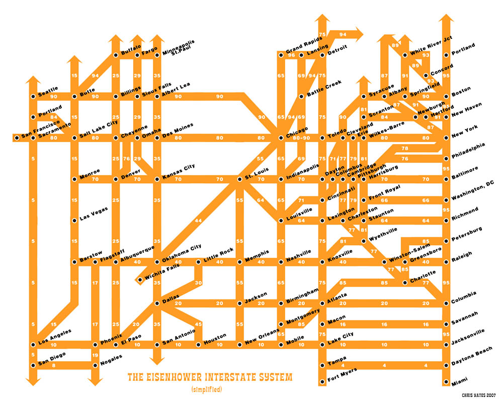
1894.And, to raise the tone a bit from the sombre, here's a stumbled-on find. In 2007, graphical artist Chris Yates must have read a description of the numbering system of the US Interstate Highway net and said to himself gee, that sounds like it should be represented on a funkily-styled grid. And that's just what he did:


Here's where you can view it bigly.

Travel your USA ... schematically.

This is Chris Yates' page. Nifty!

Technorati Tags: , , ,

Powered by ScribeFire.

Lost Friends, 2008

1893. The travails of the last several months have been seemingly bracketed by two very sad events. One I've mentioned, one I can now mention. Thier passing seemed oddly appropriate, during a very dire season of a rather difficult year.

About three months ago (I could look up the date but it's still a little painful), I lost a friend and a teacher I knew in the SCA as Ciaran Cluana Ferta, but "mundanely" as Brian Russell.

Brian was a singular guy. He died of complications from heart disease and a long battle with diabetes; he was only in his upper fifties (as seems true with many such people I knew who have endured such travails, he looked a bit older than that but he was taking care of himself as best he could and I thought he had a few more miles on the clock).

In the past I've given Jeff Fisher much credit for inspiring me to go for a career as a designer, which is true, but few people have just one inspiration. Brian was one. You see, before I had pretentions to be a graphic designer, I just loved drawing. Brian saw this, and in his persona as an SCA monk-on-the-run (long story) and my natural affinity for other heralds, he knew just the thing I needed to do: draw coats-of-arms.

And this I did. And as I got good at it (and I got good, I will blow my own horn here loudly) and then got into graphic design, I realized that heraldic art was not only technical drawing but also medieval graphic design. The designer in this case can add some style, but you're working withing a canon and toward accomplishing someone else's goal, and if you like designing, you understand that the real charge isn't sometimes so much in creating the graphic art, but watching it do its job whether or not you get the credit right away.

One of the greatest compliments was paid me by Brian. A long time habitue of British and Irish culture (he claimed to hold dual USAan/Irish citizenship and could even speak some Irish Gael) he told me that he thought that my work was good enough to stand aside anything the English College of Arms did. I had my own style and loved it; but at the same time, I know when it's time to put your style in the service of something bigger.

At the time he died, he was involving me on another project, the creation of a battle roll-of-arms of the Battle of Barnet, one of the Wars of the Roses. What I got done before he left us has been so far recorded in one of my other blogs, Creating the Roll. It is currently in abeyance, a victim of other centrifugal forces both as a result of his passing and not.

There is so much to say about Brian. He was married, divorced and was about to be remarried when his wife was taken from him in a pointless twist of fate; he served some years as a monk (an actual one) in a small monastery in Georgia, of all places (the one here in the USA); he worked for many years at Broadway Cab, which is what he was doing when I came to know him; the last decade or so of his life, not so physically prosperous. But he was happy. He had his lady love, a good life, the admiration of friends. He loved music and wrote liturgically, and served the world via his website (go here to get it all) and was renouned for the amount of music he made available to people.

He was my friend and a teacher, and, looking back on it, he was the big brother I never had.

The other person that left us and inspired me was also interesting, a character, who loved the law. He was trained legally but did not hang himself out a shingle; he worked the courts up in Thurston County, Washington. His name was David Hunter, and he was styled David Hunter of Montlaw.

David had something that you and I and not everyone you know had; he could prove descent from one of the clans of Scotland, and this gave him the right to petition the Lord Lyon ... the chief heraldic officer of Scotland ... to matriculate suitably differenced arms.

He was the closest thing I knew of to an authentic Scots laird, altho I'm aware I may be using that term incorrectly. But one thing's certain; he was proud of being officially "matriculated", as the term of art is, and even though I was rather envious, I certainly wouldn't begrudge him that. His arms, as rendered, are illustrated here; the blazon is:

Vert a cross-crosslet Argent square-pierced Gules on a chief engrailed Argent three hunting horns Vert stringed and viroled Gules

Which, translated into English, means "On a green field, a cross with crosspieces on the ends with a red square in the middle, with a white stripe across the top with a cup-scalloped line of division three green horns with red ties on".

You can see why heraldry needs a specialized language. For the complete glory of the arms, including a description of the stuff on top (the crest), go here. If you're a Herald and you don't go "that there's some good stuff, boy", then there's something wrong with you.

He was a really really smart Herald, whom we knew in the SCA as Baron David of Moffat (for reasons too complicated to explain here, you can't necessarily have your own name as a registered SCA tag ... and no self-respecting Herald, in my opine, would be seen for long without a registered name (mine's Sebastian zem Sterne, FWIW). Perhaps it was his legal training, but he could argue a contrary point of view and never make you feel as though he was just contradicting you for contradiction's sake. He was one of the whetstones we sharpened our minds against. Helped, of course, that he was right more often than wrong.

But perhaps a more defining mark was that was how he did every dog-gonned thing he ever tried superbly, as a matter of fact, it seemed almost unfair, the way he was so accomplished and made it look so easy. For him, it seemed as automatic as breathing air. For this he was sometimes referred to by some in our group by a dubbing I hacked out of the comic strip Sylvia: "The Baron Who Does Everything More Beautifully Than You".

But for the apparent snark thereon, it was actually a compliment. Sure, he seemed to do everything well and effortlessly, but he shared what he knew and would talk endlessly about it if you were interested. Just like the rest of us in the SCA, he tried to pass on what he knew in teaching. And you could do much, much worse as a teacher than Baron David of Moffat, quite easily you could do worse.

David was a type 1 diabetic who seemed to be doing quite fine. He was in his mid-forties, if memory serves. His death was as unexpected as it was untimely. I still don't feel as though I've done proper pennance for poking fun at him, which I did with maybe too much glee from time to time, because he was a much better and smarter man than I.

Each one of these two men did quite a lot to motivate and inspire me. And, just like humans everywhere, I rather took them for granted. I'm sorry about that. We will not see thier like again.

But at least I got to know them for a while, and I can carry that inspiration forward, as long as I remember them. I'm thankful for the chance that I had to know them.

Technorati Tags: , , , , , ,

Powered by ScribeFire.

03 January 2009

Buy Me Some Peanuts, Cracker Jack, and A Little National Exposure

1892. Something I happened upon in surfing my Sitemeter links ...

This here entry at the blog Providence Daily Dose, which celebrates the ascension of Sam Adams (not the beer one) to the PDX mayoralty, using this bit of photoshoppery:


... as the illustration. I was quite proud when I did it, and was very happy when it garnered this blog over 700 views in two days, which to me is like striking gold (props to Bogdanski for linking to it, though even though I came out with more such cards, everyone lost interest after I did Sho Dozono. I really put in some work on the Kyle Burris card ...)

So, thanks, Providence Daily Dose, for featuring my card as your illustration today. Thrilled and flattered, thrilled and flattered!

Technorati Tags: , , , , ,

Powered by ScribeFire.

01 January 2009

At Least One Thing I Want To Do This Year ...

1891. ... would be to create a zine of some sort.

I've really been getting into the zines I can find at the Midland branch of the library, which is the closest one to me. There was a really well-done one called Steampunk Magazine which has caused a household-wide interest in Steampunk in general (also those wonderful steampunk-y laptop casemods I've been seeing on BoingBoing.

I don't know what all will be in it yet (of course I could do it on design but we all know how easily distracted I am).

We'll be playing around with this. Make it fun and find a way to add value to the communication. Stuff like that.

Technorati Tags: , , ,

Powered by ScribeFire.

A Trip On The Tram ... A Long View for the New Year

1891. I must be cautious lest I read too much into passing events, but we celebrated today with a ride on the Portland Tram.

It's supposed to be costing taxpayers a bundle. At least, the ride is nice, as is the view.

Here's a video I made with the might plastic fantastic Vivitar VivCam 3705, as recieved and posted by YouTube:


And here are a few photos. The view from the gondola is truly one not to be missed ...


Clicky here to embiggen. Also, here's the Marquam Bridge from the Tram:


Clicky here to embiggen this.

Clearly the Aerial Tram, regardless of the policy that got it built, has given us incomparable views of the greatest town on Earth.

Happy Neo-Year!

Technorati Tags: ,

Powered by ScribeFire.

30 December 2008

The End Of A Year, A Visit To Fry's ... and Goals

1890.I think that I'm kind of starting from zero again, in a way. I'm back on a capable computer, which I got by with a little help from my friends, and I'm looking forward.

If my life was a poem, it would be "Finnegan, begin again". I always seem to be.

Anyway, I'm taking it as a positive sign. And now I look forward. Kris Coppieters has purchased my services, and I'm getting started on this with the new year, and the way I see it, designing someone's logo is a great way to start. It was what I was meant to do. It's why I keep looking for the opportunity, because there is no other option for me.

Looking over the Macintoshes on sale at Fry's tonight, I saw what I hope will be the future of my tools. I got back on the PowerMac G4 after a bit of begging. I'll work toward the MacPro/MacBook Pro/whichever by earning this.

Until then, the G4 will serve well. But there is only so far she can take me.

Welcome 2009. You've got to be a better deal than 2008 was.

Technorati Tags: , ,

Powered by ScribeFire.

28 December 2008

A Snowy Calm, Just Before The Storm

1889.A view of my favorite downtown in the world, with a dusting of snow ... just before the big one hit last week:


Clicky here to embiggen.

Technorati Tags: , , , ,

Powered by ScribeFire.

A New Style of Portland Street Sign Debuts at 117th and Division?

1888.I believe I've stumbled onto something new and rather exciting, and it's been rolled out on one street sign in my own neighborhood.

Recently I saw, on the north side of SE Division Street at 117th Avenue, the street blades you see here:


Interesting, yes? And just in this one spot so far.

This represents sort of a quantum leap in the design of the basic Portland street blade. But more about that in a 'mo. Here's a few more views.


They've added the crossing street block index! It's now an integral part of the blade, and in a slightly surprising way.

Next:


It reads well from a distance. Nifty!


The avenue blade retains the traditional Portland look, now within the new white frame with rounded corners. It's looking pretty good ... and readable!


Here's how it might look from a car. You know what corner you're at.

Now, for a little design discussion.

One of the biggest drawbacks of the basic Portland street blade is the lack of a block number. Whether or not you get that the crossing street blade holds the block number of the street you're one (the block number of the named street being self-evident from the number of the avenue), we take it as axiomatic that it's just plain nifty to have the block number on the street sign itself, thus preserving your sanity and relieving you of the need to peer at the front doors of nearby houses, thus perhaps drawing reproachful return glares.

But in general it saves you a step. You have the block number at a convenient, findable place, and it's finally been integrated into the design of the blade itself, just as it has in almost every other major city in the Willamette Valley. Currently, the block number comes on a tab bolted on to the blade itself, and, due to the ways you can have the blades stacked, not always in the same place. Moreover, several somewhat-poorly designed sign-toppers for neighborhood identification omit this information entirely, and the tab has been removed in some of these cases. This design neatly solves that problem.

Now the question becomes how efficiently the information gets delivered. We feel this design does the job quite nicely. By placing the directional (SE), specific (Division) and generic (St) all on the same baseline, the eye reads the street name at one go quite naturally. Reducing the type size on the generic preserves the traditional Portland look. And, by placing the block number a bit up and toward the upper right hand corner of the blade, the eye arrives at an important supplemental bit of information last.

On top of all that is the sheer niftiness of giving the blade a new rounded-corner profile with a wide white stroke around the outside actually contains and defines the design into an aesthetically pleasing whole.

I don't know who in the Portland department of making street signs came up with this idea, but my friend ... you've nailed it.

Beautifully done.

Please make sure you get more of these up. You make me proud to be a Portlander.


Technorati Tags: , , , ,

Powered by ScribeFire.

25 December 2008

A Christmas Gift To All ... Wallpaper For Your Root Account Desktop

1887.Now, we who have Un*x-based systems (OS X and others) know that occaisionally need to get a root account enabled because sometimes you just have to do a superuser thing or two. I occaisionally need to grab files from another account but you can't always do that when just logged in with Administrator priviledges.

But you know how dangerous root access can be. You can delete all files from your system, and the system will go ahead and let you.

I like doing this ... this wallpaper lets you know exactly what kind of fire you're playin' with when you go root. I give this idea to the general public and urge everyone who has a root account on any sort of Un*x to put it up there. Enjoy:


Merry Christmas!

Technorati Tags: , , ,

Powered by ScribeFire.

23 December 2008

Our Substance Is Lessened By This Loss

1886.It would seem that we've lost another dear friend and associate.

This has been a season of loss and of travail. Old friends of great mind have departed this sphere of existence and we will not see thier like again; this is a guarantee.

I cannot say whom at this point, but it was unexpected and he died too young. And I ribbed him but I respected him utterly.

I wish I had a chance to tell him that. Now, I never will.

Technorati Tags: , , ,

21 December 2008

A Test For The Laptop

1885.

Now this is a test of something called ScribeFire, an addon for Firefox. This is being done from the G3 iBook because I want to have an alternative from Qumana (which I have a beta of that works on OS X but the downloadable doesn't and they've gone quiet over there), Flock (which actually is starting to grow on me) and the Blogger interface (which I can't stand (nothing personal, Blogger ... it just doesn't work for me.)).

This has a bunch to say for it ... categories in the interface and Technorati tags?

Nice so far. Let's publish it and see if I can live with the results.

20 December 2008

Brain Graffiti

1884.I was trying out yet another blog editor ... a plugin for Firefox ... and it left the last bit of dross in attempting to spawn a live preview.

I decided I liked it so much that I'm going to leave it there.

On a wholly unrelated point, you know how it is that they hire endowed young ladies to staff Hooters? Why don't you see more one-legged servers at IHOP?

Discuss.

Tags: , , , ,
Blogged with the Flock Browser

15 December 2008

I Love It When This Happens (updated)

NB: There is a public update, 1438 18 Dec. Please seen end of the post


1884.


The bestest thing about the intermet is that it allows me to be an open admirer of something and sometimes the creator notices my hat tip and returns it.


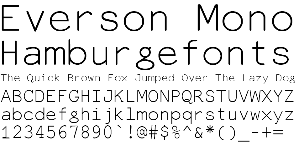
This time, it's Michael Everson. He developed this font, which I fell silly in love with, called Everson Mono:


everson mono


The thing about Everson Mono is that it's monospaced (as the name would suggest).  A monospaced font is one in which every glyph, regardless of shape, occupies one unmutable space, and all the spaces are equal. If you used Courier or Arial when you had a better choice available, that's a monospaced font ... and we'll be sending the design police round to duff you up a treat, as they say.


Well, clear your Arial and your Courier off your drives, peoples, consign them to the dustbin of type history. If you must use a monospaced font, use Everson's; it has little filips and touches, is eminently readable, and actually has a little art to them. And, as I said then as now, I adore the minuscule g.


Anyway, M. Everson acknowledged my little love letter and I must say thank you. What better way to show you where to download the font:


You'll get it for free here. That's free, as in it ain't cost you nuthin'. Free fonts, people ... do I really need to tell you what to do here?


The world will look a little better for your efforts and Michael Everson will be duly enshrined as the man who brought attractiveness to the monospaced font.


Yes, you have to do this.


While you're at it, cruise the rest of the Evertype site. Cleanly designed with an impressive reach.


UPDATE: As correctly pointed out by commenter zwetterman, Everson Mono is not actually free, but shareware:


Everson Mono is shareware. If you use it, please support its development by buying a licence to do so. The shareware fee for using one or more than one (that is, any or all) of these Unicode-supporting coded font programs is EUR 33.00. The licence gives you the right to use these fonts on three CPUs and three CPUs only. (That’s two at the office and one at home, so please don’t complain.) Shareware is not freeware. You may not use Everson Mono for free.


That's what you get for not reading the license, which is a little embarrassing because I usually always read the license.


However, I will point out that you can download the font for nothing, and would highly suggest that everyone that can pay for it, do so. Genius like this deserves to be rewarded.


Thank you zwetterman for the sharp eye. I'll continue to advocate for this font, because I like it just that much.


Tags: , , ,


Powered by Qumana


TriMet Phone Surveys

1883.


The Wife™ was able to opine on a phone survey about transit in Portland. The fellow at the call center was very charming and affable, and for all it's flaws, we like TriMet.


The irony that the phone call came from a call center in Area Code 206 – Seattle – is not lost upon us.


Tags: , ,


Powered by Qumana


14 December 2008

The (Old) Soul Of A New Machine

1882.

After a major gut check (as previously stated), I de-hard-drived the old drive from the old computer and installed it in the new one. Of course, the nifty thing about Mac OS X is that choosing which startup drive you get to use is a simple thing to do in the System Preferences. We are, in short, back ... 100%. This place is looking a lot like the old place!


Heart ... and soul


The thing about computers is that they contain two parts, when we think schematically: the heart (the processor) and the soul (the hard drive). The hard drive contains all the apps, prefs, everything that gives the computer the personality that you are so familiar with. And I've been using this machine for quite a while, so there was a lot of personality. My favorite apps outside of Adobe and Quark ... the saved mail, the font editors, Cyberduck, all that ... is on the old drive. And being able start up on the old drive brings me back to a very comfortable place. I now have three drives total on this machine, providing a total about 200 GB of storage across the three: SunDial Three is the old drive, the original 80GB drive from the old machine, SunDial Four is the 60GB outboard FW drive I have for backing some things up; and SunDial Six is the drive that came with the new machine (SunDial Five, for what it's worth, is the G3 iBook we have; SunDial One and SunDial Two are hard drives on a machine that is no longer with us that ran Windows 98). So not only do I have a good machine back and a great deal of storage space, but all my apps and the personality of the old machine. It's kind of like coming home. Tags: , , , , ,


Powered by Qumana


13 December 2008

Dreaming of 70,000

1881. Sometime later tonight, when I wont' be around to see it, the visit tally on this will hit another milestone – seventy thousand.

I just wanted to thank everyone who came by here for whatever reason.

Your visits are valued. Every one.

Tags: , , , , ,
Blogged with the Flock Browser

A Technical Investigation

1880. One of the things that really intimidates me is breaking into my computer for any reason.


I just don't like it for a variety of reasons. I hate little screws. I hate barking my knuckles on pointy metal things, edges, and trimmed and soldered leads. I hate the idea that I maybe didn't get one bit of static charge off me (I grip a big metal pipe in the basement that goes straight into the ground so I shouldn't worry – yes, my neurotic nature is awesome!) and the next touch to the circuit board I make will make my beautiful toy turn into a microscopially-fused lump of metal-and-silicon.


Apple made it easy a while back. Anyone who has or uses a Blue-and-White G3 or a Yikes!, Sawtooth, Graphite or MDD G4 tower knows this. When Apple moved off the case design with the G5s I was sad.


But the beauty of these cases ... known by some as the "drawbridge" cases (because of the way they open) are self-evident. No screws, no cover to put aside, no need to constantly reach into the case. pull a latch on the outside of the tower, and one side hinges down, like a drawbridge. There, in front of you, is the logic board. In the case and reachable are the power supply and all the disk drives.


Simply beautiful. And while you still have to use screws to affix the hard disk drives to the carrier that holds them, you only need to pull on a latch and push up to get the drive carrier out at all.


Still a little barking of the knuckles. Nothing's absolutely perfect, of course.


And now my old hard drive from the original machine is sitting it its drive carrier on top of that old machine ready to go into the new one. This has a great many apps on it (my font editors and my registered copy of QuickTime, amongst others) that I simply do not want to do without.

But I'm not pushing it. It's a late hour and the last thing I need to do is rush this.


Tomorrow, maybe ... if the gut check goes well.


 Tags: , , ,


Blogged with the Flock Browser

Can A Dotty Font Save The Planet? Are Small Steps Important?

1888. That's the question.


I'll admit that (due to extenuating cirucmstances) I'm late to the party this one; Eco Font (free for the downloading) has, if not taken the world by storm, at least generated a bit of discussion.


Looking at the font:


ecofont


It's easy to see how it does it's magic. The dots are engineered so as to not affect readability too much and only require about 80% of the ink used to print a similar solid-black letter.


As a concept, we can't argue with it. It's an original and surprisingly simple approach.


Would we actually typeset with it? Probably not, unless we were looking for an effect.


Type carries attitude. That's why you absorb the information of a Helvetica display without getting too hung up on the type design; that's why classic serif fonts make you think seriously when you read books and newspapers. The dots are clever, but a distraction.


However.


I can't remember what they call it, but there's a principle out there that says if you want to eventually roll something absurd out, there's a way you can get the public used to the idea. You roll out an idea that's destined to fail, perhaps even beautifully so. Everyone notices and a lot of people laugh a bit.


But later you roll out a variation on the concept. People are not so surprised this time, and wondering what you've done to improve it. They're starting to take you just a little bit seriously.


If this fail, you roll out another variation in a while. More refined and more people are willing to see if you "got it right" this time.


Eco font is a silly thing, but inspiringly so. I don't think it will go anywhere except as a curio, as far as fonts go. I wouldn't want to read a book in it, but to really save 20% on the ink output and to make a difference, you'd have to use it a lot.


So people will see it as a delightful curiosity and react accordingly (and hey, everyone likes free fonts).


But this may inspire someone to refine the concept. I don't see how, but surely someone out there is thinking, now. And soon enough, a variation on the concept will emerge, and maybe it will be silly too, but it will be refined.


The second time won't gain traction either. But the third time might. And the fourth time could. And the fifth time ... ?


It's a cascading spark. That's the way change happen – evolution much more often than revolution.


And so it goes.


 Tags: , , , , ,


Blogged with the Flock Browser

12 December 2008

Bootstraps. Pulling Hard

1888. We are starting to get back to the point where the place is almost looking the way it used to. Adobe CS3 has been successfully installed (Both design premium and web premium editions).


For now, we're going to be posting blog entries from the Flock blog editor. Once you use a blog editor, you don't want to go back; just having your entries off-line and editable is worth it, 100%. The Blogger on-line editor seems more a straitjacket than a liberator.


The only thing I'm going to have problems with is, as I've said before, the leading. Let's hope that Flock can handle it now. The version is up to 2.0, so it must at least be some sort of usable.


Bootstraps


Bootstraps are a popular icon in American culture. Everyone's supposed to have 'em, and if you just pull on them hard enough, you're supposed to lift yourself up to the level you want to be at, laws of physics be damned (we in America tend to think we're above simple physical laws anyway sometimes).


Not all bootstraps are created equal, though. We like to think they are, but they aren't. My personal bootstraps are more like gift ribbons ... they'll get you up but won't take you very far.


Now, more than ever I find that we are not only equal to ourselves but also what others do with and for us. This crisis I seem to be getting through has really taught me this.


My biggest ambition in life, aside from getting a little bit famous maybe, is to have enough resources on board to help people the way I just now got helped. I want to pay my favor forward. For now, that involves retrenching and recrafting my on promotional campaign to establish a real toe-hold as a designer.


I'm working this out right now. It can be said, perhaps, that one of my problems in finding success is my model is too close to that of the underpants gnomes in South Park, which, in my case, looks like:


  1. Learn Graphic Design

  2. ? ? ?

  3. PROFIT!


In as much as I am occasionally ground down by the vicissitudes of daily life, I tend to get distracted, so I can't really say I do anything but think what am I going to do about this? and try things others have tried.


But what I'd really like to do? Give other people better bootstraps, like a few people just gave me. That would be success, yes.


 Tags: , , , , ,


Blogged with the Flock Browser


11 December 2008

The Quest: We are Re-Computered

The PowerMac G4 arrived from PowerMax today, and there was no problem in plugging it in and powering it on.

I am currently running off that machine. It's good to be at my workstation; it's good to look at the computer on a big screen.

It's good to be back in the studio.

I still have benchmarks to complete. First will the the installation of the old "SunDial Three" hard drive into this case, then the SuperDrive from the old machine.

I owe it all to the people who thought enough of me to donate money to make this happen.

Thank you, thank you all.

Is Gmail Rebranding to Google Mail?

I'm mad curious because I don't see this anywhere else (hey, I Googled!) but on the Gmail interface, the word Gmail has been replaced with the words Google Mail. The only place (so far) that hasn't sported the change is the Gmail sign-in screen.

Intriguingly, there seems to be just about zero commentary on this ... at least as far as I can find.

Is Gmail rebranding? It certainly looks that way. But why on the q.t.?

09 December 2008

The Deed Is Done: The Replacement Computer Is Coming

Thanks to the incredible good will of the people who've donated, I will once again have my beloved CS3 apps available to me.
Link
I have just completed the purchase of a pre-owned PowerMac G4 MDD, with FW 800 and about 1 Gig of memory, from PowerMax. The amount in the fund has been updated to reflect the money spent.

I've learned a great deal about myself from this, and great deal about the people who come here to read or comment. You could have put that money down anywhere else. You deemed me worthy of it. Your generosity and belief in me has improved my outlook dramatically, and I'm more ready to take on the world than I have been in some time.

It has been a rather hard quarter. Losing the computer I depended on hasn't been the only travail hereabouts ... just the most germane to the mission of this blog.

Thank You, Judy!

I'd like at this time to thank one last contributor. Judy, my logo design client, with a donation. I enjoyed working for you, Judy, and I hope you and your son's realities are playing out in the way you want them to.

I'm fond of you as a fellow blogger, and I read you regularly ... just don't comment as much as I should.

Why Buy Over The 'Net When the Vendor Is Across Town?

I'll be recieving the new machine in 5-10 business days, hopefully sooner. I looked into PowerMax because of thier reputation and their smug pride in living in Oregon (that part of the character is right up my street, if you know me). Those of you familiar with PowerMax know that the actual location of the business is in Tualatin, off I-5, exit 290 (you know, the one where they want to put in a Stars Cabaret strip joint).

If they're right across town, why buy over the 'net and wait for delivery?

Convenience is one good reason. For poor folks, we're busy. This cuts out just one more trip to do.

A couple more reasons are the guarantees that PowerMax extends to internet shoppers of pre-owned Macs. They are two: 1: What they send you will work as advertised. If it doesn't, they'll replace it with one that does. 2: The 90-day warranty. If the purchase is unsatisfactory (I don't expect it will be) they will give me full credit toward something else.

As you can tell, I like having some form of guarantee. It tells me some things about the seller: that they have good will and a good rep (and are willing to take steps to preserve it by making sure they don't sell you junk).

So now, the waiting begins. UPS, don't fail me now.

08 December 2008

On Blogging, Stat Addiction, and Popularity

It might probably go without saying that when times are tough, as they obviously are now, one tends to look closely at some of the behaviors one exhibited when they were doing a certain thing, when suddenly chance dictates that they not do it so much any more.

On The Blogging Habit

Such it is with me and blogging. I love blogging. I'd even go so far as to say, even if it were inaccurate, that I'm addicted to it. So, bereft of my main computer – where all my design files and whatever research and art play on whatever it was I was doing when the wall fell down – I don't blog as much, and when I don't blog, I seemed to naturally gravitate toward asking myself why I was doing it and what I hoped to accomplish.

I'm still answering those questions. The overall answer is that I just plain love writing. I always have. And it's quite empowering when even one person reads it and even comments. That's a palpable high.

And that may be indeed a physical response that can maybe qualify as addiction. I note in my pretty-much-constant reading that some researchers are treating being on the intermets as an addictive behavior. I also note elsewhere that someone figured out that the reason you go to Wikipedia and promply lose hours of your life clicking random links is because the very act of finding something out that you didn't know (or you didn't know you wanted to know) causes the release of neurotransmitters that deliver pleasure.

I'm no medical researcher, but it all makes sense to me.

Back when there was just TV News, you couldn't tear me away from the set during "the dinner hour". When I found the internet and UseNet, I thought I'd died and gone to heaven. When I found the WWW, I revised that. When I found blogs, I revised that yet again (so far that's three dying-and-going-to-heavens. I'm probably pressing my luck here).

I guess you could call it an addiction, so.

On Stat Addiction

One thing I know I'm addicted to (or as near as makes no difference) is watching my hit count go up. I think that, in the end, that's probably a bad thing. I get about 100 hits a day, more or less and I want it to be more.

But how soon I forget that a couple years back, I only was getting 20 hits a day and was thinking I was really hitting my stride if I got more than thirty. Maybe it's tenaciousness but I really seem to be carving some sort of a niche.

The downside of being addicted to my stats is that when my stats go flat or fall (which seems to be the normal mode of operation) my smile tends to turn upside down. My Technorati authority was once over 70, would you believe? Then it started falling, and nothing I've been able to do content-wise have gotten too many people to link in to me. Noting that I've been leaning on the "easily distracted" part, I began to explore using my intense interest in design software to explore tutorials available online. It was fun, and when I'm back up and running I'll do it some more. I simply enjoy using Illustrator and Photoshop.

But it didn't result in any more inbound links or much of an uptick in stats. I really don't understand why. That was some fascinating stuff!

Also my quest to find out what artists I admire use and how they use it, which saw reality in a couple of posts about Dilbert's Scott Adams (which I still find dead cool) didn't get too much interest, which I thought funny. Who wouldn't be fascinated by such stuff?

One lesson I've learned about having a blog worth visiting is to not have one that's' banal. I think I've done my level best to get this blog there; after all, just before G4's PSU lost the magic smoke, I'll be a bit arrogant perhaps and say I've been doing the best blogging so far in the history of The ZehnKatzen Times. And I don't know anyone else who's experimenting with tutorials on line or actively finding out about the techniques of artists he likes, or even posting scans of his old Portland maps.

Where this section is all going, is that I just might be getting rid of some of the pretty stat counters on the sidebar. The Technorati authority widget might go; the Blogcatalog widget has gone from 55.2 to 58.0 and, for some reason, back down to 55.1, so that's not elevating. The trouble with stat loggers like that is they go down, but it's not clear why.

The Blogged widget? That'll probably stay. An editor over there rated me as 7.4. And the Statmeter? That'll stay. I've watched that go through 30k, 40k, 50k, and 60k and I'm almost on 70k. That's pretty good for a blog of my stature.

I'm pretty sure that that national love affair with my blog is due to start any time now, and I want to know when it happens.

So, I'll dial that back a bit ... but I won't completely abandon tracking my stats. I will try to make it rather less of a distraction.
LinkLink
On Popularity
Link
In all my blogging activity, I keep coming to a central kernel of truth for me. I also want to be liked by a lot of people.

I don't want to be the most popular blog around. I'd settle for being everyone's third most popular blog maybe. See, I'm humble!

It has gone beyond that though. Short of being everyone's hero, I have met some very very fantastic people. Stan, for one; Dale, for another (spiritually these two people are polar opposites, and I find that cosmically delightful). I live in the same city as Dale (and Stan lived in Milwaukie until he married his sweetheart Nicole, now lives in a city in SW Missouri called Orangutang, I think) but I've never physically met either, but I count them as friends and I view the emails I get from them like a friendly visit at the front door. Larry Fire, of The Fire Wire, actually asked if we couldn't exchange links (which still to this day flatters me). And Miles, of Documented Life and Portland Ground, who I don't visit near enough. And of course Portland Confidential, now Lost Oregon. I love that guys work. You all should. Alan Cordle? A hero of mine from the days of Foetry. Very courageous individual, if you ask me.

So I'm not the top of the blogging heap. I'll be honest; there is still a deep abiding need in me to be everyone's hero (and I'd try, if I weren't so weighed down by some of my own concerns). But I have built these amazing relationships that I'd not have, that sustain and inspire me, if I'd never started blogging.

I guess, then, you'd call it a kind of success.

In the near future, thanks to inspiration from Rorohiko's Kris Coppieters, I'm going to gradually remake this humble web home of mine into a more focussed place. I can't promise there won't be tangents ... I seem to be doomed to be easily distracted (the tagline in the header image is there for a reason) but if there are, I'll try to go off on them sparingly.

Back to the fray, now.

Over the $500 Mark: We Get Closer To Getting The System Back

More angels have stopped by here over the weekend: two more donations have brought the contents of the computer replacement/repair fund to over $500!

The exact amount, as of this writing, stands at $513.42.

My gratitude goes beyond words, and especially to: Dale, Kris, Alan, Jeff, and Dave. I will be able to say, without exaggeration, that I could not have done it without you. I had no idea I'd built up this goodwill, and in these tough times, it is especially sustaining.

In the PayPal department, we finally are verified. This means we can use various methods to pay from the account even to payees that don't accept PayPal. We can also get them to send us a PayPal debit card, so we can deduct from the account via ATM and use the debit card for e-payments as well.

More as the situation develops!

05 December 2008

Coming Back ... More From The Fray

With an additional donation from blogfriend Alan, I'm actually above the $450 mark now. And deals on potential replacement systems seem to be more plentiful.

I've started the PayPal verification process. It's another case of hurry-up-and-wait. In this case, I decided to link a checking account. When you do this, they make two very small (< $1) deposits to the account you specify (hey, money for nothing, yes?), and as soon as they show up, you go back to PayPal and input the amounts so they know that it was yours.

Catch: you have to wait 3-5 days for the deposits to show up.

I think I may have a few more donations coming in. I hope I hope I hope. People's generosity is a sustaining force these days. During these hard times, it's especially encouraging.

01 December 2008

Update On The Struggle

I continue to work toward getting my trustworthy PowerMac G4 MDD back on its feet. It's still up on blocks in my studio.

As reported earlier, I did hit the target. I didn't remember until after I had a few donations that the PayPal service will of course take they're cut; effectively I have got the $450 I was originally after; in reality the amount is $431.79.

Definitely not complaining! Just pointing this out as part of my own learning curve.

Next step is to convert that to buying power. I am currently an unverified user of PayPal, and those of you with PP experience know what that means; you have to give them a checking account number to link your PP account too. Have that lined up as well. We typically cast a jaundiced eye toward giving online sites like this too much information, but I haven't heard of a wave of problems with PP, so we will proceed, but proceed with caution. Checking the activity of my PP account will become a regular thing from here on out.

Though I would give one word of advice to people trying a similar thing to this: PayPal is simple to set up but you will have to get verified in order to do anything else but get your money payed out to you in a check, which can take weeks (and you're limited to withdrawing $500 until you get verified anyway).

But, like I said, it's not a complaint, and if these services work as advertised and with reasonable dispatch, I expect to have none.

I'll be spending this money locally. PowerMac (http://powermax.com) seems to have some great deals on used systems.

More as events warrant.