Showing posts with label lost maps. Show all posts

24 August 2020

Silverton, Oregon, Within Her Borders Of 1922

3746

Today has been productive when it comes to serendipitously finding things I've been looking for. There are so many things on the 'web, and so many ways to find them, that sometimes it takes years to put just the right terms together. So it is thus.

On thing I've always been curious about is the annexation history of Silverton, my birthplace. Silverton's geography and street layout have always been one of the most intriguing things to me, and one of my insatiable curiosities has been 'why', or if not that, at least, 'how'. Under the aegis of the esteemable Gus Frederick, I have acquired the knowledge of Silverton history that I always should have had but nobody bothered to ever present to me. He also connected me with McEachern's Silverton: The Morphology Of An Oregon Town which answered a great deal of questions about how My Little Town grew, and if it didn't give me any clues of the town's annexation history, I did get a certain idea of what Silverton's boundary looked like at incorporation confirmed, to a degree.

I'm considering a little thought experiment that'll require a map of Silverton to play on. I know where to go at the ODOT website to get one, but I did a bit of Googling just to see what I could find. And boy, did I stumble on something pleasantly unexpected. It would seem that the Library Of Congress would have something that would enlighten, namely, 17 scans of the 1922 Sanborn Fire Insurance map of Silverton.

What I include hence is the sheet showing the entire town. This is a city map containing all the streets in town at the time, and the city limits as of 1922. They are identical to the city limits at incorporation McEachern detailed in one of his excellent diagrams. 

When I was a kid in Silverton and got familiar with the map, I did find that I enjoyed the shape that the city limits in that time enclosed: a big ol' wing sweeping back from the north side of town; a leg reaching down Silver Creek ending at Ike Mooney Road; but what really intrigued was the visual suggestion that all these additions attached to an original town that was shaped rather as a square. McEachern's diagram confirmed that but gave the footprint a small tail on the southeastern corner of that square, as does this Sanborn map.

Something that really jumped out was the geographical dominance of Silverton's two lumber mills. Before I was alive Silverton was a big timber town, and in the north part of town the yellow area marked 17 and the blue area marked 13 were all lumber mill. As Homsar might say, I'm not gonna lie to ya, that's a healthy piece of real estate.

I note also that most of the streets in Silverton have always been called what they were called when I was a kid and what they're called today. There are very notable exceptions, perforce, in no particular order:

  1. What we call today East Main St going east from the center of town ("Danger Hill") was noted as Broadway.
  2. Maple Street, which is a short street connecting the ends of Grand and Sherman Streets just south of North Water and just north of a meander in Silver Creek, was called N. Front St. 
  3. The section of B Street east of Mill Street and West of Hill Street was then called Madison Alley, which is a whole lot cooler of a name than "B Street" but then, they didn't hire me to figure out street names for 'em
  4. On the western edge of town there's a street called Lower. Today's Silverton has that as Westfield Street. 
  5. In the north, in the area today called "Milltown" the north-south streets are labelled with what must be the names the original developers gave it: 1st, 2nd, 3rd. Today those streets are known, respectively as North 2nd, Elm, and Fir Streets. 
  6. In the northeast part of town, between Church Street and Norway Avenue and north of Chadwick Street there's a connecting street called Plamateer Avenue. Today that's known as Bartlett Street; the short T street capping that at the east end of Bartlett, on our Sanborn map known as Wolford, is today known as Wall Street. And, north of that, a short street comes off the north end of Norway and is called Solum; today's more prosaic name is Liberty Street. One can't help but wonder about the reasons behind those changes.
  7. The east side of town has also seen intriguing changes. The street known as Rook Street is, comparing modern maps, Rock Street; what was then marked as W. Park Street is now called Ames Street; the next street to the west is not marked nor does it exist on the ground however E. Park Street does (it didn't when I lived off Steelhammer Road, back in the day). 
  8. And, speaking of Steelhammer Road; it's that street that is marked as simply East. Practically named, anyway.
  9. There is now, as there was then, a W. Center Street, coming off West Main about halfway up West Hill. What is now S. Center Street (coming off W. Main going south from that intersection) was known then as E. Center St, presumably to differentiate it from that street coming off S. Water known then as S. Center St and today called Central Street. 
  10. And, last but not least (for now), what we today call Cowing Street was known then as S. Mill St, to draw the difference between it and the Mill Street serving the two lumber mills on the north side of town. This mill street was named for an altogether different mill, the old Fisher Flouring Mill, which was along Silver Creek just north of there. 
  11. Also, in the south part of town, between South Water and Silver Creek and running parallel to both there is a street that is modernly called Madison Street. In the Silverton of 1922 it was called W. Water Street.

Those, to me, are some fiercely interesting changes, just as interesting as the 1922 city boundary, and the seal in the upper right hand corner which duly reports that in 1922, Silverton's population was 2,251, and the prevailing wind was from the southwest.

The entire run of the 17 sheets can be found at the Library of Congress at https://www.loc.gov/maps/?all=true&fa=segmentof:g4294sm.g4294sm_g074631922/&sb=shelf-id&st=gallery

05 September 2017

[maps] Salem, Oregon, Within Her 1956 Boundaries

3485.
I'm leaving this here as a pretty and a bauble and a sort of a bookmark, and also drilling down into some more interesting detail of the 1956 Oregon Official State Map.

The back of the map has, as intimated, a number of insets giving detail of larger Oregon towns. One of the more important would be, of course, the state capital - then, as now, doughty Salem. The 1950 Census, as recounted in the city list in the index plus, one would assume, estimates for the six years thereunto, give a population for Salem as 43,140 (today's population is around 165,000, headed for 170,000, which is a change from my own childhood my mind's still having trouble encompassing). According to the state map, Salem laid out about thusly:


I could look at that hand-done lettering all day, it's so charming.

Okay, anyone familiar with the current geography of Salem will probably gasp a little at how small she was. Commercial Street, the main drag south (labelled BUSINESS 99) ends, in this panel, right at the point where modern-day Liberty Road forks off, or just south, where Vista Avenue crosses. By the time the late 60s were around, barely a decade later, the city had annexed Commercial all the way out to where it merged with what was then being called I-5 (and what was being called BY-PASS 99 in this map). The city also breached the bypass freeway on the right by the mid-60s. Another obvious difference is that what we today call Market Street NE is, on this map, outside the modest city limits, anyway, "Garden Road". Swegleing to the freeway would have to wait a few years.

I'm going to try to combine information from this and another map to tell a third story. It won't be a complicated one, but it'll be a story that I enjoy being told and telling again. Check back here for that.

04 September 2017

[maps] Portland to Salem, from the Official Oregon State Map of 1956

3483.
As a companion to the Portland-Salem map I posted a few days back, which see, I give you this clipping, which is from a circa 1956 Oregon official state map.

And what a visual difference there is.


... and what a difference there is, yes? This is handcrafted, a thing that went out of style in the Pacific Northwest for about half-a-century before coming back into vogue with the coming of the microbreweries. A steady, practiced, passionate hand accomplished this work. 

All the place names we know so well are there, including one that not longer is (note the "To Valsetz" director in the lower-left-hand corner of the map, a little south and west of a small place called Falls City). The footprint of the City of Salem was appropriate for the city limits during the 50s, but seemed to survive on Oregon state maps well into the 70s, after the city had annexed much territory (as noted in that entry on that map).

While the roads are largely where they were going to be, a few reroutings strike some intrigue. 99E and 99W area still US highways at the point. Longtime Salemites will no doubt be delighted by the old routes of Hwy 22 going west and east - particularly Hwy 22 to the east, a great diagonal expressway reaching out to just east of Stayton, follows a much more circuitous route. That can still be followed today, if one cares to, by going south on Lancaster Dr SE until it becomes Aumsville Hwy SE. Follow that back road to Stayton and you'll get a hint as to how our grandmothers and grandfathers got out that way.

You'll also find US 99 north from Salem in the familiar alignment of today's I-5. The Interstate highway system was just aborning at that point. The bridge over the Willamette at Wilsonville was, at most, only a fraction of a year old by this point (it opened sometime between 1956 and 1958). Also, State Hwy 217 in the Beaverton-Tigard area followed a route that still exists today as SW Hall Blvd to Tigard and SW Boones Ferry Rd from Tigard south to Wilsonville.

And, while well-served by paved roads, a great deal of the mid-Willamette Valley could only be gotten to by gravel roads. Modern times were still a few years off for some of these places (and indeed could be argued they still haven't gotten there - modern times being what they are, that might actually be an asset, these days)


06 October 2014

[art, map] The Story of the Void in Jerry Gretzinger's Map

3157.
Back last year I posted here about a most singularly delightful thing, Jerry's Map.

To recap, the story goes kind of like this: One day, in 1963, during lulls in what is only described as a tedious job, Jerry Gretzinger, a resident of New York State, started drawing a map of an imaginary city. The city reached the edge of the sheet; he attached another, and kept on going. He kept this up for 20 years.

In 1983, life offered sufficient distraction to cause him to put the map of Ukrainia on the shelf. Then, after 20 years of sleeping, the land awoke again when Jerry's grandson discovered the map and it lit the creative fire again. Since 2003, he's been expanding it even farther using a system of playing cards pained and decorated, that give him directions on what to do next.

The cards rule.

Over the past 51 years, Jerry's been working on the map for 31 of them. The map has expanded into areas of collage that are truly impressive. But some things of Jerry's world tend to stick harder than others, and the most haunting aspect is that of "The Void". See, when Jerry draws a certain card, areas of his map that aren't watched over by defensive works get transferred to The Void.

What exactly The Void is has been left as an exercise to the reader up until now. Some hint has been extended by the creator himself that The Void is not simply an oblivion where people disappear into utter annihilation. As noted in my earlier report on Jerry's map, when a section of the city of Fields West, pop about 700,000, was Voided, …
this largely unprotected city of over 700,000 souls saw the relocation of an estimated 15,700 individuals to the alternative dimensions inside the Void.  This portion of historic old town will be greatly missed by the remaining residents.
While the amazingness of Ukrainia itself is pretty entrancing, the idea of a Void incursion as an occasional thing has a hauntingness about it, and the author's evident idea that the victims within the Voided precincts actually go to another place is compellingly fascinating.

Jerry has begun posting YouTube videos about his process: the channel is https://www.youtube.com/channel/UCl07nZ3C1kGhnFiDW87EvBQThis video, however, answers the central question about just what the Void is, while raising further questions, which Jerry is no doubt exploring as we speak:


Again, Jerry's blog about all this, which is interesting following, is http://jerrysmap.blogspot.com/


05 April 2014

[maps] Here, Have EVERY MAP THE NEW YORK PUBLIC LIBRARY HAS!!!!

3043.
It's Christmas (or Samhain, or Cthulhumas, or whatever appropriate mid-winter gifting celebration fits your weltanshauung) in March for you and me and every map loving nerd you know.

Via various sources in the backchannel, I've learnt that the New York Public Library has taken the extreme generous liberty (these days, anyway) of HD-scanning and making their entire map library … that's over 20,000 pieces of cartography … absolutely free for the taking. Anyone, anywhere can create a free account and download until their DSL connection gets all shiny.

The maps are downloaded (and some can be 'rectified', though what that entails I'm not entirely clear as of yet … there's a lot of functionality there) and viewed through a website/webapp called the Map Warper. To create a free account, follow this link, then respond to the activation email, and go crazy.

Why is the NYPL doing this? They're answering a dire need in society; everyone is so concerned about protecting any opportunity to mine the commons to create wealth, there's less and less of the public domain to wander around in every day, or so it seems. Releasing this, they hope to spur inspiration and creation … they want to see this stuff disseminate into the world and spark imaginations …
It means you can have the maps, all of them if you want, for free, in high resolution. We’ve scanned them to enable their use in the broadest possible ways by the largest number of people.Though not required, if you’d like to credit the New York Public Library, please use the following text "From The Lionel Pincus & Princess Firyal Map Division, The New York Public Library.” Doing so helps us track what happens when we release collections like this to the public for free under really relaxed and open terms. We believe our collections inspire all kinds of creativity, innovation and discovery, things the NYPL holds very dear.
(clicking on the pullquote above will send you to Mark Knutson's NYPL blog entry about the collection, and should give you some idea of the intent).

So, go! What are you waiting for?

07 February 2014

[pdx,map] 84 Years Of Portland Mapping

3022.
… are on display, fanned out in this picture:


The oldest one, in the upper-left-hand corner, which has the words GUIDE MAP visible, is from 1928. The one in front, red with the word SHELL on it in stacked type, is from 1939. I've collected them over the years from a variety of sources.

I'm thinking of going through them, one-by-one, and commenting on the interesting bits of each one. I already have some commentary on the 1928 map (complete with pictures) which can be read and seen.

They are, of course, amongst my proudest and most dear possessions, this collection. They tell an interesting story of Portland's growth.

16 December 2013

[map,art] Jerry's World - What'cha Gonna Do When The Void Comes For You?

2984.
It's not looking good, suddenly, for the city of Fields West.
A new Void has appeared in the city of Fields West this morning (map year 1086).
This largely unprotected city of over 700,000 souls saw the relocation of an estimated 15,700 individuals to the alternative dimensions inside the Void.  This portion of historic old town will be greatly missed by the remaining residents.
The white spot used-to-be. Now it's not, no more. 

Our correspondent is one Jerry Gretzinger, of northern Michigan, and on-and-off now, for a period of decades, he's nurtured a very personal, evolving, and awesomely-creative world which is his, and his alone.

Starting with a make-believe town he called Wybourne, he simply drew and drew and drew. Coming to the edge of one sheet of paper, he expanded onto another. The resulting world which, if I'm reading the reportage correctly, goes by the name of Ukrania, but which the artist seems simply to refer to as The Map, is now truly large, consisting of over 2,500 8-by-10-inch panels.

Over time the expression has changed somewhat. Bits of collage have worked their way in, and abstract color patterns in others. I recall the days in which I'd create cities of my own; I kind of worked in this direction, but never went all the way. Jerry not only went all the way, he took it in directions that can only be termed a certain sort of genius.

He expands and evolves (any map panel is open to some sort of change) his map using a deck of playing cards, actually a deck made up of more than one deck, each one decorated with some sort of paint pattern and each one containing a rule. With this, and a set of rules he applies and evolves along with the work, this world expands and changes. Over time it has grown to cover an area the artist estimates as equivalent to Connecticut and a great-sized piece of Massachusetts - some 12 or 14,000 square miles … and has rail lines, highways, and quizzical and interesting cities with English-countryside-inflected names like Leyemouth, Southchurch, Fields West, and of course, Wybourne … a city suffering from its own void incursion.

This is such an entrancing thing to me that I cannot put it into words. And I'm hardly the first one who's noticed; Wired magazine has a wonderful article here (http://www.wired.com/wiredscience/2013/09/jerry-gretzinger-map-ukrania) and I understand that The Atlantic has an article on it, but I'm too entranced by his blog to be bothered to find that one. He puts on shows and his work has garnered him some attention.

The idea of a void whisking some sections of landscape off to some other unknown dimension is most intriguing, though. His blog reports dryly on the loss of numerous thousands of residents to the unknown void, and in the void-vacated areas, new areas can emerge. Now, it's possible to stave off the void with barrier walls, but, sadly, Fields West seems undefended by them. Tough times in that town.

Ukrania must have one of the most bemusing insurance industries known to man.

The evolving nature of the map and the cards which issue commands and the rules which evolve over time also form a dead-fascinating idea: an artwork which revises itself and an artwork which changes the artist at the same time the artist is augmenting and revising the other two.

It it art recapitulating life, life infusing art, or a third thing that, dear God, I just can't find the words for right now?

I don't know.

Just read Jerry's blog: http://jerrysmap.blogspot.com/

[map] Tales of the Grid: Zion, An Illinoisan Erstwhile Utopia

2983.
Brenda Balin over on the Book'o'face recommended this town to me, while I was going on about The Grid two articles back. This is a good one. She's written about it before and knoweth whereof she speaketh.

There is a town in northeastern Illinois, not-quite-but-almost snugged into the northeastern corner, on the Lake Michigan shore just south of the Wisconsin state line, called Zion. A name like that suggests a churchgoing pioneer, and that would be correct: the founder of the city, a man named John Dowie, who formed a church there on the city's founding, in 1901.

In Zion, numbered streets run east and west, named avenues (most of which in the town proper and all but one in the original city itself had been drawn from the Bible) ran north and south. A map view of the town plan shows a distinct, yet half-realized pattern:

Satellite view of Zion, Illinois. Credit: Google Maps Satellite View
Image courtesy Google Maps satellite view (of course) 
A circle at the center, with four wide boulevards converging from the cardinal points and three diagonal streets aiming that general direction but never quite getting there. There is a suggestion of a fourth, in pointing northeastward from the central square, but zooming in in Google satellite view suggests that the only thing that ever got built in that right-of-way was a foot- or bicycle-path.

The piety of the original founder is preserved in that there is a church there in the central circle, in Shiloh (another biblical name) Park.

Zion was completely planned out before it was built; a 'planned city' from the get-go, and the plan's inspirations were twofold. One was the Biblical inspiration for the names. The other was from the planner's heart – he was a import from the Commonwealth, specifically Scotland, and his graphic inspiration was, specifically, this:


… the Union Flag of Great Britain. When viewed on the modern-day planning department's zoning map, the image of the flag is perhaps a bit clearer:


Zion in at the beginning must have been quite a place. The founder not only envisioned a perfectly-planned physical town (eventually hoped to contain as many as 200,000 people) but also envisioned it as a religious utopia here on Earth:
Dowie owned everything personally, although settlers were offered 1,100-year leases (i.e., 100 years to usher in the Kingdom and 1,000 for Christ's millennial reign — after that, seemingly, you were on your own). The leases specifically forbade gambling, dancing, swearing, spitting, theaters, circuses, the manufacture and sale of alcohol or tobacco, pork, oysters, doctors, politicians — and tan-colored shoes. The city police carried a billy club on one hip and a Bible on the other; their helmets were adorned with a dove and the word "PATIENCE." At the height of his power and influence, Dowie was worth several million dollars and claimed 50,000 followers, 6,000 of whom lived in Zion City.
I couldn't make it there myself. I mean, I can do without circuses and oysters, but pork and tan shoes? I draw the line at pork and tan shoes, man. If there were a just God, he'd not want me to do without my tan shoes.

A top of the hat to the Wikipedia page who provided the basic historical skeleton, and for a more thorough exploration of the man John Alexander Dowie (a man, whom I'm sure if God were asked would opine Now, that one is a piece of work, and how) read this unexpectedly-compelling page at a site about music in the works of James Joyce: http://www.james-joyce-music.com/extras/dowie_bio.html. He started out a piece of work and built himself into a towering and rather absurd edifice, but isn't that a classic American story?

15 December 2013

[map] Tales of the Grid: Masonic Towns And Vanished Turnpikes

2981.
The sort of thing I troll the intearwebz for, since my adoration of city street grids and the maps thereunto has never waned. involves putting search terms such as "city grid pattern" into teh Google and seeing what interestingness comes up.

I have preferences. I adore a square grid that starts at an angle, aligning some local reason-to-be, and then straightens out as the planners adopted a cardinal-north orientation as the city grows. I love the way the central grid is tilted to follow the railroad track, the way it gently bends as the city grew east, west, and south (not much room on the north, with the Snake River and all.


View Larger Map

I like the layout of Canton, Ohio for the same reason, though I seem a bit obsessed with it. Maybe it's because it was the first city outside of the Pacific Northwest that named and gave directional suffixes to its streets in the manner that cities in the PNW tend to do (which was, I realize now, something of a misconception, but still, it seems a particularly Cascadian thing to do).

While we will see what we want to see, pareidolia being what it is, patterns do crop up. Cities are planned around human wants and needs, or at least what they're perceived to be, and being the sorts of artists that they are, city designers like to lay symbols in, or at least seem to. Washington DC, being founded and planned by men who were deeply involved in so-called 'secret societies' such as Masonry (it always seemed funny to me that secret societies should have easily located temples and used resources on the shelves at Powell's, but maybe there's a roguish meaning to the word I've not considered) has its legends of Masonic symbols baked into the city design, which are both advocated for and dismissed.

But what if there really was a city with a Masonic design in it? It's not so odd as one might think. We humans, whether we're Masons or not, love us our symbols and designs … a whole industry has grown up on creating them.

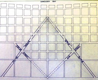
At the blog Masonic Traveler, the eponymous author makes a case, convincing, if brief, for just such a place, but no place so big or fashionable as the capital city … it's Sandusky, Ohio:
I found the city of Sandusky, Ohio, where the original grid planner, a Master Mason named Hector Kilbourne, built the biggest symbol of freemasonry right into the cities layout. Kilbourne also happened to be the first Worshipful Master of the Sandusky Masonic Lodge.
The original layout of the city's plan certainly seems to bear him out here (included from that blog for purposes of illustration):


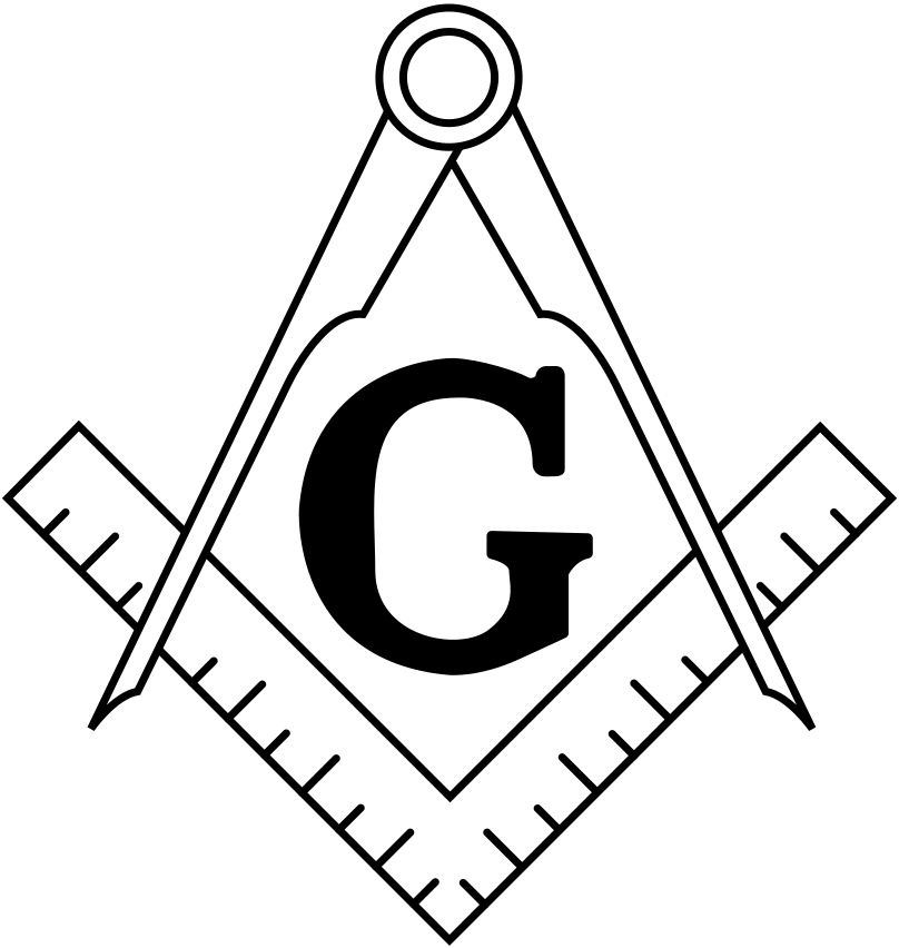
Compare with that most culturally-recognizable of Masonic emblems, the compass-and-square logo:


It would seem as good an explanation as any.  I personally don't see any problem with baking a symbol like that into the design of a town - it makes an interesting frame to create a community around, what with its diagonal streets, triangular blocks, and interesting intersections forming possibilities for public squares and quirky parks.

Of course it depends on the symbol. If I saw a town based on a Nazi-esque approach to the swastika, I'd likely recommend quick and thorough urban renewal, were my opinion to be asked.

On to a another interesting find, ever notice how, sometimes, something sticks out and seduces you into wondering why. Josh Jackson, the author of a blog post at LOST magazine, tells us about his personal, human experience with such a thing:
Last fall, I was walking through Prospect Heights, Brooklyn, when a residence caught my eye. The building was a fairly standard one — a classic three-story brownstone built, in this case, from brick. Rather, what caught my eye was its position: it was rotated about 60 degrees from the rest of the street grid. Buildings don't build themselves, and whoever built this one located it the way they did for a reason. Especially in brownstone Brooklyn, where row houses are the dominant architectural feature, buildings usually face the street.In this case, either someone decided to build it differently or the street it once faced no longer existed.
The buildings he mentioned are near the intersection of Prospect Place and Underhill Avenue, in Brooklyn, NY. The buildings he mentioned do rather stick out like the proverbial sore thumb in a view from the air (courtesy Google Maps)…


Just as interesting to me is the way the wall, and one would imagine through inference, property line, of the building to the immediate right (east) and the lot east of that, coincide exactly with the canted buildings along Prospect Place. That diagonal street at the right-hand edge of the picture is Brooklyn's Washington Avenue, and we do immediately notice that the angle of the buildings align more with this street than they do the streets they actually abut. 

Why? I mean, we can probably deduce there was some survey before that somehow governed the different buildings, but where the real interest comes is in exactly what those reasons, now obscured by centuries of development, must have been.

In the article linked in the pull quote above, Josh goes on a quest almost Holmsian in terms of deduction and certainly compelling in terms of interest.

It might be better termed Finding Flatbush Turnpike. But read it anyway. And marvel upon the things one finds when they try to figure out the exception to the rule.

In case you don't want to scroll back up, here's the links:
The Masonic Traveler's article on Sandusky OH is at http://masonictraveler.blogspot.com/2006/10/coincidences-and-tangents-sandusky.html.
Josh Jackson's LOST Magazine article is at: http://www.lostmag.com/issue14/prospect.php.

Happy hunting.