Showing posts with label transit graphic design. Show all posts

18 March 2017

[logo] A New Logo And Type Look for Salem's Transit

3466.
I follow the news with the mass transit agency serving the greater Salem area, Cherriots. Mostly it's in the 'how much of it they got' department; having grown up in the Salem area, it was my ride around town for a great deal of my high school experience. It connected me with high-school and a good many things around my erstwhile and doughty home town, and it seemed to be more vulnerable to the vicissitudes of funding than the other two major systems I was then familiar with, the Lane Transit District and TriMet, whose service I always envied because in Eugene and Portland the buses ran later and they had transit on Sundays. I survived hour-long waits on Saturdays, buses that quit running around 7 PM, and at least one major service cutback (during the late 70s the service, which was then a function of the City of Salem, was curtailed back to within the city limits only, where formerly it had gone just beyond. We Salem fringers living along Lancaster Driver and in the Four Corners area missed it mightily until the Hamman jitneys came along, but that's all a story for another time).

Then Salem-Keizer Transit established its district, service returned to the Salem urban fringe, and I left town to see the greater world, in more or less that order. Latterly, Cherriots has had to cut Saturday service because revenue but has been extremely clever in using what they had to best effect, constantly rethinking service and how to deliver it. It's been an impressive story so far, and if Salem-Keizer Transit ever gets the funding I think they deserve, with the agency's creativity, Salem could someday have world-class mass transit for a city its size.

Since the 80s, the agency has had an informally-styled script logo with a visual pun on the name, which looked like this:


The o being styled into an abstract cherry and the name itself are all puns on a somewhat forgotten-by-now nickname for the capital, the Cherry City, Salem's cherry orchards once having been a great draw to the area in the spring. The Oregon Statesman and, for a short time, its successor, the Statesman-Journal, published suggested driving tour routes when those trees were in bloom.

Slowly infiltrating the agency's public presence and by now its printed and PDF collateral, has been this new look:


Featuring a hip, bold sans-serif font with some weight to it (which reminds me of the font used by C-Tran in Vancouver), the logo expresses a very mission-driven agency which is visualized by the sweeping curves both concentric on and emanating from the enlarged initial capital, which quite obviously evoke a high-speed highway.

The brand has been simplified; gone is the tagline Salem-Keizer Transit, it's simply CHERRIOTS now, and the simplicity combined with the sturdy, bold type gives a real visual strength and presence. The sweeping abstract highway provides dynamic tension in the way it emerges from above the C and in the way it ends on a cut-off angle. Gone also is the bright dash of red filling an o stylized into a cherry, a feature of the system's logo since its inception.

The brand is also going region-wide. Up until now, the division of Cherriots that provided rural transit service to Marion and Polk counties has been known as CARTS, an initialism that stood for Chemeketa Area Regional Transit System, whose logo wasn't much to speak of. CARTS is being rebranded as Cherriots Regional and being brought under the brand's banner.

The new graphic look hasn't emerged on the website but it appears to be on all digital and PDF collateral, including service advisory graphics as well as schedules, and presumably printed matter as well.


Bottom line here for me is that this is a fairly cool, modern look for a transit agency that hasn't changed much graphically in long time and stands comfortably alongside the other major transit agencies in the Willamette Valley; it's a refined, poised, and serious presence. As I read the current news about Cherriots, I get the impression that they are, at least in spirit, trying to lay the foundation for a fully-grown up transit system to serve Salem, maybe one that will at last have buses on Sunday. The logo fits an agency who is trying to level itself up into the next-generation system for Oregon's state capital city.

Those who liked the splash of red in a stylize cherry will have to make their own peace with that.

16 September 2016

[pdx] TriMet's Graphic Design Throwback T-Shirts

3365.
This in over the transom:


It will be recalled that, from the mid-70s,
for about three decades, TriMet made navigating its innumerable routes a bit easier by slicing the Portland area into seven color-and-symbol-coded service sectors: Red Fish (NW and N), Purple Raindrop (NE), Blue Snowflake (NE and E), Brown Beaver (E and SE), Green Leaf (SE and SW), Yellow Rose (SW) and Red Deer (NW and SW). The Brown Beaver can be seen below and to the left in larger size; the simple design of the icons meant that if you going to a certain part of town, all you had to do was find the right color/symbol to guide you to the right handful of routes. I loved this system. It had a flair and a certain Portlandesque panache that was hard to put into words.

Well, times change and so did TriMet; by the middle of the aughts, the system was beginning to evolve away from the hub-and-spoke rationale which made pie-sliced sectors a natural thing, and the multiplicity of rail lines moving through the Portland Transit Mall called for a re-think and a different approach, which works a bit better today if it's a rather characterless.

For those of you (such as me) who fondly remember the old system and don't agree that it was dated, there is a way to fondly remember to others: Throwback gear from TriMet. The seven classic sector symbols are available on t-shirts (such as the one pictured at right) and caps: shirts run in the $16.99 range an the caps run a bit less.

The address for the shirts is http://www.cafepress.com/trimet/10216648, then just select a symbol, shirt or cap, and proceed to check out.

The TriMet gear front page, which includes more than just throwback shirts, is at http://www.cafepress.com/trimet.

30 June 2015

[logo] Have You Seen The New Portland Streetcar Logo?

3201.
I noticed this one a few weeks back. The Portland Streetcar, enjoying expansion to the east side and the prospect of actually closing a loop once the Tilikum Crossing is finally open, has a new look for its logo. Before, it look thusly:


The old look, with the city silhouette and the crossing tracks, is still on the stop's signs. It's a nice logo, pretty basic, rather flat. Gets the job done, though.

But then I saw this, now appearing on the streetcars themselves, though not at the stops yet:


Kind of nifty, no? There's more thought and deliberation with the type, which has an echo of Underground and Gill Sans. The logo has, rather refreshingly, avoided the driver to have something obviously Portland-esque in it, and has gone for a total abstraction. It reminded me of something more than a clever opened-circle and an abstract S. Not that I wasn't enjoying the suggestion of tracks effectively communicated by the break in the S-form.

And then I thought of the German S-bahn, and it's standard S-in-a-circle logo, which you'll see right here. The S-bahn is comparable in service to the Portland Streetcar; the Stadtschnellbahn provides more local and street level, perhaps you'd say 'tram' (in the European street-train sense rather than the American gondola-hanging-from-a-great-height sense) level service … much like the Portland Streetcar, which connects with its community in much more intimate way than the MAX, meant to pick you up here and get you out there, does.

A variation on the S-bahn logo, or the S-bahn logo being in inspiration? Sure. Why not?

We find the Portland Streetcar logo upgrade worthy. 

16 April 2014

[pdx] Tri Met Bridge, We Christen Thee … Tilikum Crossing

3060.
… and that's the new name.

The word Tilikum (or Tillicum or, if you want to be really correct about it, TilixƏm) is from the Chinuk Wawa, the inter-tribal trade argot spoken by the people of Cascadia before us white folks got here, and, for a time, by many of the white people who got here. Elements of this jargon are still with us today, as I've pointed out before: if you look up the high mucketymuck or if you buy anything from this surf sports company or wondered about the sasquatch, you're speaking Chinuk, pilgrim. A skookum thing, to be sure.

From the TriMet email
Tilikum, which is the closest we can come in the 26-character common Latinate alphabet to writing the word, is a work in the Wawa meaning person or people or family, depending on the context. It survives, perhaps in a deplacé way, as the name of a neighborhood bar in Beaverton along the BHH; the name is rather appropriate, since the greater family in these modern times still, in this area of the world, is as likely to meet in an Oregon dive bar as anyplace else, perhaps, from my experience, more so.

The use of the stereotypical Indian war bonnet seems awkward but I am, at best, an armchair historian. I'll leave the more thoroughgoing analysis to those who put the word anal in analysis. 


Chinuk Wawa shorthand system
date unclear. Based on Duployan
shorthand. Source.
The name entire seems to read Tilikum Crossing: Bridge of the People. The ultimate clause of that sentence can be seen as a translation, and also a tagline, which makes it sound somewhat more appropriate to an adventure movie poster. It's not my choice, nor is it the preference of many others; many of us, including me, hoped it would be named for Kirk Reeves … indeed, it was the popular choice, as The Oregonian's Joseph Rose reported. In his missive to us in the proletariat, sent under the aegis of TriMet, historian Chet Orloff says:
But ok, I know some of you are disappointed and may be thinking of the new name in terms of winning and losing. However, please be reminded the process was not a competition or popularity contest. It was not about lobbying and who has the most clout.
The naming process was very deliberate. Our committee of 10 citizens asked fellow citizens (you) for input -- first, to provide possible names then, second, to comment on the four most meaningful names the committee believed best met the criteria we had established early in the process.  
The criteria (which can be seen in this TriMet blog posting by Mary Fetsch) were, of nature, subjective (history being what it is, I can't really see how it could be anything but), and can, I think it not untoward to point out, argue for anyone's case as it can be against. I know more than a few people who were holding out for Abigail Scott Duniway, whose name also would have been most worthy.

But it is what it is; if there's any salve to the fact that a name was chosen that I may or may not agree with it is that the search and decision was apparently done in good faith – the committee came up with a set of criteria and have appeared to stick to it as close as they could possibly do.

In that, Tilikum Crossing, in that it is a 'bridge of the people' (certainly any gorgeous cable-stayed bridge in the Transit Capital of the World that carries only foot, rail, and bike traffic and no cars reflects an ideal a lot of us Portlanders hope for) is a goodly name, and one I can make a certain sort of peace with.

The version TilixƏm needs some explaining perhaps: See this Soylent News™ article, also by The Rose, which explains the notation. Sadly, he does not call the upside-down e what it is, which is the schwa, but the article is a solid one nevertheless.

04 May 2009

Mind The Gap

2051.My current obsession with TriMet Maps (and cosmopolitan transit map styling)(and ideas for map pastiches and parodies I've been mulling)(sorry about all the parens) invariably led me to the world-famous London Tube Map. You can get a look at the whole magila here (Transport for London guards the copyright with the ferocity of a lion, an ire I wish not to arouse ... the illustration right is sized really teeny, for illustration-y purposes). It's not only much loved and much imitated, it lends itself to a great deal of ... well, pastiche and parody.
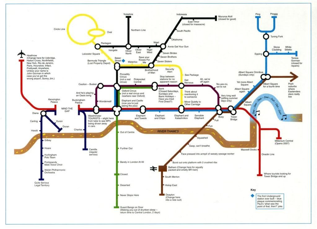
By far the funnies one is a very simplfied map loaded with Brit-funnay that I understand only because of a steady multi-year diet of Britcoms (and a wife who's an Anglophile). It was orginally published in a BBC book called Have I Got 1997 For You, and I've found it displayed in quite a few places on the web. It's too good not to share, so I'll post the version I found on Craphound.com, and hopefully the copyright holders will view my disregard for the common weal with equanimity (click to embiggen):


Some of the things I don't quite get (such as the reference to John Gorman) but most of the stuff I do get, as I said, a steady diet of Britcoms over the past never-you-mind-how-many years have paid off.

Technorati Tags: , , , ,

01 May 2009

The Evolution Of The TriMet MAX Map 4: Say Hi To Yellow

2050.Now we move up to 2004 in our series about the MAX Map, because between 2000 and 2004 several changes obtained, culminating in the quantum leap of the debut of a new branch to the network – The MAX Yellow line, for the Interstate Avenue corridor, nicknamed "IMAX" by some wags during construction.

The MAX System now has two dendritic branches rather than just one, and the design could have kept the old theme, but my guess is someone along the line found it too sprawling and probably was a stone pain to do layout around. So, treating the original Blue line as the system backbone (as indeed it seems) and the newer lines as subordinate branches:


You can clicky the map above to embiggen, or go here (while TriMet still supports it) to see the map even better and get a PDF copy.

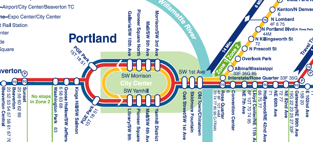
This is the acme, so far, of geographical simplification and abstraction. The Yamhill-Morrison downtown axis has become the center of the system, remarkably so, and the system has been laid out along a single backbone line, even to the extent of mapping the SW 1st Avenue and Steel Bridge sections completely out-of-line with reality.

But the genius of this style of mapping is that it works, and works well. Think again about the London Underground map and consider. If you get on the MAX, according to the diagram, at Yamhill District, and go three stops, you're at the Rose Quarter TC. It matters not at all that after the Yamhill District station the system hangs a ninety-degree left onto SW 1st or that it makes a somehwat-complicated dogleg over the Steel Bridge and into the Rose Quarter. The map and diagram works and delivers you exactly where you think you should go.

The time stripes along the line give you good information as to how long you expect to be on the train. And your eyes will provide you with the rest of the information (I've lived in Portland for most of my life but I can't stop looking at my town. If the mere sight of Portland doesn't nourish you I say its time for your to find another town, to be blunt).

The following image zooms in to the vital enter, and shows the maturing of several cosmopolitan design elements:


Clicky on the image above to embiggen. The big point, and my hobbyhorse thus far, is the use of the cartouche-like ovals for stations that serve more than one line. If you look at the Rose Quarter stop, you can see why this works. The Yellow Line stop is a circle which is physically adjacent to the Red and Blue Line oval. This indicates while they are physically close, you have to be at one or the other to get a certain line. That's a big story told very effectively by only two well-chosen and placed symbols.

Amongst the other changes reflected in the map is the extension of the Fareless Square area by a "panhandle" encompassing the Lloyd district (hard to see in this map because the Red/Blue/Yellow lines in that area are so typographically busy, but I don't see how the designer had any choice there really – sometimes the best graphic solution isn't exactly ideal) and the extension of the Red Line, for Airport service, to the Beaverton Transit Center.

One other interesting point is the PGE Park station. In this (and the map before), the station serving "The Piggy" has been diagrammed as two stations. And, while the station itself can be thought of as a single system access point, in reality, the eastbound and westbound boarding platforms are separated by about half a block, making them physically separate, and though they are very close physically, they couldn't be more separated by intent, so the wide separation of east and west bound PGE stations are quite appropriate.

The next evolutions, by the present day (2009) saw the addition of not one but two lines: The Green Line (serving a new route up and down The Portland Mall, Gateway, and the I-205 corridor to Clackamas) and WES-which turns TriMet's rail approach into multi-modal thing, and creates a truly exciting approach (well, I sure as hell like it!).

About more which presently.

Technorati Tags: , , , , , ,

TriMet Map Cover Designs: 1997, 1998, 1999

2049.Picking up a series I've dropped for a few entries, here's the continuation of the TriMet covers series. This time, we look at 1997, 1998, and 1999.


The design sense is starting to be very dialled back now. The 1997 cover seems inspired by the 1996 cover, it uses the same type and has the same color-block-and-dotted-line theme. The photo of MAX at the Civic Stadium (I don't think it was "The Piggy" quite yet) is similarly monchromatic and screened back just a little.

The 1997 Book, which I don't have to hand right now, was a different animal altogether. The format of the TriMet Schedule books have tended to resemble a paperback novel, about the same size, with newsprint pages and a cardstock cover. For this year, it was a newsprint pamphlet, about the size of a small magazine.

Being entirely newsprint and larger, it was simpler to get more than one schedule grid on a page, meaning instead of Weekday/Saturday/Sun-Holiday sections, each route had all three schedules (as appropriate) grouped under route number.

It sounds as though it was a great idea, and on paper it looks good, but in practice is was not a success. The biggest problem was durability. If you bought a Transportation Guide and Map it was something that was liable to go many places (if you were a heavy transit user) and could be stuffed in a backpack, and back pocket, a purse, or what-have-you. The smaller format also held up very well under the uses it would have gotten (I knew someone who drilled a hole through one corner and hung it up by a string by the phone, like a small-town phone book). A Guide that was wholly newsprint just didn't stand up, and the larger format was awkward, to say the least.

The preceding was my assumption, but I must be getting some of it right ... the old Guide format returned the very next year, 1998.

As far as 1998 and 1999, the design ideas, which went from restrained to raucous, went straight to restraint and stayed there. "Slice-of-transit-life" photos, friendly and quaint, formed the centerpiece of the design, and minimal type and graphic adventurism. The trend toward a new typeface is also confirmed, as the same type had graced the design since approximately 1996.

Technorati Tags: , , , , ,

23 April 2009

TriMet's Iconic Past: Service Sector Symbols

2042.In the last entry, I mentioned something about TriMet Service Sectors. That brought that though to the fore, and I decided I wanted to obsess on that for just a posting.

One of the things I was a big fan of, and that I was sorry to see go, was the idea of color-and-symbol coded service areas. I don't remember when this was inagurated – I think it goes back to the 1970s, when the Transit Mall (known on maps as The Portland Mall) was originally constructed.

It was a great and playful way of organizing a district of hundreds of square miles and about one hundred routes, both regular service and rush hour service, into big chunks making it really unnecessary to know a priori where a route was to find its terminals on the Mall.

Like a big, crazy pie, with all slices converging on downtown Portland, the greater Portland Area was divided into seven sectors, with a corresponding color/symbol icon – each symbol reflecting on the Portland area's connection with nature.


The sectors worked out thusly, from the NW and going clockwise, between loosely-defined boundaries:

The Red Fish sector covered NW and N Portland, from approximately the crest of Forest Park east to a line more or less alone Martin Luther King Jr. Blvd/Union Avenue. Locations in this area included Saint Johns, the Portsmouth area and the North Portland Peninsula, the trendy Northwest district, the and the Northwest industrial district.

The Purple Raindrop (no, not "Purple Rain", no joy for Prince fans here) covered an arc from approximately Martin Luther King Jr Blvd to a line more or less parallel to and a little south of Northeast Sandy Blvd. Destinations in this area included Portland International Airport, Parkrose, Hollywood, Woodlawn, the golf courses along Columbia Boulevard, Rocky Butte, and classier Northeast areas such as Irvington and Alameda.

The Blue Snowflake had at its northern boundary that aforementioned line south of Sandy and swept down to a line more or less between Burnside and Southeast Stark Street. East of what would eventually be I-205, the area covered everything from Burnside/Stark up to the Columbia River, all the way out to Gresham. With the advent of MAX service and the establishment of a full-service Transit Center at Gateway, all Blue Snowflake routes terminated there and were removed from thier Mall stops, those stops becoming local service/Union Station service.

The Brown Beaver sector served in the main the working-class SE part of Portland, specifically that part south of the Burnside/Stark corridor and east of the Sellwood/Moreland area, extending also all the way out to Gresham; essentially any route that was going to SE but wasn't eventually bound for Milwaukie and points south.

Like the Red Fish, The Green Leaf sector covered an area on both sides of the Willamette River, serving Johns Landing, Sellwood, the eastern 2/3rds of Lake Oswego, Milwaukie, the suburban corridor along McLoughlin Blvd including Jennings Lodge, Oak Grove, River Road and such, and also such SW desinations as Tualatin and Wilsonville. If you wanted to go to Marylhurst College or Canby, you boarded a Green Leaf route.

The Yellow Rose took in the neighborhoods of inner and outer SW Portland, such as Hillsdale, Multnomah Village, Garden Home, the Vermont Street area, the Washington Square Mall, PCC Sylvania and Lewis and Clark College, and outlying communities like King City, Tigard, and Sherwood. It also served suburban SW areas that lay, generally speaking, south of Scholls Ferry Road.

To complete the circle, the Orange Deer sector took in everything from about Scholls Ferry Road north to the Tualatin Mountains (Forest Park). Everything along the TV Hwy/Canyon Road corridor and the Sunset Hwy was in this district. This took in Beaverton, Cedar Hills, Cedar Mill, the Cornell Road corridor, Bethany, Tanasbourne, Aloha, Hillsboro, and Forest Grove. If you were bussing it to the Zoo or OMSI (when it was up on the hill), you took the 63-Washington Park, from the Orange Deer shelters.

The system changed from time to time. As mentioned, when the MAX corridor was developed, the Gateway Transit center became the Blue Snowflake terminal, and that stop was removed from Mall shelters. But in its heyday, the Portland Mall had four of each stop down Southwest Fifth and Sixth Avenues:

Shelters on Southwest Fifth had terminals for Brown Beaver, Green Leaf, Yellow Rose, and Orange Deer sectors, or those routes going south and east or south and west;

Shelters on Southwest Sixth had terminals for Purple Raindrop, Blue Snowflake, and Red Fish sectors, or those routes going north and east or north and west. There were still two terminals to the block, and the unused terminal was used for local stops and buses going to Union Station. After Blue Snowflake left the Mall, those stops were also used for Mall arrivals only.

Sometime between 2000 and 2002, the sector symbol icons were gradually phased out, sadly. I say sadly because I thought they were chaming and not quite as dated as whoever updated the TriMet look thought they were. They also gave a level of usefulness and intitutiveness to the system that I don't quite find with the current system's graphic treatment. They were so interesting that, for a time, each in its own way, Salem and Eugene's transit systems implemented thier own color/area codeing, Eugene's LTD actually going as far as creating thier own color/icon match (my favorite was the Purple Rhododendron).

TriMet may have moved on from this, but I still fondly remember it ... and miss it a bit. It was fun and creative ... quintessentially Portland.

Technorati Tags: , , , ,

22 April 2009

TriMet Map Cover Designs: 1995, 1996

2041.Now we move up to the years '95 and '96. Here they are:


The designs from these years are very different in style and mood.

The 1995 map is very businesslike and celebrates the most charming feature of the TriMet graphic oeurve from prior to 2001; the TriMet Sector Symbols. I'm saving the meat of that idea for another article, but the idea is that, like a pie, the landscape was divided into seven radial segments, all pointing toward The Portland Mall, going, from the north clockwise: Purple Raindrops, Blue Snowflake, Brown Beaver, Green Leaf, Yellow Rose, Orange Deer, Red Fish. The sector lines were grouped into their respective shelters along Fifth And Sixth Avenues on the transit mall, and the lines serving each shelter along with the sector symbol could be clearly seen on illuminated signage that was visible from at least a half block away.

The genius of this system can hardly be overstated. If you're unfamiliar with the system, all you need remember is the color and symbol of the route that brought you in, look for the sign, and you're halfway there. If you do know the system and you just want to be "in the moment", just look for the sign. The simple shapes were charming and the colors were interesting.

The 1996 design doesn't invite too much commentary, and that's a statement on the strength and appropriateness of its look. There is no overestimating what appropriately-chosen type, a screened-back monochrome approach, and simple graphic elements can do. This design is niether too much nor too little, but it's just right.

Technorati Tags: , , , ,

20 April 2009

The Evolution Of The TriMet MAX Map 3: Along The Red Line

2036.2001 was the first year of a new Century, the first year of a new age, and the first year that Portland had a light rail system that had, effectively, two lines.

The Airport MAX line opened then, and proved immediately as popular as the rest of the system. Arrivals at PDX were treated to light rail service right at the terminal doorstep.

Airport MAX began as a service from PDX going only as far as downtown. Along the way, perhaps with the prospect of future service expansions in mind, TriMet hit upon a color scheme: the main east and west line of MAX, Hillsboro to Gresham, was to be dubbed the Blue line; the downtown to Airport route, the Red line. Here's what one of the first maps looked like:


Click on the map to embiggen. The abstractization of Portland continues. With the necessity to express the physical reality of one station serving two lines, a level of sophistication occurrs; the stops, which are circles on the lines, expand into cartouche-like ovals where they have to span the two lines. See the following illustration dragging and panning in the Picasa Web Album picture browser is too much of a hassle (It's not exactly intutive, is it?):


Each station serving both lines is taken as a given, but the oval station markers is a rather urbane touch, and echoes the station icons seen on such worldly maps as the New York Subway maps and the London Underground. Amenities are shown by icons which would be familiar to any world traveller. The ends of the lines are tied down by large colored dots. Fare zones are gradated boxes.

Later this service was expanded westward to the Beaverton Transit Center, and maps evenually started featuring bars labelled with travel times between stations and along major sections. The station labels at a 45 degree angle also contribute to the sophisticated feel of the map. Though largely a schematic, in greater ways this still has some fidelity with the geography, at least in as much as the branch along 1st Avenue downtown parallels the river and turns right to cross it.

This abstraction was to become even more prominent in the next map, which will be posted soon.

PS: A couple commenters in a previous entry noted that David Bragdon, current METRO Council President, may or may not have had something to do with getting the TriMet Map and Guide series started. I'm going to get an email winging his way and see what he has to say about that (I ought to be able to find an email contact for him on the METRO web page, I should think)

Technorati Tags: , , , ,

TriMet Map Cover Designs: 1993, 1994

2035.We move on to the next two TriMet Map cover designs, this time: 1993 and 1994.

While MAX is still a big hit with the transit fans, it has become part of the landscape. It's now being incorporated in as just another part of one of America's most celebrated transit systems. The designs change to suit.


The 1993 design is a cheery, blocky, fun thing full of primary color and active play. Everything you might use to get round the town is included as part of a great palette of transportation options: bus, bike, light rail, the personal car has a place still, car/vanpooling, and your own two feet can serve to get you about this metro-area-on-a-human-scale.

The 1993 design is joyous and inviting. It reminds one of child's play blocks or a pleasant day spent at preschool. Portland's fun ... and TriMet can be a part of that!

The 1994 edition really dials back and goes for restraint. My guess is that badge down in the lower left: a bit of dignity, please, as we celebrate our 25th Anniversary of The Nation's Best Transit System. I sincerely enjoy the restrained color palette, the violet suggesting a sort of luxury and "having arrived", and the screened-back logos forming a sort of tessellated pattern that wouldn't look half-bad as a wallpaper (on your screen or on your wall).

Technorati Tags: , , , , ,

17 April 2009

The Evolution Of The TriMet MAX Map 2: MAE West

2034.Through the middle of the 1990s planning and construction activity actively worked to extend MAX west from its origin to serve Washington County.

Noting that, properly, the initialism was MAE, rather than MAX, a certain wag during the time (it was in Jonathan Nicholas' Oregonian column, if I recall correctly) opined that it should be called MAE West.

Ahh, lost opportunity.

Anyway, after a couple of years work by Bore-Regard and furious track laying to downtown Hillsboro, what we called at the time Westside MAX opened in 1997-1998. Mapping such an extended line to fit within the confines of the typically small paper publications TriMet produced for customer edification required a different approach. A map at the proper proportion, given the meanderings and the spacings between stations, would be difficult if not impossible to straitjacket to within the confines of a pocket schedule. Abstraction was called for ... and what abstraction (clicky to embiggen, or better, go to the Picasa Web album page for this one and use the zoom tool to get a real good look):


The simplification took no prisoners. The meandering route has been straightened, all stations sit in nice intervals, all spaced out evenly, happily. The only concession to scale is in the interval between the Washington Park station and the Goose Hollow/SW Jefferson station.

This is reducing something to its schematic parts and making it work. For instance, as is well known, the distance between the Washington Park station and the Sunset TC station is no short walk. However, on this line, it's enough to show that one follows the other directly to see that it works and works well for the application.

The only concessions to geographic awareness is the North arrow and the position of the Willamette River, and the quadrilateral in the middle which approximates Fareless Square. The line parallels the river before turning sharply to cross it, which, in this simplified way, is as it should be.

Since there was still, effectively, only one line, there were no colored stripes. That was to come later, with the debut of Airport MAX ... to be known as the Red Line.

But I get ahead of myself. Next time.

Technorati Tags: , , , , ,

TriMet Map Cover Designs: 1991, 1992

2033.From 1988 through 1992, we didn't live in Portland but rather Corvallis. We therefore were not able to get a TriMet Guide for every year, though I was able to obtain a couple when visiting up here in PDX.


The Tri-Met Map had adoped a different approach to layout, as far as the cover fold went; a bit of type that matched the type style on the cover, but no cover art as such. The title panel became more of a place to house the title art, cartouche-style; when it was folded, you could see that it was, in fact, the map, but no cover art was transfered into the design from the cover of the schedule book.

The maps themselves didn't change too much. The style of the maps themselves will be the subject of another series of posts, though.

Technorati Tags: , , , , ,

14 January 2009

Yamhill County Transportation Area: A Logo Expressing Service

1913.Yamhill County (a place whose name has nothing to do with either yams or hills) is a charming place; small towns, wide agricultural spaces, the legendary bottleneck/speed trap at Dundee, and capital of the State of Pinot Noir.

But it's growing up. Population estimates put the number of inhabitants near 100,000; the county seat, McMinnville, has recently notched a population of 30,000.

Yamhill County, though, no matter where you go in it (it fairly sprawls for a small county; from the Grande Ronde area of the Coast Range to the right bank of the Willamette) seems one community. So it stands to reason that the most effective way to serve it in many ways is on the country level, and it's that level from which the transit system has sprung.

You might be surprised to learn that Yamhill County has fixed-route regular daily city bus service. Actually, it's had it for a while, courtesy of Yamhill Community Action Partnership and senior service organizations, first as Dial-a-Ride service, then as minimal fixed-route service (anyone with knowledge is welcome to correct me on this; I'm working on recollection here). But latterly it's expanded to three regular routes in McMinnville proper, with link routes connecting the outlying communities to not only McMinnville but also to TriMet and Salem's Cherriots. The city service in McMinnville is Monday-Friday on the half-hour from 6:30 am to 8:30 pm, which is no mean feat for a small town like "Mac". Newberg is served by what is called the "Town Flyer" route which connects to the 99W Link route.

Anyway, this is about the graphic look, and with the growing up of the transit service In Yamhill County comes a more polished, accomplished graphical appearance. And they have it.

The logo of the Yamhill County Transportation Area (YCTA) is deft in execution and meaning. The letter Y is incorprated into a symbol that appears to be highways merging, in an ever-appropriate green, but the totality of the symbol expresses a hand supporting a tray, in the manner of a butler or waiter/waitress.

How may we be of service to you, Yamhill County? A very effective use of symbolism, a deft execution.

The understated-yet-effective look continues into signage and tickets/passes (as pictured)

Whoever created the look knew what they were doing, had a firm grasp of the message they were trying to communicate, and knew their audience: a rural county where everyone's your neighbor. They keep it friendly and approachable.

(graphics nicked from the YCTA website, which is a well-designed bit of work. I encourage a visit; you can find it here: http://yctransitarea.org).

Technorati Tags: , , , , ,

Powered by ScribeFire.