1412. As vouchsafed in an entry just a couple down, me and some friends had a road trip down to an SCA branch in greater Sacramento CA (the Province of Golden Rivers). Now, having to make that trip tout suite as it were, there was little chance to get many street blade pictures, but I was able to get but three of the towns we flew through.
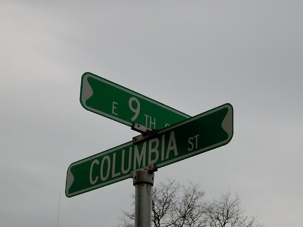
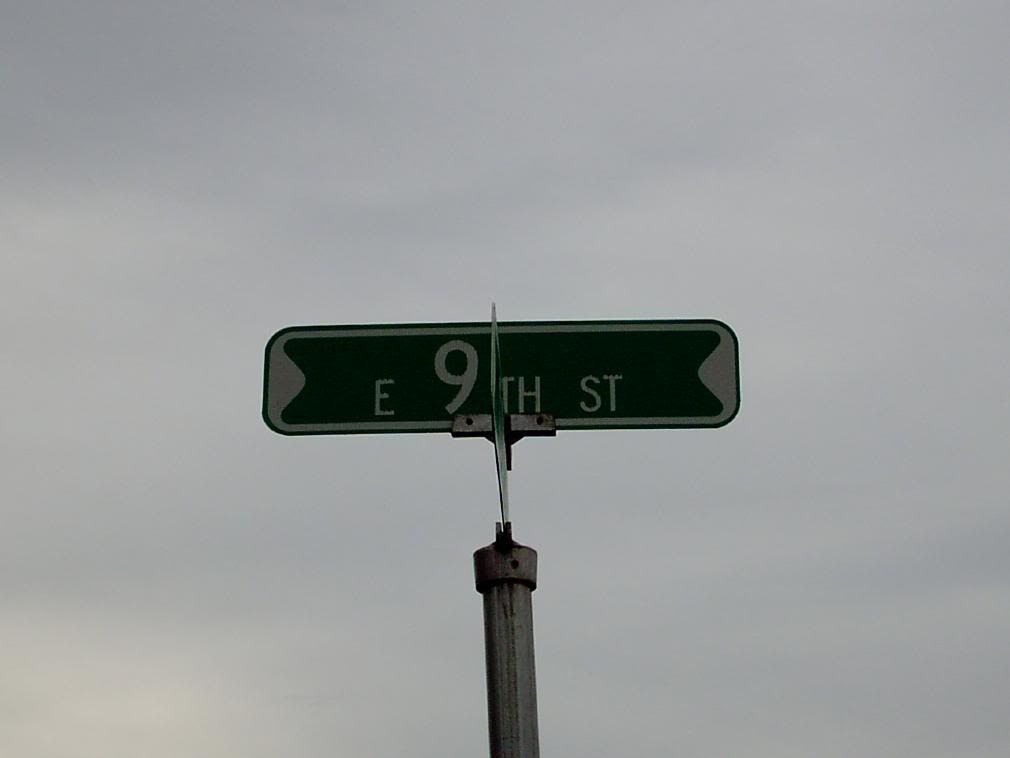
First stop was our own little Newberg, just down the road a bit. Newberg's signs echo a classic design:
The notable thing about it is of course the white border, with its rather peculiar thick "bumps" on the end. They are sheet, not extruded like Portlands, but there's no obvious reason why the white bumps on the border should be there.
I can go on naught but memory here, but there was a time when one style of blade that was available was ones that were stamped out of steel rather than having letters painted on or applied. The way they seemed to be put up was that there was two identical blades, one for each side of the sign, which were held in the middle by a clamp arrangement and riveted on the ends. The stamping allowed for the rivet by providing that expanded area on either end.
Newberg's street blades both are modern (and presumably easier to maintain) while actually remembering a classic design. This makes them rather cool. As far as information delivery, it's the standard way; different type sizes enforce a visual hierarchy which causes you to focus on the street name first, then the directional (if any) and the generic second (in towns the size of Newberg, if the sign doesn't read the way you expect it to, you aren't typically too far off from your real destination, and there ususally isn't a whole lot of street name duplication. About the only thing I'd change is to add a block number – but it's a pretty good production all around.
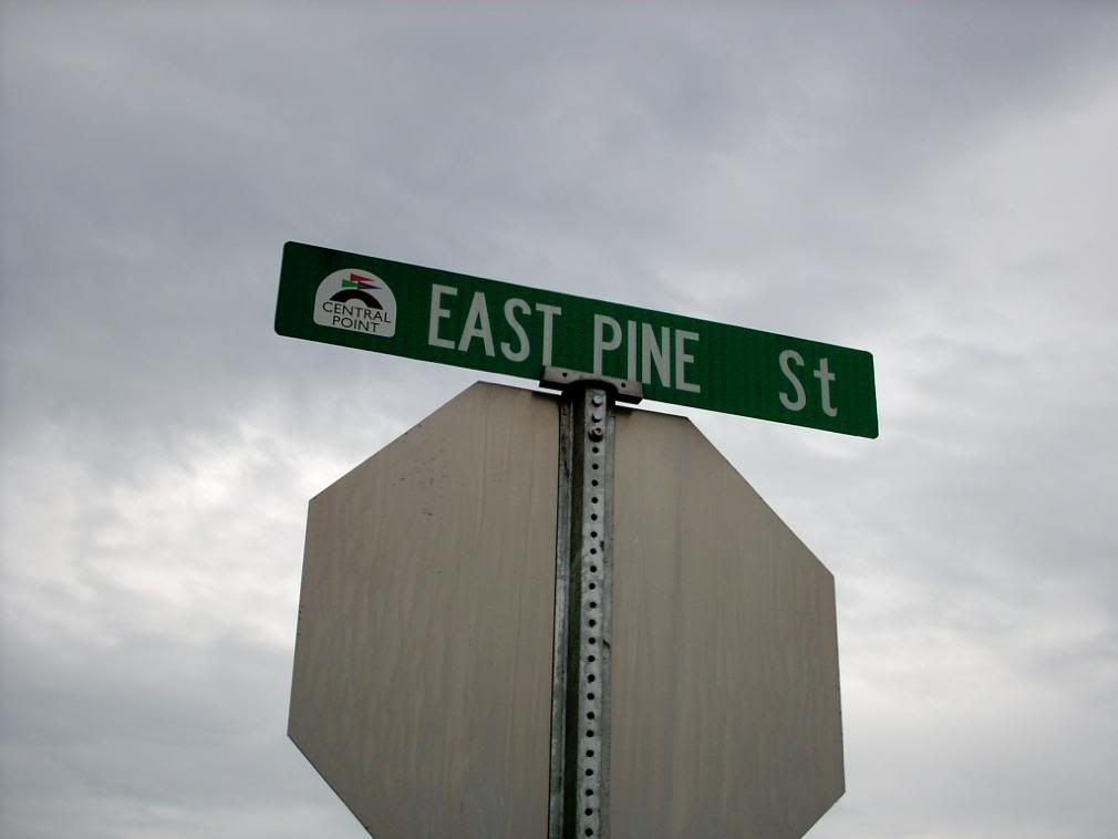
The next opportunity to get a street blade didn't come until little old Central Point, down by Medford. We stopped at the Sonic on East Pine Street, just within the city limits east of I-5, and there was a nice example of a sign at the stop sign post on the entry to the property:
Uniquely among street blades we've seen so far, the directional is spelled out rather than abbrevated. The other signs I saw while riding through Central Point showed a sort of hand crafting; the kerning wasn't uniform along the entire blade. For example with this particular one, it can be pretty obviously seen that the spacing between the words EAST and PINE and the spacing between PINE and St are widely different; it's as though someone started over as far to the left as the could and then conserved space just in case they ran out. Moreover, there's something awkward about the way the generic "St" is out there on the end, both in the way the letters sit on the baseline and the kerning between the two. Also, there's the mixed case of the generic, which creates a dissonance between it and the monocase of the directional and the specific.
I saw other examples in town that suggests that the sign glyphs are hand arranged. The most notable was one I was unable to get a picture of, but it was S. 4th St at E. Pine; the blade not only mixed case on the generic but also mixed case in the ordinal specific, reading SOUTH 4Th Street (the generic actually being spelled out).
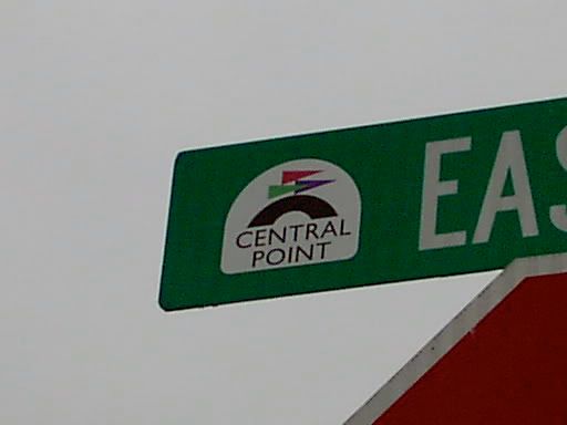
But a happy thing can be seen on the left end of the blade; Central Point has a very spiffy logo, and displays it on every sign, rather like Keizer does:
That's a detail I appreciate. I just enjoy it, is all. If you're not going to waste space on a block number, then at least make it visually interesting that way. I still wonder why they call it Central Point, though. The logo suggests a fair. Come to think, that is the location of the Jackson County Expo Center; but that still doesn't explain why they call it Central Point. Anyway.
This was the only opportunity for blades between Newberg and greater Sacramento; but once I got there in the daylight next day I was able to make up for it.
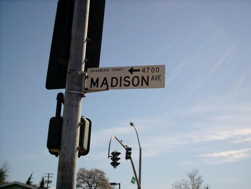
The area that we visited – which, to be exact, was a community called Carmichael, California – is in a suburban area of northeastern Sacramento, not in any city – unincorporated, in Sacramento Counry. The street blades there are mad informative. Here's a set:
Madison Avenue runs east from I-80 northeast of Sacramento; it seems to be a main route into that suburban area. The information is encoded with typical type-based hierarchy; a glance is all you need to know you're on the right street; the arrow lets you know what direction the addresses increase in, which is per se useful; if you have time to look, the block number is pretty easily determined.
The block number, in contrast to Portland's address tabs which detail the block the crossing-street defines, identifies the block face, that is, that number tells you you're looking down the 4700 block of Madison Avenue, not going into or coming from the 4700 block of the street you're on, which is defined by Madison (which is the way that they do it in Salem, for example).
The colors are black type on a white background, which enhances readability by providing for the highest, sharpest contrast.
But the most interesting detail is the legend "SACRAMENTO COUNTY" in the small type beginning in the upper left corner of the sign.
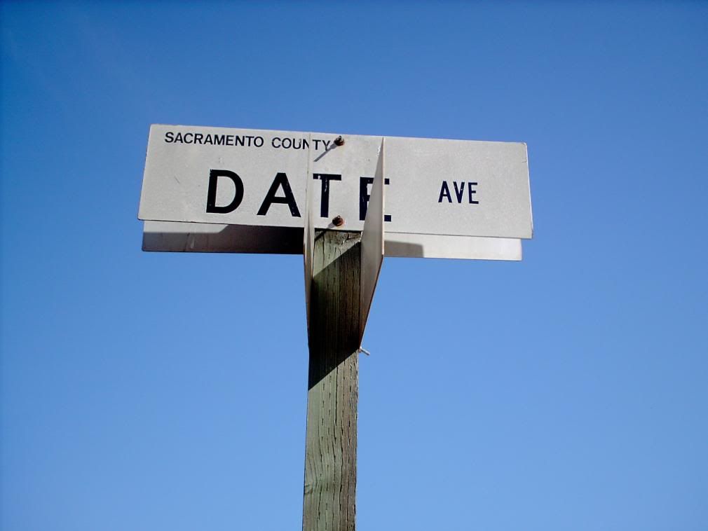
The hotel the conference was at was in the 5300 block of Date Avenue. This sign was at the entry to the property. The 5300 block of Date itself is a private road, however, so presumably Sacramento Country only saw fit to identify it as a continuation; the block-number here is absent.
Another thing that makes block number identification useful is granularity. For most places it's enough to simply identify the even hundred block, and this can be useful. But what if the street doesn't come down right on the surveyed block division, or if the streets are unevenly spaced but the addresses are surveyed as though they were? In simpler language, what if an address block is longer or shorter than a corner-to-corner block?
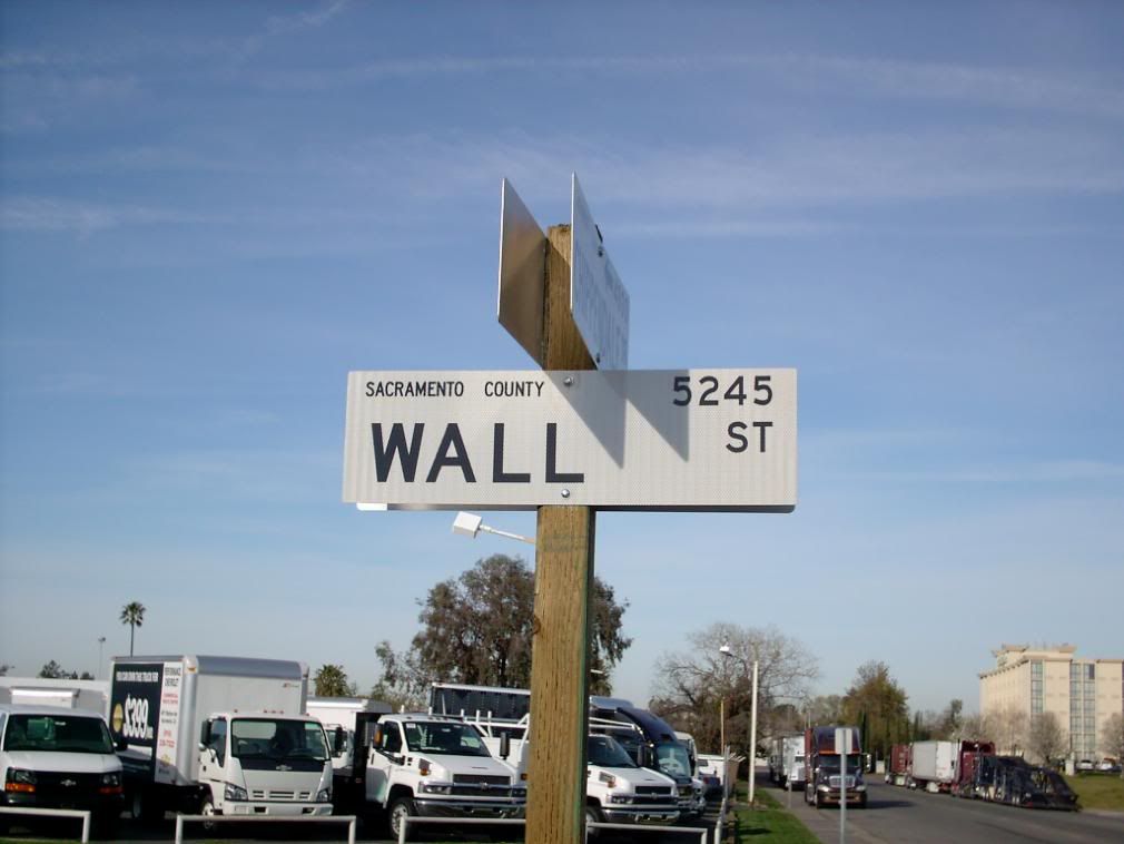
Here's the way Sacramento County solves the problem:
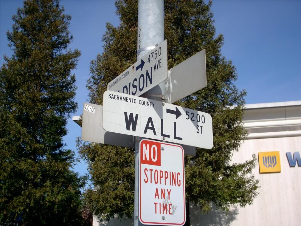
This street sign elides the arrow, but it's a t-intersection so its obvious what block face this sign addresses (see that tall tan building in the far right background? That was the Holiday Inn our conference was at, just saying). This is either going to be the highest or lowest address on this block of Wall Street. As it turns out, this is the high end of Wall Street ...
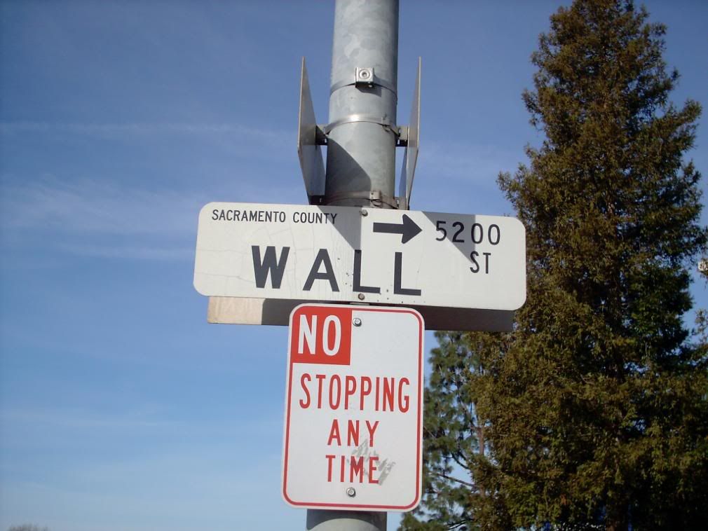
... and this, one block south of where I just was, is the low end of the block. The piece of Wall Street runs from 5200 to 5245 inclusive, which I just love to see. This is maximum street blade information.
Moving about 45 degrees clockwise for an angle view, we see the Sacramento County design in full effect, and find that we like what we see:
Max info here, and that's what we're all about here at ZehnKatzen Info Design Labs. If we gave star ratings on street blades, (which we might), we'd find that this would get 4.5-5 stars easily. We also note in passing that the Wall Street blade closest to us has rounded corners, but the rest of the blades square corners. An oversight we're sure.
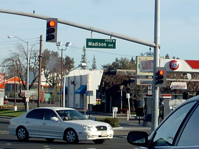
Before we conclude, it's fair to ask what does the traffic signal arm signage look like, if there is any. In Sacramento County, there are, and here's an example (on Manzanita Dr, northbound, about to turn to Madison westbound):
Nice and basic, quick to read and digest for the onrushing motorist. As one Californian we are fans of famously said, "Just the facts".
A while ago we appealed to anyone who might be reading thiese discourses that we were looking for more street blades. We still are. We further said that while we weren't averse to the weird or funny, but what we were really after was the ordinary. This is just the sort of thing we mean, Since we see design wherever we look, the principle of just what work that design does fascinates us, and we think that just examining the working parts of ordinary street blade design is a great deal of fun.
So if anyone out there finds this sort of stuff interesting and wants a critique, please send me some. I'll opine. And If I can get enough, maybe we will start a star rating system.
Tags: street blade gallery, street blades, carmichael ca, central point or, newberg or, information design
Powered by Qumana

No comments:
Post a Comment