19 April 2008

[logo_design] Logo Goodness: Tap Project, Seven Virtues Coffee

1496. A couple of cool logos lately have caught my eye, and I couldn't help but share.


A co-worker in The Salt Mines brought in a beguiling paper coffee cup. It's nothing that wouldn't look out of place anywhere in Portland; but I'd never seen the logo before. It was playful and clean, modern and intriguing; a place I'd not heard of before called Seven Virtues. I found out about it from a blog I just stumbled on called Portland Coffeehouse Journal, a blog which is such a damned neat idea that I'm adding it to the blogroll anyway.


Anyway! The logo was very playful and energetic but the energy was contained constructively. The swirls around the outside make for a sort of "pinball" effect that returns the eye to the highly neat abstract representation of the lotus flower in the middle. Using Futura (that type looks like Futura, anyway) adds a clean modern dash to the whole thing. This is a great logo, and I enjoy it muchly.


We'll try to visit it soon, and get a better read on the place. They have a website here; just hours and location. Looks funky and cool, for what that's worth.


What trying to find out about Seven Virtues got me, though, was here: The website for the Tap Project:


I could say this is a cool logo, but that would be redundant. Blue, the color of fresh water and simple but effective graphics add up to create an accessible presence that communicates almost without words (though the words that are chosen are chosen rather well. The whole approach speaks volumes about appropriate use of color, type and semiotic communications.


If this doesn't win an award somewhere, I'd be shocked.


Tags: , , , ,


Powered by Qumana


[bloggage, teh_funnay] Zrharc! Lives!

1495. Recent Entries:


Yes, Zrharc! It just won't go away. Don't Question It!


Tags: , , ,


Powered by Qumana


[liff, tunes] More For The Muxtape

1494. Added into heavy rotation at http://zehnkatzen.muxtape.com:


  1. Coplas Revisited, The Kingston Trio. Oh, I know you think you've heard "lost-in-translation" goof songs. This one's predecessor was thier grandaddy, and this one made the rest of them necessary. The jokes are dated and corny (a burst of Spanish-ishness is translated as "Please do not muddy the water around us (Porque?) Our group got 25% less cavities with clean water!") but the comic energy lives on. 99 Dead Baboons was just a facile pretender.

  2. Jennifer Warnes, I Know A Heartache When I See One. The only things we like here on Station "country-fried" is chicken and tenderized steak. This little gem, from before Warnes was a chart-busting movie-soundtrack powerhouse has that sweet country beat but really kicks it in the chorus, when that harp-like guitar plucking got under my skin and stayed there.

  3. Al Stewart, On The Border. From the album that made his name, Year Of The Cat, comes this minor hit. It never got the play I thought it deserved. It comes on like a quiet but insistent storm and is the most "poppy" of Stewart's deep, dense, literature-like music, with a short, almost anthem-like chorus and touching on themes of history and time that permeate his music.


Give it your ear.


Tags: ,


Powered by Qumana


18 April 2008

[liff] We'll Take Andromeda Strain Classic over New Andromeda Strain, KTHX.

1493. Here on Station we don't "do" pay TV. Lots of reasons. So when I heard that A&E were "remaking" the classic The Andromeda Strain, without a doubt rather one of the best SF movies to come out of the 1970s, I was actually quite excited, and had at least thought I might want to rent the inevitable DVD.


Well, I've been to the A&E site. I've seen the cast and some of the pictures, and you know, some things are better left alone ... and this looks like one of them.


The reason TAS remains a favorite with me are many: the "ordinaryish" stars; the trippy and otherworldly envrionment of the underground Wildfire bio lab; the combination of the technocratic hubristic attitude of Dr. Jeremy Stone (who, early on, showed off all the bells and whistles of Wildfire as though he were a kid that got to share his toy with his playmates), the curmudgeonliness of Dr Dutton, the irascibleness of Dr Leavitt, and the frat-boy/smooth operator/"dude, what?" attitude of Young Dr. Hall; the snottiness of the communications man in Delta 5; the scenes in the White House Situation Room (which had this air of LBJ about it)...


The original movie has a whole lot of "neato" to it, and a lot of spunk; this was done back when Crichton was still a Young Turk, and has a punch to it that none of his work does now, now that he's resting on his laurels with his brain obviously gone to puddin'.


But this one? Modern, slick, and more 'splodey than the original. All the stars are young, action-hero types; the men are cut and ripped, and the women look like it they haven't posed for FHM and Stuff, they will soon. The fellow playing the Major Manchek looks like he does more gym work than the rest of the crew combined.  Dr Dutton and Dr Leavitt wouldn't have been allowed within 15 miles of these characters. With hard looks, hard bodies, and hard attitudes, they seem plug-in and strictly stock.


The lab backgrounds – what I've seen – lack the style of the original Wildfire, which was actually more important than it might otherwise seem. The 1971 film's lab was all curves, calming colors, and austere – it looked more like a spaceship than an underground lab. The raised the set to the level of almost-a-character, as it seemed to stand it for a certain impression that Humanity could always solve a problem with enough technology, given the will and the time (a very 70s attitude) it was also gorgeous to look at, which gave the eye something to do during the movie's tedious parts (the 1971 flick was also straight ahead about how tedious doing science can sometimes be. Not so much asplosion). Instead, we have half-lit backgrounds of unremarkable windows, ordinary rooms, lab equipment backlit just enough. Meh.


Of course, I could be wrong. It might turn out that this new version is really punchy and interesting and has something to say. But in this era of reimagining the classics, both successful ones and failures, it would seem that the trend of reimagining might just have found its shark-jumping moment. As of now, I remain unimpressed.


The 1970s weren't the proudest popcult decade ever, but in this case, I'll take the 70s any day.


Tags: , , ,


Powered by Qumana


17 April 2008

[art, toons] Hereville Rocks Me


1492. I like art and literature that doesn't treat me like I'm a Grisham-reading sheep. Good art and literature should take your imagination out for a spin, make you rise to its level rather than dumb itself down to yours. I like stories I have to take on.


Right now, I'm fighting a battle with Thomas Pynchon's V. Right now, Pynchon's winning, but I digress (that's what you get from graduating from Salem Public Schools. The aversion to classics, I mean, not the digression; that's probably genetic).


Anyway, after displaying Ampersand's sketchbook page I noticed a link on Alas! to a place called Hereville, described modestly as maybe the best dragon-fighting Orthodox Jewish 11-year-old girl comic you'll read all day.


It's glorious, deep, clever, and intelligent; finally, a take on the hero's tale which doesn't look like it was cribbed straight outta G.I. Joseph Campbell. Mirka won me over from the start.


If you're comic cognosenci, you know about it already. I just have to go on record and say how much I like this work. It's nifty.


I can't afford to buy a copy, so I'm following it (it updates every Wednesday). If you can, buy it.


Tags: , , , , ,


Powered by Qumana


16 April 2008

[liff] The Hometown Hope Is Out

1492. Just heard; our Oregon hope on American Idol, Kristy Lee Cook, was voted off the island. Wait, no that's not Idol ... She was The Weakest Link ... ah, gosh, not that either ...


Seriously, we don't watch AI, but we were kind of hoping that the local girl would do good. So even though we don't give two Arby's French Dips about the show, we're sad with ya today. Though we'll probably get over it sooner.


Tags: , ,


Powered by Qumana


[logo_design] Indigo Frog Thumbnails: A Direction Emerges

1491. For the previous chapter in this saga, go here.


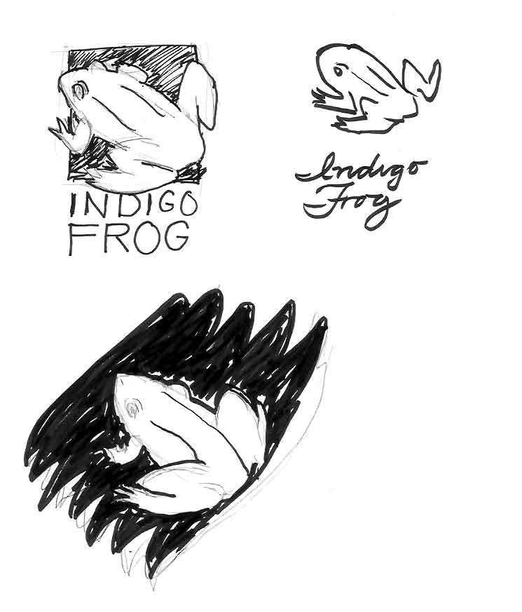
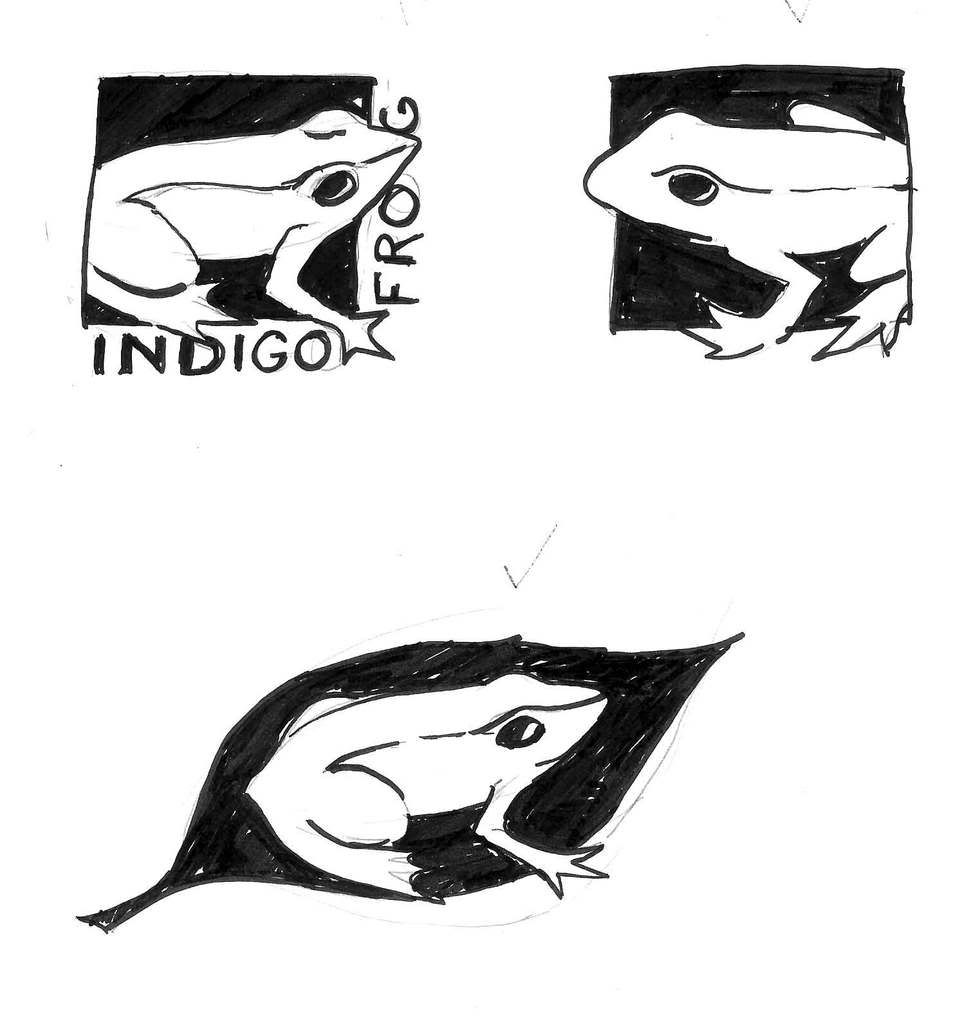
Indigo Frog Sketches 1So the first interview with the client has entered the record. I have at this point possibilites bouncing around inside my ol' coconut, combining and dancing like a bunch of whirling dervishes.


It was to the studio, and my best friend at these times; pencils, art pens, and about 1/2 a finger's thickness of inkjet paper. The sketch is on!


All the while, the impressions and concepts that had kind of 'self formed' my mind kept whispering in my ear. The first few thumbs are small ... they always are, it seems. But once I had a hand on drawing a creditable frog, it was off to the races.


I kept wanting to make it a natural thing with references to artifice, and that was a very strong current, so I went with it. The idea of the frog in its natural aspect also kind of sprung, partially formed, from the ylem. And what of type? Designed or loose and sketchy and cursive? Both of those options seemed to have some currency in the context.


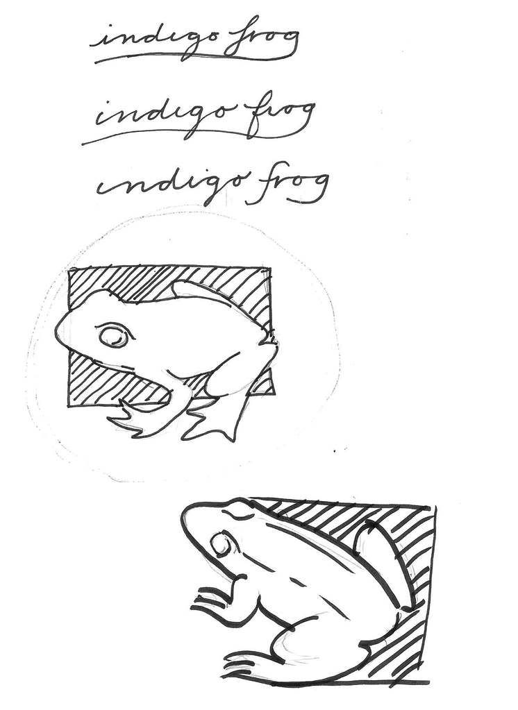
Indigo Frog Sketches 2I enjoy playing with type, and I wanted to keep it simple – the logo stands the chance of being used on a book spine, where it would be rather small, but it still had to be recognizable, so simple forms and uncomplicated lines would be called for. at least one strong edge to align along would be nifty, I decided. But I did explore other ideas that called to me, ideas of brush strokes and flowing motion, of waves.


The color scheme also seemed to call for a simple approach. Using a color close to the actual color of indigo dye seemed to be a no-brainer here. A light-colored from reversing out of a dark background made for visual punch. 


Thumbnailing serves a certain "cleansing" function as well. It was once told to me that the first several ideas we'll have are cliché. This is not meant in the pejorative sense. We quickly come up with ideas that we've had before. Our minds are kind of like a library this way; we'll always go first to the favorite section or our favorite books. When we reach into the library of our experience, almost invariably, the first things we come up with are the obvious and the comfortable.


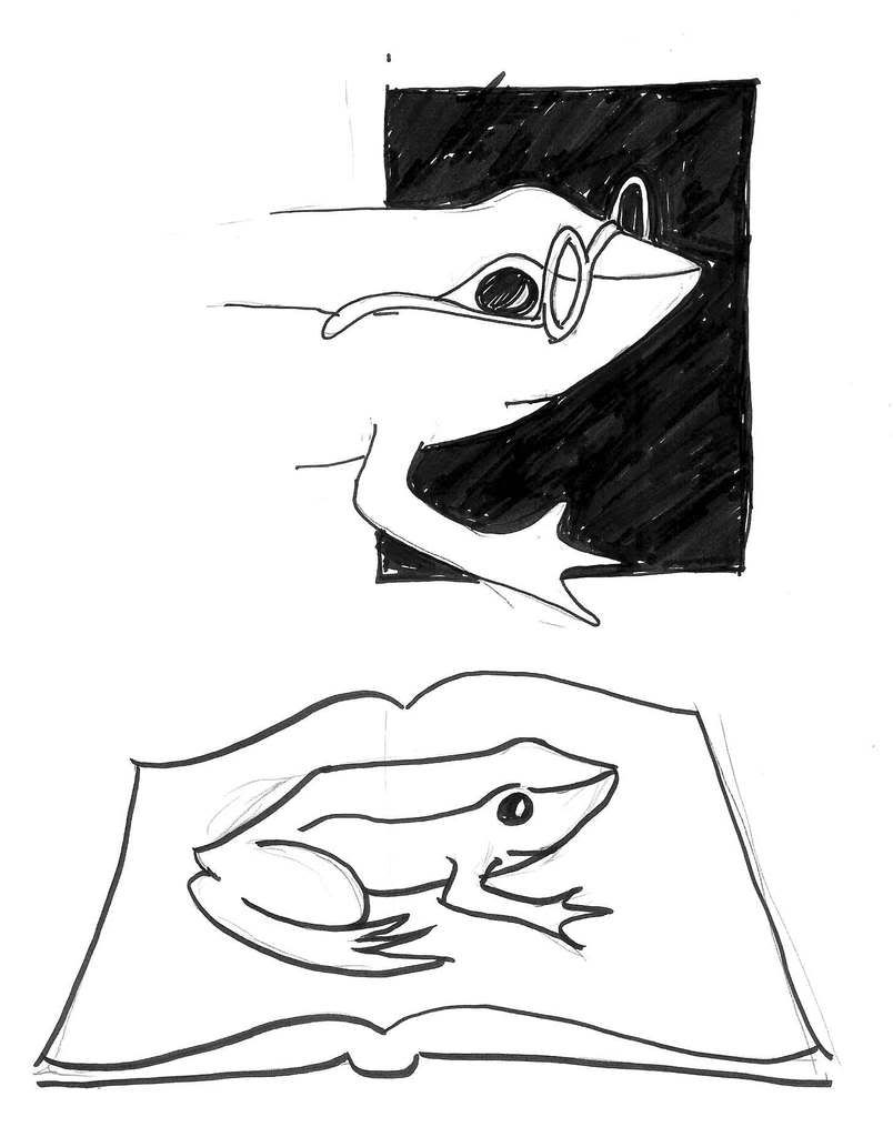
Indigo Frog SketchesThis is not the same as saying the obvious or the comfortable are not appropriate solutions; but you want to see more than that, if only to verify that the obvious and the comfortable are good ideas at all. Once you get past the cliché, you start to have access to the divergent and more unexpected.


So the obvious and expected were sketched. Froggy with specs (smart froggies read) ... a bit "cutesy". Frog reversed out of a book ... too expected. So we worked past the cliché and got back to simple form, color and line. Frog on an open book ... nah. Even more obvious than the last idea.


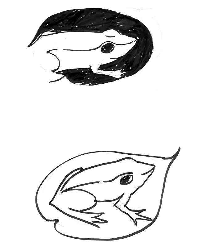
As I return to the simple color and shape, I introduce more natural forms, trying to examine the possibility of making it all natural shapes:


Indigo Frog Sketehes


They kind of work. Our final froggie is starting to emerge from thumbnail tadpolery here. But there's no strong edges; this would be a challenge to align any type to. So I go more geometric:


Indigo Frog Sketches


It should be apparent that we are coming into possession of the elements that will appear in our final. The hiding of part of the frog was something that appealed to me; I enjoyed the "emergent" nature of the frog coming out into the open. The strong edges of the square gives great alignment points for type as well as suggests placement in the bottom of a book spine ... or on a business card, or what have you.


When all the sketches were displayed, Judy responded in various ways. The strongest response was to the frog on the leaf there on the last drawing, but the aspect of the frog was what really resonated. The leaf, not so much; weak for the reasons noted already. I got ood positive response to the cursive type but we also agreed to explore the more formal type (the logo could be called "business-casual", I suppose; cool and laid back but ready to do business). She also wanted for the entire frog's form to be displayed, with none of it cut off.


Making extensive mental notes on what Judy thought was nifty and how I could make this happen for her, we broke and it was back to the studio. Now, we get out the digital tool; Adobe Illustrator CS3, and we prepare to do some real alchemy.


Which we'll recount in the next installment.


Tags: , , , ,


Powered by Qumana


[art, design tools] Everything I Needed To Know About Photoshop, I Learned From Donnie Hoyle

1490. A tribute to the greatest self-loathing PS artist evar:


The shrine is reachable via MyDamnChannel's Big Fat Brain channel here. Look on the left for the links which, as I mentioned, work now.


Tags: , , , ,


15 April 2008

[design, print_design] The "Spring" Columbia Overlook Has Been Put To Bed

1489. Once more unto the breach my friends, give and take with the editor, feedback and corrections done, and the Sierra Club's Columbia Group quarterly, the Columbia Overlook, is in the can for this quarter. It's always a welcome adventure to do it.


The Oregon Chapter is also comprised of four local parts: The Columbia Group (Greater Portland, Northwestern Oregon), Juniper Group (Central Oregon), Many Rivers Group (Lane, Douglas, Coos Counties), Marys Peak Group (Linn and Benton Counties and adjacent areas) and Rogue Group (the southwestern corner of Oregon a/k/a The Great State Of Jefferson every Thursday). The Columbia Overlook is the news publication of the Columbia Group.


We've been through a few very interesting and exciting changes in the recent tenure. The new Editor, Jeff Fryer, is moving us in some very exciting directions. The publication, which was included as an insert to the always-excellent Oregon Conifer, is now published independently. We are now also publishing in color, which has brought a splash of real excitement and fresh air to the paper.


Photos excite as well, and they are never more engaging than when they are in color. We now have a panel on the back page, which folds to create a sort of what I call a "Minor Cover". A photo of Biscuit Fire salvage is on there, a rather beautiful one (credits to the photographer, Ivan Maluski).


This is still a volunteer position. I can't afford a membership but I can afford to give a little time to a cause I believe in. The Sierra Club is a noble organization whose mission, in the face of global climate change and the centrifugal pressures we humans put on our environment, is more relevant today than ever before.


They also offer outings and events that anyone can attend, even if you aren't (or don't want to be) a member.


It's all in the mission of the Sierra Club – To Preserve, enjoy, and protect.


Tags: , , , ,


Powered by Qumana


[art] Alas, A Sketchbook Page


1488. Since I came to Alas! A Blog via the word route and it's thick with ideas an usually crackling good that way, I tend to forget that one of the intelligences behind it is a damn fine cartoonist (even though that cartoonist's cartoons illustrate the site).

And a little edgy too. Has a Ralph Steadman sort of energy but a style I enjoy a lot more.

Tags: , , , ,

14 April 2008

[teh_funnay, liff] Way Too Interesting Times.

1487.

[logo_design] Indigo Frog Part 1: Notes and Chat With Judy

1486. (From The ZehnKatzen Notebooks) I know not how exactly every logo designer starts working, but as likely as not we all start by talking to the client. We get the measure of who we want to work for; the prospective consumer sizes us up.


It's important. They're paying good money.


Indigo Frog LogoMy office for this process was the Fireside Coffee Lodge, down on 12th and Powell. My confere, Judy, proprietrix of the knitblog Persistent Illusion. Beyond any other thing that was a thing, meeting Judy was very nice. Bloggers around here like to meet an interview occaisonally, and for the record I found Judy to be very warm, friendly, genuine, and an ideal client – one who had a very good idea of what she wanted.


Indigo Frog Press is Judy's incipient publishing enteprise. A logo is a visual peg you can hang your perceptual coat on. The various parts that eventually went into this had things to say about the creative process, change, good augury; I found out some interesting things:


  • A frog is also the name of a tool used in knitting.

  • Indigo dye (which is what makes your blue jeans blue) is quite an amazing substance. It goes through a transformation to do what it does. The dye gets cooked down and becomes clear. The color returns to the dyed fabric after it cools.

  • The transformation of the tadpole to frog is well known.

  • The frog is an animal that augurs good luck and wealth according to Chinuk legend, and are treated with respect in order that the blessings pertain.

  • The frog's transformative change speaks to spring, growth, birth.


I made few notes. Some people communicate with intention that leaves an impression, and Judy is one of those people. I got a very good idea of the mood and spirit (or at least I thought I did), and images began to develop in my mind as we spoke.


Deciding we were copasetic, we signed the contract after making sure we all understood the terms thereon. A further meeting was scheduled, and we broke; there were sketches to develop! The conversation had gotten the gears spinning almost immediately; clients are cool that way.


And I had ideas.


Tags: , , , , ,


Powered by Qumana


[net_life] Spreading Muxtape Madness

1485. Just like perhaps too many other geeks, I have a Muxtape:


http://zehnkatzen.muxtape.com


The theme is "Pretty Shinies that Won't Go 'way". Over my childhood and adulthood, single songs from groups have gotten under my skin and stayed there, as though my aesthetic sense were a crow spiriting bright shinies off to its cache. Also these are underrated album tracks that never got the fame I thought they deserved. They also have hooky, assertive bass lines and quirky tunes with obsessively-interesting motifs.


Here's the listing:


  1. Symphonic Soul, Henry Mancini, 1975. From Mancini's most "un-Mancini"-like album of the same name. This tune formed the sound basis for the brilliant KATU sign-off sequence This Is Oregon, which you can see if you go to For Portlanders Only here. If you don't, I weep for you. Seriously.

  2. Home and Dry, Gerry Rafferty, 1977. This was from Gerry's amazing City to City, the album that played #2 to Michael Jackson's Thriller's #1. Everyone knows the song with the Raphael Ravenscroft's sax intro, Baker Street, which was an instant classic. This quirky gem stood out from the Celtic/Folk/Pop of the rest of the album; Gerry was doing Howard Jones before HoJo even got started. One of the best songs ever done, and certainly about the most underrated.

  3. Bangin' On My Heart, The Outfield, 1987. Funky little rocker and the apparent title track to The O's Bangin' album. This was the group that hit it big with a song that started Josie's on a vacation far away about two years before and kept putting out solid satisfying guitar-pop with Tony Lewis' clear high strong voice and John Spinks' adept songwriting. They call The Outfield one-hit wonders. That's not true; people just quit paying attention.

  4. Electric Blue, Icehouse, 1983. Iva Davies is huge in Australia, but after this bit, from Man of Colours (one of the quintessential albums of the 80s) nobody heard of them. Icehouse (and its predecessor, Flowers) put out some crafty, moving pop bordering on punk. Clapton isn't God; Iva Davies is. If I could come back as anyone else, he'd be high on the list. Electric Blue was co-written by John Oates (of Hall and ... ) and features him as backing vocals. It's all there, the cool synths, the hard bass, the almost-obligatory sax solo during the bridge.

  5. Little Willy, Sweet, sometime during the late 60s. Yes, a Chinnchap bubblegum glampop confection which stays with me, and was put in here to keep the other songs on their toes. This Willy fella ... he gots it goin' on!

  6. John Stewart, Lost Her In The Sun, 1979. We go out on a synthy roll, with the underrated hit from John Stewart's famous Bombs Away Dream Babies. "Gold" was killer, but this, with its wispy melody, was what stayed with me. Particulary beguiling is the "breaky" percussion in the second verse.


Listen to the music. Favorite a few of 'em while you're there, neh?


Tags: , , , , ,


Powered by Qumana

12 April 2008

[design_tools] Donnie Hoyle: Eulogy? (semi-NSFW)

1484.  Donnie Hoyle is gone ... or is he just "gone to a special place"? And just what–or where–is it?


 (PG-13 for raucous gamer-chat and almost using bad language) ...


Kind of touching the way Donnie's change has affected his friend ... kind of like ripples in a pond. Kind of Whitmanesque actually.


If you go to the You Suck At Photoshop series at MyDamnChannel.com, you'll find all the information you need. Although SB's "hack" is a Flash banner that doesn't actually download or connect you to anything, yet ... but a few of us have griped in the comments.


In related news, the Phebco website has seemed to have gone away.


UPDATE: The download link and script links at MyDamnChannel.com now work. (1034 13 Apr 08)


Tags: , , , ,


Powered by Qumana


11 April 2008

[liff] ORLY? News Item Of The Day: Sark No Longer Feudal

1483. (BBC full story) In a story that reminds you of all the blue laws in the U.S. such as No Roller Skating In Public Restrooms and You Can't Put Makeup On a Pig and things of that nature, we learn that Sark, one of the Channel Islands and a posession of the British Crown, as finally decided to  step boldly into the 20th Centruy and give up its system of government, which was actually still feudal:

Owners of the island's 40 tenements (divisions of land) had an automatic seat in the Chief Pleas, and islanders chose 12 people's deputies. But now the Chief Pleas is to be made up entirely of 28 elected deputies. The island needed to reform its constitution to comply with European human rights laws. The island agreed in March to change its 400-year-old system of government, which could directly trace its roots back to Queen Elizabeth I, who once granted the ruling "Seigner" a fief on the tiny Channel Island. The unelected descendents of 40 families brought in to colonise Sark, after the French abandoned it in 1553, have governed life on the island ever since.


Sark is really a very tiny place; scarcely larger than two square miles, and home to only about 600 people.


Why the island has the same name as that character in Tron remains unexplained.


Tags: , , ,


[pdx_media] Randi Rhodes is Back on the POJ

1482. Due back on KPOJ via NovaM on Monday the 14th.


Read all about it here (if you're a Loyal Listener, you already know).


Not Randi Rhodes Rotator Image from KPOJ


(h/t Casey)


Tags: , , , ,


Powered by Qumana


[logo_design] Samuel John Klein Hops To It With An Indigo Frog

1481.


---FOR IMMEDIATE RELEASE---


PORTLAND, OR–The Zehnkatzen Times–11 April 2008: Local designer Samuel John Klein today announces the successful completion of logo design for a Portland, OR concern, Indigo Frog Press.


Indigo Frog Press Logo


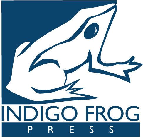
"Creating a logo that embodies the spirit that the creative force behind this effort was a delightful challenge", said Samuel John Klein, the logo's designer and principal in ZehnKatzen Design. "The truly great thing about the two elements – the indigo dye color and the frog – is that both are transformative things. Everyone knows what changes a frog goes through, but did you know that indigo dye has to be reduced to a colorless liquid that regains its color in the dyed fabric only after dyeing and cooling?


"This logo expresses both thoughts. The structure on the left gives way to the gentle energy and playful chaos of the complex margin on the right. The frog looks complex but is deceptively simple, its contours reminscent of linoleum block cuts many of us made in school art classes or personal print projects. The Gill Sans combines a modern look with a classic sensibility. The result is a logo that expresses the fun and energy that's contained in the personal change that can happen when one performs one's own art and craft projects."


Indigo Frog Press, an emerging Portland Oregon concern, is a project of a local blogger who runs the witty and readable knitting blog, Persistent Illusion. Its web address is http://indigofrogpress.com.


Samuel John Klein, an independent Portland Oregon-based graphic designer, is available for hire for print projects, writing and editing, and especially logo design. He maintains a rather opinionated but lively blog of his own thoughts on design and living the Portland life, The ZehnKatzen Times, at http://zehnkatzen.blogspot.com,  where links to his online portfolios and requests for information can be routed. He is also emailable at zehnkatzen@gmail.com.


-30-


Tags: , , , ,


Powered by Qumana


10 April 2008

[liff] It's Been a Busy Day for The Goddess of Radio ...

1480. Out of one network:


Last week Air America suspended Randi Rhodes for abusive, obscene language at a recent public appearance in San Francisco which was sponsored by an Air America affiliate station.

Air America Media was informed last night by Ms. Rhodes that she has chosen to terminate her employment with the company.

We wish her well and thank her for past services to Air America. We will soon announce exciting new talent and programming that will accelerate Air America’s growth in the future.


Right back into another:


The Nova M Radio Network is thrilled to announce the addition of “The Randi Rhodes Show” to its nationally syndicated talent offerings beginning this Monday, April 14, 2008.

Randi Rhodes is the #1 rated progressive talk radio host in the nation.

Nova M CEO John Manzo says, “I just can’t stop smiling - Randi is simply the biggest and the best. Randi Rhodes and Mike Malloy under one roof – talk about TALENT!”

Randi Rhodes adds, “With Manzo at helm of Nova M, I am truly going to work for the best of the best. He is radio elite…and I am too <laughs>. I’m home, I’m home, I’m home!”

“The Randi Rhodes Show” will air live Mon-Fri from 3-6pm Eastern on The Nova M Radio Network.


Talent like Randi can't stay down for long. And here, we can no longer just dismiss those who say that AAR (who had a ton of frisky, interesting programming back when they started) might be getting a bit moribund and corporate ... not to mention the AAR move leaving a lot of good hosts, like Seder and our own Thom Hartmann and Rachel Maddow in a rather awkward spot.


On hour two of Mike Malloy's program tonight, Randi herself called in and talked to Marc Maron (who was filling in for Mike, and is one of the extremely entertaining people given the bum's rush from AAR waaaay too fast), and if we understood Randi correctly, it was mostly a power play by AAR management to get some sort of advantage over her.


No matter. She's showing up on NovaM which had the extreme good judgement to pick up Malloy, and if AAR keeps shooting itself in the foot this way, NovaM will be more than an upstart any day now.


Of course, Portland may be Randi-less for a short time while the POJ clears time for her. I trust that they will make the right decision here and not leave us without Randi for too long.


Tags: , , ,


Powered by Qumana


[net_life} See? The 'Net DID Eat Your Email!

1479. (BoingBoing) It's a common problem, one that has even bit us a couple of times in the last week or so; sent emails just don't get to you.


But if you have a connection, you have a route, right? No, maybe not.


Some sharp pencils at the University of Washington have started the Hubble project, an effort to track these so-called "black holes". It has something to do with a concept they call "reachability" which, surprisingly enough, is not something that you can depend on.


Here's the main page of the project itself, which apparently updates black holes as they come and go, in real time.


So the next time an important email goes astray, just point your correspondent's browser at the Hubble projects page, and say "See? It really did get eaten!"


Powered by Qumana


[liff] News Item:"They Never Should Have Gotten Rid Of Us"

1478. (MSNBC) Wal-Mart has gained one more enemy: the company that documented their meetings, full of frank and candid portrayals of how Wal-Mart thought and grew, was sacked last year. Being 95% of Flagler Productions' business, the company nearly collapsed, but realized there's gold in those corporate archives.


After apparently-briefly considering Wal-Mart's "Always the Low Price ... Always" bid of $500,000 for the whole magila (note to Wal-Mart: that low-price strategy only really works with feckless customers) the company opened up the archive to, essentially, anyone who will pay a fee to watch:


Wal-Mart Stores Inc. dropped longtime contractor Flagler Productions in 2006. In response to losing its biggest customer, the small company has opened its archive, for a fee, to researchers who include plaintiffs’ lawyers and union critics seeking clips of unguarded moments at the world’s largest retailer.


Umm ... oopsey.


Company spokespeople immediately displayed an admirable grasp of the obvious:


Wal-Mart said it is unhappy with the public airing of its video record.

“Needless to say, we did not pay Flagler Productions to tape internal meetings with this aftermarket in mind,” Wal-Mart spokeswoman Daphne Moore said.


Needless to say. But she was paid to say it, so.


It's just one danged thing after another some days; if one of your surly, underpaid senior-citizen employees isn't working one of the others over with a pricing gun, then your former family videographer is airing your dirty laundry for $225/hour. I mean, I thought I had problems.


Tags: ,


Powered by Qumana


08 April 2008

[irony] Bad News For Sam Adams

1476. The beer, that is:


Boston Beer Co. said Monday that the recall comes after routine inspections found defects in 12-ounce beer bottles made by a third-party supplier. The grains or bits of glass could break off and possibly fall into the bottle.


Allegedly only about 100 bottles made by a third-party supplier got out, and it was only in the Cincinnati area, but irony knows know boundaries.


Sam Adams campaign for City Council here in Portland still seems to be going full-steam ahead, though.


Tags: , ,


Powered by Qumana


07 April 2008

[blogtopia] The ZehnKatzen Times: Disrespected Once Again.

1475. Time magazine has published the 25 must-read blogs (in their opinion) ... and once again, I was passed over.

Yeah! I know! That's just wrong!


They'll regret it when I'm famous.


On the other hand, there's their 5 most overrated blogs (they stopped at five? What admirable restraint!) with memorable snarks:


  1. Slashdot. Well, okay, "/." is no longer The New Black, but it's smarter than Time.

  2. Jim Cramer at RealMoney.com. Yah, boii ... how's that Bear Stearns stock workin' out for ya?

  3. Ars Technica. Time to Ars Technica: Too much technology, not enough art, and lose the fruity name. The ZehnKatzen Times (a/k/a the Susan Lucci of the PDX blog scene) to Time: Oooh, aren't we fancy? You guys probably think Donnie Hoyle is a real person, too.

  4. Nicholas Kristof On The Ground: Time: "Globe-trotting NY Times columnist regularly ventures into the eye of the storm only to find the "I" of the storm. Self references abound, it's all Kristof all the time even as wars rage and children starve around him.". ZKT: "Oooh, snap! ... Wait, actually we agree here. Kristof is a wanker. Good call."

  5. I Can Has Cheezburger. Time: "a site that lets users upload pictures of cats and affix funny captions to them written in a made-up language. Further evidence of the decline of Western civilization". Well, you know what, Time? ...


You guys better apologize to the bunny. Meanies!


How's that new media working out for y'all, Time?


Tags: , , , ,


Powered by Qumana


[liff, pdx] Jim Bosley, 1934-2008 RIP

1474. Word is getting out that Jim Bosley, one of PDX's top TV weathermen during the the golden age of local news, has passed away.


We note in passing. Others have better presentations, we just have our respects.


OMI is where the discussions and the memories will happen.


Tags: , , , ,


Powered by Qumana


06 April 2008

[ad_design] Toyota's Matrix Campaign: Who Says Irony's Dead?

1473. Running in heavy rotation in the ad spaces on Technorati is a series of rather bizarre pieces. They seem to be ads. They seem to be ads slanted toward the audience that loves abusurd humor ... the kind who's watched Airplane! about 300 times (The "Don't Call Me Shirley" Edition) just to make extra sure that they didn't miss every little joke.

Some of the ads are cute and funny and verge on the disturbing. If what they advertise seems improbable, that's because they are. But we get ahead of ourselves. We definitely have to tip our cap and give propers, for some of them force concepts into spaces two of them should never, ever occupy; by rights, some of these ads should rend the utter fabric of time and space about them, causing the universe to be sucked, Slurpee-like, through the resulting hole.


The Cornett Motel (The One With The Two "T"s!), to start on the merely odd and funny end, has amenities that are dubious at best (a banner ad not included here exults in a "Free 28.8 modem in the lobby!" and "English/Croation Service"). Not to be missed is the lagoon-like swimming pool:


An organization calling itself PARMM inveghs against the Devil's music (wasn't that what they called jazz?) in this banner:


And offers a book in this sidebar (with a Mom that just seems to be saying "you're GROUNDED until you're thirty, little mister/miss):


Sakura will sell you lingerie for your animals (yes, including bras for pigs) in a style that cries "J-List!":


Some chap named Sebastian will teach you the basics of English style pub-fighting (For the non-anglophile, bloke is another dude, and bird is your girl). Judging by his look, I'd trust him; he probably knows what he's talking about:


The ads for Mr. Raccoon's Pet Daycare start by abusing Cooper Black, and depart from the WTF station on an express train straight to the land of the "Uh-Oh Feeling":


Isn't loving pets almost too much like, almost actionable under law? And those manga eyes just give me the creeps.


And, veering into the Twilight zone is some scrawls on looseleaf which indeed suggest They are listening, and whatever it is, you got to buy it now. Somehow ham radios are involved:


But where does it all go? If you do click on one of the ads, you'll find that The Matrix has you, Neo. All these are designed is to get you to click on a highly improbably ad concept to go see the new Toyota Matrix.


We don't really have any specific problem with clever-clever advertising, and the jokes in the Toyota campaign are rather funny actually. But something about this sort of thing is ... well, it's gotten kind of tiresome over the years. Of course, it's an irritating kind of dishonesty that gets your clicks to add to stats to prove that, at least by stats, the campaign is a success.


I look at it this way: if someone's going to engage my curiosity, then it might be something I might actually want to buy right now. Toyota's Matrix campaign, while humorous, in the end does nothing but steals a bit of my time and attention. I can't imagine, especially the way the economy's headed everyone is willing to just jump up from thier computers and buy them a Matrix.


Perhaps that misses the point there; maybe all they're going is for mindshare.


Still, one of the most powerful features of advertising is its power to manipulate. This is a tool, neither good nor bad. If you fool too many people, though, for good or bad, all you get is a cynical population who is resistant to advertising; so you have to amp up the volume. The result is kind of an ad-crazy world (actually, we realize our lament is a few decades belated; indeed, that train left the station sometime during the 70's, when they started advertising that modern-English Bible translation (remember The Book?), as far as we're concerned. But we parenthetically digress).


Therefore, the Matrix campaign, while indeed righteously funny, leaves us kind of empty inside. The joke over, the punchline is sort of ... well, we've been there before. Meh.


If you want to advertise a car to me, then just advertise a car. I've seen some danged clever "just advertise the car" commercials.


Tags: , , , , ,


Powered by Qumana


05 April 2008

[design, teh_funnay] You Suck At Photoshop #10

1472. In which certain matters come to a head (and all the ugliness that implies-possibly NSFW. Best not chance it).


Donnie ... you're really starting to scare me. I don't know which is scarier though – the storming of the landominium, or the fact that he apparently got away just seconds before they got him ...


Tags: , , , ,


Powered by Qumana


[design] Winchell's Donuts: Redefining "Anything"

1471. Now, we likey the Winchell's Donuts. It's a character flaw, mayhap; in a city where donut hip has been redefined by our perennial heroes Tres Shannon and company, it's even a little disloyal, perhaps. But we are what we are. And the maple-frosted old-fashioned ... 'scuse me whil I wipe drool off the keyboard ...

Anyhow! The subtext here is "Slogans that Generate Scooby Moments". To wit, the following illo:


As you can see, it was ripped screaming from the side panel of a dozen-box by me in my cold, impassionate quest by my MacGuyver-style Swiss Army knife (It's a Victorinox "Tinker". Seriously. Check it out). Now, I have no arguments at all with the graphic approach. They have, to thier credit, retained the classic logo and type style therein (Souvenir, if you're curious), and have these lovely warm colors (in concert with thier slogan, "Home of the Warm 'n' Fresh Donut".


But this slogan, despite the distressed type (which looks to be a witty combination between a humanist serif and something approximating Futura) just leaves us scratching our heads.


WITH A DONUT IN EACH HAND ANYTHING IS POSSIBLE.


Erm? Now, I know Donut, and I know Hand, and I know Anything and I know Possible. Does Winchell's have a different definition of the word possible that nobody else uses (except perhaps maybe Homer Simpson)? I suppose that a altered way of thinking of anything being possible would have to apply:


WITH A DONUT IN EACH HAND, ANYTHING IS POSSIBLE. AND BY ANYTHING WE MEAN MOSTLY REDUCED MANUAL DEXTERITY (AT LEAST UNTIL YOU'VE EATEN THEM), TEMPORARILY INCREASED FAT AND CHOLESTEROL BLOOD LEVELS, SURPLUS CALORIES, SOME TIME SPENT ACTUALLY EATING THEM, AND FINDING A WASHROOM BECAUSE THESE DONUTS CAN BE KINDA STICKY.


Oh, hell. I'll just enjoy the donut. But if you wan't to actually do anything that becomes possible with the two donuts, all I ask is that you put them down first. And wash up.


Tags: , , , ,


[teh_funnay] If You Liked Glengarry Glen Ross ... (NSFW)

1470. You'll love Glengarry Bob Ross (NSFW and Kids- adult language warning)


Tags: , , ,


Powered by Qumana


[logo design] Turtle to Speed Racer: The Gradient of The Process

1469. One of the real cool things about developing a logo is the way the speed of development exhibits acceleration.


The first client meeting we took the measure of each other, found each other reasonably excellent, and started discussing. The first discussion was give-and-take finding out what was important and what I understood.


The agreement reached, we scheduled two weeks hence to review initial concepts. The first thumbnails are always the hardest. They become easier as they are done, and the speed of development changes in a sort of acceleration.


Two weeks go by, and sketches are laid out. I like this one from that one, that one is pretty cool, I like that element of that, and that one is overall pretty neat. So the designer repairs to his computer to continue. The next meeting in 1 week instead of two, because now we have solid direction. We get intimate with Illustrator.


One week passes, and tight roughs are laid out. That's working, and I really like that, and that has most of it. That's a strong one. The designer repairs to the studio once again, and the feedback time shortens even more. We have most of the pieces now. Put them together, and since we're in Illustrator, we copy about, scale and stretch, slide and push, and try out fonts.


Now, new versions issue forth and whisk to the client by means of email in mere hours in some cases.


Do you see here how we started out gently and got faster and faster until we go headlong, heady from the rush of trying things out and getting feedback. We started with exquisite tea, moved on to fine wine, and then on to hard spirits. Maybe the liquor metaphor is somewhat un-apropos, but it's the only thing that seems to imply. Because the increase of the rate of speed is intoxicating that way.


You will fear our velocity.


Tags: , ,


Powered by Qumana


03 April 2008

[liff] I'm Just Saying ...

1468. If I swear around here, don't fret.


I watched Glengarry Glen Ross last night.


Or, as it was called by the actors while in production, Death of a F@#$ing Salesman.


Crackling good movie. Sorry I waited so long.


Tags: ,


Powered by Qumana


[liff, work search] On the W+K Seeking Thing

1467. I should say that I am remiss here. Congratulations are in order. Not for me, but still. Actually waiting this long to comment on it (which would be only fair because I put it out there to begin with) is somewhat remiss of me.


Now, as many people have known for a while, the W+K Seeking campaign was over. The competition was fierce – a legion of hopefuls bellied up and only one in 40 were selected.  Those are high odds. I'm proud of myself that I tried.


The final notification was issued to me on a card gave me the news in haiku format (three lines, five-seven-five. As haiku affectionados know, real haiku is more than just putting together three lines of five, seven, and five ... but I'm digressing here.


It's hard to say the following without sounding a little whiny, but I'm human, right? Really, I was thinking it was going to be a yes. And being told no when one's hopes are high really never loses its sting. But for some reason, the haiku seemed a little too playful a way to say no.


There, I said it.


On top of it, the front of the card is a decal, two copies of a sticker reading "WIEDEN & KENNEDY GAVE ME THIS STICKER". And the sticker was frayed on the lower left corner. So it usually in my life that when I get the consolation prize, I get a damaged one.


For what it's worth, yeah, when they passed on me they passed on something special.


But the haiku did end with "not this time".


Missed the brass ring. But you can't give up, am I right?


Powered by Qumana


[liff] Holding Pattern? No, It Just Seems That Way

1466. Adobe Illustrator and Acrobat have really had a workout today.


Still waiting on word from another source. High hopes there.


Am wondering what happens to all the resumés I send out. I bet I'm not the only one.


Tags: , ,


Powered by Qumana


02 April 2008

[bloggage] Good Karma

1465. Preemptive Karma now links here.


As a longtme admirer of that blog's mien, I am thrilled and honored.


Thanks, Kevin!


Powered by Qumana


[design_life] Client Meetings Part 2: This Time, It's Not Client Meetings Part 1

1464. The little projects/gigs I'm shepherding have moved to new levels. One nears completion; the other has accepted a bid.


It's A Frog!This is pretty exciting actually. Seems every spring since I got my GD degree from PCC something interesting has presented itself to me, things that I would never have gotten to do if I hadn't taken classes there ... I've technical-edited two books, gotten to review mad cool software ... it's not a living, not yet, but I keep striving.


The client meeting I had yesterday was an amazing kick. When you're really communicating with someone and the message is getting across, and you're delivering what you promise to and they're liking it ... there's just no better feeling you can get than that.


In some ways, he said engimatically, I am a camera.


Also, I got to play with an iPod touch. Almost had a techgasm right there.


Tags: , , , ,


Powered by Qumana


[liff, meme] Memories of 1 April: I'm Bad, I'm Regionwide

1463. I will cop to being fooled by the article at Daily Observations that I linked to yesterday (rather effusively) about the idea of a Calatrava-designed symphony hall rising in Portland.


Two things to add about that one:


  1. I'm hardly a biggie around here so maybe it won't matter too much, but I've got to publicly tip my hat to DO blogger Charles Noble for what has got to be the coolest, smartest, deftest foolie I've ever been snowed by. I am still impressed by the level of intellect required to mix in Santiago Calatrava, a symphony orchestra, and April Fools Day (note to self–check the date next time something like that happens). It's not often that one gets pwned but doesn't feel embarrassed by it. This, peoples, was true art.

  2. The joke was noticed outside of our area, by a gimlet eyed editor at the Record Searchlight, the paper of record (and perhaps of any searchlights) of the metropolis of the Shasta Cascade. Silas Lyons has his own witty commentary on Charles's joke, with a comparatively-extensive quite from my own blog. So now I'm bad, I'm regionwide.


In as much as the remark was characaterized as a "nice subtle dig" at Redding, I'd like to say at this time that no disrespect was meant toward the metropolis of the Shatsta Cascade, an area that is gorgeous and for which I wrote something of a love letter (though in my own highly-nimitable style) to in this discourse (and allied discourses).


Regrettably, my experience with Redding was limited to about 20 minutes each way to and from Sacramento on a shotgun gotta-go-gotta-go trip, each way spent on a rest break at the Shell station next to the Sundial Grill at Exit 1 on State Route 44. I was able to see the Sundial Bridge from the highway bridge over the Sacramento River as we came in. It's remarkable. And the bathroom at the Shell station was very clean. I'd recommend it to any I-5 traveller in a hurry.


By saying that a Calatrava in Redding is unexpected thing it's in the "hidden gem in an out of the way place" sort of way. All sorts of things are sometimes found in unexpected places (like red Republican voters here in Portland or culture in Salem or a coherent thought in my own blog).


All that said, I take nothing remiss at the characterization of the remark as a dig: as a native Oregonian, I understand hometown pride as well as anyone else. Because at the nut of it, I think me and Mr Lyons would agree on one point with a Calatrava in Portland:


Still, not a bad idea, eh?


On that we can completely agree.


Tags: , , , , ,


Powered by Qumana