
1491. For the previous chapter in this saga, go here.
 So the first interview with the client has entered the record. I have at this point possibilites bouncing around inside my ol' coconut, combining and dancing like a bunch of whirling dervishes.
It was to the studio, and my best friend at these times; pencils, art pens, and about 1/2 a finger's thickness of inkjet paper. The sketch is on!
All the while, the impressions and concepts that had kind of 'self formed' my mind kept whispering in my ear. The first few thumbs are small ... they always are, it seems. But once I had a hand on drawing a creditable frog, it was off to the races.
I kept wanting to make it a natural thing with references to artifice, and that was a very strong current, so I went with it. The idea of the frog in its natural aspect also kind of sprung, partially formed, from the ylem. And what of type? Designed or loose and sketchy and cursive? Both of those options seemed to have some currency in the context.
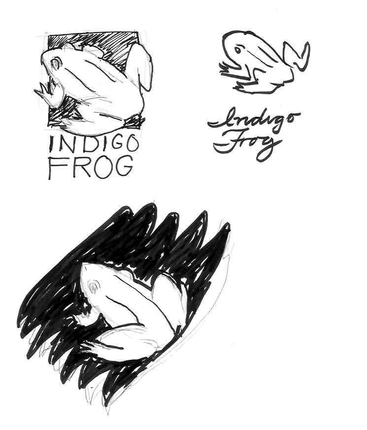
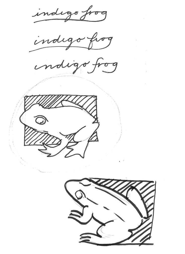 I enjoy playing with type, and I wanted to keep it simple – the logo stands the chance of being used on a book spine, where it would be rather small, but it still had to be recognizable, so simple forms and uncomplicated lines would be called for. at least one strong edge to align along would be nifty, I decided. But I did explore other ideas that called to me, ideas of brush strokes and flowing motion, of waves.
The color scheme also seemed to call for a simple approach. Using a color close to the actual color of indigo dye seemed to be a no-brainer here. A light-colored from reversing out of a dark background made for visual punch.
Thumbnailing serves a certain "cleansing" function as well. It was once told to me that the first several ideas we'll have are cliché. This is not meant in the pejorative sense. We quickly come up with ideas that we've had before. Our minds are kind of like a library this way; we'll always go first to the favorite section or our favorite books. When we reach into the library of our experience, almost invariably, the first things we come up with are the obvious and the comfortable.
 This is not the same as saying the obvious or the comfortable are not appropriate solutions; but you want to see more than that, if only to verify that the obvious and the comfortable are good ideas at all. Once you get past the cliché, you start to have access to the divergent and more unexpected.
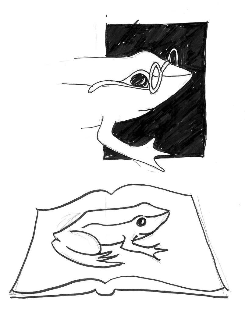
So the obvious and expected were sketched. Froggy with specs (smart froggies read) ... a bit "cutesy". Frog reversed out of a book ... too expected. So we worked past the cliché and got back to simple form, color and line. Frog on an open book ... nah. Even more obvious than the last idea.
As I return to the simple color and shape, I introduce more natural forms, trying to examine the possibility of making it all natural shapes:
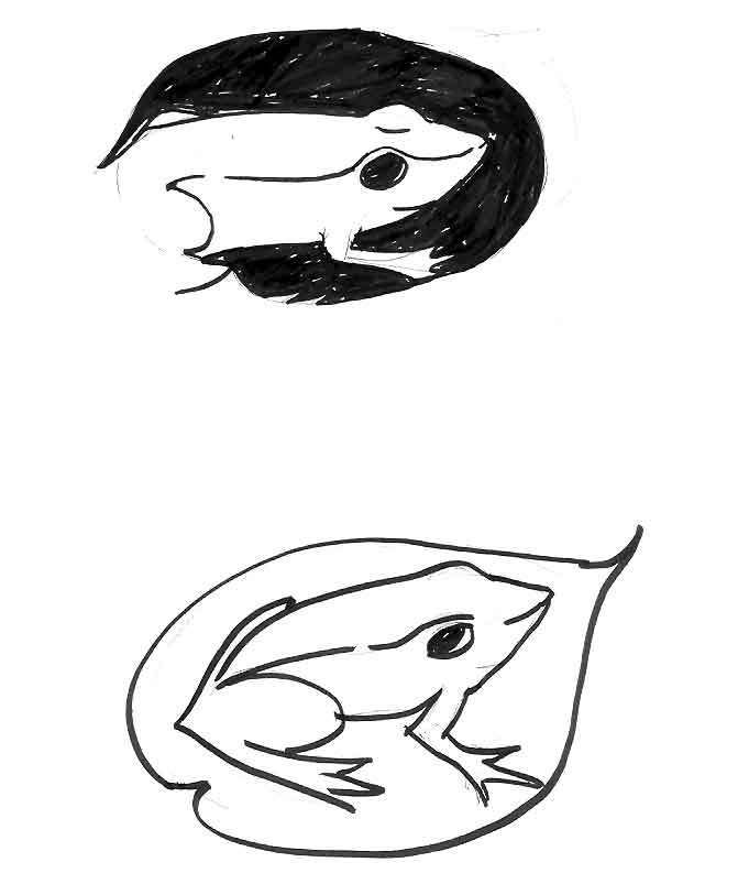
They kind of work. Our final froggie is starting to emerge from thumbnail tadpolery here. But there's no strong edges; this would be a challenge to align any type to. So I go more geometric:
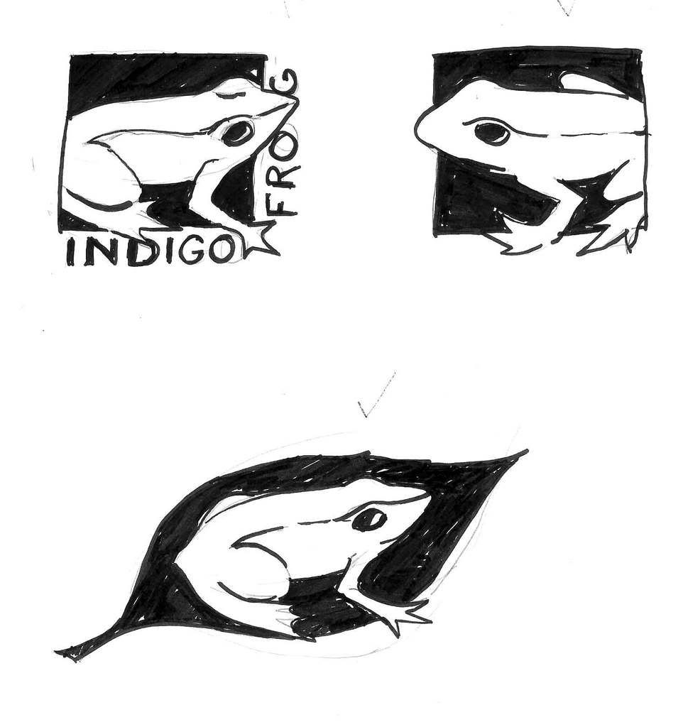
It should be apparent that we are coming into possession of the elements that will appear in our final. The hiding of part of the frog was something that appealed to me; I enjoyed the "emergent" nature of the frog coming out into the open. The strong edges of the square gives great alignment points for type as well as suggests placement in the bottom of a book spine ... or on a business card, or what have you.
When all the sketches were displayed, Judy responded in various ways. The strongest response was to the frog on the leaf there on the last drawing, but the aspect of the frog was what really resonated. The leaf, not so much; weak for the reasons noted already. I got ood positive response to the cursive type but we also agreed to explore the more formal type (the logo could be called "business-casual", I suppose; cool and laid back but ready to do business). She also wanted for the entire frog's form to be displayed, with none of it cut off.
Making extensive mental notes on what Judy thought was nifty and how I could make this happen for her, we broke and it was back to the studio. Now, we get out the digital tool; Adobe Illustrator CS3, and we prepare to do some real alchemy.
Which we'll recount in the next installment.
Tags: logo_design, logo design, zehnkatzen, Samuel John Klein, Indigo Frog Press
Powered by Qumana
No comments:
Post a Comment