1605.
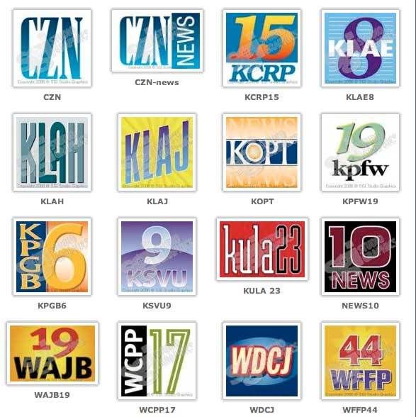
Just like the famous make-believe prefix, 555, if you need a mic flag or block or need a decal for the breaking news van from the nearest make-believe TV outlet, you could come up with your own ... or go to Studio Graphics Inc:

SGI supplies the fake products and graphics for things in television shows and movies almost everyone has seen (isn't it interesting how the Heisler Beer brand has shown up in so many movie worlds?)
SGI's ready-to-go ranges is on this page here. One thing that strikes the eye immediately is how well they've interpreted that "station that could be anywhere" aesthetic. They're very believable broadcast station logos, designed to a sort of banal middle. On an actual TV station, the design would be irritatingly laughable (knocking out the middle, stroking the text, squeezing and squashing the text). But in this range, where the idea is to have a sort of "everywhere/nowhere" look, the result is paradoxically brilliant.
It's easy to hit banal if you aren't aiming for it. It's hard to if you're trying. These people are masters of the form.
Tags: graphic design, logo_design, TV Logo Library, notional design, fictional logos, studio graphics inc
Powered by Qumana

2 comments:
I think I like 6-KPGB and 10 News the best of all. But aren't these station logos required to have lots and lots (and I mean lots) of blue these days?
Speaking of color schemes, I look forward to your take on John McSame's tragic speech-giving before a green screen. He sounded as awful and lost as usual, but the green made him seem ever more Yoda-esque -- and I hate to insult Yoda that way.
Well, I don't know if they're required to have the blue.
However, you can't fight fashion.
I saw that vid of The Man Who Won't Be President too. God what a dog's breakfast. Sometimes I think that the McBush campaign is full of people who know they're going to lose and are just having fun with the old guy until while they collect a paycheck for between now and Novemeber.
Hell, beats working I suppose.
Post a Comment