
1715.
It is called, ironically, ITC Matisse. It makes me cry a little and die a little inside whenever I see it. Here it is on a Beaverton business front:
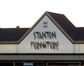
Please note, this is no commentary on Stanton Furniture which, if I correctly interpret, has a stellar and honest reputation as a seller of such. Only on their choice of signature font.
There are some fonts that work well within the design in which one embeds them. Then, there are some fonts that find their way to signs that just seem to call out "I have no real design, I just want to look neat!" Fonts that strive to be different ... just like everyone else.
Algerian is such a font. Matisse is struggling to join it.
If it were just overused that would be forgivable, if it were at least pleasant to look at. My synesthetic mix suggests textures when I look at shapes. And Matisse makes me think of little knives, piercing my eyes over and over.
How this font got named in honor of one of the great old master painters beggars the intellect. I can think of few other fonts so inelegant, so atrocious, so visually cacophonous, so lacking in actual style. I see it, I want to start stabbing myself in the face.
It's too late to save Stanton Furniture (though if you folks want a redesign, I'm available!) but maybe it's not to late to keep it from becoming as ubiquitous as Algerian. If you know someone who's designing an identity and is edging toward using this, box them soundly about the ears ...
Then send 'em my way. Hey, I'm just sayin ...
Tags: ugly fonts, bad fonts, ITC Matisse, business signage, font design
Powered by Qumana
No comments:
Post a Comment