1767.
Over the last 48 hours, the one site visitor counter to have if you have one at all ... SiteMeter ... rolled out a new interface. Shiny, flashy, java-based, it had more information even in its free version than you could shake a stick at.
Reports, graphs, scroll-bars, the works. Should have hit it out of the park.
Problem: it ran like ass.

As a faithful user of the Free version of the service I was quite looking forward to this. After all, it's impossible really to find a free service that offers as much as SM's free version does; while I'd love to have the money to lay down on the paid version, the free version faithfully counts site visitors and offered enough simple-to-access-and-understand tools that give a good snapshot of what gets people surfing in.
What was cool about it is that it was all HTML. Usable, simple interface.
Today, when the new SiteMeter finally debuted, I read it up in my browsers to see what was the hubbub, bub. And, SiteMeter Support Team, I'm hurting for you. You took a good thing and, with the best of intentions, made a shambles out of it.
Of course, saying it ran like ass, as blunt as that is, covers a lot of subjective impression. Here's a more pointed critique:
- Took a lovely, simple interface and made it confusing and unusable. The move away from an HTML presentation was presumably a move to take advantage of all the pretty shinies something like Java can provide. Trouble was, in putting in all that chrome, they took a very straightforward interface and made it absolutely inscrutable. Before, all functions were arranged in well-named links on the left side of the page. The stats and visits display was simple and elegant. The summary page, which showed totals and averages at a glance ... gave you an excellent instant impression of whether or not the world fell in love with your page or not. The new display? Where's the neat summary display? Where's my average visits per hour? Where's my quick-detail page? My By-Referrals page? there's a "Visits" list, but the type is so tiny and you have to open a whole bunch of little windowshades to find out where the visit came from. And not only did you have a list of links down the left side there was also tabs across the top. Confusing? You bet.
- And, yes, it "ran" like ass. The quick-and-lively HTML was replaced with a bloated Java that took forever to load and ran undependably (the interface refused to save changes in Safari but would do so in Firefox). A summary report that would have been up in a trice took more than a minute to generate ... if it did generate (sometimes it never came up). Sometimes the scripting seemed to hang. Reports would load endlessly. My computer (due to lack of personal success ... anybody got a couple of thou they could lay on me for an Mac Pro?) is a PowerMac G4 with the Mirrored Drive Doors. No longer cutting edge, but a real trooper ... it can run multiple Adobe Creative Suite 3 apps with aplomb, even today. The new SiteMeter made it act like it was trying to do SETI @ home all by itself. It ran like ass; blunt, but there's no other way to say it.
It's a shame because there was some seriously praiseworthy things about it. The idea of a master account being an umbrella for all your SMs that were created ... beautiful. And the Master Account page was a good idea too.
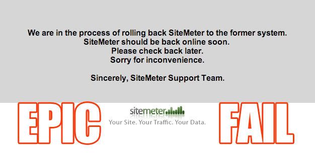
Today, as per the illustration above, SiteMeter users were greeted with the following message:
We are in the process of rolling back SiteMeter to the former system.
SiteMeter should be back online soon.
Please check back later.
Sorry for the inconvenience.
Sincerely, SiteMeter Support Team
So we went from a well-PR'd, well-orchestrated, lubed-and-greased transition to a return to the old system with a note posted at the door.
That must have been some epic fail.
But if they're going back to the old system, I have no complaints. As I mentioned, it ran well, it worked well, it provided good value for a free service. They got it right the first time.
I'd be interested to be a fly on the wall in the SiteMeter team meeting. That's bound to be one hell of a post mortem.
Tags: sitemeter, systems change, epic fail, epic internet fail
Powered by Qumana

No comments:
Post a Comment