
1581.
After reading my Cavalcade of Business Cardage in this missive, we got one submitted for our considered, thoughtful opinion.
Hmm, we thought. Considered and thoughtful? Now, that's a new approach! Let's take a look, shall we?
Mark Marston ID's himself as the fellow behind BestBusinessCards.com, and in his letter to us, said:
We make laminated style business cards that are credit card sized with rounded corners. The look and feel is one of quality and almost always prompts a "Wow, nice card" response. Website address is below. Also attached is my business card, front and back.
Also,
Feel free to critique.
Oh, boy. Let's go to work.
Here's the front of his card:

This is one of the hardest-working cards I've seen yet.
It's long been my opinion that blazing full color cards with extensive photography are pretty much the dog's breakfast. I'm not changing my opinion quite yet. The problem with it is that it gives the impression (to me, this is completely subjective) that it's a person who finally got a business and wants to impress you into oblivion with it. Either that, or its a real estate agent.
But if you're going to go this route, it's important that you at least make it work. Visual cards such as this are very very busy ... there's a lot for the eye to scan and the brain to digest. Does the card work? In my opinion, it does. If a welter of color photography is an excess, then the rest has to be dialed back a bit in order to compensate, and this does that by keeping the info down to the utterly necessary on the front: business name, employee name, position, one phone number, one web contact (the email – the company name suggests what the website address must be).
The number of fonts is kept relatively low (three); what looks like Copperplate for the name, Friz Quadrata for the rest of the info. The font that the company name appears to be in, which looks like a Times variant, I'd change that, maybe to the same Friz Quadrata that the rest of the contact info is in. The problem with using Times is that many people use it because everyone else uses it, making it the default. A default look kind of says that no actual design happened here.
The yellow outer glow around the company name makes me twitch just a little, but you've got to do something or the dark type gets lost against the light background. The palette of the photography itself is actually pretty well chosen – the light blue of the background and the light flesh tones make it all rather kind on the eyes. The contact information is rather cleverly formatted into the hand, and instead of just jamming the company's catalog on the card, the photography actually tells the story of the product in an active way.
Ample negative space allows for an uncrowded feeling, which improves the communication on the card.
And now, the back:
This is where all the verbiage and extended contact stuff go. This is a canny way to go about it. If you want to include a lot of info about what you and your business card mean, then the back is a perfect place to have it ... and a lot of companies will print both front and back for you. While a typeface that would be in harmony with the type on the front would be the best way to go, choosing a different font (as long as it were simple, like this) wouldn't completely be amiss. Choosing a font that works with the others would unify the piece however.
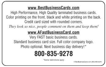
The big message I'm getting on this one is the quality of the stock. I haven't checked their site for prices, but regardless of the design on the card, it looks like you'll get a highly-classy product to hand around (it's kind of funny to hear a business card described as "high performance", but I understand what they're trying to say here).
The idea of getting a business card that has the durability and feel of an ID card does indeed have some attraction however.
Tags: graphic design, business system design, business card design, layout, design critique
Powered by Qumana
3 comments:
I like the Meta moment: the card features a hand handing a card to another hand. Whoa! Blows my mind. Looks like a lot of white businessman action going on to me.
Nice catch, alan. That had only caught me on the subconscious level. Weird ...
White businessman action? What else do white people do?
I am, by the way, white. Off-white, actually.
Thanks for sharing!! Well, my most favorite online store is Vista Print for office printing solutions.
Post a Comment