1805.
(inspired by and via BoingBoing). It should go without saying that one of the most fascinating things about the work creative artists do is the tools they use and how they use them. Today we bring you two well-known artists and find the tools they use, while expected in the big way, are unexpected in one very interesting (to us, anyway) way.
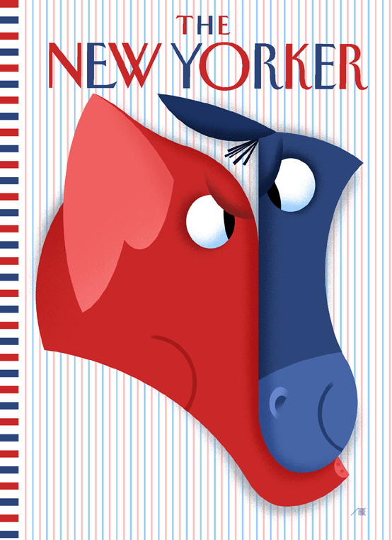
Today, on BoingBoing, was highlighted the work noted childrens' book illustrator (and presumably more than that) Bob Staake. His style is instantly recogniazable; simple shapes, saturated colors and easy patters come together to make images that are simple yet somehow very evocatively complex. He's designed the illo on the front of this month's The New Yorker magazine, which captures the hot nature of the electoral contest very well (Image hotlinked from here):

Kind of says it all, doesn't it. We quite enjoy the coolness of the trick of the interlocking shapes in the donkey muzzle/elephant trunk. Simple shapes and shadings combining for direct punchy communications.
We are fortunate in that the artist has apparently released a video (posted to YouTube) showing how he came to produce it. The coalescence of shapes and colors into the cover illo, which is sure to be seen by millions, is nothing short of fascinating (though that word kind of falls short a bit):
Now, here's another video of him creating. It's worth note to see the tool. It's apparently Photoshop 3 (vintage 1995) and Mac OS 7!
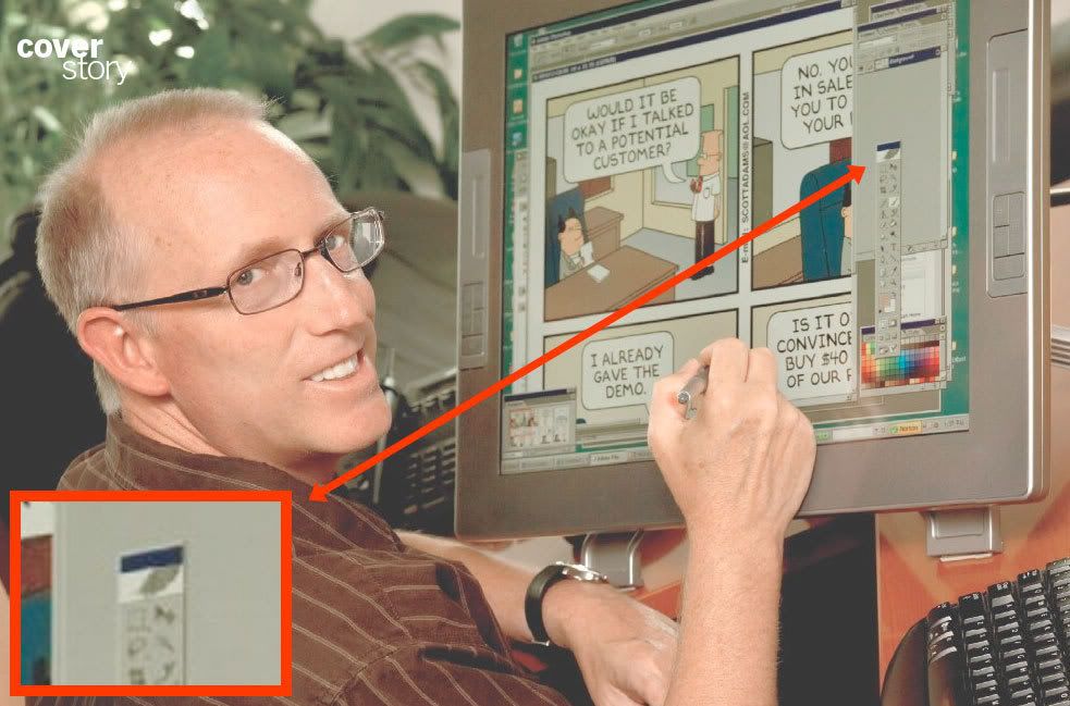
Another thing that came across our desks is the October issue of The Costco Connection. Seilling a new complation celebrating 20 years of Dilbert, the magazine profiles Scott Adams. The article was interesting indeed, but what really got my attention was Adams as his desk, coloring a Sunday strip:
(clicky to embiggen) Adams has the sort of kit that most aspiring graphic artists would kill for; the Cintiq pen tablet from Wacom that acts both as a graphics tablet as well as a monitor. Being able to seem to do Photoshop directly on your psd is a boon that should need no elaboration.
But look there. See the tool he's using. It's Photoshop, yes, but it's Photoshop CS, vintage 2002. Which I found surprising.
In both cases we have two rather wildly successful illustrators. We presume that both (and especially in the case of Mr. Adams) have little if any want the economics necessary to have the very best and most current digital design technology. Still, Scott Adams apparently is working with an application that is six years old. And Staake is working with technology that was new thirteen years ago.
This says something compelling about what artists use and what they're comfortable with. It's always a surprising thing. An anecdote I once read somewhere was that a famous cartoonist ... it may have been Dik Brown of Hagar the Horrible fame, but it may have been an associate ... didn't even use a pen. He used toothpicks ("What number toothpick did you use" was supposedly a common rib). Charles M. Schulz was famous for using regular dip pens, crow-quill pens, and a traditional drawing board (I understand it may be the same one he started on when he was doing Lil' Folks, the precursor to Peanuts) even after he was wealthy beyond dreams of avarice (well, my dreams anyway) and easily afford any drawing tool he could ever want.
Great artists, great artists that know how to really communicate through thier work, have a symbiosis with their tools. They know them inside and out and probably can push them to the utmost. With the comfort of ease of use with a familiar tool comes the thoughtless effortlessness that connects the mind of the artist straight to the medium. We've drawn enough to know that when you're reallly in the zone with a tool you're utterly familiar with, then the tool falls away and the work seems to just appear in front of you.
So, Scott Adams uses Photoshop CS. Bob Staake uses Photoshop 3. And Sparky used bristol board and dip pens.
And they did the greatest and most defining work of their professional lives.
I find that incredibly compelling and awe-inspiring, and just kind of basically inspiring.
(NB: the photo of Scott Adams was excerpted from the Oct 2008 The Costco Connection, and copyright remains with the creator)
Tags: art, artists, design, design tools, design_tools, scott adams, dilbert, bob staake, photoshop 3, photoshop cs, digital art, comics
Powered by Qumana


4 comments:
I like how you're looking at the tools of the artists and I'm merely thinking, "Scott Adams is not nearly as nerdy as I thought he'd be."
I love watching artists create, on the technical level ... of course, I'm impressed with any successful artist, but seeing thier wonderfulness is never enough for me. I always want to know how they did what they did.
Its like watching a cooking show. You know what went into, for instance, a cake, but it's kind of miraculous watching the ingredients combine.
I'd sit over Scott Adams' shoulder and watch him create, if he'd let me.
If you think this is groovy, then stay tuned ... I've actually come on a book that I checked out from the library called The Artist Inside that I'm going to flap my lips about. Really amazing book.
You:
I'm merely thinking, "Scott Adams is not nearly as nerdy as I thought he'd be."
Yea. He's kind of slick, inn'e? Of course, I understand he came from more of a marketing-degree-sort-of approach, so it kind of makes sense.
Late comment, but oh well...
If you haven't seen the accompanying video of Scott Adams drawing Dilbert on his Cintiq (let me pause for a moment to drool over the glorious Wacom Cintiq 21ux), you can see it here on Amazon.
ZOMG, Stan, you can be as late to the party as you want if you carry in gifts like that!
Gotta share this one with the world ...
Post a Comment