I have never made any secret of the fact that I loathe Courier. Now, that might not be an entirely nice thing to say, but I"m standing by it.
The problem with Courier is, despite its provenance (it was designed in 1955 by Howard Kettler, and redesigned by none other than Adrian Frutiger for use in IBM's legendary Selectric series of typewriters), it's stale. It's gone from being a font that someone developed to use in a typewriter to being the go-to font if someone wants to reproduce the look-and-feel of a typewriter. There's so little art left to it that, unlike Helvetica, not even it's bland universalness is interesting any longer ... instead of reinforcing its power as a neutral message-carrier, its lack-of-style actually is more of a distraction. You wish they'd of chosen some other font.
Sadly, time has moved on and Courier has not moved on with it. Now, for ASCII art it truly hits one over the fence, because monospaced fonts are just that ... each one takes up a single em-space, no matter what the actual shape of the glyph is. Kerning? Forget about it. Kerning's for sissies and OpenType fonts, says Courier; what was good enough for your grandmother in the secretarial pool should be good enough for you.
But, latterly, in web design, Courier has just one thing to say, unless someone actually meant to use it (horrors!): the designer was too lazy to move up to the dropdown list and just choose another font. It's become hollow, artless, devoid of meaning.
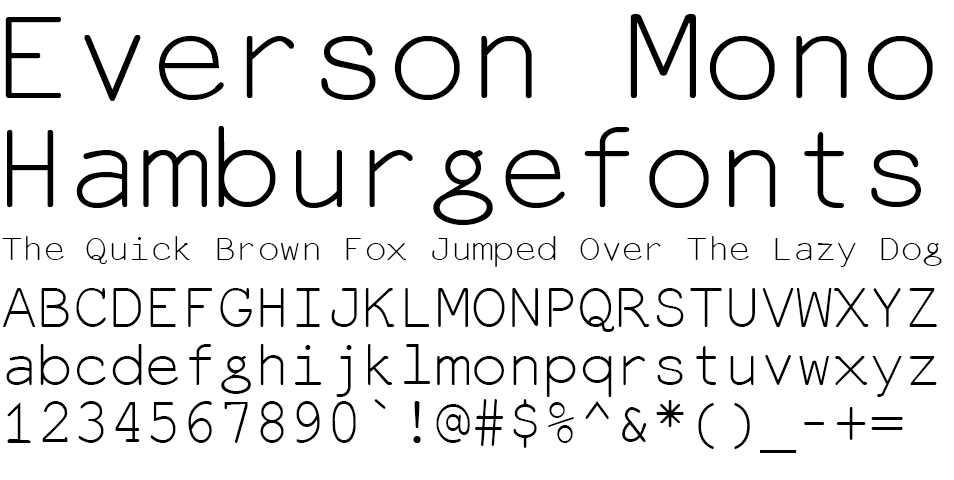
Today, I fell in love at first sight, however, with a monospaced font. That Font's name: Everson Mono:
It's got the best of both worlds. It's got the clean, simple lines of Courier, but there's a little art to it. The minuscule g is brilliant. The majuscule B has a gap at the join between the big stem and the middle stroke, joining the upper and lower counters. There's curves in unexpected places that harmonize well with the greater whole. I adore the little filip at the upper right corner of the X, both upper and lower case.
The coolest thing? it's available for free here as a TrueType font. Good to go.
Beautiful work, Mr. Everson, simply beautiful.
Tags: Michael Everson, Everson Mono, Monospaced fonts, typography


2 comments:
Thanks for saying such nice things about my font.
Mr. Everson:
I quite meant every word. Beautfully done, quite inspired.
I'd recommend this font to everyone if only to remove the scourge of Courier and Arial from the eye.
Post a Comment