1815.
Fresh from our quest to find the perfect little green apple (God, as B.J. Thomas said, didn't make 'em), we find that a beer would be a very fine thing.
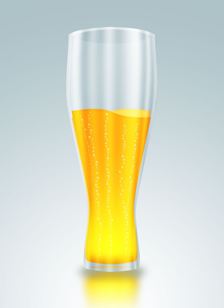
Photoshop can help again. This PSTUT tutorial, in 22 steps, enabled me to come up with this:
Which is a fine glass of Pilsener. Now, Pilsener isn't my favorite beer, but absent any other sort, it'll do nicely.
Once again the tutorial has us isolating areas for layer effects by CMD-clicking (CTRL-clicking in Windows) a layer thumbnail. This loads the non-transparent pixels of the selected layer as a selection. Say, for instance, you've made just a simple square of whatever color on its own layer, and you're going to create another layer, and you want to create a fill or effect and align it with the square. By CMD-clicking the layer thumb, the square shape – the nontransparent pixels on that layer – are loaded as a selection. This saves a great deal of time over marqueeing, magic-wanding, or quick-masking out a shape in appropriate situations.
The reflections on the glass are made with a gradient fill on its own separate layer, tweaked a bit, then using Edit > Transform > Warp to make it conform to the outlines of the glass, then CMD-clicking the glass outline's layer (there we go again, see?) to trim the gradent. Blending down using Screen and adjusting the opacity made it look like it was of the glass. A radial gradent fill overlay layer effect (which allowed me to pull the bright area down at will) provided the lovely golden color of the beer, and a brush with a specially-designed bubble and certain tweaks in the Brushes pallette provided the realistic-looking columns of bubbles. Altogether, pretty nifty.
Thristy? Draw yourself a glass of beer!
Tags: photoshop, photoshop tutorials, brushes, layer effects, photoshop cs3
Powered by Qumana


No comments:
Post a Comment