09 June 2009

What Would Wikipedia Look Like If You Printed It Out?

2070.Like this:


Yes, it really apparently exists. See Rob Matthews' blog for the other picture, which will give you a better idea of scale.

(H/T This Twitterer)

Technorati Tags: ,

ZehnKatzen Gmail Email FAIL ...

2069.A public service message for anyone who tried to reach me during the last few weeks using the email address zehnkatzen(at)gmail.com; somehow, that link broke the hell down, and I got nothing over the last ... oh, about six ... weeks.

My apologies for the interruption in service. I have cleared the blockage from that intartube and it is working again. But I'm beginning to see that maybe having multiple email accounts isn't the best thing, yes it is, no it isnt!

Technorati Tags: , , , ,

08 June 2009

Oregon Media Forum: A Logo With Wit

2068.The recently-opened Oregon Media Forum, in its current form a message forum devoted to those of us who really are having a hard time living without the abruptly-retired and rather-beloved Oregon Media Insiders, has it going on in the logo department.

LynnS's logo for that monumental work was nice, playful, and I enjoyed it much:


Radio, TV, Print. Great retro images (though in my opinion, the pencil is a timeless thing – I love drawing in pencil. Infinitely forgiving).

The pseudonymous founder of the Oregon Media Forum, "oregonmedia", brought the cleverness with a similarly-collage-like logo which takes the idea to the level of straight-faced satire:


The newspaper logo (s)he's riffing on is obvious, the two TV station logos, maybe not so much (though I parsed it straight away).

The phrase "straight-faced satire" might come off a bit awkward but it's actually meant as a compliment. An independent message board that welcomes anonymous comments branding itself using the visual grammar of prominent members of the community it critiques is actually quite visually fun if it comes off well, as it has here. And now that I'm taking a good deep look at it I like the subtle supporting touches: the gradients, the drop shadows, are all done just right. The beveling on the top of the F is a little stroke (so to speak) of genius, seriously.

If I was the type who had enough pull to give out Portland Logo of the Year awards, this would be up on that list. It's nifty!

Technorati Tags: , , , , , ,

04 June 2009

OMI Going? This Is SO Not A Good Prize!

2067.Lynn Siprelle is retiring a public service:

I lost a friend today over this site--a good friend, one of my best friends. Losing friends was always a risk of doing this site, and in a way I'm surprised it hasn't happened sooner. I don't think I can get this friend back; I've been told not to respond to the email, though I'm going to try anyway.

I've never liked running uncivil websites, ever. In fact, I've never run one, other than OMI. I've never had a website quite like it. The problem with OMI has always been that the more I censored, the more open to lawsuits I was. And I have no legal defense team, no corporate owner with big pockets to rescue me. There's only me. I know this is a concept that's really weird-sounding to some of you, but I'm telling you, that's the way the legal precedents stand now.

Moving to accounts-only posting has helped a great deal with the nasty drive-by posting. But I can't do this any more. A broken heart can do what a purple-faced news director or corporate lawyer cannot.

So I have to stop doing this. End of day tomorrow (when the current ads expire) I'm taking the site offline. I would like very much for someone to take over OMI. I think it's important that a site like this continue, but I don't have it in me any more.

We're just about to lose a very valuable resource to you, me and everyone. Is there anywhere else you can find such information?

Well, nowhere.

This sucks.

Technorati Tags: , , ,

03 June 2009

Getting Over Ourselves, and Our Bodies

2066.We're just about to life quarantine here at the Sonnenhurhaus. It has not been a pretty week for us.

Aside from the usual nastiness-of-life (we are always trying to overcome something), a cold of some sort has swept everyone under our roof. It was a nasty head cold-then chest cold-then-head cold-now nagging cough for me, but if you want to pity anyone, pity The Wife™.

She grew up with a Momma who smoked heavily, and strenuously denied that her chain smoking ever had any possible connection to the yearly bronchitis that her daughter suffered from. These days, she still doesn't stop at a mild cough ... any cough that gets her takes her to the wall. The last several days have been suffering for her, and two days after a doctor's visit that featured a chest x-ray to rule out a feared possibility of pneumonia (fortunately it was not) and racking coughing fits that you just wouldn't believe, we both got our first real sleep in several days today.

The house needs some stocking up. Spirits are up, if still flagging. The front lawn got mowed for the first time in a long time today. It needed it ... bad.

Even though I'm feeling better I feel like I still have some healing to do. This has not only sapped my strength but also my spirit, but giving up is not an option.

Fortunately, I've discovered Twitter (as hinted at). For a long time I've scoffed at Twitter, but I'm ready to eat crow here – not only is it fun, it finally provides a link to other people that is hard to beat. I don't know what most people use it for, but I'm networking like a madman.

It's nice to feel connected again. And I've found some great links to resources and cool designerly things, which I plan on commenting on here.

Wish us health. I've got to get back on my two wheels again.

Technorati Tags: , ,

28 May 2009

Come Watch Me Botch Up Twitter, Too.

2064.This is something I so don't plan on taking seriously:


Because it's not like I do anything important or interesting, so I just act out. Pretty much same-ol'-same-ol'.

Technorati Tags: , ,

Sic Transit ... Something Or Other

2063.If Silverton had been this cool when I was growing up, I never would have left it.

It makes me rather proud that my little town has become such an interesting place.

Technorati Tags: , , , ,

26 May 2009

We Haz A Pulse

2063.We're all rather sick and very tired. Life's been a bit tough on us lately. Some challenges remain intractable, but giving up is not an option.

Will resume regular posting shortly.

Technorati Tags: , ,

19 May 2009

Can You Find The Eleven In The Big Ten?

2062.There's a artistic trick called trompe l'oeil (close-enough English pronounciation "trump loy", literally "trick of the eye"), which is an artist's way of using implied perspective to make a flat thing look three-dimensional; the painting actually seems to offer a window into another world, to tell a deeper story, to mean more than it seems to mean.

Logo designers go for this. It's not necessarily a triumph of design to have a logo tell a story, but it is wicked clever to have them do it subtly. The inimitable Larry Fire of The Fire Wire pointed me to an article at the Graphic Design Forum that illustrates logo design trompe l'oeil-age.

For instance, consider the design of the Big Ten Conference's logo, pictured right. The oldest Division I collegiate athletic association in America, it has a brand-recognition second to absolutely nobody (except maybe the Ivy League). But in 1990, Penn State joined the constellation, making the membership not ten schools, but eleven.

Big Eleven conference?

Well, no. Just like 20th Century Fox didn't change its name in the year 2001 (and the 20th Century Lanes here in SE Portland off SE 92nd Avenue and Powell Blvd retains it suddenly-rustic name) you don't mess with success. You design it into the logo. By now you should see the number 11 in the BIG TEN, but if you don't, look at the negative space on either side of T.

There you go. Logo trompe l'oeil. It tells a bigger story and makes the logo appropriate even if the name is no longer.

Via Larry Fire, then, here's a bunch of similar logos. It's pretty cool tour, and not all of them are of Randian brilliance, but many come close, and have the same deft subtletly that allows the logo to tell the story without a lot of fuss, bother, or mess (including the Toblerone bear, which I documented as well).

Technorati Tags: ,

McCall's Restaurant is Getting The Rose On

2061.As reported in The Big O today, Randy's Rose is going up on the old McCall's Restaurant (once the Vistor's Center) Building:
Last month the City Council waived the sign code to allow the large red neon rose that will twinkle during the festival. That waiver meant a lively discussion and a lone "no" vote from Commissioner Amanda Fritz, who said she was "beyond troubled" that the sign proposal didn't go before the city's Historic Landmarks Commission.

We're troubled, too, Amanda, but I've noticed that's the way things roll around here. Maybe I'm tired of all the sign and landmark controversy around here, but I kind of like it. It's not as bad as some things that they could be putting up there.

Sadly, no unicorns. A man can dream, though.

(photo screenclipped from The Big O's online version. Photo credit:Thomas Boyd)

Technorati Tags: , , , ,

17 May 2009

Even More Capitolism

2060.I'm turning my attention on State Capitol buildings today because Pril left me this amazing link.

The architectural definition of a cupola is a dome-like structure atop a building. The site Cupola seems to be a privately-run gallery of really excellent architecture, and there's a section devoted exclusively to American capitol buildings, Cupolas of Capitalism. It's replete with great pictures, snappy little thumbnail histories and architechtural summaries, and the picture galleries are not to be missed.

Lots of Greek Revival out there, it would seem.

If you want the start of the seven pictures of Oregon's Capitol, you can go here; the page with the Oregon Capitol entry is here; and the start of the list, with A-for-Alabama, is here. Enjoy!

Technorati Tags: , , , ,

16 May 2009

More Zines I've Seen

2059.More zine coolness available at your local Multnomah County Library (seriouslys! They have a zine collection!). Contact information, where available, embedded within the review, taken striaght from the publications. Typos are mine.

The Zine Standard Deviation by J.V. Whimper (jvwhimper@gmail.com) bills itself as "Science for you, not for them", and lives up to that promise. The main feature of the hand-sized zine, "Caffeine from Green Coffee Beans", noting that green coffee beans (unroasted, that is) have more caffeine in them than roasted, is an experiment designed to see if the high-test beverage can be extracted and consumed via one of two cold-brew methods. Short answers: yes and yes (though it be tasting as crap), and the buzz is quite real.

The zine rounds out with an advice column (Ask Dr. Dūm), a quick bit of myth-busting (Science Will Break Your Heart), Graphs!, and a 4 panel comic on the back cover (Scientist and Robot).

I thought this one a bit of fun, and actually seems like it would be a great introduction to the scientific method – the procedure of the caffeine experiment seems solid.

The next two zines are perfect for those times when life is leaving you cold and you just want something that'll give you a little lighthearted smile.

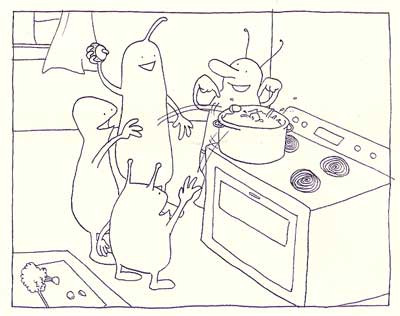
Monsters Make A Stew, by Lisa Eisenberg (lisa.rosalie@gmail.com, http://i_draw_pictures.livejournal.com), is just what it says it is; a gently funny, simply drawn series of panels showing some kinda squishy, cuddly, friendly-looking monsters getting together at a friend's house to make and share a stew. I don't know if there was any sort of message there except "get together and share good times with your friends", but whatever there was, it left me with a light feeling.

The comic is almost completely wordless, save for a monster on the cover saying that he could bring the peppers (and he did) and one of the monsters at table at the end signifying his satsfaction with a petite burp. Most charmingly cute.


Above: Scene from Monsters Make A Stew, by Lisa Eisenberg.
Copyright, the artist.


Super Crazy Cat Dance,
by Aron Nels Steinke (http://aronnelssteinke.com) is billed as a "super fun crazy comic for kids and grownups alike", and it also lives up to its billing. All black and white and using a joyously simple illustration style (see scene below), we get to see a girl celebrating all the cats she knows, teaching another girl how to do the SCCD, dancing to the moon, and then returning. It's the kind of stuff that makes you smile to read even if you are a dog-person, because even the dogs and the kitties lay down together at the end of the comic. Gently funny, and done by someone who must be a gentleman, as it's dedicated to his girlfriends three cats, which I find nifty.


Scene from Super Crazy Cat Dance by Aron Nels Steinke, copyright the artist
How can you not like this stuff?


Two more and I must dash.

Oregon 101 features Angela Wyrens and Chris Phillips (ohthedrama2003@yahoo.com) car tripping down the Oregon Coast (hence the title). They see the Sea Lion Caves, explore tidepools, sleep in the car, panic over getting something stuck in they eye, and have a minor car repair issue.

In other words, the same sort of thing that just about all of us go through on a car trip to the coast on a tight budget. I really related to it.


Scene from Oregon 101, by Angela Wyrens and Chris Phillips
Copyright, the artists.


Finally, a serious one with a lighthearted tone. Just about everyone has heard of the Dvorak Simplfied Keyboard layout (it's an option on just about every computer) but just what is it? The Dvorak Zine: Changing the World One Keyboard At A Time by Alec, Frunch, and GCB (http://DVzine.org) wants to not only show you but bring you over. They are Dvorak keyboard enthusiasts and evangelists, and not only want you to know the history of the typewriter and keyboard but bust some myths along the way:
  • Sholes, perfector of the Typewriter and the iconic Qwerty layout, didn't do that to slow down fast typists – since the board was laid out before the typewriter was even released, there still were no typists, but did it because the original mechanism was likely to jam.
  • After the typewriter was released by Remington, Sholes tried to come up with a more logical arrangement, but it was too late – The Qwerty had already taken the world by storm, as had the typewriter
  • Dvorak is hard to learn – actually it's quite easy. And since it's available in just about every computer made, you can have a Dvorak keyboard at any time.
You may be fine with Qwerty (as I am) but if you want to learn Dvorak, this conversationally-written and graphically-friendly zine, complete with three interesting personalities, should get you well down the road. It even functions as its own learning aid, and is replete with references.


Frunch introduces us to Dvorak. A scene from the Dvorak Zine,
copyright the artist.


Technorati Tags: , , , , ,

Something I Should Probably Be Abashed About, But Am Not

2058.I like Yanni.

Hey, there's no accounting for taste, man.

Technorati Tags: , , ,

I Think I've Been Insulted

2057.I love it when someone links to something clever I've done on this blog, but sometimes one wonders ...

I found, in examining my inbound traffic, I got a link from a blog referring my Periodic Table Of Oregon. And it was from a German blog, auf Deutsch! Nifty.

Although, when I fed it into Babelfish (I was lazy) I detected the writer was not all that thrilled about what I had wrought. Here's the last 'graf, as x-lated:

Therefore all are neither useful nor necessary straight periodic systems appearing in the Internet, but simply only sense-free arrangements after an outdated sample.

Here's the whole entry. I'm not sure if my feelings are supposed to be hurt here, or something. For what it's worth, I see to be in a sort of rogue's gallery, which isn't such a bad thing I suppose, since I'm in company along with the Periodic Table of Type, which is a cleverness I only wish I could bring off.

The nub of the fellow's gist seems to be that the Periodic Table of the Elements is an inappropriate lens to be looking at pop culture (and allied things) with. Either that, or he wants a pizza and the Emmentaler cheese has gone off, and his Volkswagen is full of eels.

Ah, well. Can't please 'em all. Don't know art but do know what we like, and all that.

Technorati Tags: , , , , ,

12 May 2009

For Those Who Like Dungeons & Dragons, And Those Who Love To Hate 4th Edition

2056.I've not played D&D for years. I just kind of lost interest; I only look like someone who plays RPGs. I still enjoy the atmosphere over at Bridgetown Games and similar places, but the RPG train rattled on without me some time ago.

Still, I did note with interest a group over on Facebook which hates on 4th Edition D&D, now published by WOTC (TSR, the giant of the industry, now but a memory). As a matter of fact, that's what they call it: 4th Edition Dungeons and Dragons Haters Club.

Stop by if you feel the need to vent. I've looked at it, and it looks like they game-lawyered all the fun out of it. YMMV, of course.

Technorati Tags: , , , , , ,

KOMO Adds FM Side, Numbers To Logo

2055.The Seattle radio station constellation has shifted just a little bit once again.

Tip o'the cap to Gentleman Ben in Seattle who keeps an eye out for these things for me, for which I am grateful. He catches such interesting things!

KOMO 1000 AM radio, a big talker in the Space Noodleplex, has signed an agreement to simulcast over 97.7 FM, KFMY, licensed to Oakville WA, currently broadcasting a Classic Hits format and serving the south Puget Sound area. It's branding is The Eagle 97.7 FM, which is kind of a confusing fit until you see all the motorcycles, pick-um-up-trucks and bikini babes on the site.


But it's going on May 15th, so get your looks while you can, you chauvinists. Anyway. An Agreement between The Flag and South Sound Broadcasting will get KOMO 1000 AM signal on both KFMY and KOMO, and KFMY will be rebranded KOMO News Radio 97.7 FM.

The KOMO AM logo looked like this:


Very straightforward, static and dependable, with a red slash under the word 'radio' for dynamic interest.  The spare typographic treatment brings to mind The Flag's former empire style, and synchs up well with the style used by all the KOMO broadcasting outlets, both radio and TV.

Adding a frequency calls for a change to the logo in KOMOland, and here's what they did:


This has works and not-works to speak for it. Overall it's an improvment, but I'm not sure I'd execute it quite that way.

Here's the works about it:
  • The overall balanced aspect of the logo – the square, stable shape – has been retained. The call-sign and frequencies have remained in a very modern, machine-like font, which resonates with the old look, thereby maintaining the identification on a visual level.
  • The same blue, black, and red colors are used. Consistent use of color continues to stableize the brand identification.
  • The serifed, humanist type in the middle would be an off note, but it's bookended top and bottom by the stable rectangular shapes that define the limits of the design. It's not unlike a book and its pages that way; you have thick covers and thin, flexible pages, but it's a single unit. The choice of a serifed font is a dignified touch that gives an impression of seriousness and tradition.
Now, what doesn't work:
  • My essential crotchet about this design comes from the division of the bottom stripe into red and blue parts with a slanted line. In and of itself, this isn't such a bad thing; it reminds one of a slash one might write when making a note about the two frequencies (1000AM/97.7FM), and also is engineered to be parallel to the slated strokes in the 7's. The sour note that rings comes from the inclusion of a slanting element where it seems actually rather awkward. The entire logo bases itself on a stable, locked-down look, which is appropriate for a broadcast outlet that specializes in news – a commodity that you want people to trust when it's your product. The slanted division introduces tension in a logo where tension isn't necessarily a good thing.
It's been opined to me that it's a little boring, and I'm not going to contradict that. Boring is kind of in the eye of the beholder. Solid and ordered can be a plus if you're looking to generate an attitude of trust and respect.

And a slant as part of the logo design of a news station can work: just check the slant in the KIRO AM logo, which I analyzed to death pretty much, here.

Thanks again, Ben. You have an esteemable eye!

Technorati Tags: , , , , , ,

11 May 2009

Meet Les Kerning

2054.Y'all will remember that, back here, I introduced you the singular Max Kerning, the god of clean, well-spaced, orderly type.

His döppelgänger has emerged. Yin to the yang, the self-proclaimed Jackson Pollock of type (I shudder, I do), Les Kerning does everything Max does not. He has hot girlfriends in cute underwear. He wears hoodies. He hangs around gritty urban alleys. He mixes Comic Sans and Wingdings in newsletters.

He does pretty much what he wants.
Have you seen my brother's "manifesto"? Sheesh, give that guy some aviator sunglasses and a hoodie - he could be the "Uni-typographer".
Well, he's just as opnionated as his brother, that's for certain.

Les doesn't have a web page, but he does have a Facebook page*.

You can run, Max ... but you can't hide.

* No, I will not say "has a Facebook". I believe in complete sentences, yo.

Technorati Tags: , , , ,

09 May 2009

The United States Of Capitol Buildings

2053.I give you a work in progress.

I adore Capitol buildings. I particularly thing that Oregon's is the most lovely, but there's something about that form, which makes the bifurcated nature of the national personality stone-real, that I find addictive. Also, in the main, the form a Capitol takes is usually quite graceful or inspiring.

Perhaps, I thought that mashing together Capitol pictures with the map of the nation would give an idea of how styles develop or match up with sense-of-place, and in a way, the following map does (clicky upon it to embiggen):


The big blank area on the right is an area I'm going to break the small states out into so the photos could be more better seen, and add some expository text.

I found out some interesting things. For instance, the Arizona state government has long since outgrown its Capitol building and has moved to symetrically-designed and placed legislative buildings making up their Capitol Mall; the Arizona Capitol remains as a museum. The North Carolina Capitol only contains the governor and lieutenant-governor's offices; the state Senate and House are in a legislative building across the street. And Viriginia's Capitol was built along the lines of a Greek temple, with wings for the two legislative houses added on at a later time.

The Alaska State Capitol is a poky building in downtown Juneau, and there are fewer than fifty individuals between the two houses. The legislative chambers, while formal, are decidedly intimate. And the New Hampshire House of Representatives has over 400 members, making the combined state legislature (which in NH and Massachusetts are called the General Court, a holdover term from when the two bodies actually adjudicated legally) one of the largest single deliberative bodies on earth, something like third or fourth in population behind the US Congress. In fact, each representative consituency in New Hampshire serves a district of only about 3,000 people. If US Congresspeople were similarly ennumerated, the US Congress would have over 99,000 members.

The big version is in a PNG format-the file has to be huge to include all the pictures (which I did my best to make sure are CC licensed (typically from the Wikipedia entry) so this online version is not as detailed as one would like. This is the verity of online storage
.
Technorati Tags: , , ,

06 May 2009

Here I Am, Stuck In The Middle With You

2052.I'm a fan of Gerry Rafferty. This is a little tougher to do than you might think.

Not that GR's music is hard to follow or uneven in quality (it isn't, and it sure as hell isn't!). Gerry Rafferty has been one of the smartest singer-songwriters in music history. Most people know him from his days in Stealer's Wheel ("Stuck In The Middle With You"), or his work beforehand with The Humblebums (which was him and then-musician, now-comic-and-TV-star Billy Connolly), or of course the AM radio classic "Baker Street" (you know, the one with That Sax Solo™) from his huge album City To City (the 1977 chart monster that was the number one album in America for about two and a half weeks in July of that year).

After two more well-recieved albums (Night Owl and Snakes and Ladders), he dropped off the popular radar (this usually credited with his reluctance to tour), leaving the impression of a one-hit wonder to those not completely familiar with his output. But the music continued and continued to be good. His last album, Another World, released in 2003, was a gem that you probably didn't hear about.

During the AW time, I grew involved with a group of Gerry fans that congregated around the message board run by Icon Music, the label under which that album was released. After straying for a while (I am easily distracted, remember), I went back there to find the site discontinued, which was sad. The Gerry fans are a quirky, quietly generous bunch (much like the singer/songwriter) and they connected reconnected me with a bunch of great music and rare recordings.

Just on a whim, recently, I cruised the Wikipedia entry on Gerry Rafferty and found a link to the Moonlight and Gold message board, established by Iconian refugees. It's quirky and interesting, just like the Icon message board was, with great discussions and scary discussions and people just having fun being Gerry fans. I've registered. It's great to be back home.

There are odd rumors about how Gerry's been recently. They seem to be just that, rumors. Gerry is famously private, which is kind of refreshing, and appears to have simply dropped out of sight for a while – as seems typical for brilliant performers, they get tired of fighting The Man just to produce great work and back off for a while. The most reliable rumor has him hanging out in Florence, Italy and coming up with great music again for a hoped-for future album, which I will get, without a doubt.

Oh, by the way, he has a MySpace page, and I don't really like MySpace at all, but knowing Gerry has a MySpace page is enough to get me to log back in after a long, long absence. It's here, and there's a nifty updated version of "Stuck In The Middle With You" that is really worth a listen to.

Nice to know Gerry Rafferty is still going strong. He's one of the most underrated singers of the radio age, and chances are you like him ... you just don't know it yet.

Did you dig that song in Reservoir Dogs?

Yeah, that's Gerry.

You like him. Just accept it.

Technorati Tags: , , ,

04 May 2009

Mind The Gap

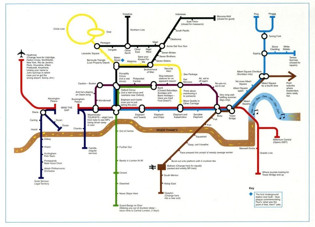
2051.My current obsession with TriMet Maps (and cosmopolitan transit map styling)(and ideas for map pastiches and parodies I've been mulling)(sorry about all the parens) invariably led me to the world-famous London Tube Map. You can get a look at the whole magila here (Transport for London guards the copyright with the ferocity of a lion, an ire I wish not to arouse ... the illustration right is sized really teeny, for illustration-y purposes). It's not only much loved and much imitated, it lends itself to a great deal of ... well, pastiche and parody.

By far the funnies one is a very simplfied map loaded with Brit-funnay that I understand only because of a steady multi-year diet of Britcoms (and a wife who's an Anglophile). It was orginally published in a BBC book called Have I Got 1997 For You, and I've found it displayed in quite a few places on the web. It's too good not to share, so I'll post the version I found on Craphound.com, and hopefully the copyright holders will view my disregard for the common weal with equanimity (click to embiggen):


Some of the things I don't quite get (such as the reference to John Gorman) but most of the stuff I do get, as I said, a steady diet of Britcoms over the past never-you-mind-how-many years have paid off.

Technorati Tags: , , , ,

01 May 2009

The Evolution Of The TriMet MAX Map 4: Say Hi To Yellow

2050.Now we move up to 2004 in our series about the MAX Map, because between 2000 and 2004 several changes obtained, culminating in the quantum leap of the debut of a new branch to the network – The MAX Yellow line, for the Interstate Avenue corridor, nicknamed "IMAX" by some wags during construction.

The MAX System now has two dendritic branches rather than just one, and the design could have kept the old theme, but my guess is someone along the line found it too sprawling and probably was a stone pain to do layout around. So, treating the original Blue line as the system backbone (as indeed it seems) and the newer lines as subordinate branches:


You can clicky the map above to embiggen, or go here (while TriMet still supports it) to see the map even better and get a PDF copy.

This is the acme, so far, of geographical simplification and abstraction. The Yamhill-Morrison downtown axis has become the center of the system, remarkably so, and the system has been laid out along a single backbone line, even to the extent of mapping the SW 1st Avenue and Steel Bridge sections completely out-of-line with reality.

But the genius of this style of mapping is that it works, and works well. Think again about the London Underground map and consider. If you get on the MAX, according to the diagram, at Yamhill District, and go three stops, you're at the Rose Quarter TC. It matters not at all that after the Yamhill District station the system hangs a ninety-degree left onto SW 1st or that it makes a somehwat-complicated dogleg over the Steel Bridge and into the Rose Quarter. The map and diagram works and delivers you exactly where you think you should go.

The time stripes along the line give you good information as to how long you expect to be on the train. And your eyes will provide you with the rest of the information (I've lived in Portland for most of my life but I can't stop looking at my town. If the mere sight of Portland doesn't nourish you I say its time for your to find another town, to be blunt).

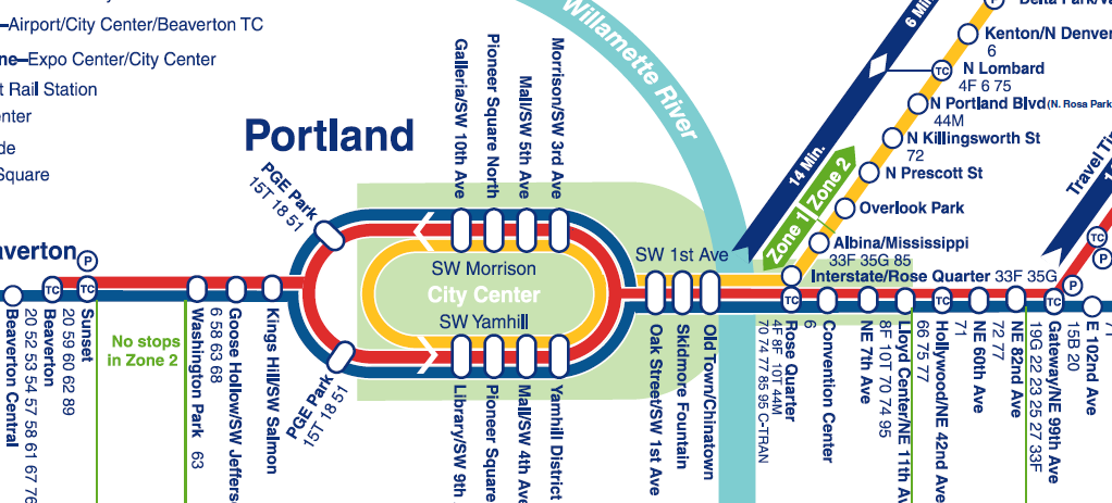
The following image zooms in to the vital enter, and shows the maturing of several cosmopolitan design elements:


Clicky on the image above to embiggen. The big point, and my hobbyhorse thus far, is the use of the cartouche-like ovals for stations that serve more than one line. If you look at the Rose Quarter stop, you can see why this works. The Yellow Line stop is a circle which is physically adjacent to the Red and Blue Line oval. This indicates while they are physically close, you have to be at one or the other to get a certain line. That's a big story told very effectively by only two well-chosen and placed symbols.

Amongst the other changes reflected in the map is the extension of the Fareless Square area by a "panhandle" encompassing the Lloyd district (hard to see in this map because the Red/Blue/Yellow lines in that area are so typographically busy, but I don't see how the designer had any choice there really – sometimes the best graphic solution isn't exactly ideal) and the extension of the Red Line, for Airport service, to the Beaverton Transit Center.

One other interesting point is the PGE Park station. In this (and the map before), the station serving "The Piggy" has been diagrammed as two stations. And, while the station itself can be thought of as a single system access point, in reality, the eastbound and westbound boarding platforms are separated by about half a block, making them physically separate, and though they are very close physically, they couldn't be more separated by intent, so the wide separation of east and west bound PGE stations are quite appropriate.

The next evolutions, by the present day (2009) saw the addition of not one but two lines: The Green Line (serving a new route up and down The Portland Mall, Gateway, and the I-205 corridor to Clackamas) and WES-which turns TriMet's rail approach into multi-modal thing, and creates a truly exciting approach (well, I sure as hell like it!).

About more which presently.

Technorati Tags: , , , , , ,

TriMet Map Cover Designs: 1997, 1998, 1999

2049.Picking up a series I've dropped for a few entries, here's the continuation of the TriMet covers series. This time, we look at 1997, 1998, and 1999.


The design sense is starting to be very dialled back now. The 1997 cover seems inspired by the 1996 cover, it uses the same type and has the same color-block-and-dotted-line theme. The photo of MAX at the Civic Stadium (I don't think it was "The Piggy" quite yet) is similarly monchromatic and screened back just a little.

The 1997 Book, which I don't have to hand right now, was a different animal altogether. The format of the TriMet Schedule books have tended to resemble a paperback novel, about the same size, with newsprint pages and a cardstock cover. For this year, it was a newsprint pamphlet, about the size of a small magazine.

Being entirely newsprint and larger, it was simpler to get more than one schedule grid on a page, meaning instead of Weekday/Saturday/Sun-Holiday sections, each route had all three schedules (as appropriate) grouped under route number.

It sounds as though it was a great idea, and on paper it looks good, but in practice is was not a success. The biggest problem was durability. If you bought a Transportation Guide and Map it was something that was liable to go many places (if you were a heavy transit user) and could be stuffed in a backpack, and back pocket, a purse, or what-have-you. The smaller format also held up very well under the uses it would have gotten (I knew someone who drilled a hole through one corner and hung it up by a string by the phone, like a small-town phone book). A Guide that was wholly newsprint just didn't stand up, and the larger format was awkward, to say the least.

The preceding was my assumption, but I must be getting some of it right ... the old Guide format returned the very next year, 1998.

As far as 1998 and 1999, the design ideas, which went from restrained to raucous, went straight to restraint and stayed there. "Slice-of-transit-life" photos, friendly and quaint, formed the centerpiece of the design, and minimal type and graphic adventurism. The trend toward a new typeface is also confirmed, as the same type had graced the design since approximately 1996.

Technorati Tags: , , , , ,

More Examples Of Ligne Claire, and Hergé Meets Warhol

2048.The picture right, clipped from a work at the URL I'm about to reference, delights but does not surprise. Somehow to me it makes eminient (if ineffable) sense that Andy Warhol (picture, right) and Hergé (left) should meet once in their lives.

Or maybe it was something in Warhol's deliciously odd and culture-vulture-y art that suggests inspiration from such a gestalt thing as the Tintin vibe.

Anyway, after I posted my last on Hergé's art, the webmeister of TintinMovie.org, Chris Tregenza, suggested I look upon the collection of Ligne Claire art in the site. Impressive, to say the least.

Hergé's mastery of the technique enabled more than just the telling of unforgettable stories, it creates a look and a feel that is voluptuous even if simple. There's just something about the combination of simplicity and reality that is incredibly captivating. And there are some splendid modern exponents of ligne claire.

I've looked at the collection, and, liking what I see, perforce recommend. Go view. you won't be sorry.

http://tintinmovie.org/category/ligne-claire-clear-line/

Bitte sehr, Chris!

Technorati Tags: , , , , ,

29 April 2009

Hergé Draws Tintin and Snowy

2047.A ways back, I found and posted a link to a video of Scott Adams doing a Dilbert daily strip.

It's very hard to find interesting videos or pictures of artists actually creating thier art, so it's been awhile but I just turned up another one.

I don't speak of it often (I'm not ashamed or anything, it just doesn't come up), but I have long been head-over-heels in love with Tintin, the boy reporter. I wish I could say I've been reading him since I was in grade school, but that isn't true; I discovered him as a young adult. But when I opened my first Tintin album, I was immediately smitten.

There are a lot of interesting things about him. Even though he's a boy reporter, in the traditional globetrotting adveturer style, I only recall him filing a story ever just one time (near the beginning of the adventure The Shooting Star). He wore his trademark "plus fours" (those short, bloused pants), traditional uniform of the European child of the day, until his last published adventure in the 1970s (Tintin and the Picaros). The 80s new-wave musical group Thompson Twins took their name from the two comical, bumbling, bowler-hatted opratives Thompson and Thomson (they even had an early song "We Are Detective").

His creator, the Belgian artist Georges Remi (known by the Francophone pronounciation of his initials reversed, or Hergé), is credited with being the originator – or at the least, the perfector – of the comic style known as ligne claire, or "clear line". It's a visually exciting collision of fancy and reality, in which all lines are drawn as clear, strong, equally-important-weight lines. It's a beautiful style.

Anyway, I told you all that as introduction to this very short clip I just located on YouTube, in which Hergé dashes out a signature Tinitin-and-Snowy sketch to (apparently) a fan with a pen in just a handful of quick strokes (follow the link there ... I tried embedding the video but my version of Firefox just shows a big white box).

One of the most amazing things about a practiced artist, as Hergé certainly was by this time, was that drawing the figures was so natural after years of doing it that they emerge from the pen of the artist almost as though they were extensions of his physical form that just grew from the pen itself.

I recently stumbled on a copy of a rerelease of the last unfinished Tintin, Tintin and Alph-Art, which Hergé was working on before he died. It remains in the form of a transcription and his layout pages in the process of being set up. Amazing stuff. I'll share that in another missive.

Technorati Tags: , , , , , , , , , ,

Alaska Airlines New Slogan, Reinterpreted

2046.Alaska Airlines' new slogan, North of Expected, is an awkward collision of subjective experience and a geographical verity. Once I heard it, it got under my skin and stayed there, and bugged me.

North of expected? Yeah, I get the play on Alaska being north and "north" also meaning above and beyond (what do they say in Argentina, I wonder? I'm expecting you guys to go above and beyond ...  I want the result to be south of what I expect of you!.

All I could think about being north of Expected was those little inset maps you got in the old Rand McNally Road Atlases, the ones with the simplified roads, and the squishy vague details:


As you can see on my map, Alaskaairlines is north of Expected, alright. Just north, as it happens.

There. I feel better now.

Technorati Tags: , , , , , ,

I'm Not The Only One Talking About Portland's Street Signs ...

2045.Joseph Rose, The Oregonian's commute columnist, wrote a couple of articles not too long ago about the street signage in Portland, too long ago, not sure how I missed them, but I've stumbled on them, and they take on the oddities and drawbacks in Portland signage, and how it tends to fall short in many areas.

The two columns make very good points as well as at least one strange one, about which one crotchet presently. The first one makes reference to awkward and insufficient directional signage (which I quite assuredly agree with) and then stretches just a bit to draw out dramatic tension between the lacklustre street signage and Portland's progressive transportation reputation.

The strange point came with a quote from one Sharon Linnenkohl, a recent Angeleno transplant who has trouble finding things in town while she learns the lay of the land, and mentioned that "getting to Foster Road from I-205 southbound is a guessing game", which just seems odd to me. But before I seem to be rashing on Rose and Linnenkohl a bit too much, I will say that the overarching point is well-taken, and perhaps explains why we've been seeing a new street blade standard for Portland:

For starters, most of the street-name signs don't comply with new federal regulations adopted for America's aging population. The font on the signs is too small and their ability to reflect light at night is way beyond warranty.

Which is a esteemably fair call, once you get beyond the Federal regulations point. There are a lot of old and badly-reflective signs that need replacment and how, and the newer blades we've been seeing about fit that bill admirably.

The second one points out some more problems, noting one of the more famous critical points, the lower deck of the Marquam Bridge going south. Approaching this bridge and knowing that at the other end you have to go left to leave the stack to go downtown and stay right to go left out of that, is kind of counter-intutive.

There is a reason for it, however, and it has to do with the old Mount Hood Freeway (and now for a digression). The Mount Hood, as planned, was to merge into the lower deck's lanes from the left. Since that was the future designated route in for Interstate 84 (The Banfield was to simply be US 30) It was assumed that westbound traffic would prefer not to have to change lanes (so as to go straight downtown – The Mount Hood was planned for commuters, after all). It was therefore thought that the downtown leg stay on the right so as to reduce the number of lane changes. But the Mount Hood Freeway was never built, and there you go.

The second column continues in the vein of inadequate signage making it hard to find ones way around (and to) the bridges of the Rose City, amongst other things, and touches on the subject I've been obsessed on of late: street blades.

The old street blades are presumably being swapped over because they just aren't up to spec anymore and as the baby boom makes its way up the population pyramid, they're going to need to see where the hell it is they're going. The real payoff from that column, though, are numbers. They're pretty intimidating and intriguing:
  • There are 130,500 signs to maintain in PDX. These include ...
  • 40,000 street blades
  • 5,500 guide signs
  • 10,000 "yellow school" signs
  • 14,000 STOP signs
  • 12,000 Warning signs
  • 49,000 parking signs
  • The annual budget for the sign shop is $702,000, which covers missing and vandalized signs and not much else, apparently
  • The signs are produced in a sign shop that has 1 (one) employee
  • Each new street blade costs $22 to make
  • The real problem is finding hands to put up the signs. Funds are at a bare-bones level, though, so they have to apparently wait for a break in work crew business to erect them.
It looks like a case of doing the best they have with what they got.

But at least now we do have some idea of why the new street blades are going up. And they are more readable, that's obvious (as I think I'm documenting very aptly here).

In Matters Related, Red Electric blogger Rick Seifert posted a couple of times about a sign imbroglio in his Southwest neighborhood. Anyone travelling down Southwest Barbur Blvd from downtown Portland knows about that hard little turn you need to make to get off Barbur going southbound to get to Southwest Capitol Highway to get to the Hillsdale business district and beyond to Southwest Beaverton Hillsdale Highway. It's a very tight corner, but it's at least got a rather adequate sign.

ODOT decided to place a bike warning sign at that intersection, which is a wise thing to do. But why, one wonders, did they put it right in front of the Capitol Hwy/Hillsdale guide sign. Couldn't they step back and say "ahh ... won't work"? Seriously – this really did make the guide sign pointless, and also partially obscured the directional sign to OHSU.

After lodging a complaint with Those Who Must Do Something, the sign was moved, and you can see the Hillsdale/Capitol Hwy guide again ... but the TriMet bus stop sign still obscures the big blue-n-white H.

And so it goes.

Technorati Tags: , , , ,

28 April 2009

You Are Here. Are You Here? Why Are You Here?

2044.Referred to me by an acquaintance who knows that I quite like this sort of thing, a thing left on a post somewhere on Southeast 11th Avenue, a poster, apparently taken back in February:


The text reads as follows:
SEEKING: CARTOGRAPHERS OF ANY SKILL LEVEL to assist in locating a sense of place. Curiosity, open eyes and ears, and a sense of humor a plus. Open to maps on paper as well as movement, music, narrative and video. Please send a draft of how you "map out" your experiences, discoveries, and psychogeographical landsapes to: mostlandia@gmail.com. Willing to barter with homemade ice creatm. Sincere inquiries only.

That sound easy enough. But how do I email them my blog?

Technorati Tags: , , , ,

26 April 2009

We Can Try To Understand The New York Times' Effect On Man

2043.The New York Times can make or break a region with its world class commentary, cosmopolitan air, and gimlet-sharp prose.

We already know what's happened with Portland. From the vantage of Manhattan, PDX is The City On The Hill, Built On The Ancient Unicorn Burial Ground. We don't just set style, we are style.

But if your state Tourism board comes up with a lame branding strategy, well ...

And Wisconsin has “Live Like You Mean It,” which sounds less like an invitation to vacation than a self-improvement project. As a matter of fact, besides being an old Bacardi slogan, it is also the title of a motivational book whose authors promise to guide you toward “a meaningful, fulfilling, and happier life with results worthy of legacy building.”

I don’t know about you, but when I want to get away from it all, I do not want to take my legacy along with me.

Kelli Trumble, the secretary for the Wisconsin Department of Tourism, said she was heartened that the new slogan already has an “amazing” 90 percent awareness rate in the state, although it’s pretty easy to get attention when you have a radio news anchor in Milwaukee blogging “Wisconsin: We have a lame slogan ... AND WE STOLE IT!”

Ooof. Now, that's cold.

On a separate but related note, I now understand why I was run out of Wisconsin that one time. I wasn't living like I meant it, I was living like I was screwing around!

Maybe we can ship them a few unicorns. That always works for me.

Technorati Tags: , , ,

23 April 2009

TriMet's Iconic Past: Service Sector Symbols

2042.In the last entry, I mentioned something about TriMet Service Sectors. That brought that though to the fore, and I decided I wanted to obsess on that for just a posting.

One of the things I was a big fan of, and that I was sorry to see go, was the idea of color-and-symbol coded service areas. I don't remember when this was inagurated – I think it goes back to the 1970s, when the Transit Mall (known on maps as The Portland Mall) was originally constructed.

It was a great and playful way of organizing a district of hundreds of square miles and about one hundred routes, both regular service and rush hour service, into big chunks making it really unnecessary to know a priori where a route was to find its terminals on the Mall.

Like a big, crazy pie, with all slices converging on downtown Portland, the greater Portland Area was divided into seven sectors, with a corresponding color/symbol icon – each symbol reflecting on the Portland area's connection with nature.


The sectors worked out thusly, from the NW and going clockwise, between loosely-defined boundaries:

The Red Fish sector covered NW and N Portland, from approximately the crest of Forest Park east to a line more or less alone Martin Luther King Jr. Blvd/Union Avenue. Locations in this area included Saint Johns, the Portsmouth area and the North Portland Peninsula, the trendy Northwest district, the and the Northwest industrial district.

The Purple Raindrop (no, not "Purple Rain", no joy for Prince fans here) covered an arc from approximately Martin Luther King Jr Blvd to a line more or less parallel to and a little south of Northeast Sandy Blvd. Destinations in this area included Portland International Airport, Parkrose, Hollywood, Woodlawn, the golf courses along Columbia Boulevard, Rocky Butte, and classier Northeast areas such as Irvington and Alameda.

The Blue Snowflake had at its northern boundary that aforementioned line south of Sandy and swept down to a line more or less between Burnside and Southeast Stark Street. East of what would eventually be I-205, the area covered everything from Burnside/Stark up to the Columbia River, all the way out to Gresham. With the advent of MAX service and the establishment of a full-service Transit Center at Gateway, all Blue Snowflake routes terminated there and were removed from thier Mall stops, those stops becoming local service/Union Station service.

The Brown Beaver sector served in the main the working-class SE part of Portland, specifically that part south of the Burnside/Stark corridor and east of the Sellwood/Moreland area, extending also all the way out to Gresham; essentially any route that was going to SE but wasn't eventually bound for Milwaukie and points south.

Like the Red Fish, The Green Leaf sector covered an area on both sides of the Willamette River, serving Johns Landing, Sellwood, the eastern 2/3rds of Lake Oswego, Milwaukie, the suburban corridor along McLoughlin Blvd including Jennings Lodge, Oak Grove, River Road and such, and also such SW desinations as Tualatin and Wilsonville. If you wanted to go to Marylhurst College or Canby, you boarded a Green Leaf route.

The Yellow Rose took in the neighborhoods of inner and outer SW Portland, such as Hillsdale, Multnomah Village, Garden Home, the Vermont Street area, the Washington Square Mall, PCC Sylvania and Lewis and Clark College, and outlying communities like King City, Tigard, and Sherwood. It also served suburban SW areas that lay, generally speaking, south of Scholls Ferry Road.

To complete the circle, the Orange Deer sector took in everything from about Scholls Ferry Road north to the Tualatin Mountains (Forest Park). Everything along the TV Hwy/Canyon Road corridor and the Sunset Hwy was in this district. This took in Beaverton, Cedar Hills, Cedar Mill, the Cornell Road corridor, Bethany, Tanasbourne, Aloha, Hillsboro, and Forest Grove. If you were bussing it to the Zoo or OMSI (when it was up on the hill), you took the 63-Washington Park, from the Orange Deer shelters.

The system changed from time to time. As mentioned, when the MAX corridor was developed, the Gateway Transit center became the Blue Snowflake terminal, and that stop was removed from Mall shelters. But in its heyday, the Portland Mall had four of each stop down Southwest Fifth and Sixth Avenues:

Shelters on Southwest Fifth had terminals for Brown Beaver, Green Leaf, Yellow Rose, and Orange Deer sectors, or those routes going south and east or south and west;

Shelters on Southwest Sixth had terminals for Purple Raindrop, Blue Snowflake, and Red Fish sectors, or those routes going north and east or north and west. There were still two terminals to the block, and the unused terminal was used for local stops and buses going to Union Station. After Blue Snowflake left the Mall, those stops were also used for Mall arrivals only.

Sometime between 2000 and 2002, the sector symbol icons were gradually phased out, sadly. I say sadly because I thought they were chaming and not quite as dated as whoever updated the TriMet look thought they were. They also gave a level of usefulness and intitutiveness to the system that I don't quite find with the current system's graphic treatment. They were so interesting that, for a time, each in its own way, Salem and Eugene's transit systems implemented thier own color/area codeing, Eugene's LTD actually going as far as creating thier own color/icon match (my favorite was the Purple Rhododendron).

TriMet may have moved on from this, but I still fondly remember it ... and miss it a bit. It was fun and creative ... quintessentially Portland.

Technorati Tags: , , , ,

22 April 2009

TriMet Map Cover Designs: 1995, 1996

2041.Now we move up to the years '95 and '96. Here they are:


The designs from these years are very different in style and mood.

The 1995 map is very businesslike and celebrates the most charming feature of the TriMet graphic oeurve from prior to 2001; the TriMet Sector Symbols. I'm saving the meat of that idea for another article, but the idea is that, like a pie, the landscape was divided into seven radial segments, all pointing toward The Portland Mall, going, from the north clockwise: Purple Raindrops, Blue Snowflake, Brown Beaver, Green Leaf, Yellow Rose, Orange Deer, Red Fish. The sector lines were grouped into their respective shelters along Fifth And Sixth Avenues on the transit mall, and the lines serving each shelter along with the sector symbol could be clearly seen on illuminated signage that was visible from at least a half block away.

The genius of this system can hardly be overstated. If you're unfamiliar with the system, all you need remember is the color and symbol of the route that brought you in, look for the sign, and you're halfway there. If you do know the system and you just want to be "in the moment", just look for the sign. The simple shapes were charming and the colors were interesting.

The 1996 design doesn't invite too much commentary, and that's a statement on the strength and appropriateness of its look. There is no overestimating what appropriately-chosen type, a screened-back monochrome approach, and simple graphic elements can do. This design is niether too much nor too little, but it's just right.

Technorati Tags: , , , ,

SE 82nd And Washington, Tuesday, 8 PM

2040.The sign of the Chinese Village restaurant, SE 82nd and Washington, doesn't get any respect in any classic neon inventories of the Portland area. But that doesn't mean it's just as charming:


If you'll remember the timeless quality of that sunset on Tuesday evening, I'm sure you'lll agree. It seemed to go on forever. If you don't agree with me ... well, why you got to be so mean?

The sign top along 82nd by many of the signs reads 82nd Avenue of Roses:


It's a bid to raise the profile of 82nd Avenue which, by many accounts, might pass as distressed. It doesn't bother me much. You see a different level of life on 82nd Avenue and it looks a little threadbare in places, but, judging by the ruin latterly practiced in Portland under the rubric of "urban renewal", maybe it's better off the way it is.

There are lovely places alone 82nd; there are shabby places along 82nd. Sure it would be nice ever everything were lovely and dear and pleasing, but life isn't that way: there are sweet spots and ugly spots. Why are we afraid that the world around us reflect the life that we live?

Sure there are things about 82nd Avenue that need attention; the prostitution traffic along that arterial comes to mind. But for every shabby car lot there's a rehabilitated restaurant; for every tired-looking Safeway store there's a pleasant view of Mount Tabor.

But then, I've always looked up at life from lower levels. Maybe that's why it does't faze me too much.

Technorati Tags: , , , , , ,

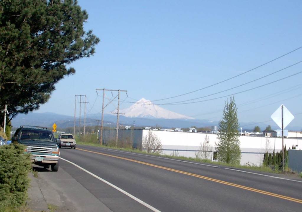
Mount Hood: Monday Night, Tuesday Afternoon

2039.Two Views.

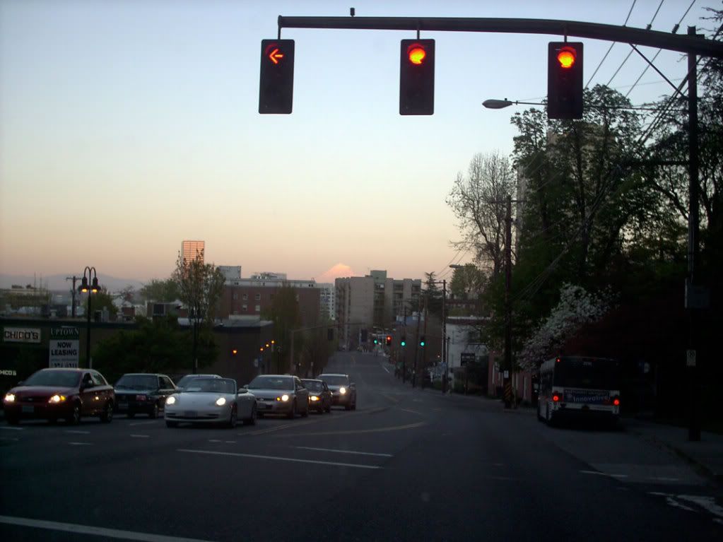
1. Monday evening about 7:30 PM, looking east at the sunset from the light at West Burnside and Northwest 24th Place:


Click image to view bigly. The white pointy cloud over the buildings in the distance is the mountain, of course. A better view was to be had about 1/2 block up the hill, but we were due somewhere, and couldn't backtrack. Some other time, it is to be hoped.

2. Tuesday afternoon, 4:30 PM approximately, from the 13800 block of NE Marine Drive:


Again click image to view bigly. Some of the best sightlines are available along Marine Drive along the mighty Columbia. Sadly, the view is befouled by industrial development. Or, if you prefer, happily, there is industrial development, contrasting the patient force of nature with the insistent one of man's development.

Choose as you'd like.

Technorati Tags: , , , ,

21 April 2009

Blade Rewrite Achieved: SE 148th and Stark

2038.It may be remembered that, back here a bit, I scouted a rogue NE avenue blade that had somehow wandered into the SE:


While we were on blade patrol today we went by that corner and found out that the rewrite that we had called for had occurred. The blade now reads SE 148th Av. Despite its closeness we were unable to go by NE 148th and Glisan to see if that had been fixed but we presume it had.

We don't know if writing about this blogwise caused the rewrite or some sharp eye in the neighbohood. Either way, good work City of Portland, and we thank you for taking the trouble to correct! Much obliged!

Technorati Tags: , , , , , ,

SW 57th and Barnes Rd: New Blades In The Woods

2037.Out on new street-blade patrol today, inspired by a tip from Isaac Laquedem who mentioned there's a new blade set at SW Barnes Rd and 57th Avenue (thanks, Isaac!)

This area, in the section of the city we call Sylvan, is a curious one in geographic terms. Portland grew to the east, mostly, and the flatter part, the part it's easier to draw straight streets over, is there, and you'll find vastly more continued streets. But there are extended streets in the West Hills, you just have to go looking for them. I'd wanted to do that for some time.

To get to SW Barnes and 57th, just find your best route to SW Skyline Blvd and go west on Barnes, which is the first cross street south of West Burnside Road. The KOIN transmitters are up there too, since Sylvan Hill is a traditional area for placing of radio and TV transmission towers, so if you follow the big masts, you'll get there too. A very short jaunt west on Barnes from Skyline will bring you to SW 57th Avenue.

The sign is there to the right. Below you'll find a few tighter shots.

This is the Avenue blade:


And here's the Street (Barnes Road) blade:


What's that now? There's no block index here. I wonder why? I have a feeling they're still trying to get the bugs out, or they just want to see these blades up; they seem to be going up rather more quickly than I'd of assumed they'd be; but there it is.

For what it's worth, if the sign did have a block index, it would be 800 at this point; SW Barnes Rd cuts SW 57th Avenue at the 800s. There's a single house between there and the next street south with a three-digit address beginning with 8, and the next block down is SW Taylor Street, which is the 900 block west of the river.

And that's why I mentioned streets being extended westward. It's an interesting thing to my Address Nerd ears to hear "Southwest 57th and Taylor", since streets are so sparse in that area. But when The Great Renaming happened, one of the tenets was a street name should be extended across the city wherever logical, and, presumably, if Taylor had been built up unbroken from downtown over the hills, it would cut through here (or near enough as makes little difference).

Speaking of new blades, the SW 57th Avenue sign at Taylor Street sign would need rather a bit of help, I think:


The setting of SW 57th Avenue going south from Taylor and Barnes is quite a pleasant place, actually:


If I wasn't already familiar with the diversity of Portland's geography, I wouldn't believe this were within city limits.

Technorati Tags: , , , , ,