1838.
It's the biggest logo change in years, and possibly the biggest re-concepting since the days of "New Coke". Aptly, it's the really new look of Pepsi, and it's bearing down on us all.
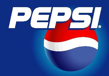
Recently, 25 media and taste "influencers" (yea, I wasn't on that list. I was surprised too) recieved a package containing matierials showcasing Pepsi new graphic look. The old one, of course, needs no introduction, so here it is:

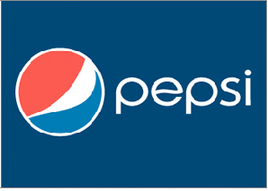
Out with the old, and in with the new:

The white wave is narrowed on one end and opened up on the other, resulting in a sort of a cocked-smile effect. The type is completely revamped, with a hint of the old wavy strip still left in the "e" (at least that's the way it looks to me).
The buzz seems to be muddled. Pepsi has not hit it out of the park with this, and it's not like Coke's attempt at "New Coke" as the recpie has not changed, but when you consider that, at its heart, soda is really nothing more than colored and flavored fizzy sugar water, the identity ... and the lifestyle that identity is seen to signify ... is "The Real Thing", and that identity, if it were exchanged for it's weight in gold, would be $0. But that lifestyle identity does make more money in a year than most small nations, so it's important to nurture and evolve it.
The aim is to capture the same youthful vibe that Pepsi has always gone for. From Michael Jackson through Britney Spears, Pepsi aims for the young and energetic. Obviously someone at PepsiCo felt that the classic look was also the dated look.
Dated is in the eye of the beholder, though. Coke's look seems modern, in my opinion, and still strongly classic. Some things never get old; Coke still appeals to the sugar-water-addicted kiddies just as it always has.
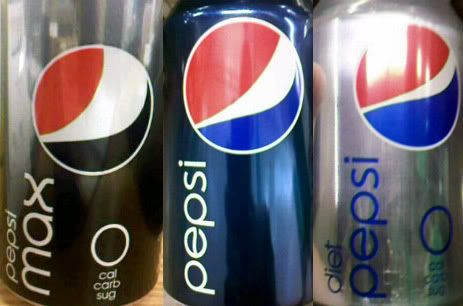
The logo gets slightly different treatments on the various Pepsi brands. In the Diet Pepsi brands the smile is very skinny: in the Pepsi MAX brand, the smile opens even wider and the blue becomes black, in concert with the overall color scheme of Pepsi MAX (illustration ripped off from Brand New):

We agree with a commenter over at Brand New that thought that they'd be much better off with simply updating the type. That type really works well (with the possible exception of the big 0 over the "caf carb sug" notation on the MAX and Diet varieties: the 0 overwhelms the three abbreviations, looking more like a graphic element balancing on three cryptic concatenations).
We are lukewarm on the logo redesign and find the individual variations on the logos between the brands clever but wonder if it's really going to register in the minds of consumers (with the change in the blue on the MAX can we wonder if people will think that it's a completely different company's cola altogether.
Then again, we've always been Peppers (if you know what that means).
Ploosa zhange, as the Frenchies say.
More about it at much more reputable outlets:
- The UK blog Bitter Wallet opines sarcastically, but they have a POV including this redesign of the Norfolk Constabulary logo which billed GBP 35,000 for removing color and simplifying the type. Nice work if you can get it.
- Jim Edwards at BNet thinks the new logo looks like the old Diet Pepsi logo (ca. 1970-something), and raises cogent points about the "iPodization" of design and the loss of an instantly-recognizable logo.
- Jason Cochran at Blogging Stocks has a trenchant view that also takes in the "New Coke" fiasco.
- The percieved Obama logo-Pepsi logo graphic equivalency is visited by Jossip.com here.
- Brand New takes it to a whole nuvva leval with mockups of the new brand packaging.
- Adrants takes a brief look at the buzz with an accent on how the "influencers" got thier packages.
- AdGabber shows us a little ol' movie that goes over the history of the Pepsi logo incuding the new design. Slick.
Tags: branding, logo, logo_design, logo design, logo redesigns, pepsi, pepsi redesign 2009
Powered by Qumana

9 comments:
When I saw the three Pepsi cans side by side, I noticed that the white ribbon in the logo was actually slimmer in the Diet Pepsi logo. That's a nice, subtle way to make the consumer think, "If I drink this as opposed to regular Pepsi, my waist size will be diminished just like this white ribbon."
But then it gets confusing, because the ribbon on the Pepsi MAX logo is wider, yet it is another zero-calorie soda. Seems like a contradictory message to me.
I predict that MAX sales will decrease once the new logo is rolled out.
I noticed the different sizes ribbons, too, Stan. I wonder what the designers were thinking when they did that.
The Pepsi MAX could sooo easily be confused with Coke Zero--same colors and no Pepsi blue! I think that was a poor design decision.
This new look feels a lot more retro (maybe 1950s?)to me than the previous heavy-weight logo. The base ribbon looks more like a feather or the sail of a boat to me. I think I've learned though, with all these logo revamps that seem to be happening lately (Best Buy, Walmart, etc), that we are very comfy with the old and the new almost always seems to just rankle us. It's good to let the newness settle a bit before judging whether or not it's truly effective and the right way to go.
Good observation on the nod to the old ribbon in the 'e' of the new logo, Samuel. I agree.
Honestly, when I see the blue and red oriented more vertically than it used to be, my first thought is "NBA logo". Of course, the NBA's logo is blue-white-red, not the other way around. The curves of the white ribbon also could invoke an image of a slender neck and head, looking to the right. Like a smoothed down version of the Girl Scouts logo (okay, that's a stretch).
I think it will probably eventually be accepted by the public if Pepsi sticks to it. Question is, will Pepsi stick to it?
The biggest problem with it, as I see is, is that the core identity, which was this globe with the white wave, was singular and indivisible, and could be dropped into whatever country you sold Pepsi in and the recognizability was instant. It's the same competitive advantage that, say Apple Computer has; you don't even have to translate the word Apple to make an ad for it in Poland ... just put in the Apple logo, instant communication.
Now you've changed an instantly-recognizable logo into something just different enough to require an explanation ("that's Pepsi's new logo now. Yes, it's Pepsi!). Also, with fundamentally different versions of the logo (while generally similar) the indivisable core has been broken up and diluted.
If they market it well, it'll be good. If they don't, Pepsi has just weakened its identity. So, even though I do enjoy the new look, I'm torn over it.
Both of you, Stan and Lauren, have kind of hit on it in your own commentary. You both seem to enjoy the new look, but it makes you think of other things, not necessarily having anything at all to do with Pepsi (the NBA, a sail). Also you've both hit on the dilution of the identity that the different versions of logo cause.
I want to know Samuel's take on Wal*Mart now (hat tip to lauren marie). LOL! They haven't changed their logo in Canada, interestingly enough.
@Ben:
Here you go:
http://zehnkatzen.blogspot.com/2008/07/logodesign-meet-new-walmart-logo.html
I noticed that Wal-Mart Mexico (aka "WalMex") hasn't changed their style either.
This freshening up appears aimed at the USAian consumer, at least for now.
gee. the new letters look suspiciously like diet rite. And I recently dug a diet rite 6-pack holder out from behind a bar that had probably been in its little niche of dirt and grime since it was new in... what... 1977? That is the vintage diet rite that the new pepsi lettering reminds me of. The old Diet Pepsi was also similar.
You're not the only commentator I've seen that draws the comparison between this and the old look of Diet Pepsi.
But the comparison to Diet Rite ... that's a good call. And the way you found the object makes for a charming story, though how you found it suggests that you should probably go in for a check up. You never now what might be in that 1977 vintage dirt and grime. Maybe a little disco. Can't be sure.
You might have disco fever now.
behind a bar... the slot between the (unused for 20 years) cooler and the false wall that faces the establishment's tables and stuff. In that slot was both a diet rite sixer holder AND a diet pepsi one, first generation design... WEirdly, the first thing I thought of when i pulled them out was the two cowboys from the Miller's Outpost commercials.
There is and never has been disco of any kind in Klam. Like 7up, never had it, never will. hahahaha
Post a Comment