29 September 2008

Portland's Address System in 1928 (Updated)

1791.


NB, Tuesday 20 Jan 2008: I noticed a lot of referrals here. If you have a few minutes, could you leave a comment saying where you came from and what got you here ... or at least where you came from? If this information helped you, then that's made my day Thanks!)

Today, we return to the 1928 Portland Hibernia Map to get another closer look. This time, we go back to Address Nerd territory.


One of the things that originally fired my interest in Portland geography was the complex (from my Silvertonian point of view) address grid. It was pleasing to the eye and easy on the ear: for some reason, saying Southeast Stark Street is intriguing to me in the way that simply saying Stark Street isn't. I like the way the letters S and W look when sitting next to each other on a street sign. Order in a directional quadranted grid is aesthetically pleasing to me.


But the idea of NE/SW/SE/NW/N had the air of an after-the-fact overlay, an artefact. So I started down the road of asking why. Eventually, I happened upon Snyder, and my questions were answered in the main, but knowing the basics I wanted to know more.


Eventually, after enough chipping away, old maps came my way in the cosmic way such things do. I learned about Portland geography before and after the Great Renaming.


As covered here before, Portland before 1933 was ordered in a different way, a thing that evolved from the merger of Portland, East Portland, and Albina in 1890 to form the modern City government and the need to bring a real wild-West style of naming (where developers got to name the streets in their new subdivisions whatever they wanted regardless of what names already existed elsewhere) under control. Names were duplicated willy-nilly across the entire city.


The plan that evolved formed the skeleton of the one we recognize today, but the nomenclature was different:


  1. All streets south of today's Burnside and west of the river were simply streets, with no directionals.

  2. All named streets north of today's Burnside and west of the river had no directionals; numbered streets were suffixed "North"

  3. The exception to 1 and 2 above was Broadway, which began life as Seventh Street and adopted the Broadway name after the Broadway Bridge was constructed and the street was extended over. North Broadway was Broadway north of Burnside; Broadway south of Burnside was South Broadway.

  4. Named streets on the east side were prefixed "East", but only if they had a counterpart on the west side. Downtown's "Stark Street" was called "East Stark Street". Named east side streets that had no west side counterpart had no directional (e.g. Thompson Street instead of NE Thompson St. Broadway was simply Broadway because the east side had it first; see number 3 above).

  5. Numbered streets on the east side were also prefixed East. What we today call SE 12th Avenue, for example, was known as East 12th Street.

  6. Numbered streets on the east side north of Burnside were, as on the west side, suffixed North, but still carried the East prefix for differention. What we today call NE 12th Avenue was known, therefore as East 12th Street North.

  7. There were 20 house numbers to the block, rather than the standard 100 that we know today. Between Front Street and First Street (no directionals, therefore the west side south of Burnside) the addresses rand 1-20. You didn't get to the 100 block until Fifth Street.


Now, for a couple of pictures. The truly exciting thing about the Hibernia Map other than its sheer age is that it contains information on how the addresses ran. Here's a section of the middle:


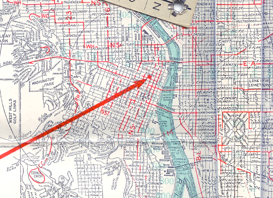
(surf this link to see it bigly in the Photobucket album). If you look closely, you'll see faded bold number in a sort of teal. Look near Lovejoy Street at the Broadway Bridge and you'll see the number "200". Near where Westover Road intersects Burnside, you'll see the number "800". This is how the address system ran in Portland in those days. An address in the 2400 Block of NW Marshall Street today would have been in the 800-820s on an un-directionalled Marshall Street. The Oregonian, at today's address of 1320 SW Broadway, would have been at about 280 South Broadway (speaking of location, of course; the actual Oregonian Building during those days was considerably farther north, in the middle of downtown).


Examining the map in full we find the highest address ranged only easterly into the 2200s (in the Montavilla area, around E. 82nd and E. Stark), southerly to about 1700 (Sellwood) and north along Union Avenue (today's MLK) in the 1500s. We assume that the addres schema increased going up the north Portland Peninusula into Saint Johns after descending to zero somwhere between Williams Avenue and Interstate Avenue, but the map is sadly silent on this point.


Now I did say that the address scheme was uniform thoughout the city. I'm afraid I told a little lie there. A curious thing can be found if we turn our attention south of Division and east of E. 41st, in the Holgate Blvd/Powell Blvd/Woodstock Blvd area:


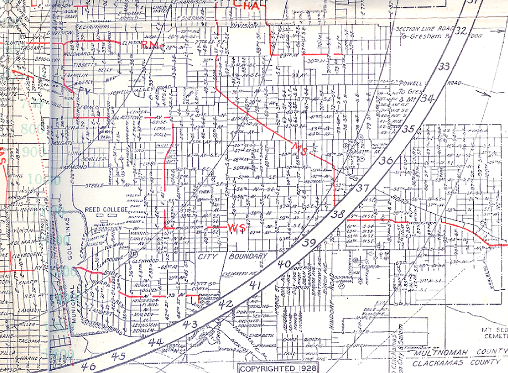
(you'll definitely want to look at the embiggened version by clicking here to Photobucket). Moving down from the top we see E. Harrison, E. Lincoln, E. Grant, E. Sheridan, E. Caruthers (these streets perforce extended names from the westisde core area), Division (no Division on the west side, remember, so no "E. Division", and then ... all names are replaced by numbers. And that's not all; the numbered streets run north and south whereas the numbered avenues run east-west (in 100% contrast to the modern Portland Avenue/Street pattern). And not just that, but this area shows awareness that, despite the house numbers, Holgate Avenue (for example ... today's SE Holgate Blvd) is 45 blocks south of Burnside, and therefore would be 45th Street SE (also showing awareness that the area is south and east of the address origin point.


There is very little written about this area or why just that area had the SE directional applied as a suffix. The only hint we have comes from pages 59-61 of Snyder, who relates that during the years when those who cared about such things were trying to dice out the rationalization of city addresses, particulary in the year 1910, City Engineer J.W. Morris advanced the following plan:


  1. All Street names to be replaced by numbers.

  2. Avenues to run east-west, Streets North-south.

  3. Burnside, the principal street divider, to be called Central Avenue. We surmise that the other divisions would likely be the ones we recognize today

  4. 100 numbers to the city block.


The plan was met with round disapproval by people who were conversant with, were fond of, and understood the sense of history inherent in the current street names. An editorial form the 24 April 1910 Oregonian had it thus:


Some people evidently don't know that there ever were pioneers! They would abolish the names on streets, and subsititute bare numbers. But a large number of citizens will not sanction this change.


We wonder if that outer southeast area was envisioned as a sort of a pilot program for this scheme. We do know that it was actually implemented: the curbstone at SE 53rd Avenue and Woodstock Boulevard serves as evidence for that (old street names are left in many areas of town preserved thusly. Next time youre at a streetcorner, look down. You might be surprised at what you'll find there (in the good way!).


It does speak for the merits of the plan that the basics of the thing – address quadrants, 100-numbers-to-the-block, and numbered ordered avenues radiating from the origin point – did actually form the basis of the current plan-on-the-ground that we all know and use daily. We don't know about our readers, but we rather prefer that names were kept on the streets, though, noting the latter-day compulsion of some to change names to honor notable historic figures, we wonder if going with the all-number system would have had a benefit of removing the pain we've seen in the news. After all, renaming 65th Avenue NE to Rosa Parks Way or 15th Street North to Cesar Chavez Boulevard would hadve turned out to a welcome change.


All the illustrations I've been using for this posting series can be seen in the Photobucket album, here.


Tags: , , , , ,


Powered by Qumana

[bloggage] Alan's Throwin' Open The Doors To PorBlogs

1790.


Just got a note from Alan Cordle:


I'm opening PorBlogs to any bloggers in the Portland Metro area (including Vancouver) and hell -- all of Oregon. Please spread the word and tell your blogger friends to join up.


And here's the link where you can do so.


So, do so!


Tags: , , , , ,


Powered by Qumana


28 September 2008

[pdx_photos] St Johns Bridge and Cathedral Park: At the Toe of a Giant

1789.


The Saint Johns Bridge is indeed a curious creature. From a distance it is a delicate thing of spun green glass. But from close up:


St Johns Bridge Tower


.... intimidating. The gothic spires - recapitulated in the outer margins of the tower - are inspiring, and tend one toward contemplation of the infinite.


There should have been an M.C. Escher-esque artist out of Saint Johns.


The view down the arches is what gave Cathedral Park its name:


Cathedral Park Arches


Cathedral Park, says the Portland Dept of Parks and Rec:


...got its name from a photo of the St. Johns Bridge by Al Monner that appeared on the front page of the Oregon Journal in 1968. Reference was made to its beautiful cathedral-like arches and the park found its name.


As we've established elsewhere, the house we live in is the one Al Monner owned when he was working his magic. His custom darkroom is just off my studio space. So, even though I'm not the only person to have ever taken a picture of Cathedral Park, I somehow think this completes a sort of circle.


Tags: , , , ,


Powered by Qumana


27 September 2008

[pdx_bloggers] Witigonen, Goodbye

1788a.


Read up Witigonen today to see if it had come back from the dead yet (no posts for well over a month). Here's what I got:


I'm sad. I liked them, and it's despairing the way they just petered off on publishing anything at all. It was unusual to find a Zeppelin-oriented NW Poliblog.


I did get to meet a couple of the Witigonians once. Classy folks. Very witty.


I hope the turn up somehwere, somehow that we can enjoy them. Or, failing that, that this is a temporary outrage.


Tags: , , , ,


[liff_as_art] More Surveillance Society Art: PPP T-Shirt. For Sale, Naturally.

1788.


(via BoingBoing) Here, as promoted by Design By Humans, is radiomode's PPP (for Perversion of Paranoid Populace) t-shirt:


PPP T-shirt


As these examples of dark humor become more and more manifest, we find ourselves forced to contemplate the cause-and-effect chain inherent here. This is an ironic reference to what some fear may become too common. Humor has a reputation of throwing a light on the blemishes we endure day to day. What do knowing references to a perception of an overwhelming need to keep tabs on everyone regardless of what they're doing (in a country where we famously revere the right to be left the hell alone) expressed in such an ironic, self-aware way say about what we think about ourselves and where our society is headed?


Or does it say anything at all?


Smile, you're on radar.


Here's looking at you, kid. Seriously.


That said, we can't fault the graphic design of this. Very well done.


Oh, yeah, you can buy one of your own. 25 U.S. Buck-a-roonis. Here.


Tags: , , ,


Powered by Qumana


26 September 2008

[logo_design] My Critique Of the KOIN Local 6 Rebranding

1787.


The conversation over at OMI about the new KOIN Local 6 look has become very raucous indeed.


It's amazing ... nobody realizes how strongly they feel about a station's look, until it gets changed. Then, watch out!.


John Christopher Burns has done a fine job of updating a look whose updating time had come and gone. The use of color, shape and font has me excited about watching KOIN again. The "KOIN Local 6" tag is kind of a courageous step. The brand has been freshened.


JCB has actually come to respond to the fray, and his response is dignified, poised, and paints a positive picture of the people he interacted with at KOIN. Some unfriendly comments were bandied and he fielded them and handled them with aplomb.


As for my thoughts, here they are from the OMI thread. I'll want to expound upon these at a later time perhaps:


As some around here have said "I'm no graphic designer", well, I am (I just can't get anyone to hire me, is all) and I'm going to come out in favor of the new look.

First, the color palette: with cool blues and greens, it is presumably meant to evoke "Northwestness" .... blue for water and mountains and sky, green for the forest. Moreover, the cool colors contrast well against the warm backgrounds that they use to show it off on.

The 'tetris'-y blocks of color fit together nicely, like a tightly-assembled puzzle, and create a sort of dynamic tension that wouldn't be there if it was all a nice, tight, symmetrical block.

The way the individual show brand ("@ 6:00") is shown by retracting the lower block, spinning it, and pushing it forward is kinda cute and allows the show branding to efficiently share the logo design. One of KOIN's big design problems has, in my opinion, been distinctive show branding. For a long time, I didn't really know that the AM program had a brand name, and even after I found it was Good Morning, Northwest, I didn't really care (the GM "Northwest" tag was also a little too vague to be compelling. Say what you will about KPTV, the show brand Good Day Oregon is at least a minor bit of branding brilliance, and they carry it off well, making it distinctive within the overall KPTV look).

I've seen the new logo and the comments about the multiplicity of fonts. I don't see all that many, only two really : the one used for the number 6, and everything else. The everything else, however, is carried forward in a number of different weights, and the chyrons seem to carry a condensed version of that font.

I actually think the minuscule treatment of the word "local" appropriate. Lower-case letters are 'friendlier' than caps, and connect with the 6 in a friendly way.

The swoopy 6 is definitely in a different font, and it stands out in its swoopiness. The number 6 is a huge brand around there on the TV, and it wouldn't do to make it uniform with the rest of the design. In the light weight it's in, though, it stands out but not too much, and keeps the logo one happy family. It also adds a little looseness to a very structured logo.

...oh, wait. I just saw an over-the-shoulder graphic which uses what appears to be some form of Officina. A little strange, that. Not what I would have chose. It does harmonize with the sans-serif used everywhere else though, since it's simple and bold like the rest of it.

I will insert a disclaimer here that I've not yet seen an entire KOIN 6 newscast. When I do my opnion may change somewhat but I don't think too much. After all, compared to the previous graphic look, with this strange big rotating machine-thing that did an abrupt 45-right turn in this hot red airless space, it's a vast improvement. It's not that I didn't love the look, but it left me scratching my head. It was well done, but what did it mean?

All that said, it's not as compelling as the Swan 2, but that one hit it out of the park. KOIN's new look is a solid triple, at least.


If I could change one thing about that review, it's probably that last sentence there. I'd say the new KOIN look hits a home run. The more I look at it, the more I like it.


JCB has posted more of his work on the KOIN Local 6 brand here. Go look. It's quite nifty and slick!


He has hinted that he will perhaps discuss his process at a later time. I certainly hope so! Watching creativity explain itself is almost as much fun as simply being creative!


Tags: , , , , ,


Powered by Qumana


[teh_funnay] It's a Freakin' Unexpected Double Feature Video Friday!

1786.


The scene, we are happy to note, has been punched up a bit by two highly unexpected and welcome video bits, so we have a double feature today, from both the Big Fat Brain Boys and our favorite scourge of the Engrish-speaking world, Kiko!


First, in an interlude in You Suck At Photoshop, we find Sn4tchbuckl3r taking a few moments out from the Battle for Peopleburg with a PSA about honesty. And with a friend like Donnie Hoyle, he should know (warning: Slightly NSFW, teh f-bomb is dropped once or twice (but in an extremely witty way))


Looks like Peopleburg has gone straight to heck.


Meanwhile, Season 2 of Gorgeous Tiny Chicken Machine Show debuts, minus Cownicorn, who is stinkin' up the place. Kiko and crew have restored the fun-timing by doing what many do ... moving to better digs. And, for some bizarre reason, Lick Poop Rick Pope shows up, apparently willingly, for more abuse.


It's a Global Housewarming at Kiko's place, and the Intermets hottest, funniest, and most disturbing woman-child invites everyone:


These two videos suggest that there is a God, and that God wants me to be happy.


Tags: , , , , , , , , ,


Powered by Qumana


25 September 2008

[illustration] Painting A Picture of USC With Type

1785.


Nota Bene: I have just learned that Kelly Guimont, at the Extensis blog Manage This, has linked to this entry with favorable noises. I appreciate and recprocate. Please enjoy, and thanks for the link, Kelly. If you all like what you see here, consider linking? And if you need someone to do production work, I am so available it hurts (my skill set is down in the sidebar (AdobeCS3QuarkXPressjustsayin).


Some typographers talk of "painting with type", after they pass a point where they realize that glyphs are more than just shapes ... each one contains a balance of light and dark, each has a sort of personal value (value here in the light-dark artistic way, not in the "I'm fond of the letter S" way).


Oregonian USC Trojans Type IlloToday's Big O gives us an example of what we mean by that. As depicted by Quentin Lueninghoener, the USC Trojans athletic logo is reimagined in type. Some parts of it seem to make an ineffable point: the word SCORING in place of the visor, giving a point of view; the word OFFENSE forms a side-guard; cerebral sorts of things such as DEFENSE, PASSING, and BLOCKING which can be quite cerebral in as much as they are key tactical things, fill the cranium. And, above all, is the primary concern of the Beavers in tonights game: FINDING A CRACK IN THE TROJANS' ARMOR.


Type is most commonly found as you view it here; in sentences, giving visual form to thoughts rendering communication. Using it as effective illustration pushes the concept of type and what it can do to a whole new level, conveying not only simple communication but effectively illustrating abstract thought.


That the illustrator did it within the canon of The O's headline type spec is something I especially admire. This is one accomplished job.


Put this one in the "Wish We'd Thought of That One" file.


USC Type Illo/Logo


(Illo copyright The Big O, used for illustrative purposes only)


UPDATE: We found out, overnight, that the Beavers did indeed find the crack in the Trojans' armor, much to the dismay of USC;  Trojans 21, Beavers 27!


The Giant Killer's are back. If there's a sports heaven, Dee Andros is very happy today.


Tags: , , , ,


Powered by Qumana


[logo_design] The Guy Who Did Two Of PDX's Major TV Station Logos ...

1784.


... is, I've found out, one John Christopher Burns, a designer based in Atlanta, Georgia.


KOIN Logo 2008He has a very impressive portfolio. Not only is he responsible for KOIN's new look, he also crafted the original "NorthWest NewsChannel 8" look (though they don't use that now, he can take some consolation in the new look being so clearly based on his former design, and that they decided to go with the call sign in the logo (which we gave high marks to as well)).


His logo work is here. Another notable client is Greensboro SC's WYFF Channel 4, were a certain expat PDX little lost robot works.


Do I wish I was this guy. Hell yeah ... except for the living in Atlanta part (nothing personal, JCB, Dixie's just not my can'o'beer).


By the way, a spirited discussion on KOIN's new look (including a critique by myself) can be found at Oregon Media Insiders ... here.


Tags: , , , ,


Powered by Qumana


24 September 2008

[logo_design, pnw_radio] KIRO-FM Radio – Crossbranding The New Kid, Breaking The Logo

1783.


A gentlemanly acquaintance in Seattle radio has let slip to me that one of the big FM outlets up that way, FM 97.3, KBSG (K-BattleStarGalactica?), popularly known as B97.3, a classic rock with personalities format, has given up music programming in favor of simulcasting Seattle stalwart KIRO 710 AM's talk content.


In order to bring the change home the station has rebranded KBSG. Formerly it was B97.3, "More Music, More Fun"


B97.3 KBSG Logo


This logo tells you a lot about the station – big fun, big happy, good music all the time, the sort of frequency you want to tune to when you want to feel good.


KIRO 710 AM is one of the old-line Seatlle stations. If it were in PDX radio, it would be up there with KXL, KEX, KGW (if it still existed as such, altho the name KPOJ has a respectable history). It's the "everybody's" radio station, judging by most of the talk hosts, and is home to the unappreciated genius that is Dave Ross (I've not heard his CBS Radio commentary in so danged long ...).


Heres the two standard logo treatments for KIRO 710 AM:


KIRO 710 AM RADIO LOGO-VERTICAL


KIRO 710 AM-Vertical


KIRO 710 AM RADIO LOGO-HORIZONTAL


KIRO 710 AM Horizontal


This is one fine logo. I'll explain why:


  1. It's complex without being complicated. The Space Noodle, which could be considered a fait accompli in Seattleized broadcast design (well, it is a signature landmark, yes) is rendered at its absolute essence and really really well. It forms an anchor for design and yet, despite its ephemeral quality, wins your attention against the bold type. I just totally enjoy this rendering.

  2. Bold type – it looks like Franklin Gothic – makes a bold statement. Note how the 1 in the 710 is the capital I, not the numeric 1.

  3. The slanted edge of the red clips the lower corner of the 7 in an interesting way. That's play going on there.

  4. But here's the real genius of the logo, and the biggest reason why I enjoy it. Note the slanted edge on the red stripe on the vertical edition. Follow it down. Notice how it aligns exactly with the left hand side of the leg on the R? This forms an implied structural line. Moreover, after you attention is captured by the Noodle, and your eye is led into the heart of the design by the slanted axis line. Graphic designers talk about eyeflow, about engaging the eye and guiding it with the structure of the design itself. This is eyeflow in action. The designer even reproduced the effect with the horizontal version, causing the slanted line to align with the W in the NEWS•TALK tagline. In this case, it creates unity in the design but doesn't divert the eye off of the KIRO; the heavy weight of the call sign keeps it in play.


Whoever came up with this logo really understood what they were doing, and took advantage of the type to create a strong unified piece out of disparate elements. Wish I'd of thought of this one!


Now, I told you all that to tell you this.


KBSG has begun, as of August, to rebroadcast KIRO's content. Consequently, they've rebranded themselves 93.7 FM KIRO News•Talk. Here's that logo.


KIRO 97.3 FM RADIO LOGO-VERTICAL


KIRO 973 FM Vertical


KIRO 97.3 FM RADIO LOGO-HORIZONTAL


KIRO 973 Horizontal


Same general design, yes. But it makes me cry and die a little inside.


  1. The stacked FM in the logo jumps right out at you ... kind of like a sliver in the eye. Ouch! All that horizontal unity messed up with a touch. In school they taught me that the stacking type was a big design nono. This is why. It also is a visual shout that the type was just kind of shoehorned in there.

  2. Notice the proportions have changed? To fit into a certain footprint, presumably, after the red stripe was stuffed with the new letterforms and the stacked type. The KIRO is bigger. The red strip is narrower (notice that the Noodle doesn't quite nicely tuck underneath the red bevel as it did before).

  3. The changing of proportions destroys the harmony which made all the parts work together as a unit. The clever red slant now connects to absolutely nothing. Everything just kind of sits together, uncomfortably. The stripe doesn't even line up in the horizontal display anymore, another victim of the stacked FM in the red.


Taking a well-done logo and breaking it really makes me sad. But wait! I hear you saying that well, wise unemployed designer guy, can you do it better?


Well, I don't know. But here's a possiblity (Note I used Impact here, as that's the font that harmonizes closest to the Franklin Gothic for purposes of the logo (we don't own a copy of Franklin Gothic but would if we could ... it's mad useful):


KIRO Alternate


... just get rid of that horrible stacked type.


Yep. No "FM". Why should there be? The AM logo doesn't say "710 AM". The decimal point in the frequency spec should be all the giveaway anyone needs.


Update: I mentioned Dave Ross and lamented not hearing him before going out and doing a little research. Someone as savvy as Ross naturally has a website (DaveRoss.com), and releases his commentary not only on the MyNorthwest.com omnibus site but also can be subscribed to via iTunes (information on the web site). You can also download for absolutely free an armload of his laugh-out-loud funny songs.


I wish Portland had someone like him. You lucky freakin' Seattleites get three hours a day five days a week of Dave. Pfui on ya's! But, seriously, if you don't like Dave Ross, then something's the matter with you. Seek professional help.


Tags: , , , , ,


Powered by Qumana


21 September 2008

[liff, news design] The Oregonian on WaMu: Irony In The Architecture

1782.


I'm not of a mind to wonder if there is a Supreme Being. I'm a fideist, in fact; to expect evidence of some thing that expects one to take it on faith seems to me to be missing the point of the while thing. I need no evidence of God; I need no evidence of not-God.


Why prattle on so metaphysically? Because on Thursday's Section A of our magnificent local daily-of-record, which I continue to insist on calling The Big O, there was a couple of elements which, why, if I didn't know better, might have been laid out with the assistance of the invisible hand of a cosmic intelligence with a real mean sense of humor and a razor-keen sense of the zeitgeist.


Here's the front page in question:


Page A1, The Oregonian, 18 Sep 08


Yes. You'll recognize, in the headline, ongoing coverage of the systemic financial woes which some say are the approaching Hurricane Ike to the Texas Gulf Coast which is the USA economy right now, which certainly need no introduction.


And the big photo of the OSP inmate barbering another inmate (I thought they didn't let them have blades in there?) was rather charming in a strange way. That's neither here nor there right now (well, it's there, and that's where we want it to stay, if you catch our drift).


This thing is a little more complicated than a Leno headline gag, so stay with me here. The article outlined in red refers to our own local "thrift" (it's hard not to stifle sardonic laughter when you refer to a savings & loan as a "thrift" these days, but there you are), the edifice we call Washington Mutual, latterly known by the chummy, Pokemon-like name of WaMu.


Here's a closeup of the article, which can be read more easily:


WaMu Article 18 Sep 08


It's looking kind of dicey for WaMu, no? A good operative passage from the above to carry forward in the mind as we move forward would be this:


As recently as Tuesday, Washington Mutual officals insisted the Seattle-based thrift had the capital and liquidity ... to ride out the storm. But facing billions of dollars worth of bad loans and seeing no near-term improvement in the housing market, Washington Mutual now seems prepared to throw in the towel.


The New York Times reported Wednesday afternoon that WaMu and its advisers at Goldman Sachs were courting JPMorgan Chase, HSBC and other potential buyers. News sources say the government is trying to organize a private buyout.


Yep. I'm no banker or finanical whizzo, but it's hard to read good news into that. As a matter of fact, it looks possible that, not too far down the road, the only thing "WaMu" might denote is a funny sound little kids make by pursing their lips.


Feel free to correct me if I'm wrong.


So, finding the story compelling we go ahead and turn to Page A8. But before we get there, derailing our headlong rush to the end of the story, a huge splash of color distracts us ... as a well-designed page-width ad should, placed by an institution whose continued survival seems a matter of reasonable doubt. Here you go:


WaMu ad 18 Sep 08 The Oregonian


Yyyyyyep!


Think about the near and the far.


That pop you just heard was your head. Asploding. And that sound you hear in the distance? The universe. Laughing at us.


Like I said, I'm a fideist. But if I was looking for evidence of a cosmic hand writing messages to us, this would rate right up there. Oh, the design of both the section and the ad are flawless ... I wish I could get in on that action.


But, seriously, think about the near and the far. Because WaMu advises it. And brother, should they ever know.


Whoo hoo!


Does anyone remember, back in the 80s, when The Big O tried a redesign and put the word BRIEFLY: in a black stripe right in front of a boldfaced summary paragraph to make the paper a quick read for those who needed to?


Yeah. Good times.


Tags: , , , , , , , ,


Powered by Qumana


20 September 2008

[pdx_liff] A Coffee Despatch From The World Beyond Grand And Belmont

1781.


Espied on the front page of The Big O's Business page; the going of the Charbucks at the Ladd's Addition location (SE 20th and Hawthorne) and the coming of the Dutch Mafia to the gateway corner of SE Grand and Belmont:


...A few blocks away, Grants Pass-based Dutch Bros. Coffee opened its first outlet inside Portland city limits at at 5 a.m. and welcomed lines of cars driving through for a free brew. The 24-hour drive-through at Southeast Grand Avenue and Belmont Street is the company's 133rd since it was founded in 1992.


This being the first within PDX city limits will come as a surprise to the people who live near the location at SE 136th and Division, which has been in the city limits since the late 1980's, and the one at SE 68th and Foster, which has been within the city limits since the early 1900s.


But it's okay. After all, according to Willamette Week, the city of Portland ends at I-205 anyway.


The reason so many eastern Portlanders are touchy about west-side arrogance will be left on the table as an exercise for the reader.


But, hey ... 24-hour Dutch Mafia service at Grand and Belmont? What's not to like about that?


Tags: , , , , , ,


Powered by Qumana


19 September 2008

[design] New YSAP #17 ... Photomerge ... It's Donnie Day Again!

1780.


Donnie is back with another episode out of the tortured heck that is his life. This time, he demonstrates something that I actually don't suck at ... Photomerge. I rather rule at this actually.


Photomerge is a pre-packaged automation that takes a bunch of photos you've had to tile and stitches them together in one big photo. It's actually quite amazing. This photo of the Oregon State Capitol building:


Oregon State Capitol Building


Was created using my trusty old ViviCam 3705, standing back in the middle of Court Street in Salem, and taking eight or ten pictures that I made sure to overlap, then uniting them all in Photoshop using Photomerge. Can't take huge pictures? Photomerge is the next best thing.


Oh, yes ... the episode. Donnie skates us to the edge of the "uh-oh" feeling as per usual. Now not only is Ricky after him, so is the spurned Sandy. And Donnie is trying to get Sna4tchbuckl3r to help him out with those flash drives that he apparently hid all over Covington, Kentucky. And, with Photomerge, he can stitch it all into one, big "this goes out if I get capped" picture:


Here, at episode #17, we don't know about you, but we see a foreshadowing of exactly what's going on with those flash drives ... and we kind of fear for Donnie, actually. This is going to end in tears, we just know.


Big Fat Institute rocks our world, though. That's true.


Tags: , , , , , , ,


Powered by Qumana


18 September 2008

[maps, hurricane_ike] Your Tax Dollars At Work: NOAA Gives You The Birdseye on Hurricane Ike's Damage

1779.


(via) Those wanting a birds-eye view of the damage Galveston and the surrounding areas of Texas and Louisiana due to the impact of Hurricane Ike are in luck.


NOAA, the National Oceanic and Atmospheric Administration, just after Ike's landfall, did a series of rapid Hurricane Ike Damage 2008reconnaissance flights for the express purpose of documenting the damage. Go to this page, and click on one of the squares on the base map. You will then go to a page displaying a satellite view of that base mape with yellow squares. Clicking on any yellow square will allow you to drill down to see the individual tract.


A complete rundown on the process can be seen at the other end of the via link at the top of this article (or just click on the via word there). As anyone can see, it didn't take long to find a rather remarkable example of damage off the Galveston seawall (clicky here to embiggen). There are also apparently files available for Google Earth (see the via article)


That'll be a tough job of cleanup.


Tags: , , , ,


Powered by Qumana


[pdx_liff] If The Barbarians Attack Us Via Mount Sylvania, We're Covered

1778.


Why? Because the PCC Science Club is ready with a trebuchet:


Built by Levi Sitts and the members of the Club, more than 6 metres in height, and with a throwweight of more than 380 kilograms of concrete, it throws something ... well, at least 300 or 400 feet. They didn't say. But that's one meaty trebuchet, yo.


But it's so cool that I'll forgive them for using the Algerian font in the titles.


That's trebuchet. NOT catapult. Or, more precisely, all trebuchets are catapults ... but not all catapults are trebuchets.


Tags: , , ,


Powered by Qumana


[sf] Space:2099 – Not Just A Space:1999 Revival, A Full Upgrade

1777.


NASA is talking about returning America the the Moon. Another individual is wanting to return us to the Moon as well ... the Moon of Moonbase Alpha, Commander Koenig, and Space: 1999.


Eric Bernard is a video editor and director who lives in Montreal, Quebec. Just like a lot of us who remember the state of SF TV in those interregnum days between the original Star Trek and the full flower of the franchise, he remembers Space: 1999 with all the same fondness that most of of us SF TV geeks do, and that Space, despite its obvious flaws (continuity, goofy aliens, Barbara Bain's restrained acting style, and the entire 2nd Season) was a bright spot in the wasteland that was the years between the Treks.


Space:2099 Title CardOne would think that with all the 70s and 80s ideas being "reimagined" into new, updated, and edgy things it was only a matter of time until someone revisited the Moonscape of Gerry and Sylvia Anderson. Space:1999, of course, presents its own set of problems, not the least of which was the glaringly dated title and the equally-dated fashions, as well as the science (such as it was) of the series. Today, even the most tyro SF fan is sophisticated enough to know that any explosion that would propel the Moon from orbit would be enough to shatter it utterly.


Bernard stepped up to these challenges and acknowledged some latter-day television realities. The result: Space: 2099, a reimagining and upgrade of the series that not only freshens it, but makes it current. How?


One of the biggest flaws of updating S:1999 was its format. As many series of the day, each episode was a self-contained story and the only thing really linking the whole series together was the writer's bible. Today's TV series are expected to have multi-episode story arcs and strong plot and sub-plot threads that weave each season into a coherent whole. Also, the concept of "TV Season" has evolved somewhat since the 1970s; back then, networks ordered a run of 24 episodes. Contrast this to today when even American TV programs have shorter seasons or even interrupted ones.


Eric Bernard has created a new chronology for the original series, reorganizing them into three seasons of 11, 12, and 12 episodes. Each episode is reënvisioned with a "Previously" sequence, tying the sequence of stories into a coherent evolving whole.


Space:2099 Episode List


What's even better about it is that Bernard, drawing on his skill as an editor, has devoted loving care to making the visuals more believable. Videophone and commlock screens that showed black and white now show color. The Bergmann forcefield in the "Black Sun" episode now covers the entire base. The Travel Tube has been updated (and the Eagle docking tube scenes have been redone to make them more believable). He's even re-imagined the Moon's breakaway from Earth, having the explosion not break the Moon out of orbit but opening a spatial rift that pulls the Moon away (in the pilot episode, retitled "The Void Ahead", which was the original working titile of Space:1999) ... and depositing it chartless light years across the universe, neatly solving one of the series' biggest criticisms.


While most of us remember Space:1999 and think of what could have been he looked at it and imagined how it can be again.


Now, it must be said that this is not a complete redoing of the entire series. The website contains clips, not entire episodes; many eps are referred to in a text summary. But what is there is fantastic. After leaving a comment on his website, he contacted me by email, and his response is quite enlightening:


Thanks for your appreciation of Space: 2099. I am really glad that you found my work interesting enough to take the time to write to me about it. Yes, like you Space 1999 has a special place in my hearth. I have tried to be as respectful to the show as possible, showing the seriousness of the series and removing some silly aspect. All this to give it the push it needed to live longer....

The next step is now making an approach with the owner of Space 1999 and show them the project (with budget and everything). The website is made as a Focus Group methode to confirm and stimulate the potential of a enhanced version of the original series. Up to now, the respond has been clear that such a project could be a way to revitalize the franchise of Space:1999 if well treated by its maker. The website will be eventually shown to Granada as a High quality visual storyboard with audience support and hopefully it will trigger something ...maybe going as far as having a new series based on this enhanced version of the show....but first thing first, making space 2099 an official reality is my first goal...and receiving supporting emails like your make me want to go foward.


We're spreading the word as best we can ... if  you loved Space:1999, you'll love Space:2099 as well. Go on over to http://space2099.tv and give it a look see ... and encourage Eric by leaving good feedback.


His video editing skills are mad, yo. We're still picking our jaws up off the floor by what he did with the graphics. And he did away with the Season 2 opening titles! Yay! We hated those!


While you're at it, here's some good Space:1999 fan sites that you may not have heard about:


  • Space:1999.net ... a front end for a network of fan sites

  • The Catacombs ... The most complete, encyclopedic, and serious S1999 resource out there. What they haven't compiled about the series probably isn't worth knowing.

  • Space:1999.org ... another fan site, but a more glossy production. Lots of good stuff here too.

  • Powys Media ... A Los Angeles-based publisher with a Welsh name specializing in Chicano and Anhuac literature that also just so happens to publish new, original S1999 stories. Somehow, it all works.


Tags: , , , ,


Powered by Qumana


17 September 2008

[design] Tablet Repair: Well, That Sucks.

1776.


After holding on to my beloved Intuos3 6x11 digitizing tablet for about three weeks, Wacom finally told me how much it'll cost to fix it.


$200. Almost.


Sucks to have no design work coming in.


Tags: , ,


Powered by Qumana


16 September 2008

[pdx_bloggers] Oregon "Reality" Revealed – It's Councilor Canfield!?

1775.


It's Troutdale city councilor Robert Canfield? Wow.


The Bogman promised that if the small person behind the risible posts at the half-correctly-named Oregon Reality (for the general edification, those posts are detailed here) 'fessed up and apologized for saying unwarranted, uncalled-for nasty things about him (pointed attacks on his stature as a professional, father, and family man) then he wouldn't reveal his identity to the world.


The only response was Oregon Reality's deletion of just one of the comments with a passionless insincere disclaimer:


"Let's see your tax returns, Bogdanski. Lets see your time sheets. I'm sure your employer, Lewis & Clark, would love to see how many days you've misappropriated from your employer, claiming to be "working" while you're really glued to your computer, writing fairy tales on your little blog."

These comments previously made are not factually supported and we regret the original publication thereof. The original post has been deleted.


So, at high noon today, as promised, the news was broke. The Bogman promised we'd be surprised ... and we were. Or at least we were disgusted.


The good Councilor has hidden behind the letter of the law on anyonymity, using it as the last refuge of the scoundrel, and reiterated a complete, yawning, abysmal lack of understanding of what "freedom of speech" really means.


But the problem wasn't The Bogman, and never was. The problem was a man who figured – incorrectly – that posting as an anonyblogger – easily findable or not – somehow protected you from being publicly humiliated by a man who you've attacked with nasty, personal prose. The First Amendment, as enumerated in the constitution, has nothing whatsoever to say about what an individual blogger will allow as comments (delcaring anathema laws that infringe the freedom of speech, infringe the freedom of the press, limit the right to peaceably assemble, or limit the right to petition the government for a redress of grievances).


The concept of "freedom of speech" in America is about what the government can or can't do to your ability to speak out in public, not about what The Bogman does to your comments in his blog. And if you don't think he respects your views? C'est la guerre, mon cher. There are other places on line that you can go and cry about that at.


So you start an anonymous blog. Fine. You rant and rave. Also fine. You then post risible, insulting, slanderous statements about someone because you think You Have The Right. Not fine. You then have the incredible lack of awareness of history to go out of your way to aggravate someone who has shown that they can effectively embarrass you in public. Appetite for self-destruction?


What Canfield posted on "Oregon Reality" is shameful. Sad thing is, he's apparently not ashamed. But judging by the comments on The Bogman's post, his reputation is taking a big hit. Some are even calling for comments to the Troutdale city council. I don't. I think having to look yourself in the mirror the rest of your life after broadcasting such indefensible public statements should be enough punishment.


Ironically, he linked to me once. Somwhere in his blog's archives, there's surely some prose from me mentioning that he was a person whose passion and desire to serve I could not question even though I didn't agree with his politics. For that, I was rewarded with link love. Sometime later, I can't recall when, I noticed my link had disappeared from his blogroll, replaced with such dreadful people as Michelle Malkin and Little Green Footballs.


I'll admit my feelings were a little hurt, as I still had his link at the time.


I've gotten over it now though. Character, you see, is what you are when you don't think anyone knows who you are. If he's willing to claim ownership of Oregon Reality, then I think I've seen all I need to see about his character. It's not pretty. Seeing what I've seen, I don't miss not having his esteem.


And so it goes.


Tags: , , , ,


Powered by Qumana


[ad_design] A Banner Ad That Doesn't Even Phone It In

1774.


Peep this:


Yep. "You are the lucky visitor".


They're not even trying anymore. They know you aren't buying the "lucky 1,000,000th" BS anymore, but they don't have anything else. And they don't care.


I thought that animated banner ads that looked like Windows 2000 dialog boxes where the worst thing ever.


Know what? I'm wrong. This is.


Tags: , , ,


Powered by Qumana


[map design, pdx_history] The Willamette River, Circa 1928 (Updated with link to Flickr photostream)


1773.

(Once again I forgot that some of my readers have a firewall issue. Here's a link to the specifically-tagged items in my flickr photostream).

The 1928 Portland Hibernia Map, detailed here, is a gorgeous thing. Taking a close look at the scales provided for image hosting is something of a obstacle, though, so over the course of a few non-consecutive blog posts, we'll take nice close looks at some things that I find interesting. This time, we'll take a gander at the lower Portland Harbor ... the Willamette River ... and see just what sorts of things a hard-working West-Coast inland harbor had about it in the late Roaring 20's.

First, forgive me dialuppers (if there are any), the images are a bit big. You just can't economize on image size and still have something to show one.

This is a scan of the upper-left part of the 1928 Hibernia Map:


(clicky to embiggen in the Photobucket account, or click here if that doesn't work). You'll see here that I've divided it into three more "bite-sized" chunks. The "Mile Circles" are taken from an arbitrary point downtown which seems to be Washington Street at South Broadway (as people in 1928 would have called them; we'd say "SW Washington and Broadway").

Section 1 takes in the river around Saint Johns and the area we today call Linnton:


Note the dot-dash line coming in via the river then cutting across the upper 2/3rds of the map; that's the Portland city limits in 1928.

Lumber and oil companies line both sides of the river, with lumber companies predominating. "Municpial Dock #3" is what we call today Port of Portland Terminal 3. Terminal 4's beginnings seem to be seen in the "Saint Johns Municipal Terminal No. 4" (complete with grain elevator) just inside the city limits

Also notable is the differing street names. We see that, west of Saint Johns' commerical center there, the name Lombard Street did not apply; they carried the names the original platters gave them, suggesting that the extension of Lombard was a way of rationalizing the street names in particular to that area (and giving motorists a consistent way to get through Saint Johns to get to the terminal; following one street name is a lot easier than following two or three.

What was to be the Saint Johns Bridge is at this time being serviced by the Saint Johns Ferry; the bridge was due to be built in about three years' time, however. The spaghetti of roads west of the river would of course never be developed into neighborhoods; they serve today as hiking trails in our magnificent Forest Park.

Just to the southeast of the ferry crossing is a small complex labelled "Gas Co.". That's the mysterious old building that the Portland Mercury's Matt Davis and The Big O's architecture and art writer Brian Libby tried to assay ... without success ... in this story.

But perhaps the most telling change is that road, which we today call "NW Germanown Road" is on this map called "Libertytown Road" (you can see it leading westward away from the ferry crossing). Recall that after World War I, anti-German sentiment was high (and apparently remained as such in Portland through the 1920s); anything German was seen as disreputable; it was common to swap "sauerkraut" in favor of "Liberty cabbage", for example. "Germantown Road" was so named, Snyder tells us, for the connection it provided the German settlers who lived in the northern Tualatin Valley over the hills to their work on the Willamette in those days.

Section 2 gives us what is today an industry-thick area with a University overlooking from the bluff as it was as it gave us Portland's first airport:


Obvious industrial presences here include the oil facilities on the left bank (Union and Standard Oil Companies) and Pacific Coast Steel just adjacent to those. The oil facilities still exist there, but under different names. The Union Oil Facility just in the upper right by the number circle is approximately where the Wacker Siltronic plant sits today. Today, the Peninsula Lumber and Shipbuilding sites is a Federal Superfund cleanup site.

Locals will recognize the location of todays University of Portland marked as "Columbia University". It's the same institution. When originally organized by the Catholic Church, it was named Columbia University in honor of the nearby Columbia River (presumably the name "Willamette University" was vetoed because there had already been a such-named institution in the state capital for some years by this point). Quizzically, there is a single street in the area of that campus ... Ballyntyne ... which seems to have no inlet nor outlet. According to this map, not only does it go nowhere, it comes from the same place!

And here you see Swan Island in its last days of being a natural feature. And, in contrast to today, the ship channel was actually on the north side of the island. That Swan Island Lagoon, that hydrographic dead-end, was once the main street! But sometime during the 1920s (soon enough before this map was drafted that they deemed it unncessary as yet to redraw it), Swan Island was leveled off and connected to the right bank by landfill to be Portland's first airport, dedicated by Charles Lindberg. It existed there until the early 1940s when it was made obsolete by the newer, bigger, and faster airplanes. Portland Airport moved out by the Columbia River, and Swan Island became an important part of Portland's port.

In Section 3, things really get busy:


There's a lot of stuff here, and a lot going on. Some things survive to the present day: part of the building called "Ainsworth Dock" may (or may not) be part of the McCormick Pier apartments. The Albers Mill Building still exists as an office building.

But most of the industrial buildings there have gone, given way to the über-trendy "River District". Just left of the "Union Depot" used to be blocks upon blocks of rail yards (today replaces by blocks and blocks of condos where the nuveau-trendee moan and complain about every train whistle they hear). An interesting thing is the ferry connecting the foot of Albina Avenue to the intersection of NW 9th and Front (Naito Parkway today). The red marks of Portland Traction streetcar lines festoon the area.

An interesting difference comes in the area off Nicolai Street. What we today call NW 24th, 25th, and 26th Place are simply marked "24 1/2, 25 1/2, 26 1/2".  Just below Nicolai on the left you can see the Forestry Bldg ... the seed for the Western Forestry Center (or as well call it, the World Forestry Center). This was a leftover from the 1905 Lewis & Clark Exposition which persisted in this location until the 1960s at which point this building ... the huge log cabin ... was destroyed by fire. The Western Forestry Center was established in Washington Park in 1964.

The dull blue overprinted numbers are also significant. These are the system of Portland addresses that existed before 1930, before the Great Renaming that gave us the current system. The street names as detailed existed without directionals ... It was "Pettygrove Street" as opposed to "NW Pettygrove Street", for example ... and all numbered streets north of Burnside were suffixed "North" (21st St. N. instead of NW 23rd Avenue). There were at the time only 20 house numbers to the block, so Lovejoy ... which today, is the 1000 block ... was only the 200 block on the above map, and the 2300 block on West Burnside today was only the 800 block of upper Burnside Street of 1928.

There are other sections of the town to tour, so stay tuned.

Tags: , ,

Powered by Qumana

15 September 2008

[bloggage] Sixty Kay

1772.


Amidst the hurly and the burly and the moving and the grooving that was the SiteMeter aborted reboot yesterday, I hit the 60,000th Visitor:


ZehnKatzen's 60,000th Visitor


(clicky to embiggen).


It happened on the 14th Sept 2008 at 22:55:01. The visitor was from somewhere in Portland. Sadly, since I'm still not rich'n'famous, no prize will be given out.


I'm serious, people. The bettter I do, the better the people I know do. Capische?


(In sincerity, thanks, whoever you were. I don't take my meagre popularity for granted. I value every hit I get, and, hopefully, I add as much interest to your blog surfing as others do to mine. Again, thanks).


Tags: , , , , , ,


Powered by Qumana


[bloggage, pdx_photo] My Skyline Photo At The Head Of PorBlogs.

1771.


One of my personal and most favorite pictures ... this one:


Portland Skyline From Marquam Bridge


(clicky to embiggen) now graced the head of Alan Cordle's independent PDX Blog aggregator, PorBlogs:


PorBlogs Head


(clicky to go there). Am I proud? Why yes ... yes I am. A donation to the cause. Thanks, Alan.


Tags: , , , ,


Powered by Qumana


14 September 2008

[design] Adobe Photoshop CS3 ... For the iPhone!

1770.


It really defies words. What will they think of next?


Tags: , , , ,


Powered by Qumana


[bloggage] SiteMeter Is Back Up

1769.


On the old system. Just in case anyone was wondrin'.


Tags: , , ,


Powered by Qumana


[pdx_bloggers] Meta: Oregon Reality About To Get A Bojack Blowback

1768.


Some time ago, a very small mind created a blog called, half-correctly, Oregon Reality (don't worry, good peoples, I nofollowed that link). One thing he set about doing was baiting the Bogman. Noted and passed here, it seemed like a troll ... rude, but a troll. The Bogman noted it with some class. People moved on.


Maybe the anonyblogger wasn't happy with merely being noted, or maybe s/he thought they smelled blood. Whatever. Whoever they are, they took it nuclear:


liar, hypocrite and irresponsible father Jack Bogdanski, instead of spending time with his family, remains hunched in front of his computer making up all sorts of speculation about his arch-enemy Sarah Palin. He's earned his daily falsehood blog entry per diem with another bogus attempt to discredit his evil nemesis Palin This time, internet addict Bogdanski (I really feel sorry for his children who will no doubt seek therapy as adults because they never saw their dad) is grasping at straws regarding Palin's per diem payments received while she serves as Governor of Alaska


There was once, seemed not so long ago, a time where we could live with each other and be nice and not ncessarily share opinions. That time clearly is past, if I may be excused the trite observation. I've been tooling around the InfoSuperDriveway since the says of UseNet and I've seen a lot of bad behavior. Trolls are trolls and baiting is baiting, but there is taking it too far. That sort of thing isn't exactly the sort of thing that you can step back from and say "just jokin'! Friendlies."


Now, for the meta.


Meta Point One: Oregon Reality posts anonymously ... or so they think. Unless you're a 'net guru with mad skills and mojo, if you're going to toss blog Molotovs, you shouldn't assume (remembering that when you assume, it makes an ass out of Uma Thurman ... won't someone think of the Uma?) that you can cover all your tracks.


Meta Point Two: A lot of people will ignore you. Some people's patience, however, is finite.


Meta Point Three, with extra added local blog history: Jack Bogdanski has shown mad skill in figuring out who you are and where you post from. Armed with nothing more than a SiteMeter report and his site logs, he will figure out who you are. Don't think so? Sherman, set the Wayback Machine for ... oh, June, 2006. In this archived posting, local political blogger Torrid Joe, of Loaded Orygun, found out that going off half-cocked at The Bogman has consequences, to his dismay.


Connect the dots, Oregon "Reality".


Nervous yet?


You should be.


And you and me and everyone we know will track back to The Bogman on Tuesday noon to see who you are. Hope you have a bunker ready.


Because The Bogman's a lawyer. He knows about slander and libel.


Tags: , , , , , , , ,


Powered by Qumana


[bloggage] Sitemeter Misses The Conversion

1767.


Over the last 48 hours, the one site visitor counter to have if you have one at all ... SiteMeter ...  rolled out a new interface. Shiny, flashy, java-based, it had more information even in its free version than you could shake a stick at.


Reports, graphs, scroll-bars, the works. Should have hit it out of the park.


Problem: it ran like ass.


SiteMeter Epic Fail


As a faithful user of the Free version of the service I was quite looking forward to this. After all, it's impossible really to find a free service that offers as much as SM's free version does; while I'd love to have the money to lay down on the paid version, the free version faithfully counts site visitors and offered enough simple-to-access-and-understand tools that give a good snapshot of what gets people surfing in.


What was cool about it is that it was all HTML. Usable, simple interface.


Today, when the new SiteMeter finally debuted, I read it up in my browsers to see what was the hubbub, bub. And, SiteMeter Support Team, I'm hurting for you. You took a good thing and, with the best of intentions, made a shambles out of it.


Of course, saying it ran like ass, as blunt as that is, covers a lot of subjective impression. Here's a more pointed critique:


  1. Took a lovely, simple interface and made it confusing and unusable. The move away from an HTML presentation was presumably a move to take advantage of all the pretty shinies something like Java can provide. Trouble was, in putting in all that chrome, they took a very straightforward interface and made it absolutely inscrutable. Before, all functions were arranged in well-named links on the left side of the page. The stats and visits display was simple and elegant. The summary page, which showed totals and averages at a glance ... gave you an excellent instant impression of whether or not the world fell in love with your page or not. The new display? Where's the neat summary display? Where's my average visits per hour? Where's my quick-detail page? My By-Referrals page? there's a "Visits" list, but the type is so tiny and you have to open a whole bunch of little windowshades to find out where the visit came from. And not only did you have a list of links down the left side there was also tabs across the top. Confusing? You bet.

  2. And, yes, it "ran" like ass. The quick-and-lively HTML was replaced with a bloated Java that took forever to load and ran undependably (the interface refused to save changes in Safari but would do so in Firefox). A summary report that would have been up in a trice took more than a minute to generate ... if it did generate (sometimes it never came up). Sometimes the scripting seemed to hang. Reports would load endlessly. My computer (due to lack of personal success ... anybody got a couple of thou they could lay on me for an Mac Pro?) is a PowerMac G4 with the Mirrored Drive Doors. No longer cutting edge, but a real trooper ... it can run multiple Adobe Creative Suite 3 apps with aplomb, even today. The new SiteMeter made it act like it was trying to do SETI @ home all by itself. It ran like ass; blunt, but there's no other way to say it.


It's a shame because there was some seriously praiseworthy things about it. The idea of a master account being an umbrella for all your SMs that were created ... beautiful. And the Master Account page was a good idea too.


Today, as per the illustration above, SiteMeter users were greeted with the following message:


We are in the process of rolling back SiteMeter to the former system.
SiteMeter should be back online soon.
Please check back later.
Sorry for the inconvenience.

Sincerely, SiteMeter Support Team


So we went from a well-PR'd, well-orchestrated, lubed-and-greased transition to a return to the old system with a note posted at the door.


That must have been some epic fail.


But if they're going back to the old system, I have no complaints. As I mentioned, it ran well, it worked well, it provided good value for a free service. They got it right the first time.


I'd be interested to be a fly on the wall in the SiteMeter team meeting. That's bound to be one hell of a post mortem.


Tags: , , ,


Powered by Qumana


13 September 2008

[design, teh_funnay] Were You One Of The 6.721 Billion Who Survived The End of The World?

1766.


(via io9) If you were one of the nearly 6,722,000,000 people who survived the activation of the Large Hadron Collider, perhaps you'd be interested in a nice t-shirt to Celebrate the occasion. This design graphically hits it out of the park with me (love the retro font and the flat color scheme and the dumb-*ss double entendre):


You can get that one here. The SF omnibus io9 has a whole list of them in no particular order of quality, but if I were spending on geek fashion, here's the one's I'd go for, in order of teh_funnay:


Altho I do wonder ... if they find the Higgs boson, will the find the Higgs boson's mate alongside? Ah, science!


Speaking of which (via BoingBoing), they're selling a cute cuddly and (apparently) happy little Higgs boson for your boson's mate (make clicky here see one) for $9.75/collision (plus s/h).


Tags: , , , , , , ,


Powered by Qumana


[pdx_photo, modren_times] Suburban War Protest

1765.


Someone objects:


SE 117th Avenue, Just north of Market Street. Mill Park Neighborhood.


Tags: , , , ,


Powered by Qumana


12 September 2008

[liff] LHC: Since It Didn't End The World, You Might Well Wonder How It Works

1764.


The Large Hadron Collider:


The stepping up of the protons is quite fascinating actually.


Warning to the drunk among us: lots of eye-glazy science-y stuff. But there is a soothing British voice, so it's like watching PBS.


Tags: ,


Powered by Qumana