31 October 2008

You Suck At Photoshop #20: Donnie Bids Us Adieu

1839.


This is it, peoples, the last episode of You Suck at Photoshop. It begins a little like YSAP 1, so there's a feeling of completing the circle.


There is a little violence involved. This violence involves Dane Cook. Which may be, depending on the view, great ... or awesome ... and there's a lot to see off toward the end.


Seriously, this is a fitting end to the series. I weep. We shall not see its likeness again soon.


Even though there are lessons learned, will Donnie ever go gently into that good night?


Not bloody likely.


And Dane Cook? Who knew?


Tags: , , , ,


Powered by Qumana


30 October 2008

Thirsty For A Change? How About The New Look Of Pepsi?

1838.


It's the biggest logo change in years, and possibly the biggest re-concepting since the days of "New Coke". Aptly, it's the really new look of Pepsi, and it's bearing down on us all.


Recently, 25 media and taste "influencers" (yea, I wasn't on that list. I was surprised too) recieved a package containing matierials showcasing Pepsi new graphic look. The old one, of course, needs no introduction, so here it is:


Old Pepsi Logo 2008


Out with the old, and in with the new:


New Pepsi Logo 2009


The white wave is narrowed on one end and opened up on the other, resulting in a sort of a cocked-smile effect. The type is completely revamped, with a hint of the old wavy strip still left in the "e" (at least that's the way it looks to me).


The buzz seems to be muddled. Pepsi has not hit it out of the park with this, and it's not like Coke's attempt at "New Coke" as the recpie has not changed, but when you consider that, at its heart, soda is really nothing more than colored and flavored fizzy sugar water, the identity ... and the lifestyle that identity is seen to signify ... is "The Real Thing", and that identity, if it were exchanged for it's weight in gold, would be $0. But that lifestyle identity does make more money in a year than most small nations, so it's important to nurture and evolve it.


The aim is to capture the same youthful vibe that Pepsi has always gone for. From Michael Jackson through Britney Spears, Pepsi aims for the young and energetic. Obviously someone at PepsiCo felt that the classic look was also the dated look.


Dated is in the eye of the beholder, though. Coke's look seems modern, in my opinion, and still strongly classic. Some things never get old; Coke still appeals to the sugar-water-addicted kiddies just as it always has.


The logo gets slightly different treatments on the various Pepsi brands. In the Diet Pepsi brands the smile is very skinny: in the Pepsi MAX brand, the smile opens even wider and the blue becomes black, in concert with the overall color scheme of Pepsi MAX (illustration ripped off from Brand New):


new pepsi can photo from brand new blog


We agree with a commenter over at Brand New that thought that they'd be much better off with simply updating the type. That type really works well (with the possible exception of the big 0 over the "caf carb sug" notation on the MAX and Diet varieties: the 0 overwhelms the three abbreviations, looking more like a graphic element balancing on three cryptic concatenations).


We are lukewarm on the logo redesign and find the individual variations on the logos between the brands clever but wonder if it's really going to register in the minds of consumers (with the change in the blue on the MAX can we wonder if people will think that it's a completely different company's cola altogether.


Then again, we've always been Peppers (if you know what that means).


Ploosa zhange, as the Frenchies say.


More about it at much more reputable outlets:


Tags: , , , , , ,


Powered by Qumana


29 October 2008

I Guess It's A New Cop Buddy Picture

1837.


The newest meme: Robocop on a Unicorn.


Robocop on a Unicorn


I am not messing with you people.


Also.


(H/T to Alan Cordle)


Tags: , , ,


Powered by Qumana


I Am ALL Oregon, Baby, V 1.01

1836.


Oregon State SealNota Bene: This list was originally composed back in 2007, when I found myself looking over a quiz and probably realized it came up a little short. The subject was How Oregon Are You?, and it was a cute quiz but I must have thought it missed the mark a bit ... so I came up with a list of my own, based on the fact that I was born here and while still young (and remarkably good looking), have, because of my unquenchable adoration for my home  (and my thrill at being fortunate enough to be able to calll myself native Oregonian) seen an awuful lot of modern Oregon history


From being born in Silverton to the Urban Growth Boundaries to the Ocean Beaches, from the Cascades to the Coast with occasional trips to Grass Pants Grants Pass, Terrebonne, and Pendleton, to the Rajneeshees and the Bottle Bill, I've seen an awful lot of Oregon. I know, instinctively, the correct pronounciation of the word Willamette, and how to properly school someone in saying it right. And while I might not be the quinessential Oregonian, I think I come pretty damn close.


There is a je ne sais quoi (no, I'm not making that joke) to being in Oregon. You can be in a beautiful evergreen grove, in majestic mountains, somewhere else ... and you just know it's not Oregon. It comes from the ground, somehow. It's a subliminal sense, a sense of terrior, if nothing else. There's just something right.


Anyhow! I recieved in the email another item to put in the list (H/T to you, Glenn Dettweiler) and it made me look on the list again, and in the interest of keeping it current, adding it to the list (it's #72, at the end). So, in the interests of being up-to-date and all, here's I am ALL Oregon, Baby, V 1.01.


Enjoy:


Welcome readers from UtterlyBoring, over in Bend. Feel free to comment–or if you have a question, ask away (and thanks for the tip).

861. It has not escaped my notice that a little quiz has been bopping about the blogging-o-sphere locally. The subject: How Oregon Are You?

Usually I shun taking such quizzes. Occasionally they are a little fun, but in the end they are typically based on someone else's perception of something we think we have in common but actually really don't–or at least, understand just differently enough that even though we all think we're on the same page, we actually aren't, or we're just using slightly different versions of the same alphabet.

Anyway, I'm not really trying to trash this quiz (especially in view of the tragic fate of the author...please, everyone, a moment of silence and then make the proper donation if you are so moved and can so afford), especially since it made a lot of people smile (me included) and was just made out for fun. It did make me think about what made "an Oregonian".

Especially in view of the fact that, despite the fact I was born in Oregon (Silverton, as I've before said), after two tries the best I could do was 88% (what did I get wrong, I wonder). Regardless, I do have an Oregon birth certificate, and that trumps all.

There are also "Oregonians" that I never "got". Gerry Frank, for instance. He's seems typically to be regarded as the quintessential Oregonian, even borrowing the name of a cherished Portland retail memory (M&F's "Friday Surprise") for his Oregonian column, but I can guaran-dang-tee you he never even soujourned for even a moment on my side of the tracks. I don't care who his family is; I just can't buy the idea of a fellow whose most signature literary achievement is the renowned How to Buy It, Find It, Eat It in...New York.

Yeah, I know...Meier & Frank heir, chief-of-staff to Mark Hatfield, and all that, but what he decidedly ain't is Oregonian Just Like Me™, and hardly the quentessential Oregonian. What business does an Oregon homie have getting to be an expert on the Big Smoke anyway? I mean, in those Pace picante sauce commericals, weren't the words "New York City" followed perforce by the phrase "Get a Rope"?

Okay, enough ranting. My point (and I do have one) is that there are many things that can qualify one as having that certain Oregonian something. Having grown up as a native-born (there are only fifteen of us: identify us for cool prizes!) there are a variety of things that I think you should be aware of and conversant on to be really Oregonian in my book. Since I have appointed myself arbiter, herewith, the list (not necessarily complete). You could really be an Oregonian if:


  1. You remember who Gene Brendler is.

  2. You watched Ramblin' Rod, no matter what age you are

  3. You or some family member appeared on Ramblin' Rod, no matter what age you are.

  4. You inveigled your parent(s) to buy Pop Shoppe pop because you saw it on Rambin' Rod.

  5. You know what Ramblin' Rod and Lars Larson have in common.

  6. You can name which TV stations the following personalities anchored for: Richard Ross, Pete Schulberg, Ivan Smith, Kathy Smith (no apparent relation), Bill Lagatutta, Bill O'Reilly (yes, that Bill O'Reilly), Robin Chapman, Tom McCall, Fred Jenkins, Rod Luck, Jim Bosley, Rick Meyers (no relation to Fred Meyer. Speaking of which...).

  7. You know what Fred G. Meyer's middle initial stood for.

  8. You knew that Freddy's was where you found things were "My-te-Fine".

  9. You remember than Fred Meyer once had a store on SW Morrison St in Downtown Portland.

  10. You understand why all Fred Meyer ads that aired during that time seemed to indicated that virtually nothing Fred Meyer advertised was sold at that Morrison Street Store

  11. You remember how the building that housed that Morrison Street store was levelled (this doesn't happen often in Oregon)

  12. You remember what sort of imported car Tom McCall stuffed his 6-foot-plus frame into during his tenure as Governor.

  13. You consider Tom McCall God. There's no passes on this one.

  14. You remember what Tom McCall did to make the beaches of Oregon open to everyone, all the time.
    You know that, in Oregon, signs that said "Ocean Beaches" was just Oregonian for "This way to the coast".

  15. You understand that the correct way to say Glisan is seen as incorrect, and the incorrect pronounciation is what everyone uses.

  16. You have spent at least one (preferably more) camping holidays at Detroit Lake (or similar reservoirs in the Cascades.

  17. You remember when Bend had a population of about 15,000. Wasn't all that long ago.

  18. You know what they Round-Up in Pendleton each year.

  19. You have eaten frozen food products by Ore-Ida.

  20. You have had earnest discussions with someone east of the Cascades about what Oregon really is.

  21. You have visited Silver Falls State Park at least once.South Falls of Silver Creek

  22. You have ridden a Cherriot...or know what one is.

  23. You know which Oregon town the "Cherry City" is...and why they call it that.

  24. You have watched at least one go of the Jerry Lewis Telethon on KPTV.

  25. You know what Vortex was (I'm not talking about the one down in SW Oregon).

  26. You know what the 80's one-hit-wonders Quarterflash was before they were Quarterflash.

  27. You know what the founders of Quarterflash went on to.

  28. You know where Mark Hatfield kicked off each election campaign (or maybe that was Packwood).

  29. You remember why "Trooper" Dick Curtis wanted to know where those two truckers were going with all that beer.

  30. You remember his extremely short-lived daytime talkshow on KOIN-TV.

  31. You remember where the Portland Sports Arena was. Bonus if you know what it was before it was that.

  32. You know who Frank Bonnema was.

  33. For that matter, you know who Victor Ives and Jimmy Hollister were, which radio station they worked for, which TV station they did a show for (and the characters thereon), and what style of comedy they did.

  34. You ever ate "jo-jos" bought in a roadside convenience store.

  35. You know there really is (was? what's become of her?) an Izzy's behind Izzy's Pizza and where Izzy's began.

  36. You have a Bi-Mart Membership card (I still have my original green paper card from 1981) (It's Okay, I don't know what the 7734 is up with that name, either. But it IS a nice place to shop).

  37. You vistied OMSI while it was still in Washington Park (and still affordable).

  38. You saw a Tom Peterson's "Wake Up" commercial after midnight. Bonus here if you went down to Tom Peterson's in the middle of the night just to see if they weren't fooling about being open that late. Whether or not you were drunk when you did it doesn't matter, but it does make for an interesting story.

  39. If you ever noticed that the Humane Society seems to be out near the airport...of course, that might just be me.

  40. You remember what the shows "Evening" and "PM Magazine" were about.

  41. You cringe whenever you hear someone going on, once again, about that damned exploding whale. Bonus points grudgingly awarded if you know who broke that story.

  42. You don't get bonus points if you know where the fellow who broke the story in number 38 works now, but I will say he has a fine morning radio show. You should listen.

  43. You know what KPOJ was during the 70s and 80s, when it was huge.

  44. You know where the call-sign KPOJ came from, and what the letters (except the K) stood for.

  45. You are aware of Mill-Ends Park, and why it became what it is today.

  46. You know what was in Tom McCall Waterfront Park before it was a park.

  47. You know the elevation of Mount Hood within 100 feet without consulting a reference book.

  48. You remember when the Willamette ferries were for free.

  49. You know how to get to the Wheatland, Canby, and Buena Vista ferries without consulting a Thomas Guide.

  50. You ever had (or saw) a bumper-sticker that read "The Wheatland Ferry Does It For Free"

  51. You remember Yamhill County back when all they had out there was McMinnville.Oregon State Capitol, by Samuel John Klein

  52. You remember that McMinnville's annual city fete is called "Turkey-rama".

  53. You remember when Western Oregon University was called "Oregon College of Education".

  54. You remember that OCE's campus paper was once called The Lamron...and why.

  55. You know the back way from Independence to Corvallis (actually, that is just me...I highly recommend it. It's pretty!).

  56. You know what the huge blockhouse of Highway 99W at Adair Village (just north of Corvallis) used to contain.

  57. You remember how scandalous it was to have a case of Coors, and why you couldn't get it here.

  58. You remember how disappointed you were at finally tasting Coors, and thinking you'd of been better off with a six-pack of Blitz-Weinhard.

  59. You remember that Blitz-Weinhard was once "the beer here".

  60. You know what I mean when I say "Mossback" (hint-this list is highly mossback-centric).

  61. You're thankful that hops are once again plentiful along the state highways.

  62. You miss the smell of beer brewing next when you go to Powells.

  63. The words "Harbor Drive" mean anything to you.

  64. You ever said "Don't Californicate Oregon".

  65. You're sure that you'd love the Oregon Shakespearean Festival, if you'd ever get round to going.

  66. You've heard of "Drain, Oregon", and that's just fine. No need to actually visit (no hatin' on Drain, by the way).

  67. You know what and where the "D" River is, and think those kids up in Great Falls MT are just a teensy bit uppity. And wrong.

  68. When you go to Newport, whether or not you can visit the Oregon Coast Aquarium, you make sure you stop by the OSU Marine Science Center.

  69. You aren't as impressed by the various bouts of the "town" of Brothers being sold as the outside world is.You, every now and then, use Highway 99E to get to Salem, rather than I-5. Also a pretty drive.

  70. You know the correct pronunciation of "Gervais"

  71. You know the difference between "Eola" and "Ecola".

  72. You remember when smelt were caught by the bag full every summer.


Wow. I didn't know I'd come up with such a big list.


Now you know what I mean when I say I think this is more than a little subjective. To me, however, the definition of an Oregonian would be someone, no matter where, they're from, that cherishes the special character of Oregon-no matter how you see it-and commits themselves, just like many of us do, to see that Oregon endures and Oregon, and not just some other place in the world.


Tags: , , , ,


Powered by Qumana


The Conspiracy Exposed: KPTV Reveals At Least One Of The Neighbots Amongst Us

1835.


Two nights ago KPTV 12, on The 10 O'Clock News, ran a story about a family on NE Cleveland Avenue in Gresham who had their house looted to the tune of about $30,000 whilst they're on vacation and happened to leave a window open.


During the course of the interview the intrepid reporter got several vox pops from the neighbors around the address. And, at about 1:20 in, a certain chyron caught our eye. Do you see it?


Neighbot?


Look real close again:


Neighbot? Closeup


Scary. They're looking more and more lifelike every day.


We're betting the clanking the neighbors at night might have heard probably wasn't actually her walker.


The lower third ... where men are men, women are women, and conspiracies are exposed.


Tags: , , , , , , , ,


Powered by Qumana


28 October 2008

Obama/Merkley Horn Poll On I-5 Northbound at Brier Place, 7:30-9:00 AM Today

1834.


I'm posting this in obligation to an Obama supporter who identifies in the Thom Hartmann chat room as "Akamai".


On Monday morning, he was holding an Obama/Merkley banner so you northbound I-5 drives comin' into town to work passing under the Brier Place overpass (the overpass you go under as you come out of the Terwilliger Curves and start down the hill). I noticed him in the chat room after seeing him saying he was the one who did it, and I heard him calling in on the KPOJ Carl Wolfson show saying he was doing it.


I told him I'd be trying to get out and take a picture of it, but it looks like that won't happen.


If you're on the way into work on I-5 north coming in from the SW city and suburbs, give him mad ups for me!


Tags: , , , ,


Powered by Qumana


27 October 2008

ObamaBats: Dingbats You Can Believe In

1833.


Being subscribed to Jeff Domke's email newsletter has its benefits. One of them is hearing that he's designed an extremely cool set of twenty-four TrueType dingbats.


Obamabats Poster


They were inspired by art in the open:


If you walk through Brooklyn, you can find several massive Obama paintings/graffiti pieces on garage doors and old brick walls. Inspired by this notion (and time between freelance projects) I decided to create a collection of dingbats that would allow anyone to easily build similar artwork.

Each dingbat was converted from photographs found on web using a combination of Adobe CS3 adjustment layers and live trace. The poster is just an example which I made in about six minutes using ObamaBats.


Inspired, yes? See what you can do with type sometimes?


Here's the whole of it:


Obamabats Set


Like I said, it's free, and you can find it here.


Neato, Jeff!


Tags: , , , ,


Powered by Qumana


26 October 2008

OryCon 30, The Best Time You Can Have On This Planet

1832.


It's coming. From the 21st-23rd of Novemeber. The Marriott on Naito Parkway.


OryCon 30 Logo Concept


Harry Turtledove's gonna be there. So is Jeff Fennel. So is Tricky Pixie.


Here's your passport. (Clicky the image above to embiggen via Photobucket)


Tags: ,


Powered by Qumana


25 October 2008

On The Subject Of Web Design, This Must Be Said

1831.


I absolutely loath sites that automatically play you music.


Give it to me as an option, if you must, but make it default to off. I'm not coming to your web page to get an idea of your favorite music. My tastes are very narrow, and I won't likely enjoy it. You'll just drive me off.


If you absolutely must play the music, make the OFF switch real. easy. to. find. Don't make me scan down the page until I find your embedded player to mute it.


This all goes triple for Peter Cetera fans. Now, I don't have a problem with Pete and actually enjoy his music, but I remember The Peter Cetera Decade, otherwise known as the 1980s, where Pete's dulcet tones and AOR easy-listening stylings wafted from every damn wedding in every damn park in America.


I'm not asking Pete lovers to stop buying his music (nor for Pete to stop performing) but please let's just dial it back a bit.


End rant.


Tags: , , , ,


Powered by Qumana


International Affairs: Spot The Typo

1830.


(via Microsoft Typography, via the ATypI mailing list) There is a subtle error in the photo below. Can you spot it?


International typos!


Here's a hint: if you're clever, like Rick Seifert of The Red Electric, you'll know what to look for.


Tags: , ,


Powered by Qumana


24 October 2008

Sometimes Alphabets Are Where You Find 'Em

1829.


(via Larry at The Fire Wire who has a scary talent for finding these things) Alphabets can be made of traditional strokes and hairlines and serifs or be made out of just about anything you can find that makes itself into the shape of a glyph.


This one is amazing. Reducing matchbooks to sign language hands just requires a certain insight:


Matchbook alphabet


And finding the alphabet on the backs of truck trailers on the Interstate has a certain poetry to it too:


truck door alphabet


The rest of them are here, at Rueben Miller's blog.


Tags: , , , ,


Powered by Qumana


How the Successful and Powerful are Different From You (Updated)

1828.


(via Pizza Delivery Stories) Well, if you're the Majority Leader in the Utah State Senate, you apparently berate a 24-year-old pizza delivery girl because her pizza joint won't take a check.


Class act, this fella.


It made the KTVX ABC4 news, actually.


In fairness, this happened in August. But the truth remains: It's nice to be important, but it's important to be nice.


And this: Someone who may (or may not) have been John McCain's brother called 911 ... because he was stuck in traffic. And then, when he hung up on the Emergency Dispatcher Operator and she called back to explain that 911 wasn't for that (and having got his voice mail, had to leave a message) ... he moaned about that!


Shame traffic was gridlocked. They couldn't have gotten the waaahmbulance to him if they tried!


Update on that: Just heard on the rad-did-io that Joe McCain copped to it. Big ol' generous equivocating designed-to-be-sincere (which, therefore, does not sound sincere) "apology". There's only one proper response to abuse of emergency services personnel: "I'm sorry" and "I was wrong". For all he knew, he was preventing someone whose life was in peril from getting the help they needed.


And if you're aware of my political stripe, then, yes, I'd feel exactly the same of a Democrat who did the same thing. Nobody deserves a pass or a face-save from this. If you do it, you're wrong. Don't make an excuse.


Tags: , , , ,


Powered by Qumana


23 October 2008

In King County, The Streets Go Even Higher - How About 762nd Avenue?

1827.


The photos in the last discourse give you the highest-numbered avenue we can find in the greater Portland area.


As absurd as a street named SE 502nd Avenue might sound (and as awesome a picture it might make) you will find others more highly-numbered elsewhere. Like, in King County, Washington, for instance.


The address system that encompasses King Country is fun to play with for Address Nerds. Thanks to the build-out in the orginial town of Seattle, the address system became at once amazingly complex and amazingly logical. Even though it's kind of odd, it's consistent and makes sense, so it's actually a lot more intutitive than you'd think at first. And it not only covers the land areas of King but also the islands (Vashon and Quartermaster) that belong in the county. And by looking at the address you can more or less instantly infer how far away from downtown Seattle you are. Nifty!


While I'm wont to go make a diagram of it and write a long discourse on how it all works, there's just no time. In the meantime, a creditable description (though it needs a diagram) is at Wikipedia here.


But what I was getting to (my point) is that the King County address grid is so thorough and consistent it really does have the whole big county ... including areas with no direct connection to Seattle. Skykomish is an area in northeastern King County, along the Stevens Pass Highway, US Hwy 2. To get to it, you acually hove to go north into Snohomish County – the next county north and take US 2 out of Everett, which tends southeastward until about thirty miles east of Everett when the highway takes you back into King County, and back into the King County address grid, which is consistently maintained.


If you follow this link, you'll find the following picture at Google Maps:


762nd Ave NE


(zoom out to get a good look at the area) To get there, take the Stevens Pass Hwy and turn of at NE 122nd Street. It will take you to 762nd Ave, NE. I'd love to get picture of that blade, I don't think I need to say.


We see evidence of a 763rd Ave, NE right next to it off the end of NE 123rd St, but since Google Maps has mislabeled it to the nonsensical "766rd Ave NE", we'll take a pass on it at this time. But given the utter consistency and relentlessness of King County street naming and addressing, we will say it's a likely thing.


If those tender hearted souls we read about in Snyder who quailed at the thought of in-city addresses as high at 7700 were transported to the present and escorted out to Skykomish, WA, we suspect their dear heads would asplode.


Tags: , , , , ,


Powered by Qumana


SE 502nd Avenue And Mount Hood From Gresham

1826.


I have written before about my favorite street in the Greater Portland Area ... the highest numbered street I know of in these parts. SE 502nd Avenue. Here's where the map says it is. This route in Google Maps says it's about 8.9 miles away from downtown Sandy via Highway 26, and SE Baty Rd (with a jog at SE Cherryville Rd).


It's beautiful country, truly. We didnt get good pixs of that country, about which more in a moment.


One of the things I'd always wanted to get was a street blade for SE 502nd Ave. The last time we tried, though, we discovered to our sorrow that it was gone. On a whim (and buoyed by those lovely lower gas prices) I decided we'd have a short car trip today, and take a chance that the sign was back.


Because, having at least one picture of a sign that says "SE 502ND AVE" is awesome.


SE 502nd Ave Blade


And having two, even more so.


SE 502nd Avenue Blade


And having three ... well, that's bliss.


SE 502nd Ave Blade


We didn't get a good picture of the area because it was just too sunsetty. Here's what we did get:


SE 502nd Avenue View down hill


This is a very tranquil place. Very quiet. A passing cyclist on Baty Road gave us a nod, so it's friendly, too, in the shadow of Mount Hood.


Speaking of which, got some good snaps of old Wy'East on the way out. Tarried a bit in the Gresham Town Center area. But if you want a good view on a good day, look east on Burnside Road just east of NW Civic Drive. Stands out like a beautiful monument.


Mount Hood


While I was angling for these shots, a young dude - about 10 years old or so - came by on his scooter.


"Do you live here in Oregon?", he asked me.


"Yes, I do", I said.


"Why are you taking pictures?", he asked.


"Because," I said with a smile "this place is beautiful, and I love that mountain".


That seemed to hold him. I don't need a reason, of course. I'm a native-born Oregonian, and smug about it. But with what we got here, do ya blame me?


Tags: , , , , , , ,


Powered by Qumana


22 October 2008

A Lens From Adobe Illustrator

1825.


Today, looking for something a little less intense than the 3D drawing I did the day before, I found yet another great adventure at VECTORTUTS; drawing an icon-worthy camera lens.


This lens has it all ... gray tones, rich translucent depths, but it's all layering circles on top of other circles, gradents, and opacity shifts. The only advanced technique was feathering out some of the shapes, and type on a path for the outside inscription:


Kleinflex Lens


I took a snapshot of some of the action along the way, so if you don't read the tutorial, you have some idea of why it works:


All we have here are a couple of circles shaded just so ... in this case, linear gradients at opposing angles. But it's really just shading that creates the illusion of a concave void, which is cool.


A great case made for knowing how art basically works along with the application skills.


Tags: , , ,


Powered by Qumana


Playing Chess With Adobe Illustrator CS3 ... In 3D!

1824.


Today I played chess with Adobe Illustrator ... in more ways than one.


Anyone who's used the Adobe Illustrator CS versions knows that Illy can fairly keenly generate 3D volumes from paths you've constructed. And this is a good, good thing.


However.


The extra calculations the program will require your computer to do to make some effects happen may make you wonder if it's worth the bother, for those of us with PowerMac G4 computers and below, though the program itself runs just peachy in regular old flat-drawing mode.


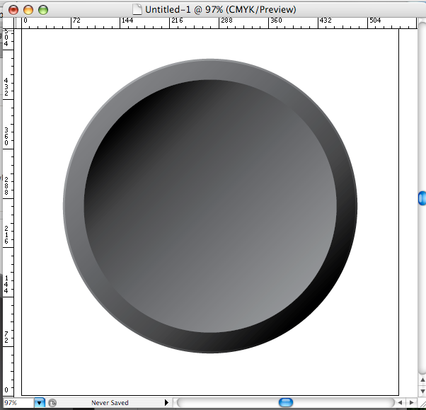
Today, I attempted a drawing based on this tutorial at PSDTUTS's vector sibling called, predictably, VECTORTUTS. Follow the link to the tutorial I did. Here's what I got:


3D Chess Illo


... which is not too bad, really, I think. This was done in Illustrator CS3. Included in the skill set are: paths, gradients, opacity masks, drop shadows, and 3D rotation.


Now, I mentioned that I played a game of chess with Illy two ways. One is alluded to in the drawing above. The other was a series of moves I had to work out in order to get the drawing rendered while I still have some youth left in me.


The tutorial had me making the two front white chess-pieces thusly:


  1. Draw a path, which amounted to a profile of one-half the object.

  2. Create a 3D object out of it by invoking the 3D Rotate filter.

  3. Add a drop shadow, just so.

  4. Copy the object, move it down and to the left just a tecth, go back to 3D Rotate, and specify a rotation sufficient to make the copy look like it's laying in its side.


Not really too advanced, as to process. But along the way, something happened. I reason this: When you add a drop shadow to a 3D object, Illy creates of it and the 3D object, a single, very complex group. When you're bucking around 3D object in Illy on a G4–even a dual core machine like mine–waits can be noticeable, but acceptable. But when you do it with a drop shadow effect employed, when you make the rotation, it has to analyze and render all items in the group, especially if you've added additional light sources. The complexity seemed to go up by a couple of orders of magnitude.


What it amounted to was that I wound up looking at this:


Long Wait ...


... for over a half and hour. Actually, I tell a lie: I went off, had a shower, got dressed, make a pot of coffee, and drank a cup of coffee. And the progress bar was still there, still working.


And, oh yes, I could tell it was working. Here's the CPU monitor when that was going on:


CPU Work Hard!


It makes you break a sweat just looking at it. By way of comparison, here's what it looked like when I quit the program right after aborting the rendering:


CPU Whew!


See? Just fell right off there. The greatly reduced histogram on the left is what we usually have to deal with.


I have always approached 3D rendering in Illy with trepidation. This has been a bother since CS2, so even though my computer is about three years old, I think it has as much to do with the fact that perhaps Illy isn't the greatest engine for 3D design out there.


But I did come up with a workaround. What it amounted to was duplicate and place all the 3D shapes, and THEN apply drop shadows to them. The lack of a complex group for Illy to deal with took a great deal of the load off the processor, thereby making shape generation much quicker (there's still an inconvenient pause, but it does work. Man, how I want to upgrade!)


So it was indeed a lesson, and it did teach some skills. Thankfully, I don't need to do 3D illustration much. By holding off on applying the drop shadow, I won that little chess match with Illy and my three-year-old PowerMac G4.


Of course, the more I think about it, the more I wonder if it was chess that we were playing ... or Go, perhaps.


Tags: , , , ,


Powered by Qumana


21 October 2008

"Bad type is an assault. It hurts the eyes as much as a bat to the knees. Don’t be a design Gillooly."

1823.


(via Microsoft Typography) Who is ... Max Kerning?


He's opinionated. He's punctilious. He's fussy, finicky, hard-to-please, exacting, demanding. He's persnickety and nitpicking. He has the arrogance which comes of being ... well, right (don't you just hate those people?). He has a bit of an accent ... sounds kind of German.


Max KerningHe's not above invoking greater Portland's most famous Bad Girl to make a point.


He's the Mr. Blackwell of type.


Max Kerning is Extensis' new virtual pitchman, a type-spacing-obssessed, anally-retentive maven of movable type. He's impassioned and quite willing to go to the mat with Comic Sans (Sorry, Vincent ...):


Do you use Comic Sans? Then you must check yourself into the Albuquerque Institute for the Terminally Tacky. Tell them Max sent you.


He's irritating, snarky ... and instantly addicitive to me. Because, verdammt, I agree with him!


Max Kerning: he wants type in good taste, not type that tastes good.


Visit Max's home on the web here; for a never ending stream of snarky Max goodness, follow him on Twitter (RSS Feed).


He's the greatest thing since keming.


Tags: , , , , ,


Powered by Qumana


How To: Making ZOMG Web 2.0 !!11!! Glossy Badges in Adobe Illustrator

1822.


This technique requires a bit of a trick in Adobe Illustrator with transparency blending.


One of the things that I find so humorous about "Web 2.0" is the way it's expressed as visual design. "Rounded Corners!" "Glossy Buttons" "Gradients!" The word beta pretty much everywere (doesn't beta mean not quite finished yet?)


But we digress. We've had all those for years now and it wasn't a web design philosophy. I'm not the only one who thinks so:


(via Wikipedia) Some technology experts, notably Tim Berners-Lee, have questioned whether one can use the term in any meaningful way, since many of the technology components of "Web 2.0" have existed since the early days of the Web.[


Fricken Web 2.0!But it does open up excuses to have fun in Illustrator and Photoshop. The layers and blending modes of the two programs allow the artist to come up with depth and dimensional effects that weren't doable even a short time ago, and will make you want to tear your eyes out of your skull if you try it in MS Paint. And now, you have to use 'em or you look like you're wearing 1998's designer jeans.


Two tutorials I recently read gave me quick and easy ways to create Web 2.0 badges ... you know, the ones with the jaggedy edges that tell you there's something afoot that's cool, or something. You can view them here. But, to get down to the nut, here's all it really takes:


  1. Make the badge outline. Using Illustrator, get the Star tool. Drag out a star. As you're holding the mouse button down/pen pont to the tablet, press the up/down arrow on your keyboard to increase/decrease the number of points as needed, and (keeping that mouse button clicked down, still!) hold down the CMD key and drag back'n'forth until you get the length of points you want.

  2. Copy that badge outline and paste it in place.

  3. Using the pencil tool, create a quick, 1-up-1-down wavy line. Group the wavy line and the badge copy and use the Divide tool from the Pathfinder palette. Ungroup that and delete the bottom half.

  4. Use Edit>Path>Offset with a small minus amount, say, -2 mm or -5 px or whatever is approprate, to shrink the top half left over (if you have a copy of that behind the newly-offset path, then delete that.

  5. Fill the half-part with a white-to-black gradient. Adjust using the gradient tool ... you want it to nearly fade out at the bottom

  6. Blend down using Screen (via the Transparency palette)


Et voila! You now have a nifty Web 2.0 badge with which you can beat your friends into submission. Put a snarky saying on it and Save for Web with GIF or PNG formats for the transparent background.


Tags: , , , ,


Powered by Qumana


17 October 2008

Adobe Illustrator Extra Goodies: You Haz Them!

1821.


To an Adobe Illustrator power-user, this is nothing new. I'm not a power user yet, but I do know my way around the app I affectionately call Illy, and just like my advetures in Photoshop latterly, I'm working on sharpening my Illy skills up.


Illustrator is an image editor too, but it works on vectors. It's somewhat counter-intuitive from natural drawing styles, but once you learn Illy's ways and means, you can do amazing things (there's something about Illy, and that's a subject for a not-too-far-in-the-future epistle).


If you have Illy CS, CS2, CS3 or (and now) CS4, and you're on Mac, open a Finder window and navigate to your Mac HD/Applications/Adobe Illustrator (whatever)/Cool Extras/Sample Files folder. There is some great stuff in there, yo.


Now, open the Crystal.ai file. This is what you'll see:


Miaymoki Crystal AI Sample File


Is that not gorgeous? You just about want to reach into your monitor and pick it up. But it's all paths, fills, gradients, and blending modes (need it also be added that the artist, Miyamoto Yukio, is evidently a master of photorealism?)


Let's take a good close look at one of those marbles in the water. Here's one I isolated:


Single Marble


The reflection on the left side now starts to resolve into individual shapes. These are actually filled paths, but when viewed at the proper scale, the eye naturally blends these together, and it looks like the reflection of the side of the glass and the marbles around it.


The shadow covering the lower 2/3rds of the marble is like this (I turned Smart Guides on, which highlights all sorts of nifty things when you use it:


Miyamoto Marble way close up


(the blue-green boundary around the gradient fill is because of the Smart Guides. Like I said, Nifty! Clicky here to embiggen) So you see here that the shadow of the marble is just one big path and fill. Gradient fill, to be exact (check the fill box at the bottom of the tool bar to find out)


Adobe Illustrator is ideally qualified to create photorealistic illustrations for things like icons and the ever-popular glossy-glassy buttons that Web 2.0 has made ever-so-fashionable.


I'm looking for Illy tutes that have done the same thing that the Photoshop tutes I've found do; limber my mad skillz and show off just what these amazing programs do.


And if you're lucky enough to have Illy, look for the Cool Extras folder. You won't be sorry.


Tags: , , ,


Powered by Qumana


You Suck At Photoshop #19: The Exegesis Of Donnie Hoyle

1820.


You Suck at Photoshop #19 is here ... and things are looking awful dark in Donnie's Dark Night of the Soul, Or Whatever It Is He Has That He Uses For One.


Before we go into the video, though, they takeaway is also something I've been finding out more about; using Photoshop to do more than just geek your photos around. It's obvious perhaps to know that PS can be used to create art. What's not so obvious, however, is just how. Donnie gives us an idea in a tableau that includes Sn4tchbuckler, and avatar for the ex, the Shaggin' Wagon, (if the van is a-rockin, don't...your wife is getting drilled by some guy named Ricky) the Ring of Infinite Sorrows, an idea of just what was on those Flash drives, and Roger Leventhal making a surprise appearance as Bridget Jones the Cat (hey, get a grip people ... did you know "Lassie" was a dude? 'strewth!)


Anyway, to the unhappiness (oh, there's a 30-second ad on the front. Just deal. The entertainment value alone is worth waiting through a kind of "uh-oh" feeling ad for Swedish Fish candy):


See? What'd I tell ya? Comedy gold, loose ends converging, creepy mystery, and solid PS techniques all in one video. The Big Fat Brain institute fellow are geniuses. Evil? I don't know. Your mileage will vary there.


We also see that, in two weeks' time, 31 Oct (appropriately, given the trend of this series), YSAP Season 2 comes to a (very probably) sickening end. Will Donnie meet his end ... or an entirely new beginning again?


Trick rhetorical question. He's going to get it, good and hard (if I may paraphrase HL Mencken ... and I will, he can't stop me, 'cos he's dead. Look it up).


Well, I'll be there anyway.


Tags: , , , ,


Powered by Qumana


16 October 2008

Jack Narz, Game Show Host: 1922-2008

1819.


Correction: the original version of this missive named one of the Twenty-one contestants at the heart of the quiz-show scandals as James Van Doren. This is incorrect: it should have been Charles Van Doren. The Times regrets the error (thanks to Mark Murphy at murphyscraw.blogspot.com)


I am a lover of game shows. Not necessarily the current overbred, overproduced, hyper-funded kind; I loved the old game shows, the ones that were big in the second game-show golden age of the 1970s. When I was but a neat thing, my idea of a perfect day wasn't going to school, it was being sick, staying home, and spending the morning and afternoon watching a perfect thirty minutes of blinking lights and sound effects, six or seven times from the morning through the afternoon.


I was enjoying Match Game before it became ironic. I really believed that Charles Nelson Reilly and Brett Somers hated each other.


Anyway! The reason I put down these memories is because I just learnd that Jack Narz has died. This would be an name with very little Q today, but back during the 70s, Jack was not only a respected member of the small-yet-ubiquitous game show host fraternity, he actually survived the quiz show scandals of the 50s unscathed.


You'll remember that one if you saw the movie Quiz Show, where Ralph Fiennes played James Charles Van Doren and John Turturro played Herbert Stempel. That was of course the show Twenty One, the show famous for the scandal, but the quiz-show-fixing scandal first erupted on Jack Narz's own show, a show that combined quiz questions with a childrens connect-the-dots game, a show madly popular in its own right, called Dotto. Quiz shows were huge in those days, and the networks and the show's sponsors spared no measure to keep crowd-pleasing contestants on and keep the drama high.


In 1958, Dotto went straight to the top, becoming the most popular show in daytime television. After evidence was discovered that it was fixed, it fell even faster, very soon to be cancelled. Narz was never implicated in the scandal, indeed it seemed as though he wasn't in the loop at all. Perforce, he escaped the tarring and feathering that, for example, Jack Barry's career endured (he was out of work in game-showing for the better part of 20 years, until The Joker's Wild).


He was at work soon after Dotto's cancellation. Eventually landing on such shows as Now You See It, the TV version of the good old word-search. MrMatchGame has a great tribute to him:


Jack Narz was the brother-in-law of the great Bill Cullen, and the actual brother of Tom Kennedy ... who was born James Narz (and is, as of this writing, still with us).


Very few of the old hosts from the good-old-days of 70s game shows are still with us.


TV was so much more simple then. $10,000 was considered a huge jackpot. Match Game was the king of the roost.


And so it goes.


Tags: , ,


Powered by Qumana


15 October 2008

The Photoshop Compass

1818.


Another day past, another PSTUT down. This time, we created a rather spiffy looking compass, perfect for use as an icon in an application or just looking at and going oooh, preetty!:


The Photoshop Compass


That is really nifty, no? The real takeaway from this illustration is the ways one can make a 3D look from two-d shapes, gradients, and shading.


Note the shiny spots along the side of the compass. The first thing that was done was creating an ellipse and filling it with gray. Then, I copied this and moved that up. Using guides, I created a rectangle between the two ellpses, and filled that with a gradient. After putting in (and Gaussian-blurring out) more white for reflections, without actually creating a 3D shape, I had a 3D look.


Technically I implemented skills used in the other tutes ... including command-clicking layers to load them as selections, and rocked the blending modes. Shadows and layer effects are used liberally to give depth and reality, and the selections are moved this way and that based on the other layers to keep things in the right sizes.


All the instructions needed to produce this ... inlcuding a PNG of the compass dial ... are available at the tutorial site.


In our endless search for interesting tutes to keep our PS skills sharp, we've concluded that PSTUTS is a worthwhile stop.


Tags: , ,


Powered by Qumana


Criggo: When Leno Doing Headlines Just One Night A Week Won't Hold You

1817.


(Via BoingBoing). An example:


criggo clipping


It's like, here, cats.


The URL is http://criggo.wordpress.com, if you swing that way.


Tags: , , ,


Powered by Qumana


14 October 2008

Photoshop Layer Blending Modes: Normal, Darken, Lighten

1816.


Working the last few tutorials has again reminded me how useful Photoshop's blending modes are. However, when I was trained in PS, I wasn't given a very deep understanding of them. The modes were used in a trial-and-error fashion, which, for a beginner, was kind of a relief ... the list can be eye-glazing to the tyro.


However, for long-term artistic development, one really wants to have a somewhat deeper understanding of what blending modes (with their odd names) mean. Along the way, and from various sources, I've made my own list. It's a work in progress, but it helps me a bit.


Knowing which tool to use improves your workflow; you save yourself the trial-and-error step and go straight to tweaking the mode.


The blending modes in PS are divided into a handful of groups, which are related by the general effect they have on the pixels they govern. In the following, I use three terms: base color is the original color in the image, blend color is the color that's being applied with the editing tool, and result color is the color that, of course, results.


 Herewith the list, divided by groups:


The Normal Group: causes no fundamental change to the pixel's color values


  • Normal Normal blending is just what it says; the normal mode of operation. To be specific, any painted pixel on a layer above simply covers up any pixel below it. This is the default.

  • Dissolve This one I don't use much. On a layer with a faded edge, Dissolve randomly replaces the pixel color with the blend color, depending on the opacity of the location. On something with a soft, blurry fade, Dissolving with another layer will turn it into a choppy, noise-y sort of thing. If you drop layer opacity below 100%, Dissolve will dither all pixels.


The Darken Group: Blends the pixels on the active layer to a darker color depending on the setting.


  • Darken The result of this is the blend color or the base color, whichever is the darker one. If the pixel is lighter than the blend color it's replaced; if not, no change.

  • Multiply Mathematically multiplies the two colors together; the result is the new blend. Multiplying any color by black will give you black; multiplication with white produces no change. Paint with this mode active and get darker and darker colors with each successive stroke.

  • Color Burn darkens the base color to reflect the blend color by increasing the contrast. I'm not too clear on what that verbiage means, but the result is what one site calls "crisp, toasty" colors. They look rich, warm, and overexposed.

  • Linear Burn darkens the base color to reflecting the blend color by increasing the brightness. The result is less lurid and smoother than Color Burn.


The term "Burn" comes to us from the photographer's darkroom, where an area of a negative was overexposed by by screening out the light all around. The Photoshop Burn tool icon itself reflects this heritage: the hand forming an aperture just so was a common way photographers isolated a burn.


The Lighten Group: Blends the pixels on the active layer to a lighter color depending on the setting.


  • Lighten replaces the base color with either the base color or the blend color depending; pixels darker than the blend color are replaced, and pixels lighter are not.

  • Screen mathematically inverts the colors, multiplies them, then inverts them again. The result is usually a lighter image. The name is wholly non-intuitive.

  • Color Dodge with the dodge modes we once again return to the darkroom. Dodging an image was the opposite of burning an image; instead of isolating an image for more light, the photographer used a paddle-shaped tool with a wire handle to block out the light, resulting in a lighter area. Similar to Color Burn, Color Dodge lightens the base to reflect the blend by decreasing the contrast. Each color becomes a value-brightness multiplier; black drops out entirely.

  • Linear Dodge Lightens the base color to reflect the blend by decreasing the brightness. Gives a smoother effect than Color Dodging.


We'll treat the next groups, Light, Invert, and Color blending modes, in the next missive.


Tags: ,


Powered by Qumana


The Photoshop Glass Of Beer

1815.


Fresh from our quest to find the perfect little green apple (God, as B.J. Thomas said, didn't make 'em), we find that a beer would be a very fine thing.


Photoshop can help again. This PSTUT tutorial, in 22 steps, enabled me to come up with this:


The Photoshop Glass Of Beer


Which is a fine glass of Pilsener. Now, Pilsener isn't my favorite beer, but absent any other sort, it'll do nicely.


Once again the tutorial has us isolating areas for layer effects by CMD-clicking (CTRL-clicking in Windows) a layer thumbnail. This loads the non-transparent pixels of the selected layer as a selection. Say, for instance, you've made just a simple square of whatever color on its own layer, and you're going to create another layer, and you want to create a fill or effect and align it with the square. By CMD-clicking the layer thumb, the square shape – the nontransparent pixels on that layer – are loaded as a selection. This saves a great deal of time over marqueeing, magic-wanding, or quick-masking out a shape in appropriate situations.


The reflections on the glass are made with a gradient fill on its own separate layer, tweaked a bit, then using Edit > Transform > Warp to make it conform to the outlines of the glass, then CMD-clicking the glass outline's layer (there we go again, see?) to trim the gradent. Blending down using Screen and adjusting the opacity made it look like it was of the glass. A radial gradent fill overlay layer effect (which allowed me to pull the bright area down at will) provided the lovely golden color of the beer, and a brush with a specially-designed bubble and certain tweaks in the Brushes pallette provided the realistic-looking columns of bubbles. Altogether, pretty nifty.


Thristy? Draw yourself a glass of beer!


Tags: , , , ,


Powered by Qumana


13 October 2008

Artists And Thier Tools: Watch Scott Adams Draw A Dilbert Daily

1814.


Stan, who, for someone I've never actually met in person knows me unnervingly well, spotted my discourse on Bob Staake and Scott Adams here and thought I'd enjoy this: a four-minute video hosted at Amazon.com of Scott Adams actually performing that voodoo that he do so well (this is not an embed, clicking on the illo will take you to the video's page at Amazon and you can play it there):


Scott Adams Drawing Dilbert


(or clicky here) That loverly bit of tech that Scott's drawing on is a Wacom Cintiq 21ux tablet. This tablet has an lcd screen beneath the tablet surface, so in apps like Photoshop you get the luxurious experience of drawing directly on your documents ... tools, brushes, erasers, marqueeing, everything. It's a combination of touch-scren monitor and digitizer tablet. Luxury like that costs: the price I just saw for one is $1999. But as Scott shows, it just makes for a killer workflow.


The takeaway here for me is that I didn't know that Adams created the strip from jump street in the virtual world. Many web cartoonists and cartoonists that use digital tools I've read about work in a hybrid; nailing down the art on paper or bristol, then scanning and coloring and finishing on the computer. The working is particularly interesting, because aside from stritctly-digital moves ... like using the paintbrush tool at a touch to fill in spots instead scribbling in the color or fill ... what he does is what a lot of artists do: rough in the general shapes the go back and harden in the lines that matter.


I'm not fortunate enough to have a Cintiq of any description, but I do have a 6x11 Intuos3 from Wacom. It's worth it. The pen he uses is the same model I have, and it feels and reacts just like a real pencil or pen - you can vary strokes with pressure and tilt. I also have a touch-sensitive strip and programmable key combination on each side of the tablet surface.


Wacom makes really quality equipment. They all but own the market in digitizer tablets, and there's a very good reason. They even have a line of low-cost starter tables, the Bamboo line, that retail for under $100, so anyone who saves thier pennies can buy thier way into some Wacom goodness. And they have a major distriubution center across the river in VanWa. I don't know if that changes the service dynamic at all, but it is kind of cool.


Stan is correct in saying that it's droolworthy, but I advise caution; as detailed earlier, a bit of moisture can cause a couple hundred dollars in repair. But either way, it's worth it.


If there's one thing I'd ask Scott if I had the chance, though, it's still about Photoshop. He's apparently using CS, which is two versions back. Why not upgrade?


And thanks again to Stan for the ref.


Tags: , , , , , , ,


Powered by Qumana


12 October 2008

Portland Neighborhood Moves From the CENTER

1813.


CENTER neighborhood logoIt's not exactly news to some, but I think it's kind of cool that the Center Neighborhood's (NE 44th to 68th Avenues, and East Burnside Street north to the Battlefield Freeway) name was drawn from the initialism CENTER, standing for Citizens Engaged Now Toward Ecological Review. This is a wholly noble goal, and one which we approve of.


Trouble is, it's not in the center of everything, and just about everywhere in Portland, people think ecological review nearly all the time. The logo is a little dated as well; the calligraphy is beautiful, and the artwork is charming, but it clearly speaks of a time when evironmental awareness wasn't necessarily on everyone's mind.


They'll most likely be renaming themselves to North Tabor very soon now, or Rosemont perhaps (dialup warning: that link will download a 1 Megabyte PDF to you). I have no dog in this contest, but I like Rosemont better. Much more picturesque. North Tabor is accurate, but a little utilitarian.


And so it goes.


Tags: , , , ,


Powered by Qumana


The Republic Of San Seriffe: A Foreign Land for Cartographers and Typographers

1812.


(via Strange Maps) San Seriffe is a land which few have heard of and even fewer have visited. But its a land you should be familiar with – especially if you love maps, type, or like me, both.


The Republic of San Seriffe


(also clicky here) If you haven't heard of this semi-colon-ial state, don't feel bad. San Seriffe kind of keeps its own secret. But it's a cool place. With an economy based on the three pillars of the phosphate industry, petroleum industry, and tourism, it has the economic chops, and with a newly-civilian government, things are opening up on the civil side as well.


The archipelago itself is a little hard to find. One of its reputed locations is in the Indian Ocean, but due to a process of erosion removing land from the west sides of the islands and depositing in on the east side, the islands are moving east at the rather enthusiastic rate of about 1400 metres per year! So, as the great State of Hohoq that John Hodgman revealed to us in The Areas Of My Expertise, you really can't tell where you'll find it next.


Of course, map jokes are a thing of long tradition. The habit of putting puns and jokes in cartographic form goes back quite a ways, and some of them here are obvious (Upper and Lower "Caisse", a capitol named Bodoni, the beaches of "Gill Sands", and Picas scattered about) as well as a little inscrutable (I still can't figure the joke behind the swamp on Lower Caisse called the "Woj of Type"). But it's a fine example of a hoax in the open, created in 1977 by the British newspaper The Guardian, complete with a special supplement.


The supplement was so convincing that people apparently looked to visit and open economic opportunities.


But it really doesn't exist except as a monument to imagination, creativity, and a very dry sense of humor. So, if you try to book a vacation to San Seriffe and can't, don't feel bad.


I couldn't, either. Now, that was an awkward moment!


Tags: , , , , , ,


Powered by Qumana


The Photoshop Apple

1811.


(tutoral via PSDTUTS) One of my favorite pastimes is finding Photoshop tutorials to do. With paying design work currently very few and far between, skills can atrophy if not maintained, and there are enough tutorials on the intermets that an aspiring employed designer and illustrator can have what amounts to a constant continuing education program.


With the advent of fall, we think apples ... green, red, whatever. We love apples. If you can't get to the store, though, Photoshop allows us to get a nice green apple (with a dash of fall color) pretty much any time we want.


This tutorial at PSDTUTS is what does the trick. In 21 steps of moderate difficulty, you use layers, blending, opacity, clipping masks and a lot of standard tricks just about every Photoshopper is better off knowing to create a rather realistic, shiny, green apple with a delightful blush on one side. This was how my effort turned out: nifty, which you can clicky to embiggen:


The Photoshop Apple


(or click here if the picture link proves intractable-goes to Photobucket) Amongst the most relied-upon skills in this tutorial is the use of CMD-Clicking (or CTRL-Clicking for Windows users) the thumbnail in the Layers palette. This loads the non-transparent area of the chosen layer as a selection, which is a quick way to control fill and effects and cöordinate work on child layers with a parent layer, which ends up working kind of like registration holes on a mylar stack ... they keep work on upper layers aligned with that on a lower layer. It's kind of an intermediate point between just selecting by eye and going the full ride and committing your selection to an alpha channel for later use. It's one of those mad useful skills I occasionally go on about.


I did this in Photoshop CS3 but it will probably work as far back as version 7, maybe even earlier. Layers, layer groups, the selection technique, layer opacity and filling selections ... these are all old PS standbys.


About the only weakness the tutorial has is that it's 99% process and 1% exploration. In other words, while you're going 'round the world with blending modes, and that's fine because blending modes really are part of the key to making your Photoshop illustration come to life, I'd like to know the why. Just like any Photoshop user, I can name at least five or six blending modes off the top of my head, but I'd love it if someone could explain it and why they do what they do ... and where it would be good to use each. I find I use Multiply quite a bit ... but just what is that doing? Blending modes for me is less of a thinking thing and more of a trial-and-error thing.


But enough of the complaining. If that's a flaw, it's a small one; this tutorial is very good ... just like that apple'd taste, I'm sure.


Go ahead. Have yourself an apple!


Tags: , ,


Powered by Qumana